-
Tired of adverts on RWI? - Subscribe by clicking HERE and PMing Trailboss for instructions and they will magically go away!
You are using an out of date browser. It may not display this or other websites correctly.
You should upgrade or use an alternative browser.
You should upgrade or use an alternative browser.
New Sub up on Toros - Noob V2?
- Thread starter cubicle_monkey
- Start date
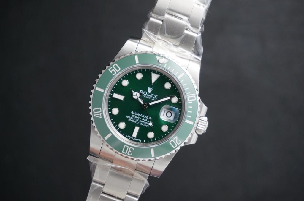
Wow, I have just gone through this thread in more detail and I am really surprised (although I shouldn't be) at some of the nits some members are picking out with this watch. I think some of you guys found a couple of pictures of gens and then compared them to the rep and are drawing the wrong conclusions--which are wrong. First of all, Gen makers change their watches in small ways all the time without any fan fair. The same model can have 4 or 5 dial variations over the course of its production life, with most people never noticing the changes. Because of these subtle changes, some people get very confused when looking at pictures and point out these purported flaws in a rep. Guys, chill the f--k out and do some homework before you start to tear a new watch to pieces. Some of you really have no idea what they are talking about. This is a stellar looking piece with some very minor flaws that no one would ever really notice in the real world. That said, there is NOTHING wrong with the dial on this rep, namely the spacing between the 1000ft = 300m
The dial (which has been critiqued quite a bit) looks great to me. Unfortunately, the hour hand in your pictures is covering the print in OP's pictures, but there has been quite a bit of complaints about the spacing between in the 1000ft = 300m. I want to put this to rest now:
Here's the a gen from Rolex's first production run, which began in 2010. These dials were used in watches produced in 2010 into 2011:


More recent production runs made a few changes to the dial spacing, which made it look a little less cramped. These new dials were used from mid-2011 (along side the original dial) through the present. This is a picture of a updated dial (not the change in the size of the "f" in 1000ft and the spacing between the "= 300 m"):
In my eyes, the V2 dial looks like a great copy of the original 116610 dial from 2010-11. I would guess that noob bought a preowned 116610LN that came from an early production run. That's what the copied and they did a good job of it. Second, there is some variation in thickness on the marker surrounds in various versions of the gen. These surrounds look fine for the first gen sub-c dieal. The pearl also looks spot on.
Real flaws, as well noted, the engravings on the bezel insert could be a bit deeper and, of course, should have platinum paint (easy mod), but this is very hard to see on the wrist. The bezel fonts look good to me though (but could be a smidge thicker).On the other hand, think noob also did a very good job getting the bezel teeth right.
In the end, it's all about how the way the watch feels anyway. If this is anything like the Exp2, it's a winner.
I was looking at the pictures of the watch above and magnified them 50X on my computer at home. I noticed there is a big gap between the bracelet and the lug at 11 O'clock. Are your sure this is a Gen? I think it must be a version Noob 2.456 and it really isn't a very good one. I hope the owner didn't pay the Gen price. If he did he got ripped off.
I also noticed the metal around the 6, 9 and 12 hour markers is thicker than the rings on the other hour markers. I am pretty sure this is a "Flaw"...
:rofl:
LOL... Yeah it's a gen. Pictures taken from a review done back in 2010.
.Sent from my SCH-I535 using Tapatalk 2
noob dial hour markers are horrible.....
no they are thick like gen hour markers
I wore my cousins gen 116610 to the office today and compared it to the V2 rep and the dials IMO looked almost identical. The hour marker rims honestly looked the same. Like mentioned in previous posts, there must be a few different iterations of the dial.
The bezel markers are indeed different but it's really hard to point it out unless they are next to each other.
If I get a chance I will try and post some comparison photos.
The bezel markers are indeed different but it's really hard to point it out unless they are next to each other.
If I get a chance I will try and post some comparison photos.
I wore my cousins gen 116610 to the office today and compared it to the V2 rep and the dials IMO looked almost identical. The hour marker rims honestly looked the same. Like mentioned in previous posts, there must be a few different iterations of the dial.
The bezel markers are indeed different but it's really hard to point it out unless they are next to each other.
If I get a chance I will try and post some comparison photos.
Would be great to see the side by side comparison. Really contemplating to pull the trigger but not fully convinced that I am too nitpick about the hour marker rims...
Would be great to see the side by side comparison. Really contemplating to pull the trigger but not fully convinced that I am too nitpick about the hour marker rims...
+1 on comparison shoot and review
Capt. Obvious
Respected Member
- 5/5/13
- 4,136
- 2
- 0
Capt, you heard from the Skiing Dealer yet mate?
Lol, nope, I sent him ANOTHER email yesterday, pointing out that I've not heard from him since I paid.
I reckon he's just raking orders in and doesn't have it in stock!
I have on the other hand heard from Trevs. He should be shipping my Expl. II white face today or tomorrow
*fingers crossed*
Did you end up buying one of those?
Aldo69
I'm Pretty Popular
- 29/10/12
- 1,791
- 34
- 0
No mate, Ryan said he had no stock at the moment, when were in discussion about repairing/updating my V1. Wouldnt take my money if he had no stock, so cant fault him.
Definately for one soon mind.
Genuinely hope you hear something soon.
Toro's had his TD wrists slapped over his conduct with this.
Definately for one soon mind.
Genuinely hope you hear something soon.
Toro's had his TD wrists slapped over his conduct with this.
Cmon guys.... All these talk about bezel numbers.. I dont doubt that they are a instant giveaway. But in what situation would you the other party "inspecting" your watch would be able to see the platinum paint? So lets say you were having dinner with your mate.. and he questions whether you are wearing a gen, would you say yes? I would say eh, its a rep. Never pass a rep as a gen.
However if you are trying to convince someone that you are wearing a gen when you are wearing the v2...
Then save some pennies and get the gen. 9k vs $350. The decision is yours really.
However if you are trying to convince someone that you are wearing a gen when you are wearing the v2...
Then save some pennies and get the gen. 9k vs $350. The decision is yours really.

Keyser_Soze
Getting To Know The Place
- 15/4/13
- 63
- 0
- 0
you're right, but I lament this because I'm sure it's not difficult for any factory to build a bezel with good numbers printing .. we wait so long, we have many desires to see new improvements, v1, v2, and instead ...
I'm sure these defects are not corrected deliberately by factory, so we continue to buy new rep least possible improved but never perfect...
I'm sure these defects are not corrected deliberately by factory, so we continue to buy new rep least possible improved but never perfect...
you're right, but I lament this because I'm sure it's not difficult for any factory to build a bezel with good numbers printing .. we wait so long, we have many desires to see new improvements, v1, v2, and instead ...
I'm sure these defects are not corrected deliberately by factory, so we continue to buy new rep least possible improved but never perfect...
+1
However what the factory does is not within the control of most of us here on the fora... So what can we do?
Some dealers and exceptional members are really good tho, in terms of pushing the factory with the crucial info they need, for eg minor flaws etc. But I think at the end of the day these chinese factories are looking for volume. And if they, like you said, produce a rep that is 99.99% close to a gen, who would buy the next edition?
I guess on our end its either we buy and accept that its a rep. Enjoy it for a mere 300 bucks, or wait(who knows for how long) for the "99.99%" rep to come out.
Or just get the gen already???
We still have these ready for qc pics. We purchased a bigger stock before they run out of stock.
so you have the black and green in stock now