126710 DD3285 on oyster! Great Choice! Thats my grail right there. Have had an order for a long time now. Glad to see its getting out there!Hi there! Pulled the trigger last Friday 14/3, got QC today for Batman DD!
So far @CTime is amazing!!!

-
Tired of adverts on RWI? - Subscribe by clicking HERE and PMing Trailboss for instructions and they will magically go away!
You are using an out of date browser. It may not display this or other websites correctly.
You should upgrade or use an alternative browser.
You should upgrade or use an alternative browser.
Clean new GMT with DD3285 QC pics and video release [finally]
- Thread starter CTime
- Start date
- 13/6/21
- 325
- 171
- 43
And if someone likes the Pepsi, here you go ")

- 13/6/21
- 325
- 171
- 43

Does the transition on the bezel still look like this?
- 12/3/18
- 35,927
- 72,503
- 113
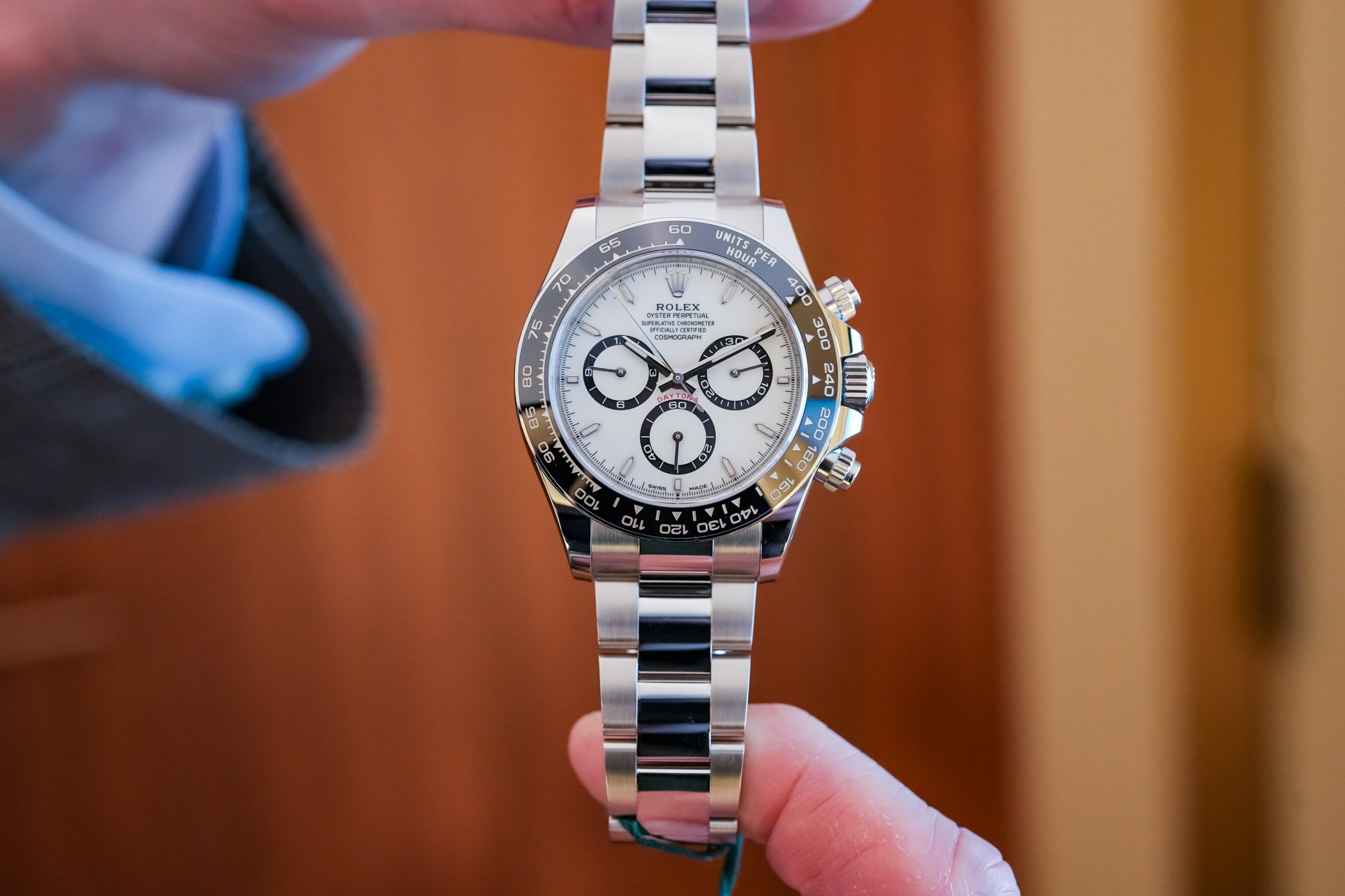
In case anyone was wondering, gen Rolex dials have often had some text height and spacing anomalies, primarily in these lines:
SUPERLATIVE CHRONOMETER
OFFICIALLY CERTIFIED
It's a common subject of debate as to why the anomalies exist, some have suggested it was an anti-counterfeiting measure, who knows?
There are many variations of these anomalies but mostly they are either present or absent with certain letters
These letters can be taller than others:
S C O L T F E D
Some font widths are noticeably less than others
O T F
Spacing is uneven at the end of CHRONOME TER
You can find all kinds of examples of these anomalies, here are just a couple quick ones to look at:
I've seen a few pics of the new CLEAN DD3285 GMT with a crooked bottom line on the final E in CERTIFIED (not acceptable), but the others shown here with an oversized CE and ED in CERTIFIED, C in OFFICIALLY, and maybe a few others are well within the standards of gen Rolex fonts.
These anomalies can even be present on Daytonas, where the text is in the upper half of the dial. Here's some actual gen 2023s (zoom in)
 monochrome-watches.com

From the above 2023 actual gen dial, there are many instances of uneven letter spacing. Here is just one example, in the word CHRONOMETER. Also note the E is taller than the R's and the H.

SUPERLATIVE CHRONOMETER
OFFICIALLY CERTIFIED
It's a common subject of debate as to why the anomalies exist, some have suggested it was an anti-counterfeiting measure, who knows?
There are many variations of these anomalies but mostly they are either present or absent with certain letters
These letters can be taller than others:
S C O L T F E D
Some font widths are noticeably less than others
O T F
Spacing is uneven at the end of CHRONOME TER
You can find all kinds of examples of these anomalies, here are just a couple quick ones to look at:
I've seen a few pics of the new CLEAN DD3285 GMT with a crooked bottom line on the final E in CERTIFIED (not acceptable), but the others shown here with an oversized CE and ED in CERTIFIED, C in OFFICIALLY, and maybe a few others are well within the standards of gen Rolex fonts.
These anomalies can even be present on Daytonas, where the text is in the upper half of the dial. Here's some actual gen 2023s (zoom in)
Photo Report: All The New Rolex 2023 Models In Live Photos
As Watches and Wonders 2023 kicked off, Rolex released its brand-new collection. And the Crown has put on quite an impressive show. No fewer than nine new models have been released, ranging from a new ultra-classic dress watch to a very surprising model with colourful bubbles on the dial or the...
monochrome-watches.com
From the above 2023 actual gen dial, there are many instances of uneven letter spacing. Here is just one example, in the word CHRONOMETER. Also note the E is taller than the R's and the H.
Last edited:
- 17/4/17
- 879
- 759
- 93
Only the number 8 and 6 are affected by this rough finishing. It definitely has something to do with their manufacturing process. All of the remaining numbers, in the green and black section are perfectly fine.
Does the transition on the bezel still look like this?
- 13/3/16
- 1,298
- 2,036
- 113
In case anyone was wondering, gen Rolex dials have often had some text height and spacing anomalies, primarily in these lines:
SUPERLATIVE CHRONOMETER
OFFICIALLY CERTIFIED
It's a common subject of debate as to why the anomalies exist, some have suggested it was an anti-counterfeiting measure, who knows?
There are many variations of these anomalies but mostly they are either present or absent with certain letters
These letters can be taller than others:
S C O L T F E D
Some font widths are noticeably less than others
O T F
Spacing is uneven at the end of CHRONOME TER
You can find all kinds of examples of these anomalies, here are just a couple quick ones to look at:
I've seen a few pics of the new CLEAN DD3285 GMT with a crooked bottom line on the final E in CERTIFIED (not acceptable), but the others shown here with an oversized CE and ED in CERTIFIED, C in OFFICIALLY, and maybe a few others are well within the standards of gen Rolex fonts.
These anomalies can even be present on Daytonas, where the text is in the upper half of the dial. Here's a new 2023 (zoom in)
Photo Report: All The New Rolex 2023 Models In Live Photos
As Watches and Wonders 2023 kicked off, Rolex released its brand-new collection. And the Crown has put on quite an impressive show. No fewer than nine new models have been released, ranging from a new ultra-classic dress watch to a very surprising model with colourful bubbles on the dial or the...

Finally…the voice of reason! Thank you KJ.
- 13/6/21
- 325
- 171
- 43
8 on one side and 6 on the other side… but is it still as rough as in the picture above?Only the number 8 and 6 are affected by this rough finishing. It definitely has something to do with their manufacturing process. All of the remaining numbers, in the green and black section are perfectly fine.


- 12/3/18
- 35,927
- 72,503
- 113
I know that one will be good bro, it's been CERTIFIED, haha!
Clean new GMT with DD3285 QC pics and video release [finally]
Hi there! Pulled the trigger last Friday 14/3, got QC today for Batman DD! So far @CTime is amazing!!! 126710 DD3285 on oyster! Great Choice! Thats my grail right there. Have had an order for a long time now. Glad to see its getting out there!
Congrats, looks good!
Last edited:
BlossomboofyBoofystewie2
Active Member
The depth of some of the member's knowledge on here is simply amazing! - Mate, I'm in awe!In case anyone was wondering, gen Rolex dials have often had some text height and spacing anomalies, primarily in these lines:
SUPERLATIVE CHRONOMETER
OFFICIALLY CERTIFIED
It's a common subject of debate as to why the anomalies exist, some have suggested it was an anti-counterfeiting measure, who knows?
There are many variations of these anomalies but mostly they are either present or absent with certain letters
These letters can be taller than others:
S C O L T F E D
Some font widths are noticeably less than others
O T F
Spacing is uneven at the end of CHRONOME TER
You can find all kinds of examples of these anomalies, here are just a couple quick ones to look at:
I've seen a few pics of the new CLEAN DD3285 GMT with a crooked bottom line on the final E in CERTIFIED (not acceptable), but the others shown here with an oversized CE and ED in CERTIFIED, C in OFFICIALLY, and maybe a few others are well within the standards of gen Rolex fonts.
These anomalies can even be present on Daytonas, where the text is in the upper half of the dial. Here's some actual gen 2023s (zoom in)
Photo Report: All The New Rolex 2023 Models In Live Photos
As Watches and Wonders 2023 kicked off, Rolex released its brand-new collection. And the Crown has put on quite an impressive show. No fewer than nine new models have been released, ranging from a new ultra-classic dress watch to a very surprising model with colourful bubbles on the dial or the...
From the above 2023 actual gen dial, there are many instances of uneven letter spacing. Here is just one example, in the word CHRONOMETER. Also note the E is taller than the R's and the H.
Relos_Indios
Known Member
That's a gorgeous GMT! Congrats!
This information is invaluable, I'm speechlessIn case anyone was wondering, gen Rolex dials have often had some text height and spacing anomalies, primarily in these lines:
SUPERLATIVE CHRONOMETER
OFFICIALLY CERTIFIED
It's a common subject of debate as to why the anomalies exist, some have suggested it was an anti-counterfeiting measure, who knows?
There are many variations of these anomalies but mostly they are either present or absent with certain letters
These letters can be taller than others:
S C O L T F E D
Some font widths are noticeably less than others
O T F
Spacing is uneven at the end of CHRONOME TER
You can find all kinds of examples of these anomalies, here are just a couple quick ones to look at:
I've seen a few pics of the new CLEAN DD3285 GMT with a crooked bottom line on the final E in CERTIFIED (not acceptable), but the others shown here with an oversized CE and ED in CERTIFIED, C in OFFICIALLY, and maybe a few others are well within the standards of gen Rolex fonts.
These anomalies can even be present on Daytonas, where the text is in the upper half of the dial. Here's some actual gen 2023s (zoom in)
Photo Report: All The New Rolex 2023 Models In Live Photos
As Watches and Wonders 2023 kicked off, Rolex released its brand-new collection. And the Crown has put on quite an impressive show. No fewer than nine new models have been released, ranging from a new ultra-classic dress watch to a very surprising model with colourful bubbles on the dial or the...
From the above 2023 actual gen dial, there are many instances of uneven letter spacing. Here is just one example, in the word CHRONOMETER. Also note the E is taller than the R's and the H.

Thanks mateThat's a gorgeous GMT! Congrats!

- 15/5/16
- 578
- 30
- 28
I did 2 days ago.. was a lil disappointed cuz the bezel insert was bad had to RL ...waited almost a month for it and now waiting game start over
had to RL ...waited almost a month for it and now waiting game start over TD?I did 2 days ago.. was a lil disappointed cuz the bezel insert was bad
Date disc looks ok. Just needs gen crystal am I right??126710 DD3285 on oyster! Great Choice! Thats my grail right there. Have had an order for a long time now. Glad to see its getting out there!
Theonewatches.io but Steve is very nice and easy to work with
.. please let me know I ain't overreacting or tripping bout the transition at the 6 right?
Last edited: