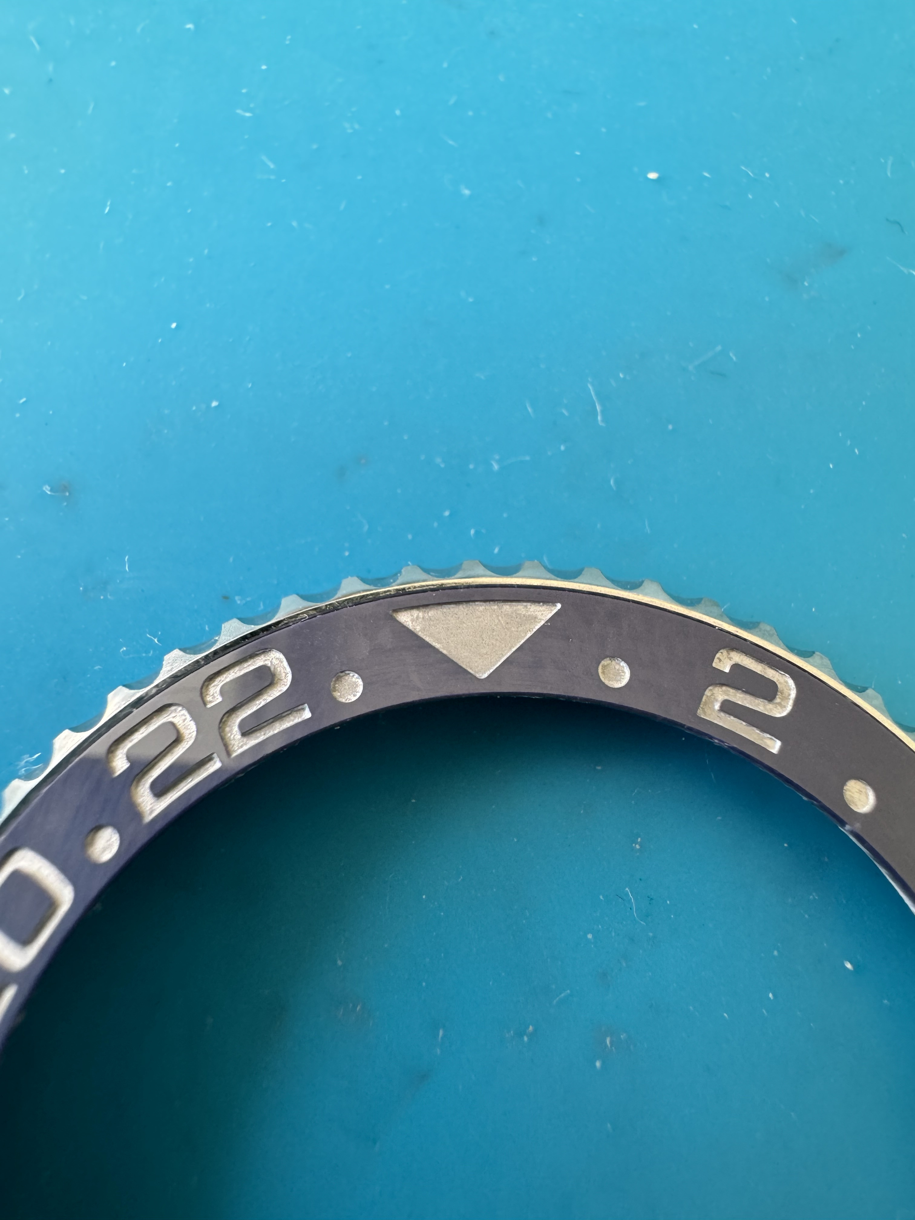
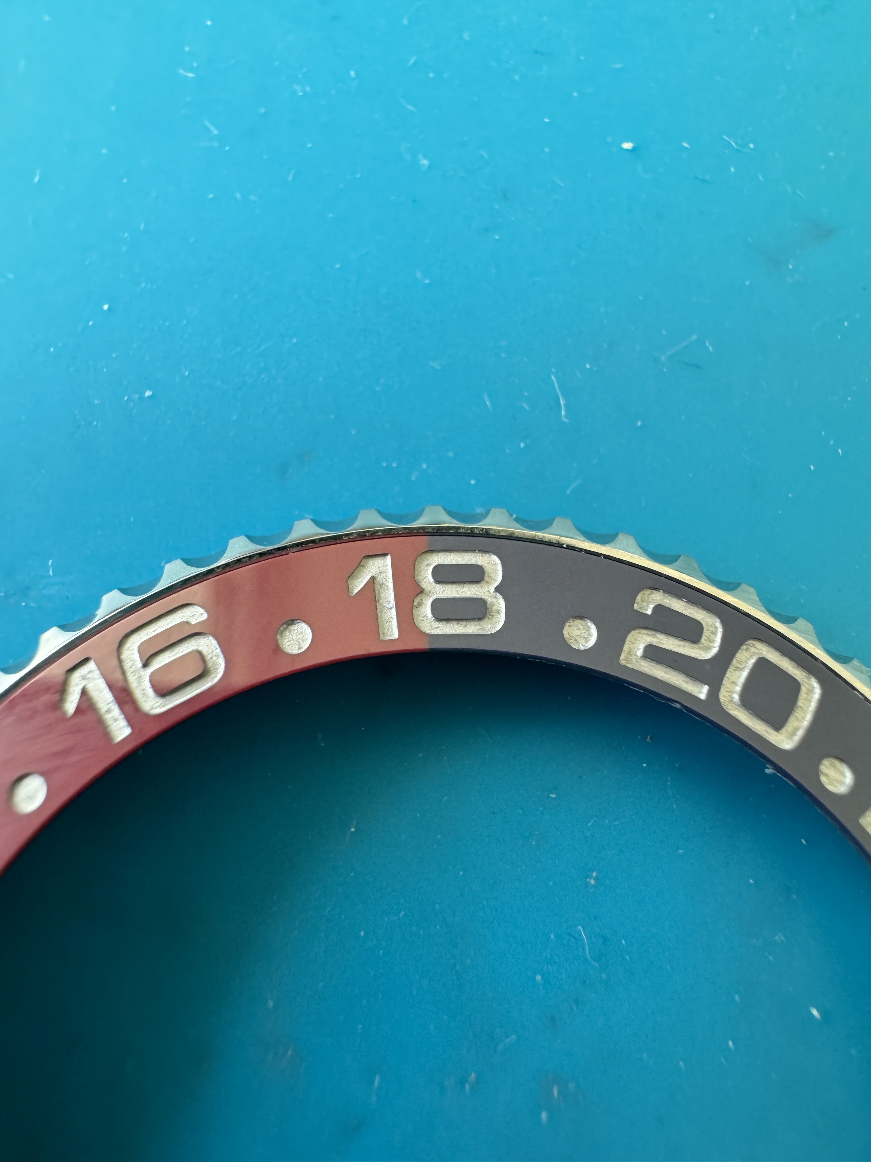
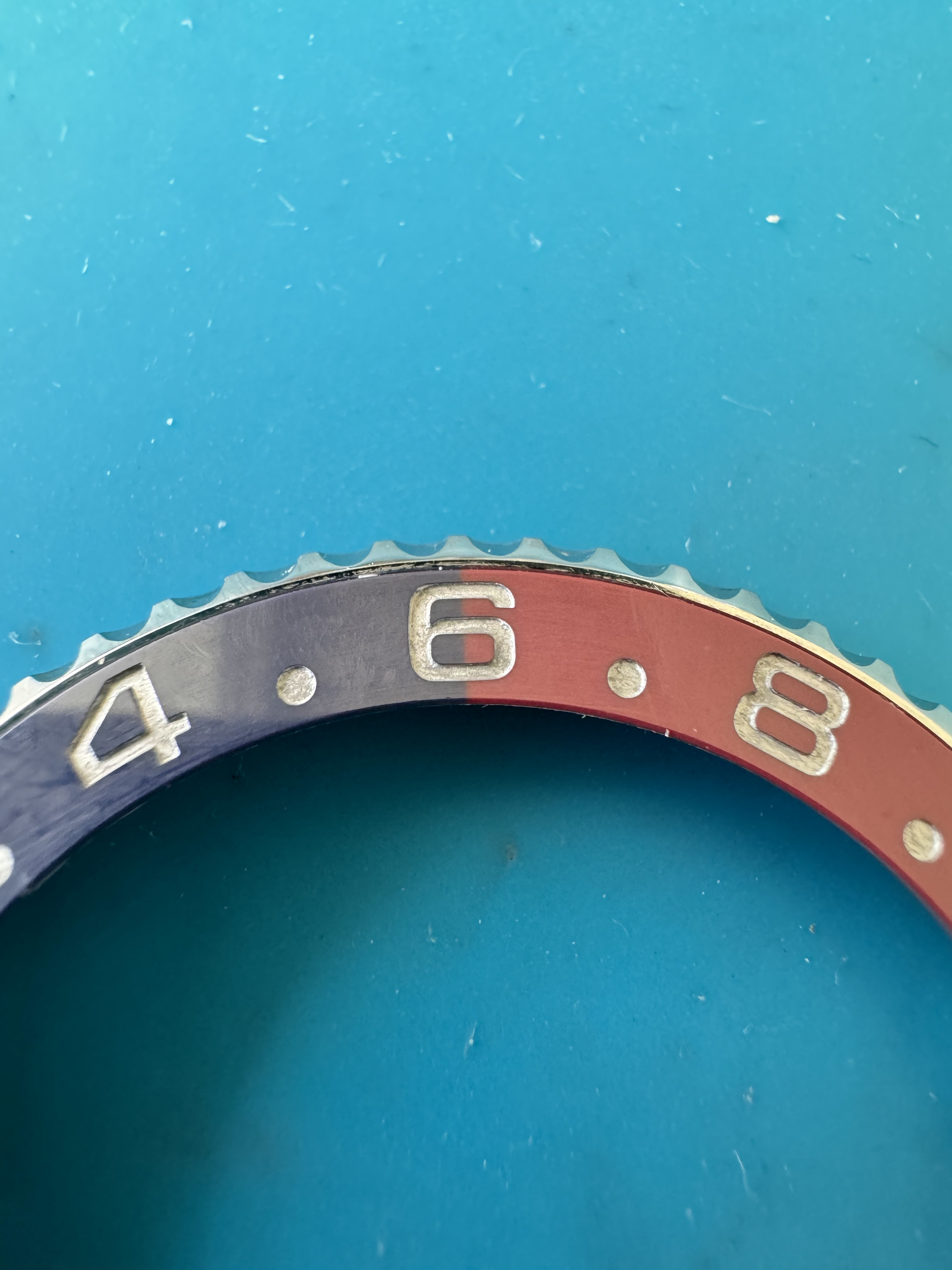
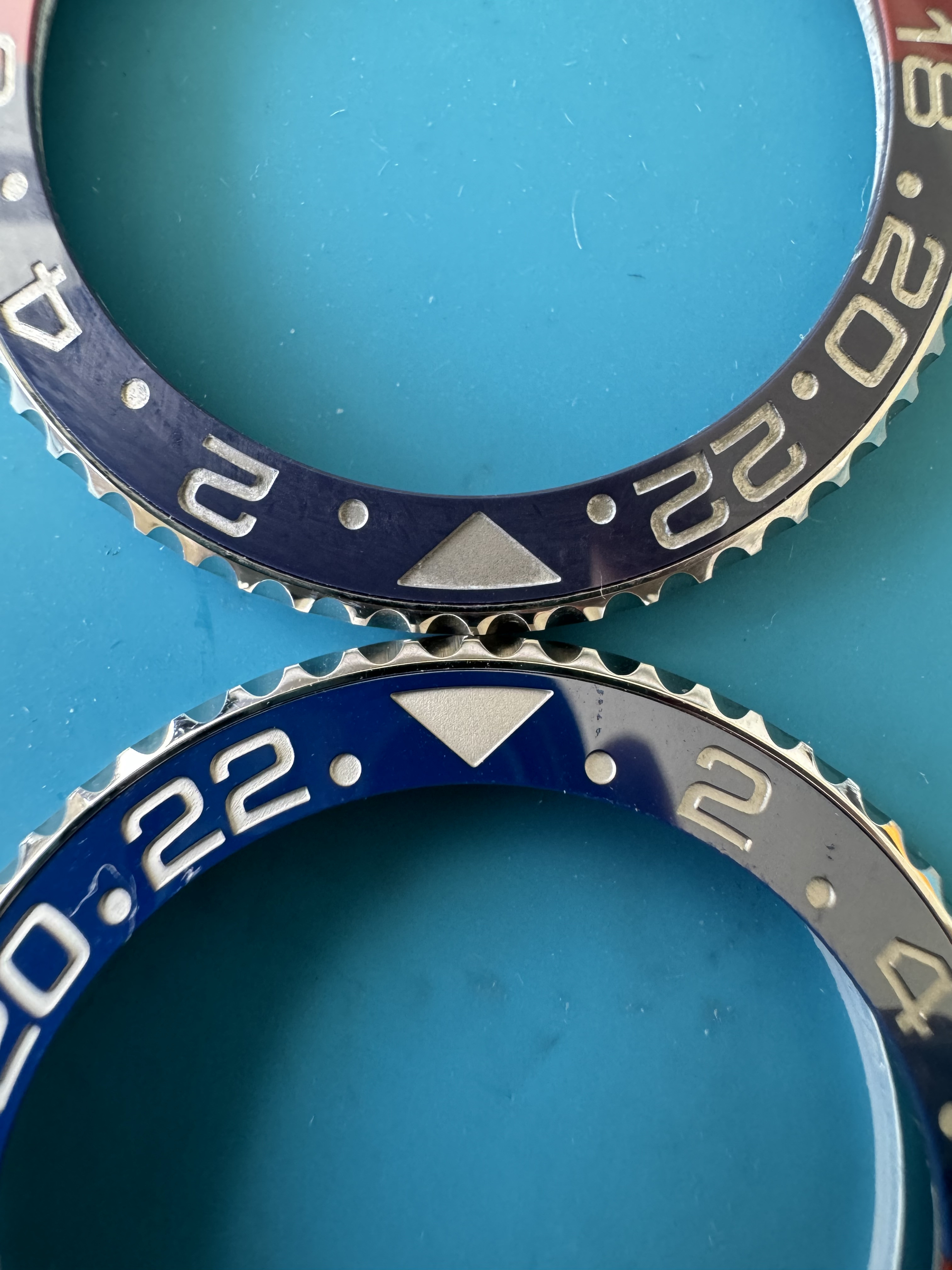
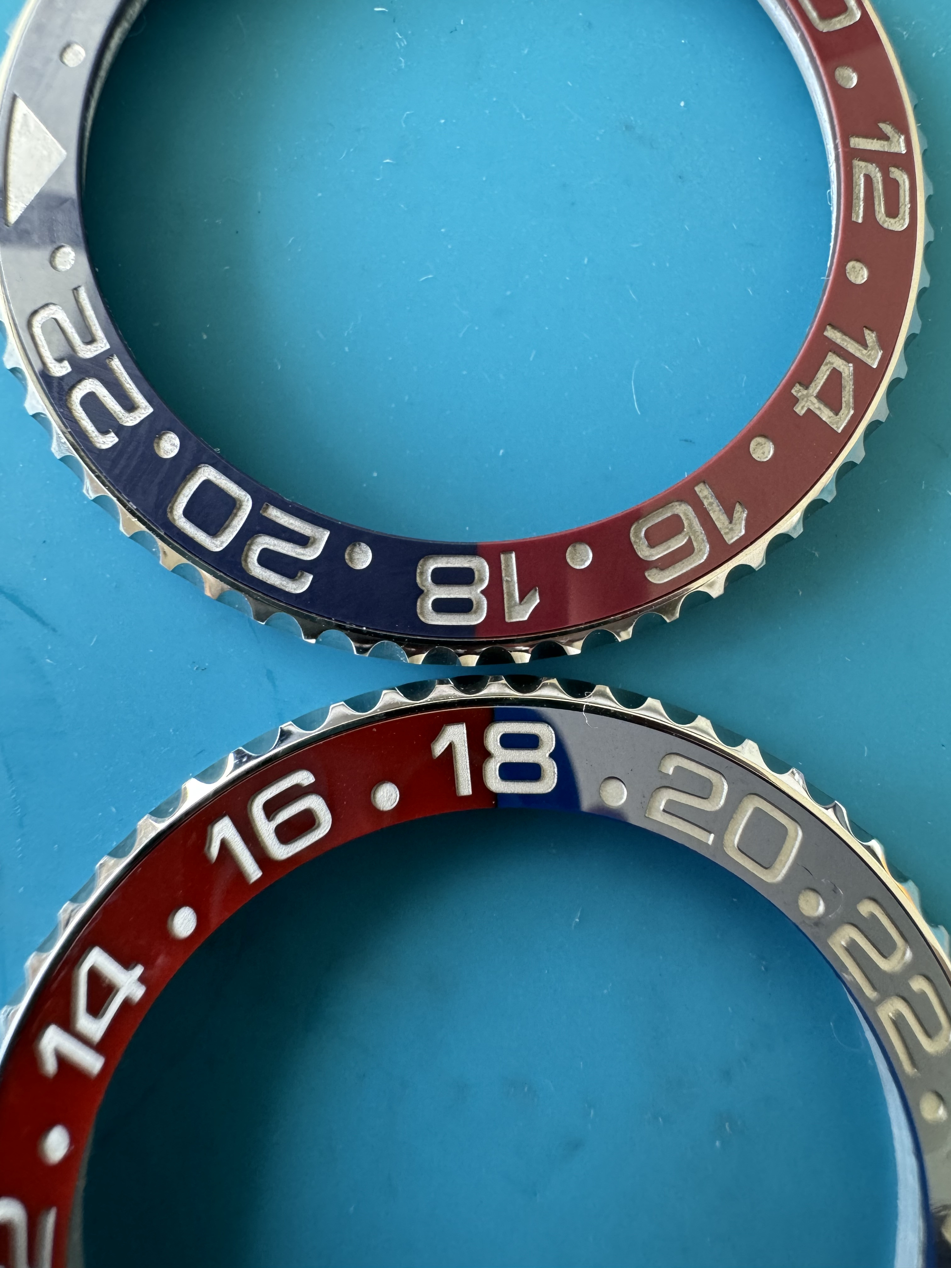
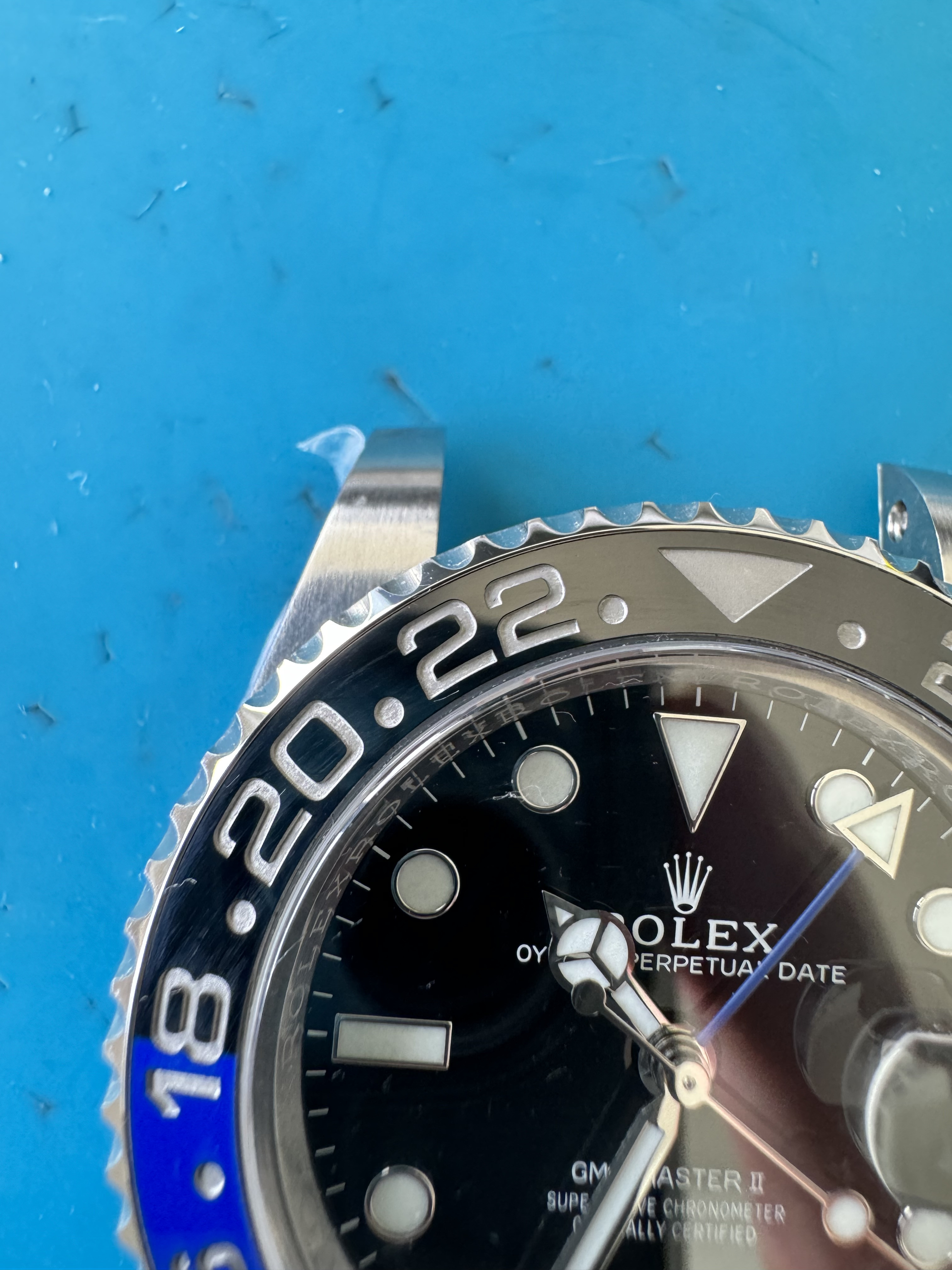
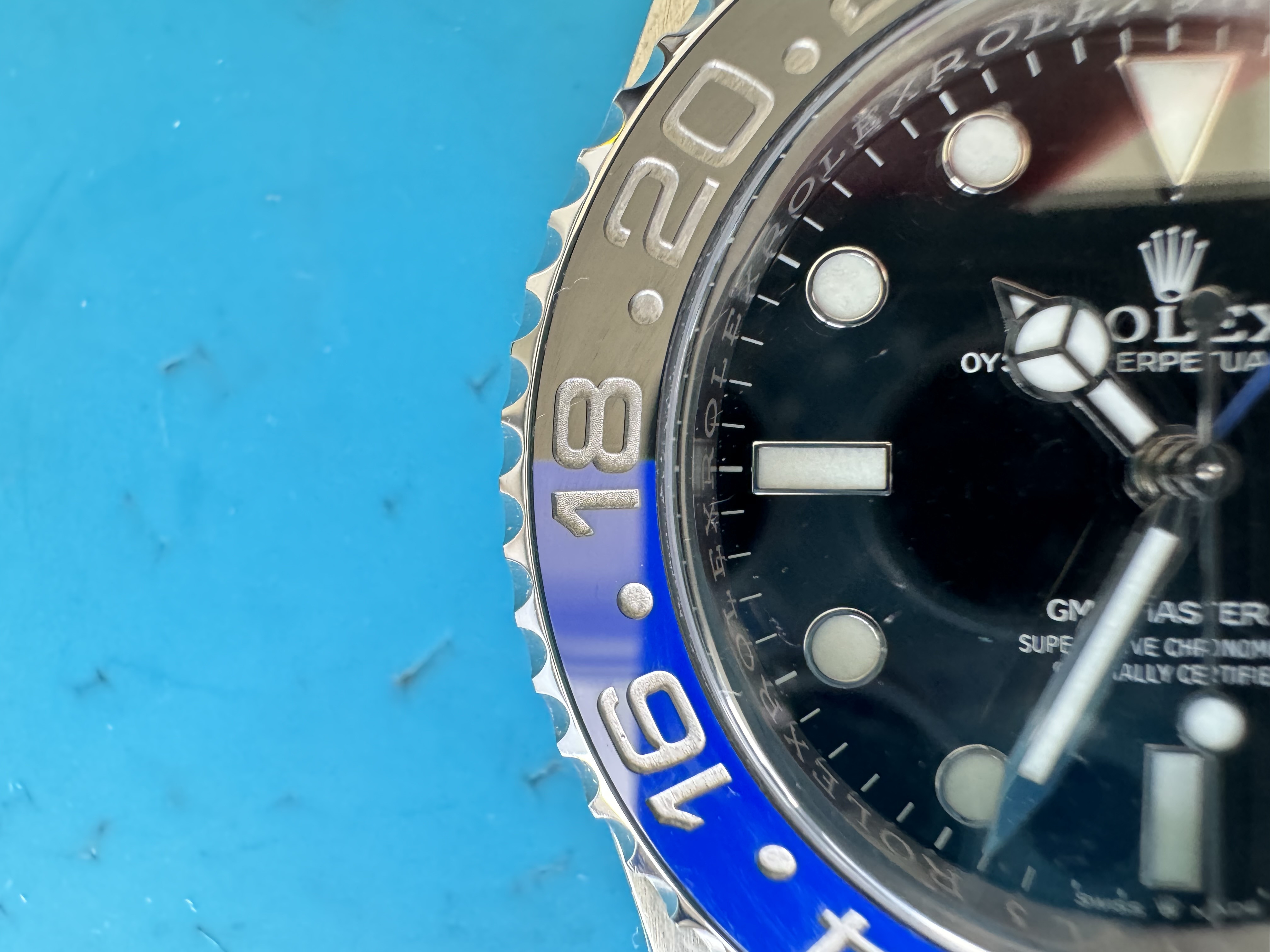
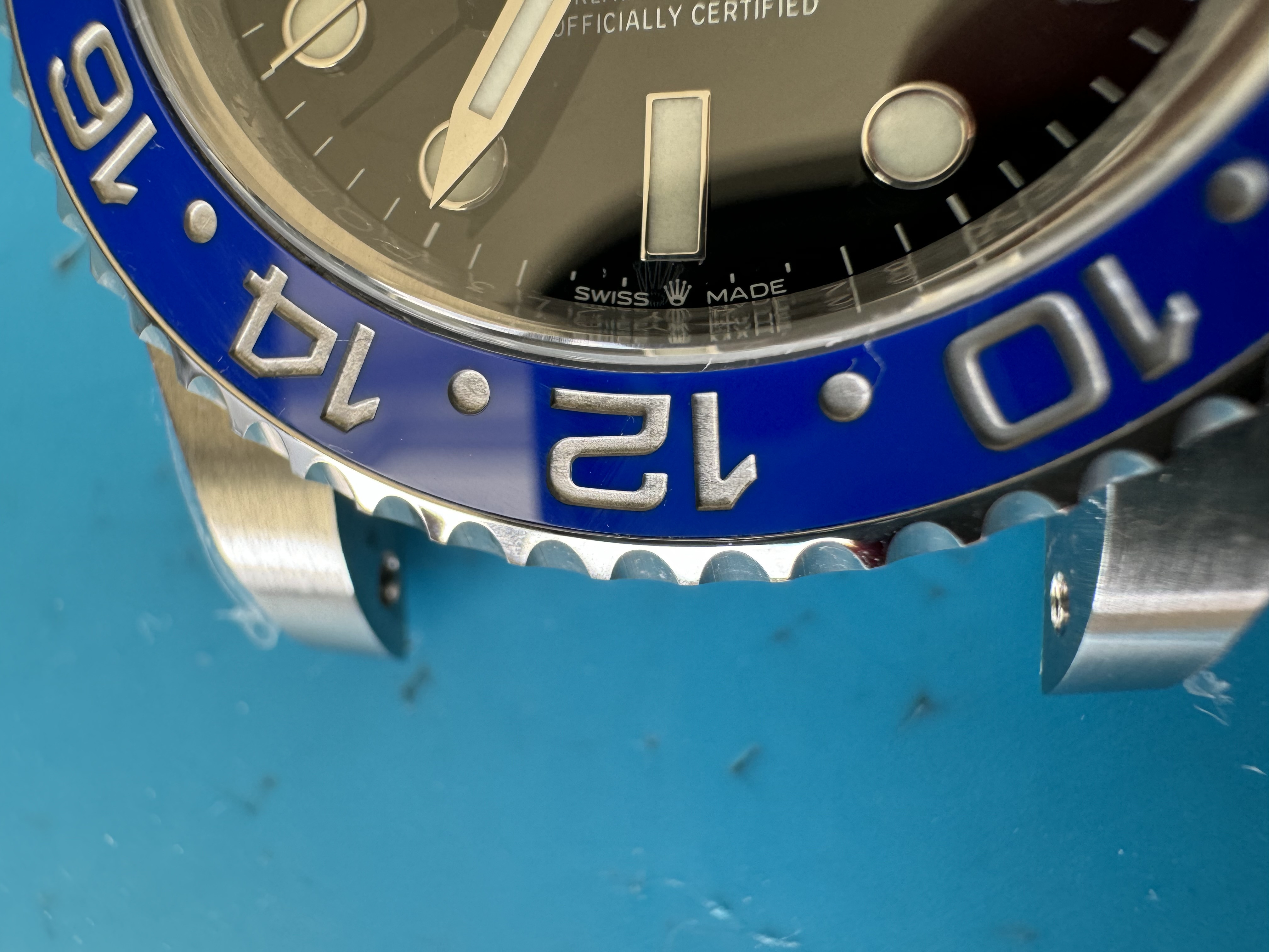
The red in the V2 looks pink when you compare it side by side to the V1. When you look at it separately it does not seem pink. Same as the purple tone on the blue.
The pink and purple tone is more accurate to how the Gen Rolex is.
The fatness I think is just your eyes playing tricks on you, they're identical thickness in in person.
Either way it's all personal preference. Like
@mmaggi I was an advocate for the V1 for the simple reason that even
Rolex changes the color tones every year because they can't keep it consistent. There is no right or wrong version, just whatever you prefer. I like the CF V1 over the Xing bezel, but in comparison to the V2 I can't unsee the brown tone of the red now. Consider it lucky that you'll be able to get the V1 much cheaper now.


