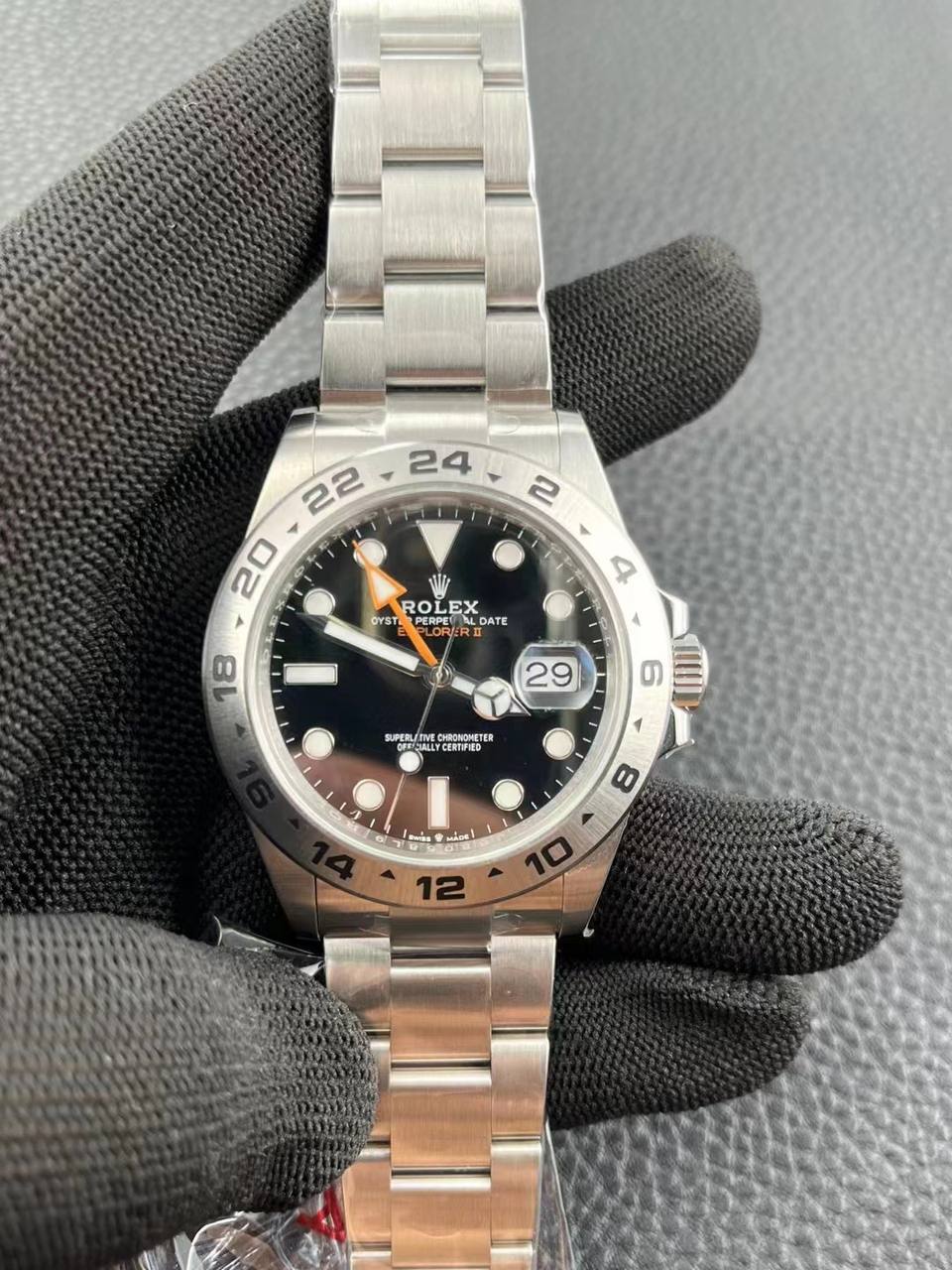
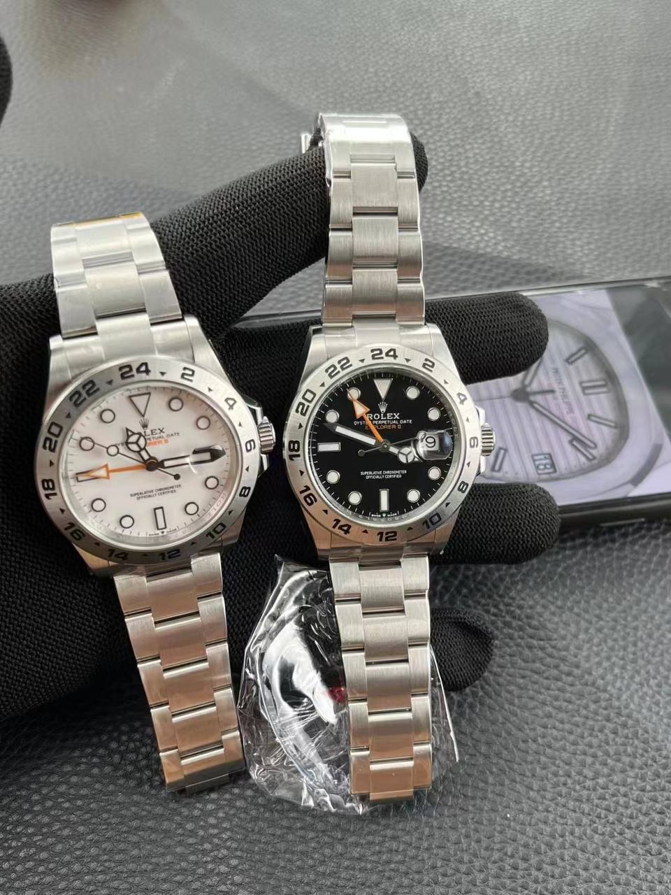
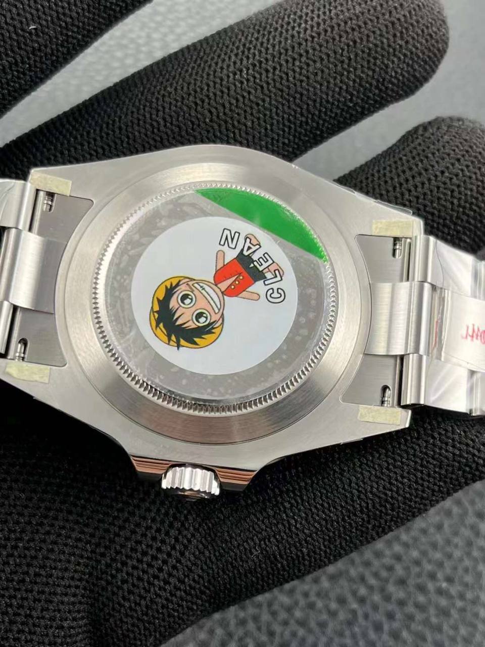
Sorry. Still learning. What is NWBIG?Clean V3 Pepsi GMT is not a NWBIG status yet.
-
Tired of adverts on RWI? - Subscribe by clicking HERE and PMing Trailboss for instructions and they will magically go away!
You are using an out of date browser. It may not display this or other websites correctly.
You should upgrade or use an alternative browser.
You should upgrade or use an alternative browser.
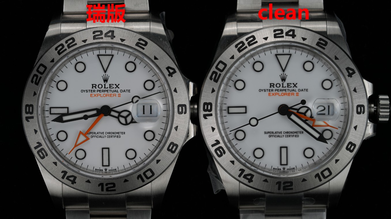
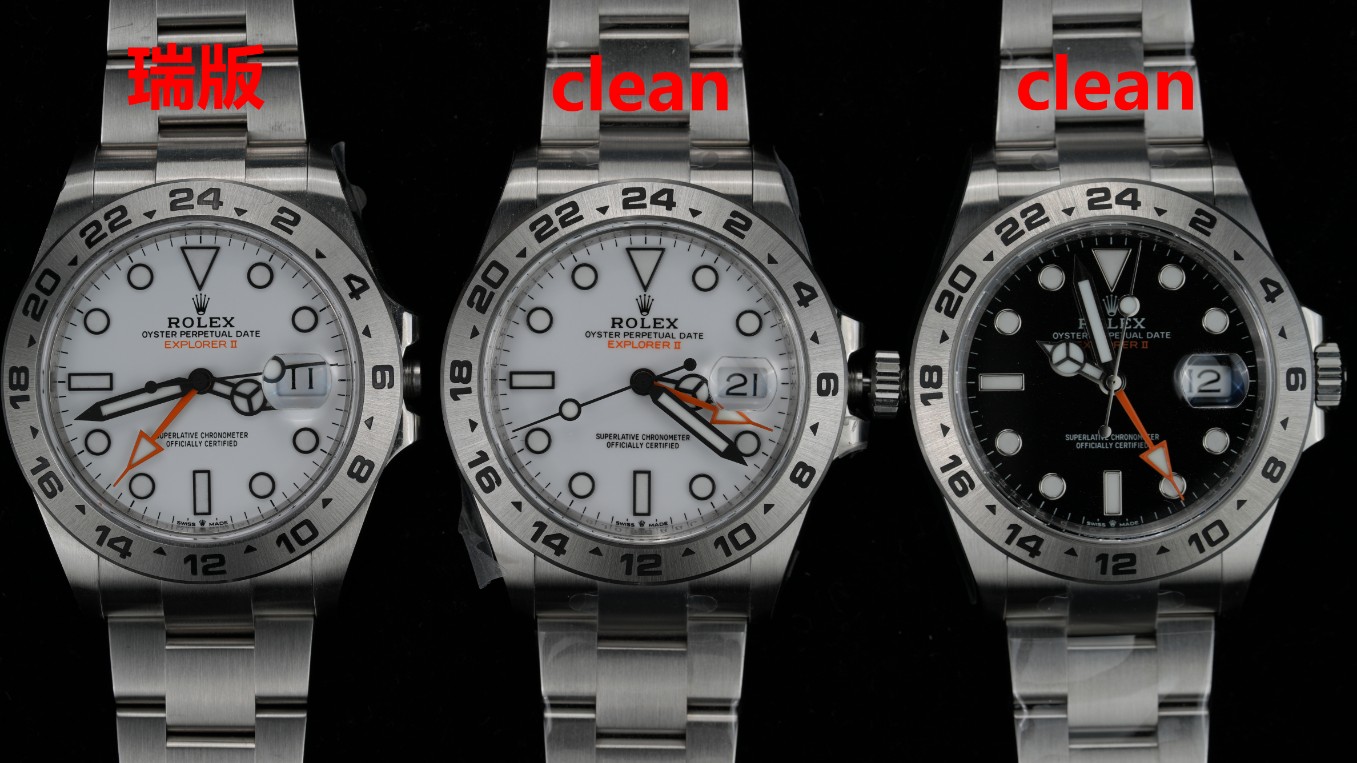
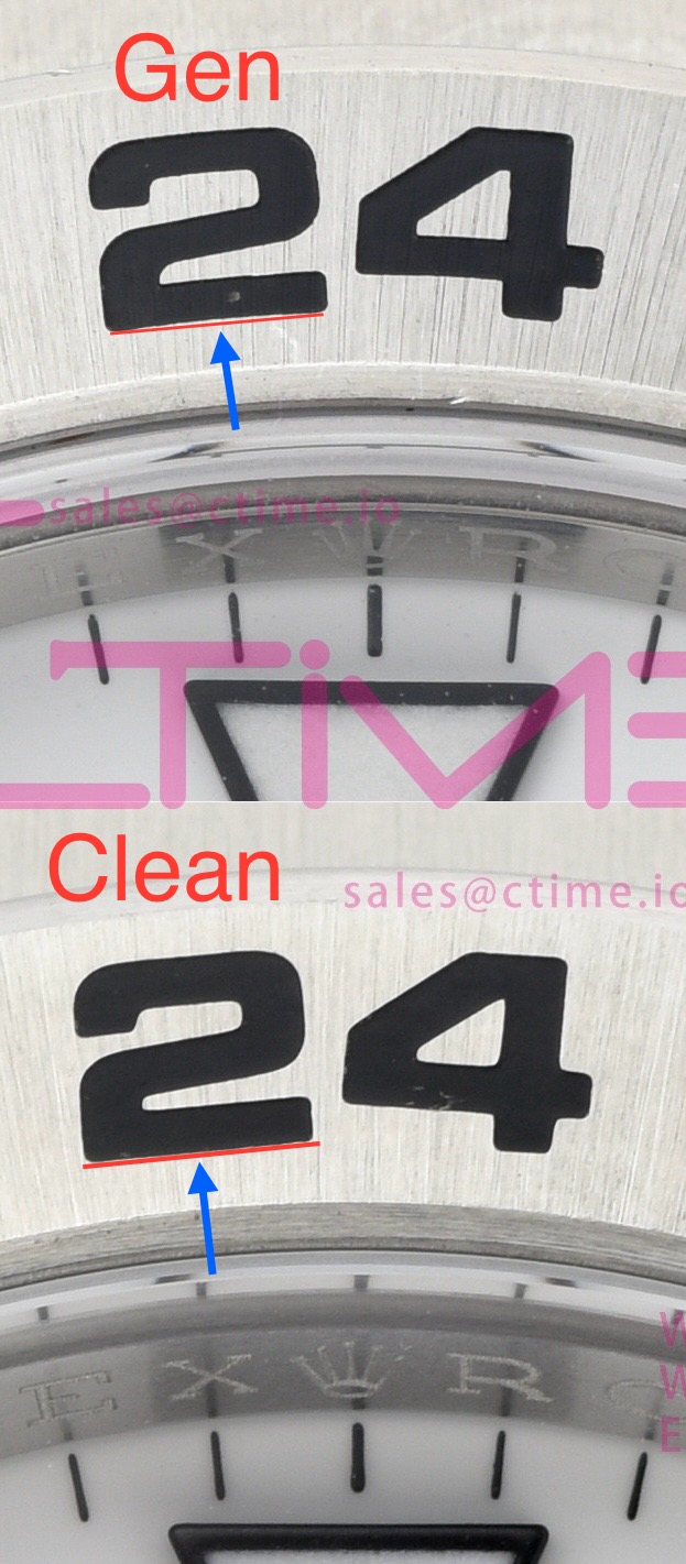
Clean EXPLORER II 226570 black & white with DD3285 comparison Gen Vs. Clean
- Thread starter CTime
- Start date
- 25/9/22
- 9,129
- 25,392
- 113
Nwbig is a garbage term that stands for "not worth buying in geninue" and should be put to death.Sorry. Still learning. What is NWBIG?
Since everybody can tolerate different things in a replica, one's person definition of NWBIG is not another.
Post Some more pictures if you have any more!
- 18/6/24
- 501
- 662
- 93
Yeah and thats sad. But maybe the orders for the first 5000 crowns where made lol
- 9/9/19
- 2,647
- 1,807
- 113
The uneven thickness would be a bummer:/Don't know if it's lighting but the thickness of the bezel numbering also seems inconsistent (some thicker than others) and still too thick.
Regarding the general thickness wasnt there something about the new/old references that was different?
Not sure since i am not a pro on those references
- 17/1/24
- 158
- 106
- 28
Yes the gen ones have different thickness based on batch and so on.The uneven thickness would be a bummer:/
Regarding the general thickness wasnt there something about the new/old references that was different?
Not sure since i am not a pro on those references
I thought more than CLEANs sample Gen was older reference ir somethingYes the gen ones have different thickness based on batch and so on.
Just caught up on this thread, Holding out hope for a thinner crown or if it can be swapped with a gen. Never paid much attention to the Explorer, but these (either color) look very nice.
I really don't think that's something to notice on your wrist tbh @dogwood magnified like this... sure it looks bad, but in reality?
I’m not so sure. My eye can quickly see parallel or co-linear lines vs. divergent lines. I agree it’s a tiny detail, but an artifact of our vision is that we tend to notice parallel lines (or their absence) quite easily.I really don't think that's something to notice on your wrist tbh @dogwood magnified like this... sure it looks bad, but in reality?
- 18/6/24
- 501
- 662
- 93
I'm either OCD or a super recognizer and I saw it right away, but it's not a deal breaker for me. Really looking forward to one of these.
muiramas
Aristocrat
- 18/1/17
- 6,105
- 8,133
- 113
The overly bold bezel font, which doesn't arc around the dial is a huge tell IMO.
Definitely a V2 wait. The BP/GMF might have the problematic movement but the aesthetics are better. Clean cases and bracelets are always great so once they fix these things I’ll be in.
It's the correct hand set from what I see.IDK how yall are wigging about this but not about the wrong handset.
For the polar it's glossy black for the 216570 and matte for the 226570.
The clean 226570 polar appears to have the matte black hands which is correct

