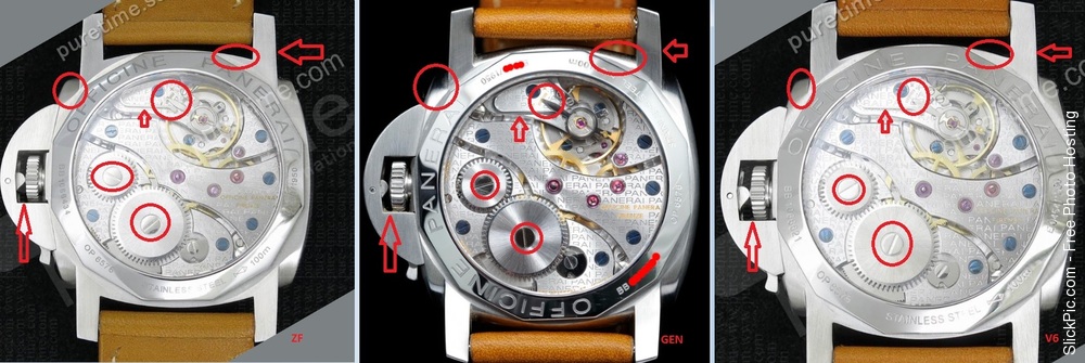
OK,gens,enough of no pics talk. i made some quick comparison on V6, ZF and gen.
In my opinion,both reps has many flaws. Which one is better for you, you have to decide.
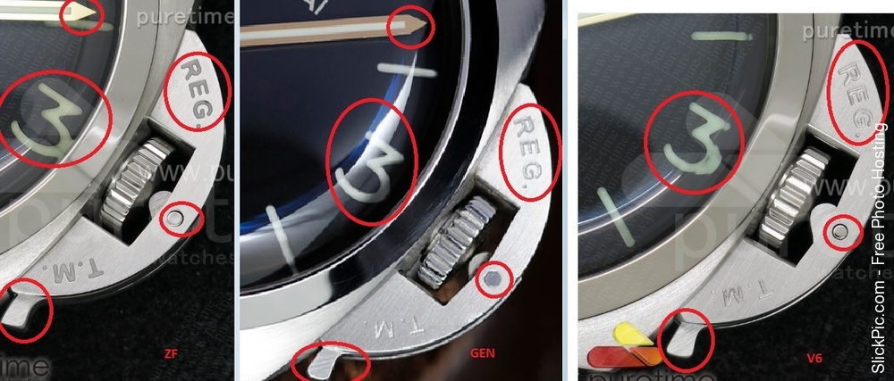
ZF font is too thick while V6 font is too thin.
CG spacing in both reps are larger than gen
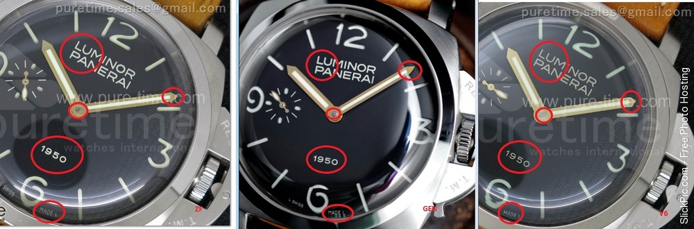
CP better on V6
Distortion.. well it very much depend on camera,lightning and so on,but reps both are very similar and gen has less distortion
L SWISS letters are more accurate on V6 but still it could be different angle,but i check that on few pics and V6 seems to be better
Lume collor is wrong on both but V6 has more closer color
CG engravings both are wrong but more accurate is V6
CG pin is wrong on both (don't have to be polished), but V6 has it in center
CG lever also wrong on both , but V6 is more correct, but still needs reshape
Minute hands are wrong on both but ZF is more correct here
On the back
Bots reps cases are incorrect shape. On lugs too, so needs reshape
regulator on movement is wrong on both reps, but +/- engravings are better placed on ZF
So to my own opinion, both reps are great, but both has many flaws. But they are small and probably visible only with gen piece compared in one hand.
Piece!

")