Where does one source these?Yes viet bracelet but re-brushed.. I believe this bracelet was $150.
But you need to polish the edges smooth and then re-brush it again. The original finish is too poor.
-
Tired of adverts on RWI? - Subscribe by clicking HERE and PMing Trailboss for instructions and they will magically go away!
You are using an out of date browser. It may not display this or other websites correctly.
You should upgrade or use an alternative browser.
You should upgrade or use an alternative browser.
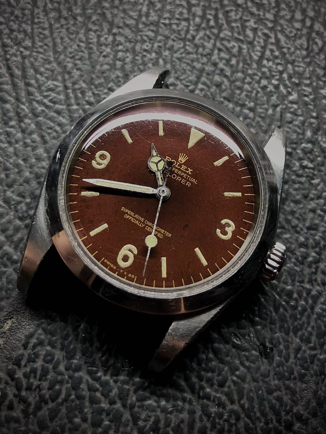
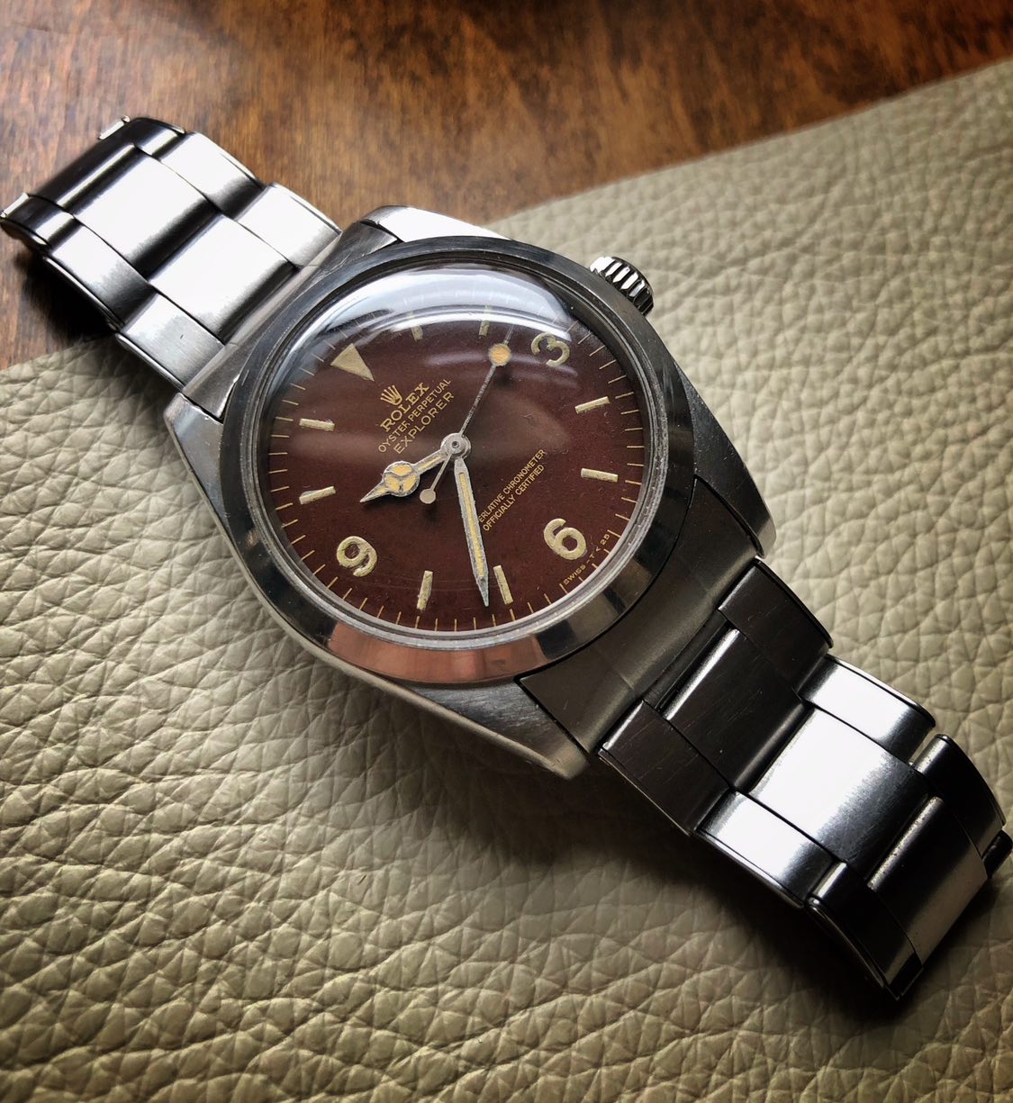
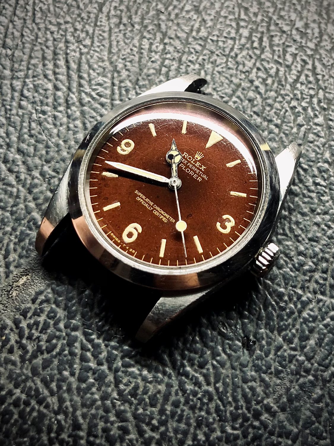
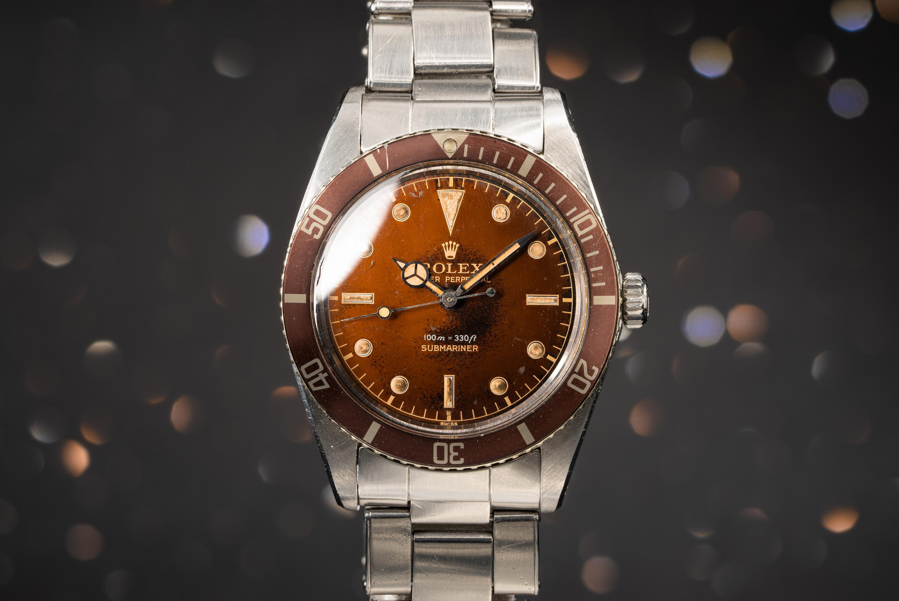
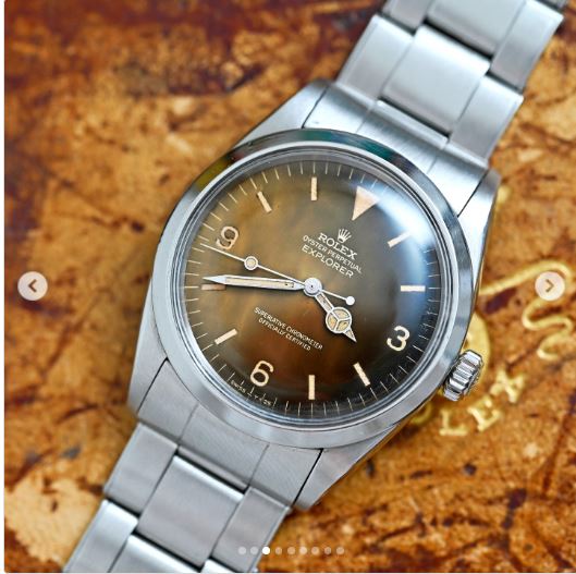
The 1016: The Under Appreciated Thread
- Thread starter ebzen02
- Start date
BiVintageWhere does one source these?
Those with the hateble deformable centerlinks for adjustment of bracelet ?Yes viet bracelet but re-brushed.. I believe this bracelet was $150.
But you need to polish the edges smooth and then re-brush it again. The original finish is too poor.
I never managed to get a comfortable fit
Thanks for the feedback fellas.. There is no wrong way to do a tropical in my extensive research (ie saving every tropical picture of an explorer ever posted to the internet) . on this one I felt that the dial looked too clean and that the center section of the dial looked off to me , it was too....flat brownish ? I wanted to break up the evenness of the colour I know it is common for the center to age more so and then it fades to black on the edge. and it is what I did with my piece but felt that it needed
I think I might go back and do a bit more around the edge and have it fade into the center area . The transparent smoke black that I used was a bit thin and it splattered a bit but it does look organic and naturally occurring , but I would like to add a bit more detail to the edge without covering up the print too much . the beauty of transparent candy paints is that you can build the color and opaqueness with the more coats you do.
this was phase one... I think I will do more to see how it goes...already in for a dime as they say..
a few more pics
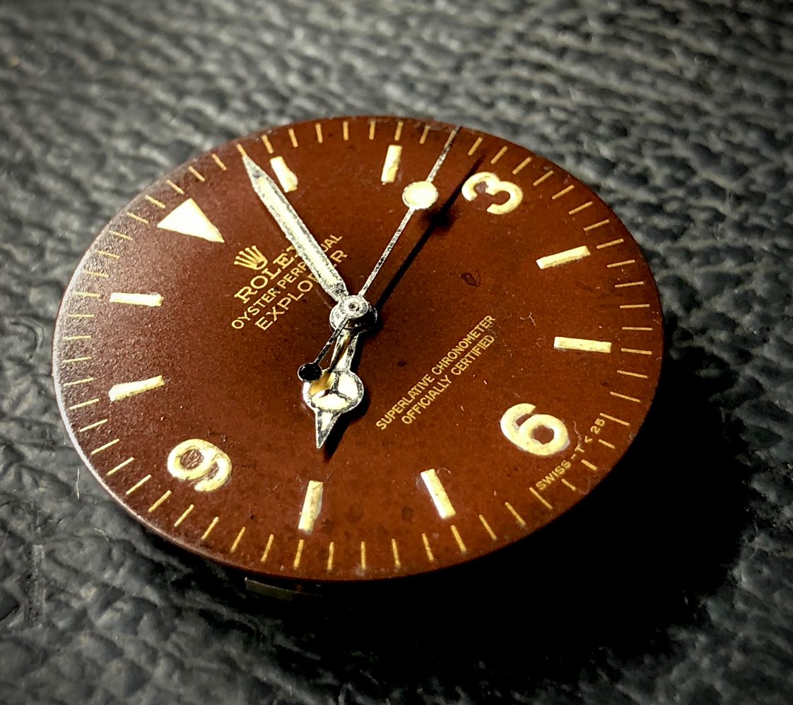
this was inspiration
I think I might go back and do a bit more around the edge and have it fade into the center area . The transparent smoke black that I used was a bit thin and it splattered a bit but it does look organic and naturally occurring , but I would like to add a bit more detail to the edge without covering up the print too much . the beauty of transparent candy paints is that you can build the color and opaqueness with the more coats you do.
this was phase one... I think I will do more to see how it goes...already in for a dime as they say..
a few more pics
this was inspiration
Last edited:
That looks bloody good 369. Well done!
Thanks brother....I will report back once I have done a lil bit more air brush aging....usually I know well enough to stop while Im ahead, so we will see if this still rings true.That looks bloody good 369. Well done!
With all of thos eexamples 2369, it looks like we still have a top coat - of sorts - intact.
The faulty chemicals that make the Tropic "do it's thing" must be an intermediary layer - between the paint and the top coat - i think it was the anti-uv coat, must react with the black paint and make it fade to golden brown, etc.
Looks like the top coat in many examples was unaffected?
I've only ever seen one gen Tropic in the wild and that was many, many years ago before the love took hold of all things RLX.
Let me know if you ever want to sell that one. Expertly done!Thanks for the feedback fellas.. There is no wrong way to do a tropical in my extensive research (ie saving every tropical picture of an explorer ever posted to the internet) . on this one I felt that the dial looked too clean and that the center section of the dial looked off to me , it was too....flat brownish ? I wanted to break up the evenness of the colour I know it is common for the center to age more so and then it fades to black on the edge. and it is what I did with my piece but felt that it needed
I think I might go back and do a bit more around the edge and have it fade into the center area . The transparent smoke black that I used was a bit thin and it splattered a bit but it does look organic and naturally occurring , but I would like to add a bit more detail to the edge without covering up the print too much . the beauty of transparent candy paints is that you can build the color and opaqueness with the more coats you do.
this was phase one... I think I will do more to see how it goes...already in for a dime as they say..
a few more pics
this was inspiration
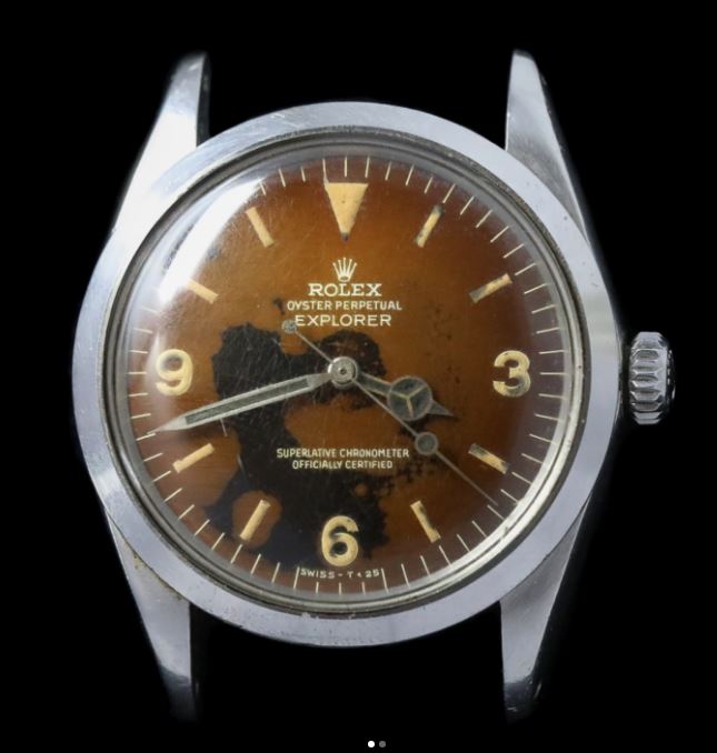
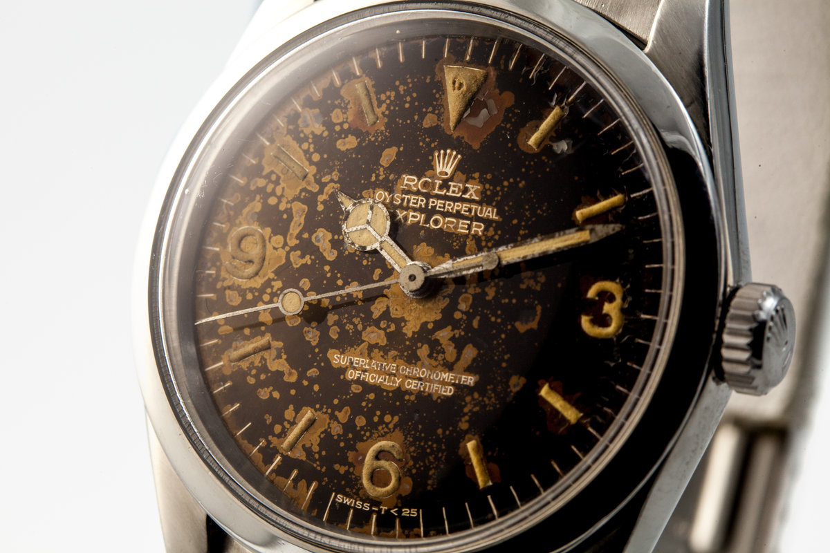
I think the lume is a little too smeared, but considering that it's not an actual gilt dial, I don't think one could've done better when adding additional tones to the base brown.Thanks for the feedback fellas.. There is no wrong way to do a tropical in my extensive research (ie saving every tropical picture of an explorer ever posted to the internet) . on this one I felt that the dial looked too clean and that the center section of the dial looked off to me , it was too....flat brownish ? I wanted to break up the evenness of the colour I know it is common for the center to age more so and then it fades to black on the edge. and it is what I did with my piece but felt that it needed
I think I might go back and do a bit more around the edge and have it fade into the center area . The transparent smoke black that I used was a bit thin and it splattered a bit but it does look organic and naturally occurring , but I would like to add a bit more detail to the edge without covering up the print too much . the beauty of transparent candy paints is that you can build the color and opaqueness with the more coats you do.
this was phase one... I think I will do more to see how it goes...already in for a dime as they say..
a few more pics
this was inspiration
The different shades are subtle, yet noticeable. Also, the shade application doesn't seem to have muted the gold printed text. Those two aspects make it very realistic to me considering the base dial you started with.
Making the shades appear organic without losing the font contrast is something I rarely see. So, for printed text gilt, I'd give you an A/A+.
@369mafiaI think the lume is a little too smeared, but considering that it's not an actual gilt dial, I don't think one could've done better when adding additional tones to the base brown.
The different shades are subtle, yet noticeable. Also, the shade application doesn't seem to have muted the gold printed text. Those two aspects make it very realistic to me considering the base dial you started with.
Making the shades appear organic without losing the font contrast is something I rarely see. So, for printed text gilt, I'd give you an A/A+.
TUTORIAL! TUTORIAL! TUTORIAL!
….pretty please.
Something different.
Ever seen a skeleton 1016?
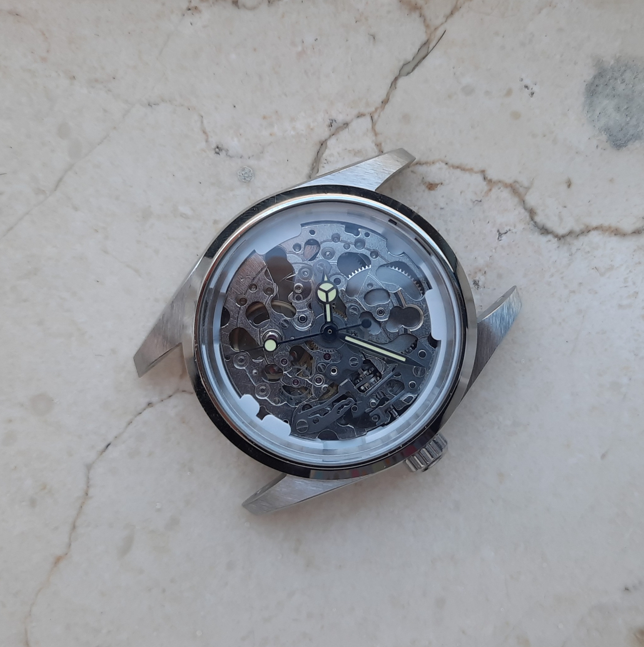
Ever seen a skeleton 1016?
I’m super inspired by this…”Skexplorer”.Something different.
Ever seen a skeleton 1016?
Sexplorer... got you...erect?I’m super inspired by this…”Skexplorer”.
NSF....Sexplorer... got you...erect?
")
jinish
Getting To Know The Place
- 17/1/19
- 17
- 31
- 13
Hello everyone.
I usually buy replicas but this is my first build.
I built it with raffles cases, but I am concerned about the depth of the rehaut. I plan to change to a WSO bezel in the future, will just changing the bezel solve this problem? Or should I sanding the rehaut down a bit?
I usually buy replicas but this is my first build.
I built it with raffles cases, but I am concerned about the depth of the rehaut. I plan to change to a WSO bezel in the future, will just changing the bezel solve this problem? Or should I sanding the rehaut down a bit?
changing the bezel won’t help.Hello everyone.
I usually buy replicas but this is my first build.
I built it with raffles cases, but I am concerned about the depth of the rehaut. I plan to change to a WSO bezel in the future, will just changing the bezel solve this problem? Or should I sanding the rehaut down a bit?
but honestly it’s not that noticeable on day to day wear. i suggest installing the WSO bezel right on rather than going back n forth and swapping things out.
or you could get one from 1016lover
I would suggest this. Go contact him for your bezel.or you could get one from 1016lover
jinish
Getting To Know The Place
- 17/1/19
- 17
- 31
- 13
Thanks for the reply.changing the bezel won’t help.
but honestly it’s not that noticeable on day to day wear. i suggest installing the WSO bezel right on rather than going back n forth and swapping things out.
or you could get one from 1016lover
So is there still a problem with actual rehaut?
I wanted to know if there is a problem with the depth of the rehaut.
Thanks for the advice regarding the bezel as well.
I have plans to build another 1016built, so I will consult 1016lover about the bezel at that time.
jinish
Getting To Know The Place
- 17/1/19
- 17
- 31
- 13
Thanks for the reply.I would suggest this. Go contact him for your bezel.
I have plans to build another 1016built, so I will consult 1016lover about the bezel at that time.