That looks like what I need, thanks!
Cyclops Crystal for Tudor Prince Oysterdate 34mm (29.2mm)
Diameter approx 29.2mm Perfectly fit High definition Buy with confidence No trimming requiredlobtime.com
Maybe lobtime is of use to you?
-
Tired of adverts on RWI? - Subscribe by clicking HERE and PMing Trailboss for instructions and they will magically go away!
You are using an out of date browser. It may not display this or other websites correctly.
You should upgrade or use an alternative browser.
You should upgrade or use an alternative browser.
The 1016: The Under Appreciated Thread
- Thread starter ebzen02
- Start date
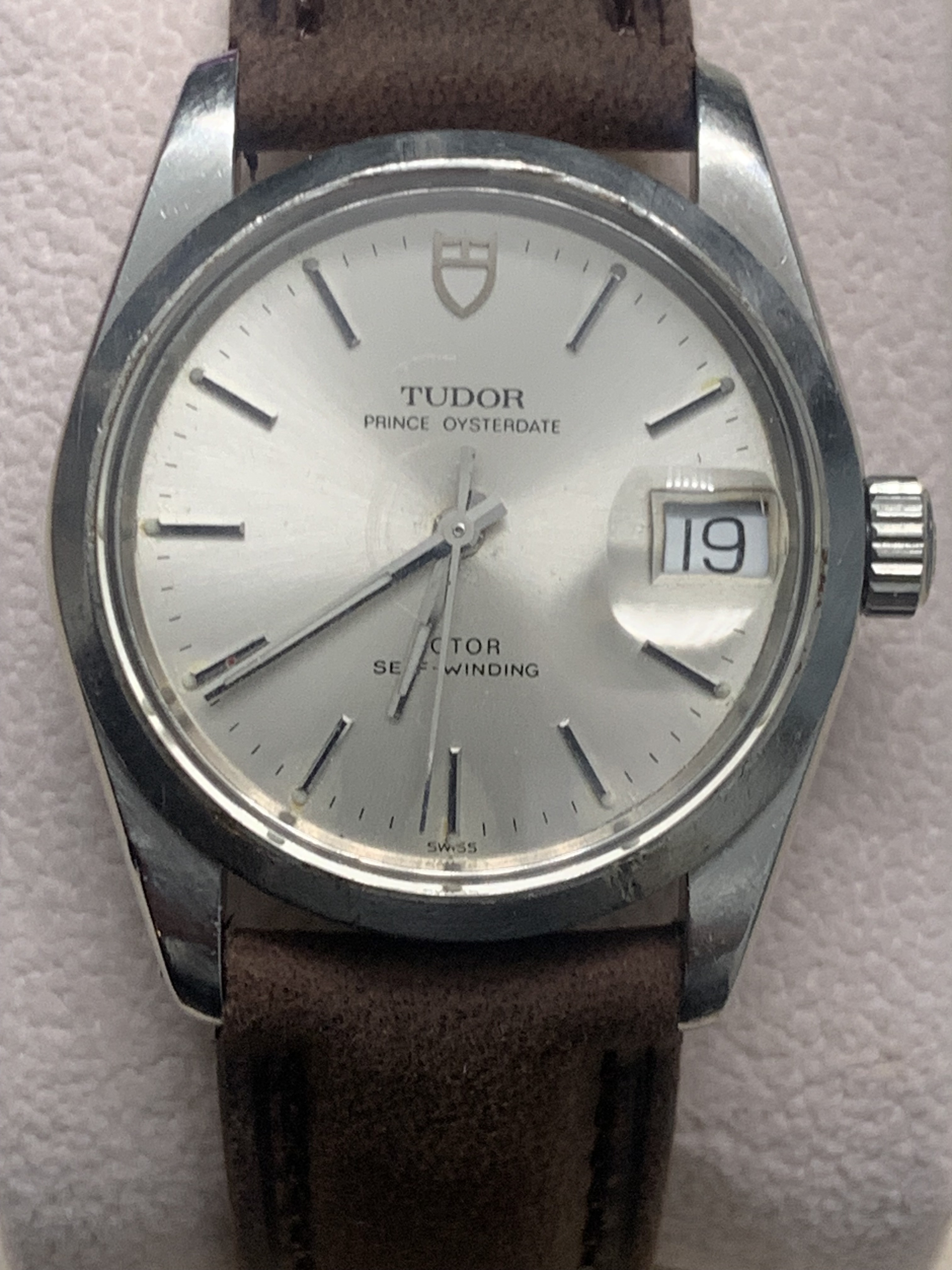
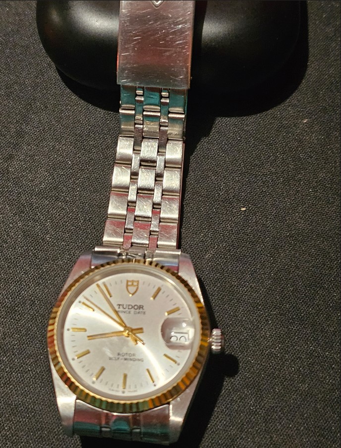
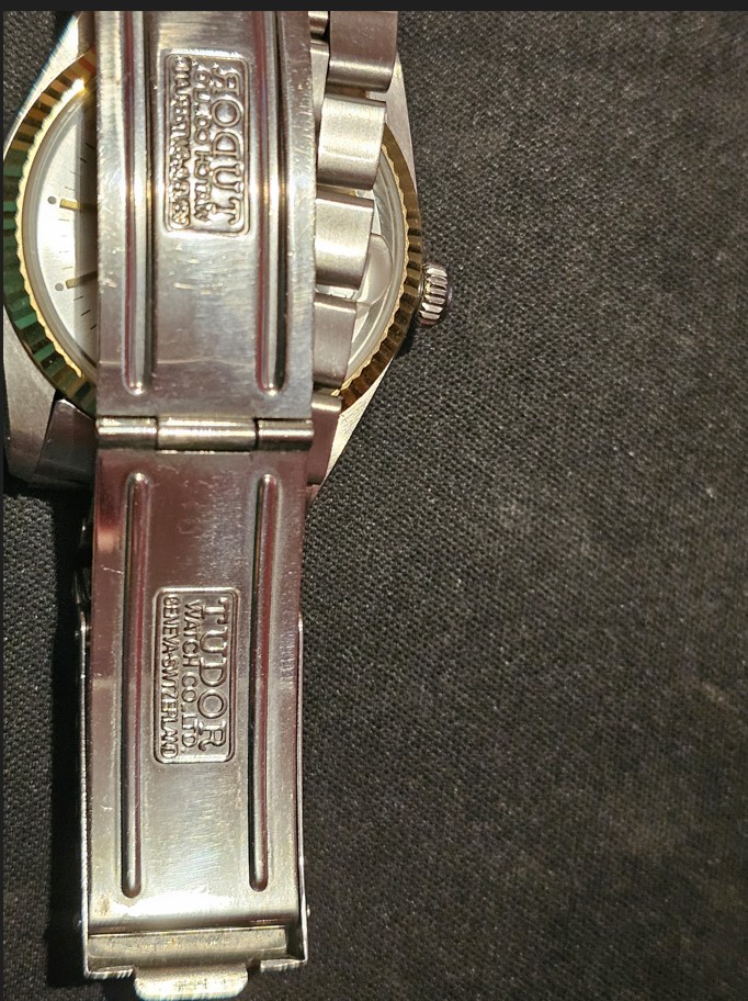
My girl's watch isn't on a Jubilee, it is on one of Raffles offerings. I offered the lass one of Markiemark's 19mm oyster bracelets but she declined as she likes this one. And I do not disagree with her decision as Ken got this one right.Yes, that crystal is for a 2824, the cyclops is much closer to the edge.
My issue is that I can't seem to find Tudor-specific crystals. Everything seems to be for Rolex or claims to be interchangeable, which has the cyclops closer to the center. Here's my very similar build with a gen cyclops. The dial, hands, and case are all Gen Tudor, for a 2824, but I can only find crystals for a 1570…I even used a Tudor date wheel (not overlay) on the a2824 movement.
I even tried it on a Jubilee like yours but changed my mind…now you have me second guessing myself, lol.
- 28/2/17
- 2,405
- 1,982
- 113
My first foray into the world of vintage rolex! The excellent 1016 rwi branded dials by kaboose. I lumed the dial (my first attempt at luming straight onto the dial, so much easier with lume plots!), and went for a NOS kind of look, but obviously this watch doesn’t exist in gen. I kinda like it! Rattly bracelet is a bit annoying but its a fun little watch!
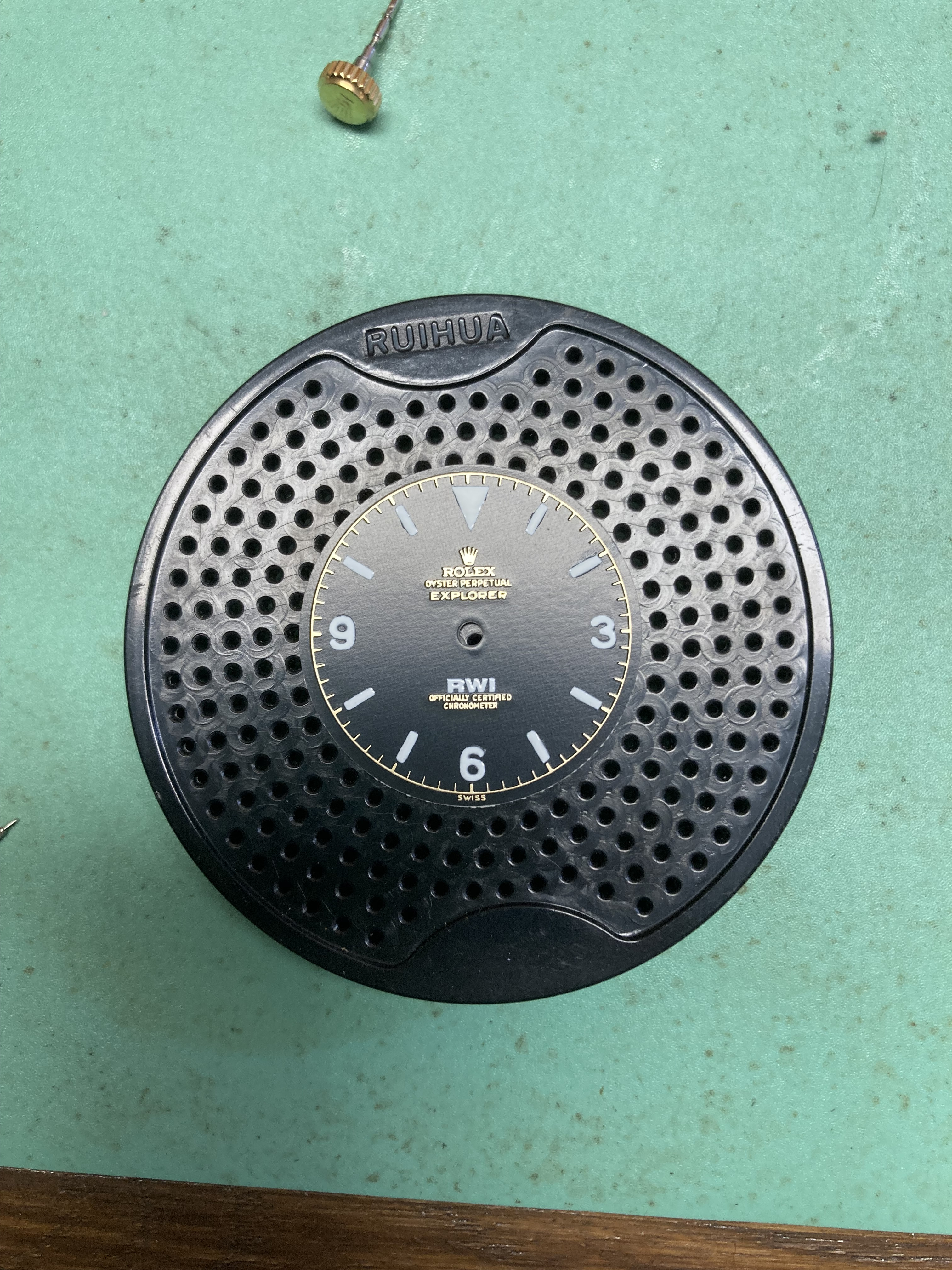
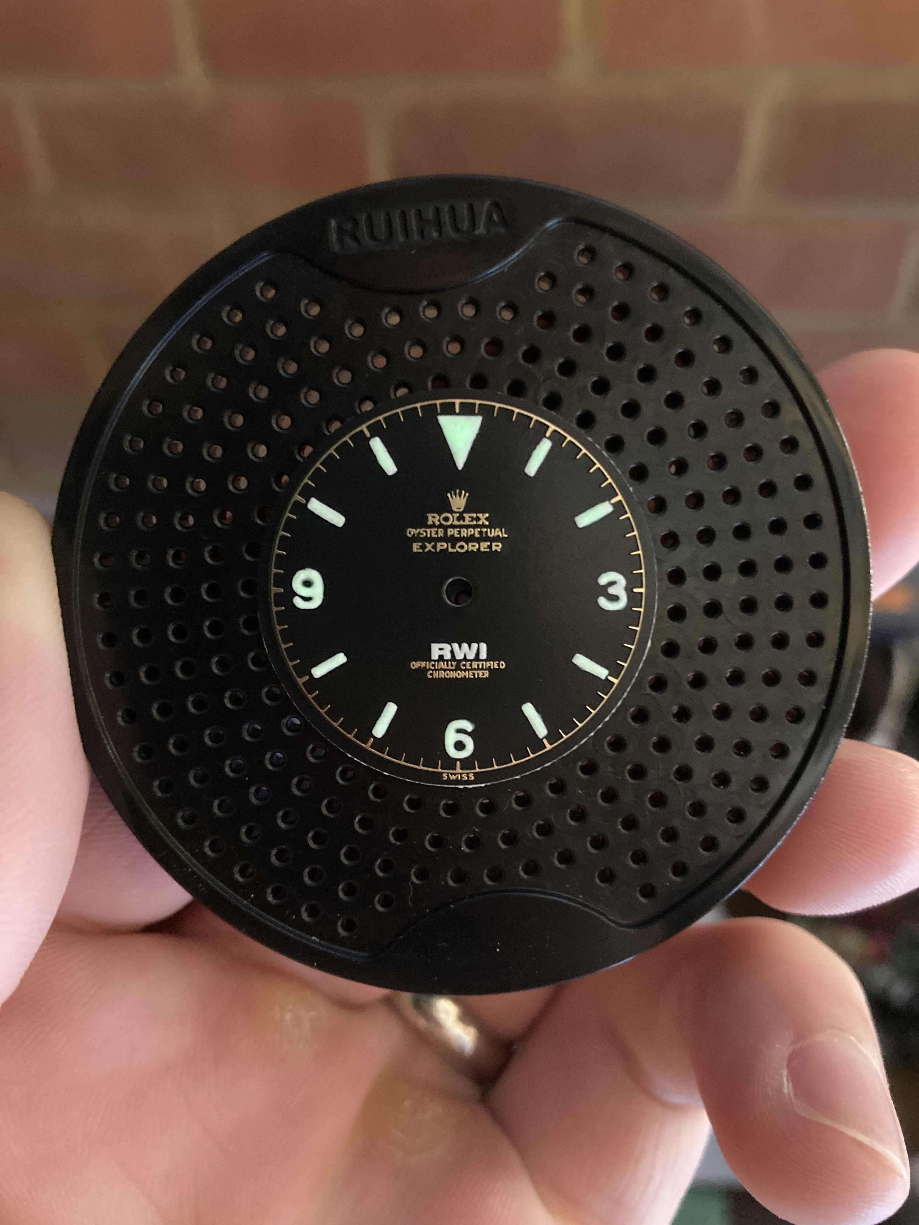
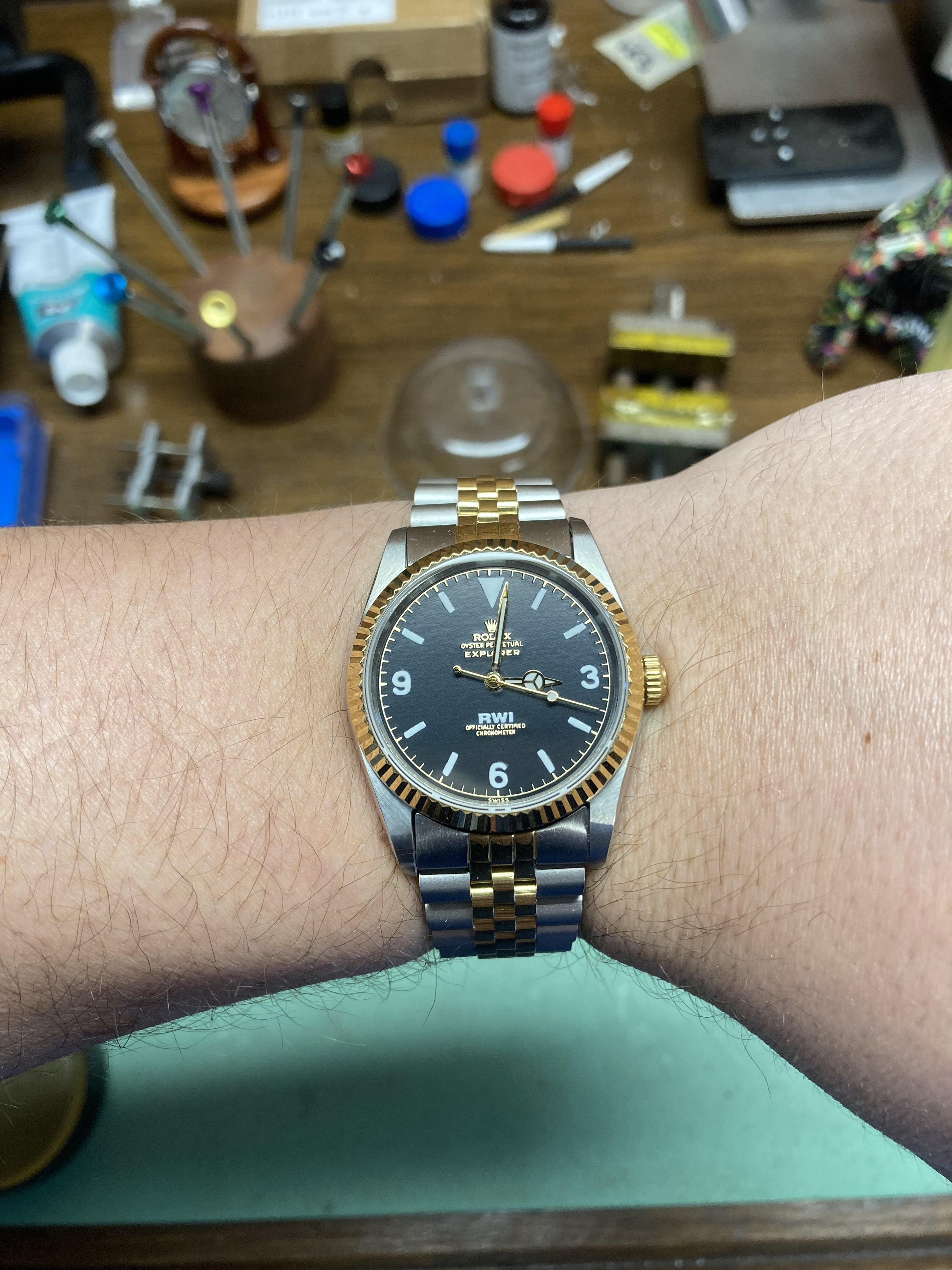
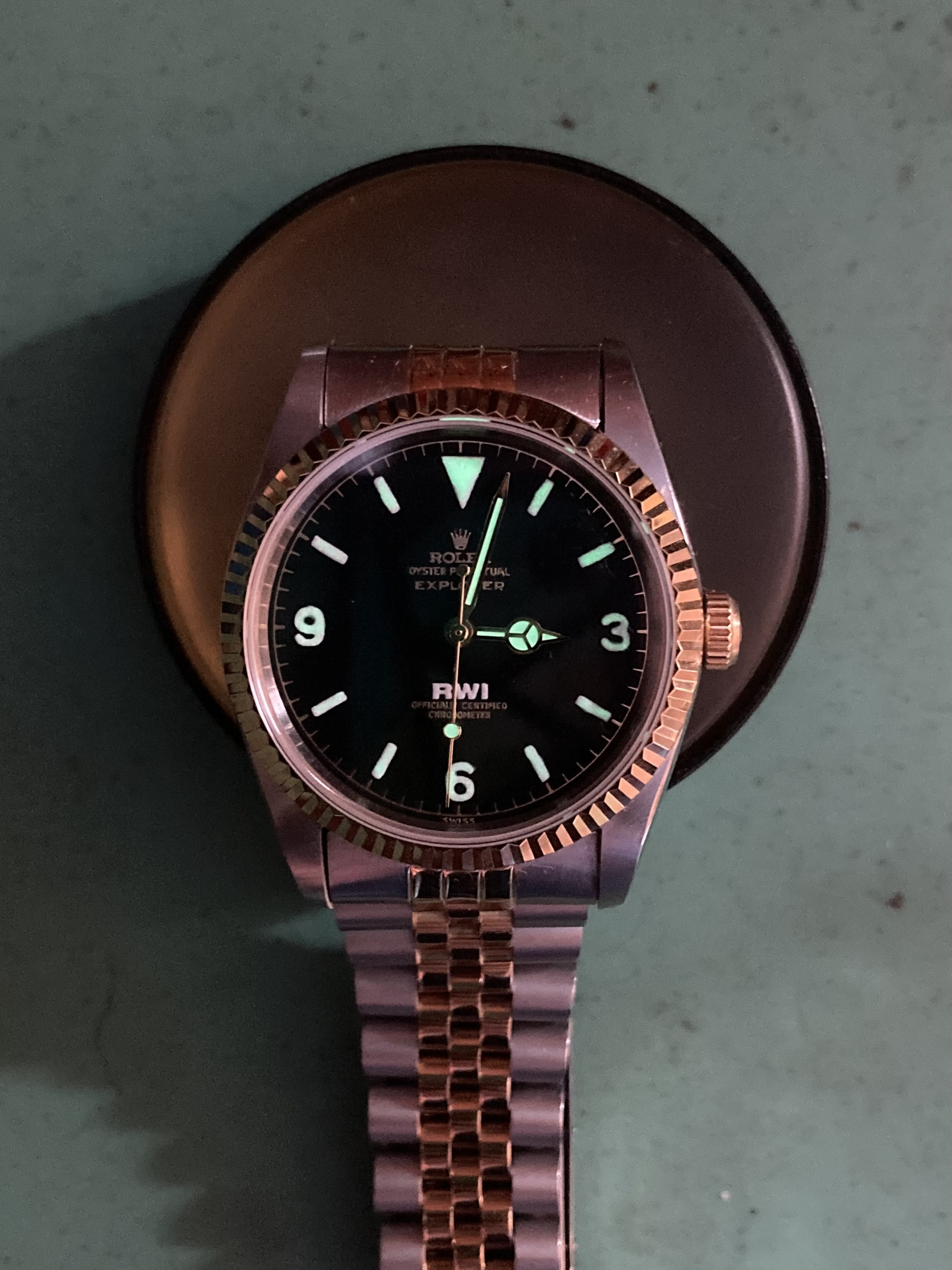


This is my favorite build so far. The gold for sure pairs nicely with the dial! I believe you are the first to lume my dials!My first foray into the world of vintage rolex! The excellent 1016 rwi branded dials by kaboose. I lumed the dial (my first attempt at luming straight onto the dial, so much easier with lume plots!), and went for a NOS kind of look, but obviously this watch doesn’t exist in gen. I kinda like it! Rattly bracelet is a bit annoying but its a fun little watch!


- 28/2/17
- 2,405
- 1,982
- 113
I can dig the two tone. it compliments the text on the dial nicely
Thanks guys much appreciated, really happy with how it came out! From the first time i saw the dial i knew i needed a bit of gold in the build to bring it out on the dial.This is my favorite build so far. The gold for sure pairs nicely with the dial! I believe you are the first to lume my dials!
Im not in a rush to be luming dials again, leave it to the pro’s like natas. Looks mint in the light, then you look under uv and its like a patchwork quilt! Fun learning experience though, always nice to try something new!
I’d be interested to know what you use for the lug bars and how/if you weld them
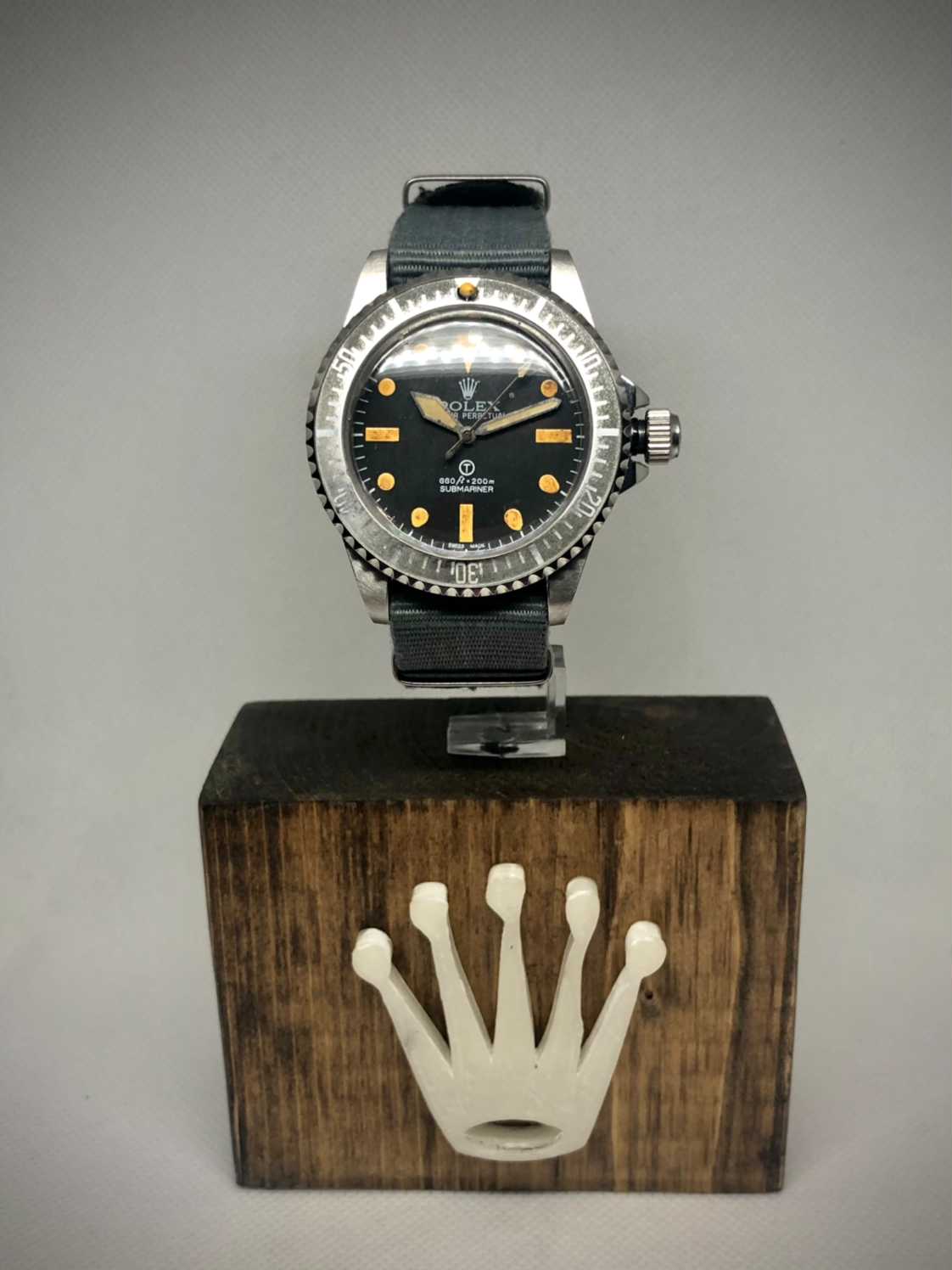
I solder in the shoulder less 2 mm spring bars into the case and then wire brush away any spatter .
new post in my 5517 thread.
I was going to use broken drill bits, but spring bats is probably easier.
I solder in the shoulder less 2 mm spring bars into the case and then wire brush away any spatter .
new post in my 5517 thread.
I was going to use broken drill bits, but spring bats is probably easier.
Issue with springbars is that the outer circle is 1.3mm and not 2mm. I found 2mm steel rods. Maybe one day I will play
Fantastic work D. They both look the part. Getting the gilt text as well as you did at that scale is no easy feat. Nicely done ! I call dibs on the one you don’t want lol.
Fantastic work D. They both look the part. Getting the gilt text as well as you did at that scale is no easy feat. Nicely done ! I call dibs on the one you don’t want lol.
36 or 34 ?
36Fantastic work D. They both look the part. Getting the gilt text as well as you did at that scale is no easy feat. Nicely done ! I call dibs on the one you don’t want lol.
36 or 34 ?
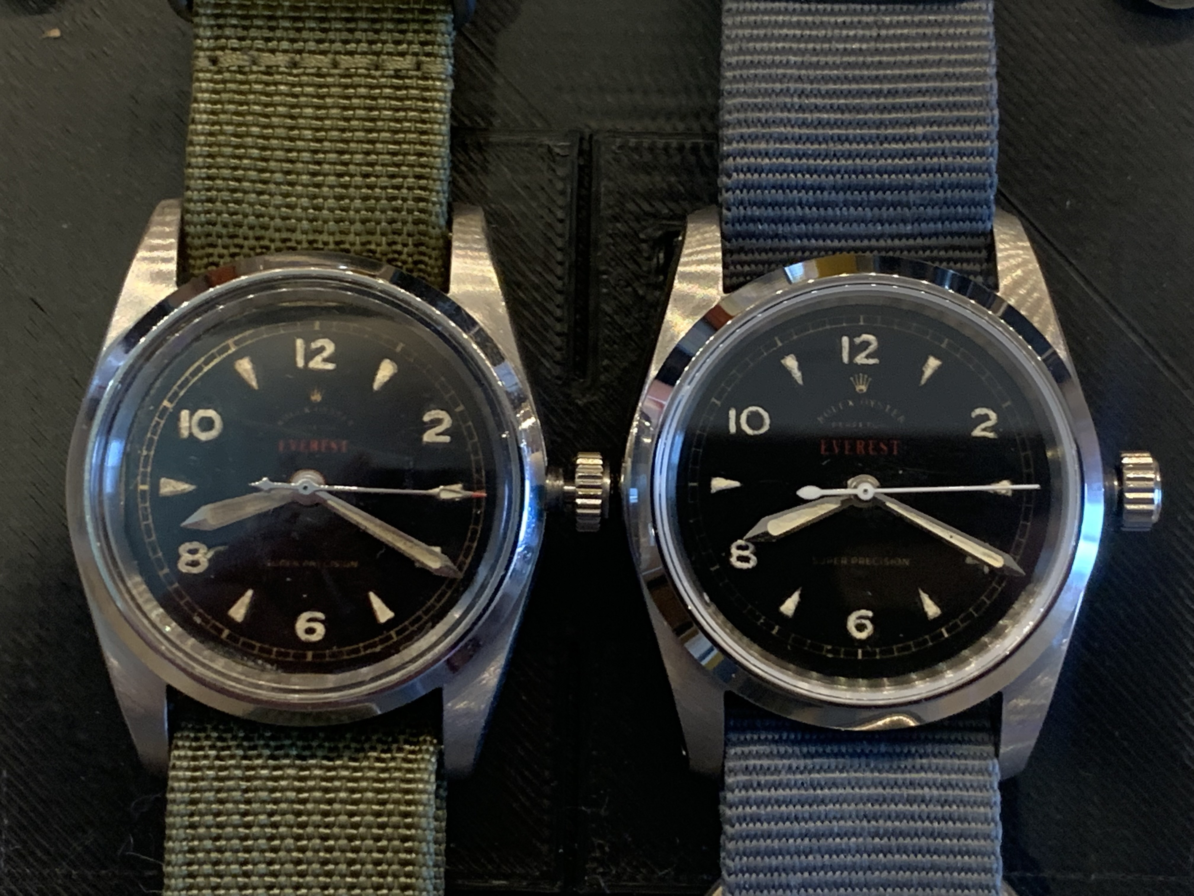
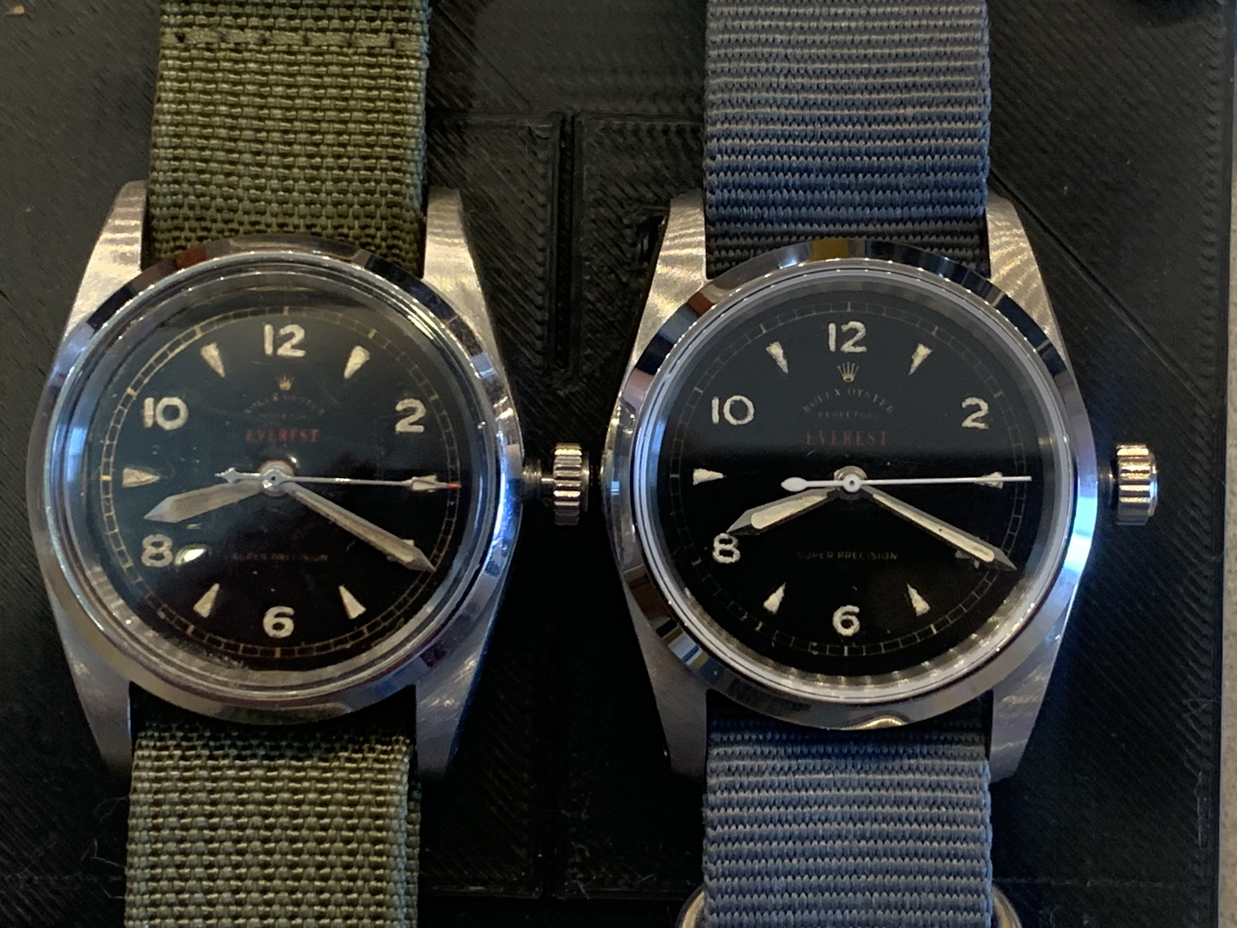
Thank you very much! These do look good. May I ask a few things?
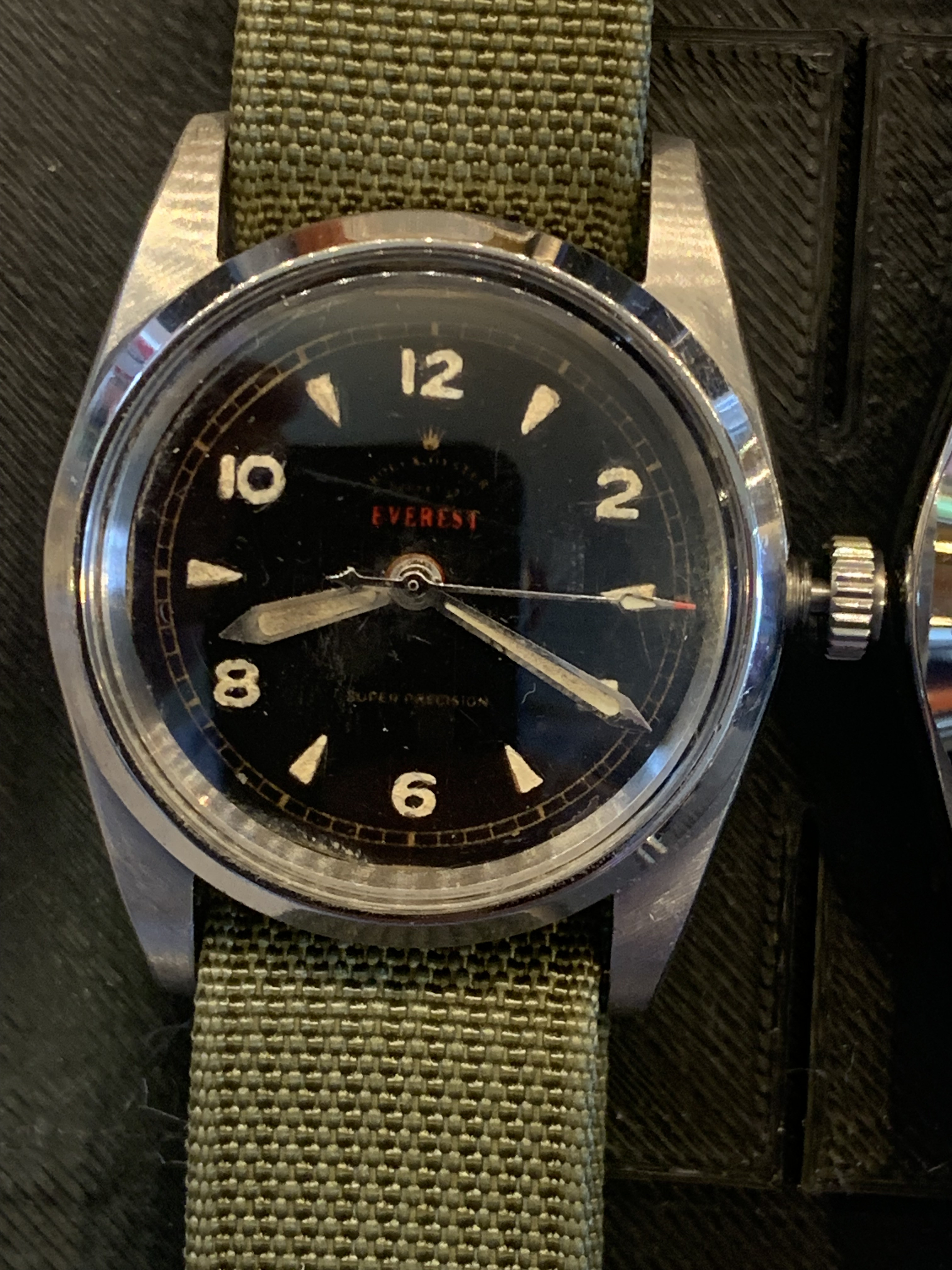
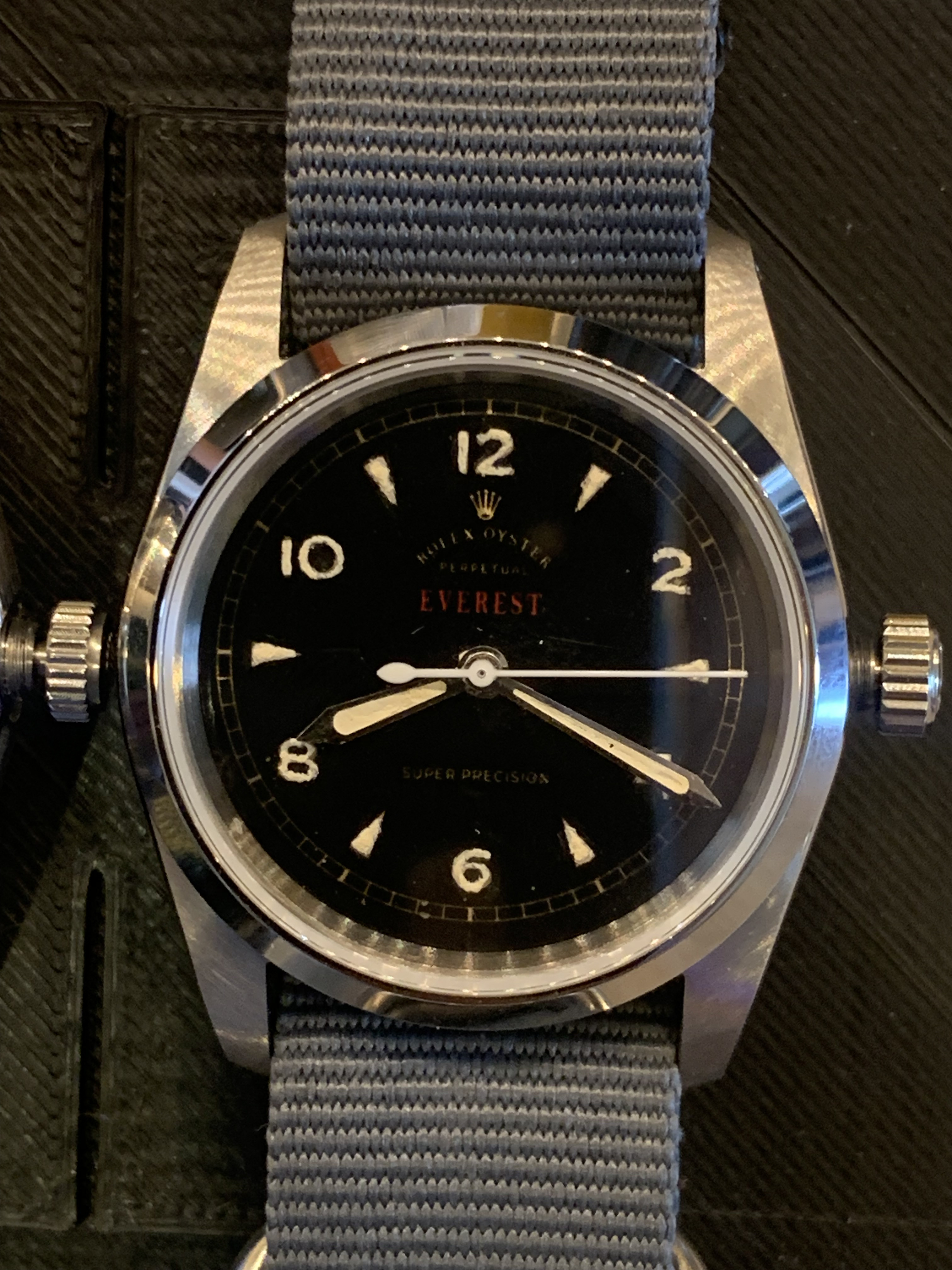
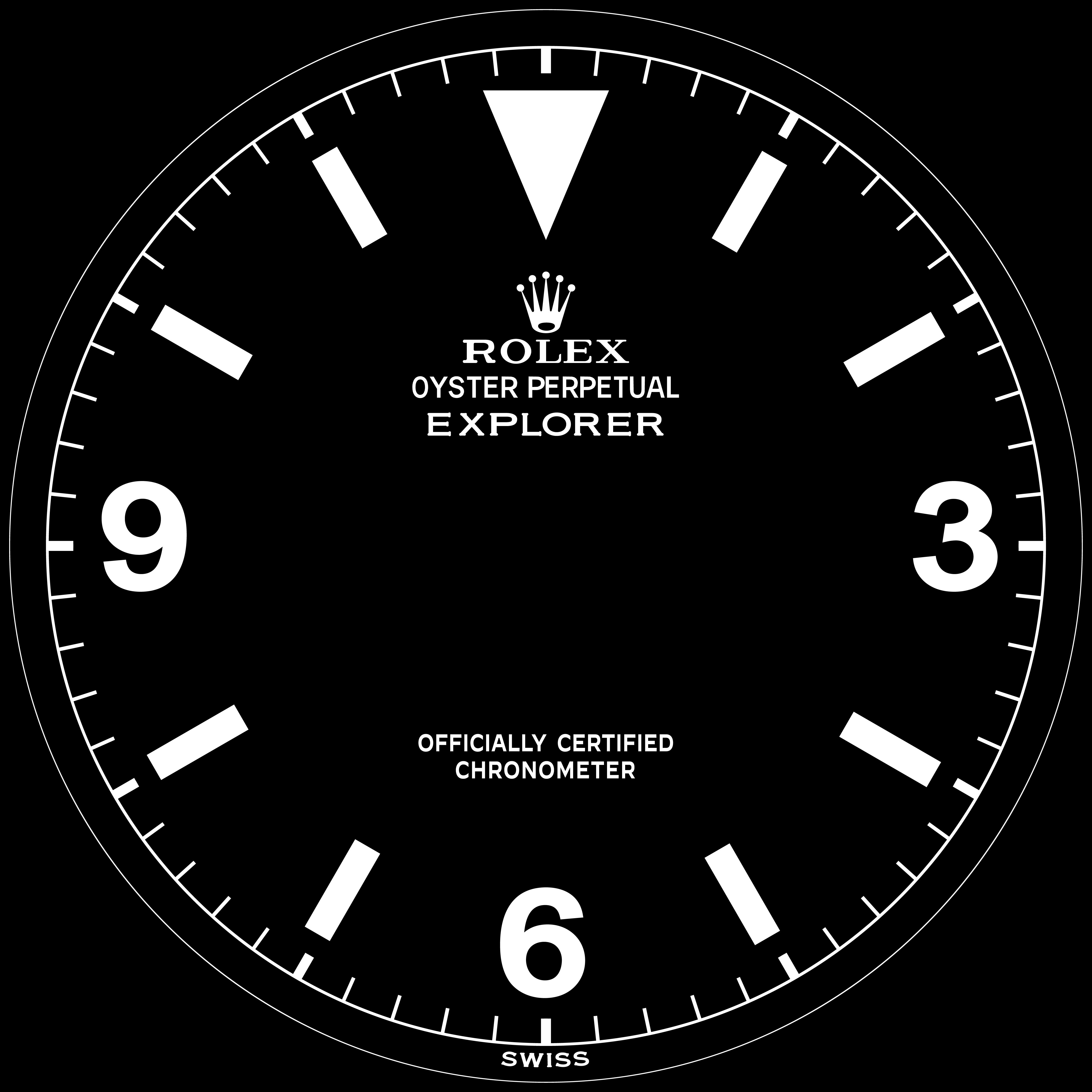
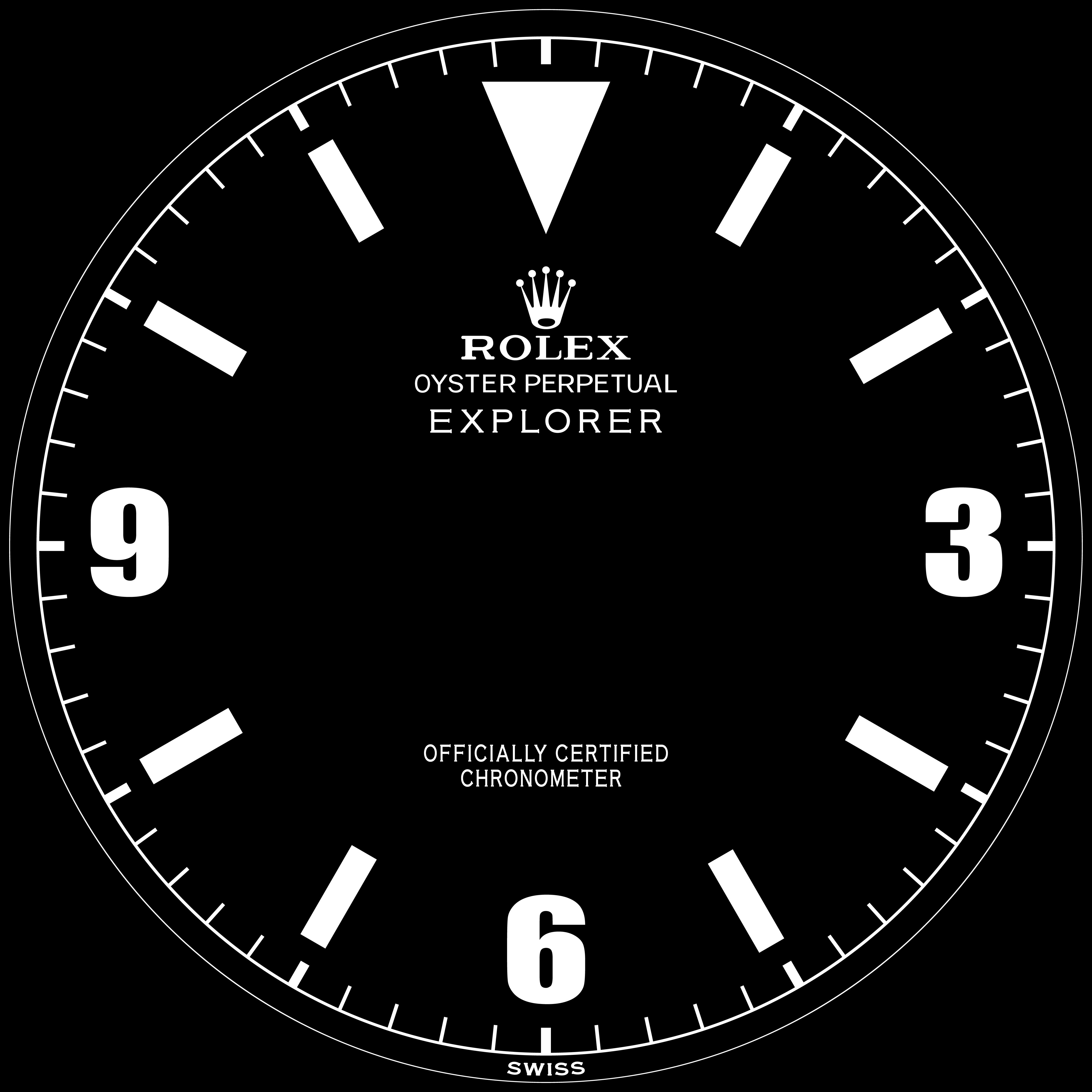
1) First and second vector are quite different, text is more bold on first one - where as the numbers are fatter on the second and slightly different font it seems? What gives?
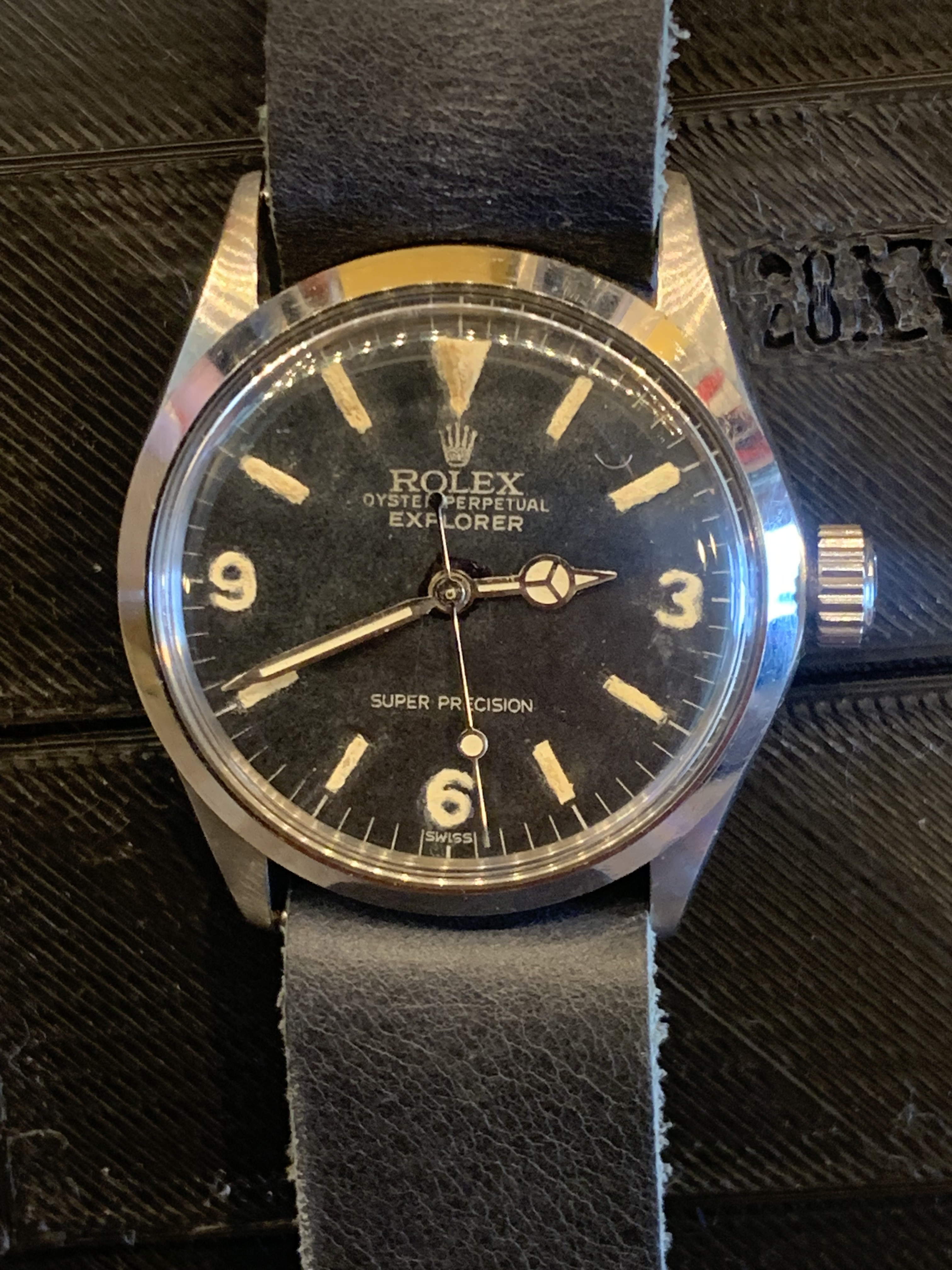
2) It seems like your vector was 100% made from scratch? I salute this. With this I mean that in comparison, my vector was "drafted" from a real dial. That is also why my numbers and lines are not perfectly straight and a bit wonky in shape. As there was uneven lume, aging of the lines, oxidation... and I had to decide wether or not I wanted to make straight lines or keep some of the wonkyness, which gives a more aged look and an indicator for how far to lume, I guess. What I'm trying to say is, you drafted a perfect circle, added the minute indicators in straight bars with some thicker ones at each 5 minute mark, found matching font of the original and typed the text, placed it accordingly with a real dial as reference, spacing... etc? Is that right?
I did not type a single letter, it was all "drawn" from a real dial. It's probably not the correct way to make a vector, but I was too afraid to lose its authenticity and details if I were to build one from scratch as I don't trust myself with such a big responsibility, lol.
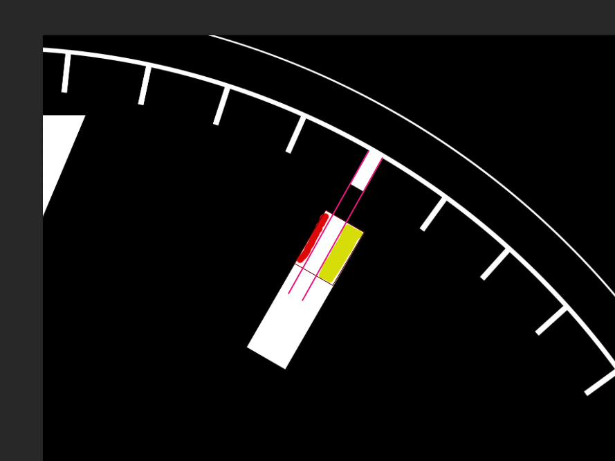
3) Is it me, or are the hour bar markers slightly moved to the left (as opposed to center)?
Please do not take any of the above the wrong way, I salute you for your work and would greatly appreciate it if you'd be willing to share these with me. I'm just trying to learn and elaborate on the way you approached making these vectors.
Hope this doesn't come over the wrong way. I will PM you my e-mail address.
1) First and second vector are quite different, text is more bold on first one - where as the numbers are fatter on the second and slightly different font it seems? What gives?
2) It seems like your vector was 100% made from scratch? I salute this. With this I mean that in comparison, my vector was "drafted" from a real dial. That is also why my numbers and lines are not perfectly straight and a bit wonky in shape. As there was uneven lume, aging of the lines, oxidation... and I had to decide wether or not I wanted to make straight lines or keep some of the wonkyness, which gives a more aged look and an indicator for how far to lume, I guess. What I'm trying to say is, you drafted a perfect circle, added the minute indicators in straight bars with some thicker ones at each 5 minute mark, found matching font of the original and typed the text, placed it accordingly with a real dial as reference, spacing... etc? Is that right?
I did not type a single letter, it was all "drawn" from a real dial. It's probably not the correct way to make a vector, but I was too afraid to lose its authenticity and details if I were to build one from scratch as I don't trust myself with such a big responsibility, lol.
3) Is it me, or are the hour bar markers slightly moved to the left (as opposed to center)?

Please do not take any of the above the wrong way, I salute you for your work and would greatly appreciate it if you'd be willing to share these with me. I'm just trying to learn and elaborate on the way you approached making these vectors.
Hope this doesn't come over the wrong way. I will PM you my e-mail address.
No offense taken. I sent a bunch of screen shots of dials, and a bunch of the jpgs from the Decal Printed dials thread to an artist on FFiver, who cleaned them up and converted them to vector files. They do have flaws, and could probably benefit from some tweaking, but it does allow me to print decal dials without the pixelation that comes from using smaller jpg images.Thank you very much! These do look good. May I ask a few things?
1) First and second vector are quite different, text is more bold on first one - where as the numbers are fatter on the second and slightly different font it seems? What gives?
2) It seems like your vector was 100% made from scratch? I salute this. With this I mean that in comparison, my vector was "drafted" from a real dial. That is also why my numbers and lines are not perfectly straight and a bit wonky in shape. As there was uneven lume, aging of the lines, oxidation... and I had to decide wether or not I wanted to make straight lines or keep some of the wonkyness, which gives a more aged look and an indicator for how far to lume, I guess. What I'm trying to say is, you drafted a perfect circle, added the minute indicators in straight bars with some thicker ones at each 5 minute mark, found matching font of the original and typed the text, placed it accordingly with a real dial as reference, spacing... etc? Is that right?
I did not type a single letter, it was all "drawn" from a real dial. It's probably not the correct way to make a vector, but I was too afraid to lose its authenticity and details if I were to build one from scratch as I don't trust myself with such a big responsibility, lol.
3) Is it me, or are the hour bar markers slightly moved to the left (as opposed to center)?

Please do not take any of the above the wrong way, I salute you for your work and would greatly appreciate it if you'd be willing to share these with me. I'm just trying to learn and elaborate on the way you approached making these vectors.
Hope this doesn't come over the wrong way. I will PM you my e-mail address.
I paid quite a bit to convert a couple hundred files that I had, and some are very good, while some need a bit of work. If you're familar with working with svg files (I am not, lol) you could probably tweak them to fix the flaws. I'm happy to share them, if you're happy to share any "improvements" that you make with me and anyone else in the community bit by the bug (basically, the folks in this thread, lol).

