-
Tired of adverts on RWI? - Subscribe by clicking HERE and PMing Trailboss for instructions and they will magically go away!
You are using an out of date browser. It may not display this or other websites correctly.
You should upgrade or use an alternative browser.
You should upgrade or use an alternative browser.
NEW! 1675 GMT case set offering from Raffles.
- Thread starter 369mafia
- Start date
Again, the last Milk insert is I got is very close. He previously made some vintage ones with fatter fonts, but the last I got was thin.
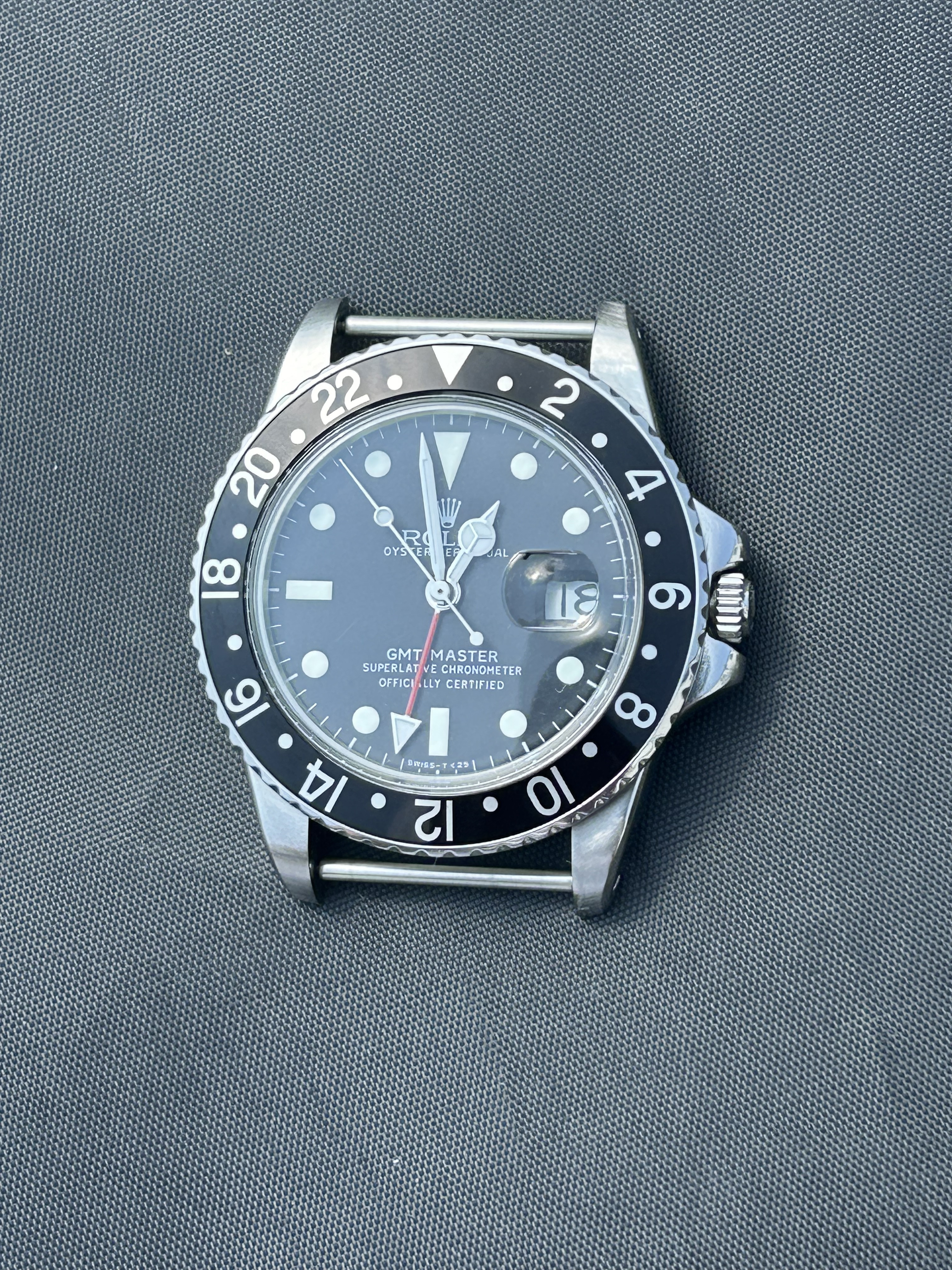
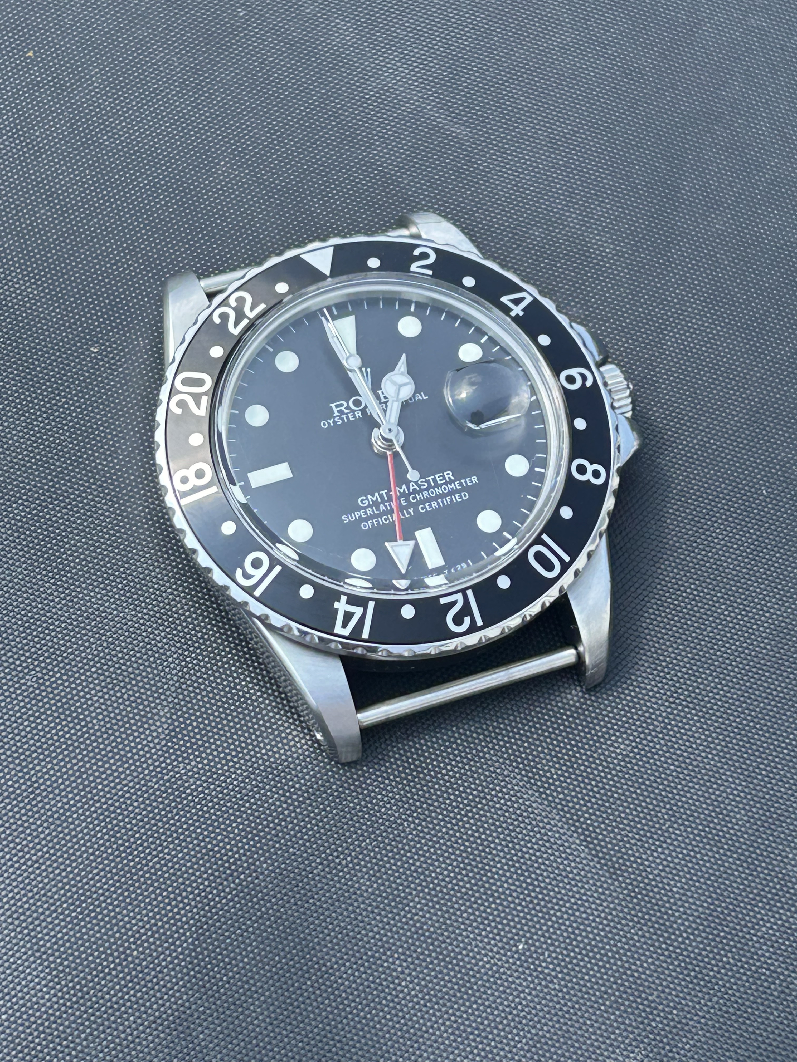
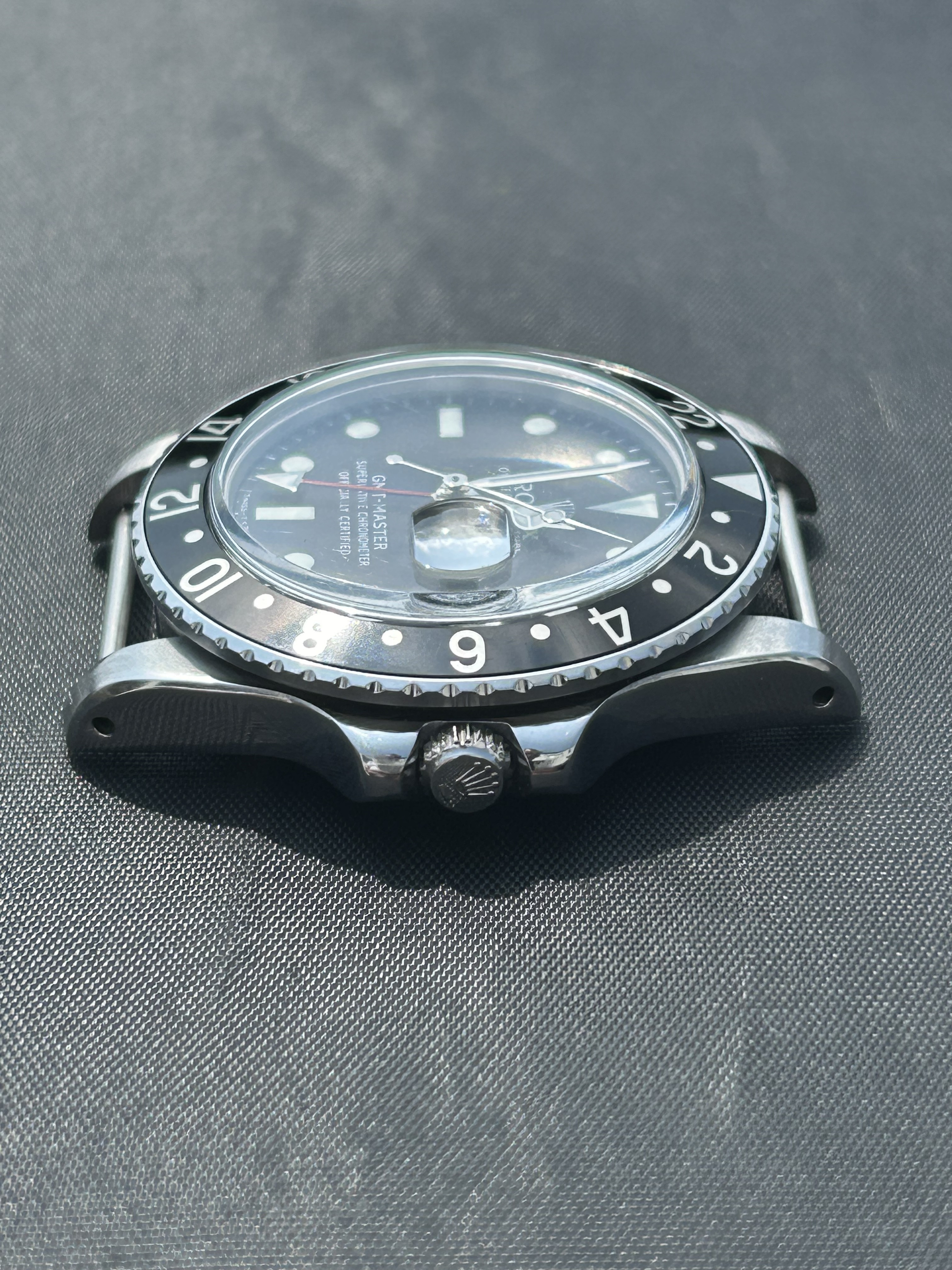
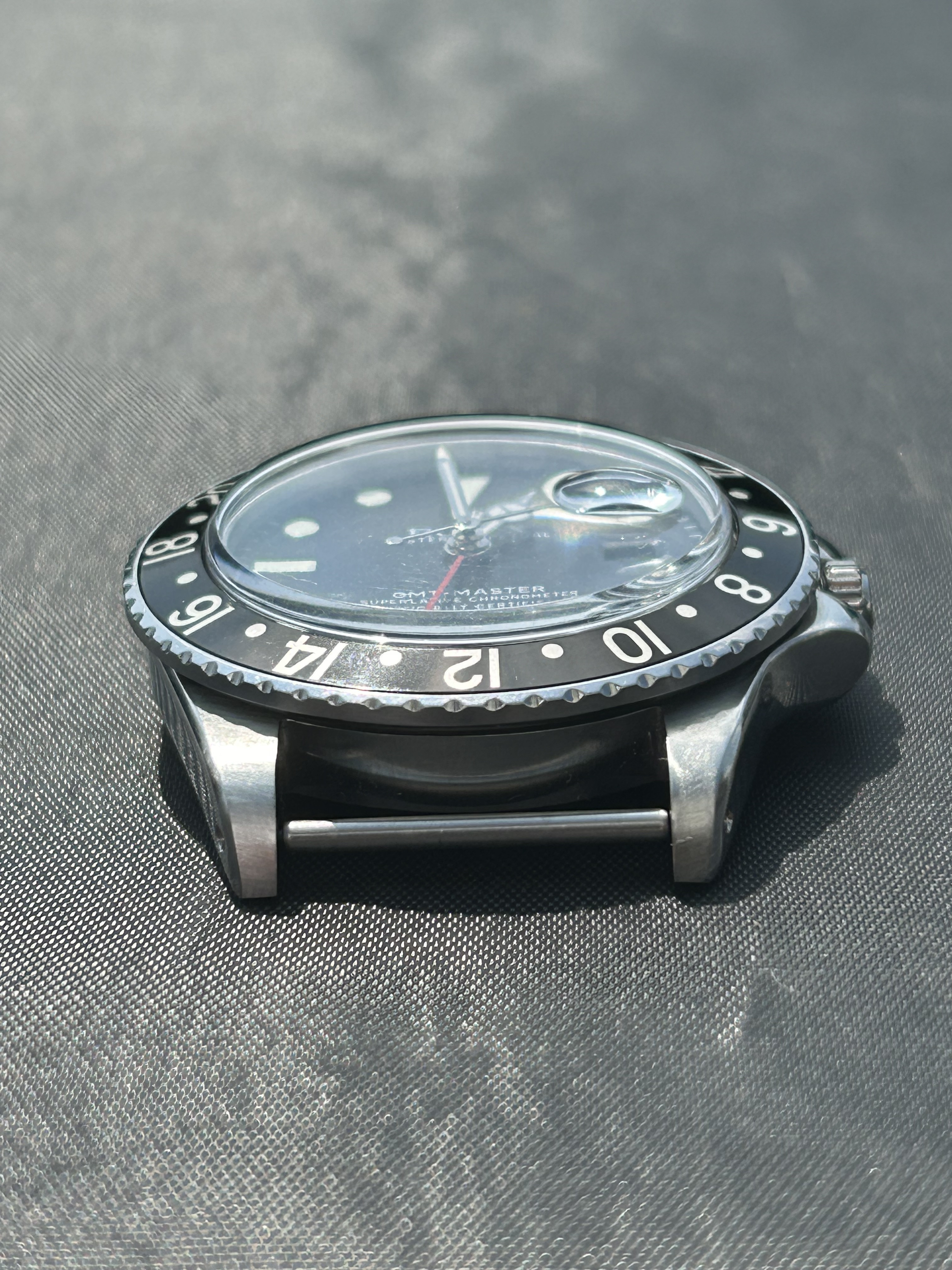
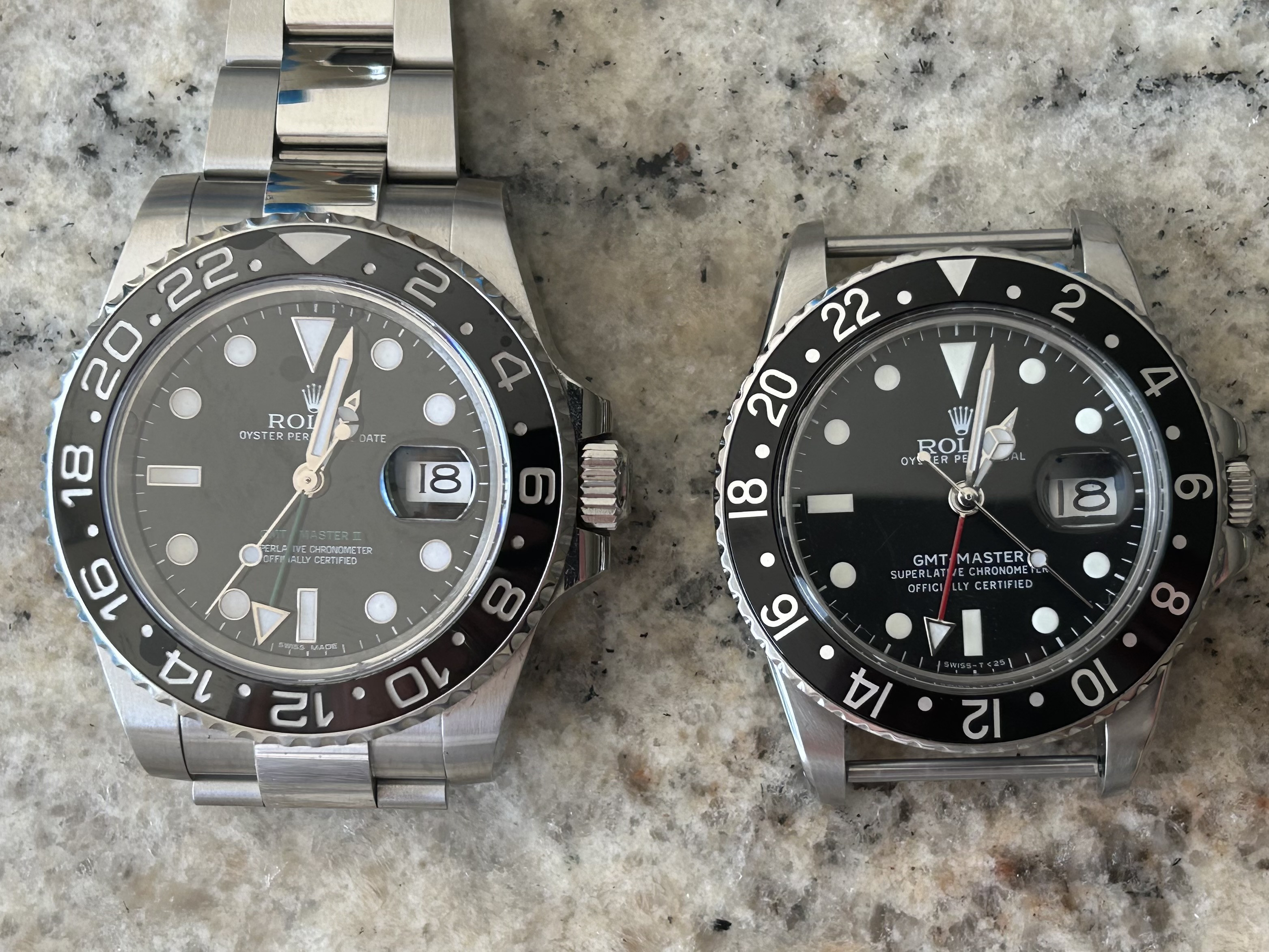
I'm on this wagon too. The straight 22s are a joke. I will never unsee it now that I noticed. In fact, I might have x-ray vision for straight 22s. I only wanted 20/20 vision.Yeah. Agreed, I’d really like to be able to get hold of a decent quality insert that replicates a service insert as gen prices for the Pepsi remain so high!
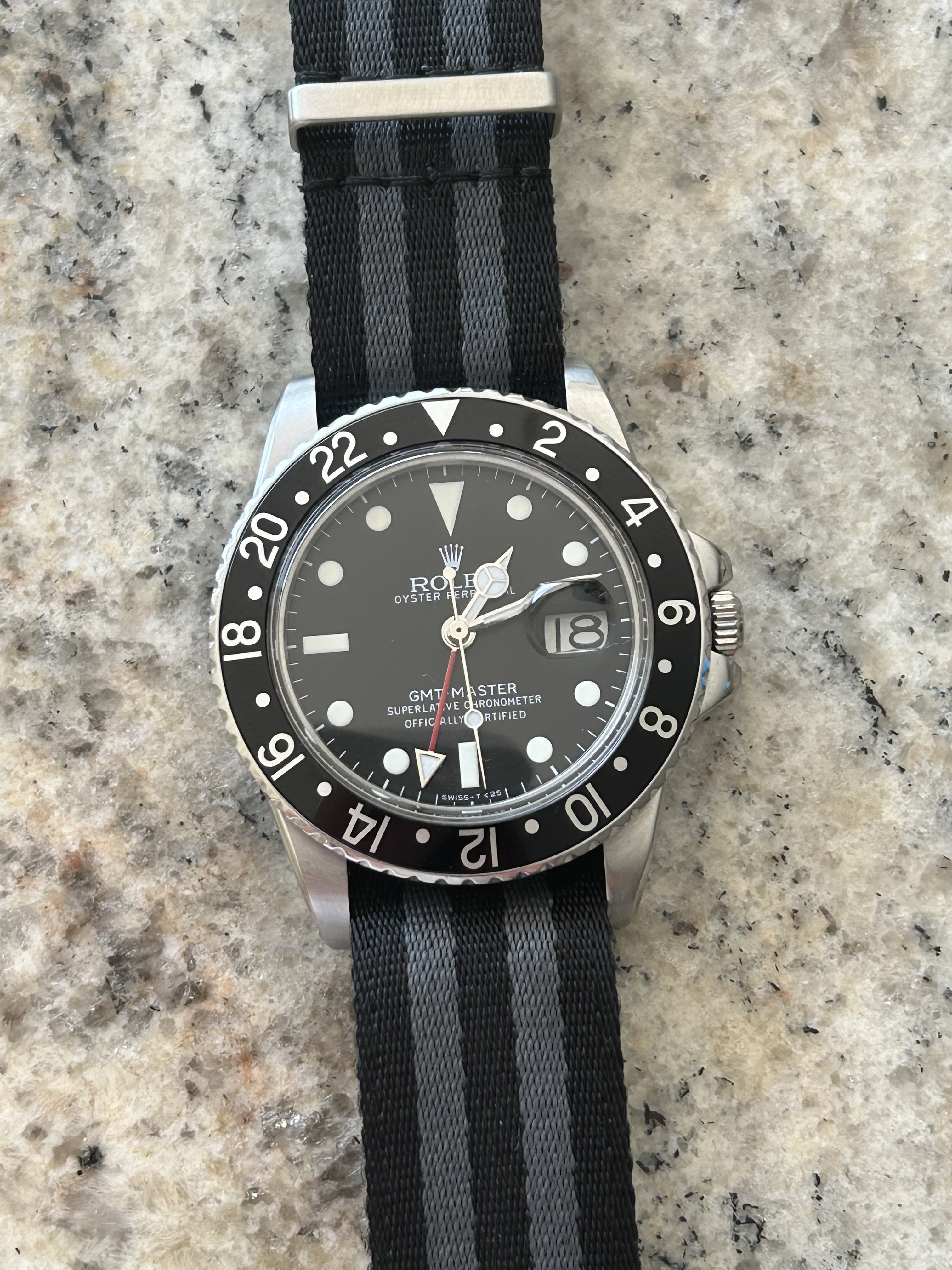
BTW, here's another a pic of the Milk bezel with thinner fonts next to a service bezel with thin fonts. It's probably your best bet unless you score a genuine. The two other pictures are ones I found on my phone.
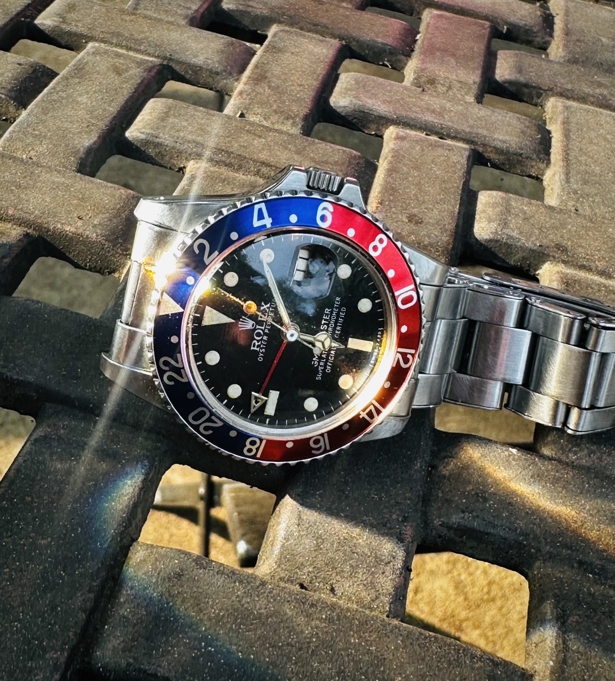
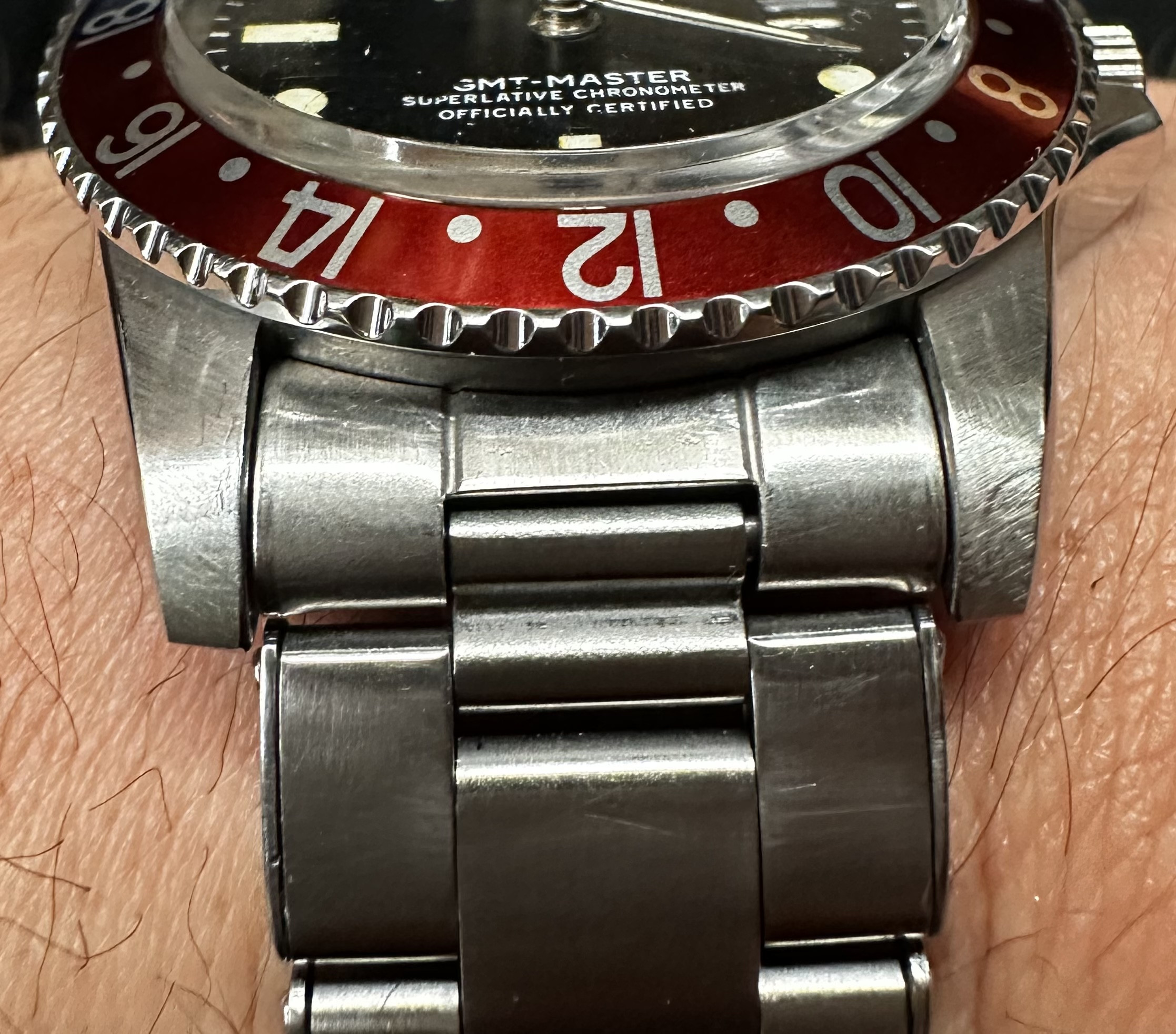
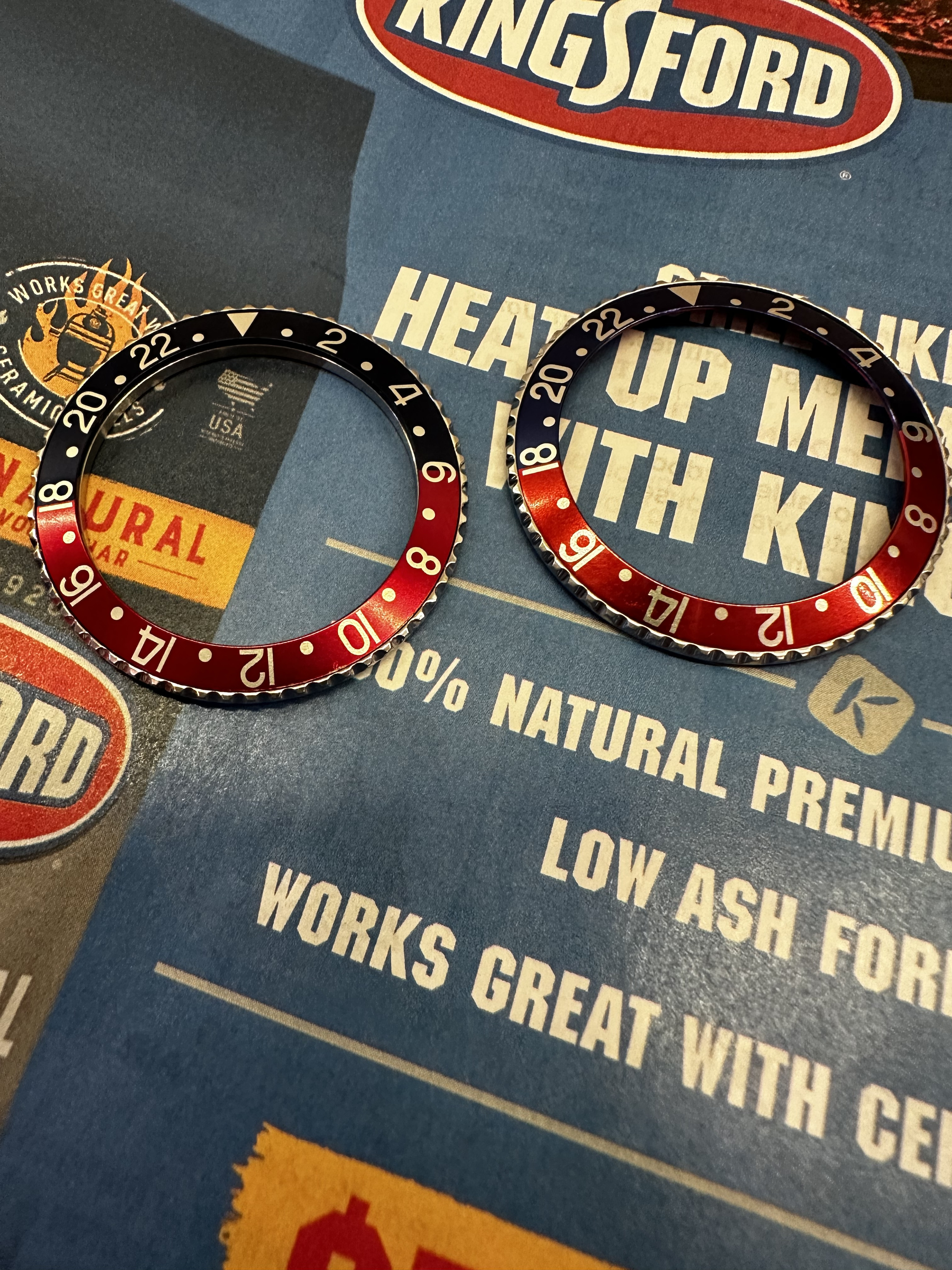
These are ok, number 2 is how it should be, but in almost all aftermarket inserts number 2 is incorrect, the more you start looking at it the more you will notice it. At first I didn't see this difference, now it's immediateI'm on this wagon too. The straight 22s are a joke. I will never unsee it now that I noticed. In fact, I might have x-ray vision for straight 22s. I only wanted 20/20 vision.
BTW, here's another a pic of the Milk bezel with thinner fonts next to a service bezel with thin fonts. It's probably your best bet unless you score a genuine. The two other pictures are ones I found on my phone.


My point exactly! The 2s and 22s are a deal breaker for me. It's been a year or two since I've even seen Vietnam sellers have something decent. The current insert situation is a total ripoff to me. It's like everyone shares the same one or two suppliers.These are ok, number 2 is how it should be, but in almost all aftermarket inserts number 2 is incorrect, the more you start looking at it the more you will notice it. At first I didn't see this difference, now it's immediate
Yes indeed but I think that in the end there will not be many producers, so that the products are similarMy point exactly! The 2s and 22s are a deal breaker for me. It's been a year or two since I've even seen Vietnam sellers have something decent. The current insert situation is a total ripoff to me. It's like everyone shares the same one or two suppliers.
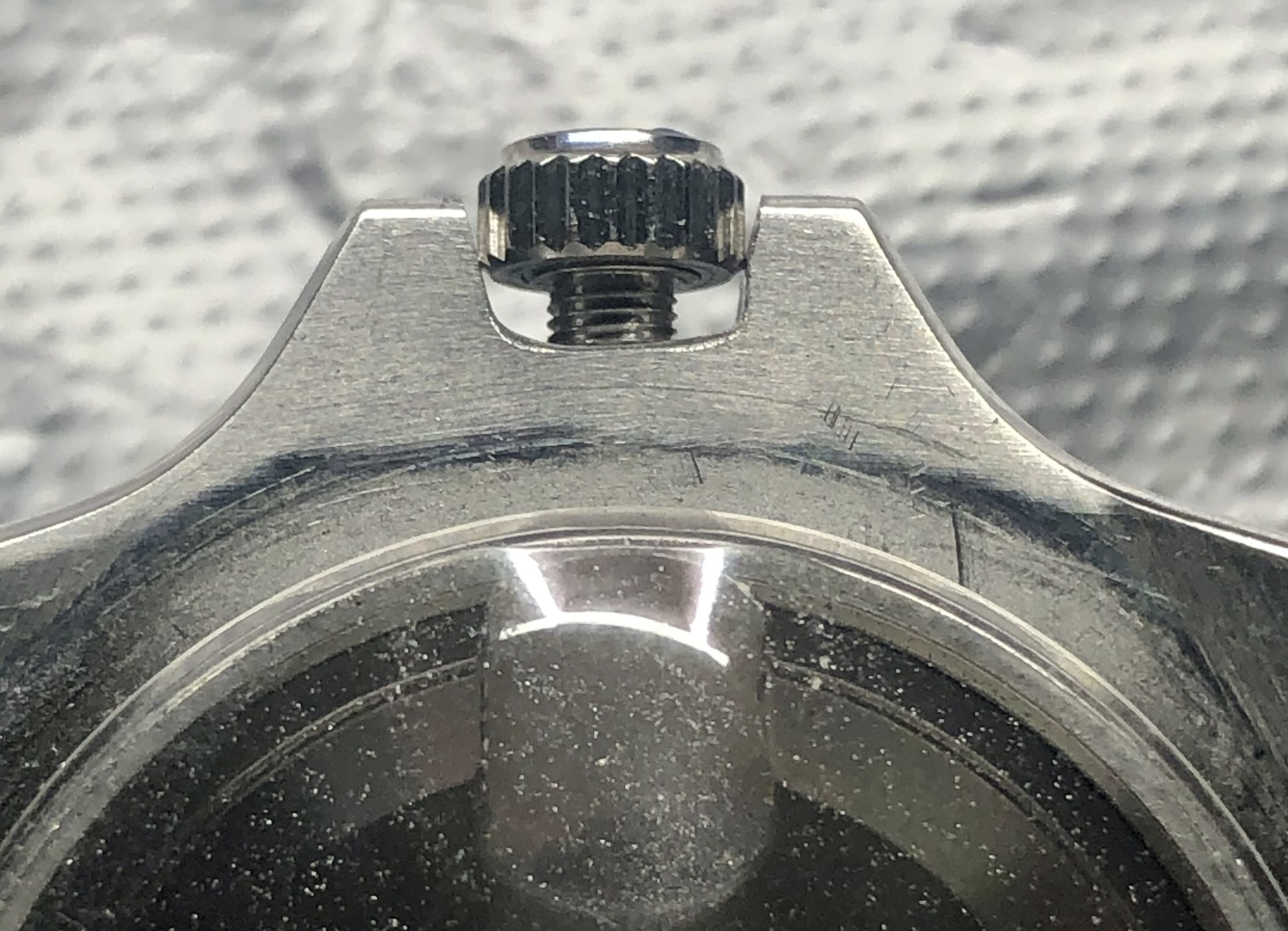
Yes!!! Looking forward to another one. I like those angles, but that leads me one piece of advice and and another question.
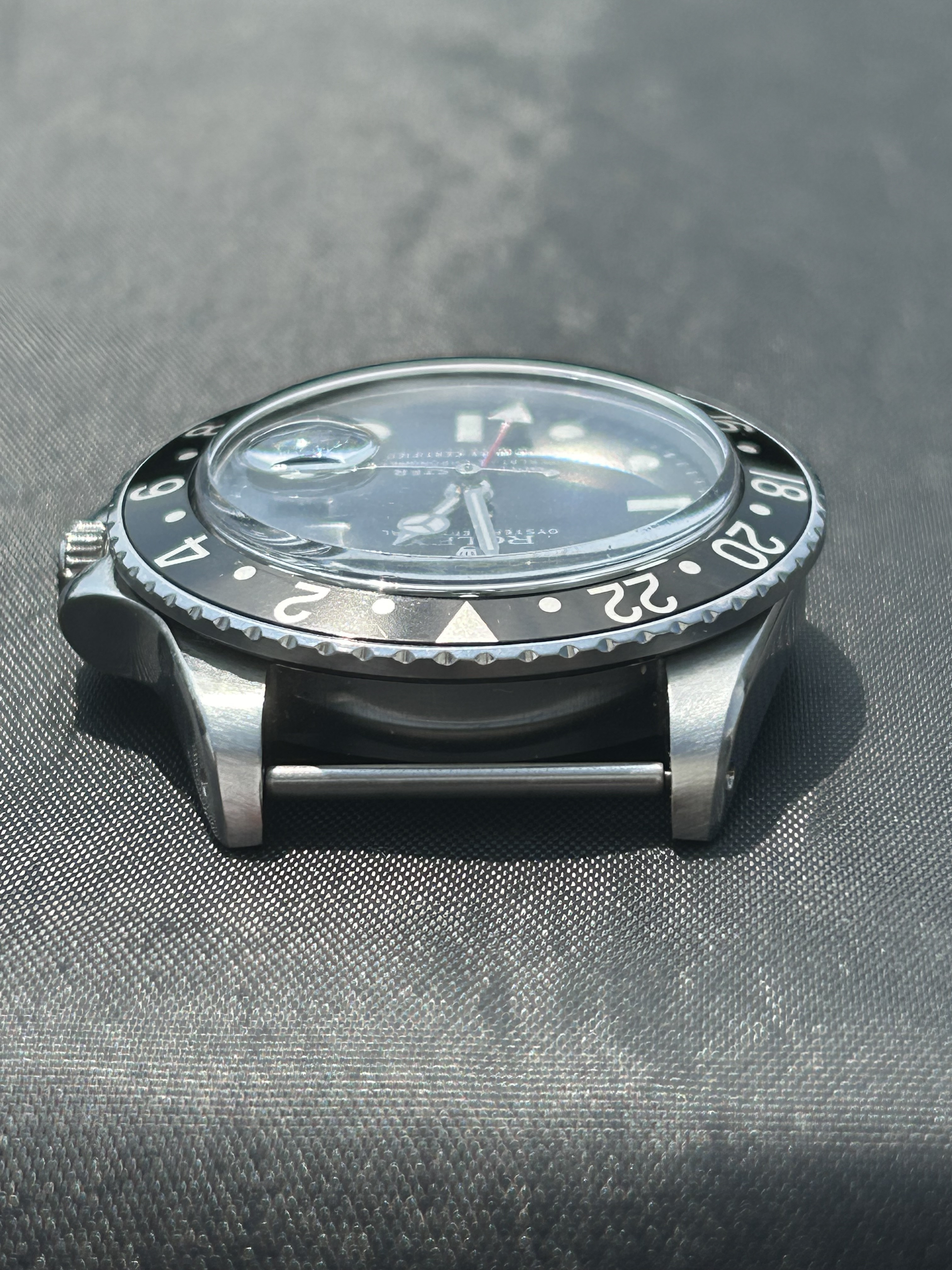
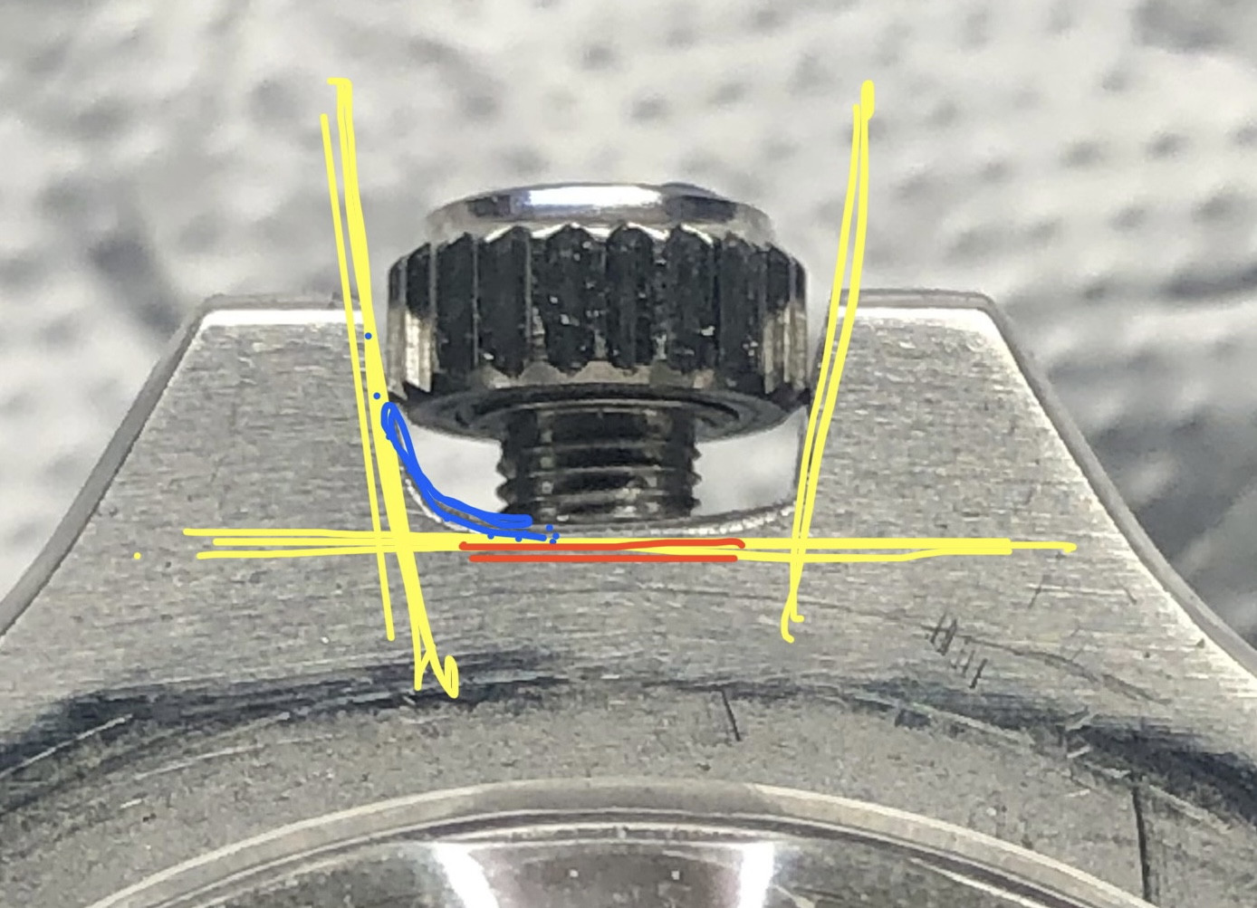
Advice: unless you're going for a more rounded shape surrounding the crowns, like I drew in blue, try to not lose the entire flatness (90degree-ish angle?) of the horizontal part I highlighted in red. I've done it before and it's tough to fix.
Question: have you decided what period of watch yet? Only curious if you prefer more of mid-60's vs. late 70's, etc. Or if you have a picture of your holy grail you want to replicate?
I'm not trying to be nosy or tell you what to do. I just love build threads and want to know everything all at once!!!
By the way, the shaping is looking great. Looking forward to the updates!

Yes!!! Looking forward to another one. I like those angles, but that leads me one piece of advice and and another question.
Advice: unless you're going for a more rounded shape surrounding the crowns, like I drew in blue, try to not lose the entire flatness (90degree-ish angle?) of the horizontal part I highlighted in red. I've done it before and it's tough to fix.
Question: have you decided what period of watch yet? Only curious if you prefer more of mid-60's vs. late 70's, etc. Or if you have a picture of your holy grail you want to replicate?
I'm not trying to be nosy or tell you what to do. I just love build threads and want to know everything all at once!!!
By the way, the shaping is looking great. Looking forward to the updates!

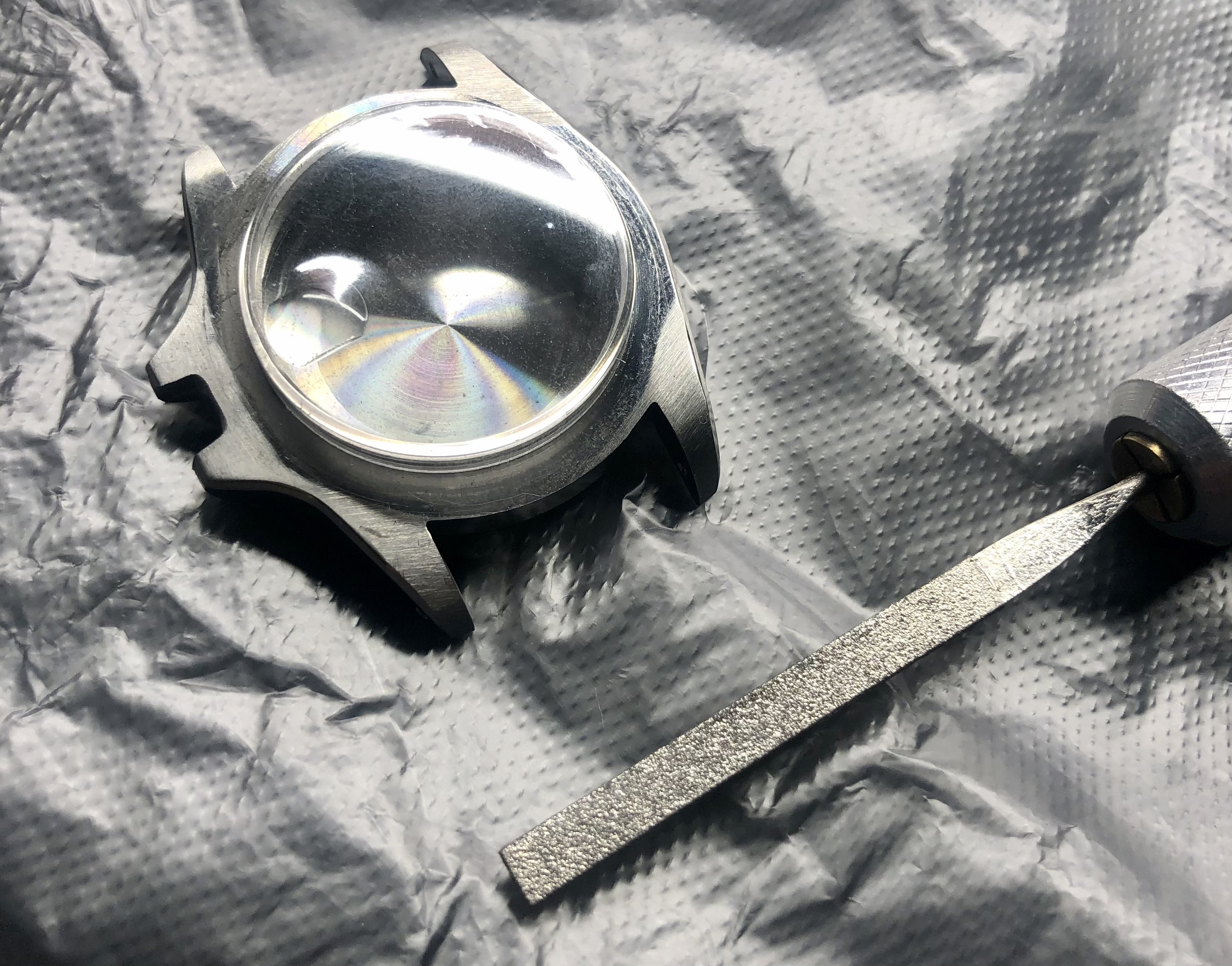
No worries, thanks for the comments and advice. I am using this mid case to build a 1655 and that reference has a 6 mm crown so I need to open up the crown guards quite a bit to get it in there. as you see I still have a way to go , but since this pic Im almost home.
yes those curves are tricky but that was from my first efforts to open it to this point using a grinding stone on a Dremel to remove material. the stone started to lose its edge so the corner started to become more gradual.
I am not using only hand files to fine tune the shape and then will give it a light sanding to clean it up.
I also had to mind how much I am taking off on the base of the crownguards to where the tube mounts. I think I have to where I like it but may have to do go a bit more to level it it. This is under macro and nobody will ever notice this .
These cases are a blessing and a curse...lots of material to work with , which means there is alot of material to remove lol
bigtiddygothgf
Active Member
- 7/10/18
- 323
- 149
- 43
Depends on your measurements, but it's about 27mm exactly. It's genuine size.
Did you do anything in the dial? Mine is from raffles also, but yours looks much better!So my build is coming along nicely. I really like the white lume plot look of the service dials and the raffles dial replicates this quite well, so I’ve decided to go for a fully serviced look with my build. Basing the CGs on a late 70s birth year model.
Just waiting for the Athaya crown (stuck in post somewhere for almost a month now!) and a decent quality Pepsi insert, although half tempted to go for a gen black insert too as the Viet bezel will accept the gen.
The dial, datewheel and hands from raffles are all ok, the gmt hand is a little shorter than gen. Dont think I did too bad at all for my first ever attempt at fitting the dwo on the hz6460! The movement has run steady now for over 24hrs so far and keeps great time.
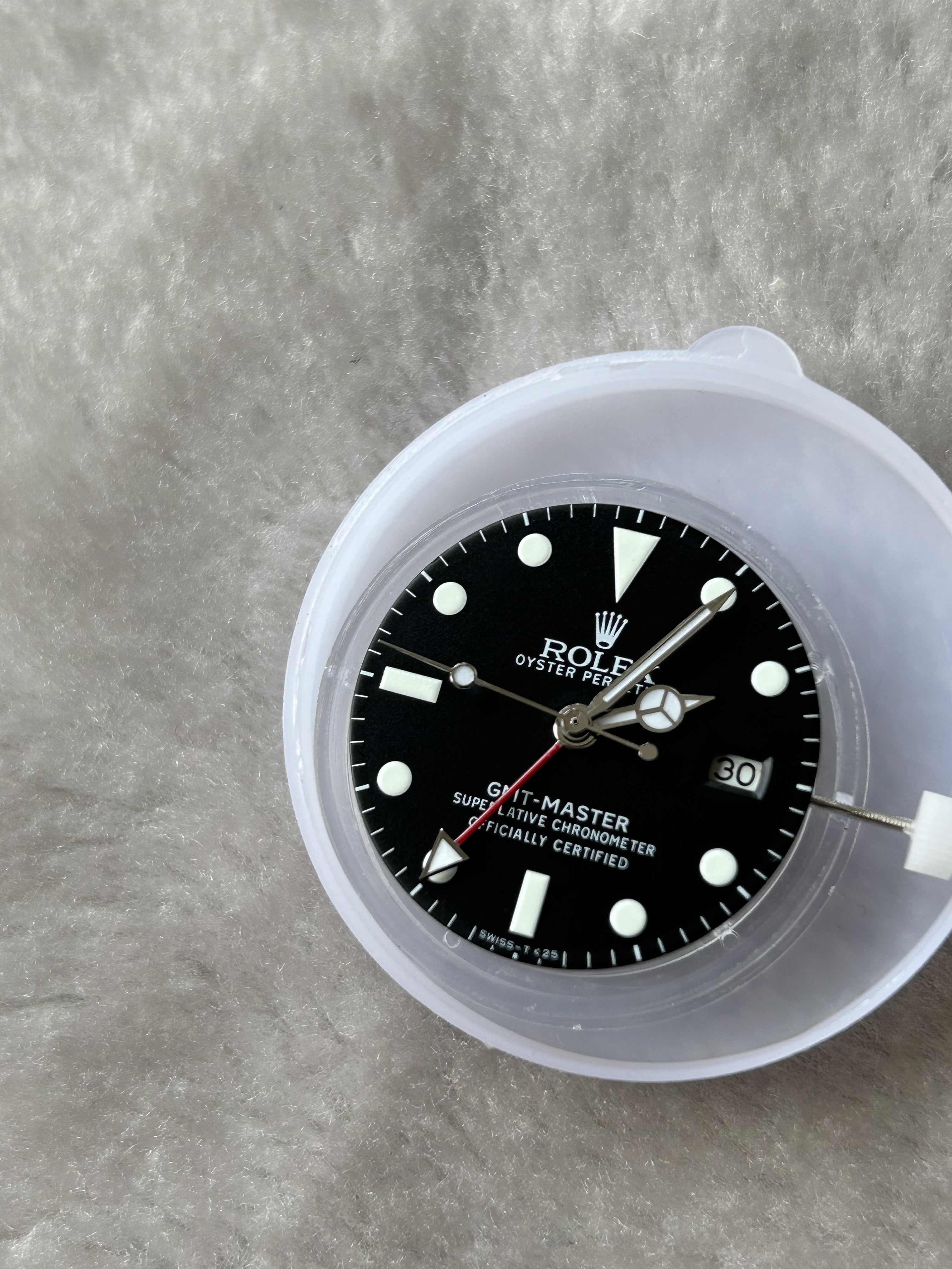
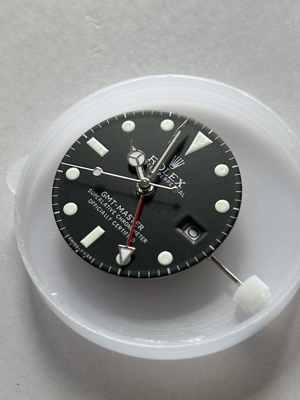
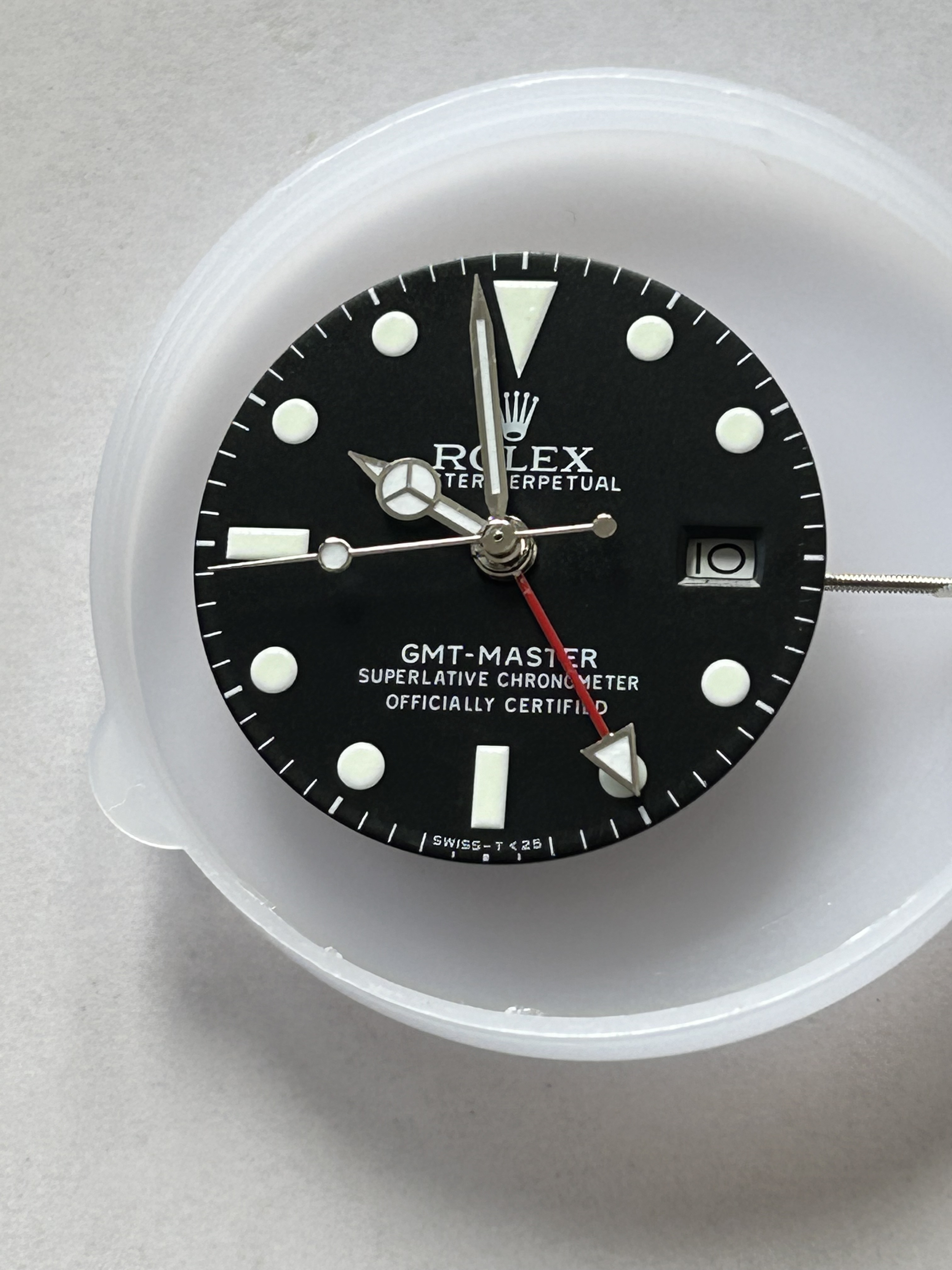

Nope just the standard dial as it comes.Did you do anything in the dial? Mine is from raffles also, but yours looks much better!
Adam123
1,,2,,3
- 28/8/17
- 86
- 38
- 18
Gents,
Fair read here.
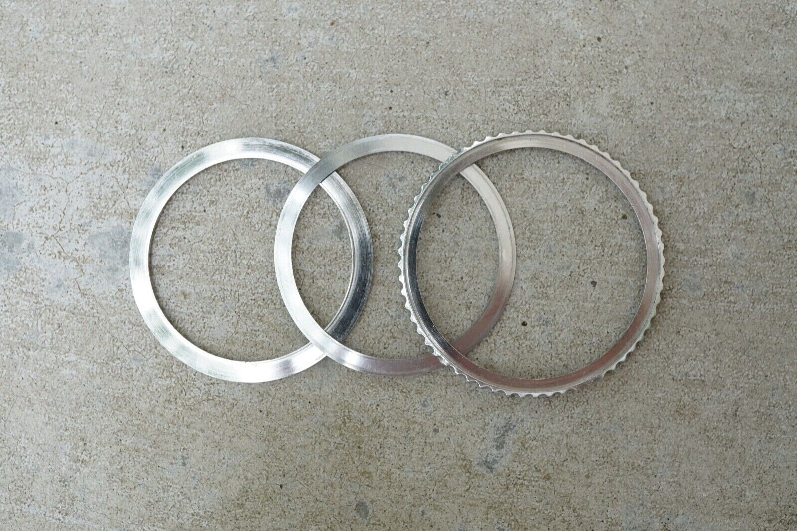
All the folks commenting, its generally agreed that the Raffles 1675 bezel assembly that comes with the watch is sub standard.
I've heard Kuared sells a decent upgrade but recently raised prices from 225 to 240
Has anybody tried this one ? from Ricks repair ? 105 USD
https://ricswatchrepair.com/rotating-bezel-assembly-for-rolex-gmt/

The items on website don't always mirror items on ebay. Posting ebay info hoping other members had input.
https://www.ebay.com/str/ricswatchrepair
Fair read here.
All the folks commenting, its generally agreed that the Raffles 1675 bezel assembly that comes with the watch is sub standard.
I've heard Kuared sells a decent upgrade but recently raised prices from 225 to 240
Has anybody tried this one ? from Ricks repair ? 105 USD
https://ricswatchrepair.com/rotating-bezel-assembly-for-rolex-gmt/

The items on website don't always mirror items on ebay. Posting ebay info hoping other members had input.
https://www.ebay.com/str/ricswatchrepair
I also bought one from Ric's about a year ago, and I'm 99% sure it worked perfectly. Unfortunately, I also bought 2 more at the same time from other vendors, and those were problematic. (WholesaleOutlet and Tymetiks were the ones I had trouble with.)
Trust Oldtools, as his experience is exactly what I remember from my orders. Can't go wrong with Milk's either.
Trust Oldtools, as his experience is exactly what I remember from my orders. Can't go wrong with Milk's either.

