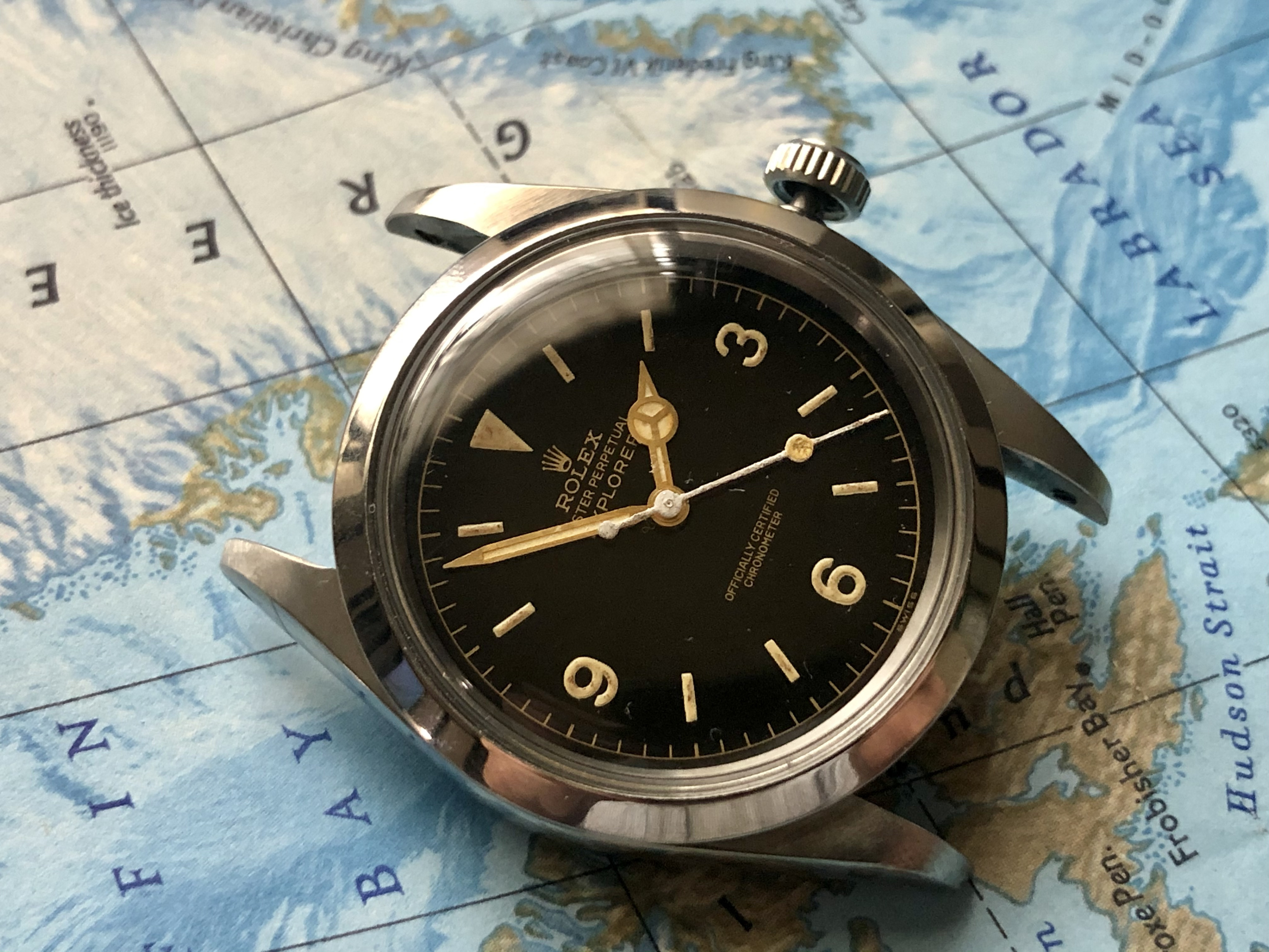
Some Updates on What You Guys Are Probably Most Excited About
I will add it into the part 2 write-up later, too lazy right now.
Here it goes—the dial progress:
Introduction
The most resource-intensive part of this entire build. The part that takes the most time, the most money and effort... requires multiple people across continents to work on it.
As most of you saw in part 2, the dial result with the vector made by the professional illustrator, as per my R&D, was decent but nowhere near there yet.
Challenges with the Laser Machine
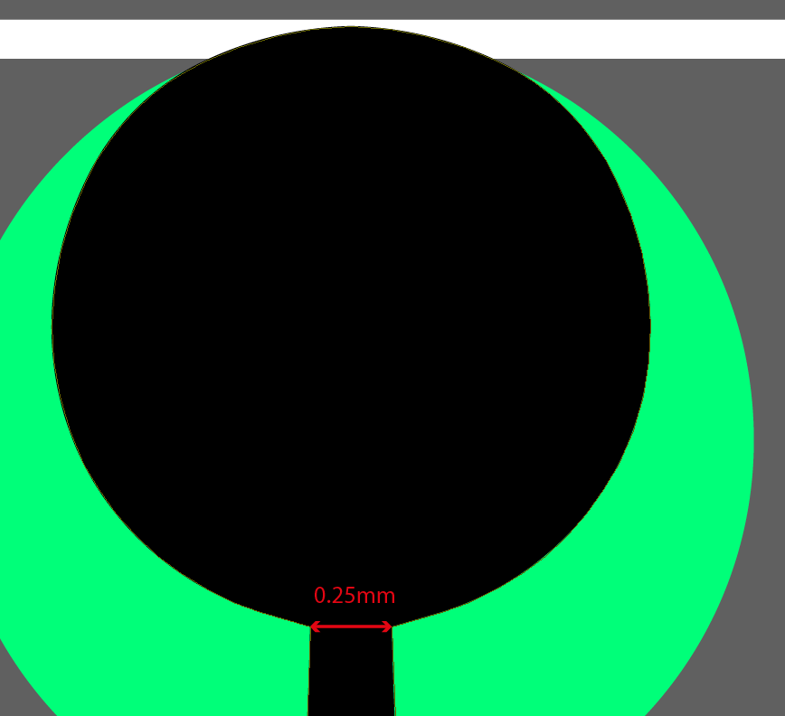
Found out our laser machine is not the 0.01mm accuracy it is advertised to have. It ranged more like 0.01–0.04mm dot size. I forgive the machine, despite it costing €1,500, it is 5 years old or so; therefore, I can't be too hard on the old girl.
So... after many, many adjustments, the font was still fat.


We did get a better result after some more adjustments:

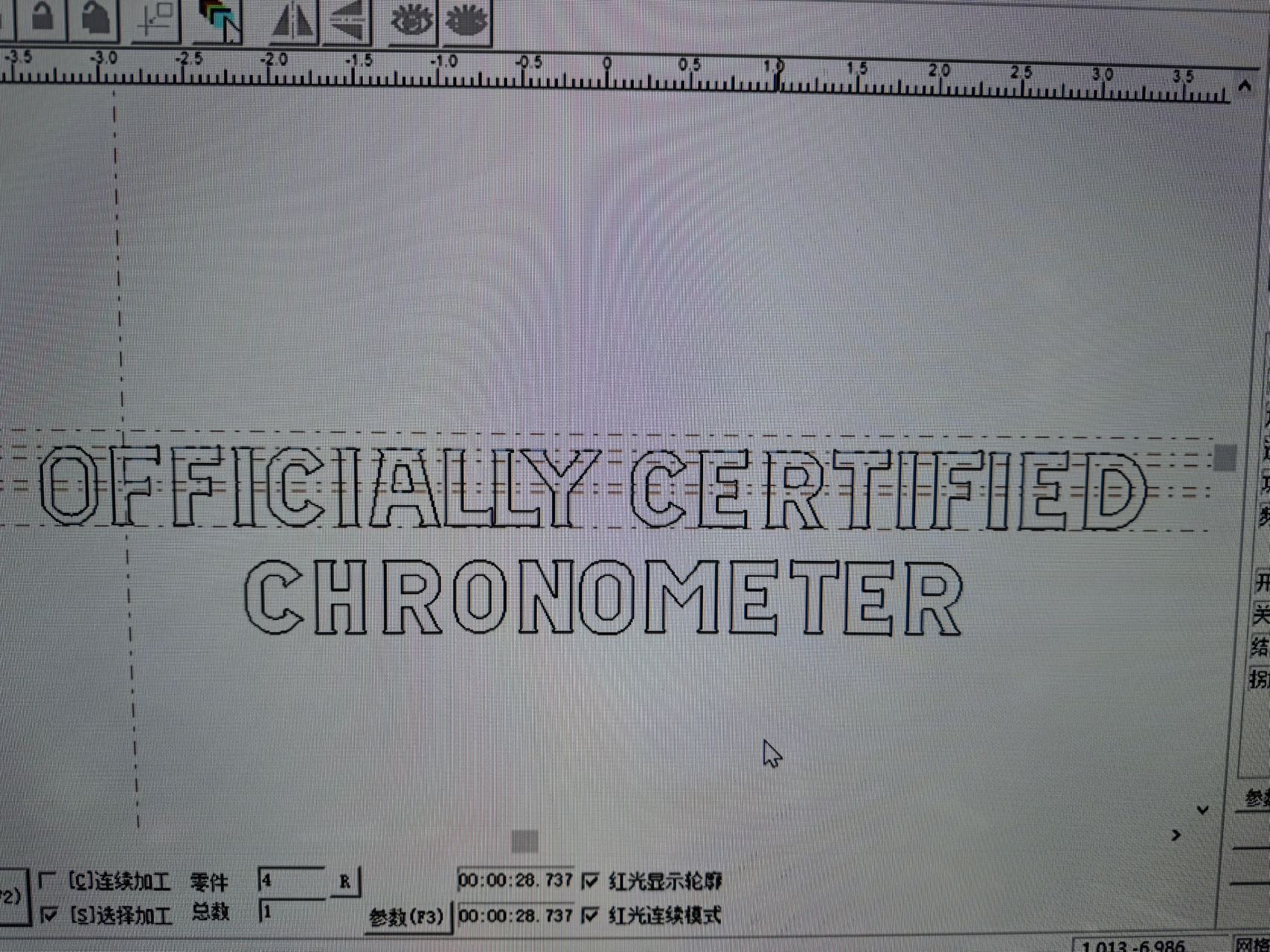
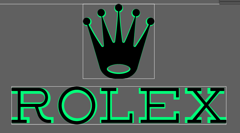
But of course, still too fat. So, to avoid hiring the illustrator again (he's expensive at $33/hour—you can imagine how many hours have gone into this), we tweaked the vector some more in the laser software:


Progress and Results
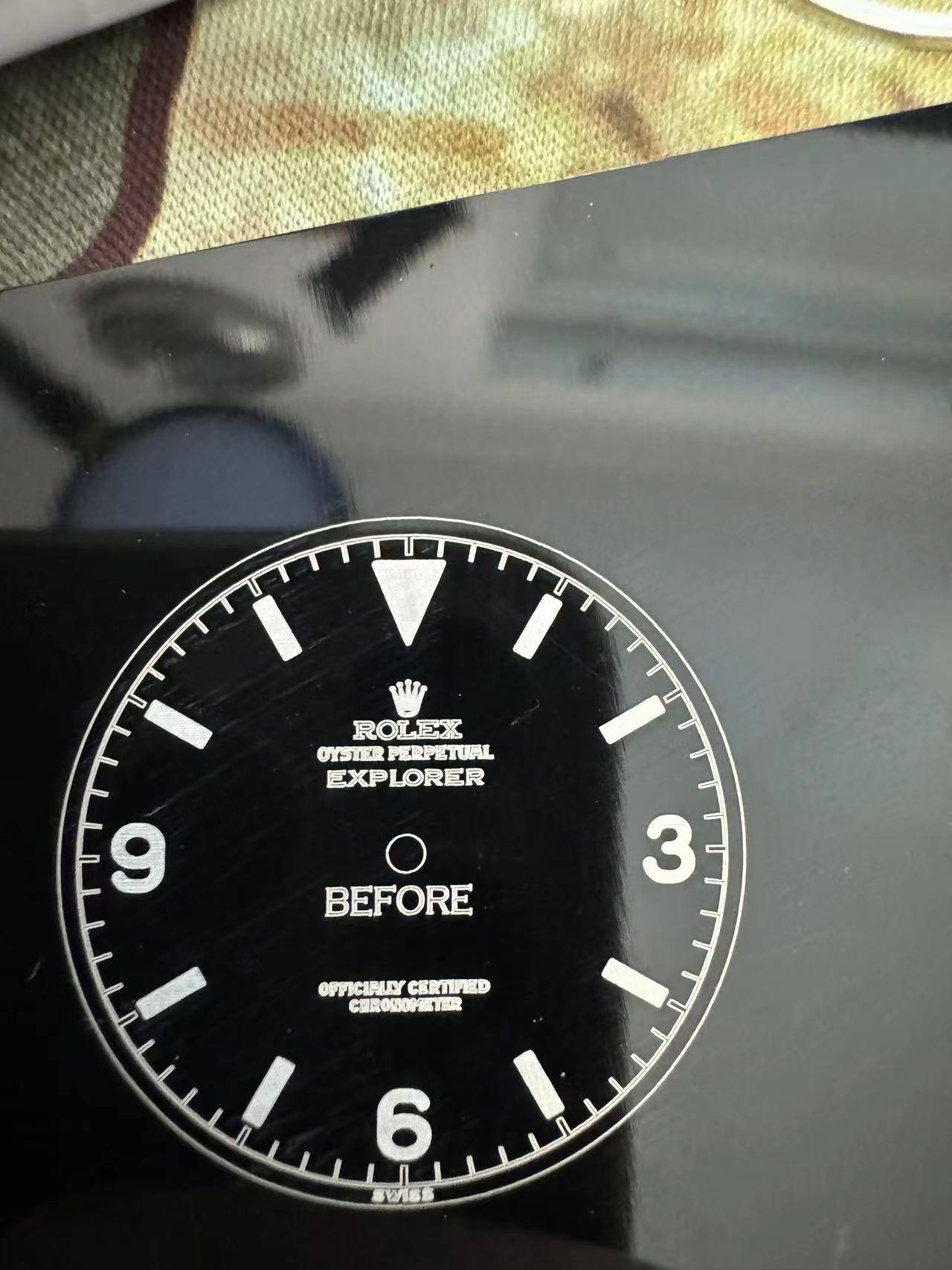
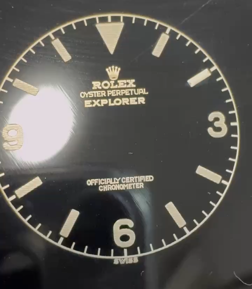
The result:


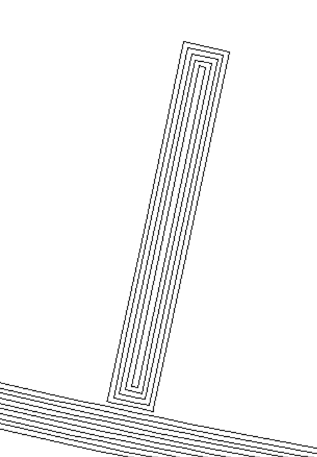
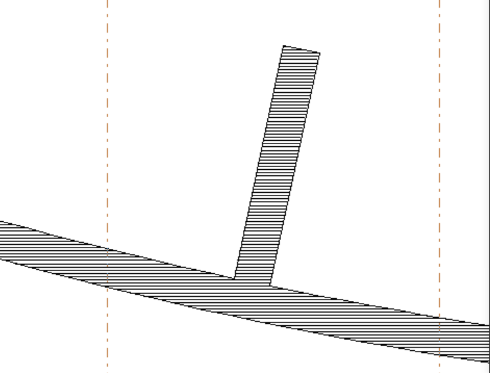
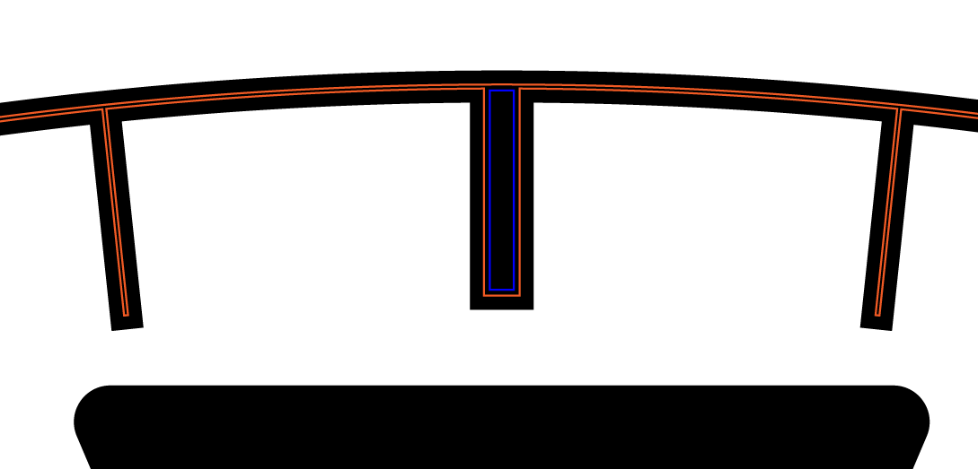
Not looking too bad, still too fat. And as marked in red, the conversion from vector to laser has filling issues. As illustrated below, there are two ways our old girl can engrave. More modern (and expensive) lasers can also engrave rasterized. Ours can't.


It's important to realize that there are a LOT of factors that change the outcome. The laser speed, the laser pattern, the laser density, but also the base plate used (more on that later). If you make the laser engrave too densely, you risk overflowing when the burning/melting happens. The result is not a crisp engraving but rather a "blended out" engraving.
Back to the Drawing Board
So since we could not achieve the desired thinness, we had to go back to the drawing table and I re-hired our illustrators (yes, multiple—I hired two now). After a lot of instructions back and forth, testing... as you can't know what it looks like unless you actually engrave it... we started tweaking the design.
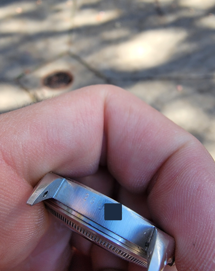
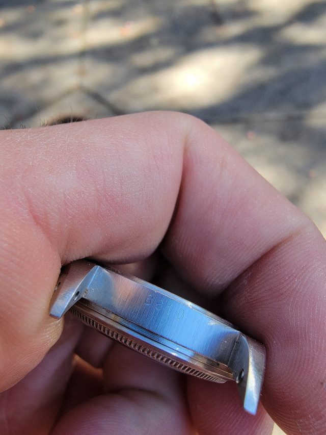
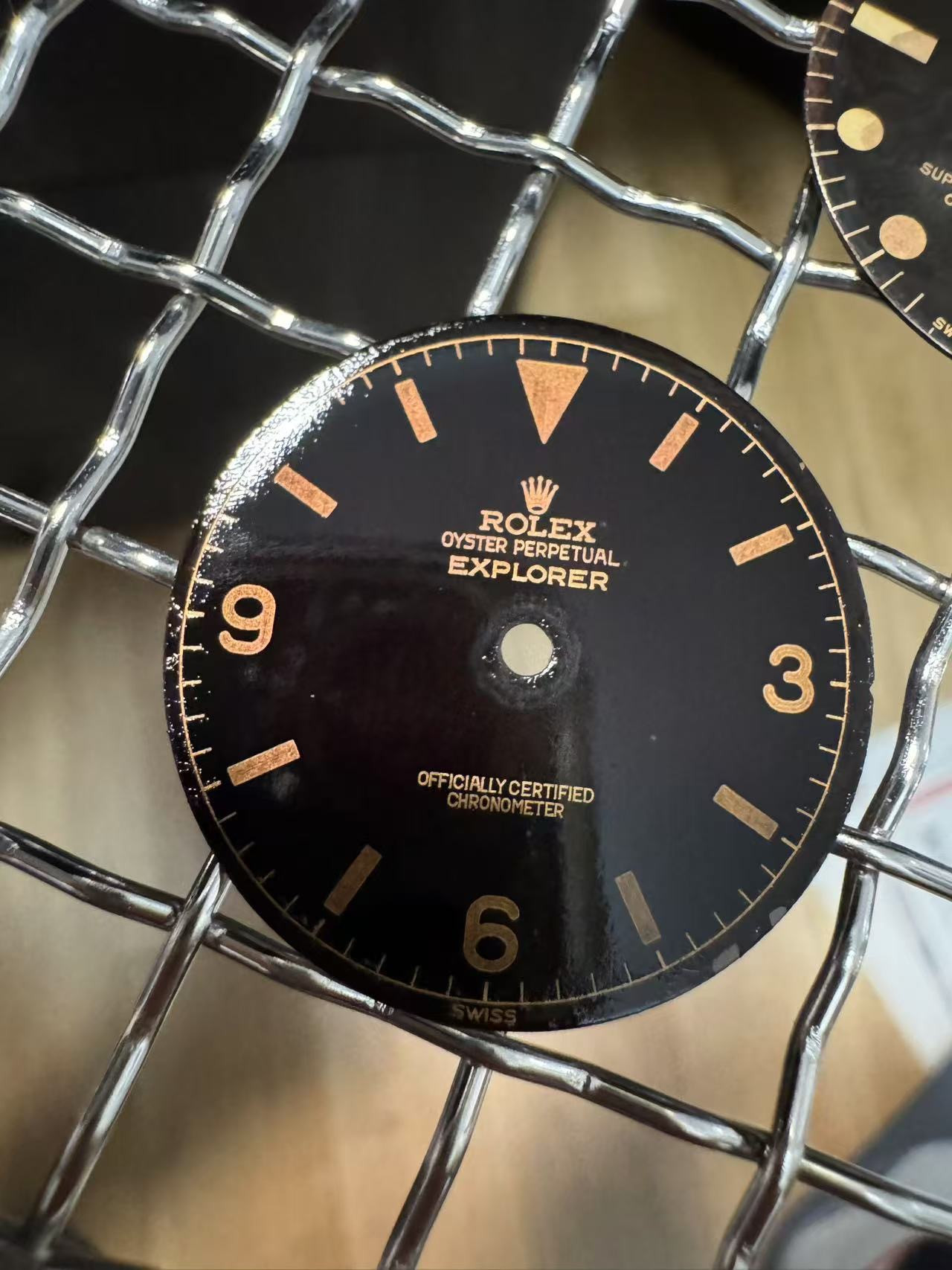
Previously, the vector was an almost perfect copy of an authentic dial—8 authentic 6610 dials to be exact. The vector looks amazing on the computer, pretty much 1:1. But translating that onto the actual dial is an issue.
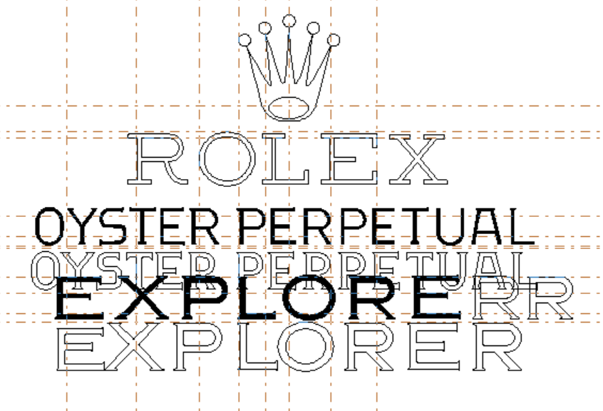
So we started thinning things. At first, I wanted only the crown, "OYSTER...", and "OFF..." text to get thinned, simulating a maximum laser point of 0.5mm resulting in an outline of 0.25mm. We took off 0.2mm everywhere. There's no way our laser point would be 0.5mm lol.


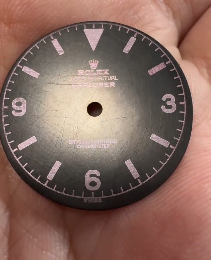
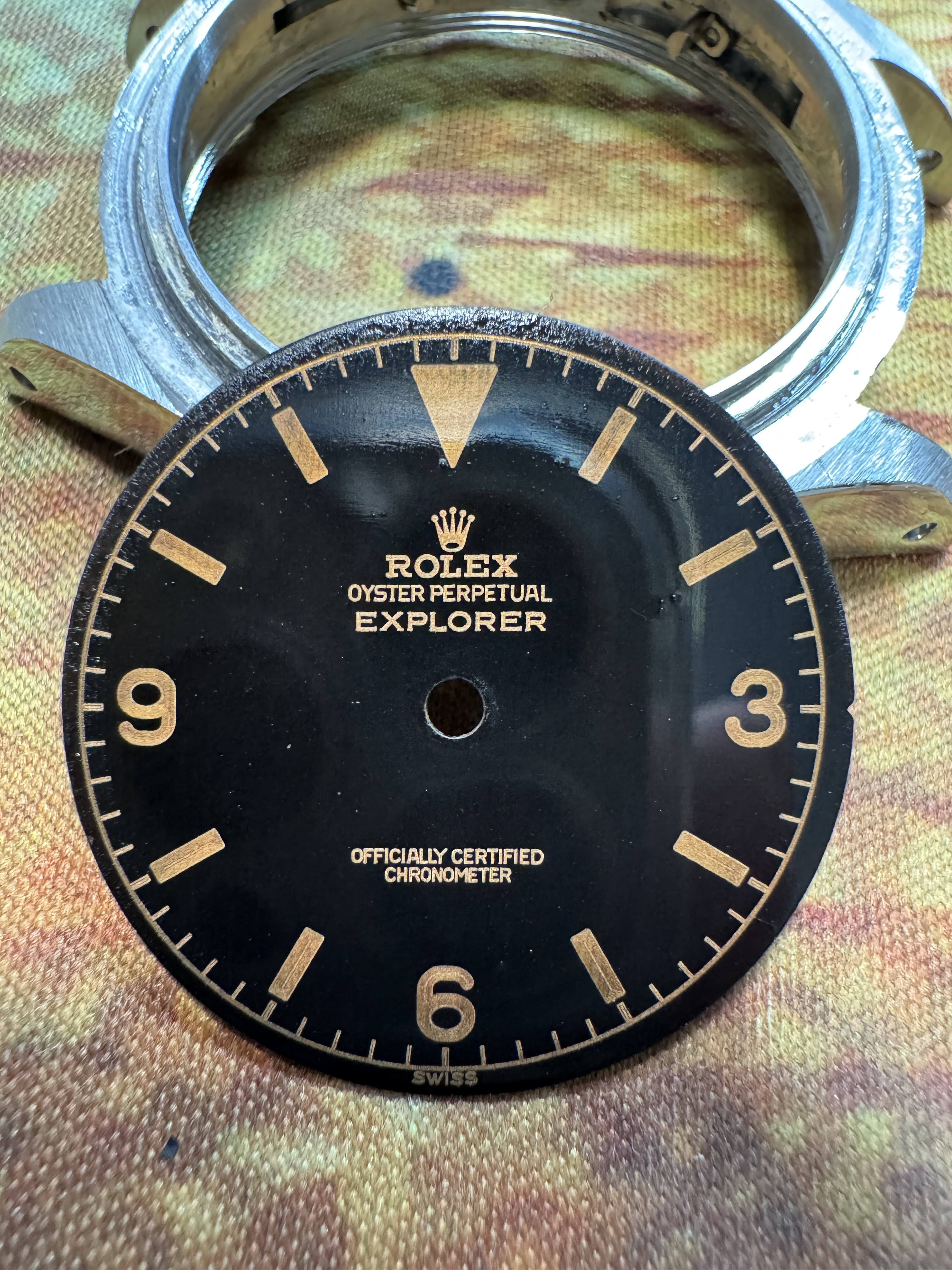
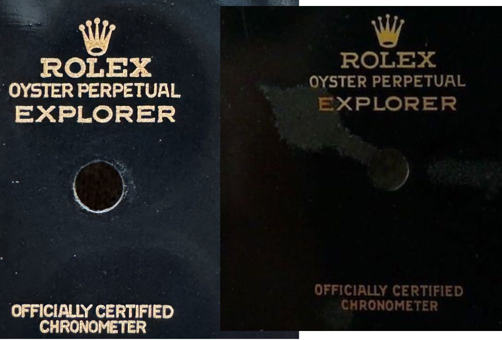
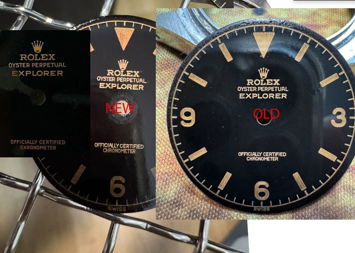
But obviously that wasn't enough... still too fat. (Authentic dial on the right.) Don't mind the spacing between the letters—that is easily adjusted, but before that, I want to get the thickness right:

Further Thinning
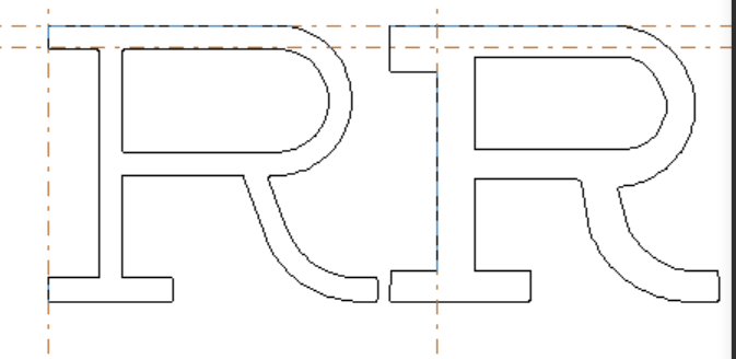
So I decided to have the illustrator make the entire dial vector thinner. The chapter ring with minute indicators, the 5-minute indicators—all thinner. And the chapter ring the thinnest possible, as we could still widen it to desired spec in the laser software. Also, the numbers made more thin.
Latest Results and Observations
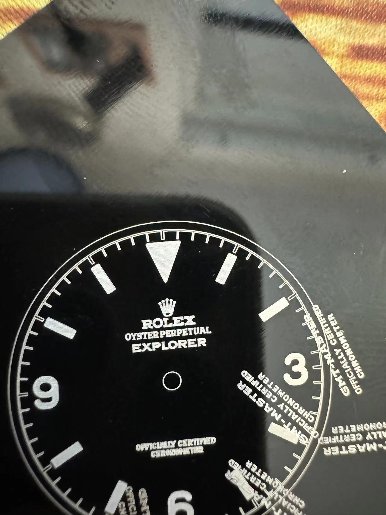
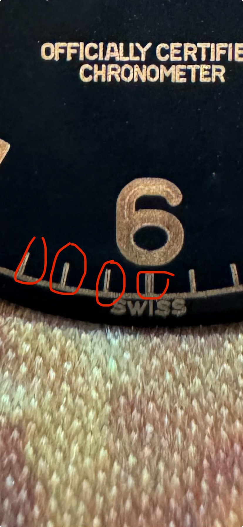
The result:

This is the point where we noticed the bleeding issue. The bottom on the "new" dial looks amazing! (Besides spacing.) And is probably the limit of how thin we can get the text to be. Compare the size to the chapter ring and minute indicator lines—that's the thinnest we can probably get, but also looks very, very close to the real deal in my opinion. The "OFFICIALLY..." text looks great too, just need to sort spacing.
The numbers and 5-minute indicators are thinned out compared to the previous version. You can tell the 6 looks different and the 10-minute indicators are further separated from the chapter ring, as they're thinner.
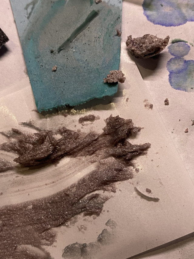
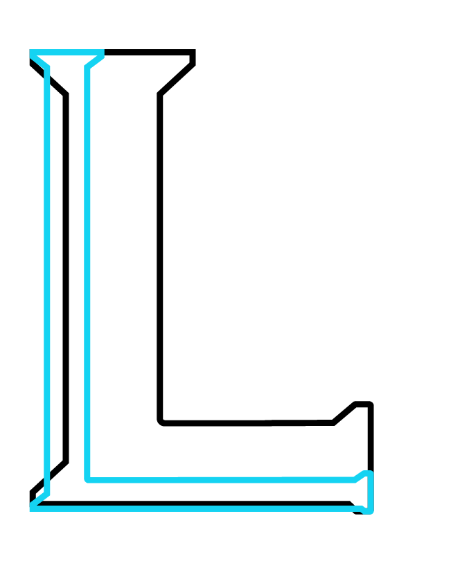
But even though we thinned out the "ROLEX," "EXPLORER" text, and crown, it looks more fat than the version before these alterations! Turns out the way you apply the black coating influences the engraving outcome a lot. Too thick of a layer and you get the bleeding effect, resulting in non-crisp and more fuzzy detailing, as seen in the "ROLEX" and "EXPLORER" text as well as the crown.
To make things a little more easy, I hired the illustrator again to thin out "ROLEX," "EXPLORER," crown... basically everything on the dial. We're now making some base plates attempting to evenly apply the black coating, and see which one gives the best result.
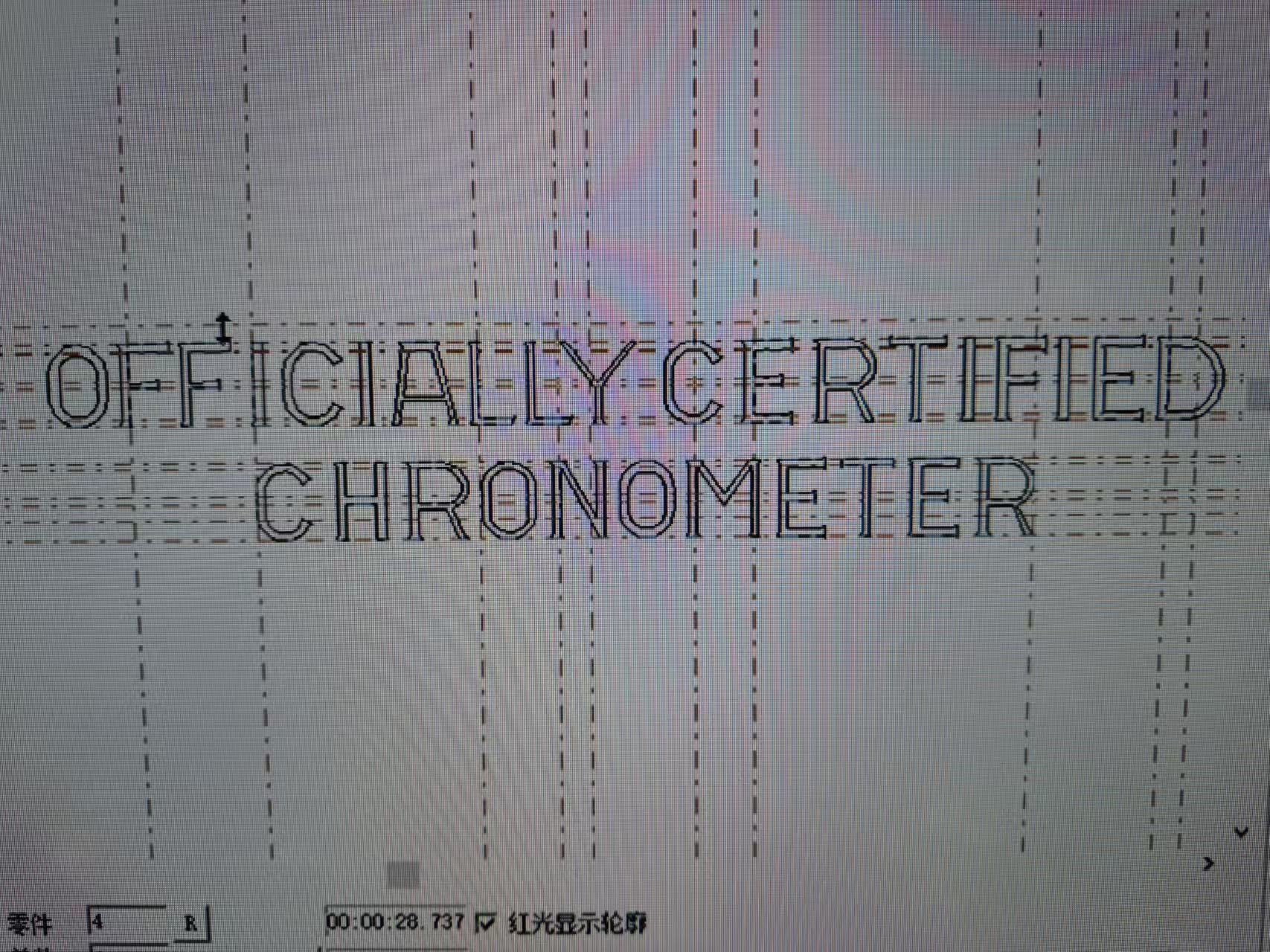
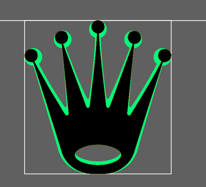
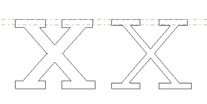
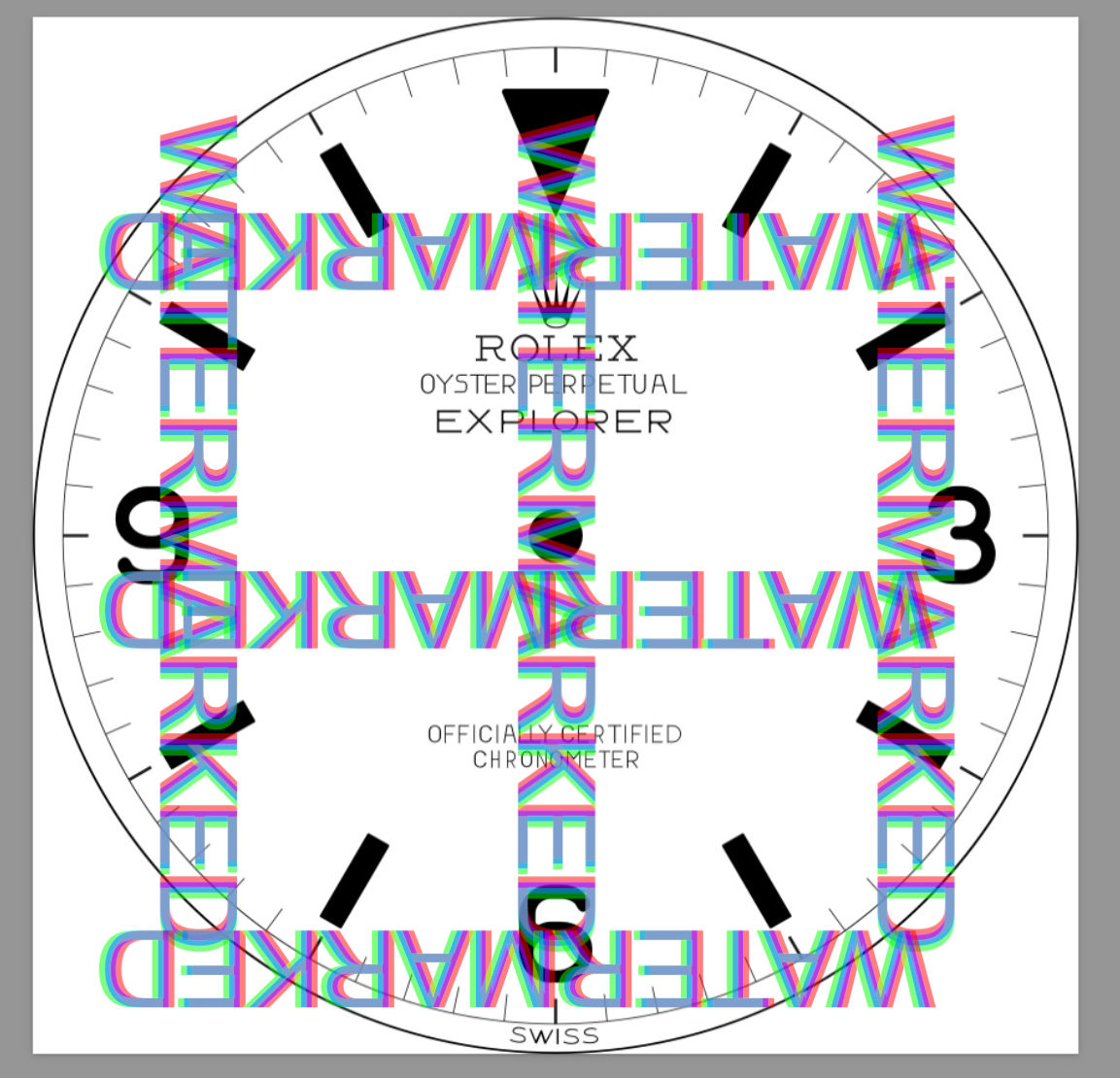
I don't have a dial to show yet, with the latest adjustments. But the vector now looks like this:

As you can tell, it's much thinner than what an actual dial looks like. But that's to compensate for laser dot thickness... It does require further adjusting in the laser software, but this needs to happen adjustment per adjustment, with a test dial engraved between adjustments. As you don't know what the outcome will look like unless you've engraved it. You can imagine how many brass dials have been used in this project and the amount of coating, varnish....
Conclusion
We're getting there! At this point I'm so invested, both financially and in time, with over 7 months of research and development (I'm not kidding), I do want to get it the closest to perfect that we can obtain.
With the current V4 vector, which is thinned everywhere, we should be able to obtain a good result.
Keep you posted!

