-
Tired of adverts on RWI? - Subscribe by clicking HERE and PMing Trailboss for instructions and they will magically go away!
You are using an out of date browser. It may not display this or other websites correctly.
You should upgrade or use an alternative browser.
You should upgrade or use an alternative browser.
[BUILD LOG] Rolex 6610 big white lollipop - 1957
- Thread starter Erect
- Start date
Thank you for the kind words!@Erect Truly amazing content, these are the projects that keep me in the forum!
Wow! I really enjoy your journey and like your result. I wouldn't have your patience. It reminds me of the time when I created my dials. The method is different, but the problems are the same. During the progress, I also had to change the thickness of typo and lines to improve the result. But my result is not as good as yours now.
Compared to a 1680 Submarine, the 6610 has a very small font. That makes it more difficult. Especially the spacing and that there is no font you can use at Illustrator software.
I can't answer your question, I don't know the ref 1016. But maybe give you a hint (you already know). Checked the spacing, typo and line thickness by putting a gen dial image as a layer under the new vetor grafic with a alpha effect. So you can see if the result of everything is correct. In my opinion the best way to fix the right spacing and correct the letters. Here how it lookes at my files during the progress.

And the other problem is that there a different versions of each dial. Sometimes with different font type. For the 1016 there is a very good page that catalogues every dial type. So you can copy exact what you prefer. I don't know if this exists for the 1016. So if you have a good picture of your gen dial put it as a image over your result to compare them.
I look forward to further updates.
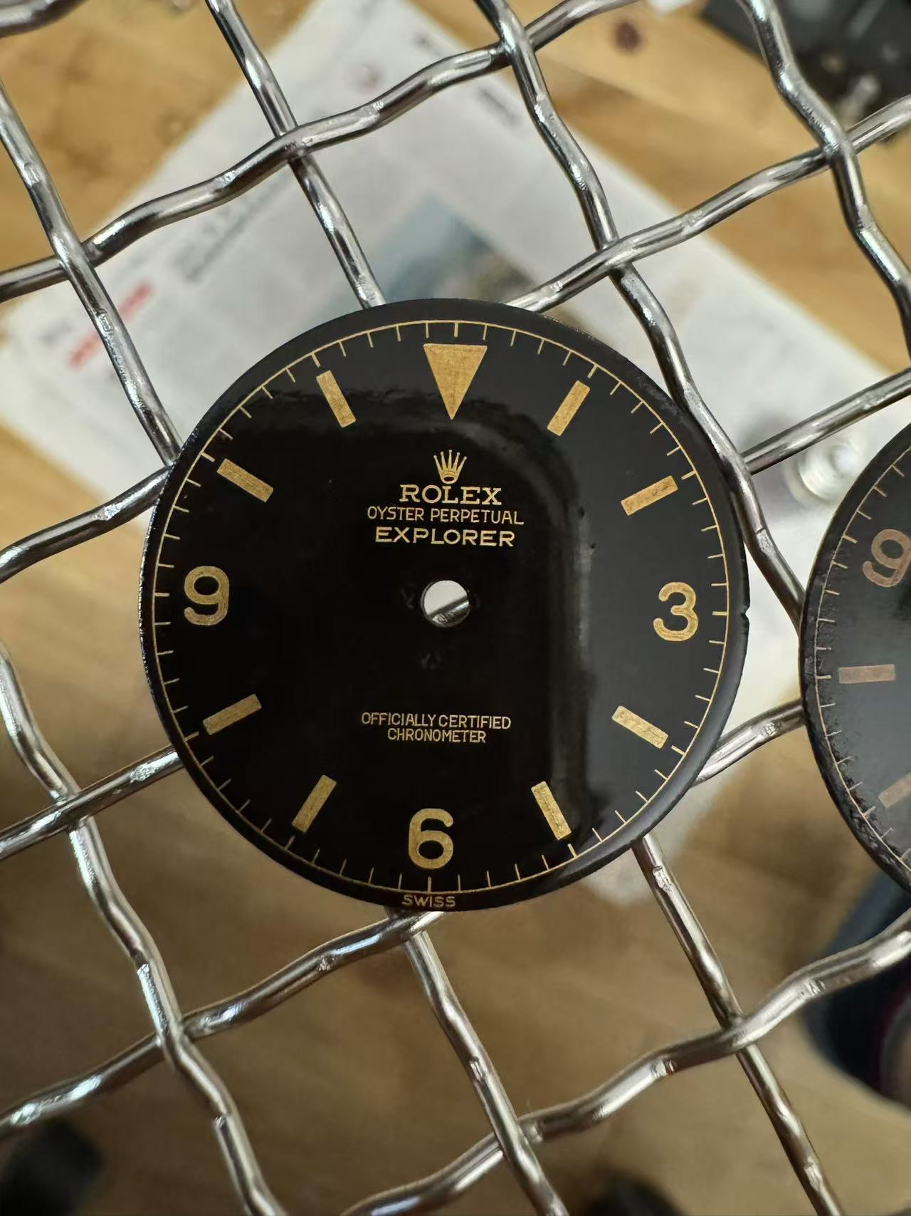
- Do you agree that the chapter ring and the numbers, as well as minute indicators and "Swiss" look the appropriate size in the "NEW" dial?
- Whats your opinion on the OFFICIAL.... text size? Do you agree that it looks very close to genuine, except the spacing between letters? (so merely the size, is what im gauging at currently).
Compared to a 1680 Submarine, the 6610 has a very small font. That makes it more difficult. Especially the spacing and that there is no font you can use at Illustrator software.
I can't answer your question, I don't know the ref 1016. But maybe give you a hint (you already know). Checked the spacing, typo and line thickness by putting a gen dial image as a layer under the new vetor grafic with a alpha effect. So you can see if the result of everything is correct. In my opinion the best way to fix the right spacing and correct the letters. Here how it lookes at my files during the progress.

And the other problem is that there a different versions of each dial. Sometimes with different font type. For the 1016 there is a very good page that catalogues every dial type. So you can copy exact what you prefer. I don't know if this exists for the 1016. So if you have a good picture of your gen dial put it as a image over your result to compare them.
I look forward to further updates.
Thanks for your reply. Yes the 6610/1016 is a pain compared to GMT/1680… 1675 dial for example is not a problem with this laser.Wow! I really enjoy your journey and like your result. I wouldn't have your patience. It reminds me of the time when I created my dials. The method is different, but the problems are the same. During the progress, I also had to change the thickness of typo and lines to improve the result. But my result is not as good as yours now.
Compared to a 1680 Submarine, the 6610 has a very small font. That makes it more difficult. Especially the spacing and that there is no font you can use at Illustrator software.
I can't answer your question, I don't know the ref 1016. But maybe give you a hint (you already know). Checked the spacing, typo and line thickness by putting a gen dial image as a layer under the new vetor grafic with a alpha effect. So you can see if the result of everything is correct. In my opinion the best way to fix the right spacing and correct the letters. Here how it lookes at my files during the progress.

And the other problem is that there a different versions of each dial. Sometimes with different font type. For the 1016 there is a very good page that catalogues every dial type. So you can copy exact what you prefer. I don't know if this exists for the 1016. So if you have a good picture of your gen dial put it as a image over your result to compare them.
I look forward to further updates.
(This watch is a 6610 reference, a bit different than 1016)
Yes good call about the transparent. I did that before when creating the initial vector. Spacing is a thing we still need to fix but its more easy to do. First I want to focus on size, which is the real issue… Im afraid we cant get the size smaller than what it currently is on the OFFICIAL… text. Maybe a little bit more “crisp” but not much smaller. Although it does seem to get very close to correct sizing.
I will make a genuine 6610 transparent and compare tomorrow
Last edited:
Stunning, crisp, deep… you have “erected” a masterpiece
This result certainly causes some.... erectment on my part. I will definitely try to get multiple.Stunning, crisp, deep… you have “erected” a masterpiecePlease consider making any “leftover” dials available to us common folk (starting with me, of course
)
Man, I am excited for you (and also a little jealous)! Excellent work!!! Did you do any more 1675 dials you'd care to share pictures of too?
I'm quite busy and sick right now, but yes we spoke about it before.I’m sure I have asked this before but how do you prepare the brass base plate again? Do you polish? Plate with gold?
Brass plate is polished, galvanic coated, then black converter applied. Then laser engraved, polished and varnished.
No gold plating has been used. In order to "lay in the gold" I'd need a perfect stamping setup. Another option would be to plate the entire brass dial thick enough so that when you engrave, a little bit of gold remains. But I honestly don't see the need to attempt this. The brass shines beautifully.
It's very likely that the next dial which I want to perfect, or erect, will be the 1675. As my Chinese friend is very much into 1675's and wants a perfect dial design. For which he would like my contribution.Man, I am excited for you (and also a little jealous)! Excellent work!!! Did you do any more 1675 dials you'd care to share pictures of too?
I'm unsure if I will be actually getting a build in though. As I'm out of funds... the 6610 build has depleted my budget for the next years to come.
Last edited:
Little bracelet sneak peak as all the parts have arrived.

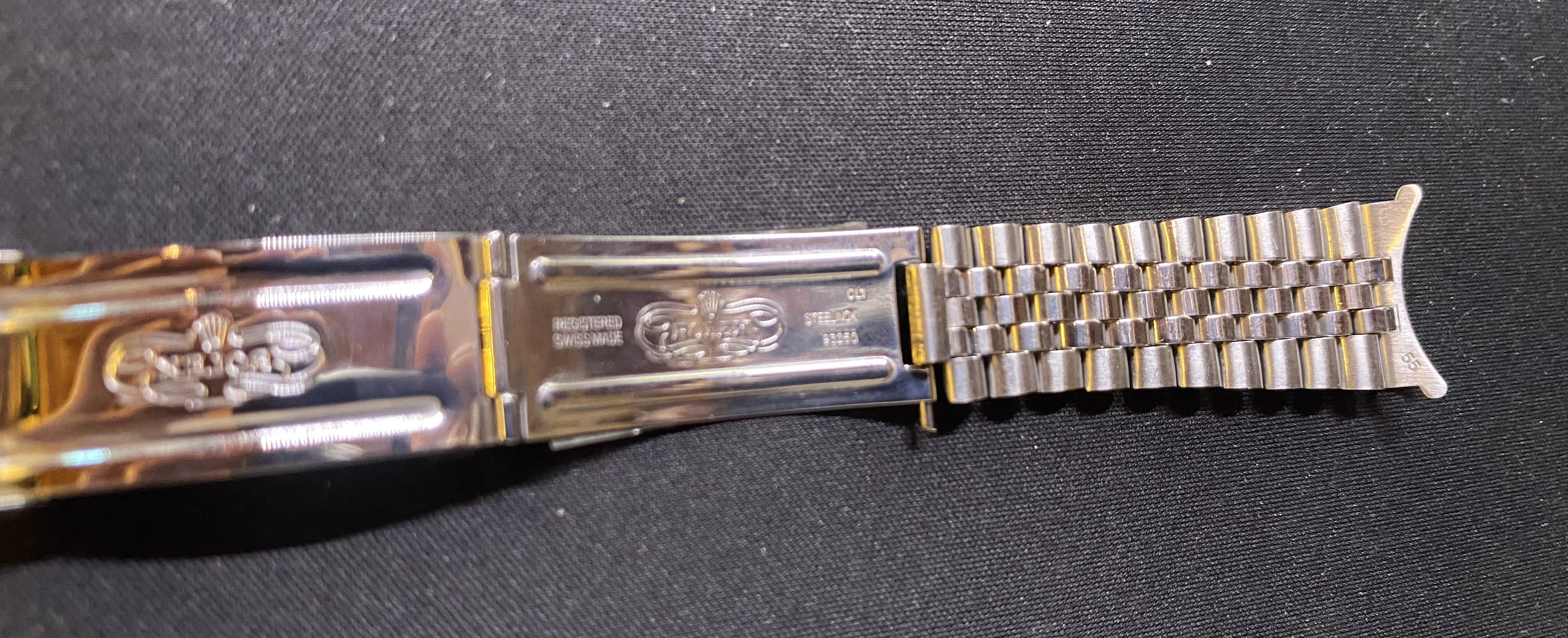
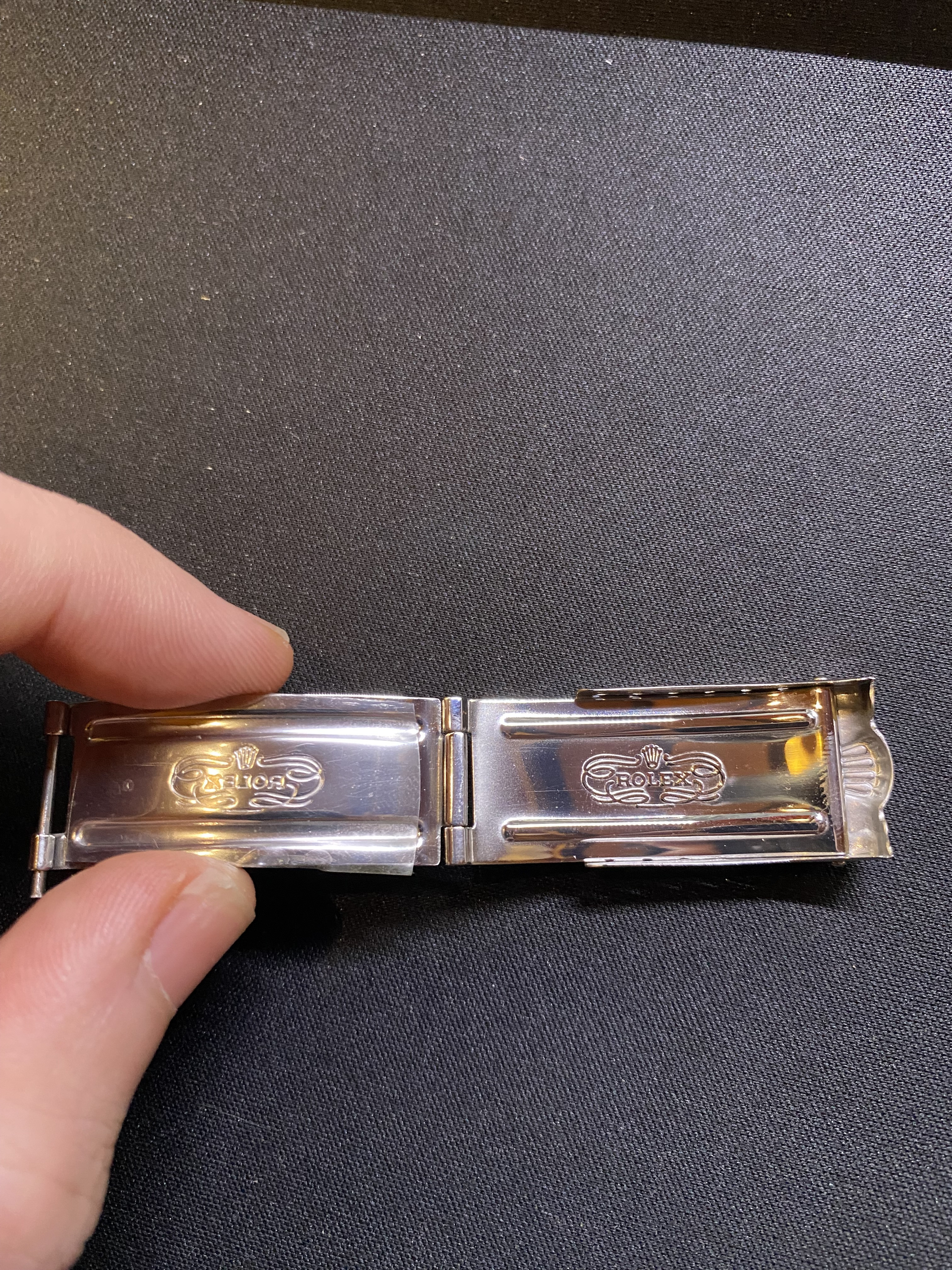
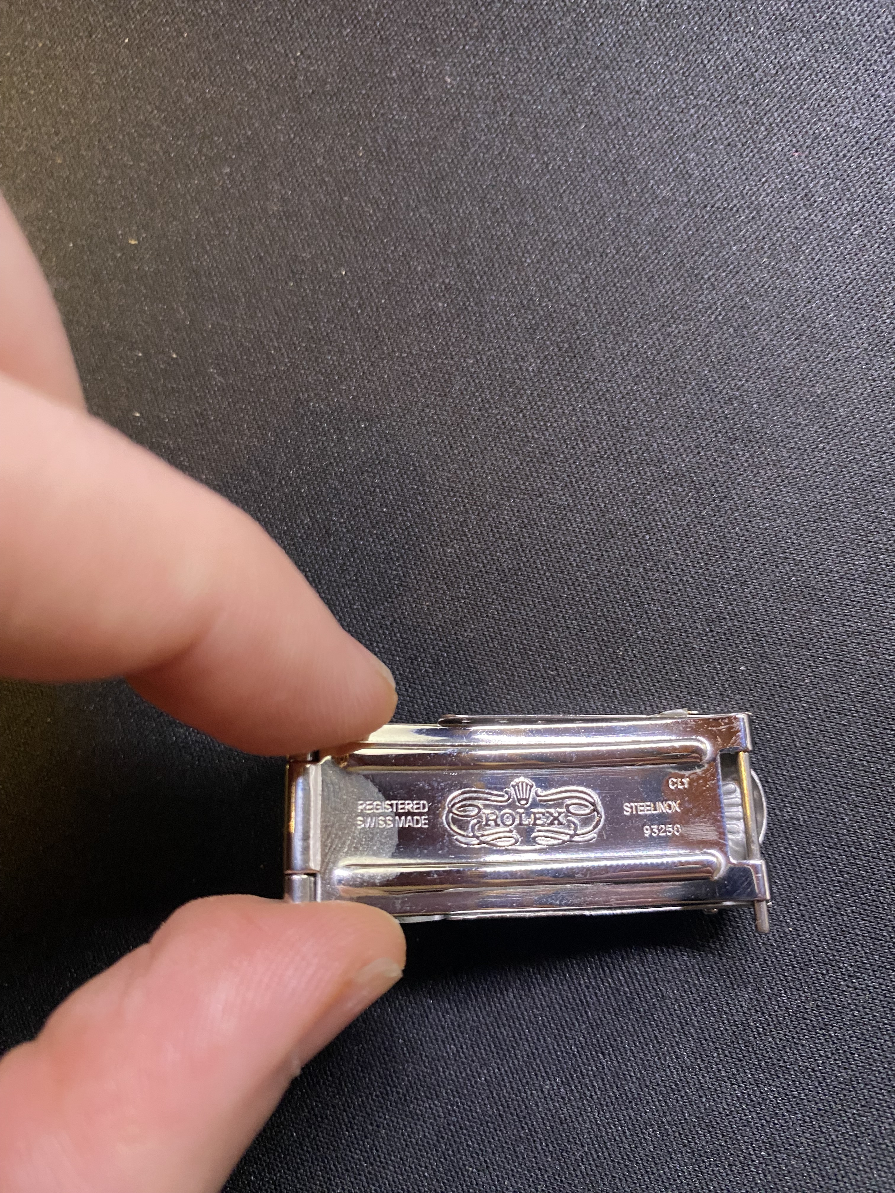
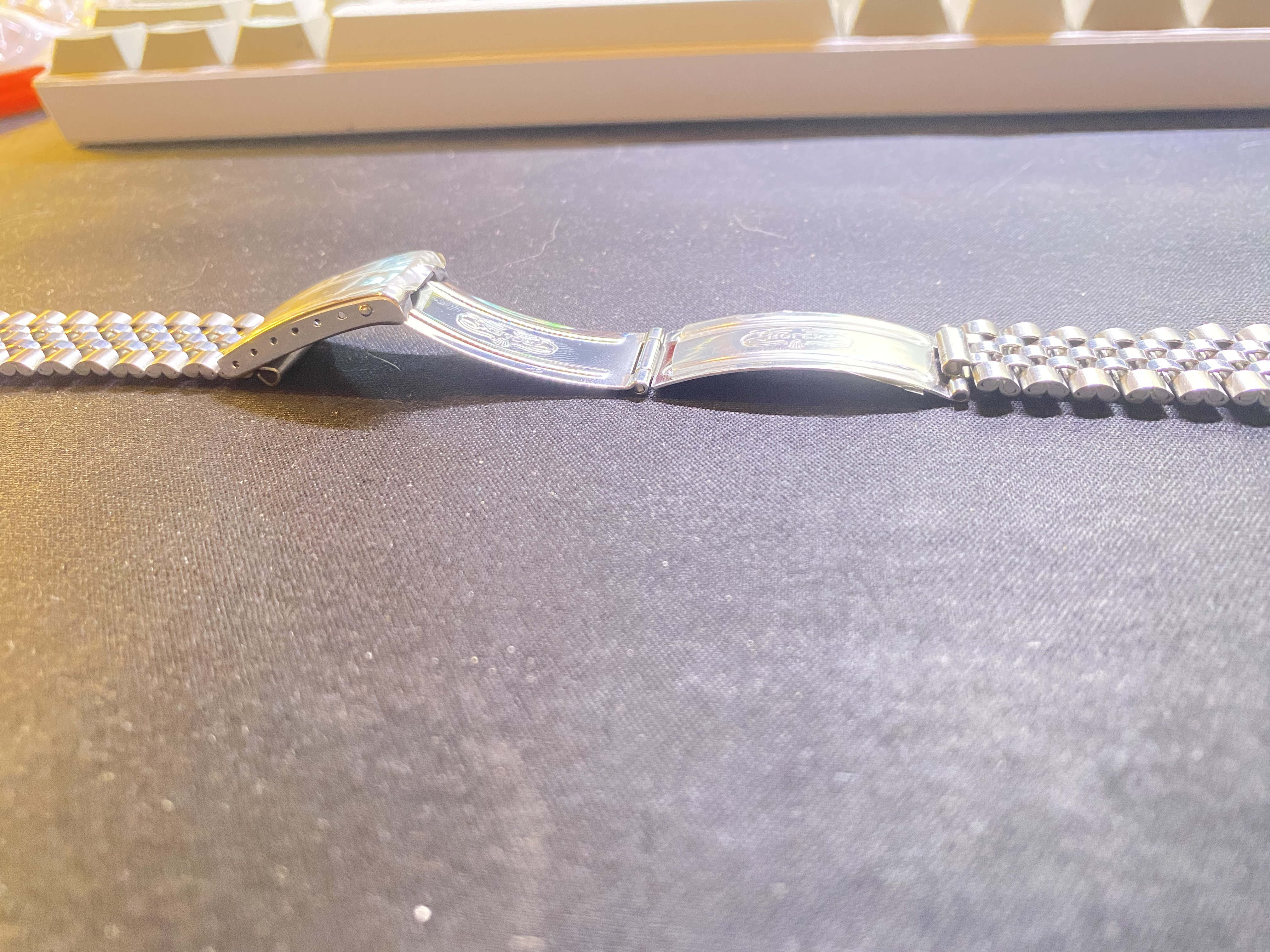
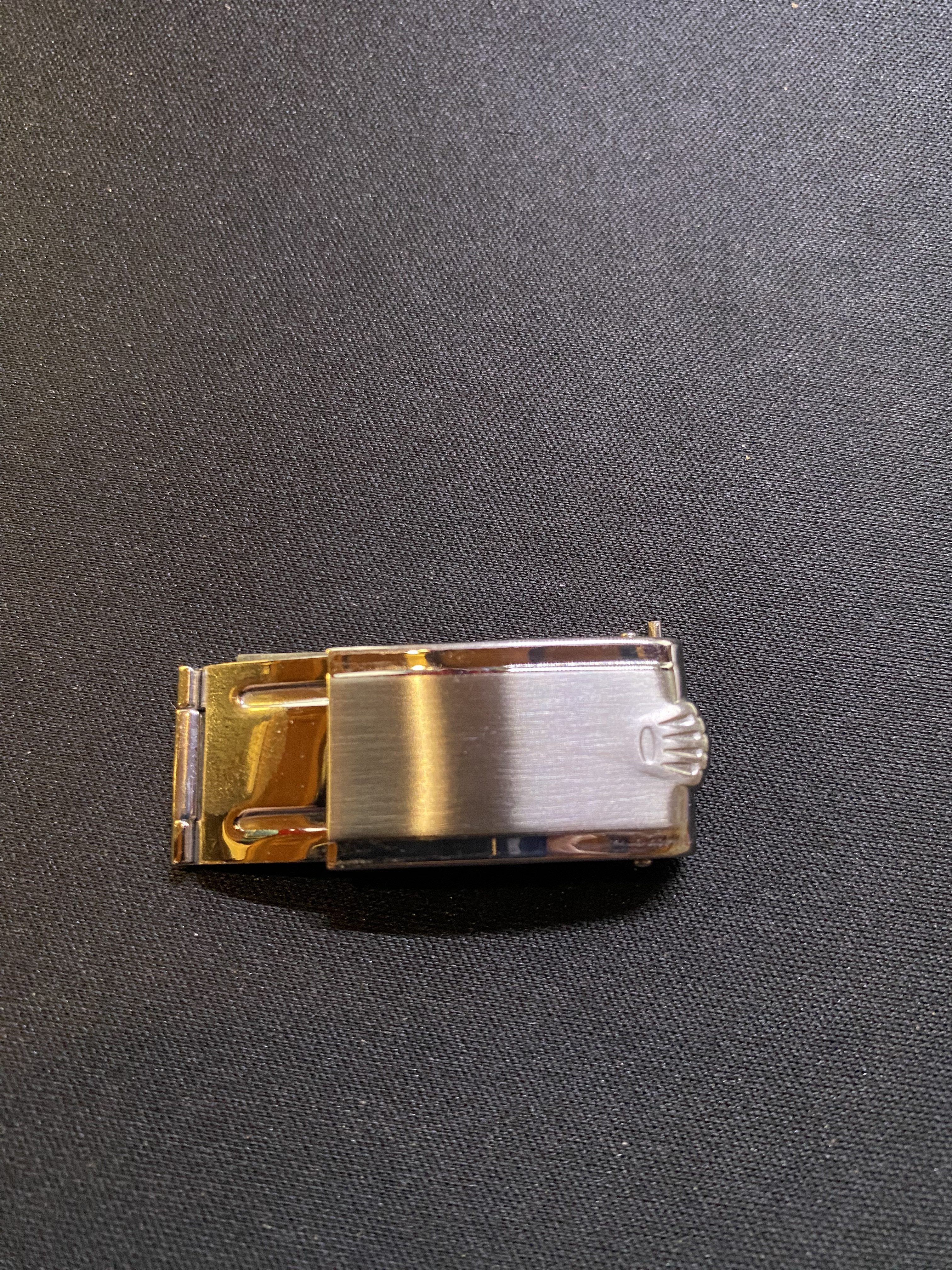
I personally think it's beautiful, the buckle needs some pad sanding to make it worn and uniform.
EDIT: I'm aware it's not the correct clasp, but I can't find a 6251H clasp for a reasonable price anywhere.
Maybe the clasp broke some time, and the previous owner took it to a store and all they had was the 93250. Let's not forget its supposed to be from 1957 with an after market bracelet from the '60s (after some patina magic by Kilo)
Last edited:

