Thanks tranzmizzion for all the great post in this thread!
ALE: what You have to remember is that the base of my conclusions was my H-fac V1 vs. Kuvarsit photos.
I did this Kuvarsit vs. Noob later since I did not have the H-fac with me anymore when I get my Noobs.
But remember that the H-fac I had was a V1.
What tranzmizzion have is the V1.2.
The V1.2 got the new thinner numbers and a much lighter grey case color then the H-fac V1!
So tranzmizzion is right, the case is much lighter then both the Noob and H-fac V1.
But if I remember member projectologist (who own a gen 360) correctly he said that the H-fac V1 had the closest to gen lume color and numeral shape. But the case was a bit to dark. Also the V1 had shiny CG pin witch is incorrect.
I can be wrong but I think he also said that the V1.2 case color was to light?
I think what we want is something in between the H-fac V1.2 and Noob in color. But without a gen to compare to none of us can be sure.
All versions have their flaws and there is no way of combining them to make it 1:1 perfect. But I'm in the process of trying as I type this.
I have four 360 in front of me in pieces.. Will try to snap some pics of the dials and post later.
I agree. I feel the v1 and the noob are clearly too dark imo, I don't know about the kurvastis, the v2 while a shade too light, conveys, from my study, the "spirit" of the "pencil lead" dlc the best currently....
I think what we want is something in between the H-fac V1.2 and Noob in color. But without a gen to compare to none of us can be sure.
I thinks 1 shade up from hfac would be best. noob may be a couple shades a bit dark, though better than the hfac v1....
From my studies, I can make the hfac look like almost all the gen pics I found on the internet, especially that youtube, it's almost dead on there. I can also with lighting make it look dark like some of the gens,
What I can't do, is make the Noob look anything like that video. That's where I am at with this.
the youtube, whiskey picture and the watchuwant sale add, all have a very hfac looking case IMO....
All of the "darker" 360 pics that are closer to noob, seem "artistic", and ran through filters for effect if that makes sense.
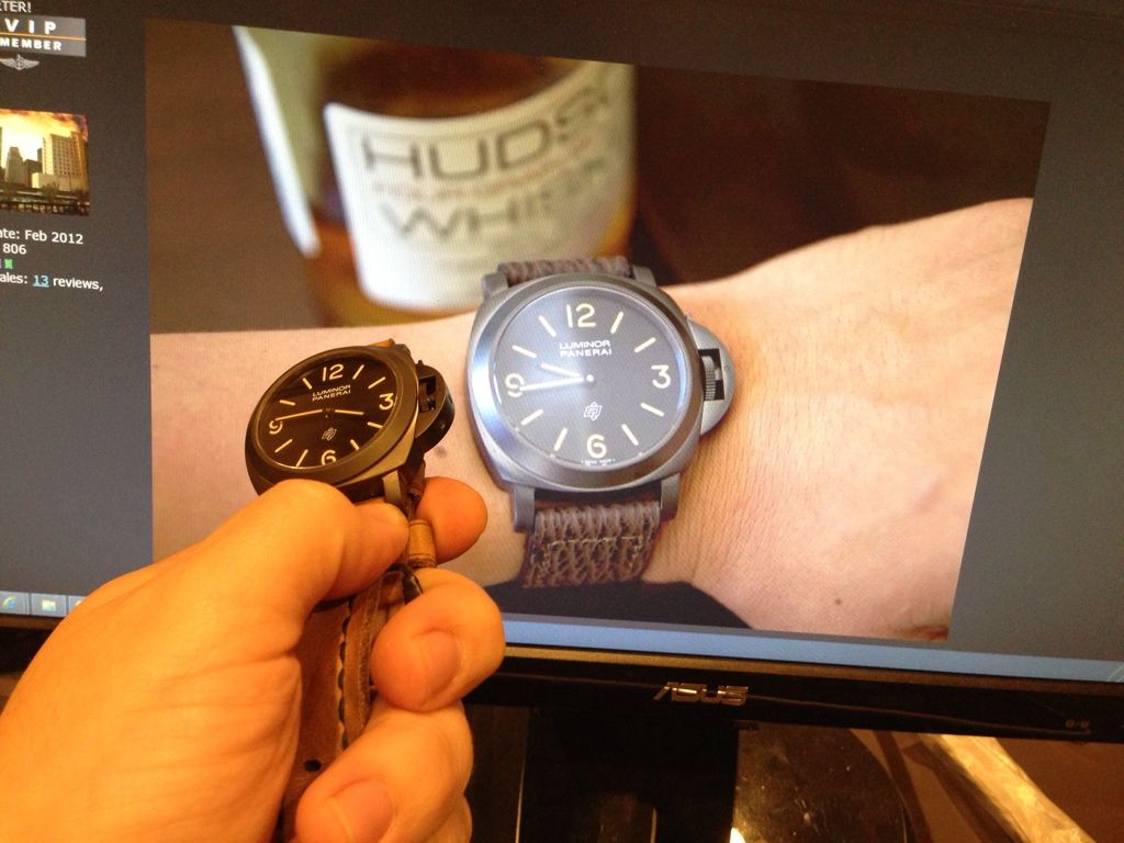
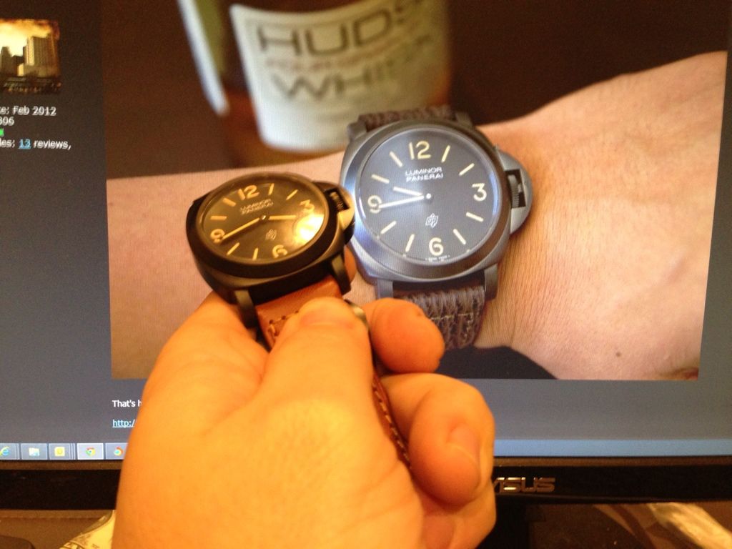
Here is another gen wrist shot I found
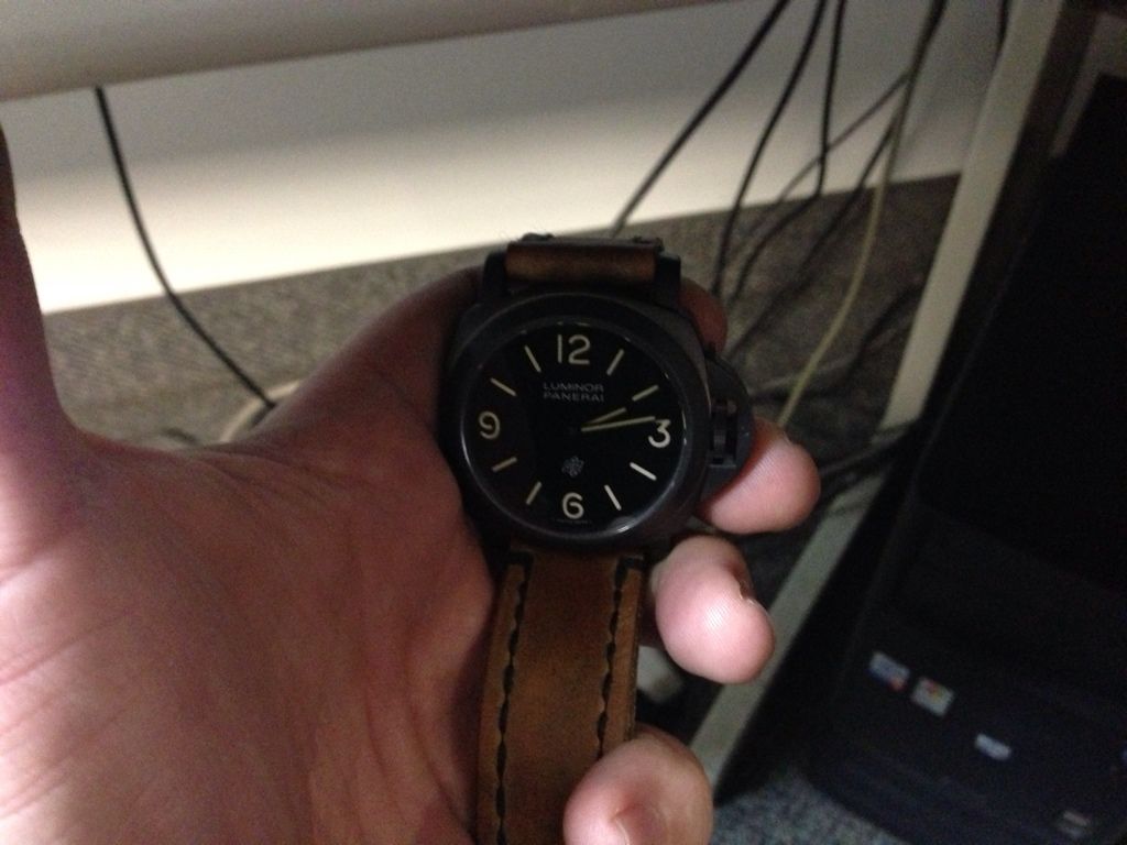
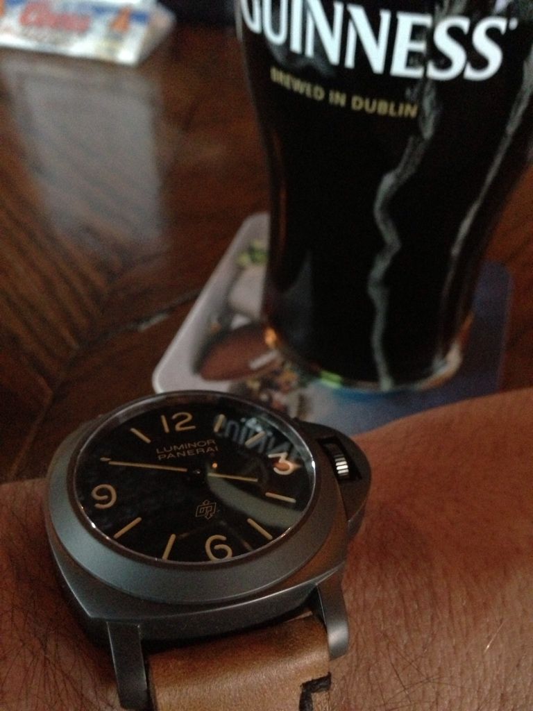
Here and quick iphone snap comparison:
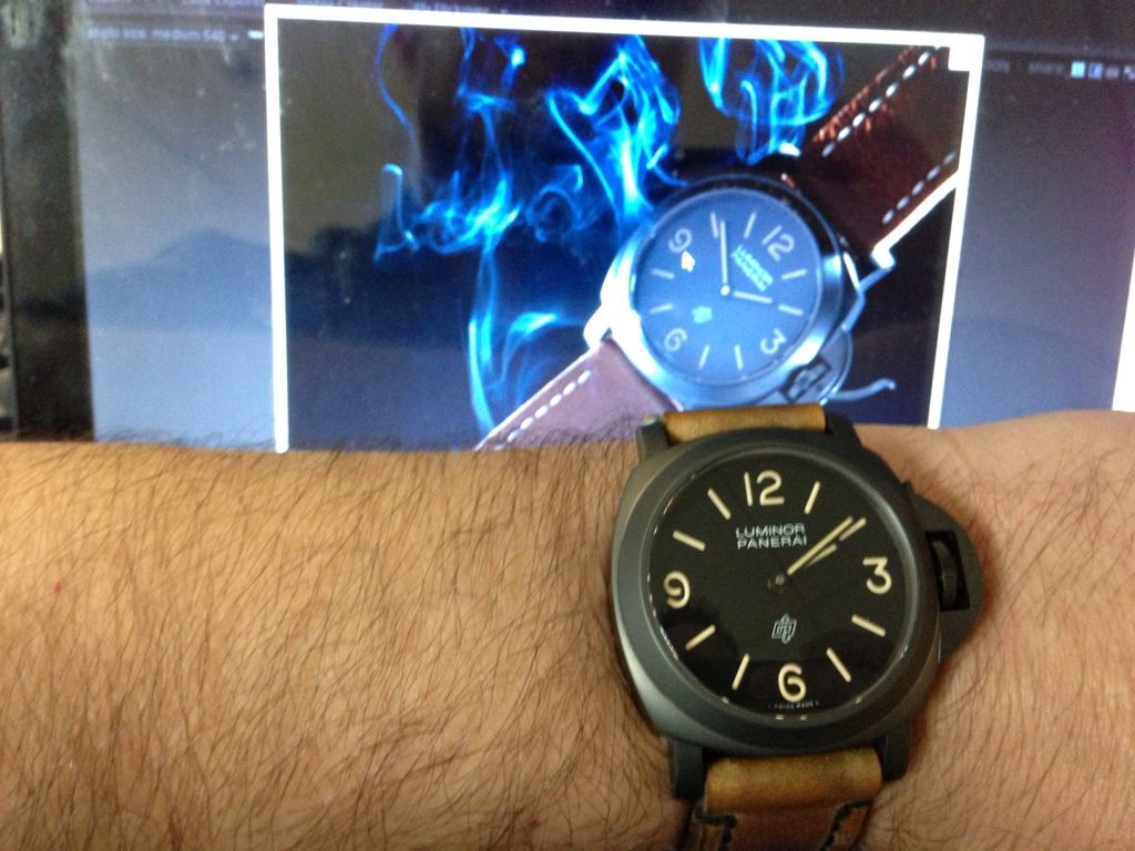
and here is an example of artistic lighting showing a "dark" 360:
and comparison shot:
One thing you will notice is how dark that 360 looks in the origional photo, note how dark the lume is as well....
You also notice hen comparing to the hfac v2 in the second photo it's not that far off considering.
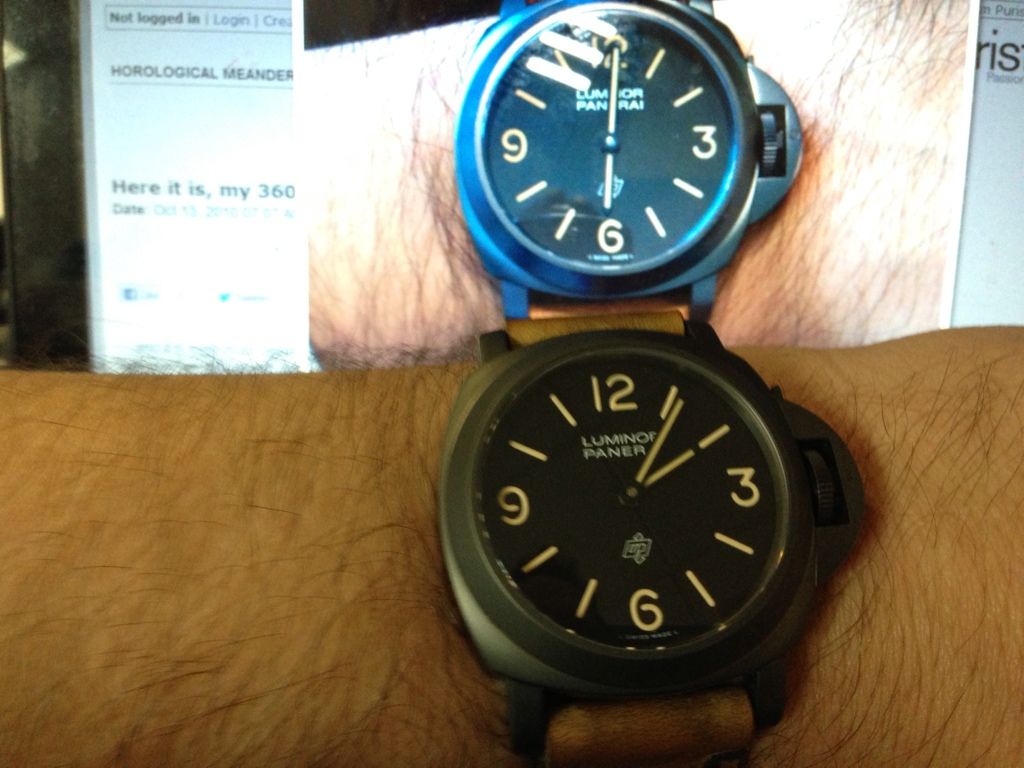
Here is another view. My hfac shadowed by the desk,,, note the color and the lume color, and compare to the smokey picture.


