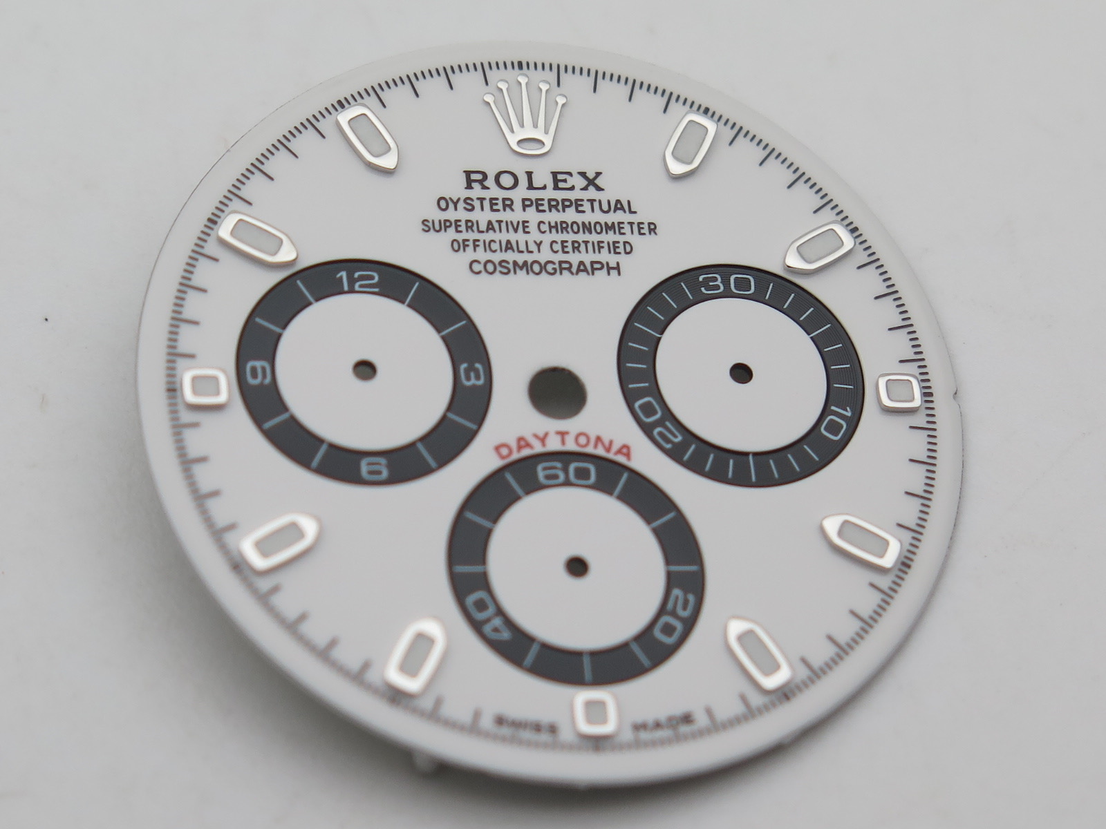
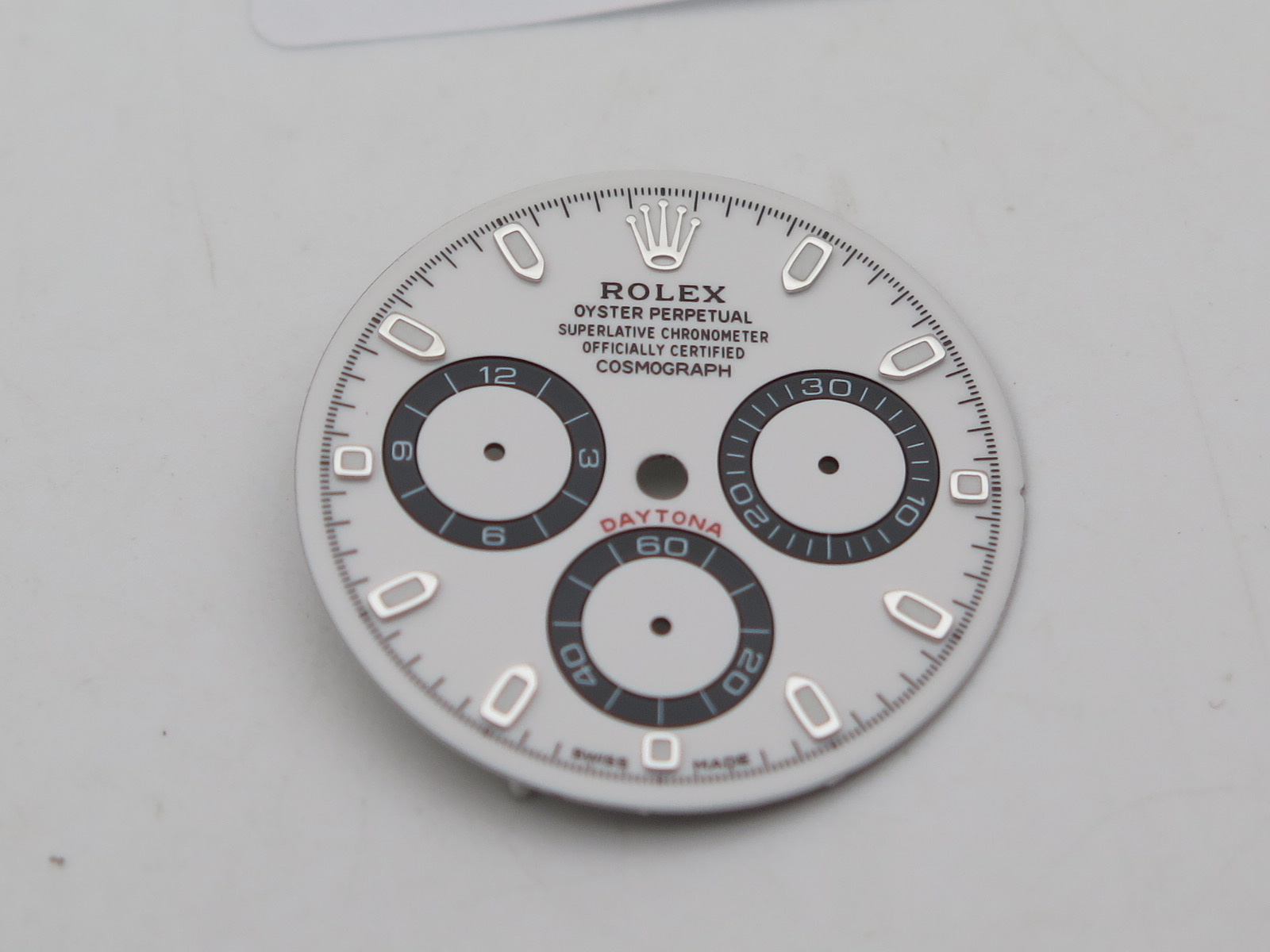
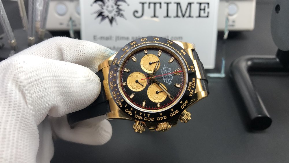
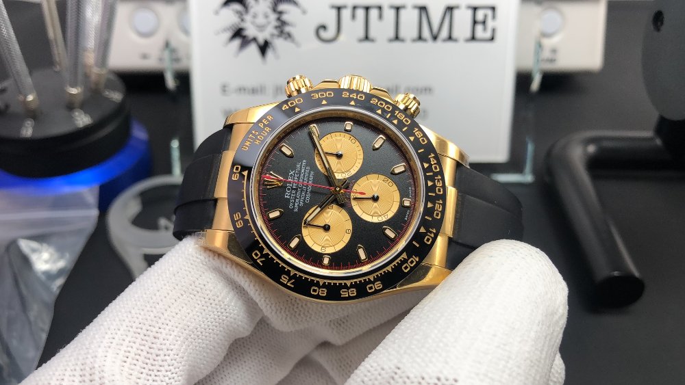
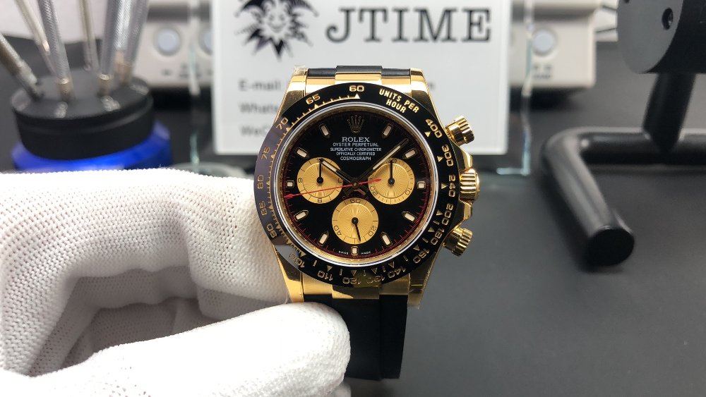
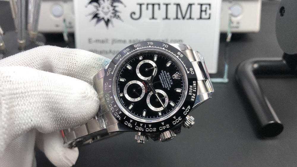
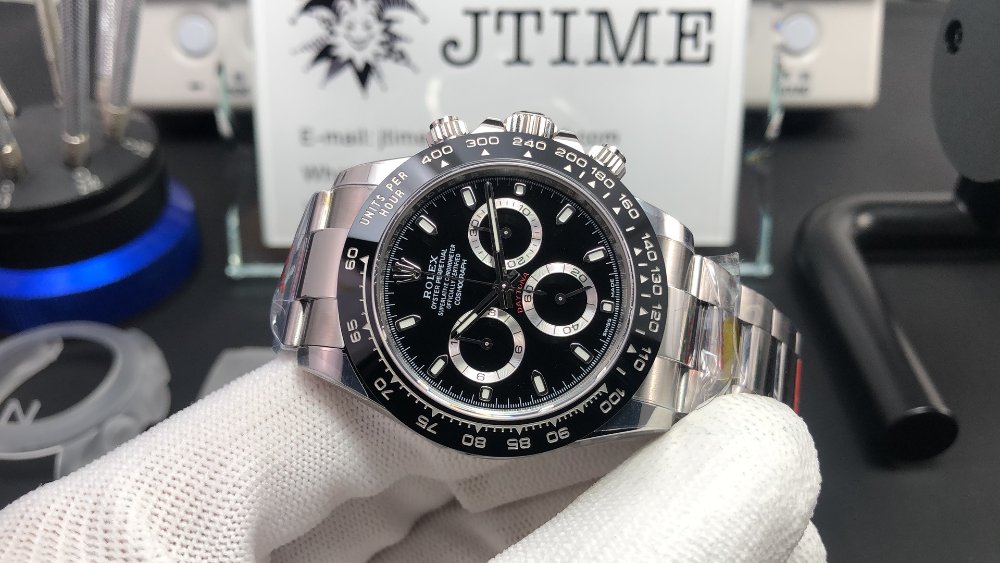
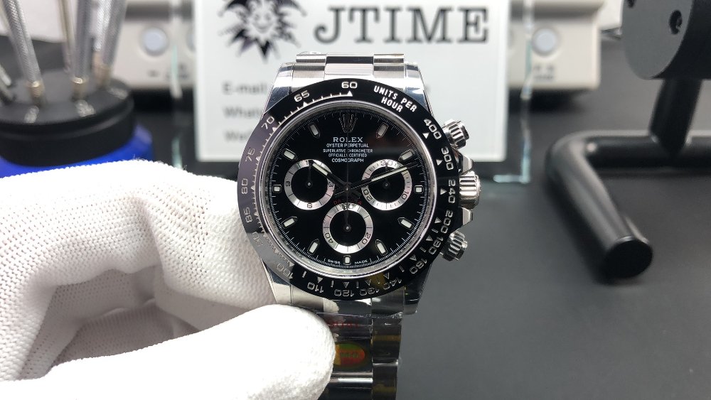
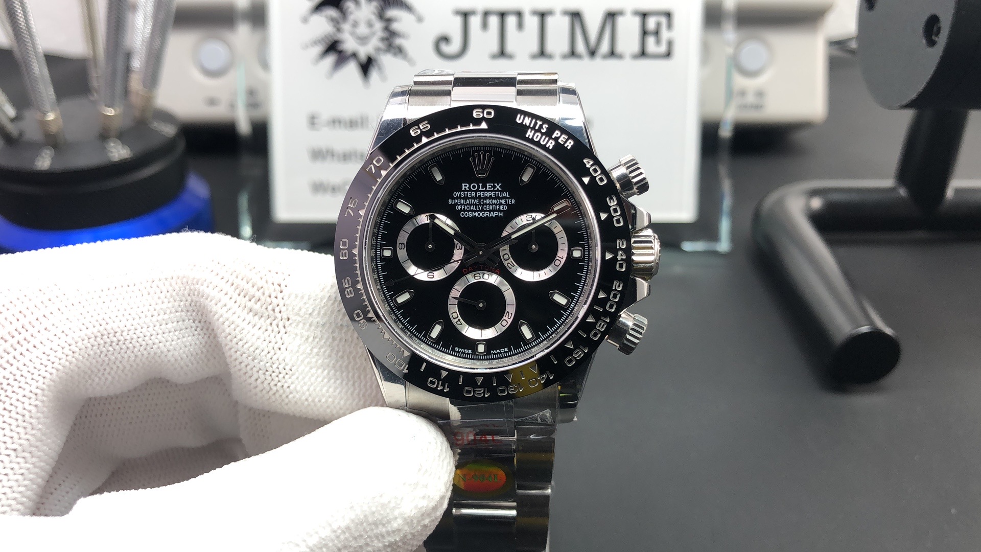
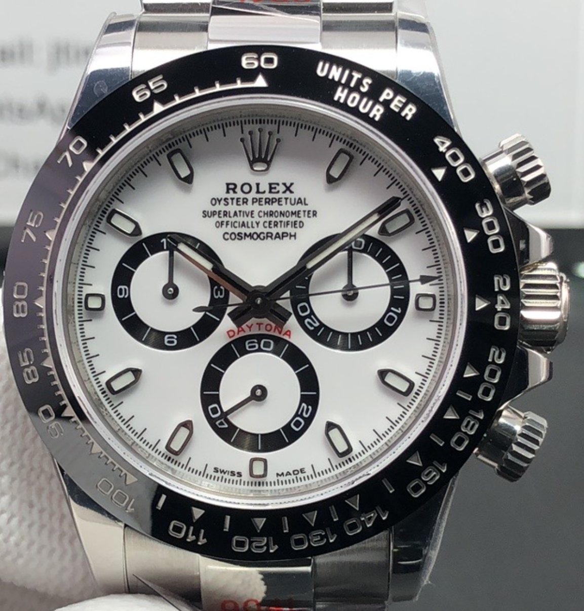
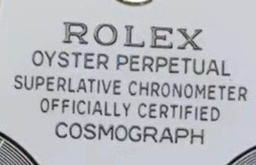
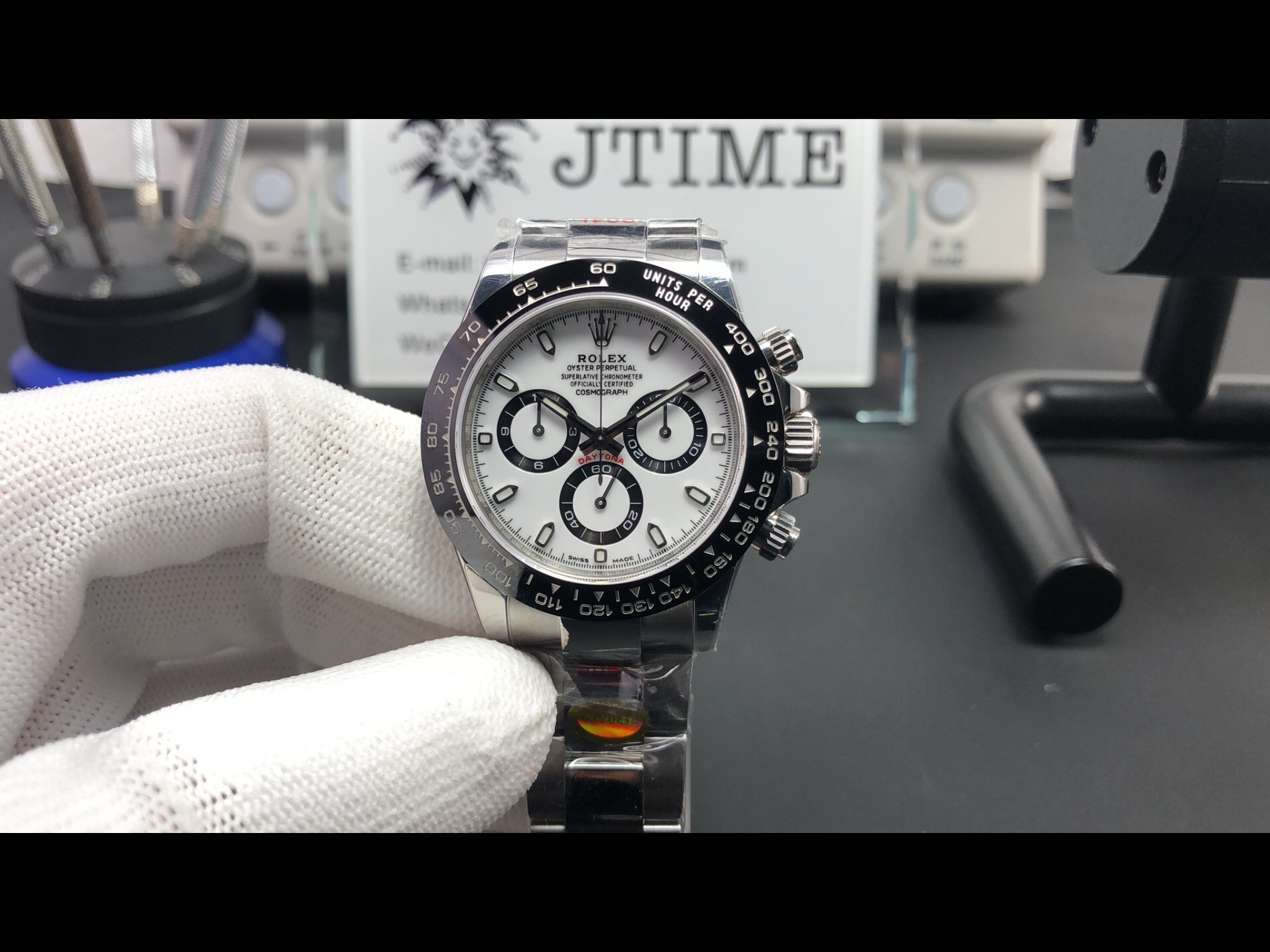
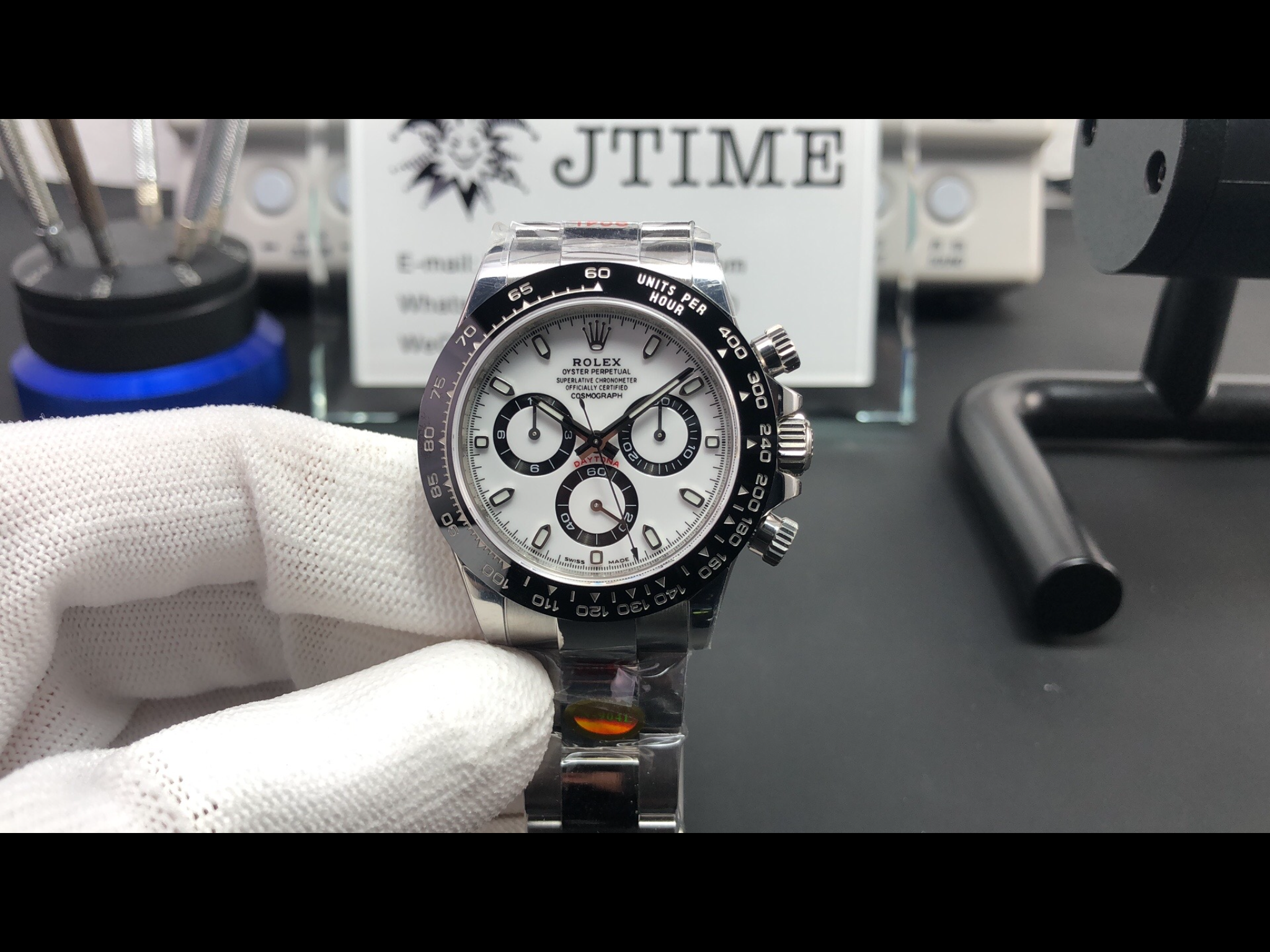
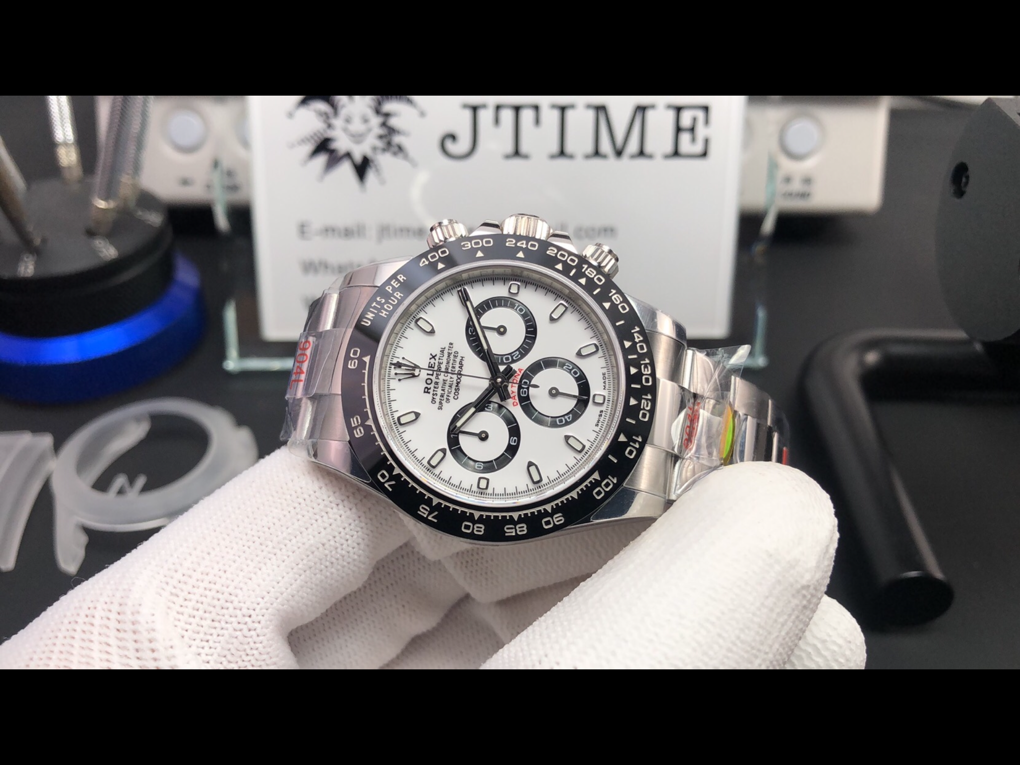
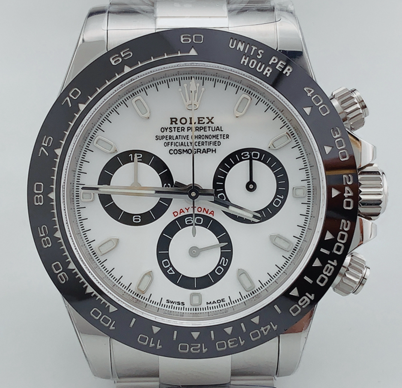
Subdials are slightly to thin, subdial numbers are not placed correctly towards the bottom. And the red Daytona text is to high on the dial (but so is noob) ARF did do a dial with perfect proportions some months ago, but then the took a step back. Both dials where labeled as v.2
noob v.2.2 and v.4 has perfect sized subdials and the subdial numbers are placed correctly. (But the 5 lines of text is horrible on both)
Thanks, would like your opinion on this dial, it’s a
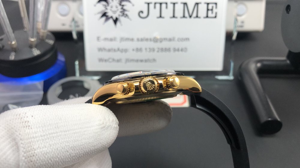
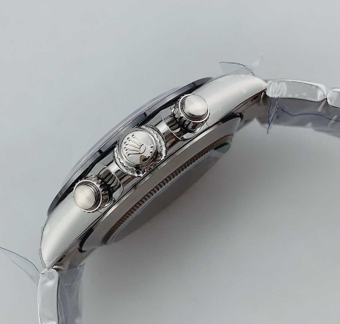
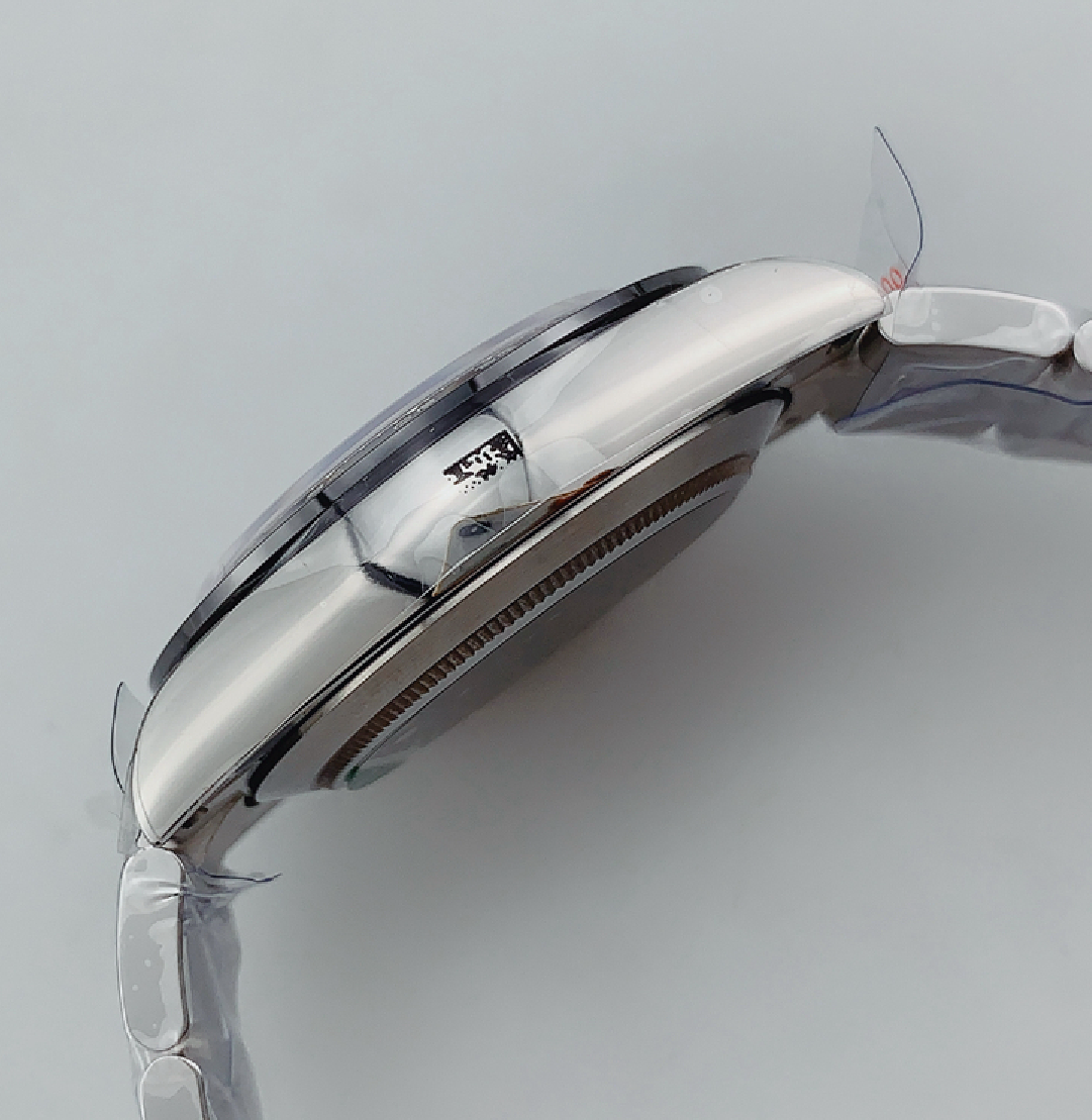
n ARF V2 I was told, but not sure if like you said it has thinner subdials. Printing is definitely better than Noob V3 or V4. Don’t have a better picture.
