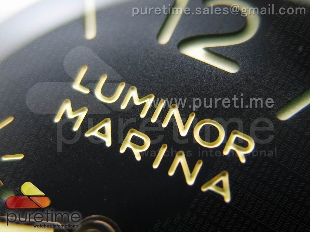
-
Tired of adverts on RWI? - Subscribe by clicking HERE and PMing Trailboss for instructions and they will magically go away!
You are using an out of date browser. It may not display this or other websites correctly.
You should upgrade or use an alternative browser.
You should upgrade or use an alternative browser.
NOOB PAM 372 Launched - [[ QC pics ALLOWED ]]
- Thread starter leandim
- Start date
Is it just me or is the color of the letters and numbers on the dial overly saturated?
They do seem that way, you are right, I am guessing it's just the camera settings?
Here are the comparo pictures:
Front

Hi Mysterio,
Is it the lighting or really the Noob's number looks greeny?
Hi Mysterio,
Is it the lighting or really the Noob's number looks greeny?
Indeed ..and look at the '3' On the Noob , the cut-out is much broader?
These dials are way different, wonder which is close to gen..?..
Hi Mysterio,
Is it the lighting or really the Noob's number looks greeny?
I noticed that too, but it could be due to the super-luminova. Super-luminova tends to glow faintly under a shadow even if it's in a brightly lit room. (notice the green only shows on the top of the numbers at around 12 where the bezel casts a shadow)
To me, the color of the numbers and hour markers on the H-factory model look more gen-like
Sharkdiver
Known Member
- 17/10/13
- 159
- 0
- 16
Hi Mysterio,
Is it the lighting or really the Noob's number looks greeny?
Lume is loade in this pic
Here QC pic with off lume
Regards

Gesendet von meinem iPad mit Tapatalk HD
Sharkdiver
Known Member
- 17/10/13
- 159
- 0
- 16
I see a 422 is now out on PT .....
Discuss


Looks really good ,better filled ,deeper engravings , imo
Good approach

Regards
Gesendet von meinem iPad mit Tapatalk HD
DreambreaX
Renowned Member
- 26/11/12
- 842
- 0
- 0
Looks really good ,better filled ,deeper engravings , imo
Good approach

Regards
Gesendet von meinem iPad mit Tapatalk HD
But look like the "PANERAI" on dial is not engraved.
MoreCowBell
Active Member
- 5/9/13
- 419
- 0
- 0
Wow, awesome pics.
Thanks Pete!
I have the H factory 372 and the case, crownguard, cg lever and lume is great but the dial engraving is way too shallow. Lume looks like its a bit too dark.
Noob cutouts are thicker than the gen IMO although dial engraving should be very good.
View attachment 32910
Thanks Pete!
I have the H factory 372 and the case, crownguard, cg lever and lume is great but the dial engraving is way too shallow. Lume looks like its a bit too dark.
Noob cutouts are thicker than the gen IMO although dial engraving should be very good.
View attachment 32910
Sharkdiver
Known Member
- 17/10/13
- 159
- 0
- 16
Wow, awesome pics.
Thanks Pete!
I have the H factory 372 and the case, crownguard, cg lever and lume is great but the dial engraving is way too shallow. Lume looks like its a bit too dark.
Noob cutouts are thicker than the gen IMO although dial engraving should be very good.
View attachment 32910
Let us also give a salute to OP of the original thread on ZG Omepam ,he is on our Board too
Good photos Omepam 1+
Regards
Gesendet von meinem iPad mit Tapatalk HD


