• Tired of adverts on RWI? - Subscribe by clicking HERE and PMing Trailboss for instructions and they will magically go away!

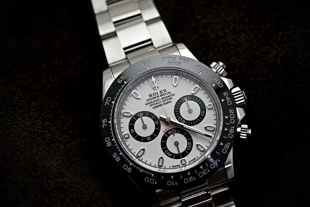
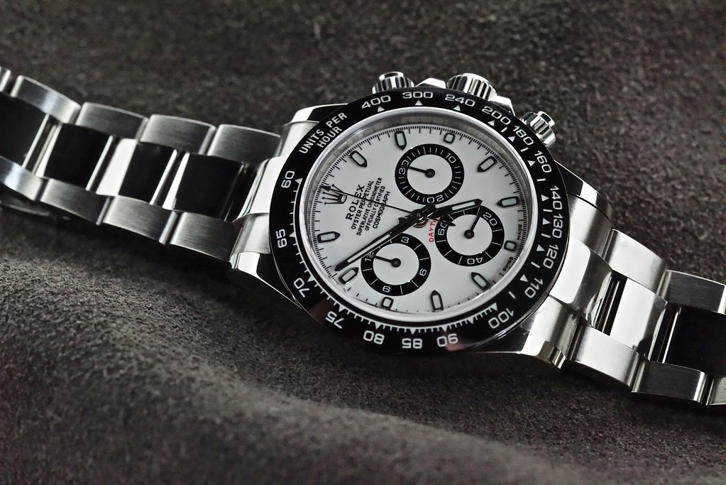
Noob Daytona 4130 arrived

vcappp

I'm Pretty Popular
20/6/18
1,000
296
83
Ok I'll bite ;)

Firstly, let me say I am a member here for 5 years, have had probably over 50 reps pass through my inventory, have a number of gens, have had built and sold many super frankens. I have massive respect for timnic54, I follow him here and on HB and have bought watches on his recommendations.

I'll also say that both the noob and the ARF are excellent watches, but neither are IMO good enough to class as super reps. I have detailed why elsewhere but I'll do it again for the sake of people who don't want to read the whole thread.

The noob movement is a work of art. The pushers are good, the case is decent, the sels are good enough but the dial and bezel on the 116500 fall short of the quality required for a super rep and the bezel and especially the dial on the noob 116520 are miles off.

I'm a nitpicker, it's in my nature. If people don't like it, I don't really care. I'm not showing this to justify my own purchase, I'm not an ARF fanboy, I'm not a noob fanboy, just a daytona fan that wants the perfect watch.

Franken of a 116520 is plausible but 116500 is cost prohibitive. So ideal situation is fix these small issues and everyone wins.

G=Gen
N=NOOB
A=ARF

d0473ccf4f20dd0fd57219a5e6dfb611.jpg


Let's start with the front dial on. First observations are the lettering of ROLEX on the noob. Look at the O. Look at the tail on the R. ARF is a touch too bold but this isn't as noticeable as the poor spacing on the noob.

Also visible is the poor insert. The engravings are too shallow and too thin on the noob. A touch too deep on the ARF but still closer to gen.

Daytona on both ARF and Noob is too dark.

Pinion on gen is capped, fail for ARF and Noob.

e80e4eb3a272bd7caff821b257932c17.jpg


Subdials. Ever so slightly too wide on the noob, ever so slightly better finished on the ARF.

375fd11315aed33722e2038bd7e9bf3b.jpg


Indices. Nicely polished on the gen. Ok on the ARF. Too thick and bland on the noob.

3c06c47a6f75f6fb7746c701029b8b39.jpg


Insert. Noob has definitely improved this from v1. V1 triangle was miles too small. Now the font is still too skinny but the lines are better, they are too fat on the ARF. But the triangle is still too far away from the numbers.

e66a7d8293280e340217446a4af21190.jpg


Lugs. Better on the noob. Not sure what ARF were doing here. Too skinny and completely the wrong shape. Amusingly Noob have added the little indentation that they failed to put in the v9 116610, even though it doesn't exist on the daytona.

So yes, I'm pretty finicky as you can tell, but that dial and insert aren't quite good enough for me. I'll let you guys all buy the v1, and I'll buy the v2 when they get closer ;)


Sent from my iPhone using Tapatalk

great post. thank you for your valuable input!


Sent from my iPhone using Tapatalk
 

Rina1988

Known Member
21/7/16
101
49
0
Elena from Puretime just replied to me about the V2 - "The dial is updated since July ,what we show u is exactly V2 version ". Once mine arrives i'll post pics for everyone to see.
 

vcappp

I'm Pretty Popular
20/6/18
1,000
296
83
Now for the 116520

This is the watch that is IMO nowhere near super rep due to the dial and the bezel.

On the dial on the 116500, whilst it doesn't look great, it's not far off. This one is frankly crap.

I read early someone questioning my knowledge etc and saying the nuances could be explained away with dial variations through the years, so I've taken images from a 12, 8, 6 and 4 year old 116520 to prove the point.

5e1a833a0255fe5b238cef90d22466c7.jpg


Let's start with the lettering, the branding, the thing everyone sees first.

As you can see some variations over the years. ARF could easily fit into one of these categories. Noob is quite clearly using the font from the ceramic dial. Total fantasy.

6119f42fb54194dc222f931ea95b6a92.jpg


Next bezel. ARF is a touch long in the numerals but close enough. Noob - oh dear. Everything far too skinny. Very obvious from quite a distance.

7b7261386b6b657c88bc6d79a7a0ac5d.jpg


Subdials. Well credit where credit is due, at least all of the noob ones work :D but what is that strange inner circle?!

Noob doesn't look too far away from the 6 year old Daytona but the numbers are top angled. Look at the 60.

ARF don't win any awards here either. Look at the numbers, too bold, although straighter. The lines reach to the end of the subdial, which is wrong. Noob doesn't, which is correct.

DAYTONA lettering. Completely wrong on ARF and Noob.

I couldn't be bothered to even look at the rehaut, lugs, sel etc on this one, I will at some point.

Again - I'm not knocking either watch, they are what they are, but if you want the watch to look as nice as possible, these are the bits that need fixing.


Sent from my iPhone using Tapatalk

very good informative post ! thanks.


Sent from my iPhone using Tapatalk
 

vcappp

I'm Pretty Popular
20/6/18
1,000
296
83
eb94fd52382b08c1c08674ccdb12c4a8.jpg


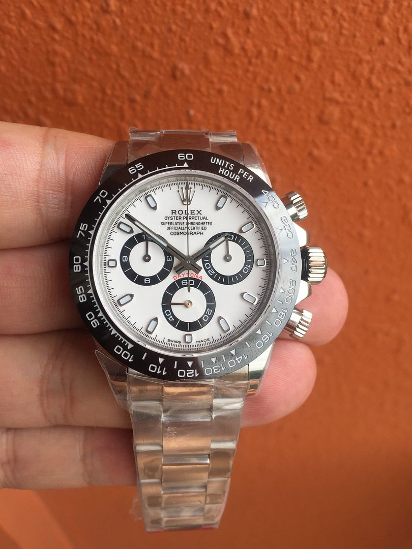
This picture doesn't show it so well, but from what I can see:

Marginally better spacing of ROLEX on v2
Printing on the subdials is better (v1, grooves look like they've been applied post printing of numbers, v2 looks clearer)

Still a non-starter with that bezel insert sadly


Sent from my iPhone using Tapatalk
it looks like the noob v2 copied the bold arf one.


Sent from my iPhone using Tapatalk
 

Repgoon

Getting To Know The Place
27/8/15
40
10
8
RS6man my QC pics look a lot like that but I’ve received mine and in hand, it doesn’t look misaligned IMO.
 
  • Like
Reactions: RS6man

SuperLory

Well-Known Repist
22/10/15
8,467
5,063
113
ssouthall6 immense, commendable, superb job and should be used as a sticky

This said, IN MY OPINION, those are really really subtle differences mostly hardly noticeable at wrist distance. I think noob is the only choice really.

Is it perfect ? No.

Is it good ? hell yeah !

if ARF was a 300$ watch then it could be a cheap option, but with prices differing roughly 100USD it's a no brainer decision for me
 

bettoban

Known Member
30/12/15
189
110
43
I pulled the trigger on v2 :p
puretime published this pic on their blog today
5X9A9527.jpg

I'll post pics as i get it!
 

molivio

I'm Pretty Popular
Certified
19/10/15
1,154
201
63
Seriously why are people so into 904? Nobody notices this at all. It rather have them correct the subdials, thicker bezelnumbers and you have a superrep.


as a gen daytona owner ( RG btw, and the weight is night and day between rep and gen) and gen daytona two-tone owner, the difference is signficant. 1. I feel better about it being a quality piece 2. as a gen owner, I had twice reps in my hand where other blokes didn't admit it but based on the feel and weight.....I knew.

So yes it matters as it is an easier tell (if held) than many others......like a real boob and fake boob....might look the same, but the moment you feel it
 
  • Like
Reactions: vcappp and Rufctr2

RS6man

This member is doing hard time, they pissed off the goat.
INMATE
6/3/18
73
18
0
as a gen daytona owner ( RG btw, and the weight is night and day between rep and gen) and gen daytona two-tone owner, the difference is signficant. 1. I feel better about it being a quality piece 2. as a gen owner, I had twice reps in my hand where other blokes didn't admit it but based on the feel and weight.....I knew.

So yes it matters as it is an easier tell (if held) than many others......like a real boob and fake boob....might look the same, but the moment you feel it

Your post makes zero sense. You're talking about a rose gold and two tone Daytona yet the original post you're referring to is about 904 vs 316 steel?

Of course a gold gen is heavier than a gold rep but what has that got to do with 904 or 316?
 

seisohai

Getting To Know The Place
9/8/18
28
4
0
Am so sorry for the noob question.

What's a CL and what's the ticks all about? Lol!

Sent from my SM-G950F using Tapatalk
 

Muni

Renowned Member
9/7/17
559
31
28
Ok I'll bite ;)

Firstly, let me say I am a member here for 5 years, have had probably over 50 reps pass through my inventory, have a number of gens, have had built and sold many super frankens. I have massive respect for timnic54, I follow him here and on HB and have bought watches on his recommendations.

I'll also say that both the noob and the ARF are excellent watches, but neither are IMO good enough to class as super reps. I have detailed why elsewhere but I'll do it again for the sake of people who don't want to read the whole thread.

The noob movement is a work of art. The pushers are good, the case is decent, the sels are good enough but the dial and bezel on the 116500 fall short of the quality required for a super rep and the bezel and especially the dial on the noob 116520 are miles off.

I'm a nitpicker, it's in my nature. If people don't like it, I don't really care. I'm not showing this to justify my own purchase, I'm not an ARF fanboy, I'm not a noob fanboy, just a daytona fan that wants the perfect watch.

Franken of a 116520 is plausible but 116500 is cost prohibitive. So ideal situation is fix these small issues and everyone wins.

G=Gen
N=NOOB
A=ARF

d0473ccf4f20dd0fd57219a5e6dfb611.jpg


Let's start with the front dial on. First observations are the lettering of ROLEX on the noob. Look at the O. Look at the tail on the R. ARF is a touch too bold but this isn't as noticeable as the poor spacing on the noob.

Also visible is the poor insert. The engravings are too shallow and too thin on the noob. A touch too deep on the ARF but still closer to gen.

Daytona on both ARF and Noob is too dark.

Pinion on gen is capped, fail for ARF and Noob.

e80e4eb3a272bd7caff821b257932c17.jpg


Subdials. Ever so slightly too wide on the noob, ever so slightly better finished on the ARF.

375fd11315aed33722e2038bd7e9bf3b.jpg


Indices. Nicely polished on the gen. Ok on the ARF. Too thick and bland on the noob.

3c06c47a6f75f6fb7746c701029b8b39.jpg


Insert. Noob has definitely improved this from v1. V1 triangle was miles too small. Now the font is still too skinny but the lines are better, they are too fat on the ARF. But the triangle is still too far away from the numbers.

e66a7d8293280e340217446a4af21190.jpg


Lugs. Better on the noob. Not sure what ARF were doing here. Too skinny and completely the wrong shape. Amusingly Noob have added the little indentation that they failed to put in the v9 116610, even though it doesn't exist on the daytona.

So yes, I'm pretty finicky as you can tell, but that dial and insert aren't quite good enough for me. I'll let you guys all buy the v1, and I'll buy the v2 when they get closer ;)


Sent from my iPhone using Tapatalk

Omagad review
 

Muni

Renowned Member
9/7/17
559
31
28
Now for the 116520

This is the watch that is IMO nowhere near super rep due to the dial and the bezel.

On the dial on the 116500, whilst it doesn't look great, it's not far off. This one is frankly crap.

I read early someone questioning my knowledge etc and saying the nuances could be explained away with dial variations through the years, so I've taken images from a 12, 8, 6 and 4 year old 116520 to prove the point.

5e1a833a0255fe5b238cef90d22466c7.jpg


Let's start with the lettering, the branding, the thing everyone sees first.

As you can see some variations over the years. ARF could easily fit into one of these categories. Noob is quite clearly using the font from the ceramic dial. Total fantasy.

6119f42fb54194dc222f931ea95b6a92.jpg


Next bezel. ARF is a touch long in the numerals but close enough. Noob - oh dear. Everything far too skinny. Very obvious from quite a distance.

7b7261386b6b657c88bc6d79a7a0ac5d.jpg


Subdials. Well credit where credit is due, at least all of the noob ones work :D but what is that strange inner circle?!

Noob doesn't look too far away from the 6 year old Daytona but the numbers are top angled. Look at the 60.

ARF don't win any awards here either. Look at the numbers, too bold, although straighter. The lines reach to the end of the subdial, which is wrong. Noob doesn't, which is correct.

DAYTONA lettering. Completely wrong on ARF and Noob.

I couldn't be bothered to even look at the rehaut, lugs, sel etc on this one, I will at some point.

Again - I'm not knocking either watch, they are what they are, but if you want the watch to look as nice as possible, these are the bits that need fixing.


Sent from my iPhone using Tapatalk

Review Omagad