jaredjohnson
Active Member
- 26/2/17
- 255
- 5
- 0
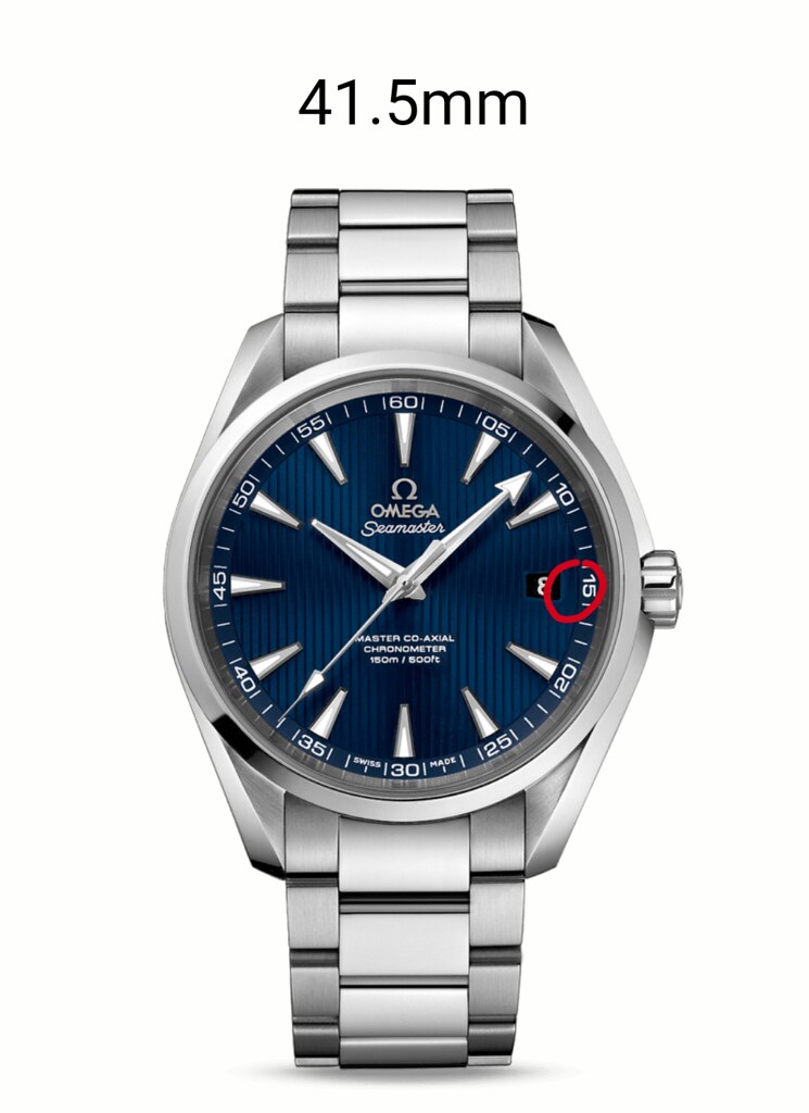
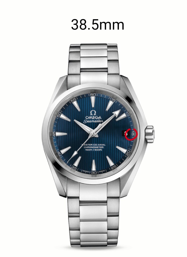
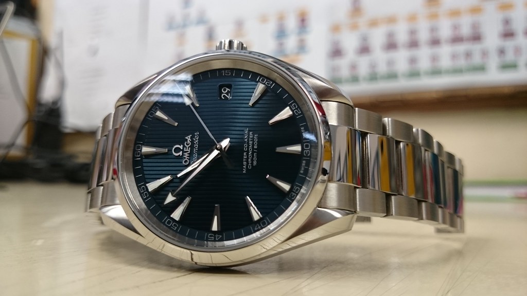
We really need a side by side comparison of the blue dial. In general, the rep looks great, and for the money, it's a steel.
However, after inspecting the details of the
Gen (under "warm" light), I really think the blue rep is not quite there, and most probably it will never be.
The white and black ones are very, very good. Will probably buy the bumblebee next. Eventually, the omega logo and font are a little bit too bold?
Gen:

I think you're correct, the logo and the font are much more refined on gen. By the way, I think the rep omega font is quite uneven, but it should not be visible to the naked eye, and the white version seems to look much better in that sense.


