-
Tired of adverts on RWI? - Subscribe by clicking HERE and PMing Trailboss for instructions and they will magically go away!
You are using an out of date browser. It may not display this or other websites correctly.
You should upgrade or use an alternative browser.
You should upgrade or use an alternative browser.
M+ releases "Mark XX Patrouille Suisse", aka Mark XX in Titanium, IW328209
- Thread starter Reaps
- Start date
johnchpark
Active Member
A simple fix and fairly inexpensive considering it's a standard font for IWC.datewheel font on the new M+ release seems to be hit or miss.
- 6/8/24
- 78
- 76
- 18
For me it is not a major flaw but in any case if you want a data wheel of 2892 on ebay it costs €10.datewheel font on the new M+ release seems to be hit or miss.
Patsanchik
Renowned Member
“The same is also blue noodles.”V7F released a v2 with revised case finishing/color:
johnchpark
Active Member
A 2892 datewheel is not interchangeable on a Miyota 9015.For me it is not a major flaw but in any case if you want a data wheel of 2892 on ebay it costs €10.
Additionally, stock 2824/2892 datewheel font is not the same as IWC's font on their datewheel.
I've done the search, and you can't find a 2892 or a 9015 datewheel with IWC's font - these are custom printed by rep factories.
johnchpark
Active Member
Case shading still seems darker than gen or M+'s. Dial shade also seems slightly darker too? But crystal seems nice with the ARV7F released a v2 with revised case finishing/color:
All correct.A 2892 datewheel is not interchangeable on a Miyota 9015.
Additionally, stock 2824/2892 datewheel font is not the same as IWC's font on their datewheel.
I've done the search, and you can't find a 2892 or a 9015 datewheel with IWC's font - these are custom printed by rep factories.
I always assume the transplant would happen to a 2892 as I dislike Miyotas.
You would need a rep IWC date indicator or a gen indicator. The font is the same for the XVIII, I assume the size too, that means is not too complicated to source one.
johnchpark
Active Member
You cannot easily drop a 2892 in a Miyota 9015 watch. Date positions are the same, and the stem height are similar enough (1.50mm vs 1.53mm). However, the dial feet positions are different and hand sizes are different.All correct.
I always assume the transplant would happen to a 2892 as I dislike Miyotas.
You would need a rep IWC date indicator or a gen indicator. The font is the same for the XVIII, I assume the size too, that means is not too complicated to source one.
You cannot easily drop a 2892 in a Miyota 9015 watch. Date positions are the same, and the stem height are similar enough (1.50mm vs 1.53mm). However, the dial feet positions are different and hand sizes are different.
I simply do not buy watches with Miyota, that's why I haven't considered that limit
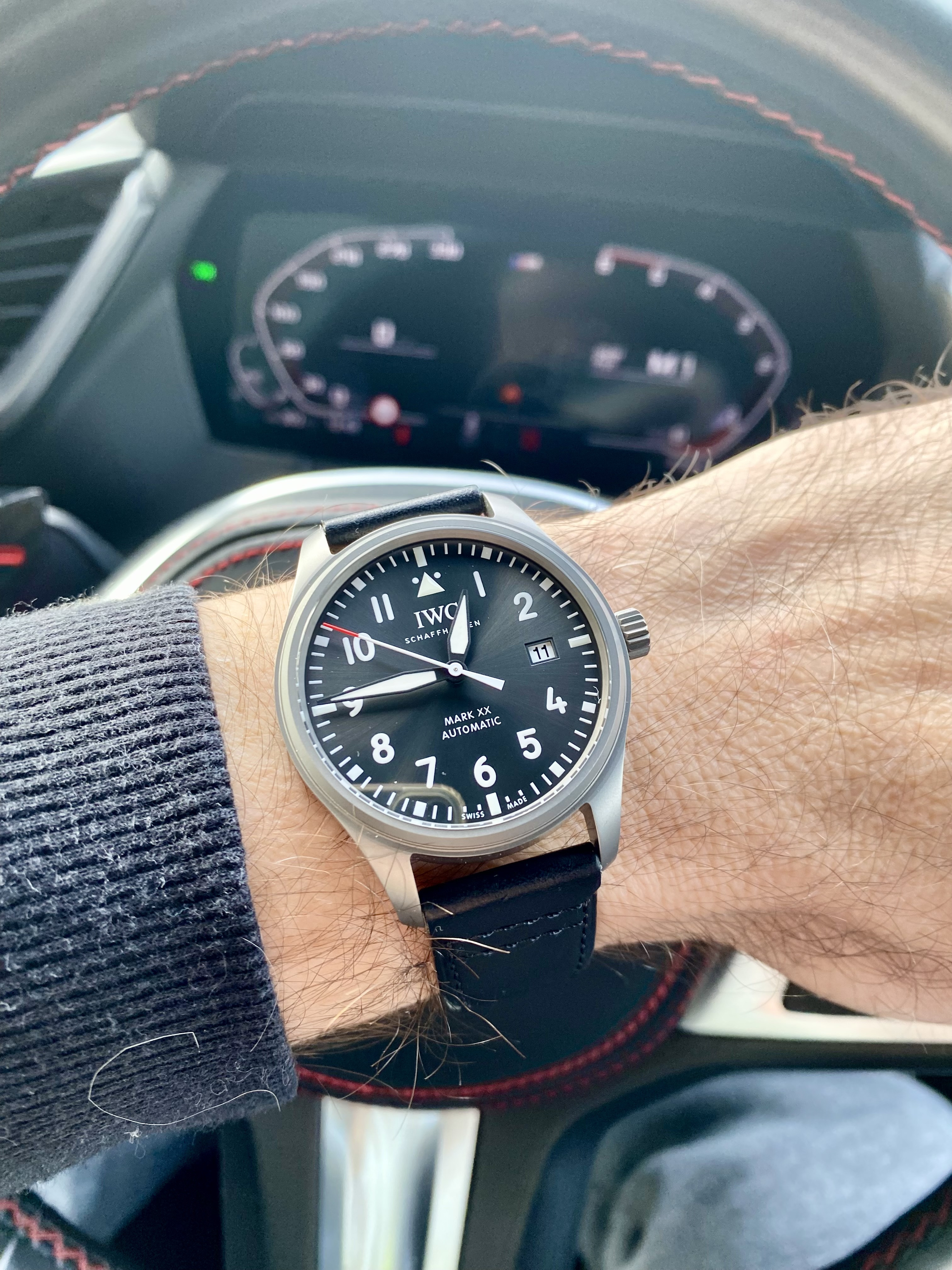
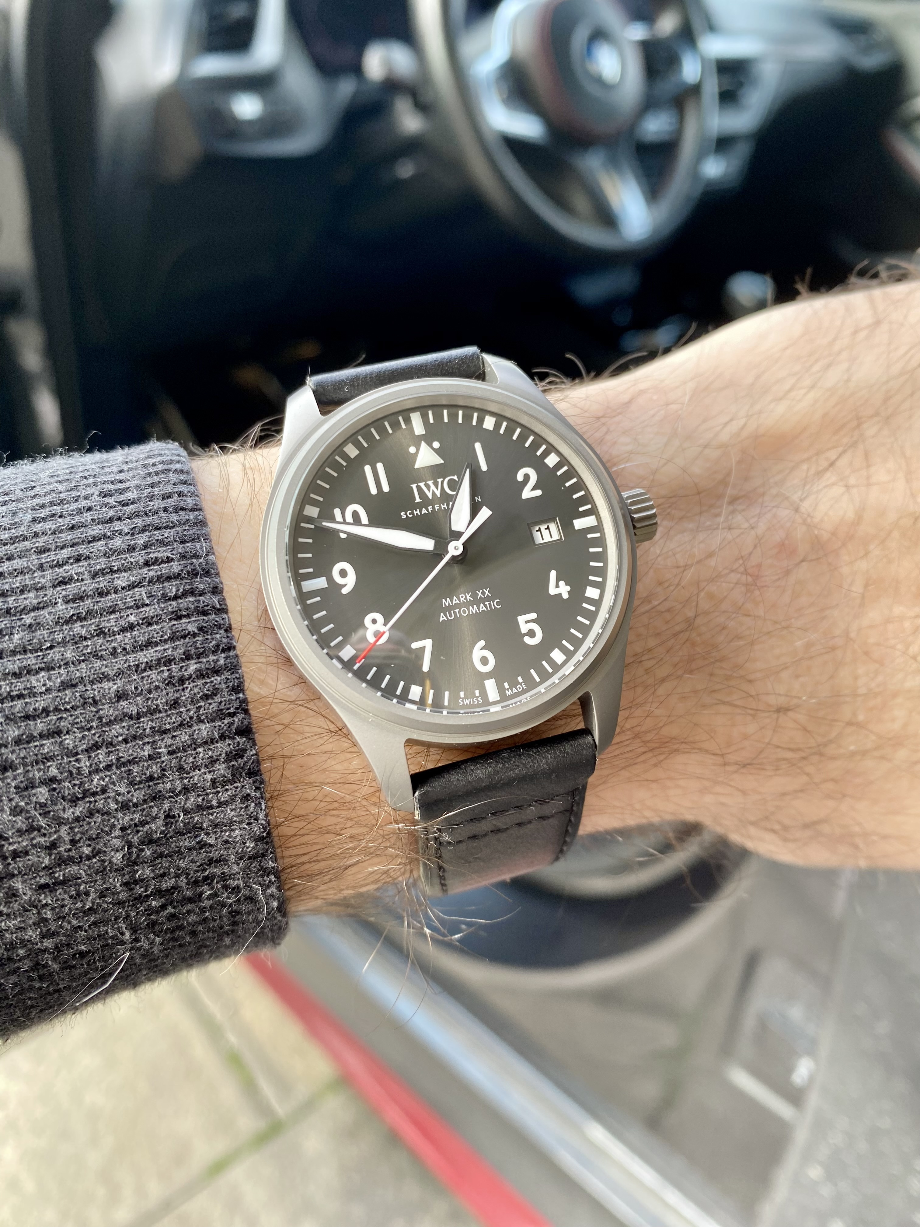
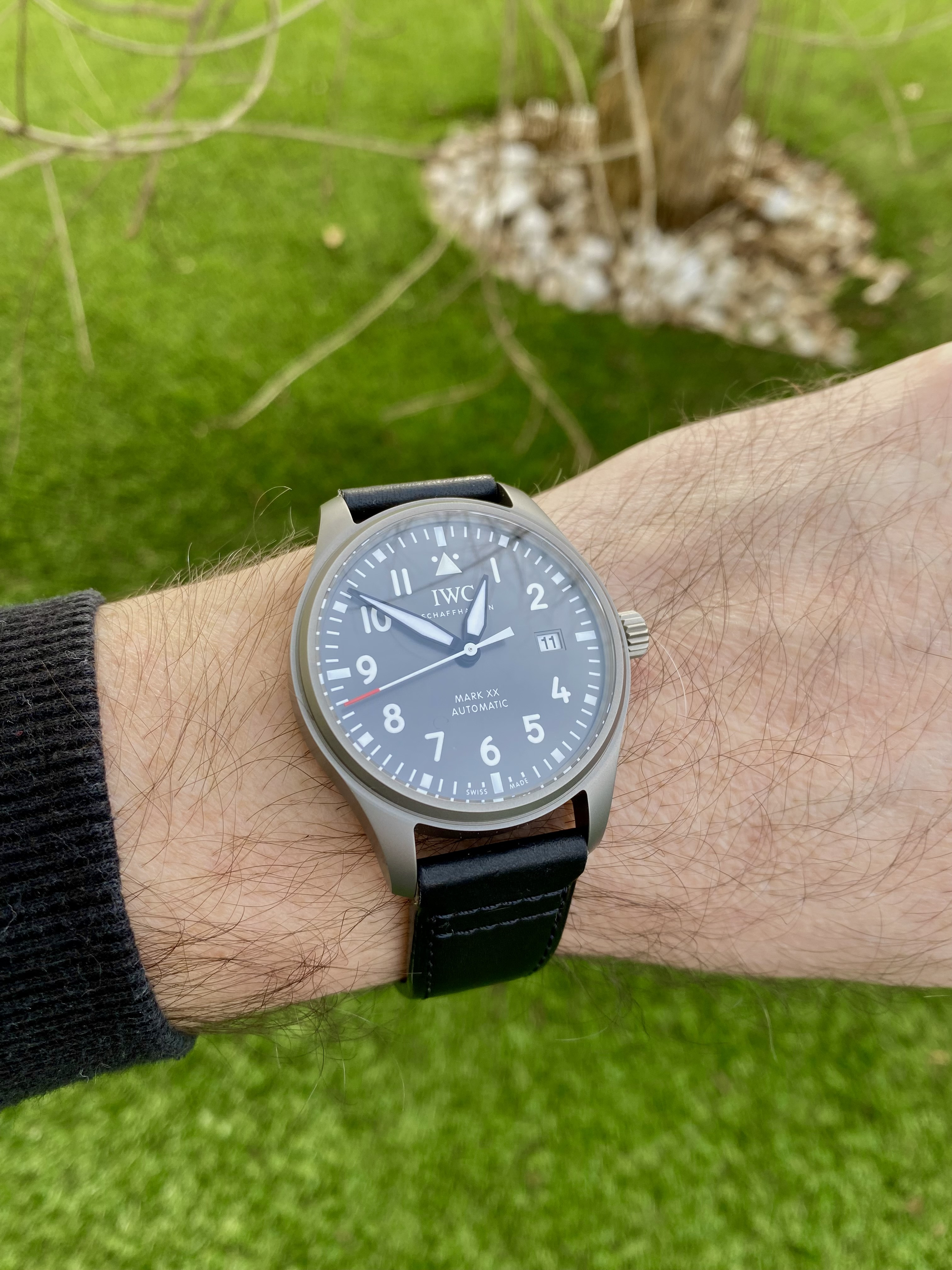
Finally got mine today. It looks really amazing. AR could be a bit better (especially when looking at this nice blue AR coating on the gens and V7F), but it's good enough really.
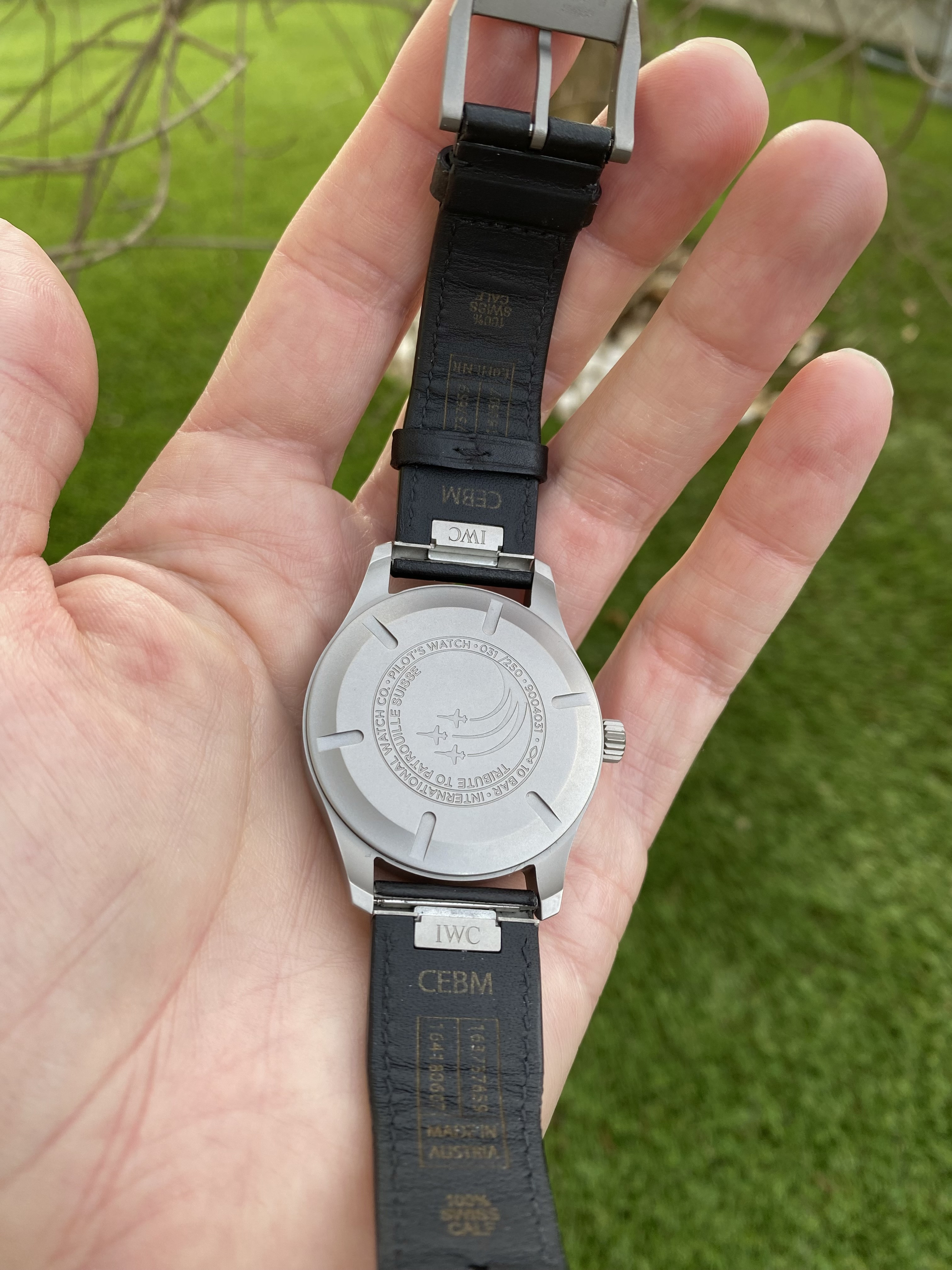
As has been commented here before, the strap is quite stiff, so let's see if it will get a bit softer after with some wear.
I am a bit shocked by the movement, though. I expected it to be a bit louder, but the rotor is even louder than on my JLC MUT rep. What bothers me more, is the rattling noise of the rotor when I shake the watch / my hands - it sounds as if the rotor was loose. Is this normal for this Miyota movement?
I do consider getting the watch as gen now, that's how much I like it.
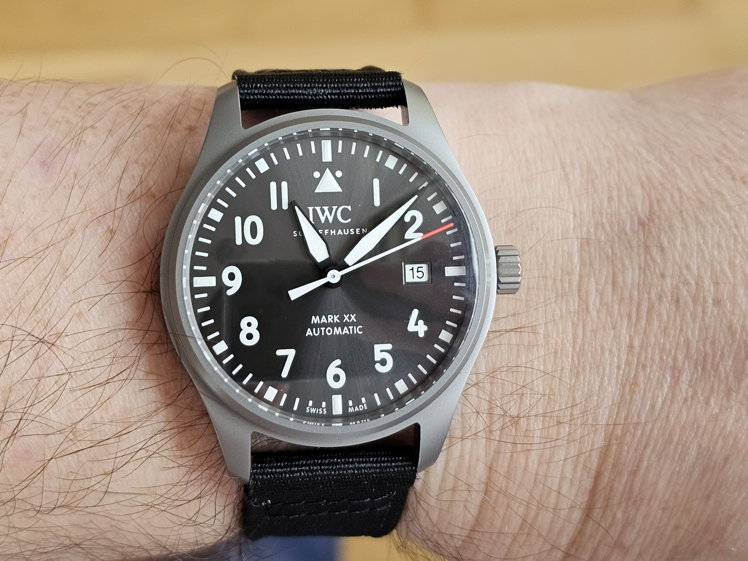

Oh, and I like that the strap says "made in Austria". So I guess the gen is made by Hirsch? Too bad, that they don't sell a similar strap under their own name. They do have a similar looking textile strap, but it's rubber on the inside, not leather.
- 6/8/24
- 78
- 76
- 18
The rotor can be silenced with Moebius 9010 or HP1300Finally got mine today. It looks really amazing. AR could be a bit better (especially when looking at this nice blue AR coating on the gens and V7F), but it's good enough really.
As has been commented here before, the strap is quite stiff, so let's see if it will get a bit softer after with some wear.
I am a bit shocked by the movement, though. I expected it to be a bit louder, but the rotor is even louder than on my JLC MUT rep. What bothers me more, is the rattling noise of the rotor when I shake the watch / my hands - it sounds as if the rotor was loose. Is this normal for this Miyota movement?
I do consider getting the watch as gen now, that's how much I like it.

Teetertank
Known Member
This is a really nice looking watch model.
I have a ceramic M+ mk XVIII and it's nice but really missing the blue AR as per the gen and V7 versions. I wish M+ would add blue AR as standard. They claim they're adding AR, so why not use blue tint?
Couple of other observations - the second hand on the M+ looks a little chunky compared to gen and the V7 which is looks more svelte. And same applies to the printing on the numerals. Looks a bit thicker to me.
Also, some earlier comments praise the straight second hand used, but from what I've seen the original has a curved tip on the second hand, so surely that should be replicated?
I suspect the lighting in the V7 photos on here aren't doing it justice.
I think for me, the ideal rep for this would likely be:
M+ case
V7 movement
V7 hands and dial
V7 crystal
M= buckle
Original for comparison:
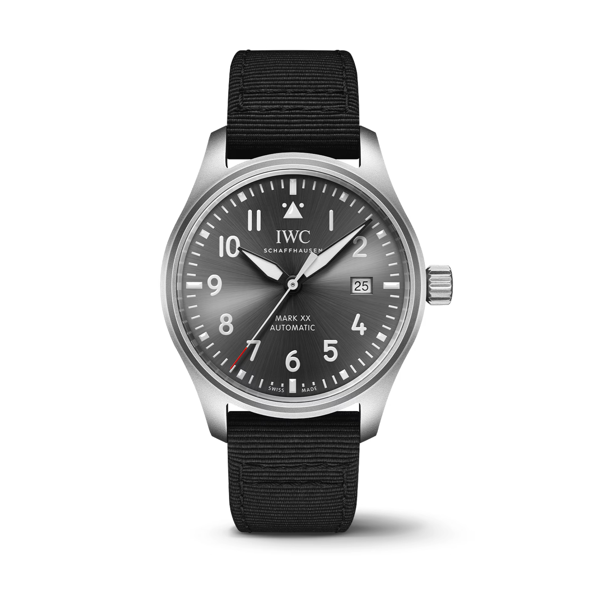

The problem is, that there are barely any real photos of the gen out there - most websites are using IWC's promo renderings.
Susan says in her review that the seconds hand should be straight, and in the V7F v2 review video I linked above, it's also mentioned that the curved seconds hand is not gen-like.
You are right about the print being a tiny bit too thick (not only on the numerals, but also on the Schaffhausen and Mark XX / Automatic text).
I'm also under the impression, that the crown is a bit too small for a Mark XX, it looks more like the Mark XVIII crown.
I'd say this is a typical M+F rep, like their Tudor Pelagos FXD reps - it's a good watch, but not a true 1:1 gen.
With only 250 gens out in the wild, there isn't much to worry, though. This is a super rare watch.
I wonder if the V7F v2 might be the better choice now. I don't think I will order one for comparison, but maybe someone else here in the forum decides to buy the V7F over the M+F and will post some photos.
The big question is if they got the case color/finish right. V1 looked pretty bad.
remco909
Getting To Know The Place
Here is a video about the Mark XX Petronas in titanium which I assume has the same case and crown.
johnchpark
Active Member
This is a really nice looking watch model.
I have a ceramic M+ mk XVIII and it's nice but really missing the blue AR as per the gen and V7 versions. I wish M+ would add blue AR as standard. They claim they're adding AR, so why not use blue tint?
Couple of other observations - the second hand on the M+ looks a little chunky compared to gen and the V7 which is looks more svelte. And same applies to the printing on the numerals. Looks a bit thicker to me.
Also, some earlier comments praise the straight second hand used, but from what I've seen the original has a curved tip on the second hand, so surely that should be replicated?
I suspect the lighting in the V7 photos on here aren't doing it justice.
I think for me, the ideal rep for this would likely be:
M+ case
V7 movement
V7 hands and dial
V7 crystal
M= buckle
Original for comparison:

After being burned by a ZF Mark XX, V7F is the only factory I'm interested in for the Mark series.
M+ honestly isn't that bad except the lack of blue AR and the movement/date font issue. But V7F has done it better for the other models so far. We'll see if they can get the Patrouille and Petronas right though

