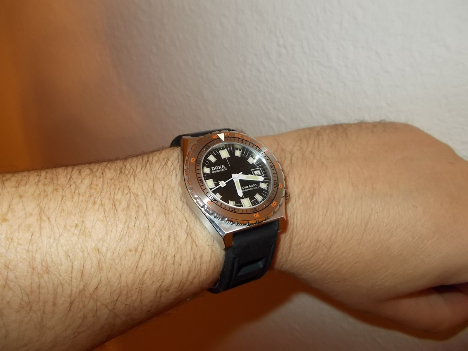
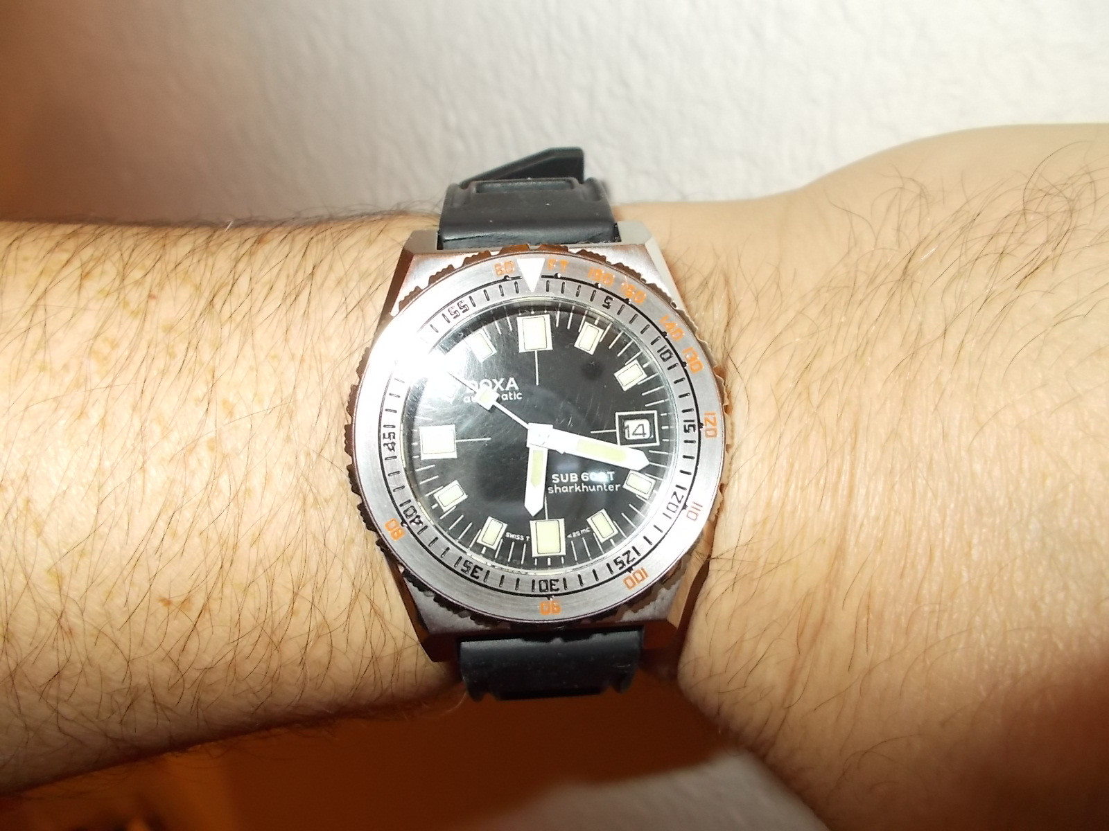
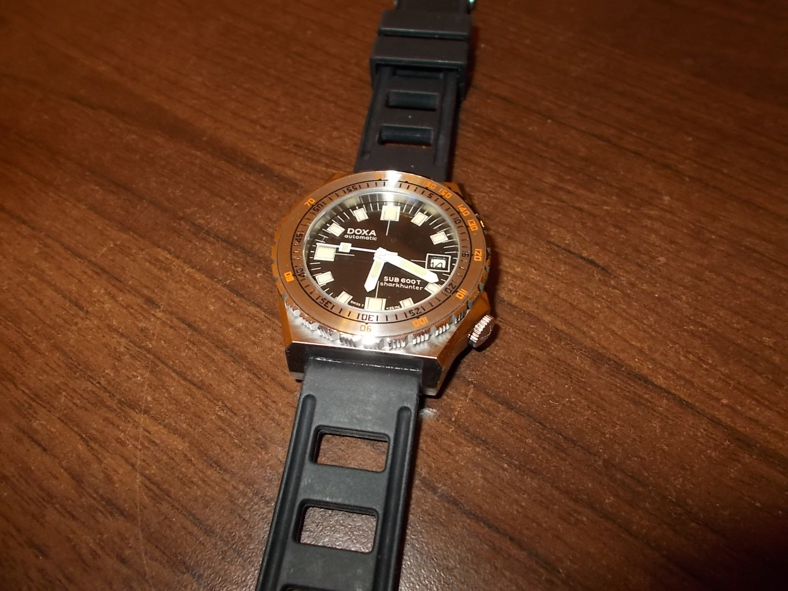
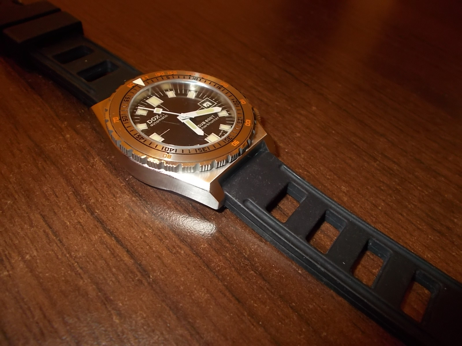
-
Tired of adverts on RWI? - Subscribe by clicking HERE and PMing Trailboss for instructions and they will magically go away!
You are using an out of date browser. It may not display this or other websites correctly.
You should upgrade or use an alternative browser.
You should upgrade or use an alternative browser.
DOXA diver dials ... is it a virus or just an obsession ?
- Thread starter manodeoro
- Start date
@manodeoro
Hello Charles,
I seem to be unable to reach you via pm.
You finished a Doxa dial for me and got paid over a month ago.
When will you ship it?
Best regards,
Sebastian
Hello Charles,
I seem to be unable to reach you via pm.
You finished a Doxa dial for me and got paid over a month ago.
When will you ship it?
Best regards,
Sebastian
- 13/10/16
- 3,919
- 2,426
- 113
@manodeoro
Hello Charles,
I seem to be unable to reach you via pm.
You finished a Doxa dial for me and got paid over a month ago.
When will you ship it?
Best regards,
Sebastian
Hi Sebastian
I just PMed you about that.
I shipped the package but it came back to me ... all my fault because of an error on the adress.
I shipped it again today using Colissimo and Pmed you the tracking number.
Please accept my sincere apologies.
Never met Monodeoro, but I can assure you there's nothing to worry about. People that post helpful things like this thread are as honest as they come. In fact, I'll personally refund you if the dial doesn't arrive within a month.
- 13/10/16
- 3,919
- 2,426
- 113
Never met Monodeoro, but I can assure you there's nothing to worry about. People that post helpful things like this thread are as honest as they come. In fact, I'll personally refund you if the dial doesn't arrive within a month.
nice offer but you won't need to do this ...
If the dial and handset doesn't arrive within a week I will consider it lost and I'll refund @sebman ... but I'm 100% certain it will arrive
BTW ... I already PMed him that the next dial, if he ever want one, will be free to compensate the delay
Thank you, my friend. I'm an idiot and embarrassed for doubting him. I've received my dial this week. manodeoro's work is fantastic and I 'm the one who is apoligising to him!!!Never met Monodeoro, but I can assure you there's nothing to worry about. People that post helpful things like this thread are as honest as they come. In fact, I'll personally refund you if the dial doesn't arrive within a month.
- 18/8/14
- 588
- 59
- 28
Badass diver from the 80s, but only with the proper dialVery nice! I like it!
I agree. Contact the man, he might be able to help you out with the bezel tooLooks awesome. I love that style the most. That boxy, industrial style with the rectangular indices instead of the shark teeth indices is my favorite. I hope to do the same, but I'm hoping to replace the bezel insert with a matte one that has submariner style numerals.
Big thank you to @manodeoro for this my 2nd Doxa
A pure fantasy Doxa dial
Pic at the end of this post and not that the reasons necessarily interest anyone but me but Clive Custler wrote many books and many different series.
(he wore an orange Doxa himself btw)
Not like reading the greatest Booker prize winning novels mind you.
More like eating McDonalds than eating at a Michelin restaurant. Mind you, I like eating both!...and so too is it with my reading!
The Dirk Pitt series my favourite. This character also wore an orange Doxa
Hence M and I decided "Dirk Pitt" at the 6 o'clock rather than "swiss made"
Pacific Vortex is the 1st novel in the Dirk Pitt series. Hence the purported "pacific vortex" model also inscribed on the dial
- in blue
This I also thought echoes the gen blue "Pacific" on the limited edition Doxas too
The seahunter diver logo because Dirk Pitt is a diver (for NUMA - the National Underwater Marine Agency)
Two trains of thought but decided the traditional "Doxa automatic" suits this fantasy watch best (better than the original synchron idea I had Kicked around)
Regarding font style - as the 600T is a relatively new Doxa, and each of the coloured dials having different names eg pacific, morning star, carribean etc so we used that more modern style Font
Why a red dial face? It is in fact the worst colour for a diver dial as the red gets filtered out in seawater at one of the most shallow depths vs orange, yellow etc. I just saw and liked a red dial (not many around for probably the above reason) and then thought it would contrast nicely with a Seestern black bezel model I saw on their site
So enough blah blah - drumroll for another ultimately Mano creation:
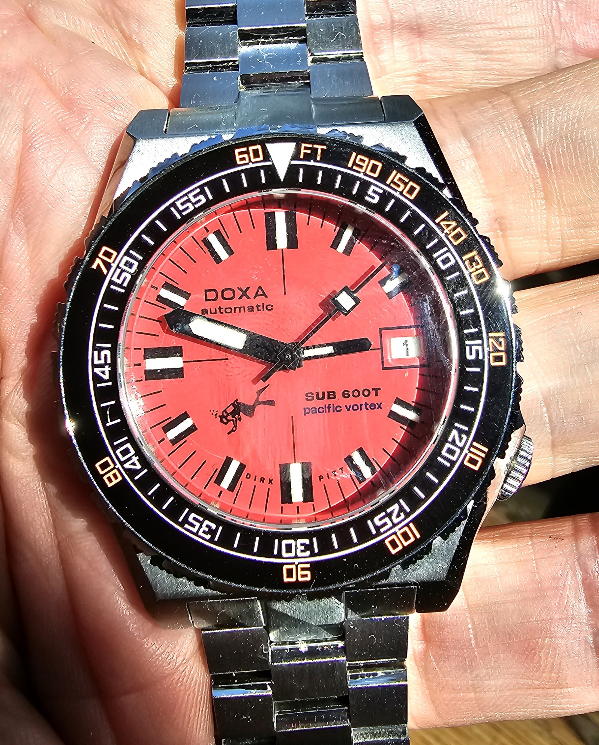
So what does everyone you think?
PS and yes Mano - I mixed up the "blue" lumed second hand with my Maranez blacklung so will be swapping that back into this Pacific Vortex shortly. Doh! I didn't see my error until now while taking the pic!
Thank you again for your skill set, patience and all your suggestions M
I love this watch!
A pure fantasy Doxa dial
Pic at the end of this post and not that the reasons necessarily interest anyone but me but Clive Custler wrote many books and many different series.
(he wore an orange Doxa himself btw)
Not like reading the greatest Booker prize winning novels mind you.
More like eating McDonalds than eating at a Michelin restaurant. Mind you, I like eating both!...and so too is it with my reading!
The Dirk Pitt series my favourite. This character also wore an orange Doxa
Hence M and I decided "Dirk Pitt" at the 6 o'clock rather than "swiss made"
Pacific Vortex is the 1st novel in the Dirk Pitt series. Hence the purported "pacific vortex" model also inscribed on the dial
- in blue
This I also thought echoes the gen blue "Pacific" on the limited edition Doxas too
The seahunter diver logo because Dirk Pitt is a diver (for NUMA - the National Underwater Marine Agency)
Two trains of thought but decided the traditional "Doxa automatic" suits this fantasy watch best (better than the original synchron idea I had Kicked around)
Regarding font style - as the 600T is a relatively new Doxa, and each of the coloured dials having different names eg pacific, morning star, carribean etc so we used that more modern style Font
Why a red dial face? It is in fact the worst colour for a diver dial as the red gets filtered out in seawater at one of the most shallow depths vs orange, yellow etc. I just saw and liked a red dial (not many around for probably the above reason) and then thought it would contrast nicely with a Seestern black bezel model I saw on their site
So enough blah blah - drumroll for another ultimately Mano creation:

So what does everyone you think?
PS and yes Mano - I mixed up the "blue" lumed second hand with my Maranez blacklung so will be swapping that back into this Pacific Vortex shortly. Doh! I didn't see my error until now while taking the pic!
Thank you again for your skill set, patience and all your suggestions M
I love this watch!
I love reading this kind of stuff. So detailed, informative, and interesting! Enjoyed the extra notes about the thought process and reasoning for your choices too. Watch looks awesome.Big thank you to @manodeoro for this my 2nd Doxa
A pure fantasy Doxa dial
Pic at the end of this post and not that the reasons necessarily interest anyone but me but Clive Custler wrote many books and many different series.
(he wore an orange Doxa himself btw)
Not like reading the greatest Booker prize winning novels mind you.
More like eating McDonalds than eating at a Michelin restaurant. Mind you, I like eating both!...and so too is it with my reading!
The Dirk Pitt series my favourite. This character also wore an orange Doxa
Hence M and I decided "Dirk Pitt" at the 6 o'clock rather than "swiss made"
Pacific Vortex is the 1st novel in the Dirk Pitt series. Hence the purported "pacific vortex" model also inscribed on the dial
- in blue
This I also thought echoes the gen blue "Pacific" on the limited edition Doxas too
The seahunter diver logo because Dirk Pitt is a diver (for NUMA - the National Underwater Marine Agency)
Two trains of thought but decided the traditional "Doxa automatic" suits this fantasy watch best (better than the original synchron idea I had Kicked around)
Regarding font style - as the 600T is a relatively new Doxa, and each of the coloured dials having different names eg pacific, morning star, carribean etc so we used that more modern style Font
Why a red dial face? It is in fact the worst colour for a diver dial as the red gets filtered out in seawater at one of the most shallow depths vs orange, yellow etc. I just saw and liked a red dial (not many around for probably the above reason) and then thought it would contrast nicely with a Seestern black bezel model I saw on their site
So enough blah blah - drumroll for another ultimately Mano creation:

So what does everyone you think?
PS and yes Mano - I mixed up the "blue" lumed second hand with my Maranez blacklung so will be swapping that back into this Pacific Vortex shortly. Doh! I didn't see my error until now while taking the pic!
Thank you again for your skill set, patience and all your suggestions M
I love this watch!
Also, thanks for the picture. I still can't get over how precise his dials are. Congratulations on the pick-up!
kilowattore
Sales Moderator / Section Moderator
Staff member
Moderator Sales
Section Moderator
Certified
Didn't know that Dirk Pitt (who is Clive Cussler's himself fantasy alter ego imho) wore an orange Doxa. Another good reason to own one, his novels are so filled with action and adventure that I always wondered why no one thought about a series of films based on them
The movie Sahara with Matthew McConaughey as Dirk Pitt wearing an orange Doxa may interest you.Didn't know that Dirk Pitt (who is Clive Cussler's himself fantasy alter ego imho) wore an orange Doxa. Another good reason to own one, his novels are so filled with action and adventure that I always wondered why no one thought about a series of films based on them
I have the whole series of novels - beat up copies from ebay - but I never highlighted each mention of the " orange faced Doxa" mentioned
Here is a cut and paste from someone more fastidious:
"Iceberg (second book published, but third book written) is the first time Pitt's Doxa is mentioned.
Chapter 10, page 127: "The depth gauge read ninety feet and the orange dial on the Doxa diving watch notified him that he had been down two minutes."
Chapter 10, page 132: "He glanced at the Doxa watch. He had only been down for nine minutes, not the ninety his imagination suggested."
Chapter 11, Page 144: "Pitt looked at his Doxa watch. One-thirty, still early in the afternoon."
Chapter 21, Page 273: "Pitt glanced at the luminous dial of the orange-faced Doxa watch on his wrist."
In Trojan Odyssey, Dirk Pitt passes his watch on to his son Dirk, Jr. and it's the first time the actual model is mentioned.
Chapter 14, Page 140: He glanced at his SUB 300T orange-faced Doxa dive watch given to him by his father - 7:47 P.M. They had been alone in habitat without communications from the outside world for nearly sixteen hours."
Chapter 19, Page 198: "Using the light, he took a glance at the orange dial of his ancient Doxa dive watch. He had been down four minutes"
So Mano, do I go ahead with the Sharkmaster or the orange faced 300T? Or both?
Personally I think one can never have too many of your excellent Doxa dials and everyone on RWI should have at least one!

