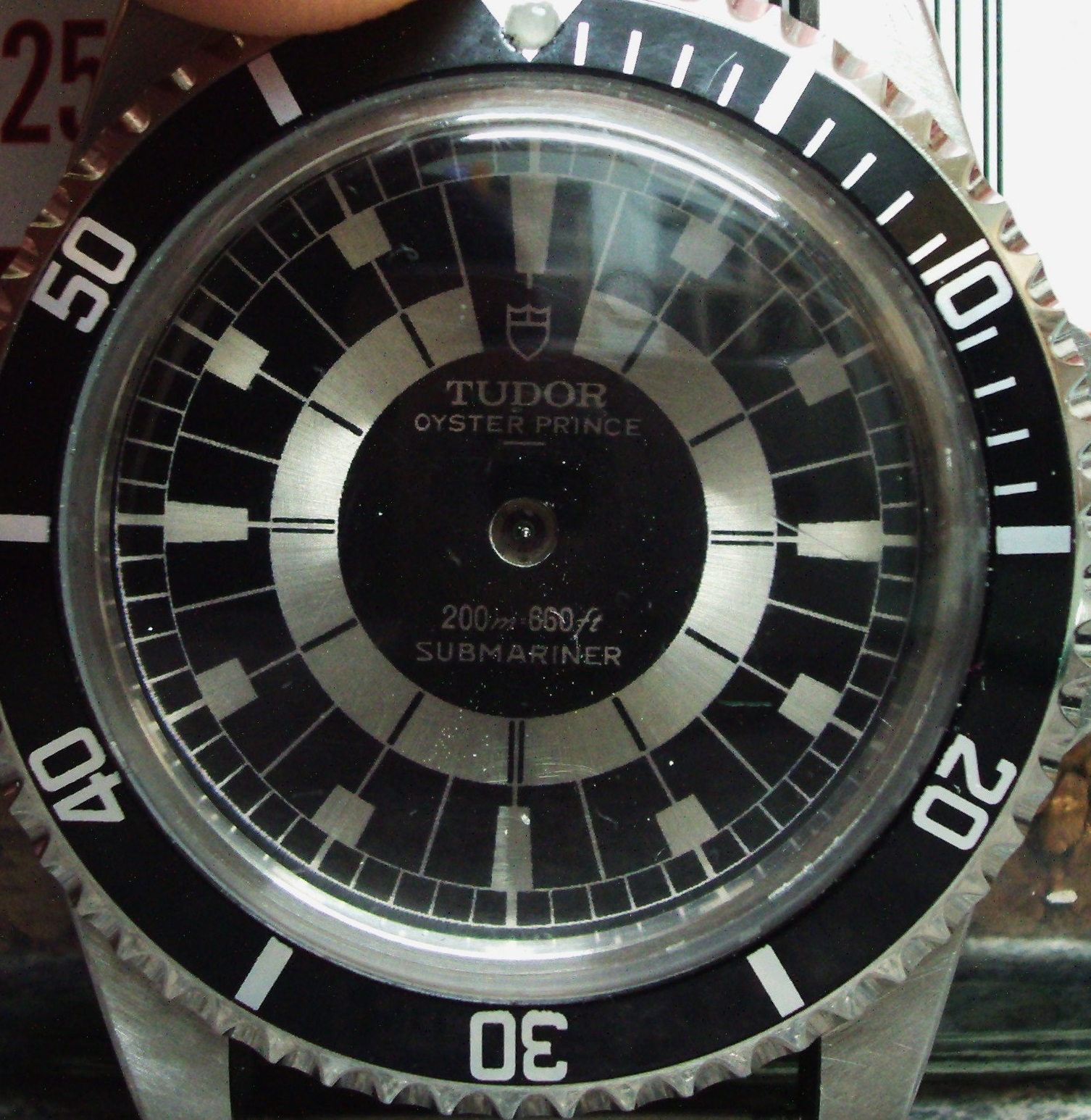
-
Tired of adverts on RWI? - Subscribe by clicking HERE and PMing Trailboss for instructions and they will magically go away!
You are using an out of date browser. It may not display this or other websites correctly.
You should upgrade or use an alternative browser.
You should upgrade or use an alternative browser.
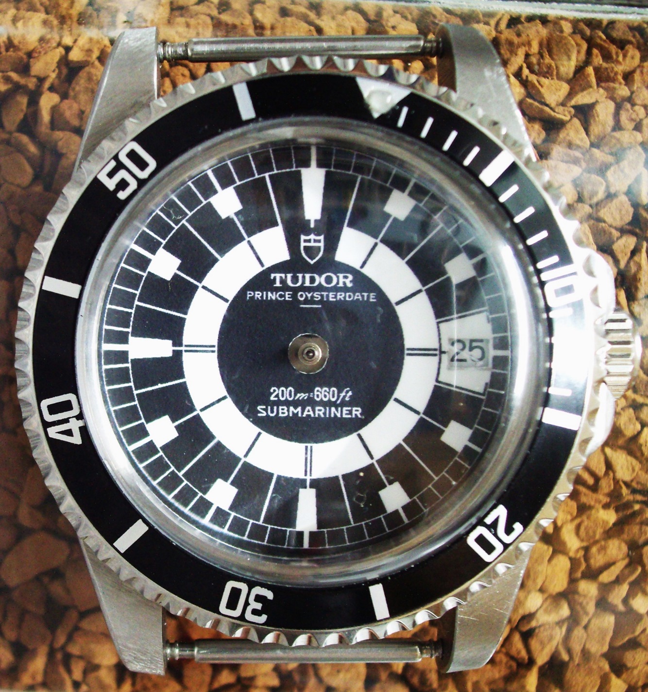
Decal printed dial
- Thread starter Bart Cordell
- Start date
weldergeoff
Getting To Know The Place
- 6/10/23
- 16
- 3
- 3
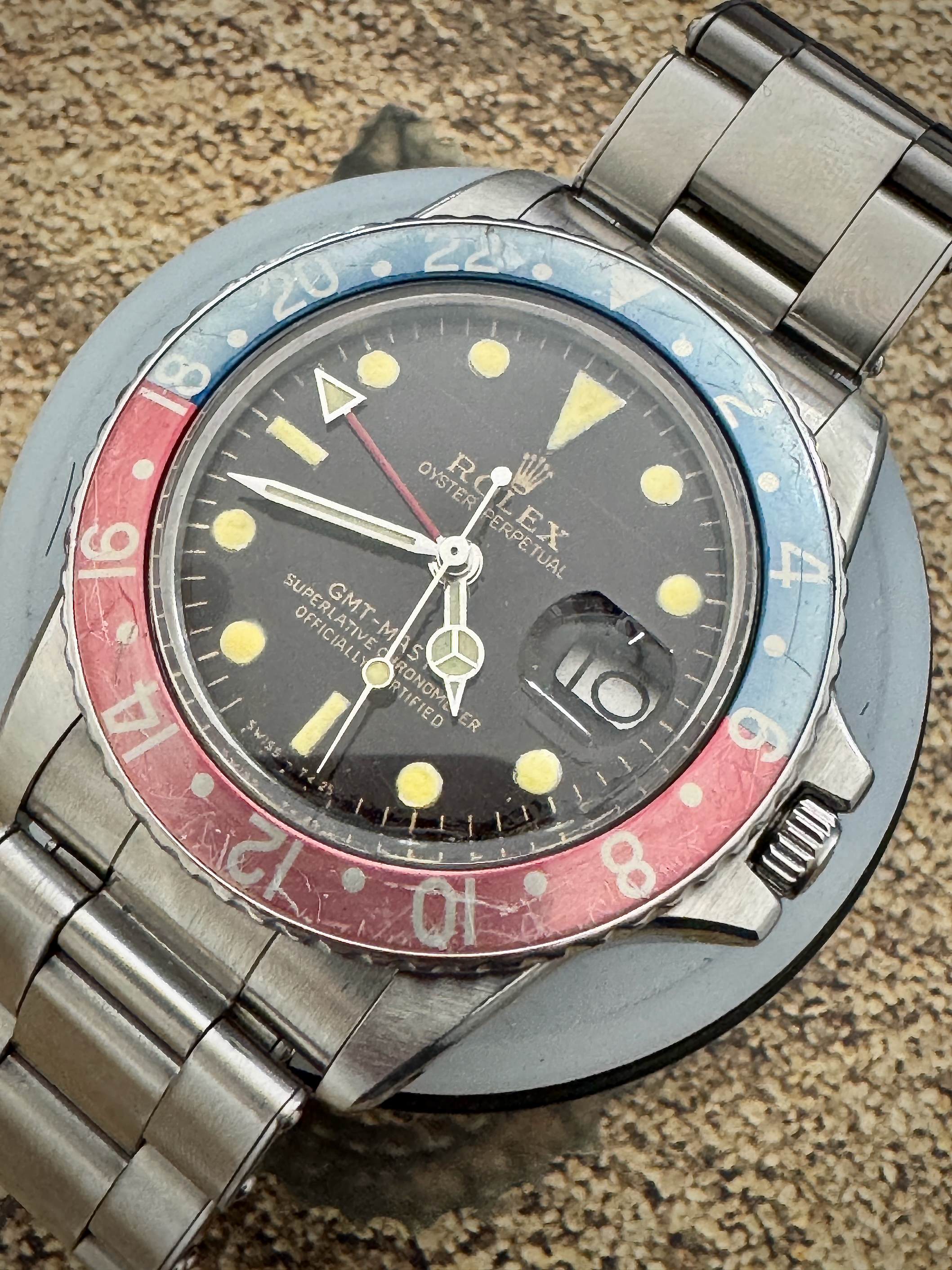
Looking for a gilt dial, 2 line 6538 to fit a 2824 movement in either tropical or black, preferably tropical. Can any of you genius transfer dial makers help me out and what would the price be. I’m based in the UK.
Some beautiful stuff being produced! Still need a nice tropical dial for my 6542. Keep up the great work!
I love hearing this! It's not so much the keyless on HZ for me, although it's terrible. There are many times it's the date function where it seems like something is wrong. If it's not feeling like it's about to be jammed, it's a weird feeling that the date wheel is turning imprecisely to just eventually crap out.Personally, I'm quite happy with the dg3804, it doesn't pose any problems. And I even think it has an unjustified bad image. On the other hand, I hate the hz, which is poorly designed, and the most annoying thing for me is the date change, which is really down-market.
I've never managed to get this date to work - it was triggered at midnight and then in the middle of the day a half-day passed....... I took it apart and reassembled it many times until it broke.I love hearing this! It's not so much the keyless on HZ for me, although it's terrible. There are many times it's the date function where it seems like something is wrong. If it's not feeling like it's about to be jammed, it's a weird feeling that the date wheel is turning imprecisely to just eventually crap out.
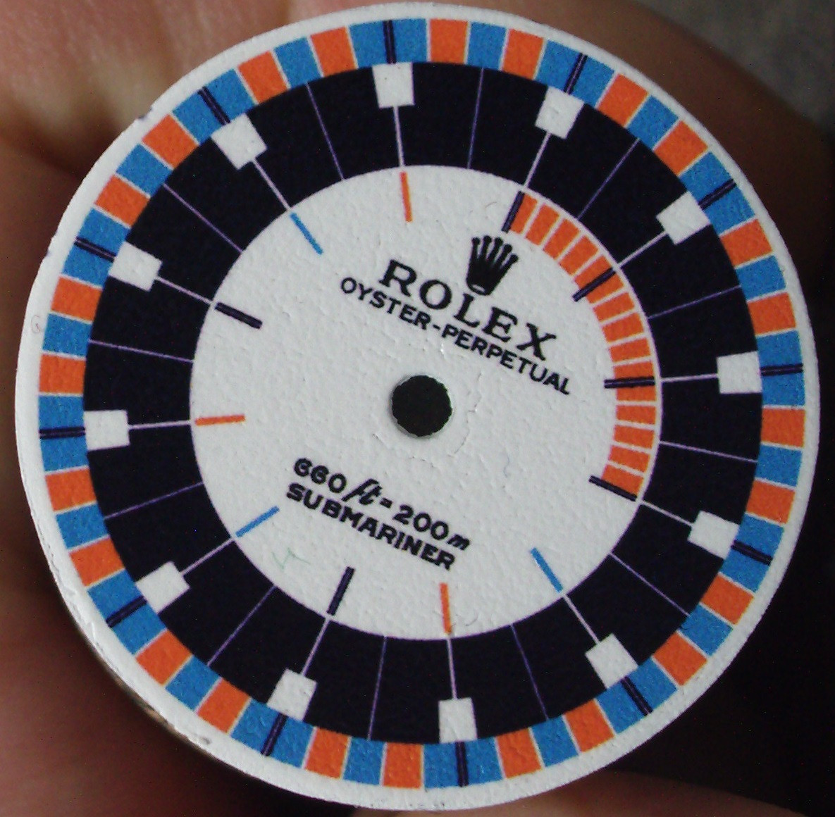
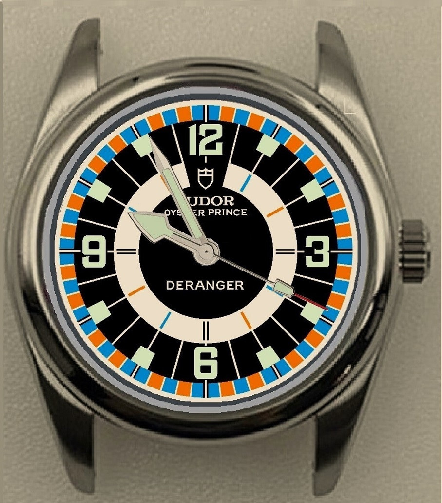
I'm not so sure. I see some cool 60's-70's colors, functional lines, some Tudor chrono influences, and a hint of the 1655 Exp II.
It's a cool design for me. Print-wise, I would thicken some lines that run through darker colors to give a better pop to the naked eye.
But... I don't think you went too far!!! I think you nailed it on many levels.
rangan
Renowned Member
- 8/4/12
- 831
- 234
- 43
This prototype was to be commercialized , and Singer named it as “harlequin” , then this nickname was given to the Day date 1803 , and I have never understood why since it has a simple brown dial!
In any case thank you @janneau you enlighten with these dials !!!
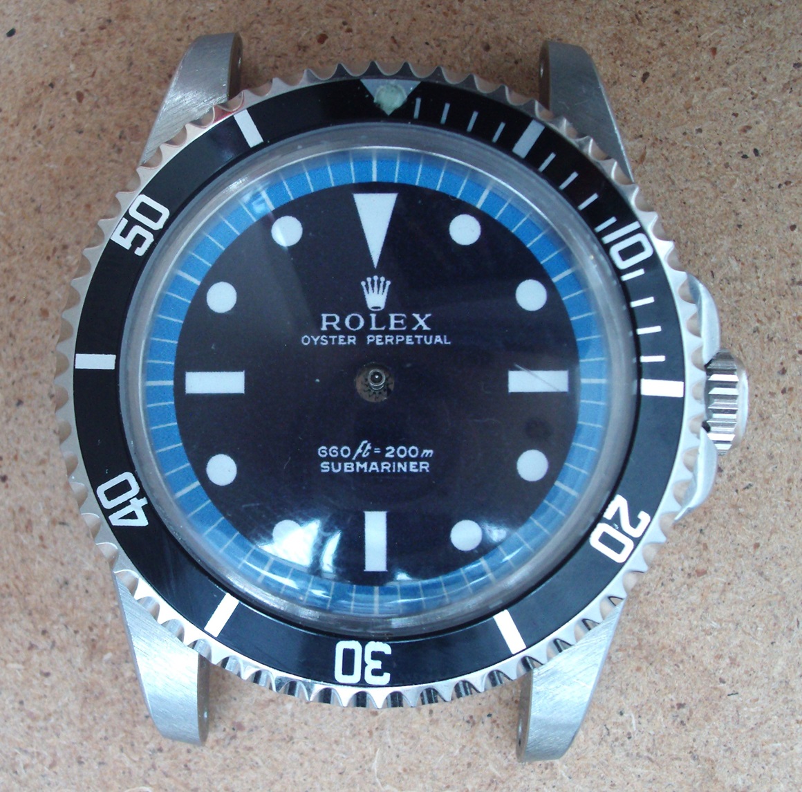
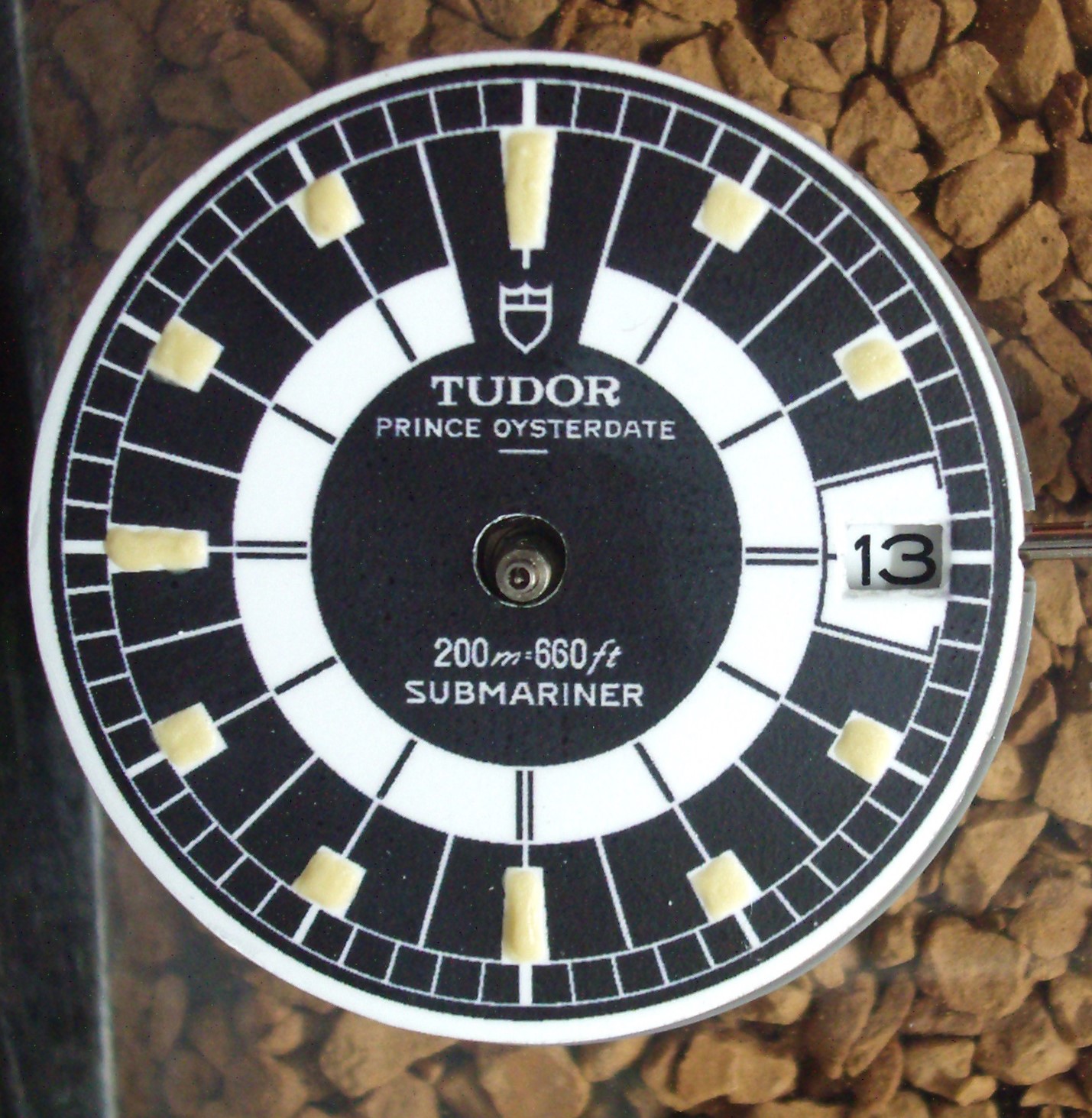
I used a matt white spray paint as a base (which gives it the slightly textured surface of the original) The decal paper I used is this stuff : https://www.ebay.co.uk/itm/286315677697?var=588453098404 and a matt clear Rustoleum over the decal print.It makes me want to try your method. The results are cool. What type of decals do you use?
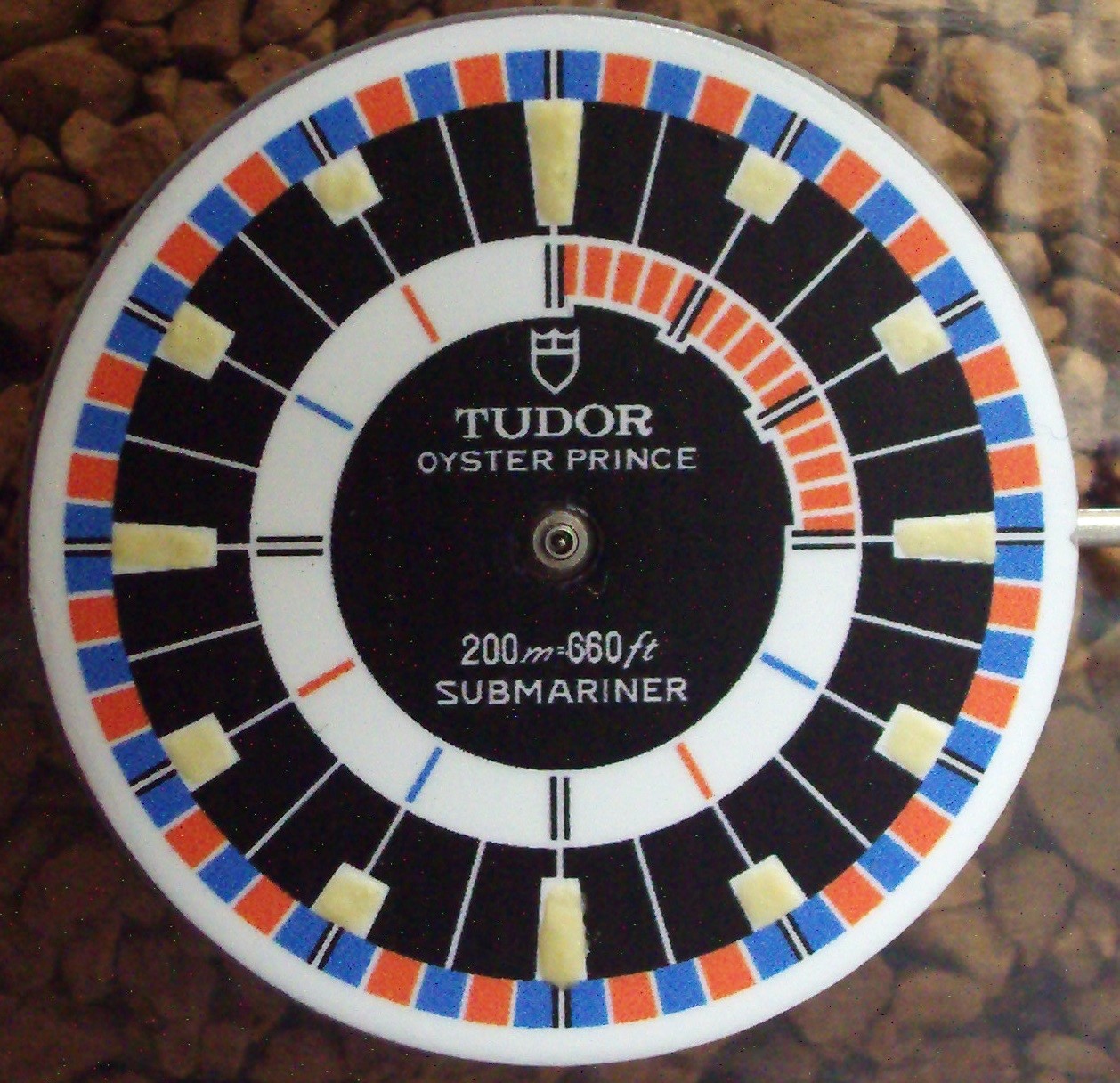
I went to get a more blue finish and got this:
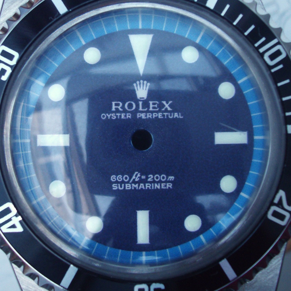
The actual template is several shades lighter and it took trial and error to get what was actually printed to the right shade (my printer prints darker than the template)
I'm not so sure. I see some cool 60's-70's colors, functional lines, some Tudor chrono influences, and a hint of the 1655 Exp II.
It's a cool design for me. Print-wise, I would thicken some lines that run through darker colors to give a better pop to the naked eye.
But... I don't think you went too far!!! I think you nailed it on many levels.
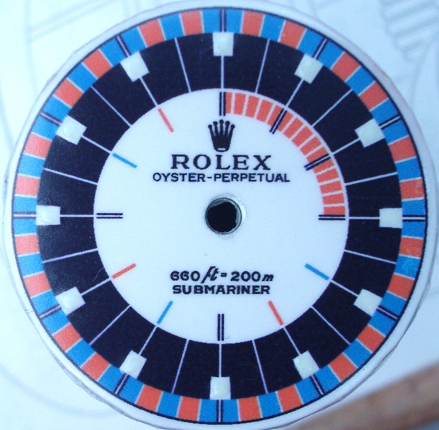
I opened up the white lines and laid it over a gloss white a bit and got this:
I'm not so sure. I see some cool 60's-70's colors, functional lines, some Tudor chrono influences, and a hint of the 1655 Exp II.
It's a cool design for me. Print-wise, I would thicken some lines that run through darker colors to give a better pop to the naked eye.
But... I don't think you went too far!!! I think you nailed it on many levels.
Agreed on the Tudor. Going to re-do as Tudors as I think the snowflake hands would work with the indicies shapes. Probably going to a version of one of these colourways. I've lengthened the 12-3-6-9s and use a cream/ivory base on the dial
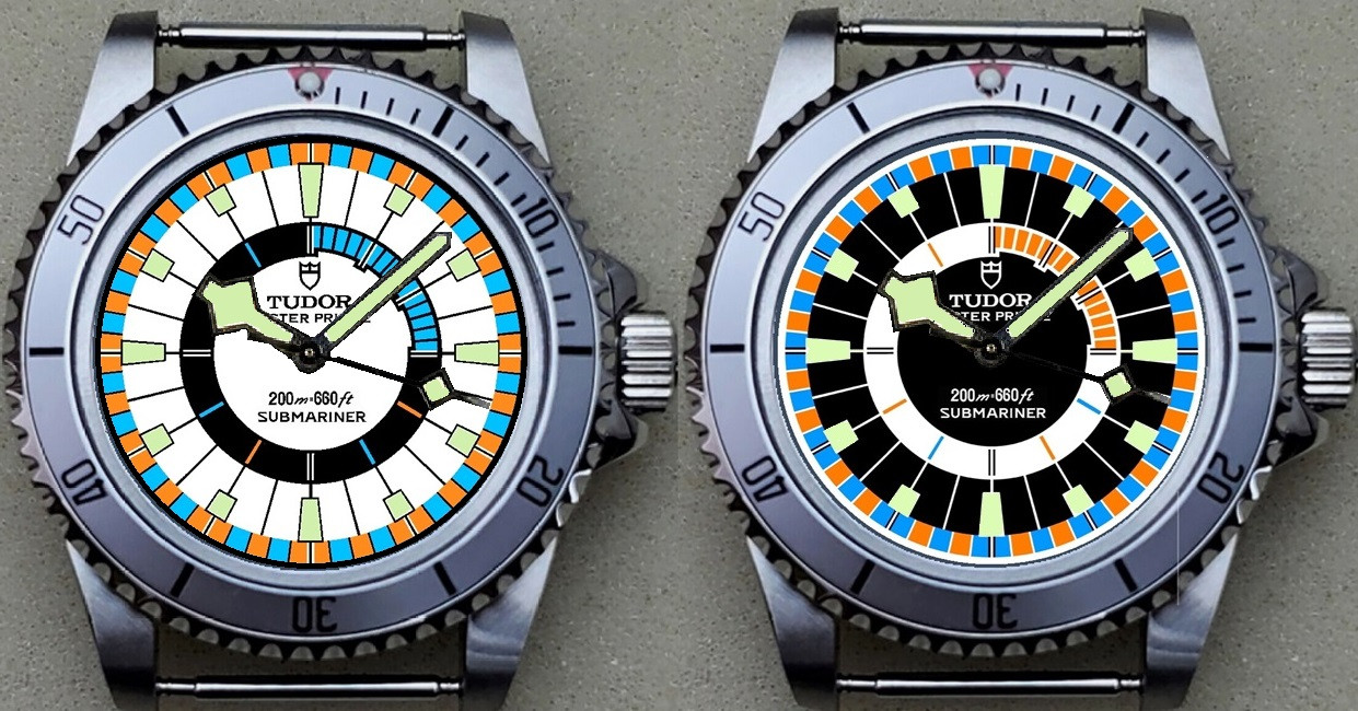
If you can produce dials at this level of detail and color I think you are going to stay as busy as you want making dials for as much as you want.
here are my first scrap training pieces.
Still a lot of things to fix. Having problems with my printer since he creates vertical print lines where the black ink is missing. Done head cleaning etc. multiple times to no avail Will try printing from a different app next to see if that makes a difference.
the 6538 dial is not bad, i am more or less satisfied with my lume job. The 1675 Gilt i will sand down (was my first one) since i struggled with the decal to get it over the dial edges and the nozzle of the clear laquer spray can was crap and made puddles.
So more tweaking necessary
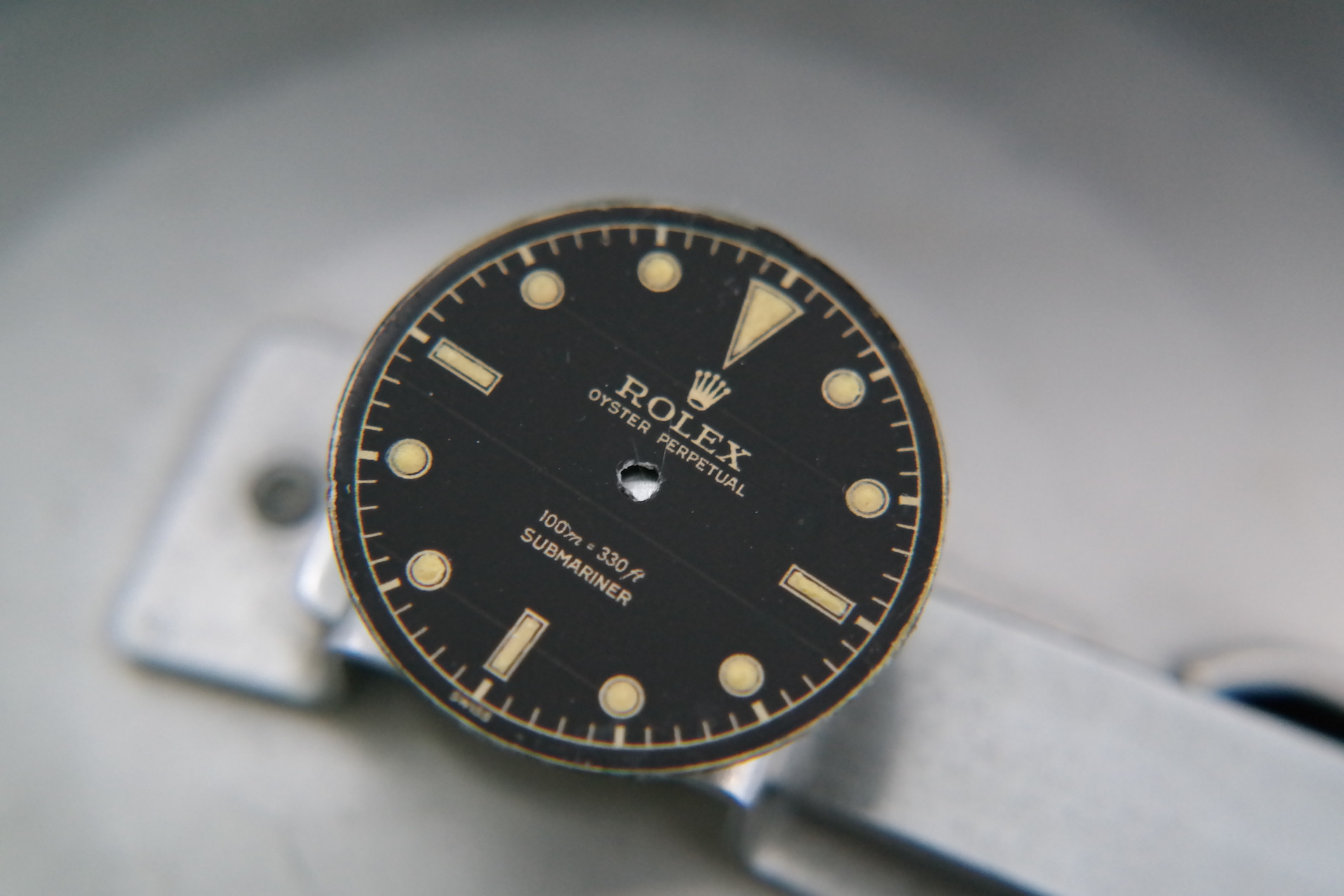
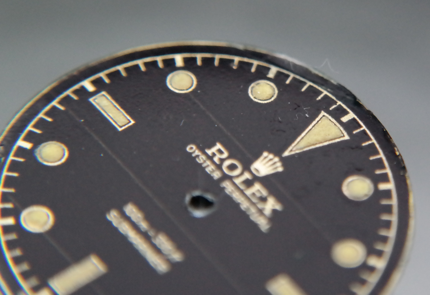
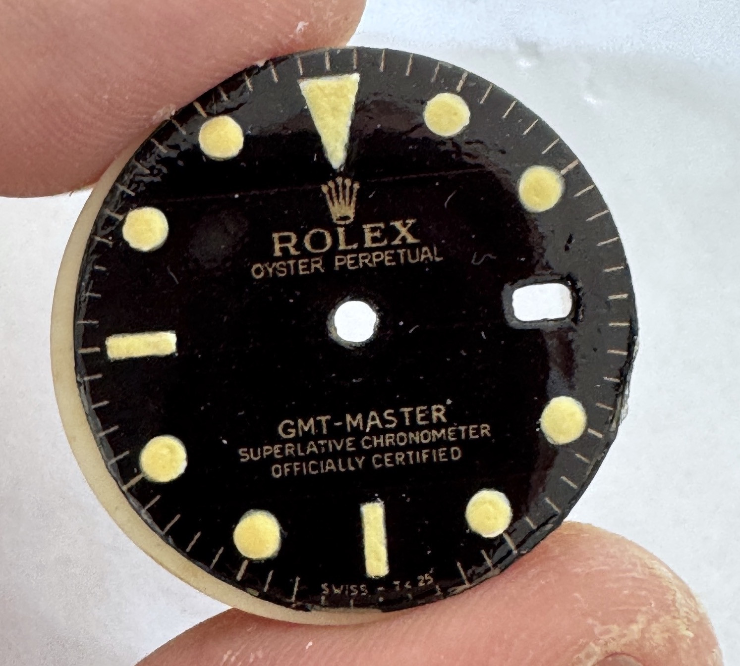
Still a lot of things to fix. Having problems with my printer since he creates vertical print lines where the black ink is missing. Done head cleaning etc. multiple times to no avail
the 6538 dial is not bad, i am more or less satisfied with my lume job. The 1675 Gilt i will sand down (was my first one) since i struggled with the decal to get it over the dial edges and the nozzle of the clear laquer spray can was crap and made puddles.
So more tweaking necessary


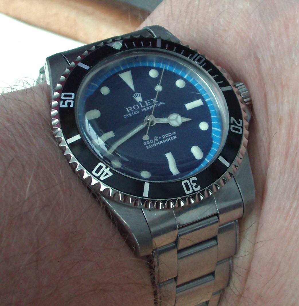
quick install. like it although there is room for improvements
