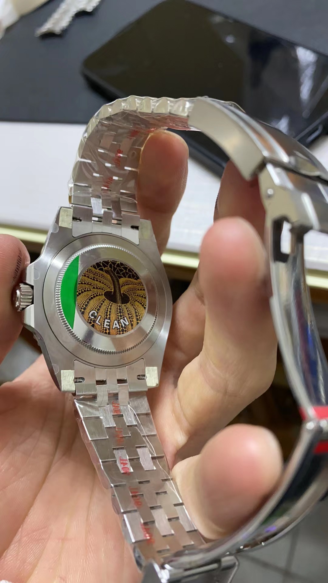
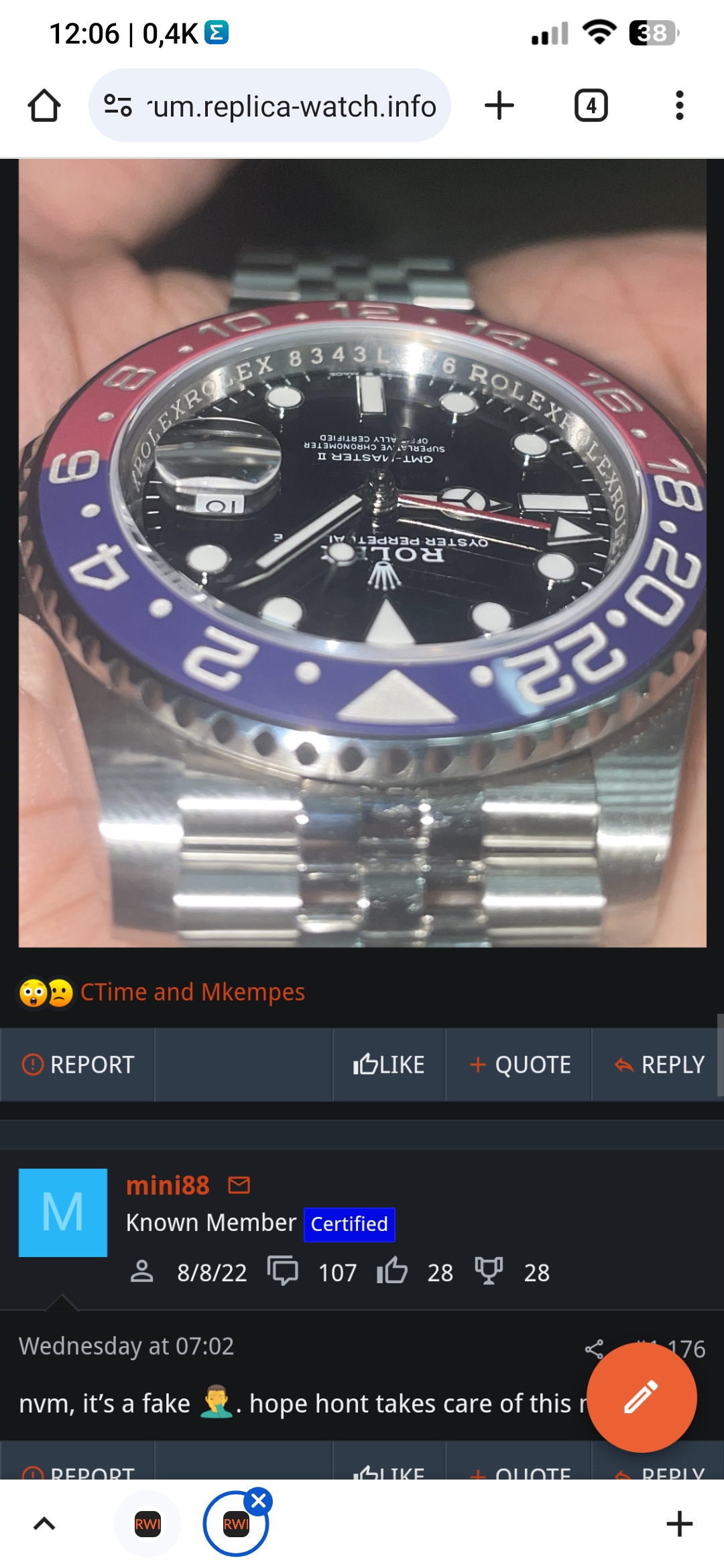
New batch sticker and updated insert (V3).Can anyone tell which version this is?
-
Tired of adverts on RWI? - Subscribe by clicking HERE and PMing Trailboss for instructions and they will magically go away!
You are using an out of date browser. It may not display this or other websites correctly.
You should upgrade or use an alternative browser.
You should upgrade or use an alternative browser.
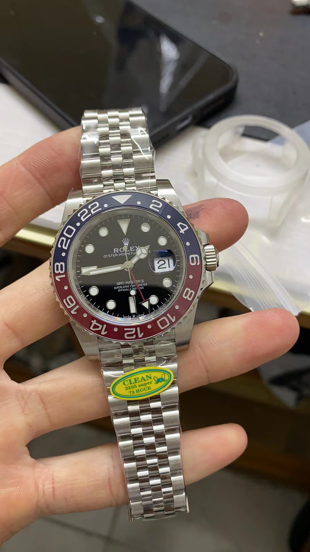
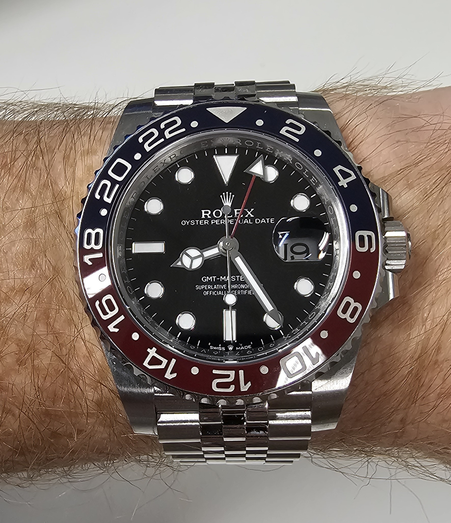
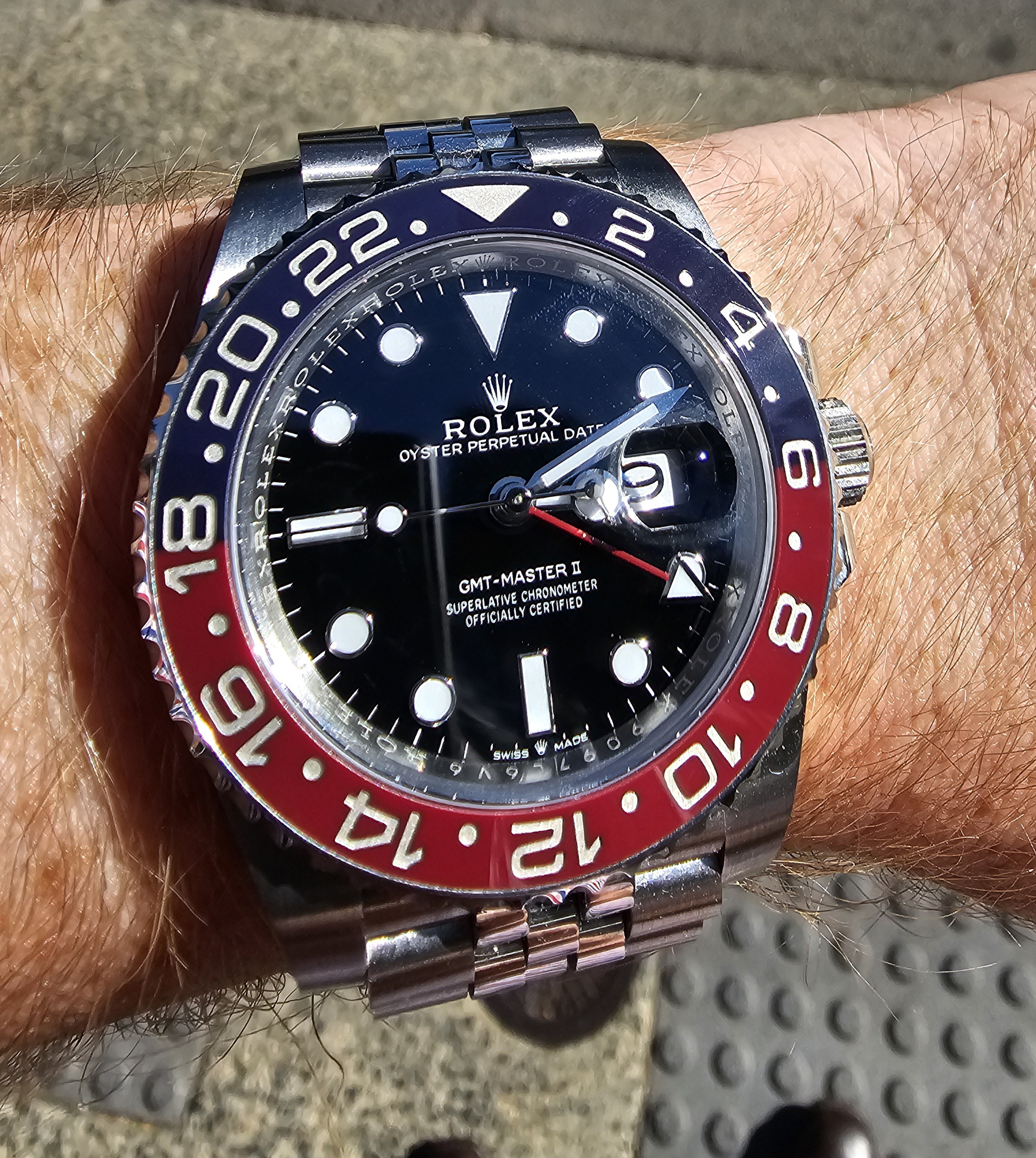
Clean GMT-II Pepsi updated bezel insert V2/V2s review and comparison
- Thread starter CTime
- Start date
Thanks for the response. I was worried cause the serial number.New batch sticker and updated insert (V3).
Is the serial number font correct?Thanks for the response. I was worried cause the serial number.
Fervid
I'm Pretty Popular
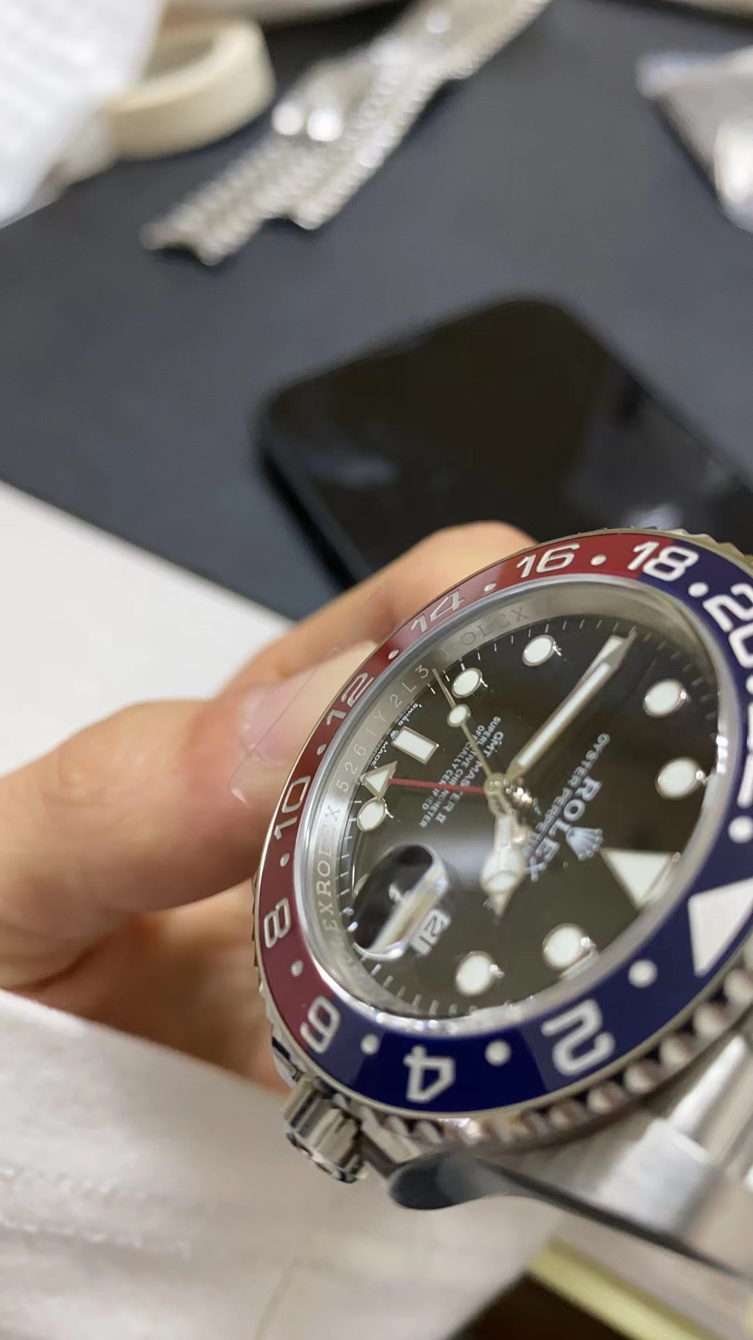
V3 arrived yesterday, the blue is very dark / purple in person.


Yes, 6 is correct
From Jan. 5th
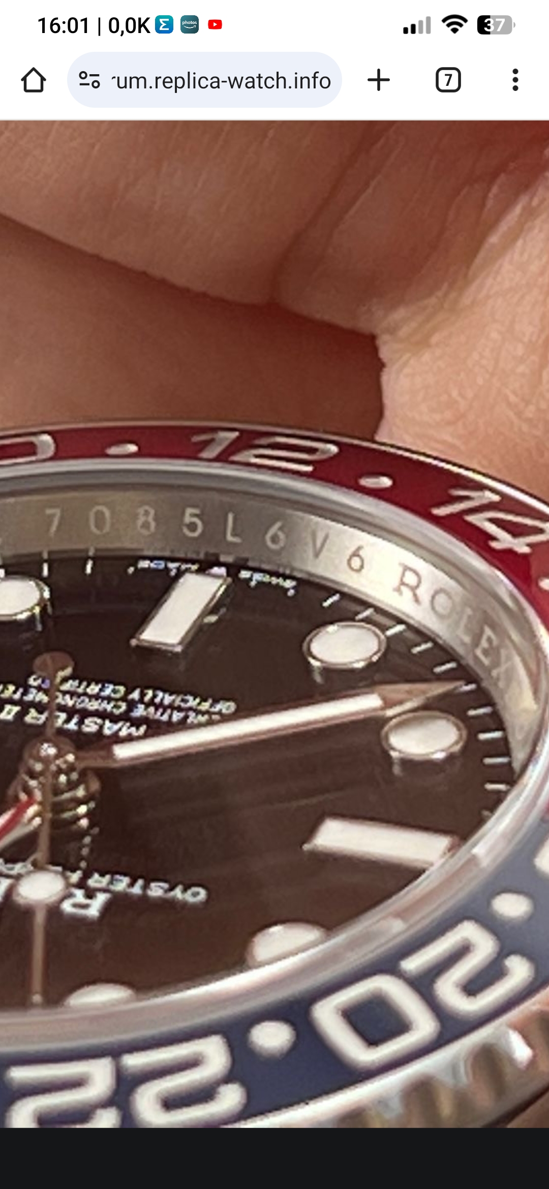
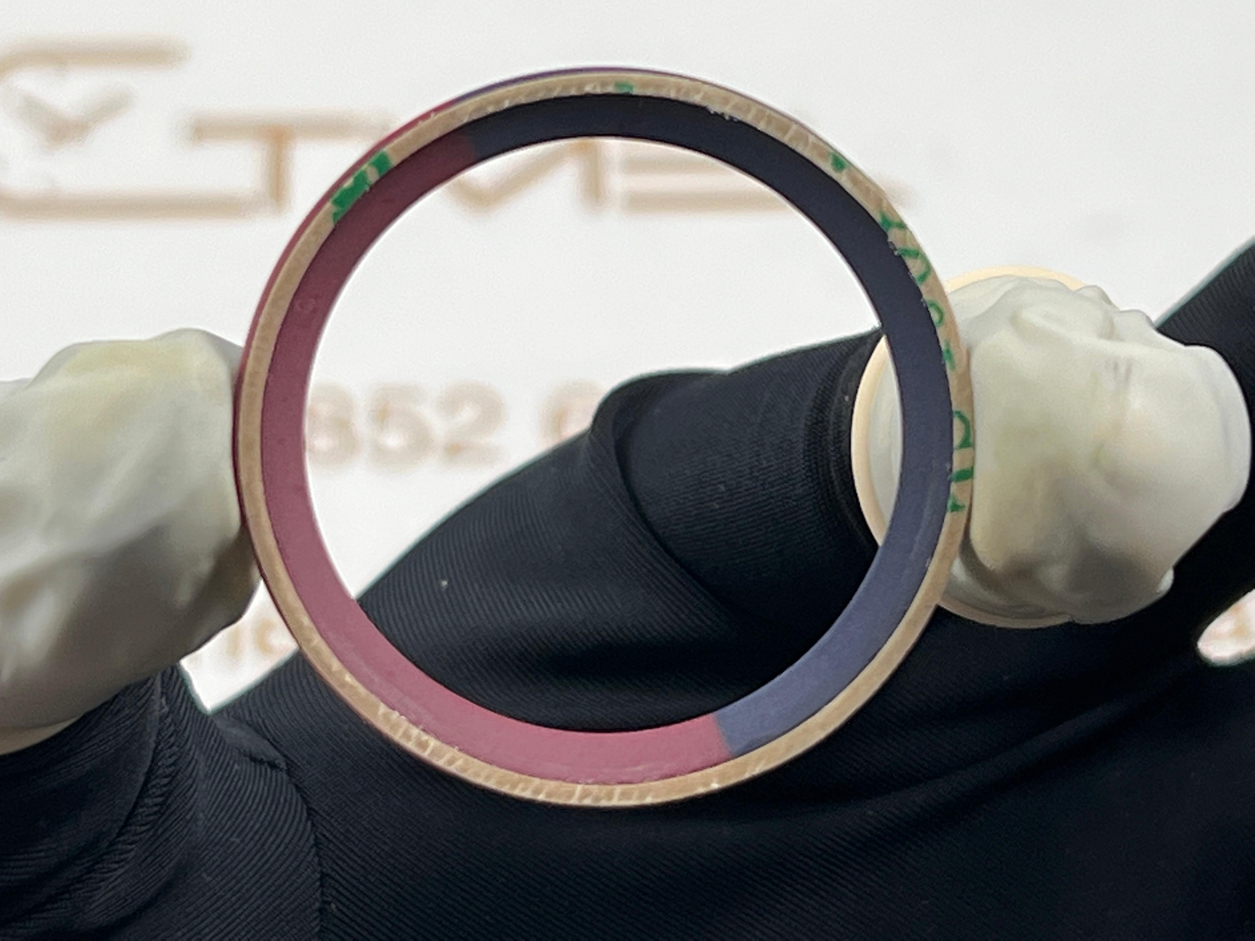
Hi guys at post 1252 I asked more info about 6 font in rehaut to check real or fake clean gmt2.
Someone could please confirm me that the correct font is on first image?
Screenshot 2024 01 05 16 01 45 017 com.android.chrome
Image Screenshot 2024 01 05 16 01 45 017 com.android.chrome hosted in ClickPix.org
 clickpix.org
Screenshot 2024 01 05 12 06 36 753 com.android.chrome
Image Screenshot 2024 01 05 12 06 36 753 com.android.chrome hosted in ClickPix.org
clickpix.org
first real second fake
- 9/9/19
- 2,349
- 1,715
- 113
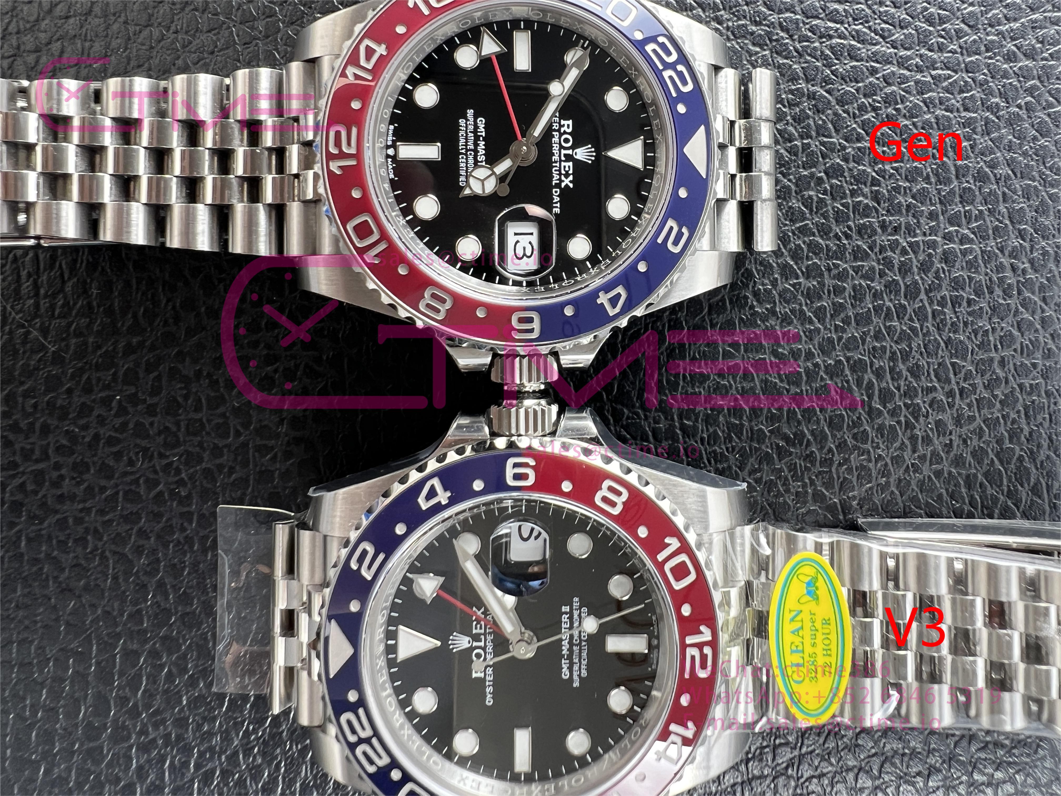
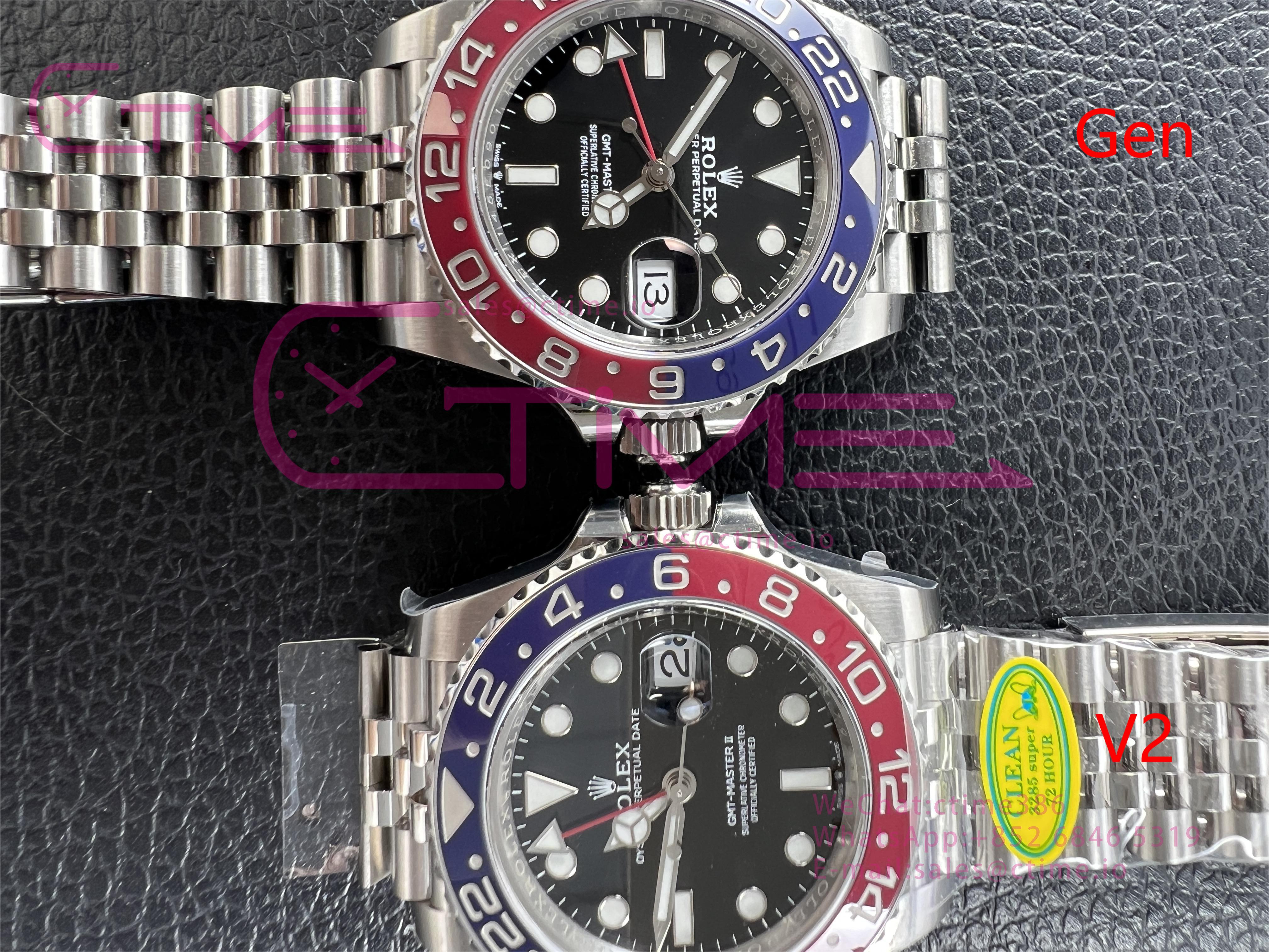
C+ have better rehaut, bezel lip, crystal and gasket with correct height. Maybe hands too.So the V3 bazel on C+ was from clean, besides that any noticeable difference on the case, dial, and hands?
C+ have better rehaut, bezel lip, crystal and gasket with correct height. Maybe hands too.
So clean only has the movement going for it? C+ wins on all other things?
- 9/9/19
- 2,349
- 1,715
- 113
In my opinion yes, i like it straight OOTB. Both factories are good. But cant stand the crystal with wrong date mag and no lip.So clean only has the movement going for it? C+ wins on all other things?
Buy what you like, DD movements are insane.
In my opinion yes, i like it straight OOTB. Both factories are good. But cant stand the crystal with wrong date mag and no lip.
Buy what you like, DD movements are insane.
Thanks for the help, I think I'll get one in the future, still don't know which one yet. I'll probably wait for the c+ v3 to come out first.
SponsorSFC
Do not accept unsolicited offers
CF V3 arrived today.
Big difference in colour between inside the office and outside in the sun.
Big difference in colour between inside the office and outside in the sun.
- 17/7/23
- 152
- 134
- 43
MerovingioRS
Known Member
- 9/8/18
- 104
- 18
- 18
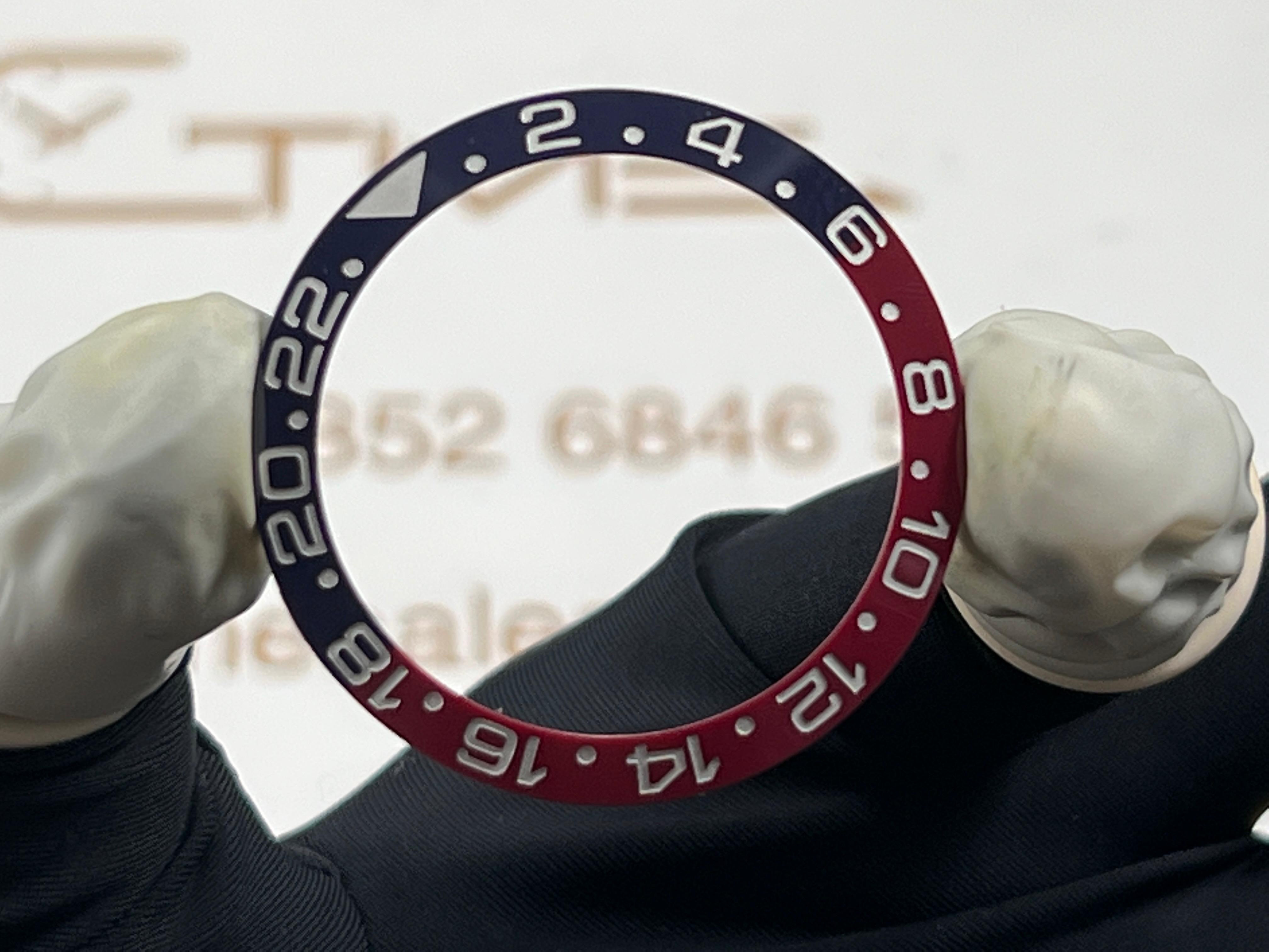
UV Test is very good!!!
Update:
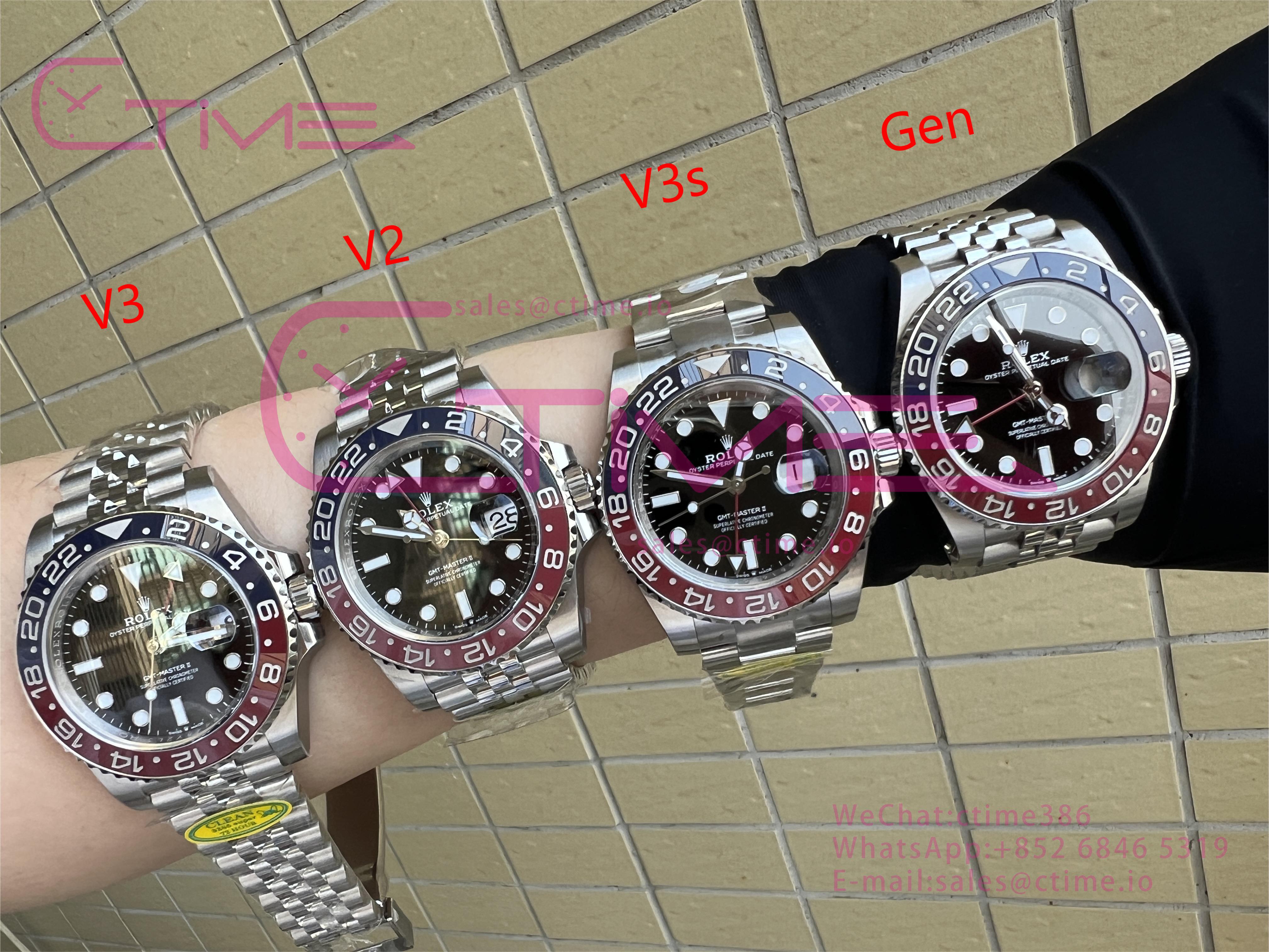
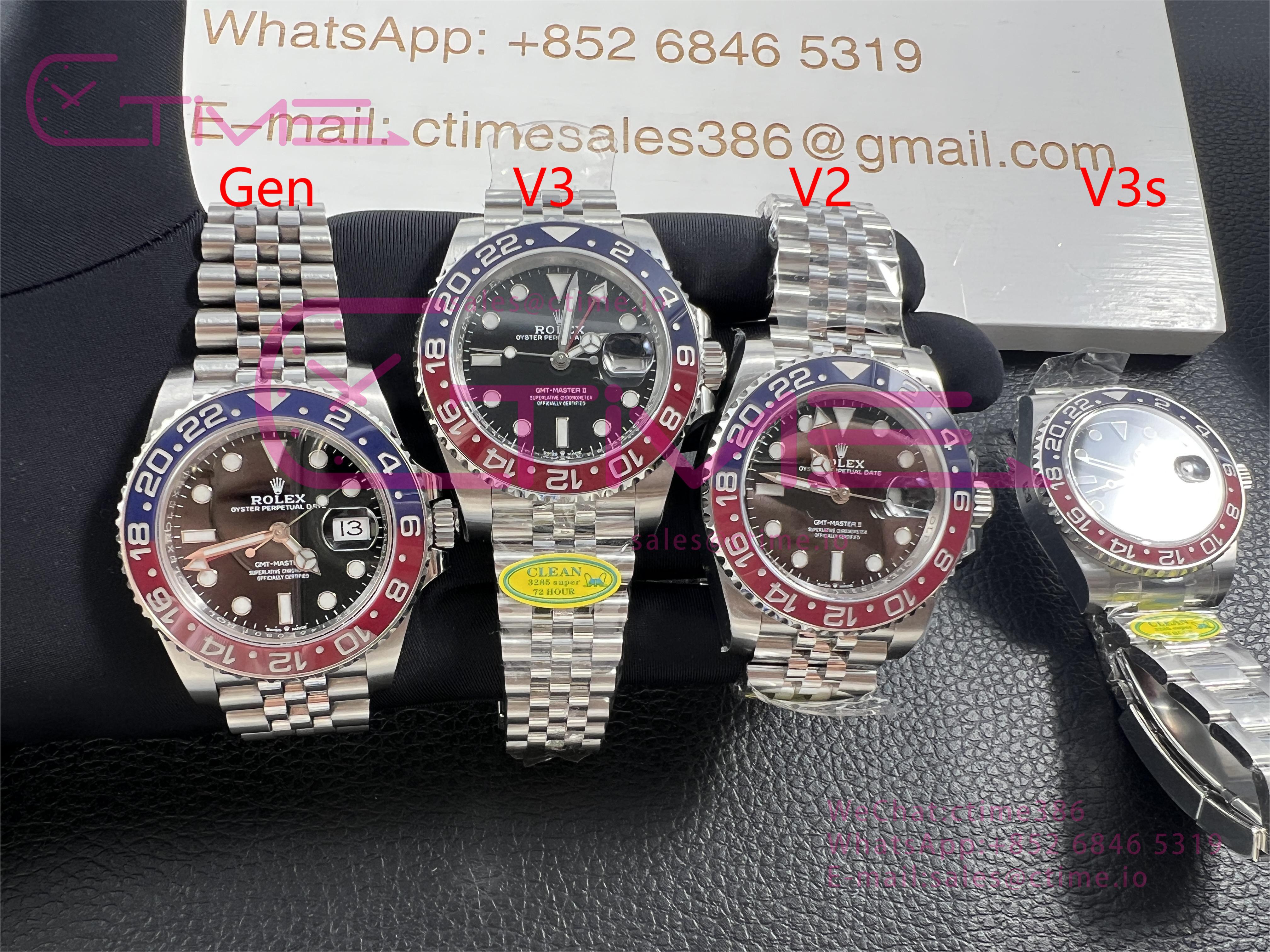
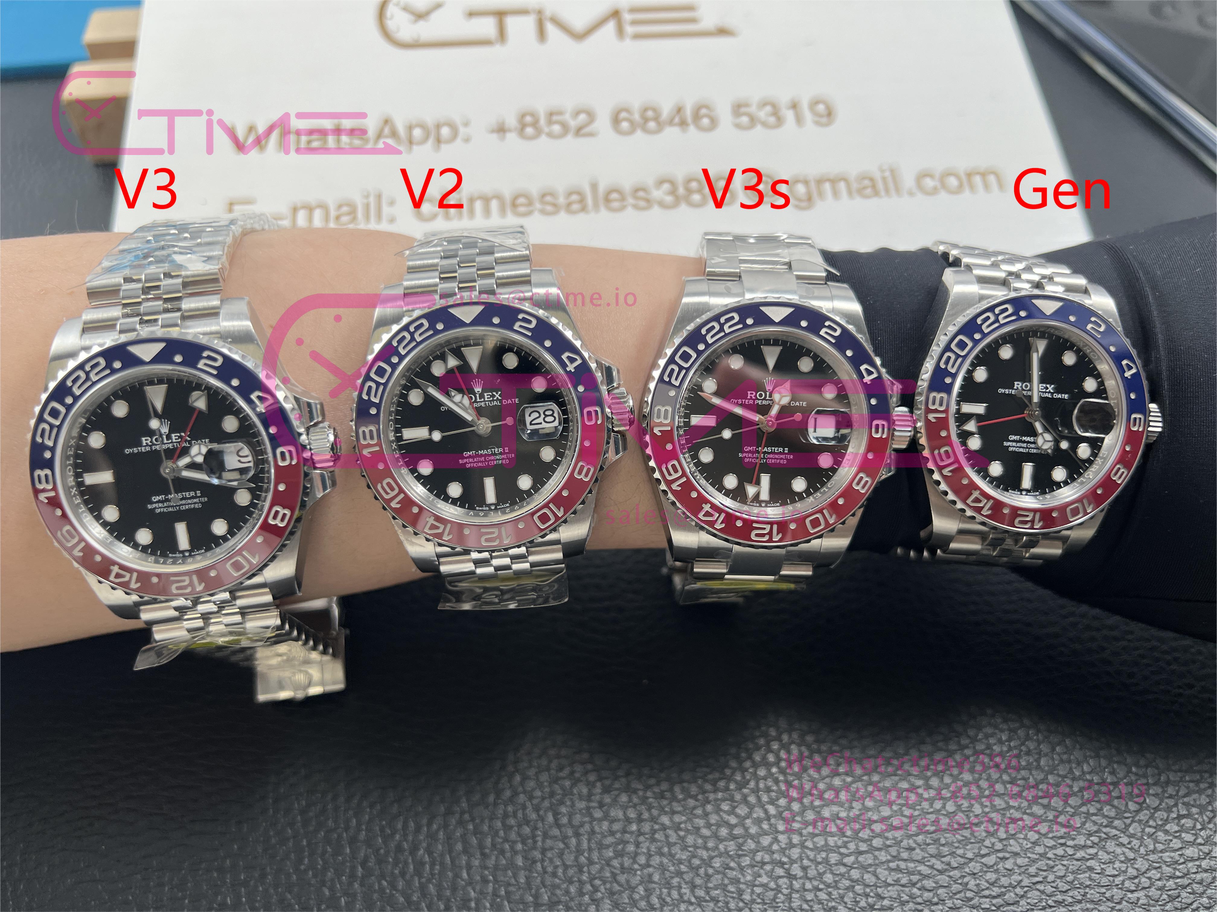
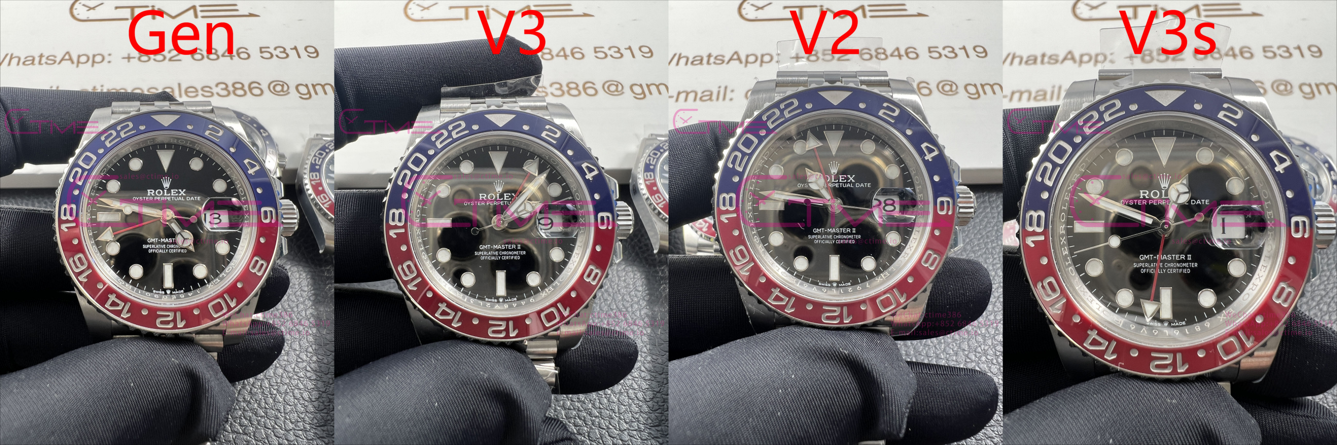
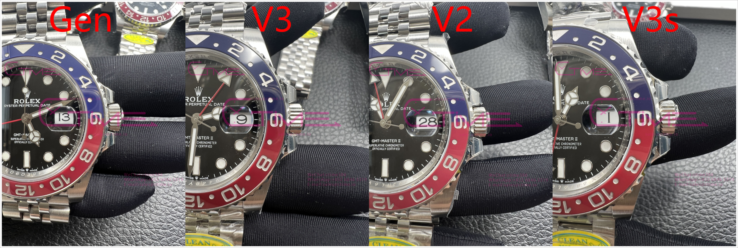
Finally the new comparison of these versions! (Gen is MK3)
The light affected a lot in the pictures, it's really hard to capture the color, please take them as a reference.
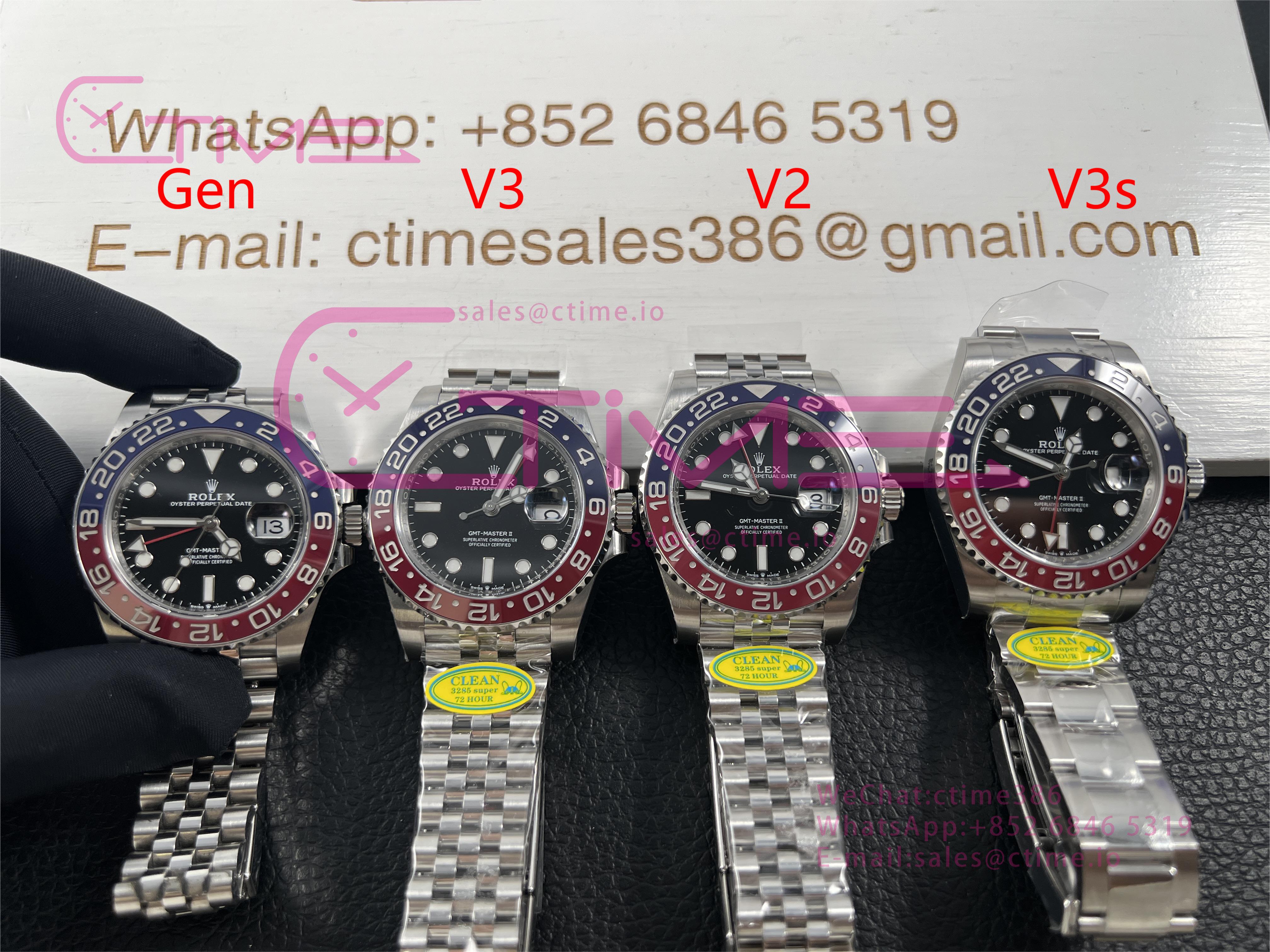
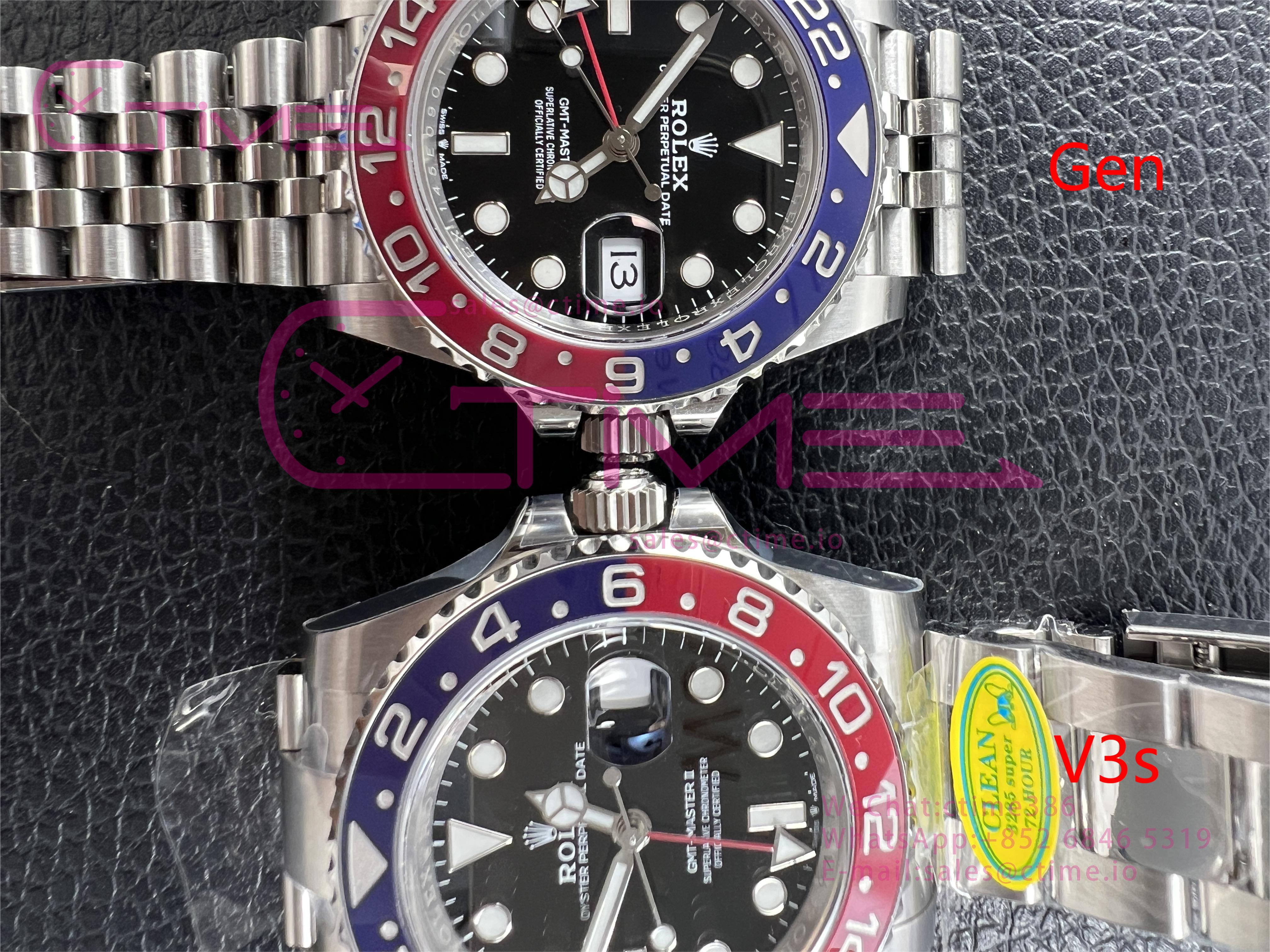
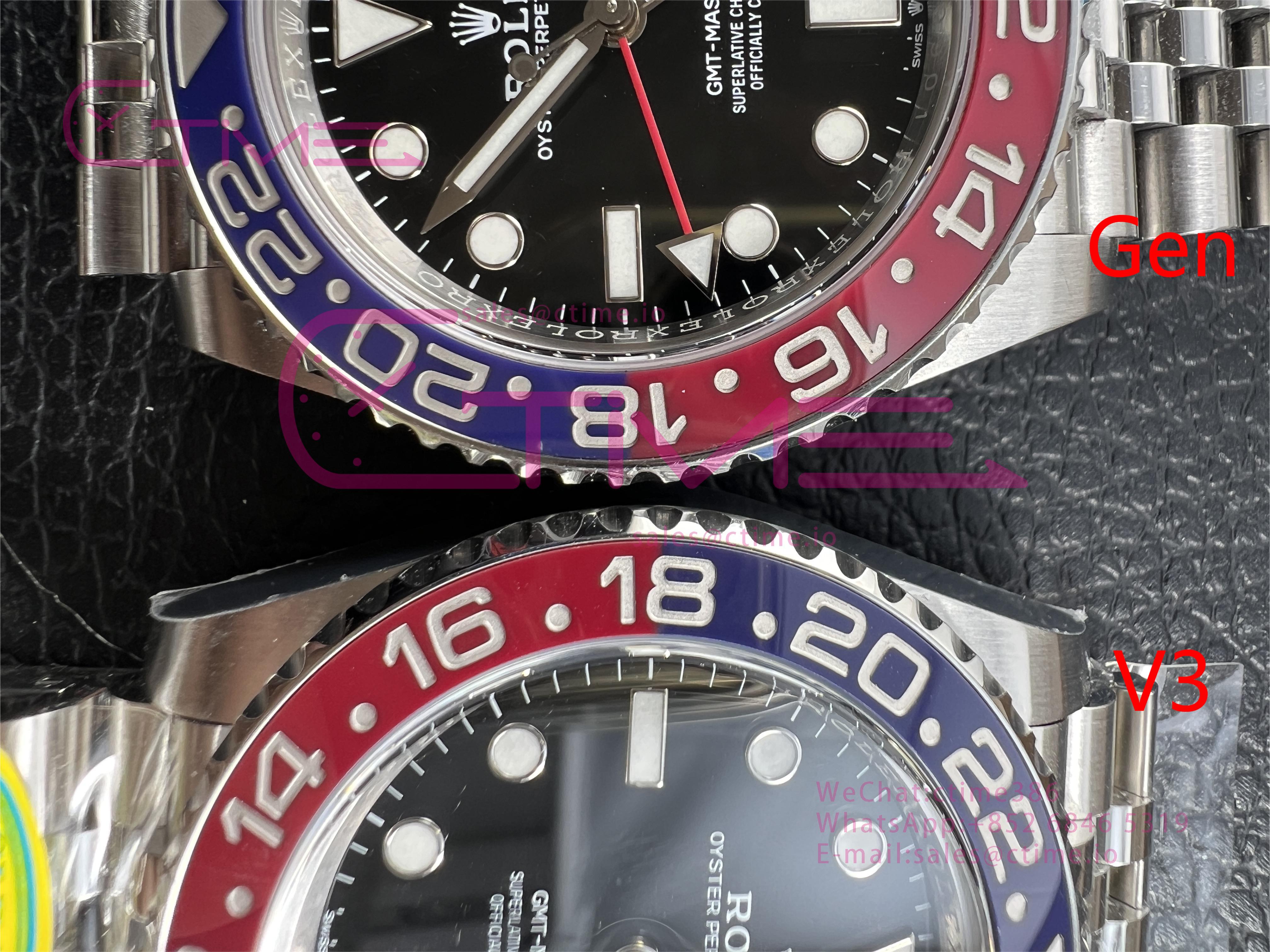
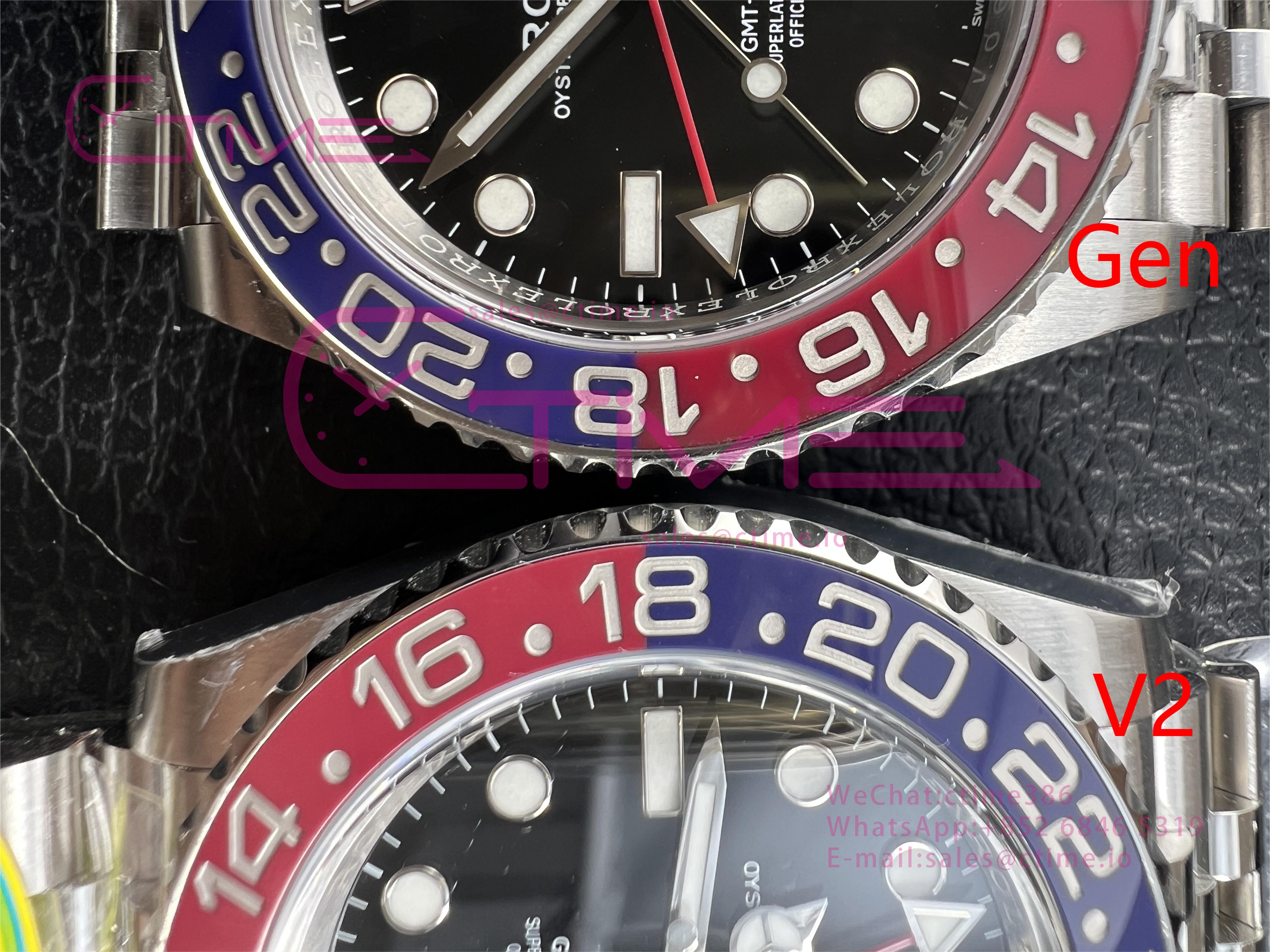
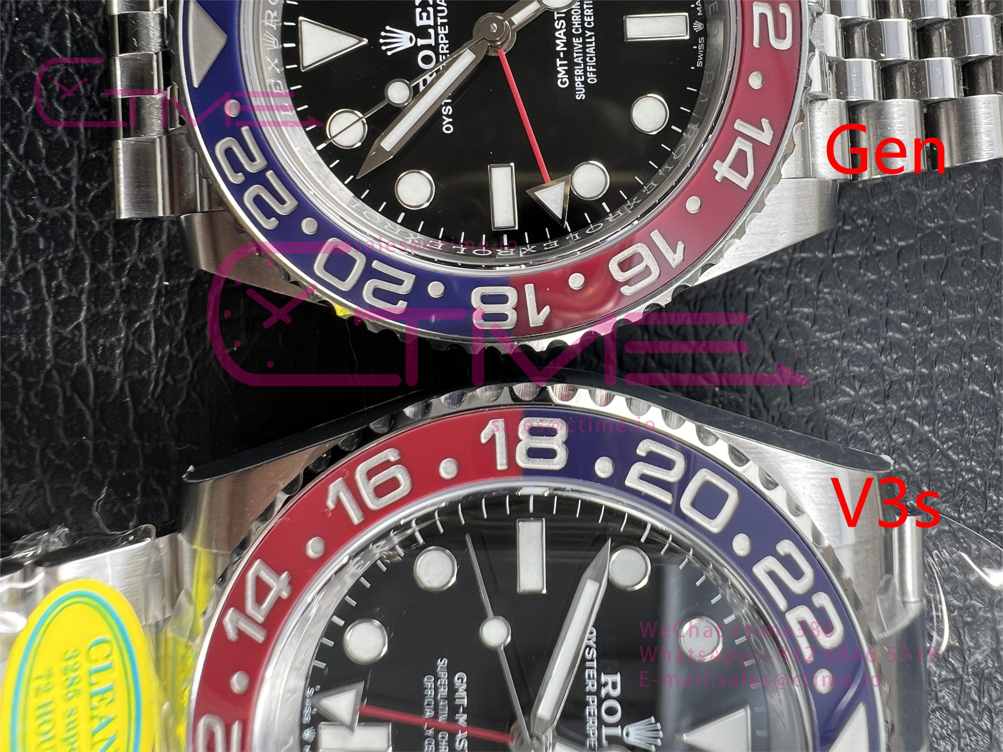
Finally the new comparison of these versions! (Gen is MK3)
The light affected a lot in the pictures, it's really hard to capture the color, please take them as a reference.
Looks rather dark and brown in office lightCF V3 arrived today.
Big difference in colour between inside the office and outside in the sun.
Difficult to judge.
For me the V2's blue is closest to gen. Red sometimes V3 and sometimes V2.
For me the V2's blue is closest to gen. Red sometimes V3 and sometimes V2.
Thanks so much Again @CTime for your contribution to the community!! Well done! This is what we’ve been waiting for.
My thoughts:
1. V2
2. V3
3. V3s
V2 seems to have the best red, V3 seems too darkish red and misses the pastel color a little. V2 ‘wins’ with blue as well. In the end it comes to personal preference. In my opinion, v2 looks the most like mk3 (in these pics).
I have the v2 and owned the gen mk3, kind of surprised how similar they are. The v2 is just WOW!!
V3 also good, either choice is a winner")
My thoughts:
1. V2
2. V3
3. V3s
V2 seems to have the best red, V3 seems too darkish red and misses the pastel color a little. V2 ‘wins’ with blue as well. In the end it comes to personal preference. In my opinion, v2 looks the most like mk3 (in these pics).
I have the v2 and owned the gen mk3, kind of surprised how similar they are. The v2 is just WOW!!
V3 also good, either choice is a winner
Last edited: