penguin234
Do not accept unsolicited offers
- 4/8/22
- 7
- 1
- 3
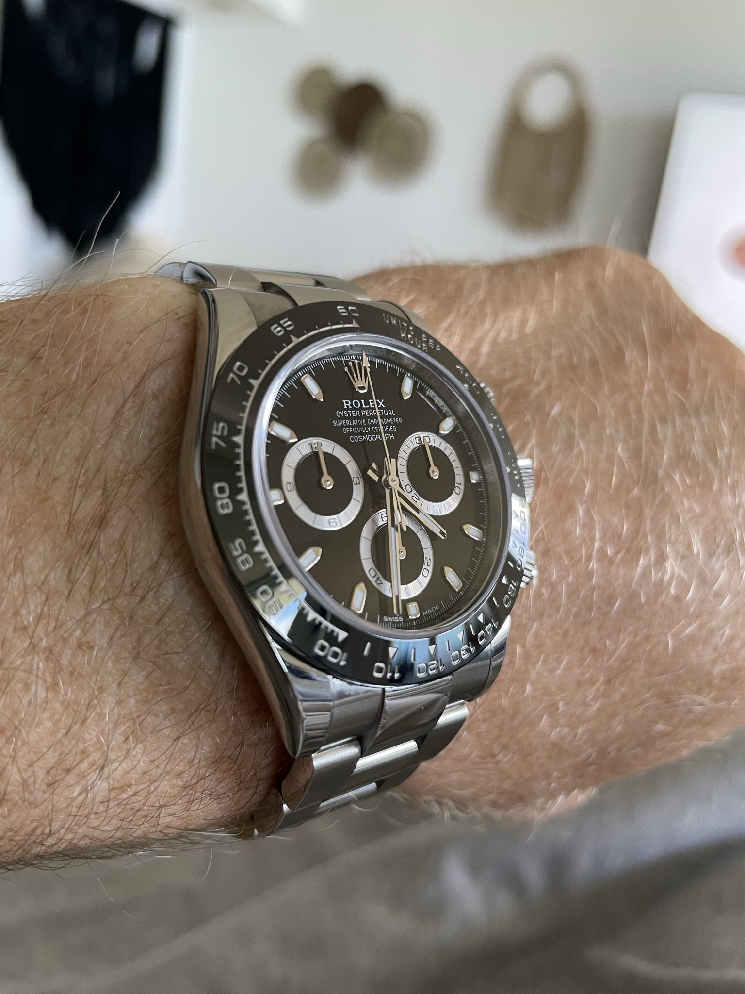
Really nice! Is this the CF V3?Got this one in the mail today, very impressed!


Really nice! Is this the CF V3?Got this one in the mail today, very impressed!
Got this one in the mail today, very impressed!


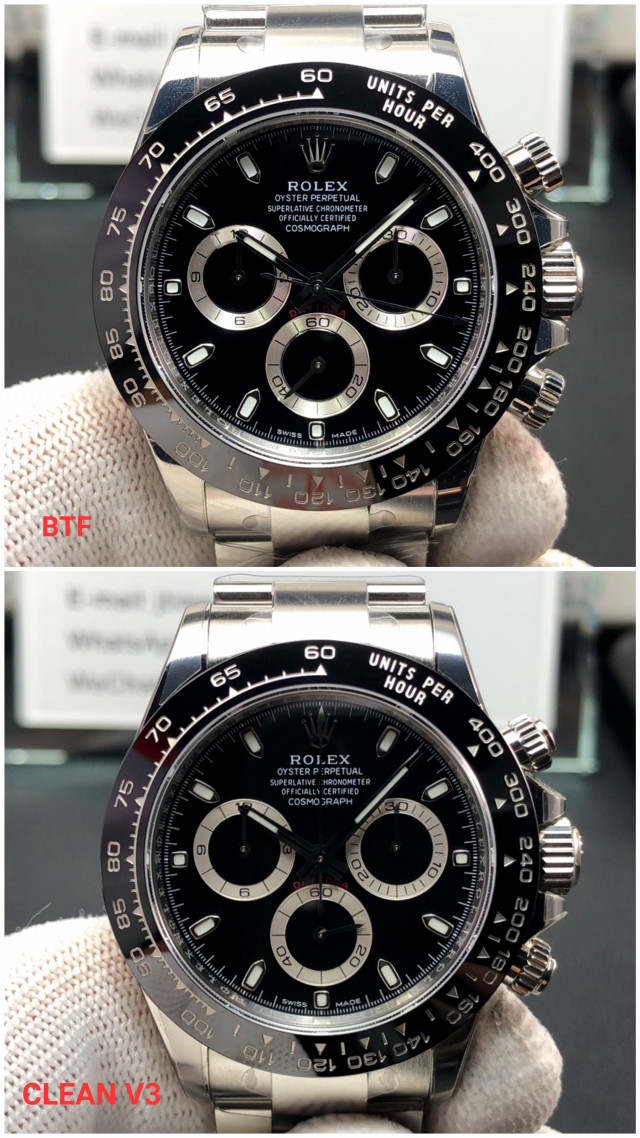
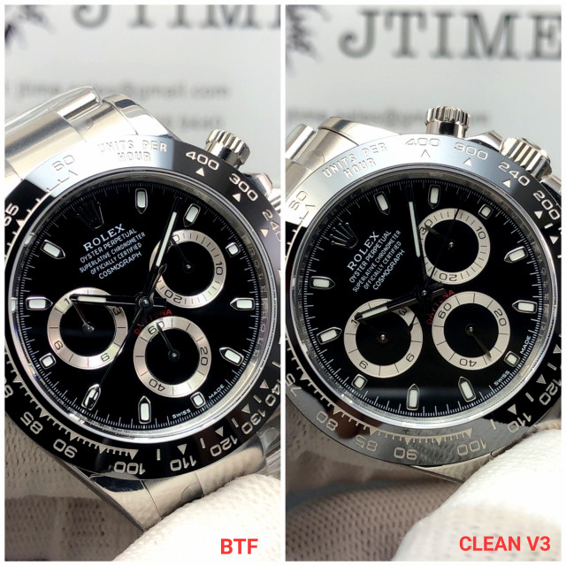
Probably depends on which year your gen is from. Apparently newer gens have AR coating when gens from a few years ago didn'tAlso, the crystal on the BTF v2 to TOO clear compared to gen.
Christ - the shininess paired with the red "Daytona" lettering is just way too off gen...it's completely obvious. Maybe I was wrong and the example a few above with the less shiny subdials was a CFv3 (that the user "wactch" posted).I received my BTF v2 today. When comparing side-by-side to gen, I'm very disappointed in the "shininess" of the subdials. They are BRIGHT. But when I put it on my wrist, do I notice them? Yes, absolutely. But it bothers me less. Mentally, I know it's not close to gen, but it still brings me joy and I can wear it with less paranoia. If I had to choose now, I'd likely get Clean v3 (although it's not an official v3).
Also, the white dial is a Clean v2. I prefer the case of the Clean v2 to the BTF v2. Maybe I'm a noob in that regard.
fauquier spca
Actually, I am very happy with the red Daytona text. Pictures never do things justice. IRL, the red is very close IMO.Christ - the shininess paired with the red "Daytona" lettering is just way too off gen...it's completely obvious. Maybe I was wrong and the example a few above with the less shiny subdials was a CFv3 (that the user "wactch" posted).
Ah, I see what you're referring to now. That outside sunlight picture?Christ - the shininess paired with the red "Daytona" lettering is just way too off gen...it's completely obvious. Maybe I was wrong and the example a few above with the less shiny subdials was a CFv3 (that the user "wactch" posted).

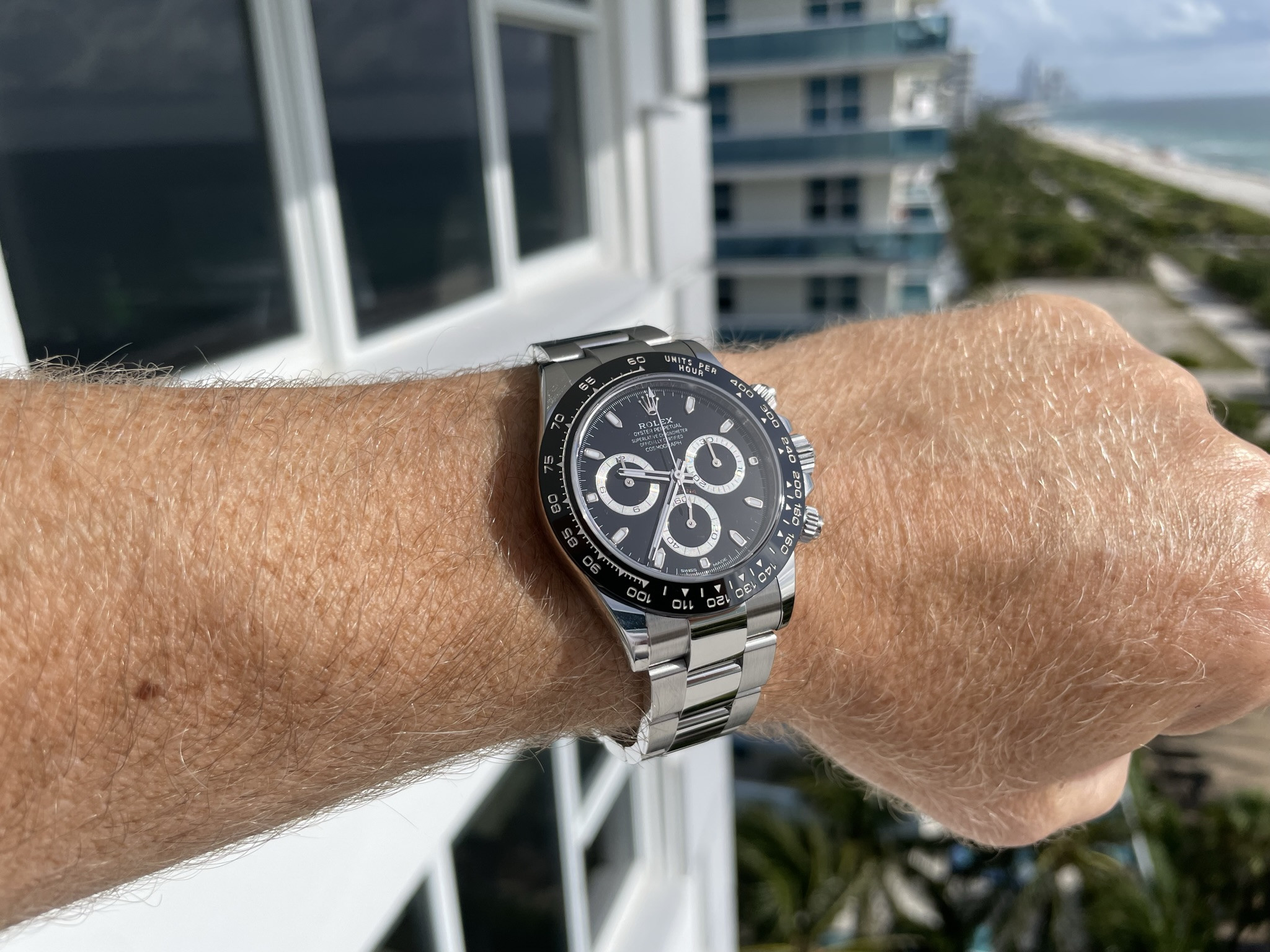
Is this btf?
Subdials look so close to gen!! I'm not alone there right? This looks very very close on first glimpse but further comparisons will be needed on the micro level. At a glance though...dare I say most accurate OOTB yet? The red ink Daytona lettering, while off, doesn't look HORRIBLE without a gen next to it even...unlike many other models that veer towards a bright red, they have gotten much closer to the darker "blood" red format (albeit a bit thicker).
That has to be CF "v3"
It's btfChrist - the shininess paired with the red "Daytona" lettering is just way too off gen...it's completely obvious. Maybe I was wrong and the example a few above with the less shiny subdials was a CFv3 (that the user "wactch" posted).
")
Thank you for taking the time to post all these pictures and comments... The difference is easy to see.I received my BTF v2 today. When comparing side-by-side to gen, I'm very disappointed in the "shininess" of the subdials. They are BRIGHT. But when I put it on my wrist, do I notice them? Yes, absolutely. But it bothers me less. Mentally, I know it's not close to gen, but it still brings me joy and I can wear it with less paranoia. If I had to choose now, I'd likely get Clean v3 (although it's not an official v3).

It's tough because you can't see the shine the CFv3 vs the gen, but I'm a bit confused with everyone leaning towards BTF. In these comparisons and the above - the BTF just looks to shiny on the subdials, white dials too white - all of it a bit to "clean" lol (ironic). Am I wrong here?There seems to be the same difference between BTF / GEN and BTF / CLEAN