- 19/7/16
- 607
- 949
- 0
Hi all, while I do not wish to take sides with either party in this minor misunderstanding, I do believe that what Tigerdragon says has some merit, albeit putting it across or justifying it in a way that might have ruffled some feathers.


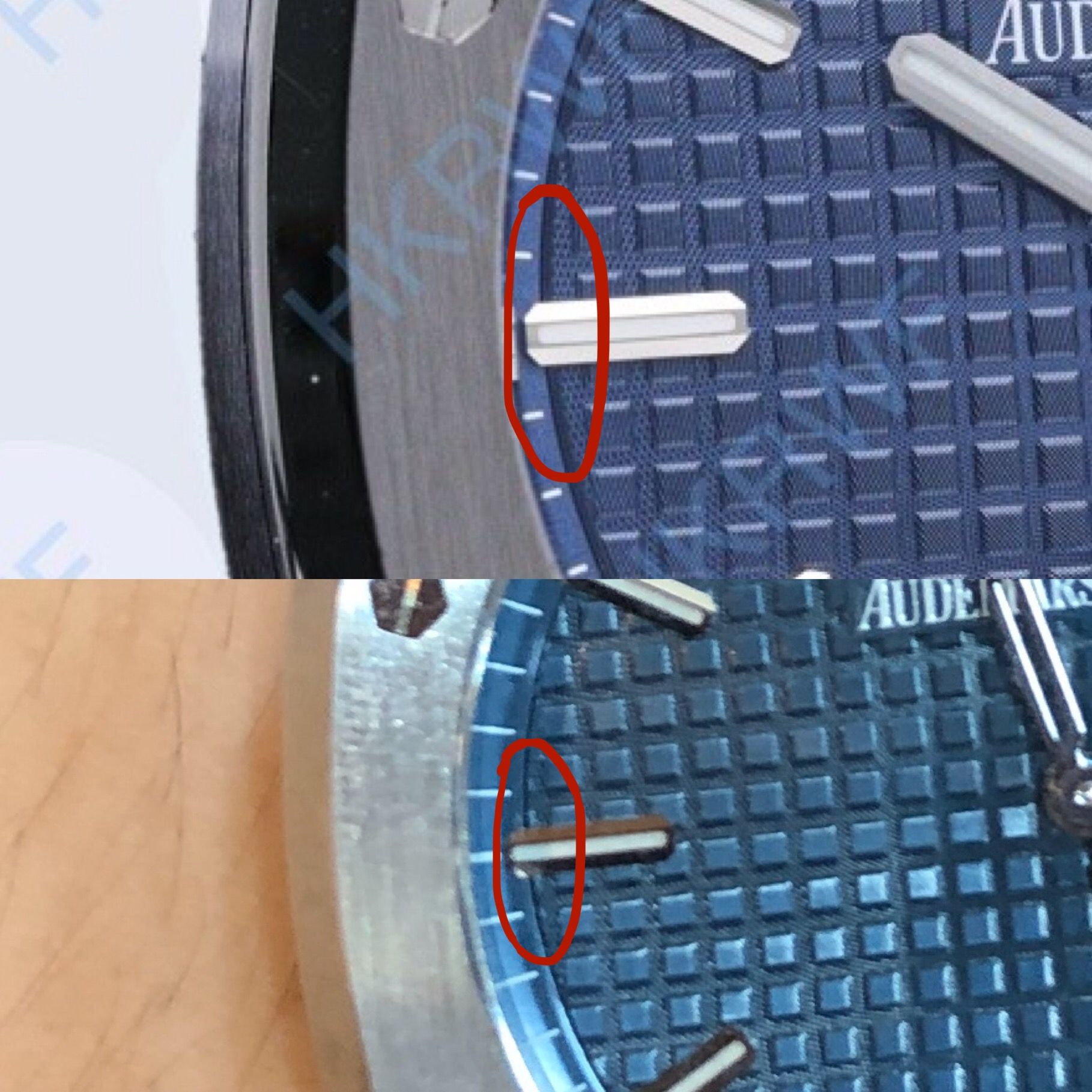
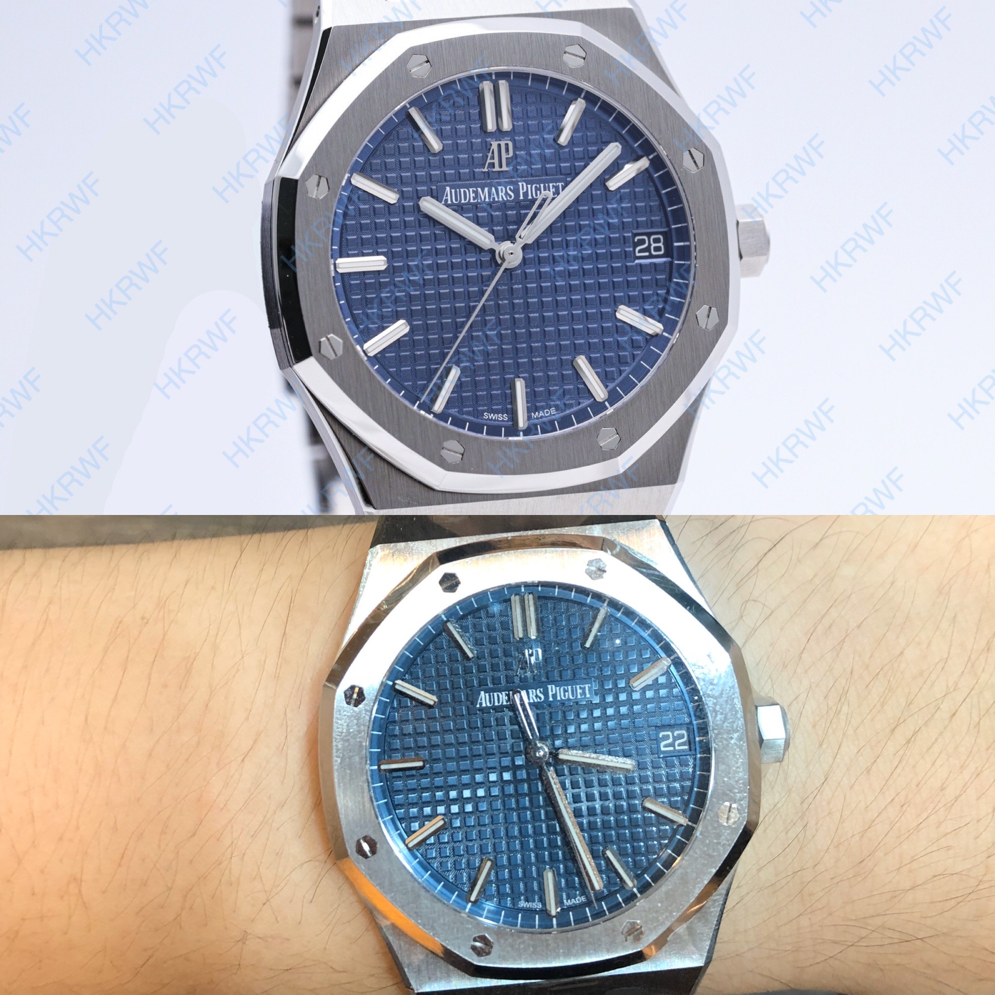
If you look at the aforementioned pictures, the bottom image of each collage is a gen 15500 I tried on, while the other is the HD image of the ZF 15500 that kobe24 has provided us with.
Looking at the edge of the tapisserie at 9 o’clock, you will notice on the gen that the edge of the next ‘pattern’ does in fact appear, with the majority of the ‘pattern’ being hidden by the minute track. However on the ZF 15500, this ‘pattern’ simply stops, leaving an awkward space where there should exist a continuation of the tapisserie ‘pattern’. Looking at the gorgeous gen that legend has, it is also apparent on his 15500 that the edge of the ‘pattern’ does exist at 9 o’clock, with the majority being hidden by the minute track. The aforementioned occurs at the 6 o'clock marker as well.
Everyone is entitled to their own opinions but I think that properly articulating our reasons for our opinions instead of shooting each other down with curt remarks will serve to enhance the collective experience we have here at RWI
Thank you for this breakdown.
I’ve nothing against Tigerdragon personally other than the way he appears to discredit all new rep releases and even gens lol.
But what the heck, everyone is entitled to his opinion. I don’t think tigerdragon meant to harm anyone with his opinions too. He’s someone who has been around and his posts can carry some weightage to new members reading the information for the first time.
I have no quarrel with him in this regard and thank you once again daracus for your informative post!
Sent from my iPhone using Tapatalk
Blue will be spot on, you can't capture it with a camera same problem was with the 15400 its to vibrant (like the Gen).
BIONONE
You didnt watch the youtube video didnt you? Also i don't care what do you think about mei'am not a AP fanboy who approves any flaw. Even not on Gen if somebody is dumb enough to pay 20k for a dial with dust and shit on it, do it! I would not do it
its so simple.
Its just pure fanboyism, like the Rolex guys which never see any flaw on there submariners even smoke mentioned misaligned markers on Gens etc. But like i said you didnt watch the youtube video so yeah. Also because iam tired to discuss with you i will just ignore your posts.
P.S.: Who did the investigation on the XF 15202 screws postition? Ahhhhh that was me who did search for the serialnumbers and found the exact same models with the exact same bezel and screw position. Everybody was criticizing iti was the only one who actually looked it up like i looked it up on the 15400. Where was you? Ahhhh right you did nothing (like always). Thats why i don't write a review about the 15400 ZF because iam sick of this talking the whole time.
I have eyes and i see flaws and thats it. End of Story and now back to topic.
Interesting I never saw that on the gens I saw. Batch issue with the gens? Would be not the first time AP is fucking something up.
BIONONE
Iam not talking anything down be reminded that I bought the 15400 after I critized it to make me an own picture. On all the 15500 gens I saw this issue was not present even kobe said in the startpost that they fix that issue. AP are also making mistakes in the past they are not "perfect" as it seems like that one YouTube video were someone shows the flaws on the new RO diver with dust and not printed underside of second hand etc.
Would be also not the first time that AP changes the tapseries and colors in the series.
https://youtu.be/Z_Umb_S-RDM
Check this out.
Grey and black dial also available at puretime now.
Thinking about buying this grey one, looks closer to gen than the blue dial.
What do you think?
https://puretimewatch.io/royal-oak-...tured-dial-on-ss-bracelet-a4302-free-box.html
Wow this looks very promising, I was about to pull the trigger on a 15400 but now I’m debating on getting this 15500.
legend Hello sir, as you have both 15400 and 15500 gens, and very knowledgeable on AP’s. What would be your preference between both models if you had to choose one and why?
Many Thanks in advance.
15500 is a nice watch but for me the dial is unbalanced, everything logo and brand on top and... Nothing at bottom, empty wasted space.
Personal opinion.
I agree 100%/ I hate the dial design of the 15500. If they wanted to eliminate the Automatic text from the bottom half then at least put the AP logo there...
15500 is a nice watch but for me the dial is unbalanced, everything logo and brand on top and... Nothing at bottom, empty wasted space.
Personal opinion.
A friend got one with the blue dial and it's gorgeous in the metal.In fact the more I look at a 15500 the more I understand why AP made those specific design choices. Maybe Legend will agree too
India Whiskey Charlie N0tail_ SHB Phantomtech The 15500 vs 15400 will always be an on going debate and personally, the 15500 is a watch which needs to be viewed in person to better appreciate it. It will not guarantee that you will like it of course, but like most watches, you need to view and feel it in person to form a complete opinion.
Vs the 15400, the 15500 has thicker hour markers, different hands, a different date window position and date font, and a thicker bezel visually. Like you guys pointed out, it does have a somewhat unbalanced dial print, with the missing "automatic" text. Of course, it also has a brand new cal.4302 movement, which is supposedly higher specced than the cal. 3120.
For me, I like both the 15500 and 15400. Having already owned the 15400 then, the 15500 was a watch which grew on me. I bought one as I was offered it at retail, so it was a no-brainer. The watch took time to grow on me, and it gave a very different feel vs wearing the 15400.
The 15400 has a slimmer profile, a more balanced dial, and the slimmer hour markers and hands make it the ideal dress watch and a classic beauty. The 15500 comes across as slightly more bulky, more contemporary looking, and more sporty. The wear-feel is different, even though both are 41mm. The proportions of the dial, bezel and mid case makes the 15500 look bigger on the wrist, and the new placement of the date window is reminiscent of the Nautilus dial layout. The 3120 caliber used in the 15400 was a little undersized, and the dial layout was created to accommodate the caliber size, and the end result was aesthetically very pleasing and balanced to most. The 4302 caliber used in the 15500 can be argued to be the "optimal" size for the watch, though this is of course a moot point,and already the subject of many contentious discussions.
You can own a 15400 and a 15500 and find different occasions for both. They are not alternatives for each other IMHO. With regard to the missing "automatic" text on the 15500 dial, it is a case of "less is more" for me, and it allows you to view the intricate finish of the tapisseries better. To each his own. Be it the 15400 or 15500, both are beautiful pieces of art and occupy niches of their own.


