Hey Guys,
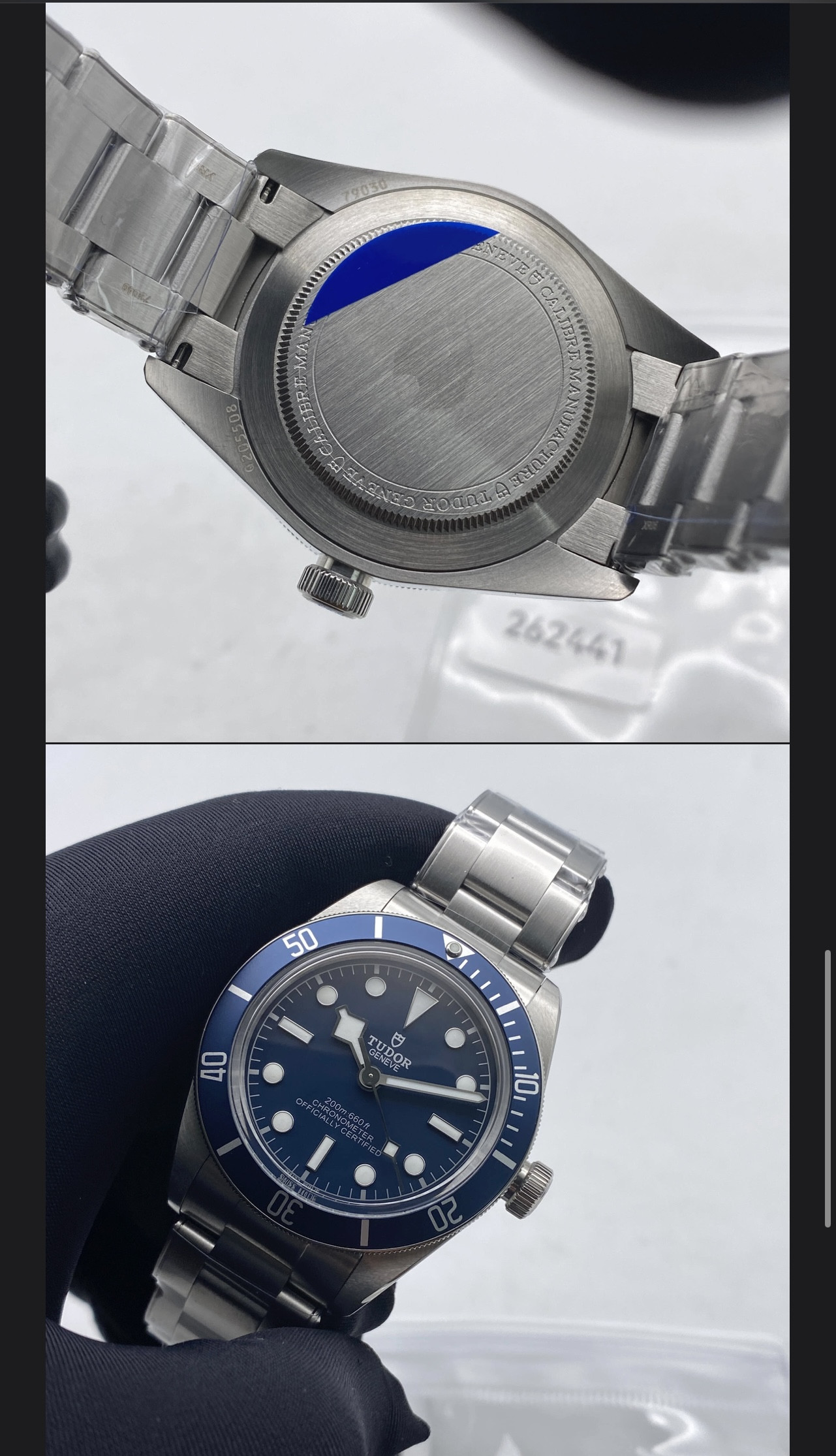
anyone who knows me here or on discord knows I've aquired a Gen Tudor. A timeless Black Bay Fifty-Eight in Gilt Black. I just received a brand new ZF V2 version of the 58 and thought why not give something back to this forum which I just love spending time in.
Here is my review guys:
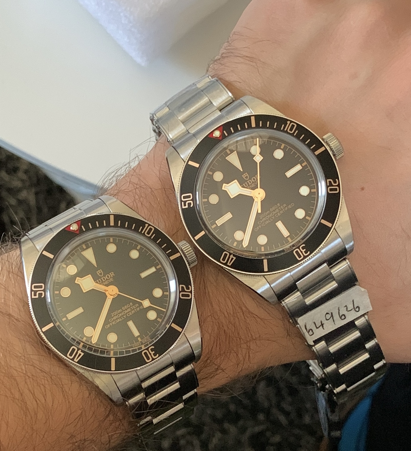
Here we have the two watches next to each other.
GEN on the left, ZF on the right!
Both beautiful watches.
So what differences can you see from this perspective?
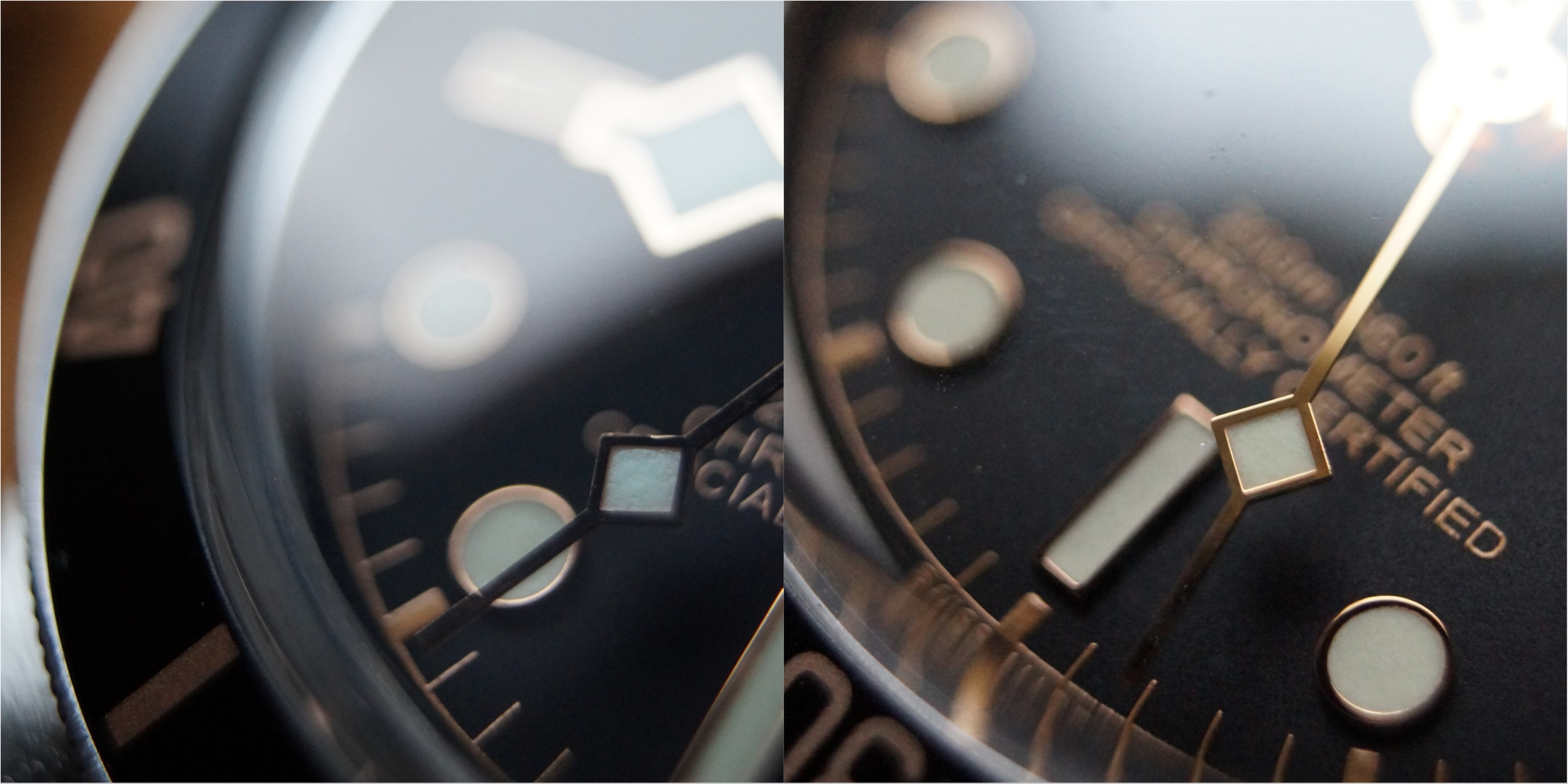
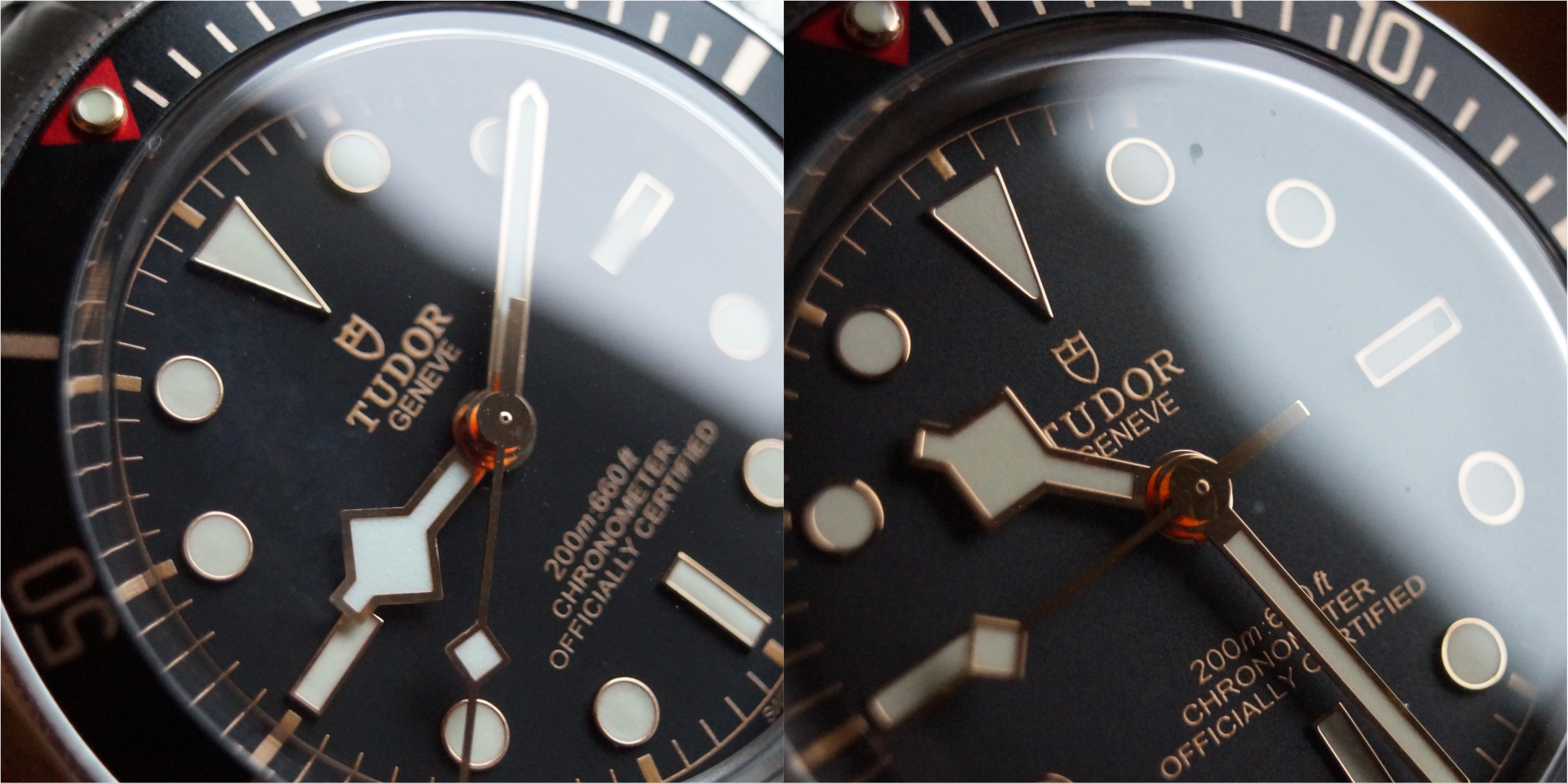
What instantly feels off on the ZF is the color of the lume on the hands. Much more white than gen!
Also color of the dial looks dull compared to GEN. The gen dial has more texture to it.
Also the font on the gen is thicker but not as wide as the ZF.
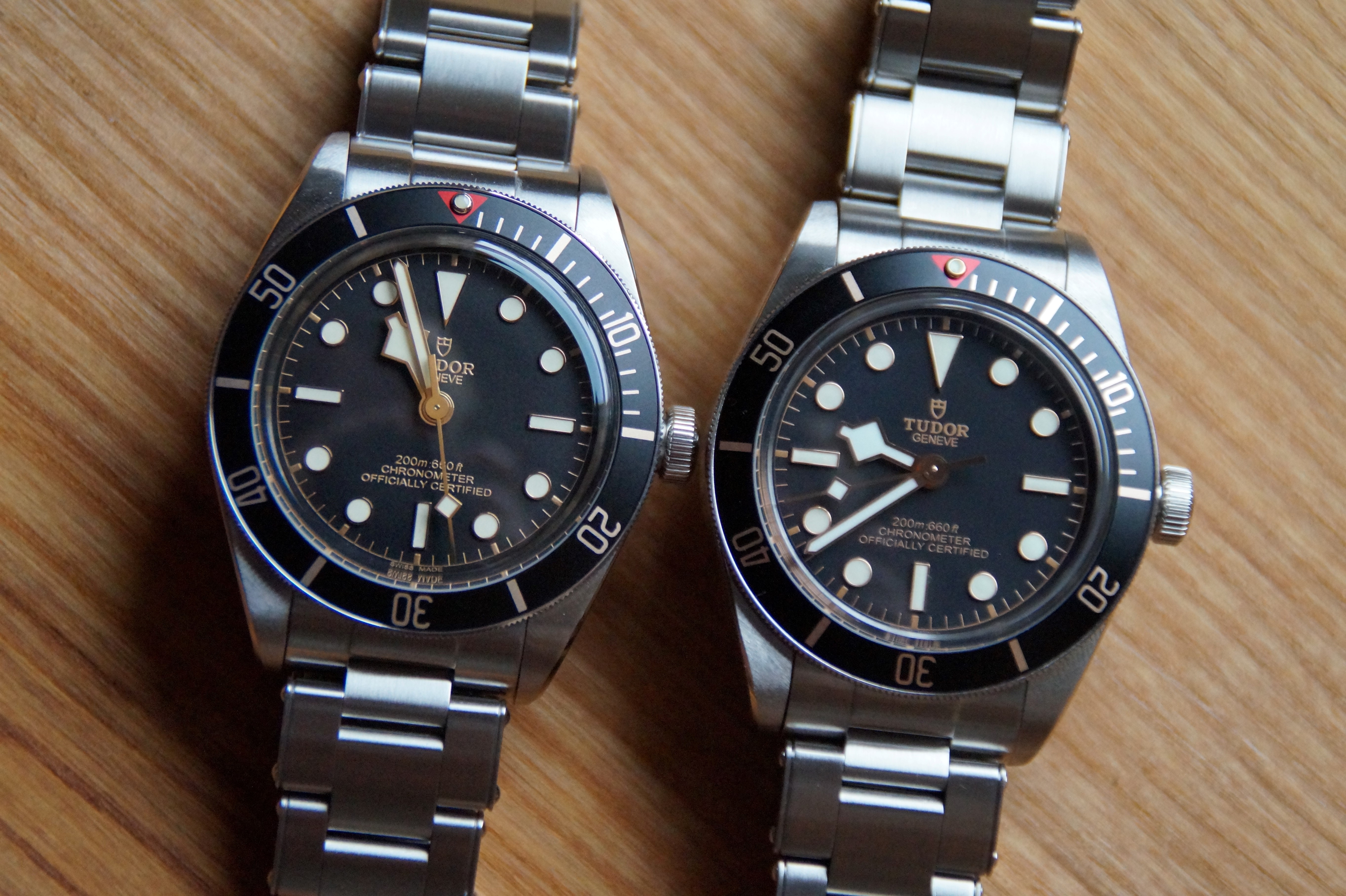
So now up to the makro pictures.
From now on in EVERY PICTURE ZF ON THE LEFT and GEN ON THE RIGHT
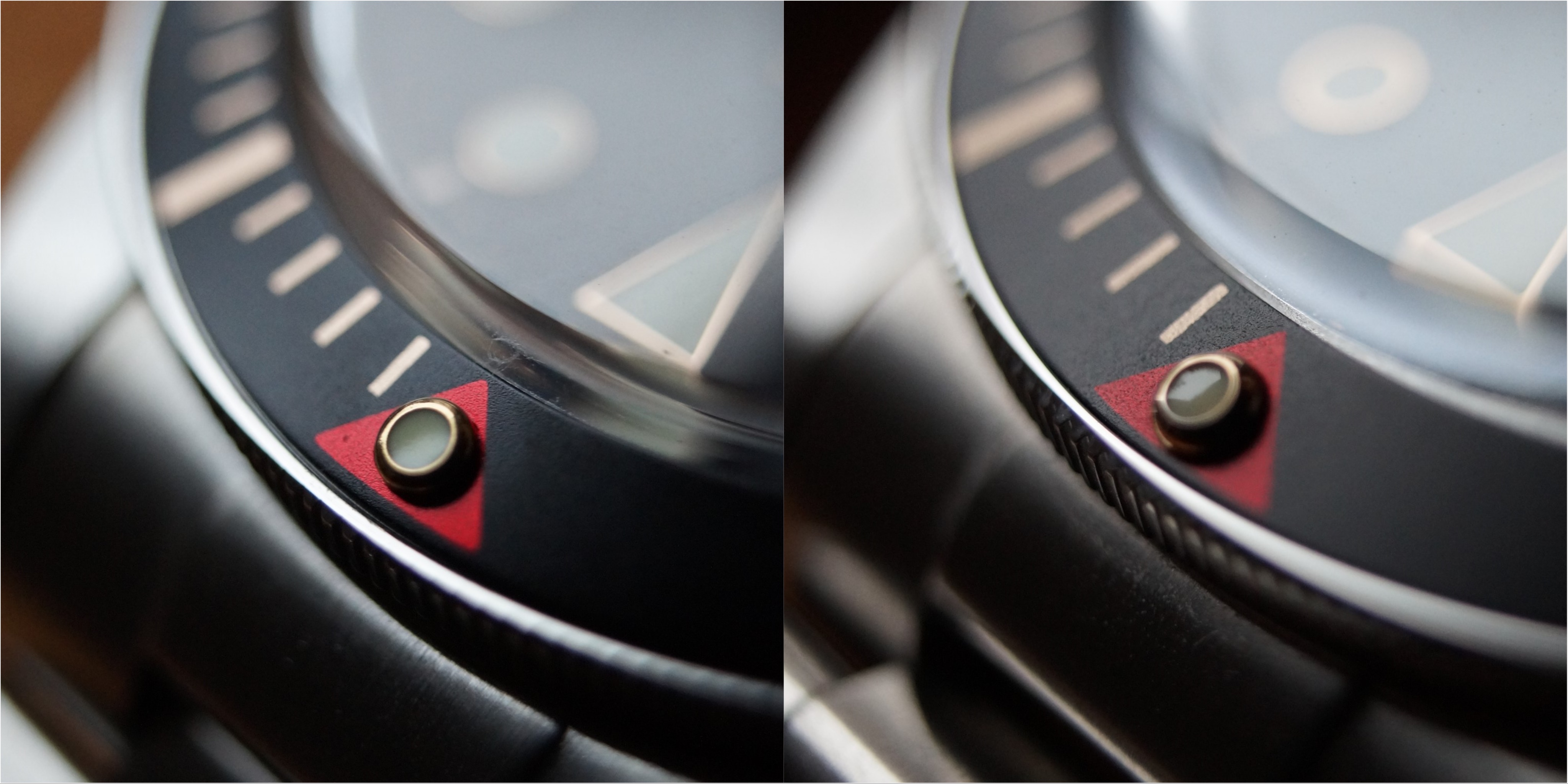
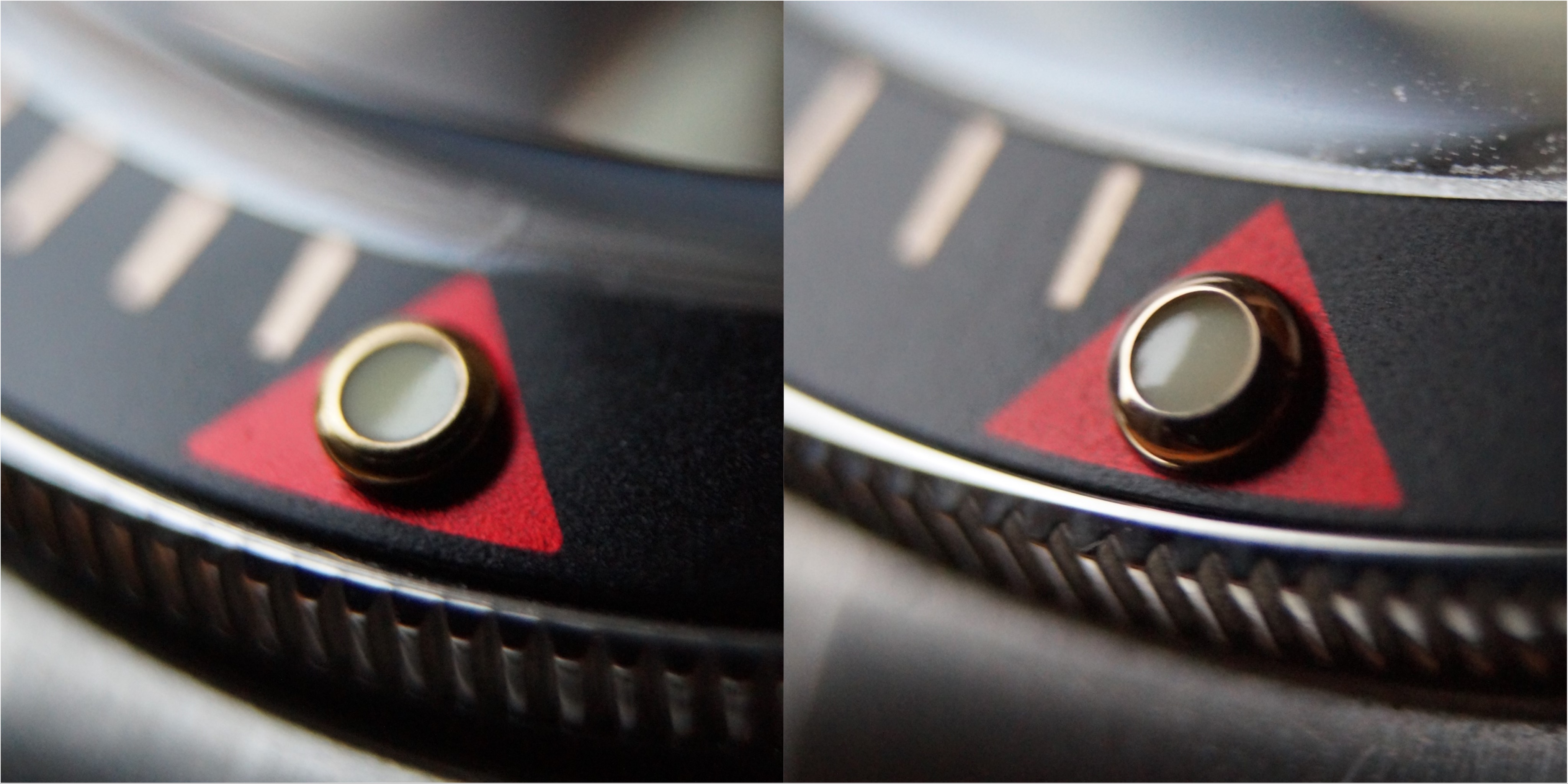
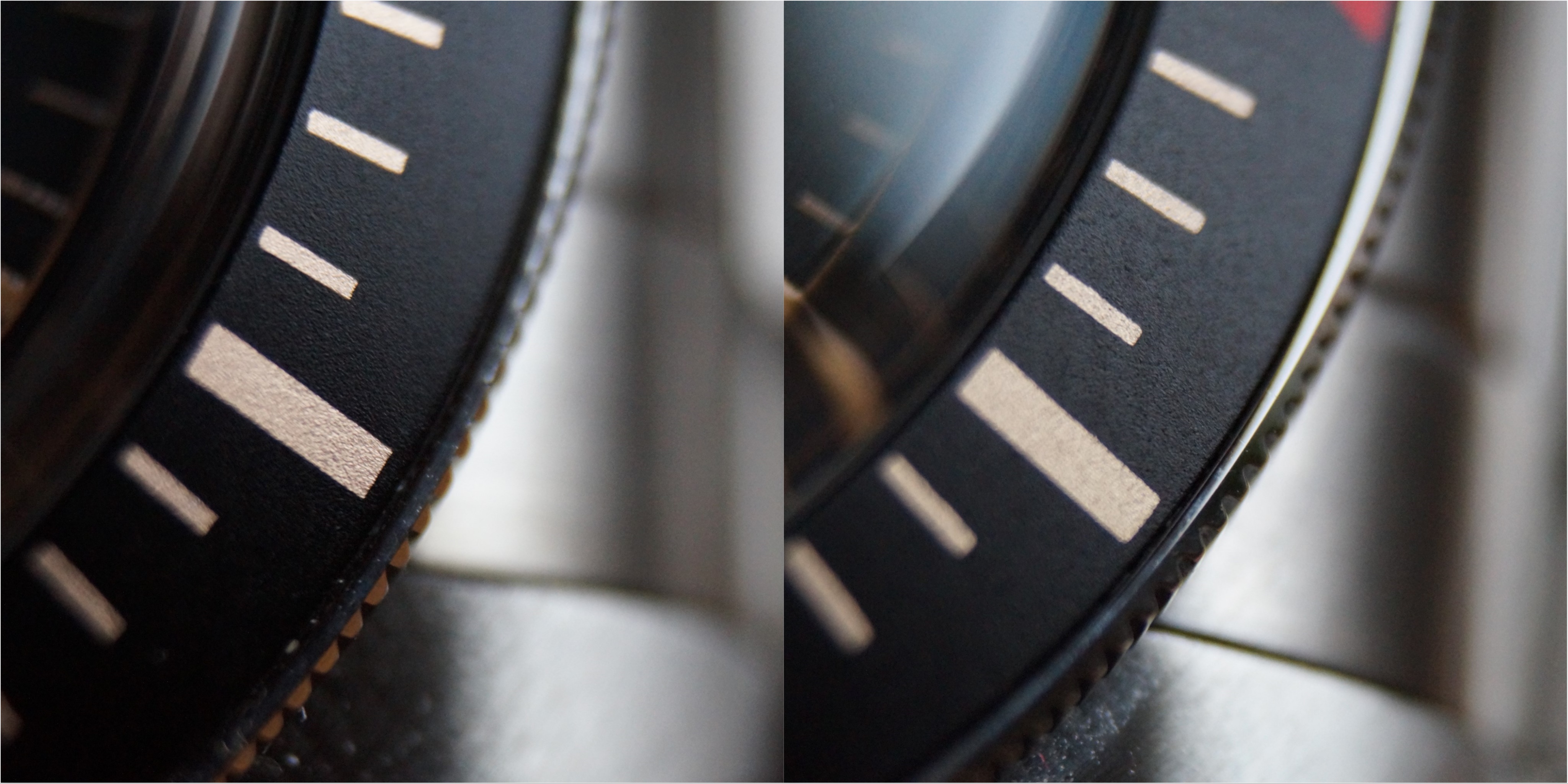
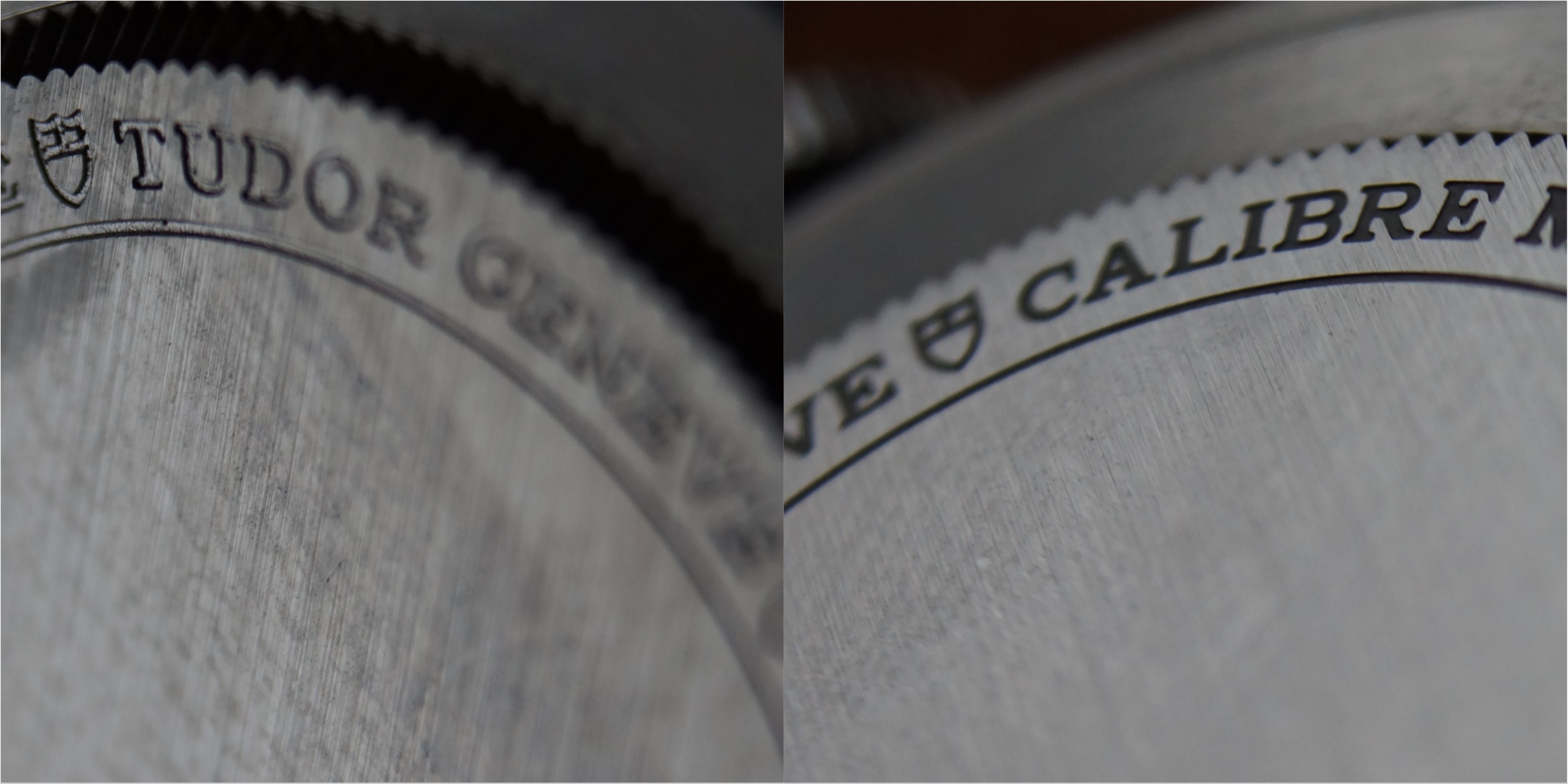
Let's start with the bezel and pipe:
I have to say overall the bezel on the ZF version looks damn close to the gen! Texture, font, color - everything really close!
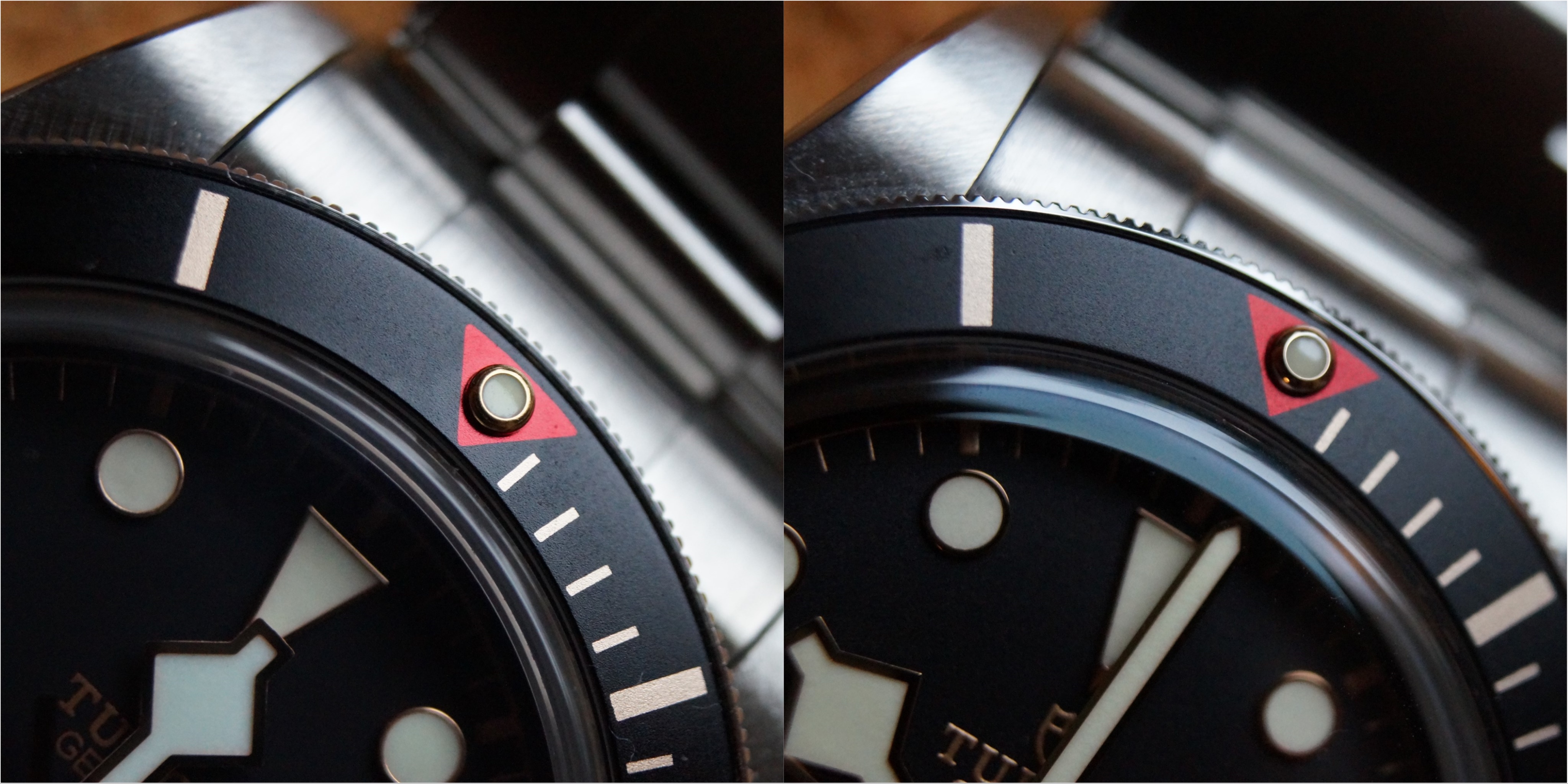
What i recognice is the color and shape of the pip is off in the ZF.
Also in this picture you can see the color differences of the hour hand between ZF and GEN!
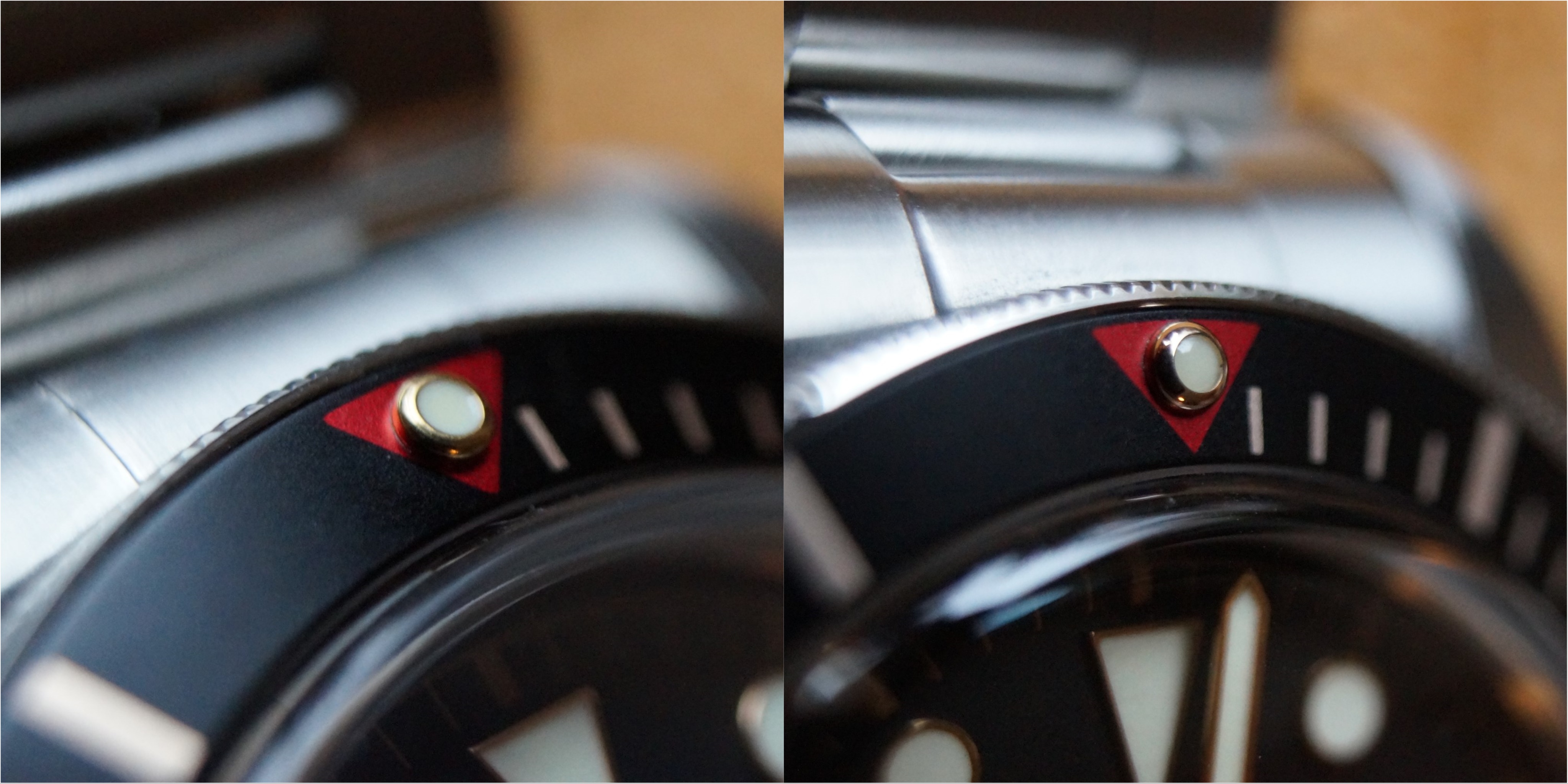
Have a look on the different shapes of the pip between ZF and GEN
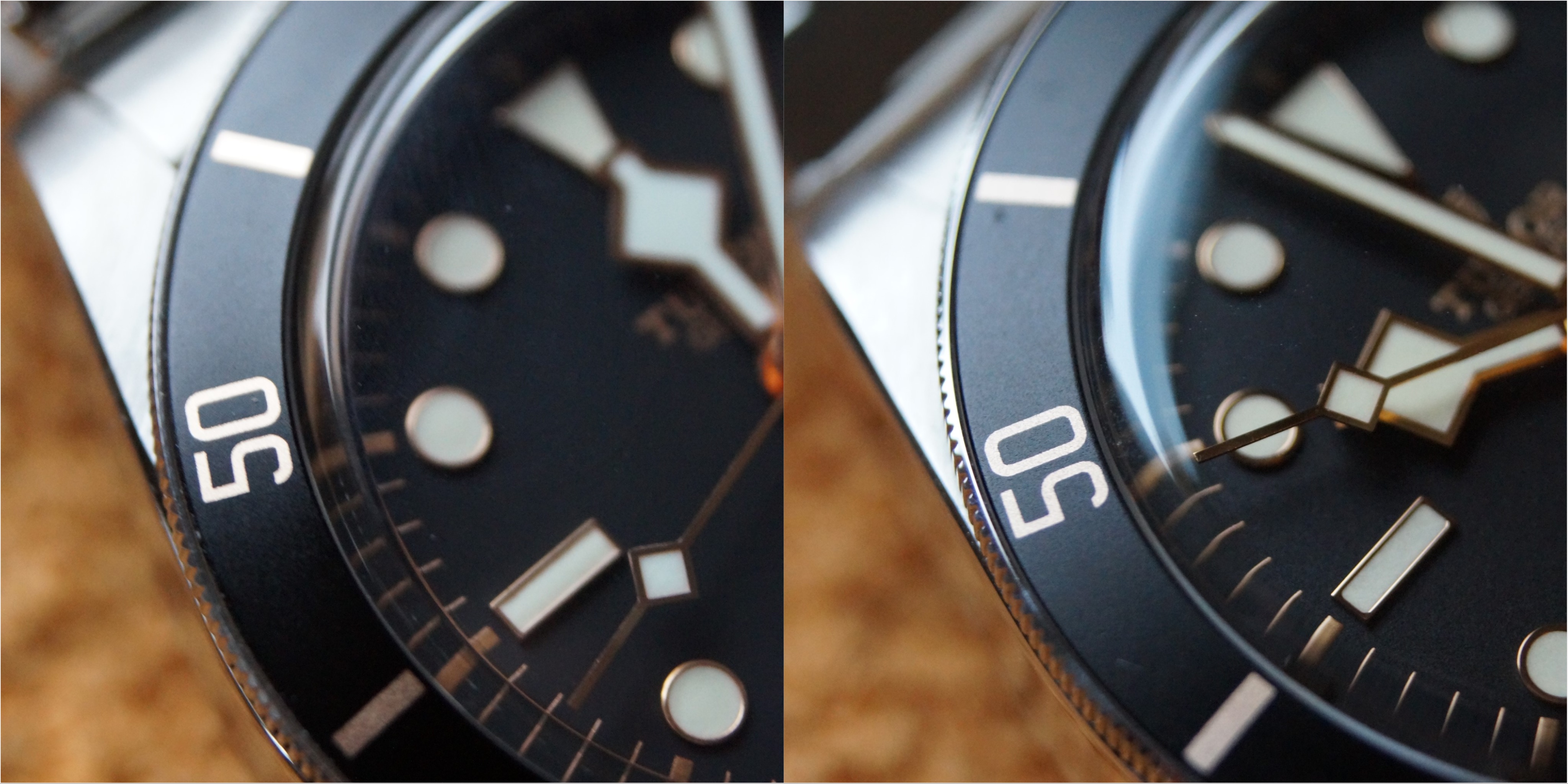
The next pictures show more examples in different angles of the bezel structure and color!
What can be seen? Bezel teeth are differently shaped on the ZF and the GEN. On the GEN if you look at the teeth from above the ZF version has a different angle and the teeth look shorter. Also the finish is kind of poor on the ZF bezel teeth, I couldn't even get them in focus properly.
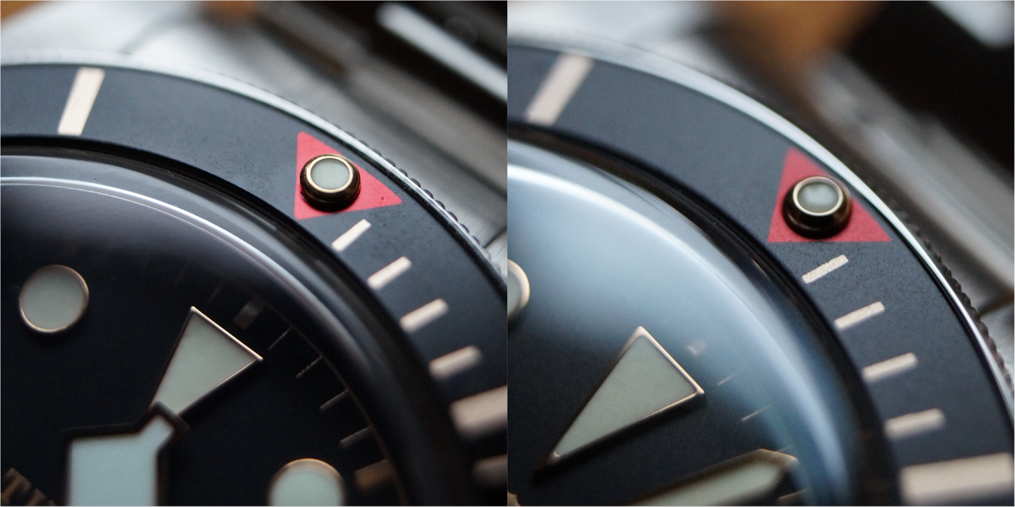
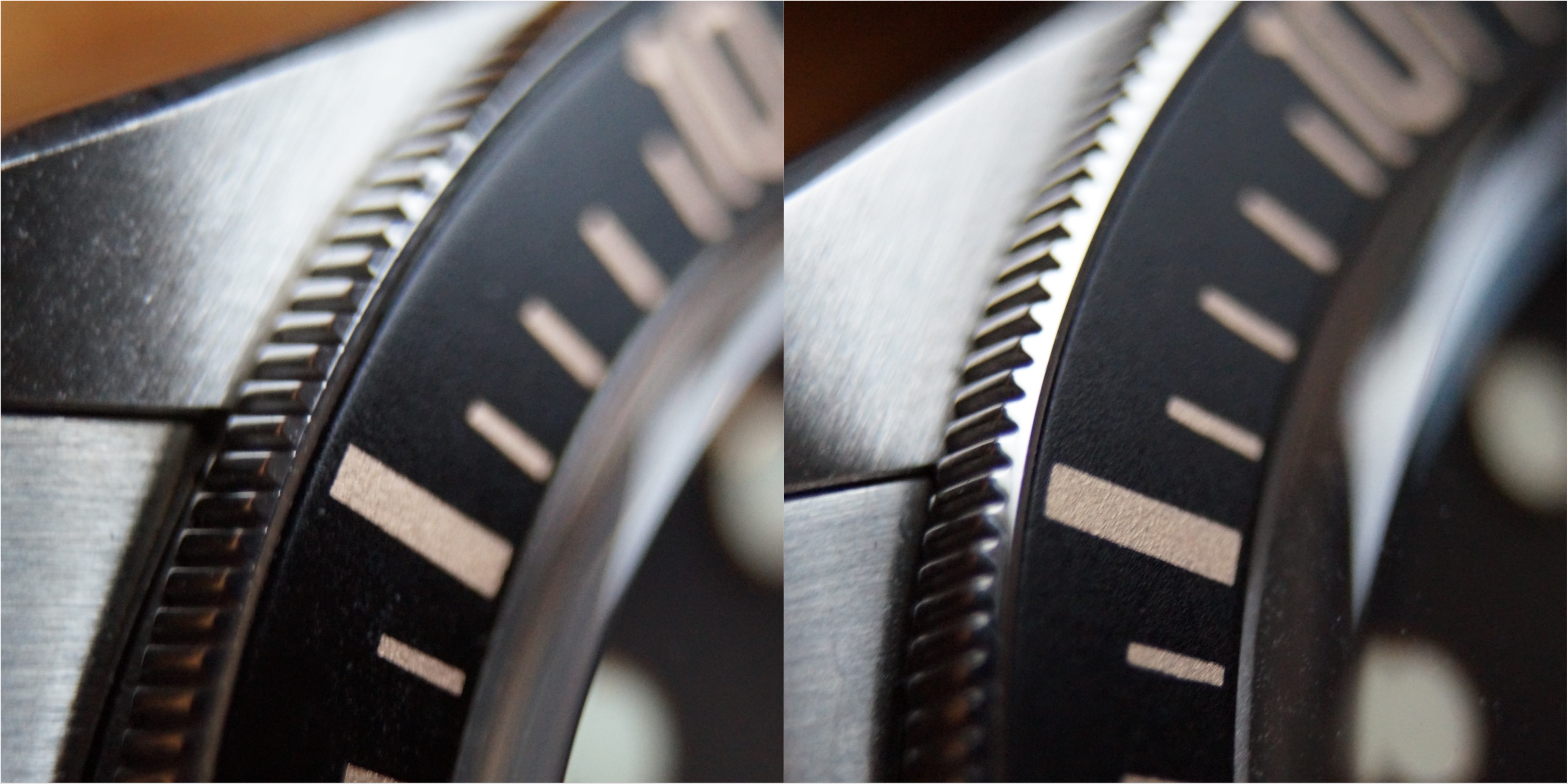
In this angle the bezel structure looks good on the ZF compared to GEN:
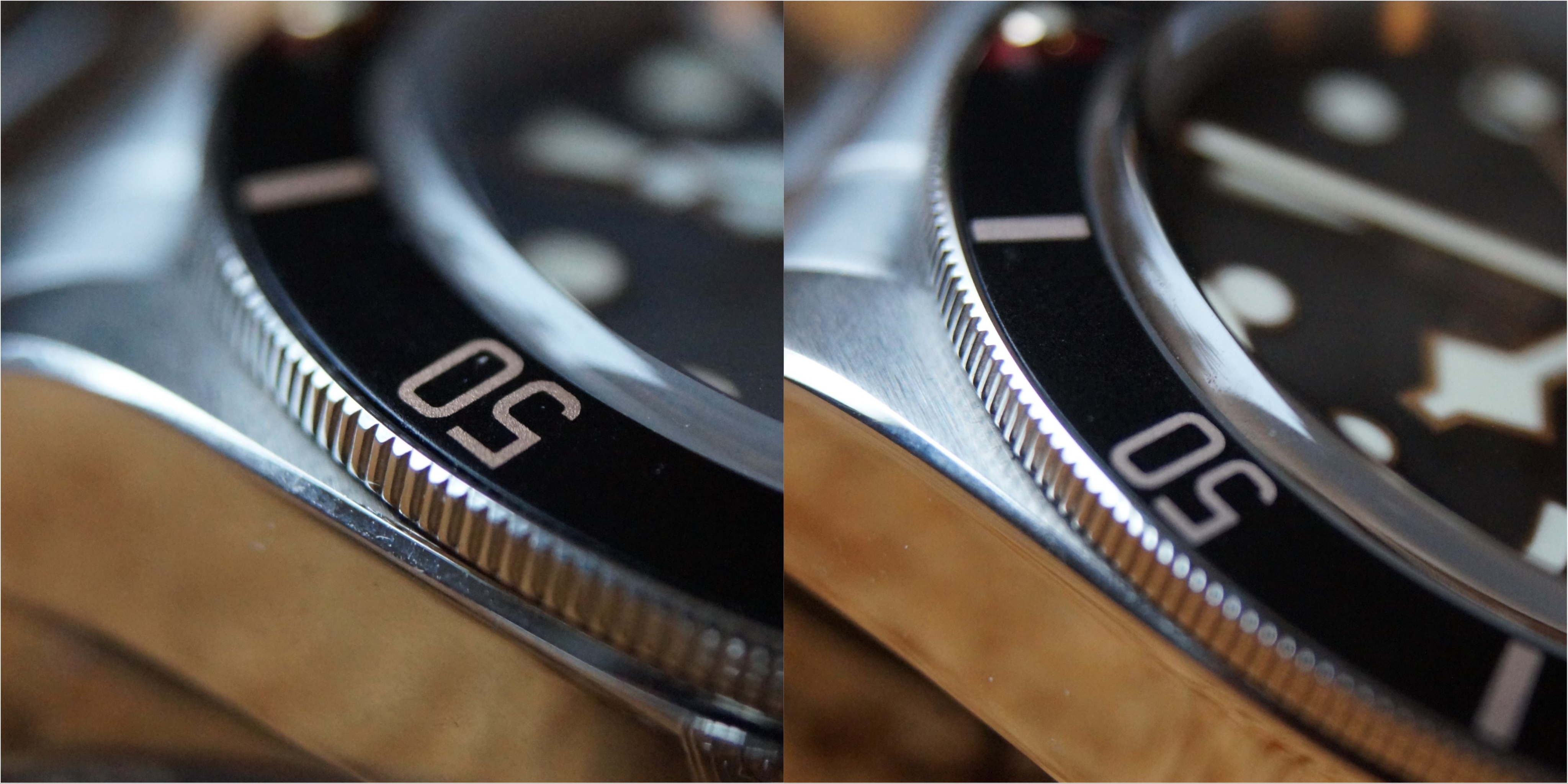
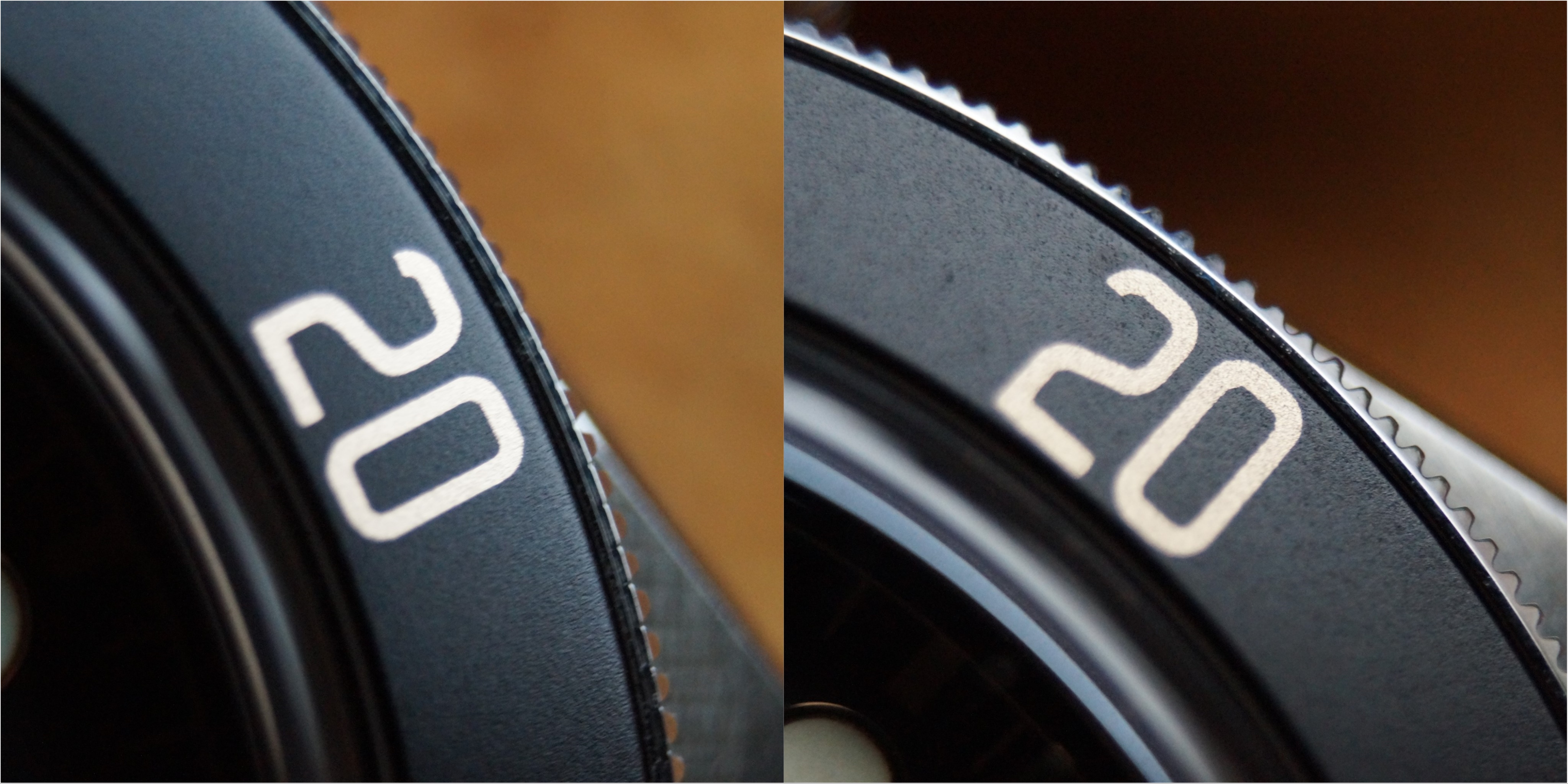
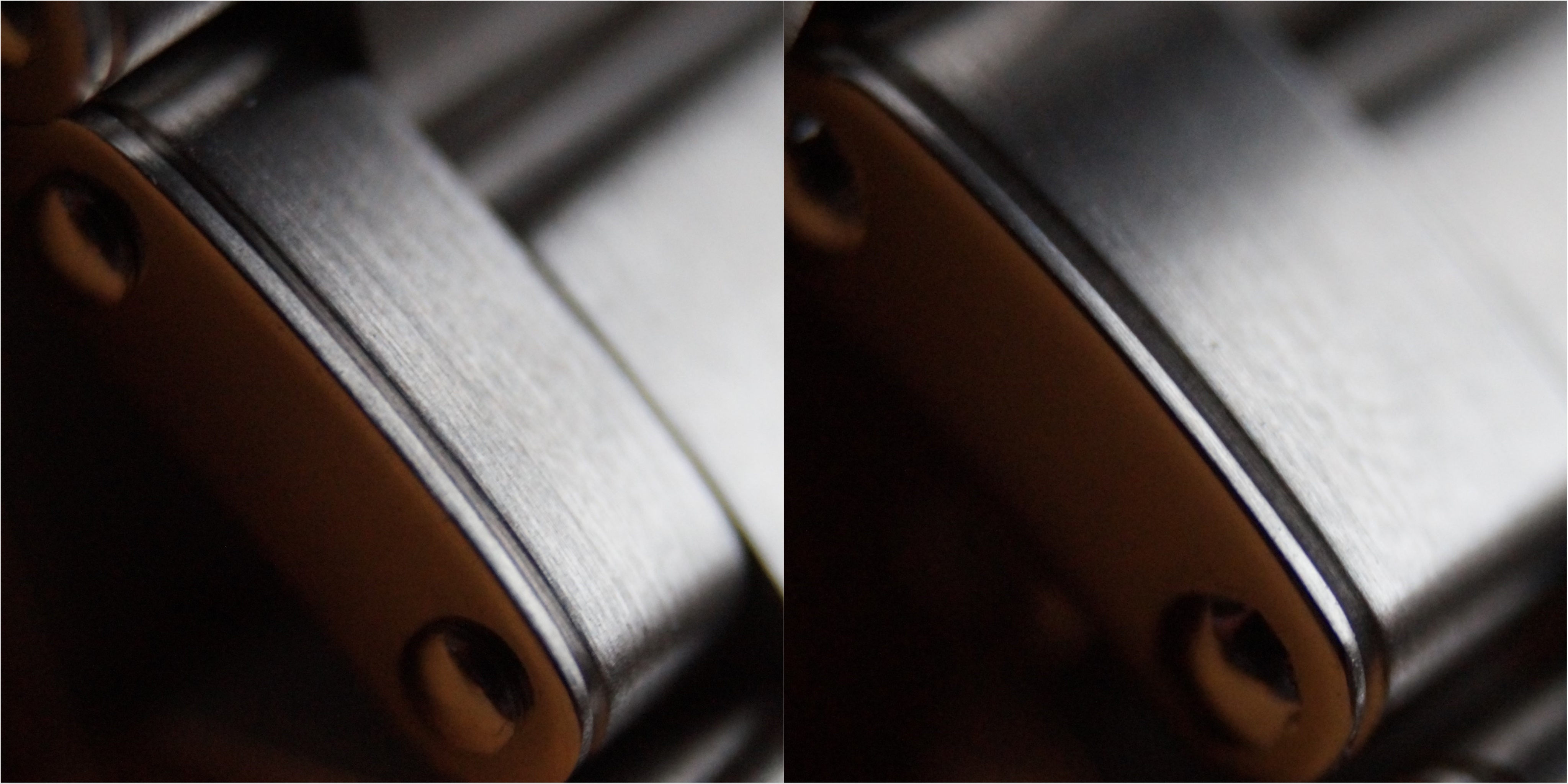
What you can also see is the finish on the high polished line between brushed surfaces on the case. Have a look at the edges of the brushed surfaces in the transition to high polished.
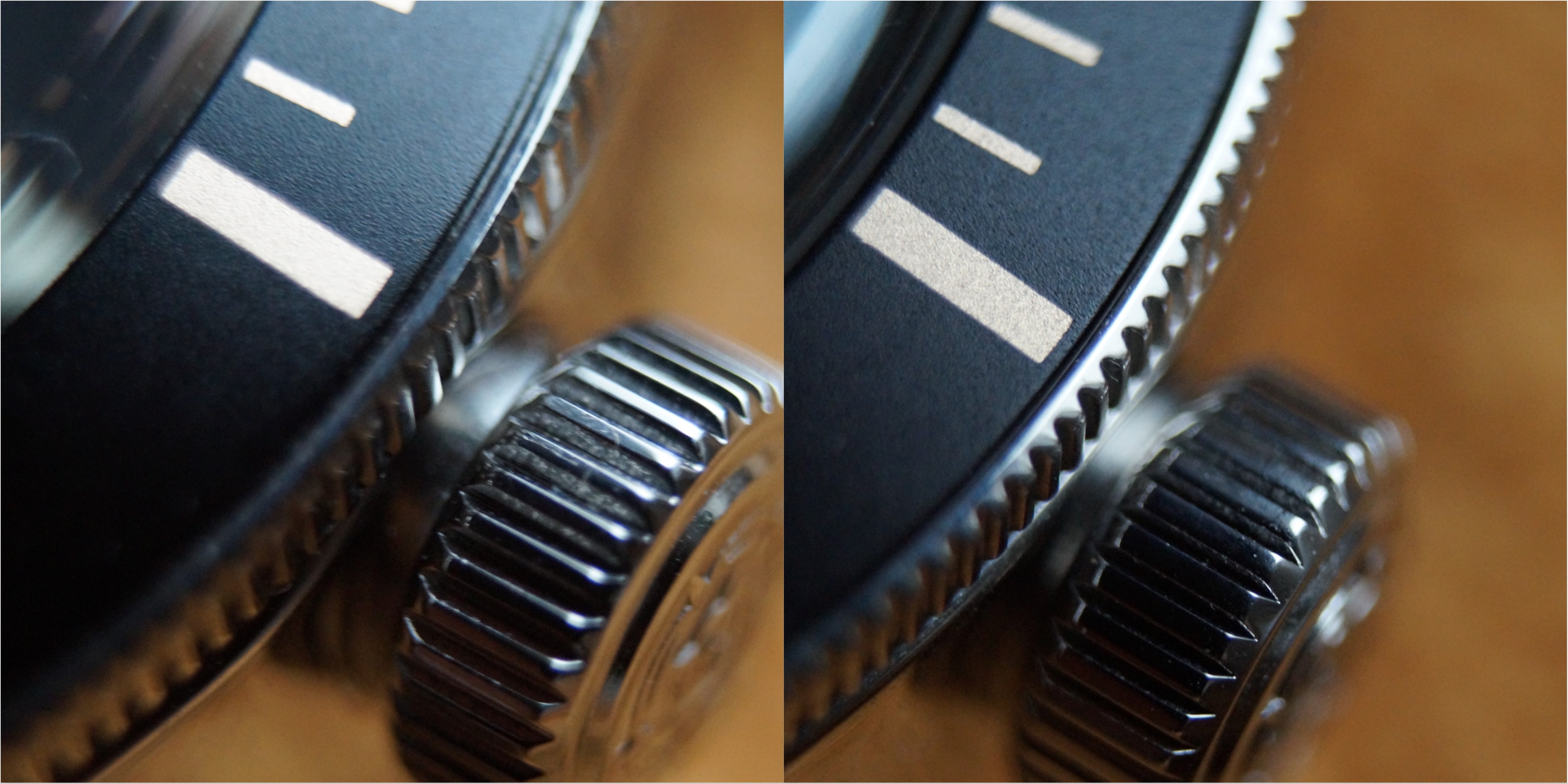
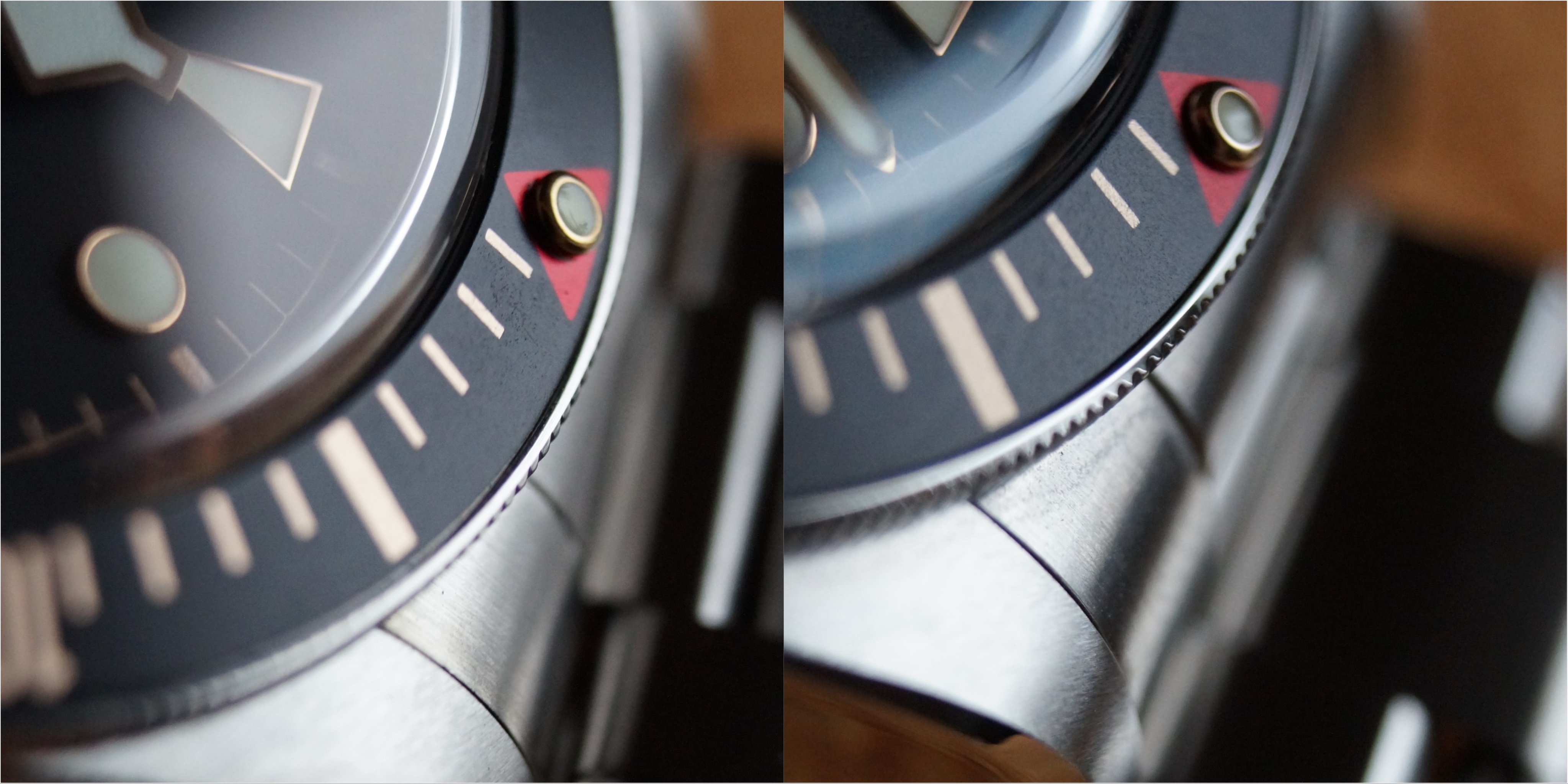
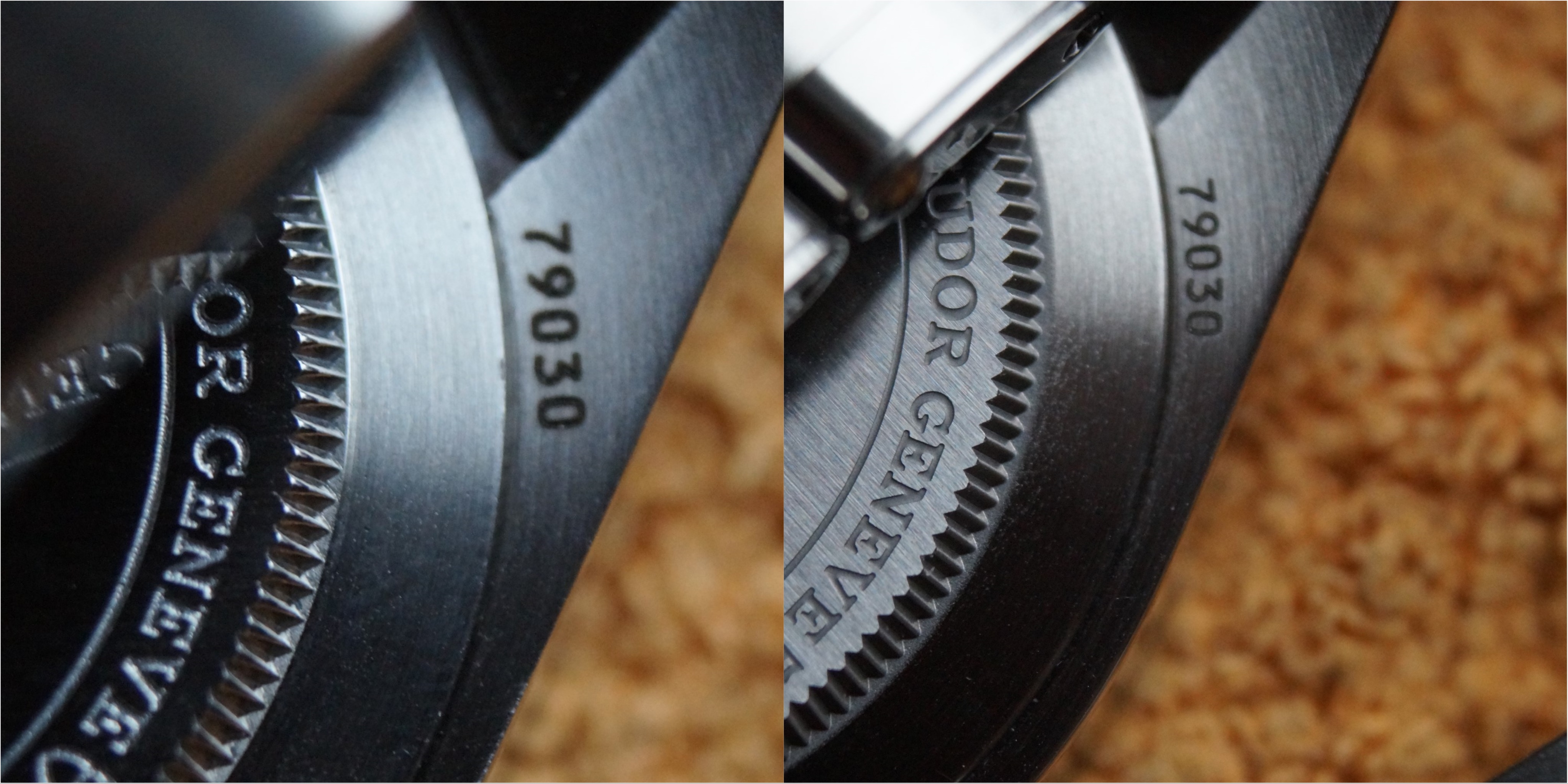
Next to the crown and bezel printing as well: Here you can see that the printing of the bezel markers are not good on the 15 min marker of the ZF version. Inconsistent around the bezel.
Also the finish of the crown and the crown teeth is much smoother on the GEN. The stem of the ZF is longer than GEN, this is common knowledge of course.
Bezel action: Rotates very good, nice clicks to it and 60 clicks like GEN! Rotates with a bit less pressure than GEN! And one instant tell if you have handled a GEN 59 before: The GEN bezel rotation has a "harder" click when the pip is at 12 o clock, so you feel when you arrive at 12. The ZF version does not have that!
Next stop:
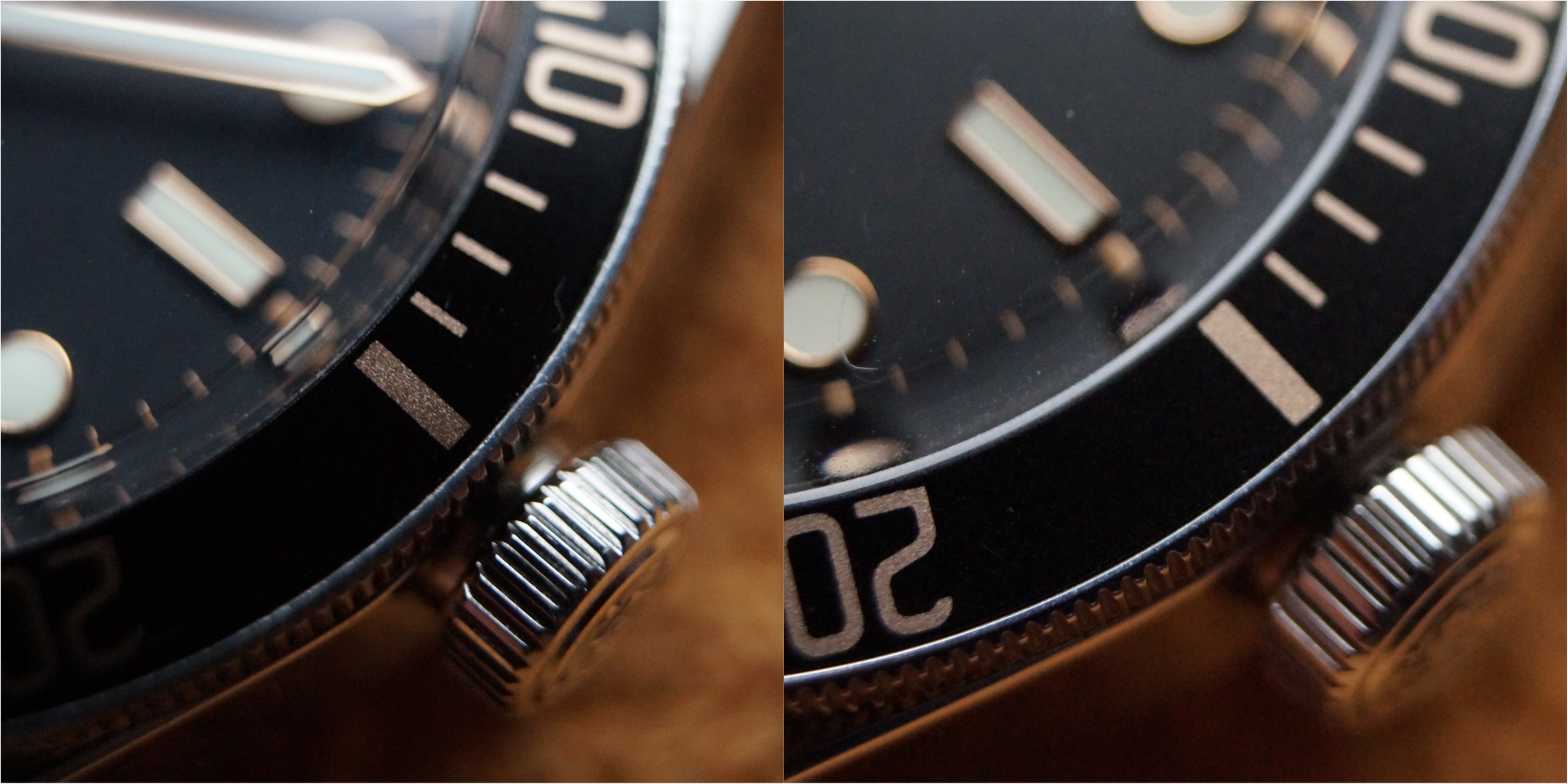
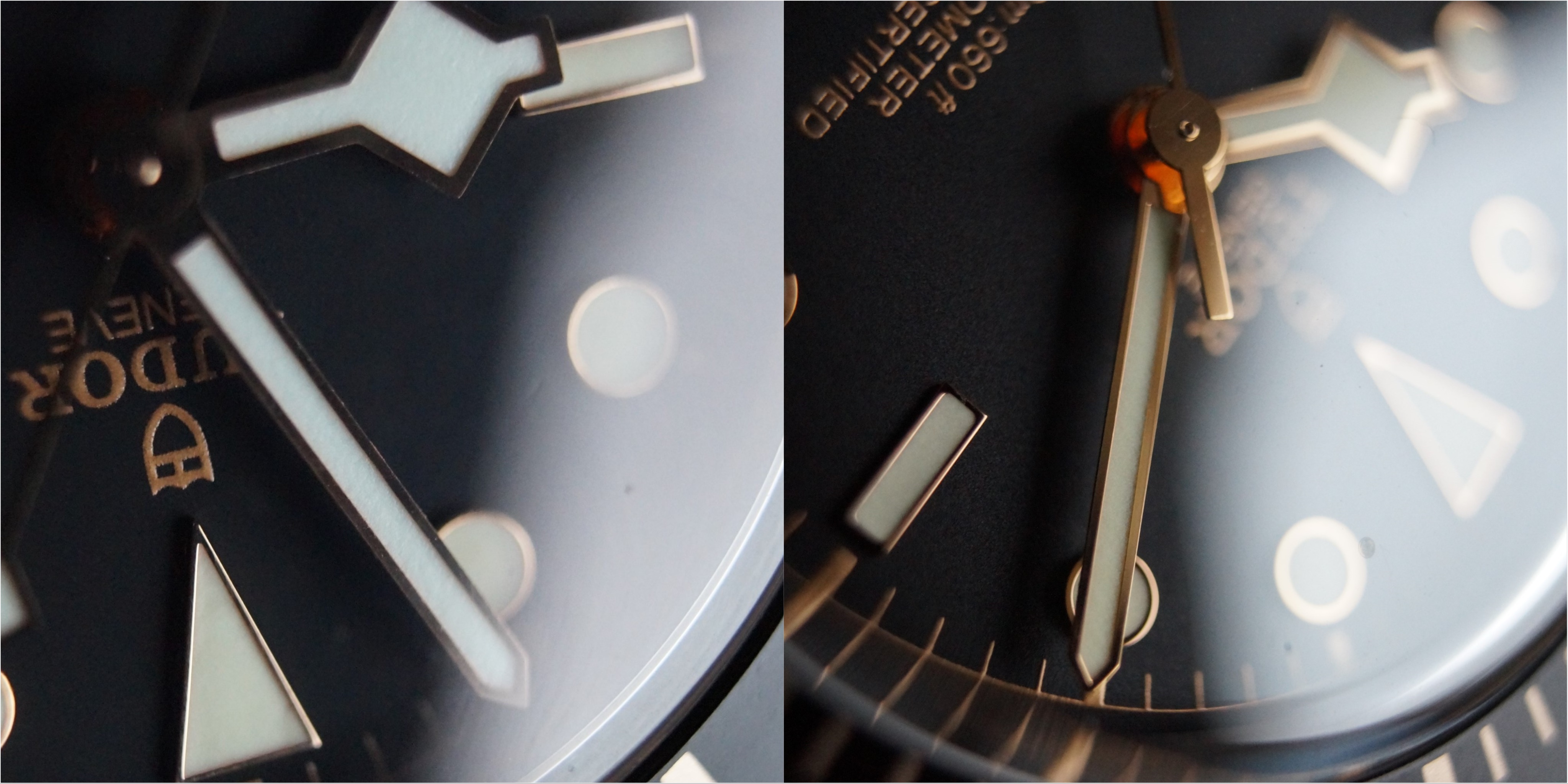
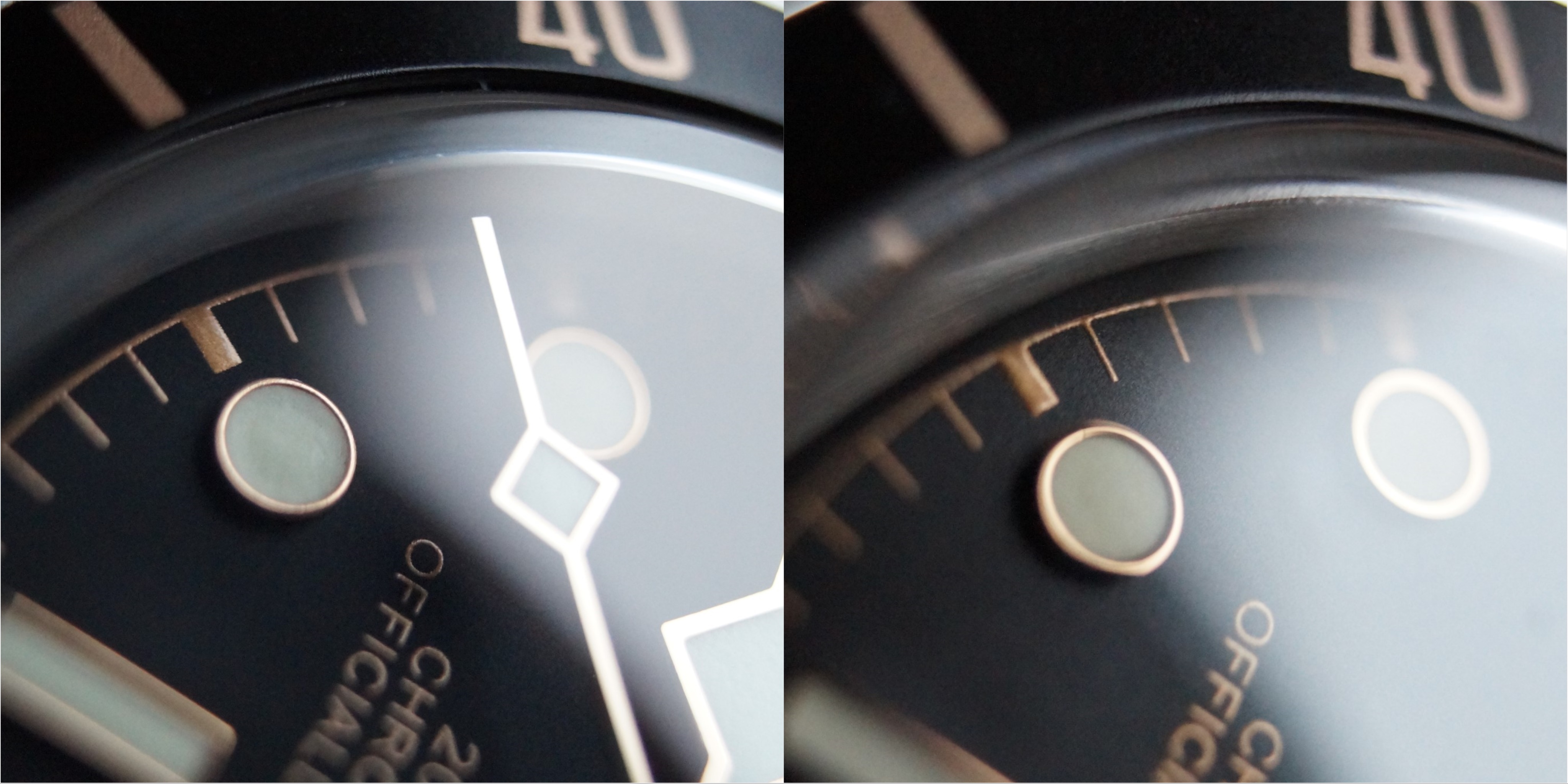
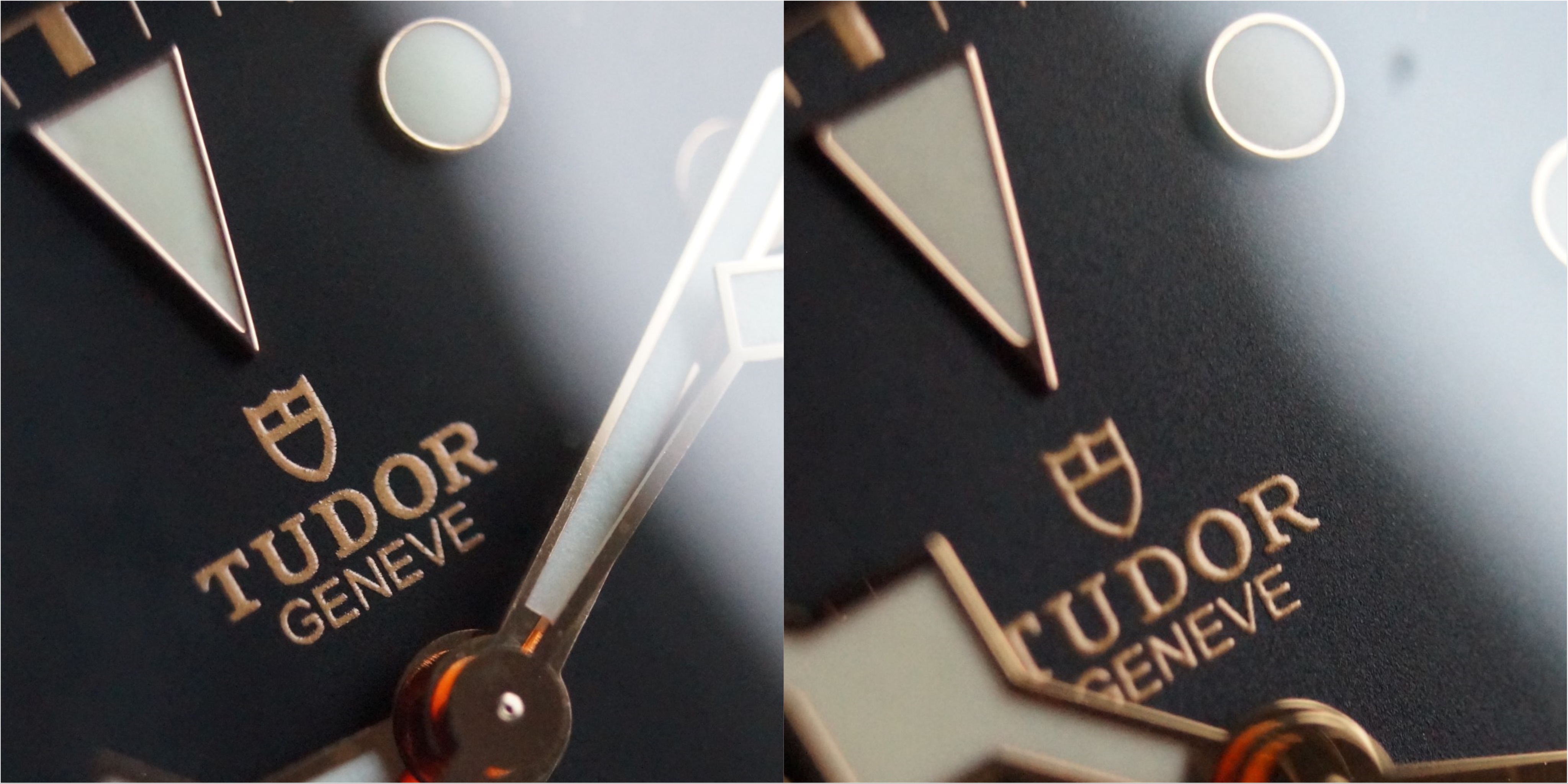
Hands and indices: The gen is way way way better polished. Also the lume has less texture and a creamy look to it. The indices also are better finished on the GEN as you would expect. You can see the rough edges on the left side ZF version
The 12 hour marker is a day and night difference in my opinion. The bottom of the 12 hour marker is smooth and bigger on the GEN compared to the ZF. Once you see this you can instantly tell the ZF from the GEN in my opinion. Also the round indices on the GEN have a bigger gold ring around them as the ZF.
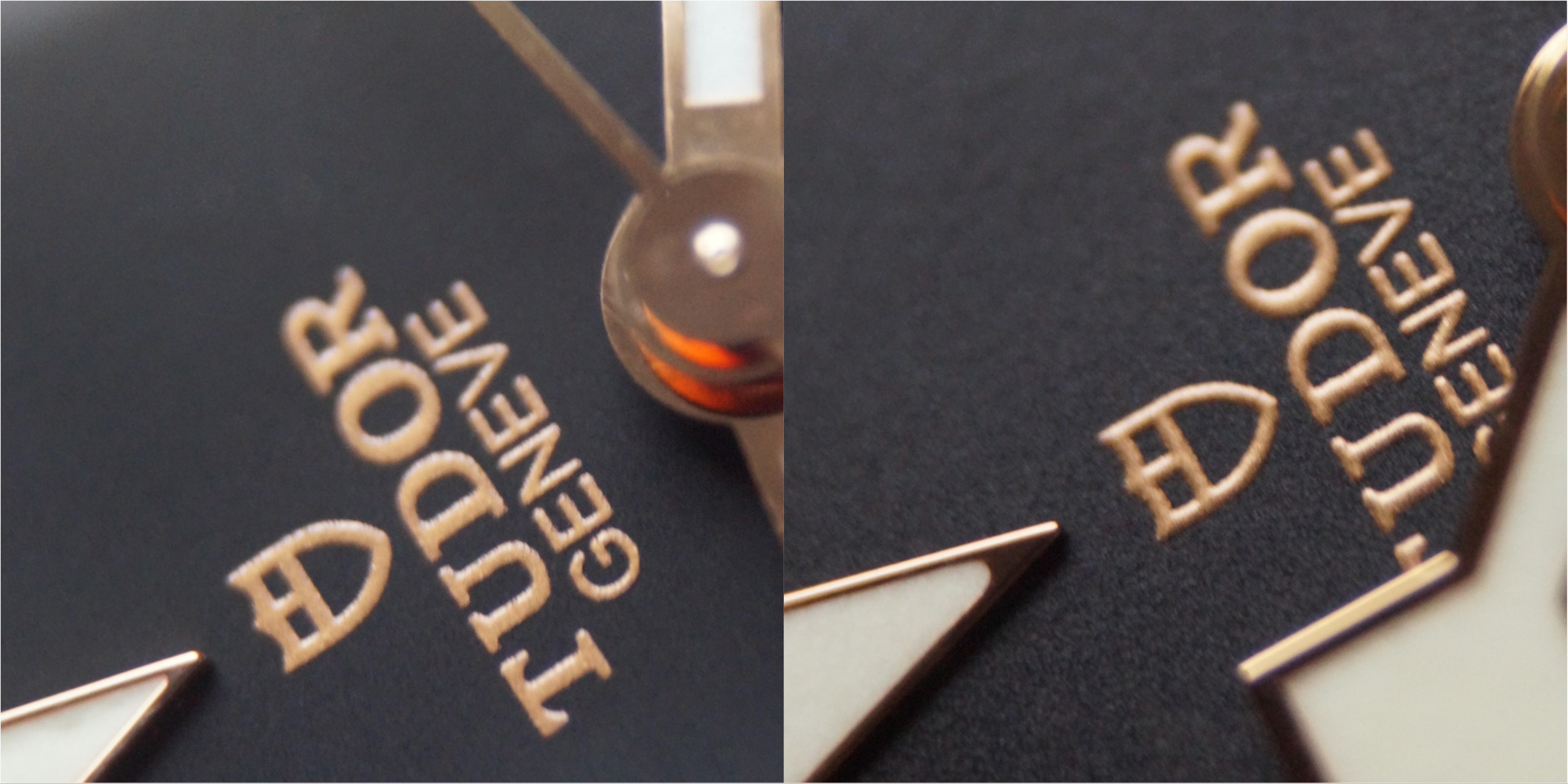
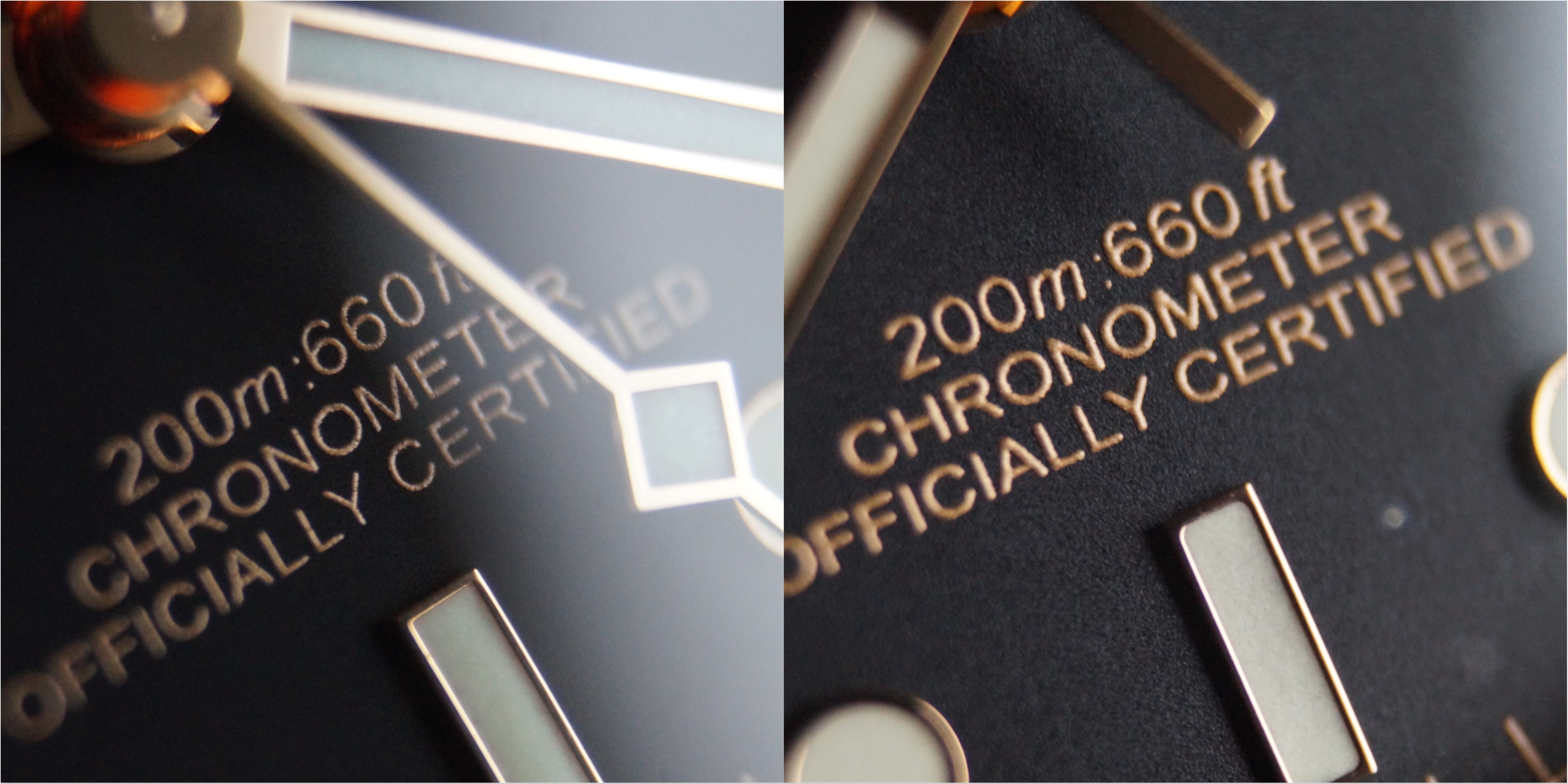
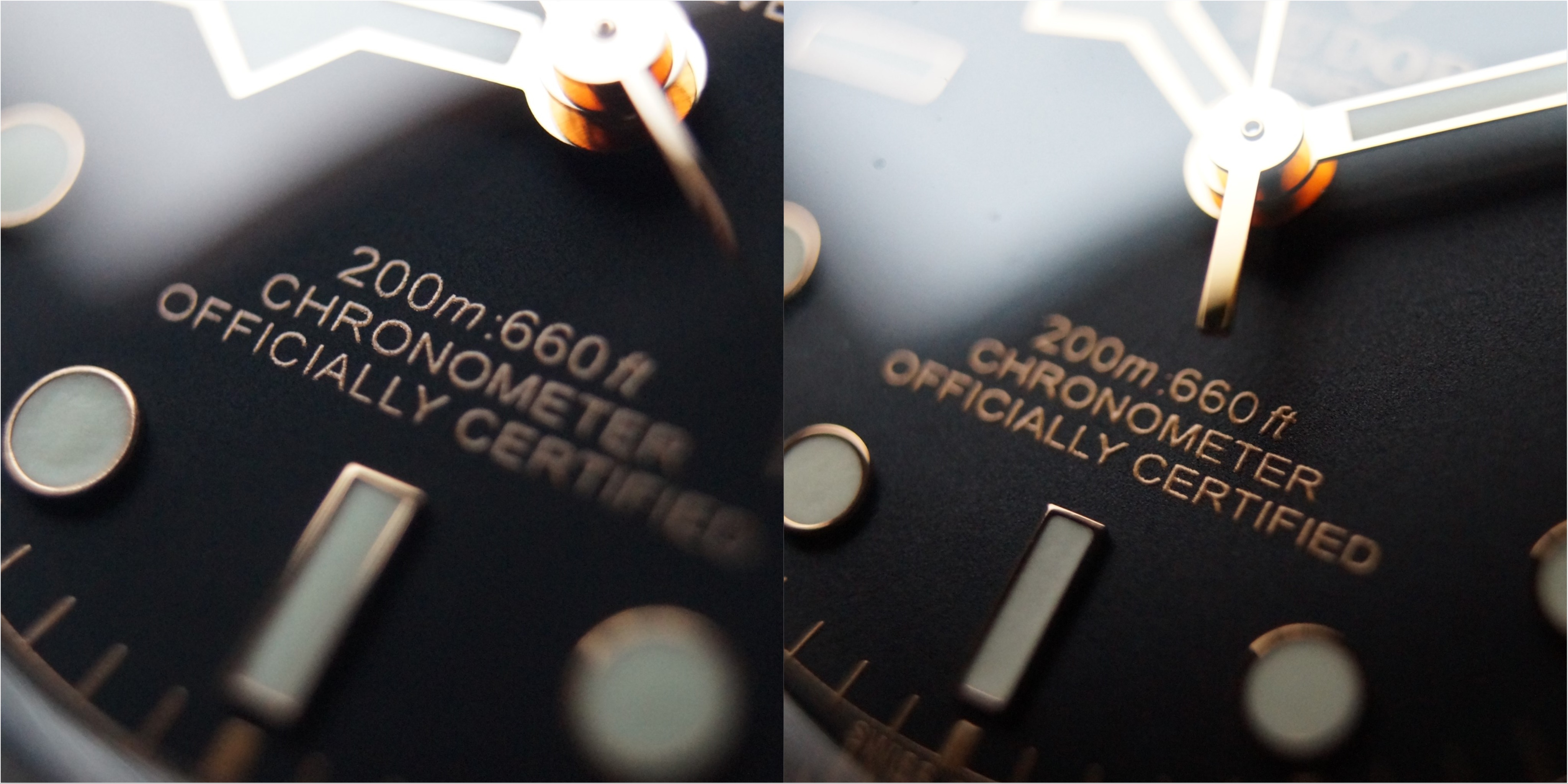
Dial printing: The printing looks pretty good on the ZF to be honest. What I can see is that the GEN printing is higher but a noch thinner! Also the color is a bit darker on the GEN.
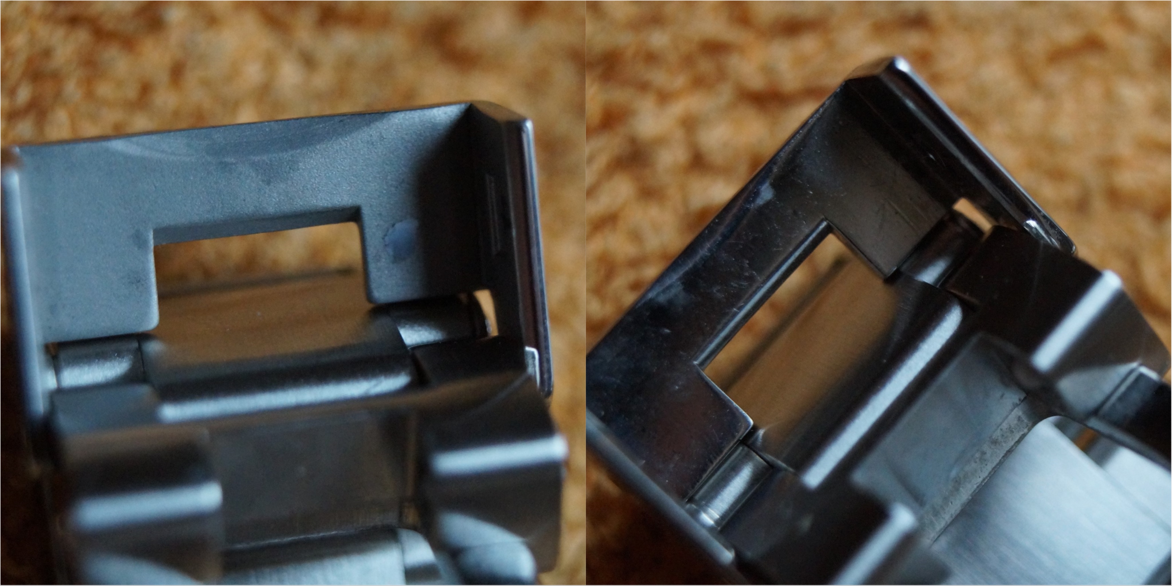
Lets flip the watches upside down:
What can you see? Instantly you see the cutting of the TUDOR GENEVE CALIBRE MANUFACTURE is disgusting on the ZF compared to GEN on the macro shots The cuts are rough on the ZF. Also the text is brushed to a darker tone on the GEN it almost looks like its painted inside. Instant tell if you have the both casebacks next to each other. Also the finish on the caseback teeth is rough and just looks different on the ZF version compared to GEN
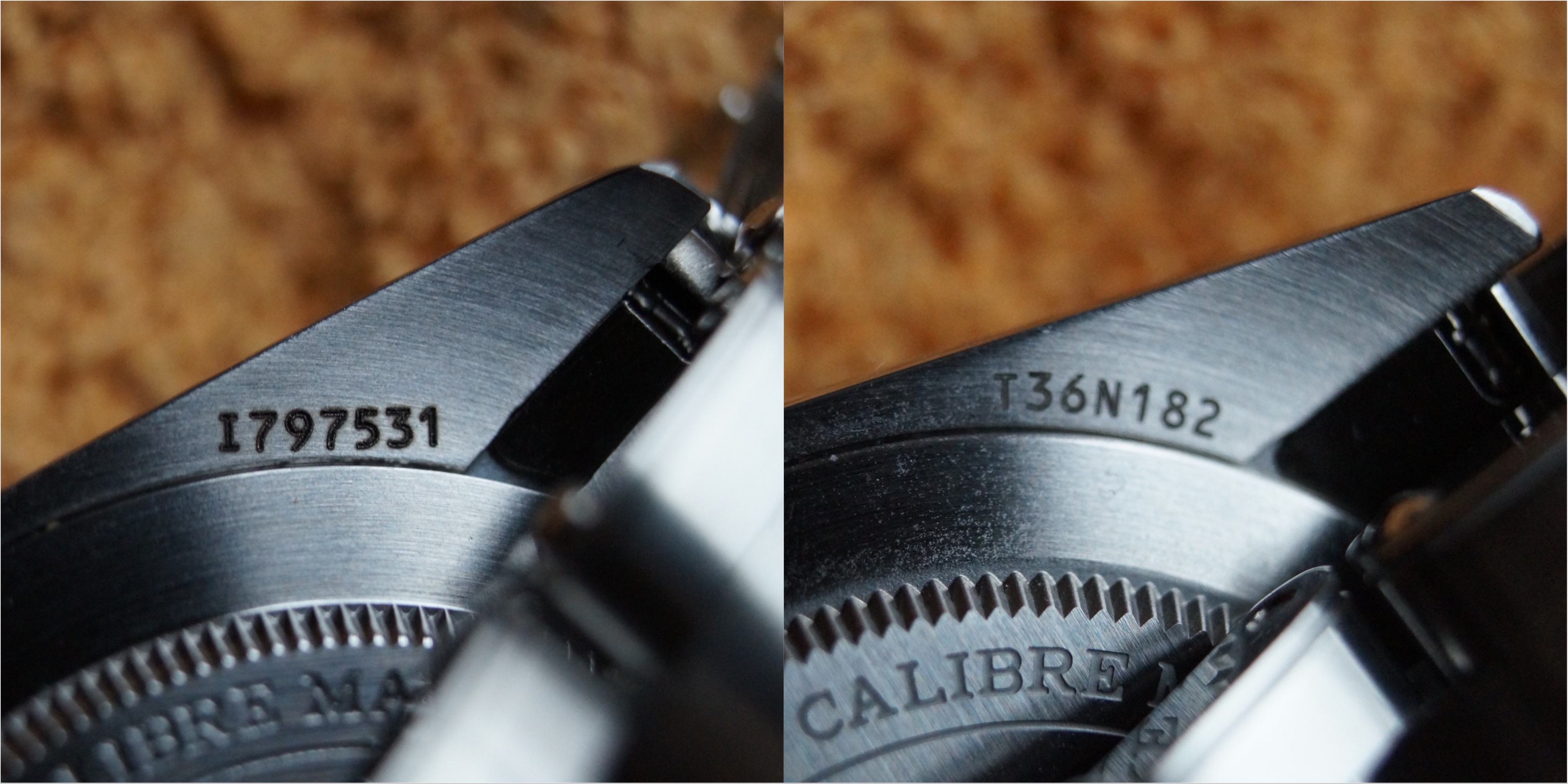
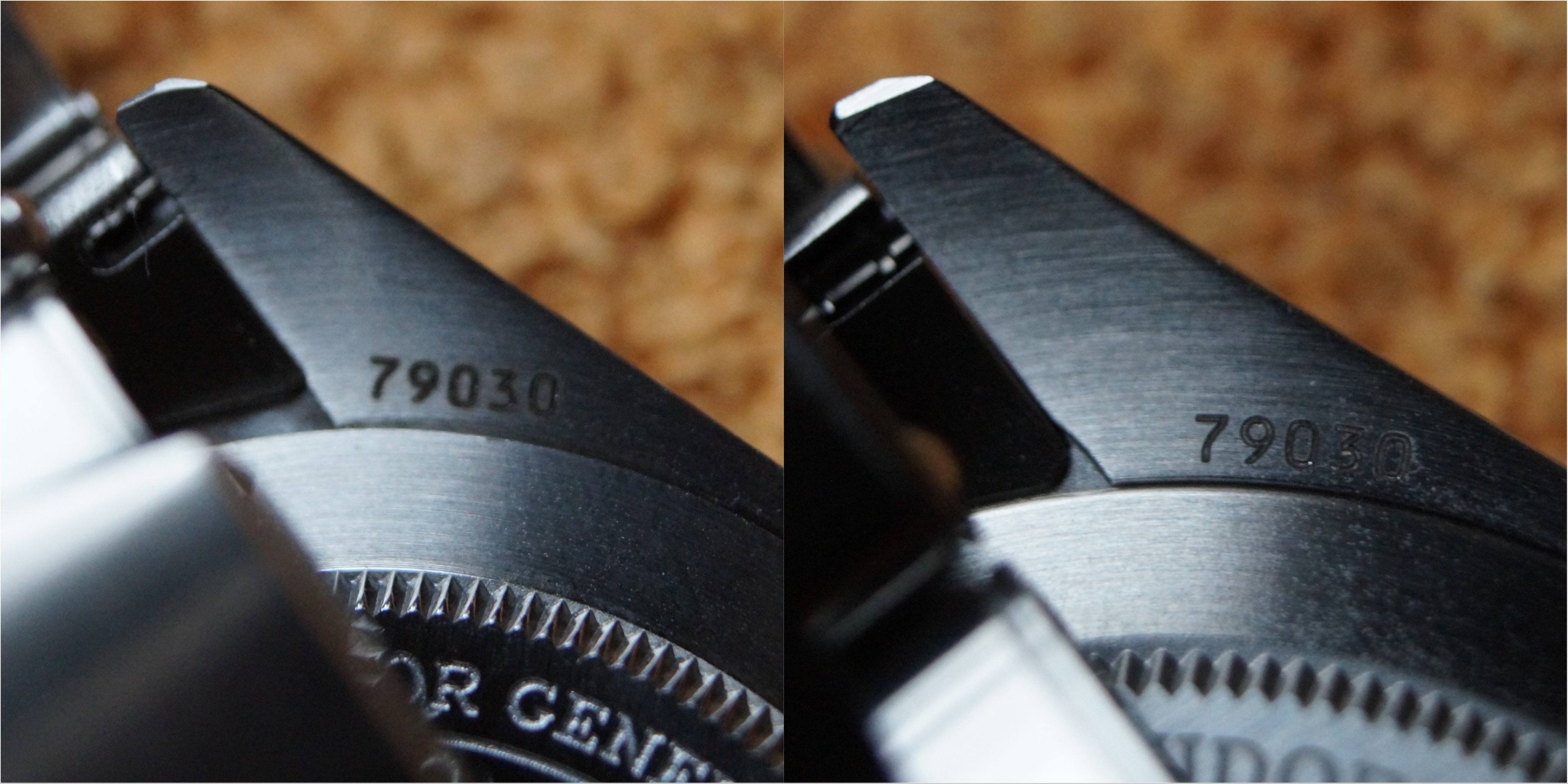
Also the laser cutting of the serial number looks poor on the ZF compared to GEN. What i noticed is the finish of the lug horns also, they do a bent or kink on the ZF and on GEN they are brushed evenly in one turn. For cutting of the reference number the finish is the same as on the serial number.
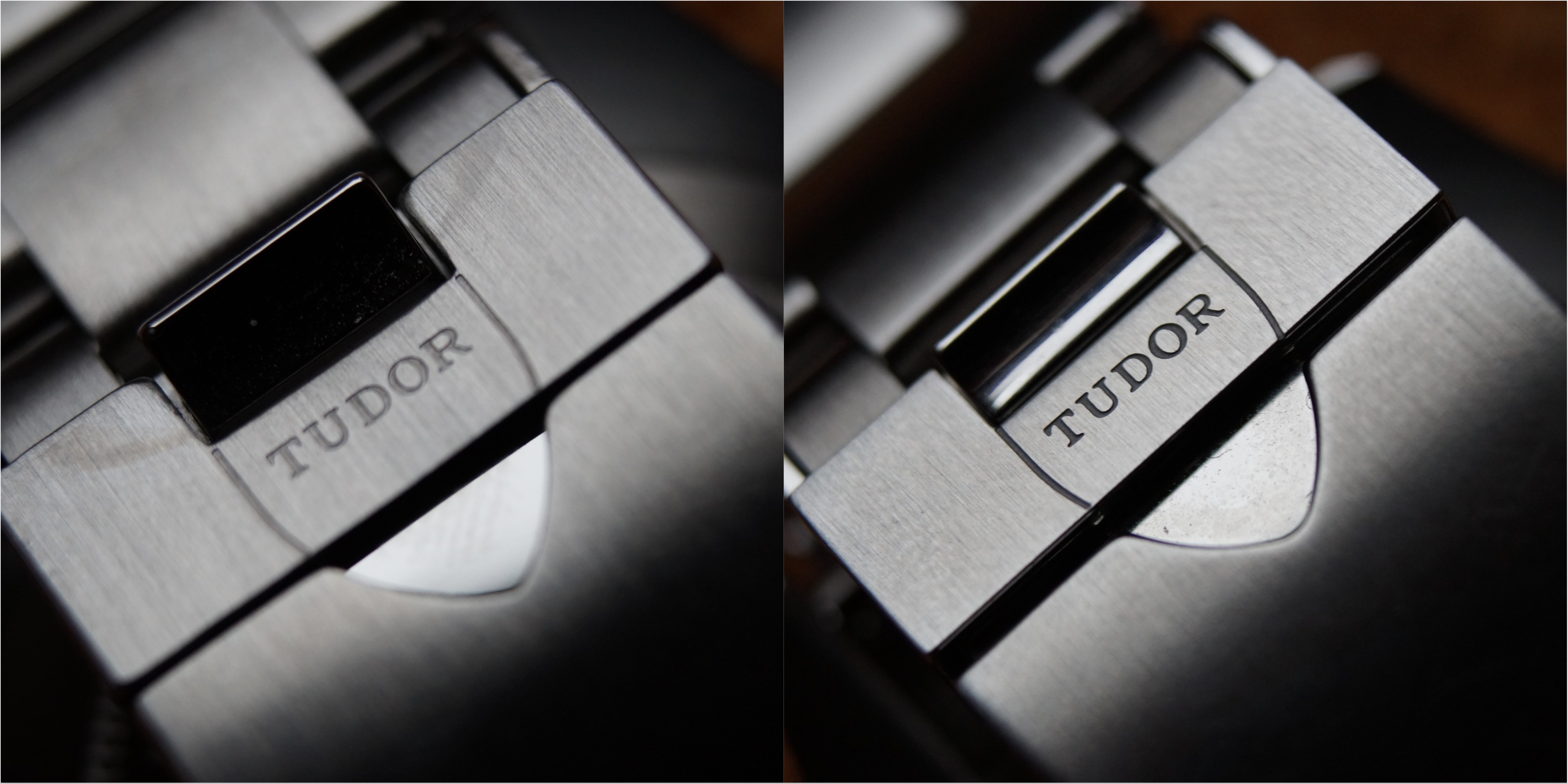
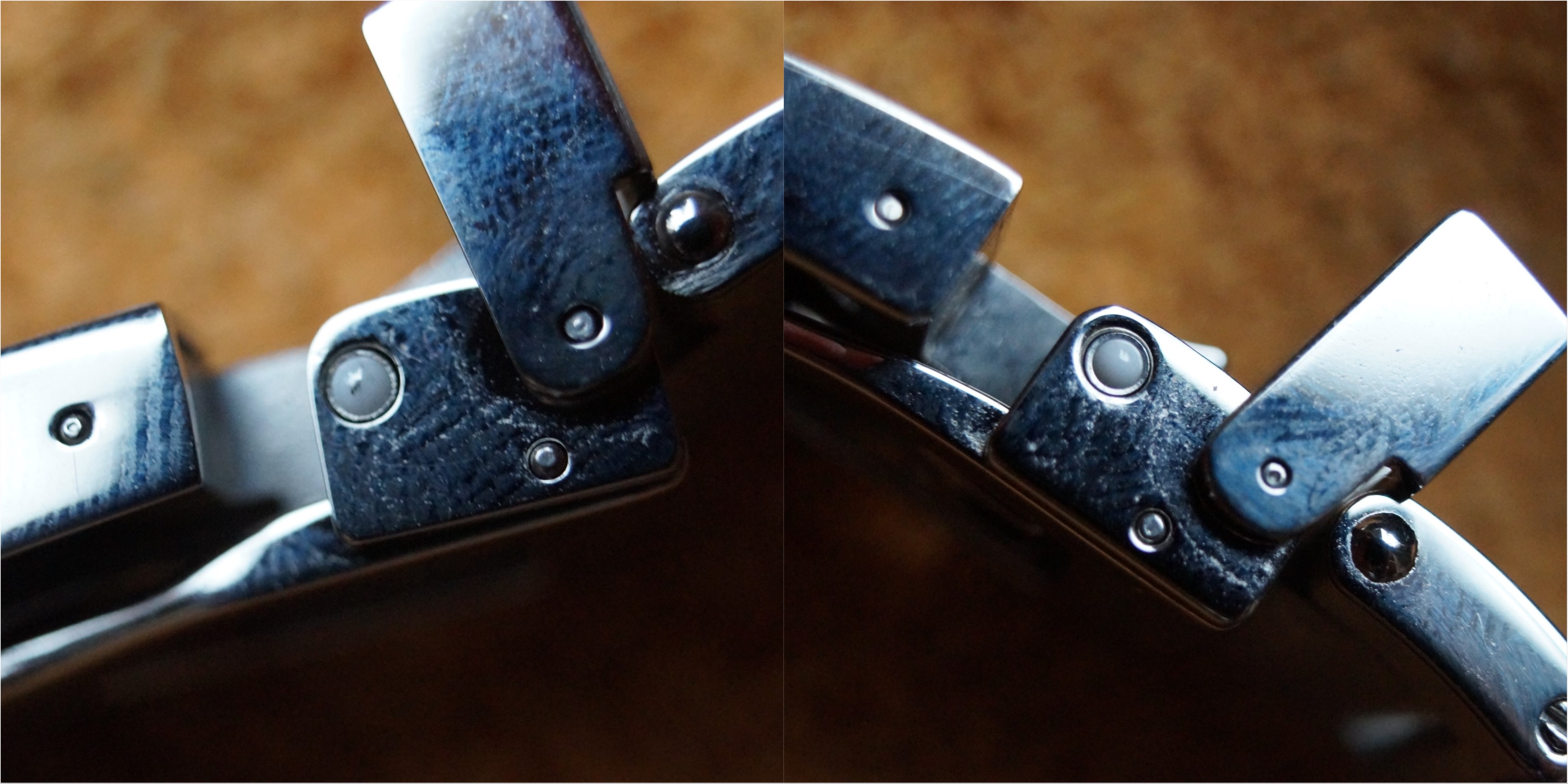
Lets look at the bracelet and clasp:
Clasp looks really good and is definitely close to GEN. The finish of the TUDOR lettering is better executed on the GEN as you would expect. What always seems weird to me was the finish of the inside of the clasp in the ZF. You can see the differences compared to GEN!
Also the ceramic ball on the clasp is better finished on the GEN.
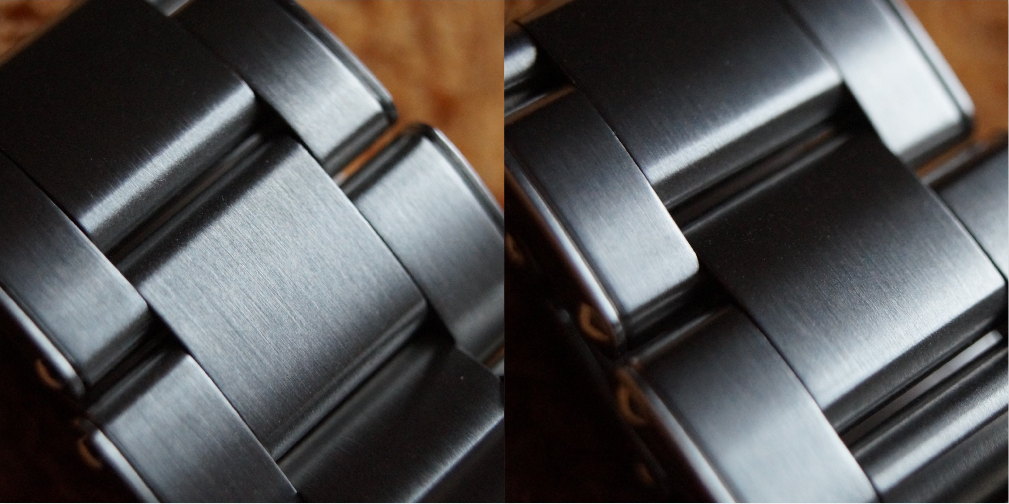
Brushing of the bracelet is really good on the ZF version. Maybe GEN is a bit higher polished but overall really really close to GEN!
Also the faux rivets are well executed, maybe the edges are a notch smoother on the GEN, but no big difference.
Bracelet feels great I have to say. I gave it an oil bath and now id handles very close to gen. It feels a bit rougher on the edges but not a big difference!
So what is the final verdict of the ZF version compared to GEN?
Overall a great replica for 300€! You get 99% close to gen for 1/10 of the price!
The weak points of the ZF version are in my opionion:
- dial color is „dull“
- crown stem a bit too long
- no "harder" bezel click when you turn over 12 o clock
- finishing of the hands
- lume color of the hands
- lume pip on the bezel
- finish of the caseback and laser engraving on the caseback
What do you guys think of the ZF?
I would suggest to buy one if you never had one. Its a banger for the bucks and definitely as close to gen as you can get for 300 bucks.
Best regards
germansubmarine
anyone who knows me here or on discord knows I've aquired a Gen Tudor. A timeless Black Bay Fifty-Eight in Gilt Black. I just received a brand new ZF V2 version of the 58 and thought why not give something back to this forum which I just love spending time in.
Here is my review guys:
Here we have the two watches next to each other.
GEN on the left, ZF on the right!
Both beautiful watches.
So what differences can you see from this perspective?
What instantly feels off on the ZF is the color of the lume on the hands. Much more white than gen!
Also color of the dial looks dull compared to GEN. The gen dial has more texture to it.
Also the font on the gen is thicker but not as wide as the ZF.
So now up to the makro pictures.
From now on in EVERY PICTURE ZF ON THE LEFT and GEN ON THE RIGHT
Let's start with the bezel and pipe:
I have to say overall the bezel on the ZF version looks damn close to the gen! Texture, font, color - everything really close!
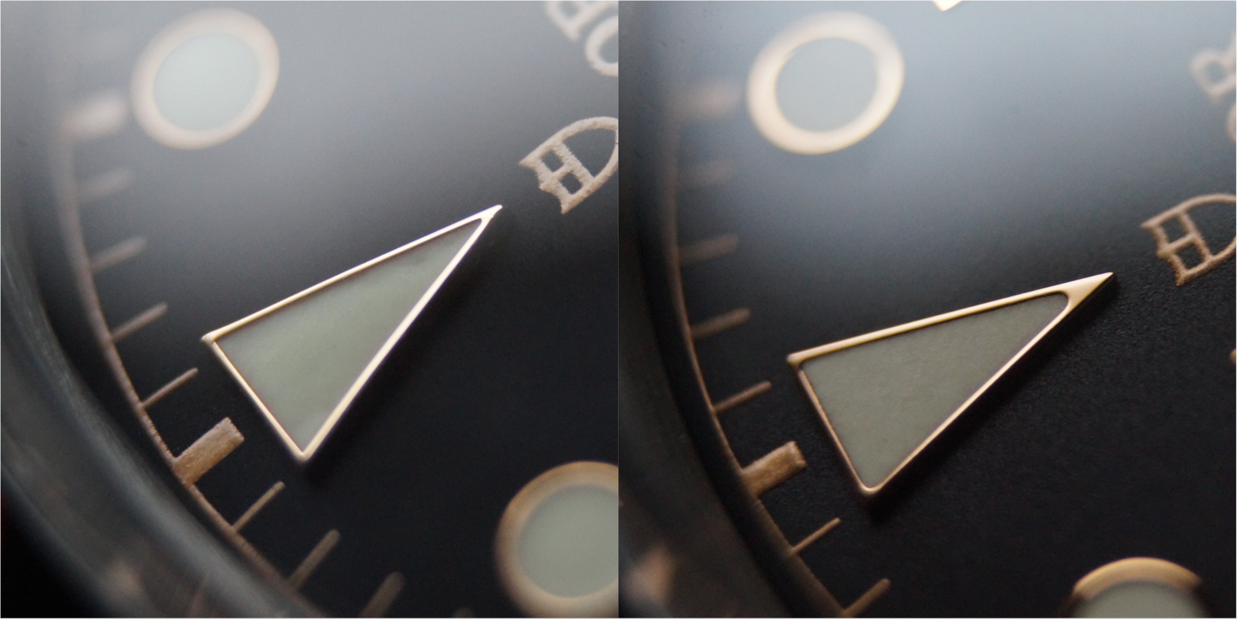
What i recognice is the color and shape of the pip is off in the ZF.
Also in this picture you can see the color differences of the hour hand between ZF and GEN!
Have a look on the different shapes of the pip between ZF and GEN
The next pictures show more examples in different angles of the bezel structure and color!
What can be seen? Bezel teeth are differently shaped on the ZF and the GEN. On the GEN if you look at the teeth from above the ZF version has a different angle and the teeth look shorter. Also the finish is kind of poor on the ZF bezel teeth, I couldn't even get them in focus properly.
In this angle the bezel structure looks good on the ZF compared to GEN:
What you can also see is the finish on the high polished line between brushed surfaces on the case. Have a look at the edges of the brushed surfaces in the transition to high polished.
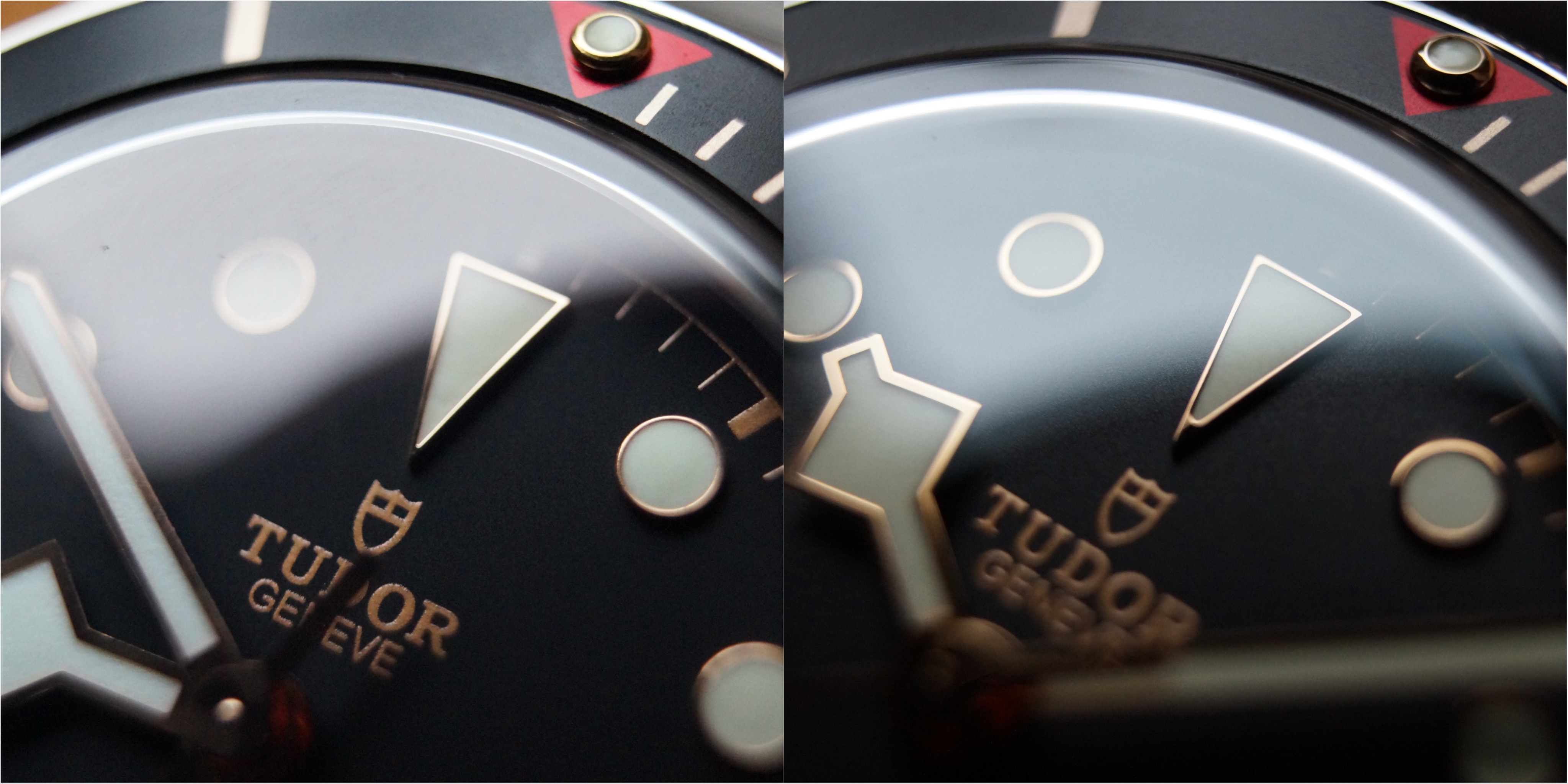
Next to the crown and bezel printing as well: Here you can see that the printing of the bezel markers are not good on the 15 min marker of the ZF version. Inconsistent around the bezel.
Also the finish of the crown and the crown teeth is much smoother on the GEN. The stem of the ZF is longer than GEN, this is common knowledge of course.
Bezel action: Rotates very good, nice clicks to it and 60 clicks like GEN! Rotates with a bit less pressure than GEN! And one instant tell if you have handled a GEN 59 before: The GEN bezel rotation has a "harder" click when the pip is at 12 o clock, so you feel when you arrive at 12. The ZF version does not have that!
Next stop:
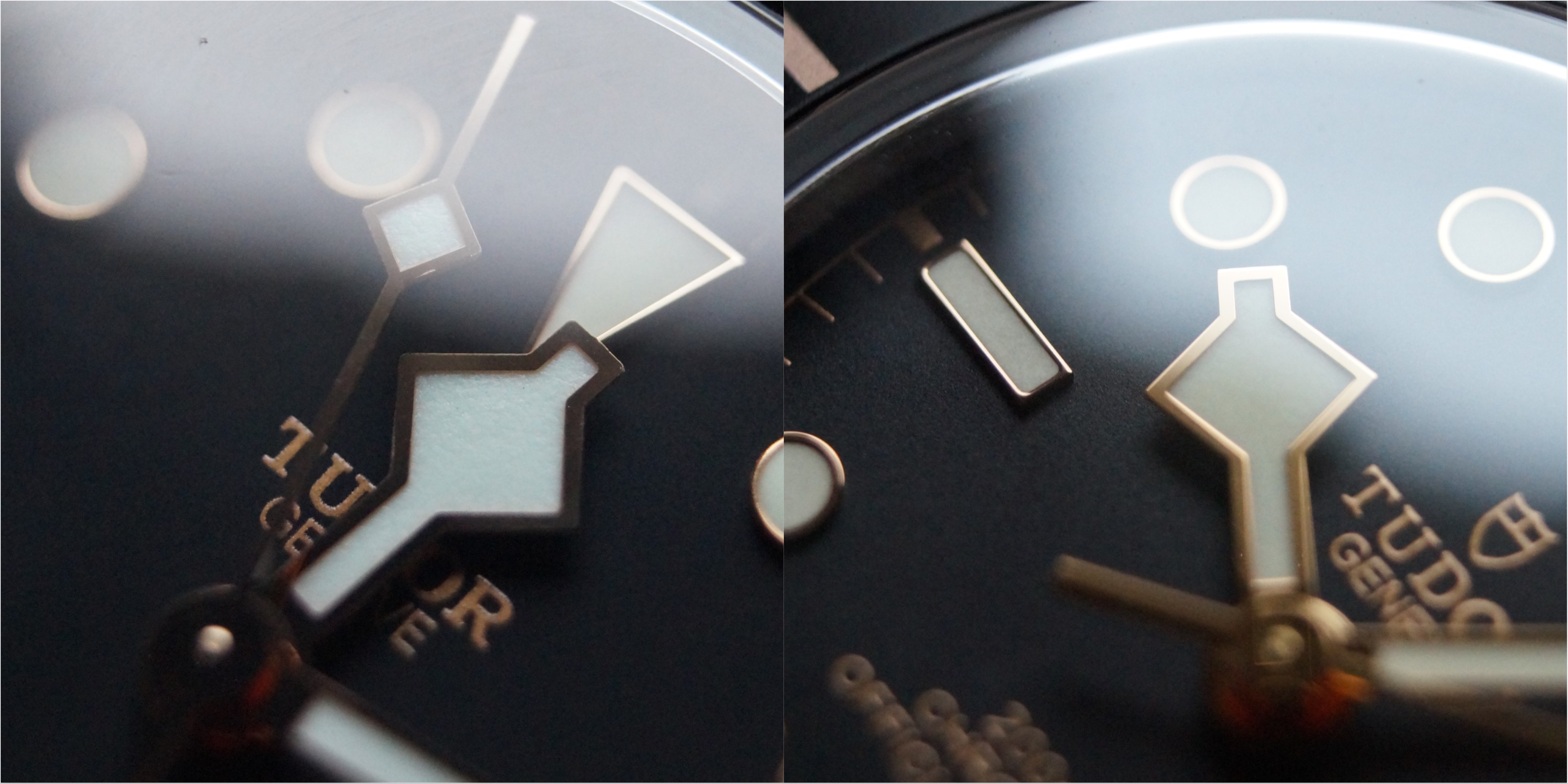
Hands and indices: The gen is way way way better polished. Also the lume has less texture and a creamy look to it. The indices also are better finished on the GEN as you would expect. You can see the rough edges on the left side ZF version
The 12 hour marker is a day and night difference in my opinion. The bottom of the 12 hour marker is smooth and bigger on the GEN compared to the ZF. Once you see this you can instantly tell the ZF from the GEN in my opinion. Also the round indices on the GEN have a bigger gold ring around them as the ZF.
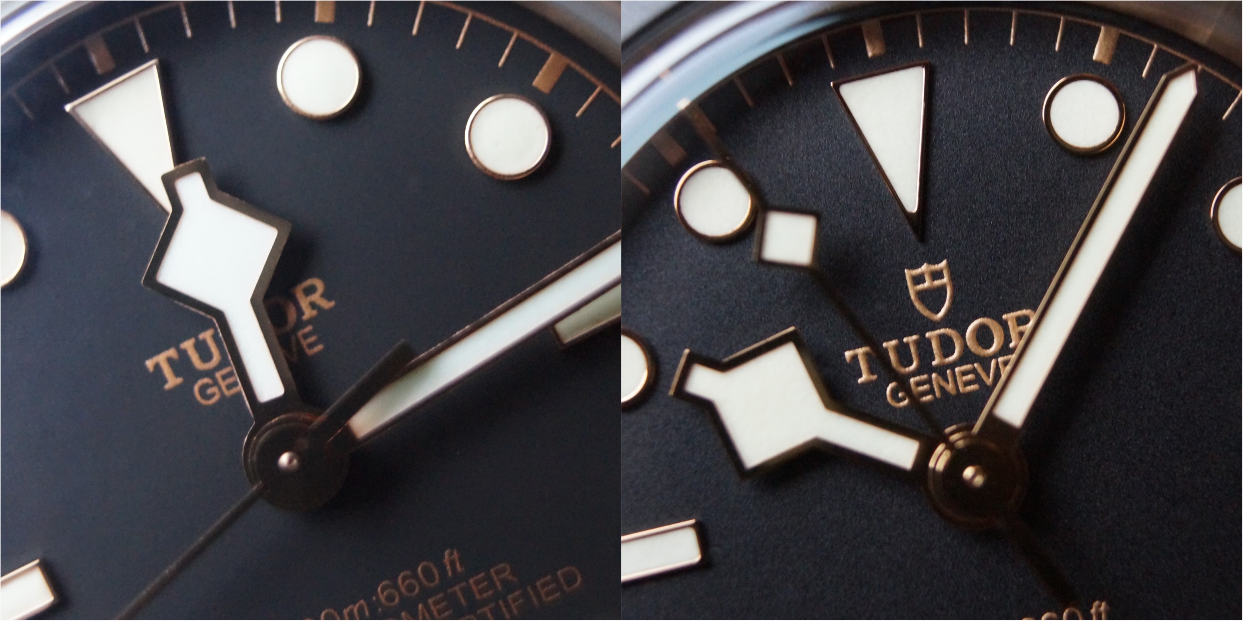
Dial printing: The printing looks pretty good on the ZF to be honest. What I can see is that the GEN printing is higher but a noch thinner! Also the color is a bit darker on the GEN.
Lets flip the watches upside down:
What can you see? Instantly you see the cutting of the TUDOR GENEVE CALIBRE MANUFACTURE is disgusting on the ZF compared to GEN on the macro shots
The cuts are rough on the ZF. Also the text is brushed to a darker tone on the GEN it almost looks like its painted inside. Instant tell if you have the both casebacks next to each other. Also the finish on the caseback teeth is rough and just looks different on the ZF version compared to GEN
Also the laser cutting of the serial number looks poor on the ZF compared to GEN. What i noticed is the finish of the lug horns also, they do a bent or kink on the ZF and on GEN they are brushed evenly in one turn. For cutting of the reference number the finish is the same as on the serial number.
Lets look at the bracelet and clasp:
Clasp looks really good and is definitely close to GEN. The finish of the TUDOR lettering is better executed on the GEN as you would expect. What always seems weird to me was the finish of the inside of the clasp in the ZF. You can see the differences compared to GEN!
Also the ceramic ball on the clasp is better finished on the GEN.
Brushing of the bracelet is really good on the ZF version. Maybe GEN is a bit higher polished but overall really really close to GEN!
Also the faux rivets are well executed, maybe the edges are a notch smoother on the GEN, but no big difference.
Bracelet feels great I have to say. I gave it an oil bath and now id handles very close to gen. It feels a bit rougher on the edges but not a big difference!
So what is the final verdict of the ZF version compared to GEN?
Overall a great replica for 300€! You get 99% close to gen for 1/10 of the price!
The weak points of the ZF version are in my opionion:
- dial color is „dull“
- crown stem a bit too long
- no "harder" bezel click when you turn over 12 o clock
- finishing of the hands
- lume color of the hands
- lume pip on the bezel
- finish of the caseback and laser engraving on the caseback
What do you guys think of the ZF?
I would suggest to buy one if you never had one. Its a banger for the bucks and definitely as close to gen as you can get for 300 bucks.
Best regards
germansubmarine
Last edited: