babola
I'm Pretty Popular
- 19/9/06
- 1,670
- 95
- 48
David,
few suggestions, if I may...
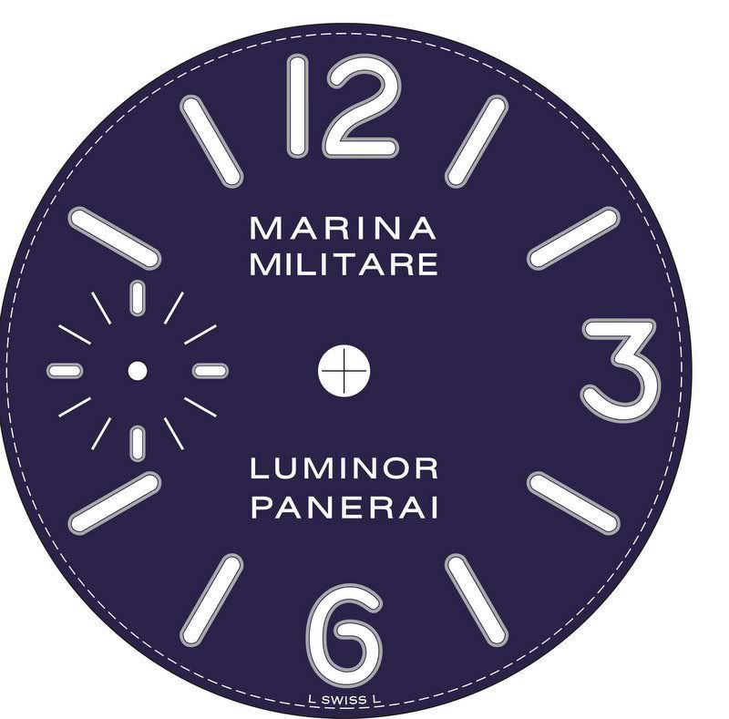
- the shade of a 082 dial should be a bit more 'vibrant' blue, similar to the gen
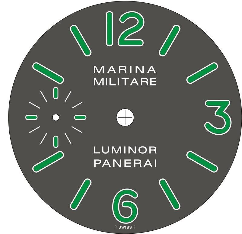
- Marina Militare at the top and Luminor Panerai dial text at the bottom is not the same font and style on your drawings, on both 036 and 082. Marina Militare letters should preferably be just a tad wider, to match the Luminor Panerai text on the bottom, which is close to perfect, especialy horizontal bar on "A".
- on 055 brown dial, the text should be slightly wider, both Luminor at the top, and Panerai at the bottom. You will notice that if you for example compare the position of letter "P" and letter "I" in Panerai, relative to 5 and 7 o'clock bar hour indices on the gen.
That's all for now, keep 'em coming mate !!!
regards,
babola


