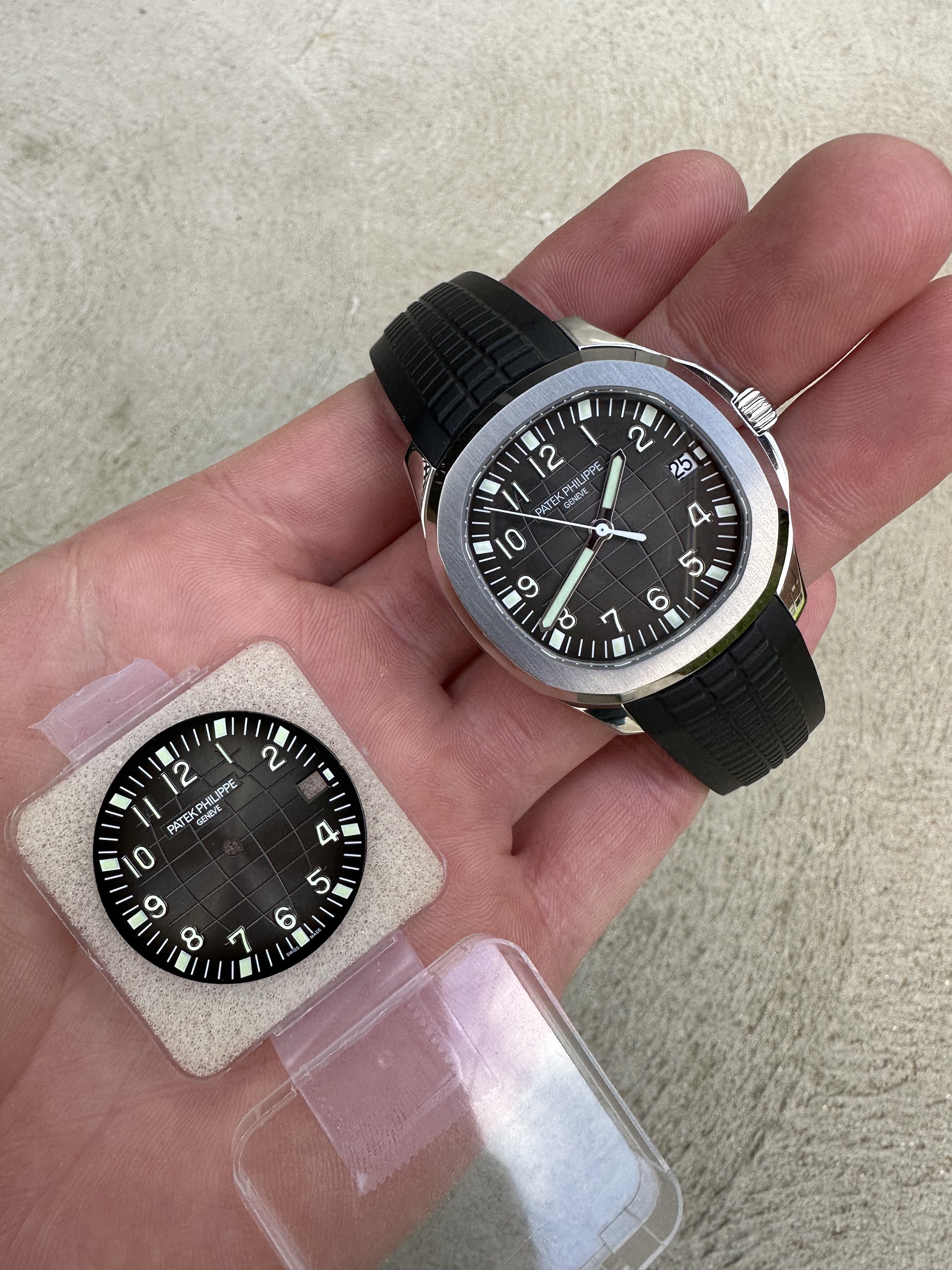
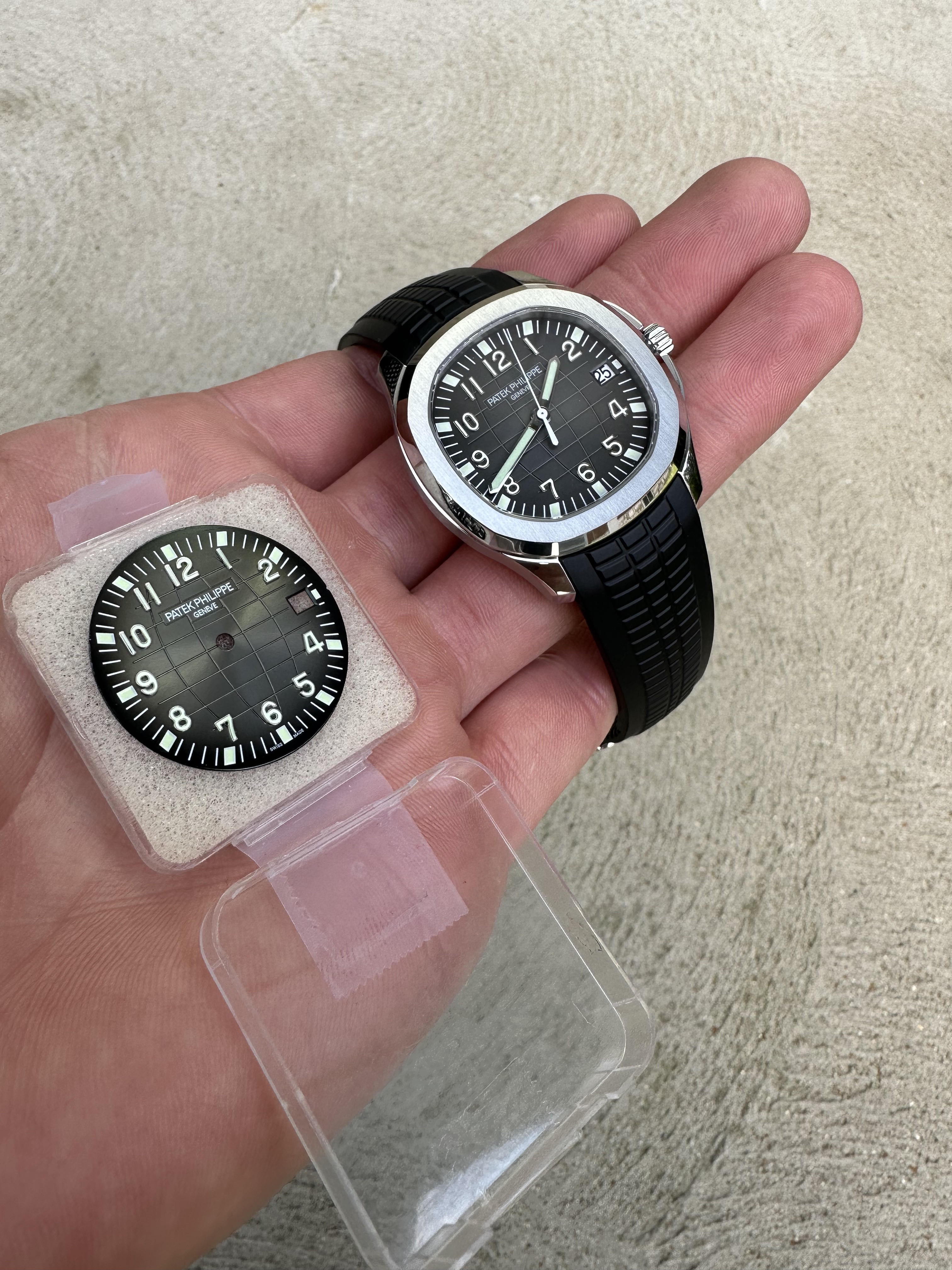
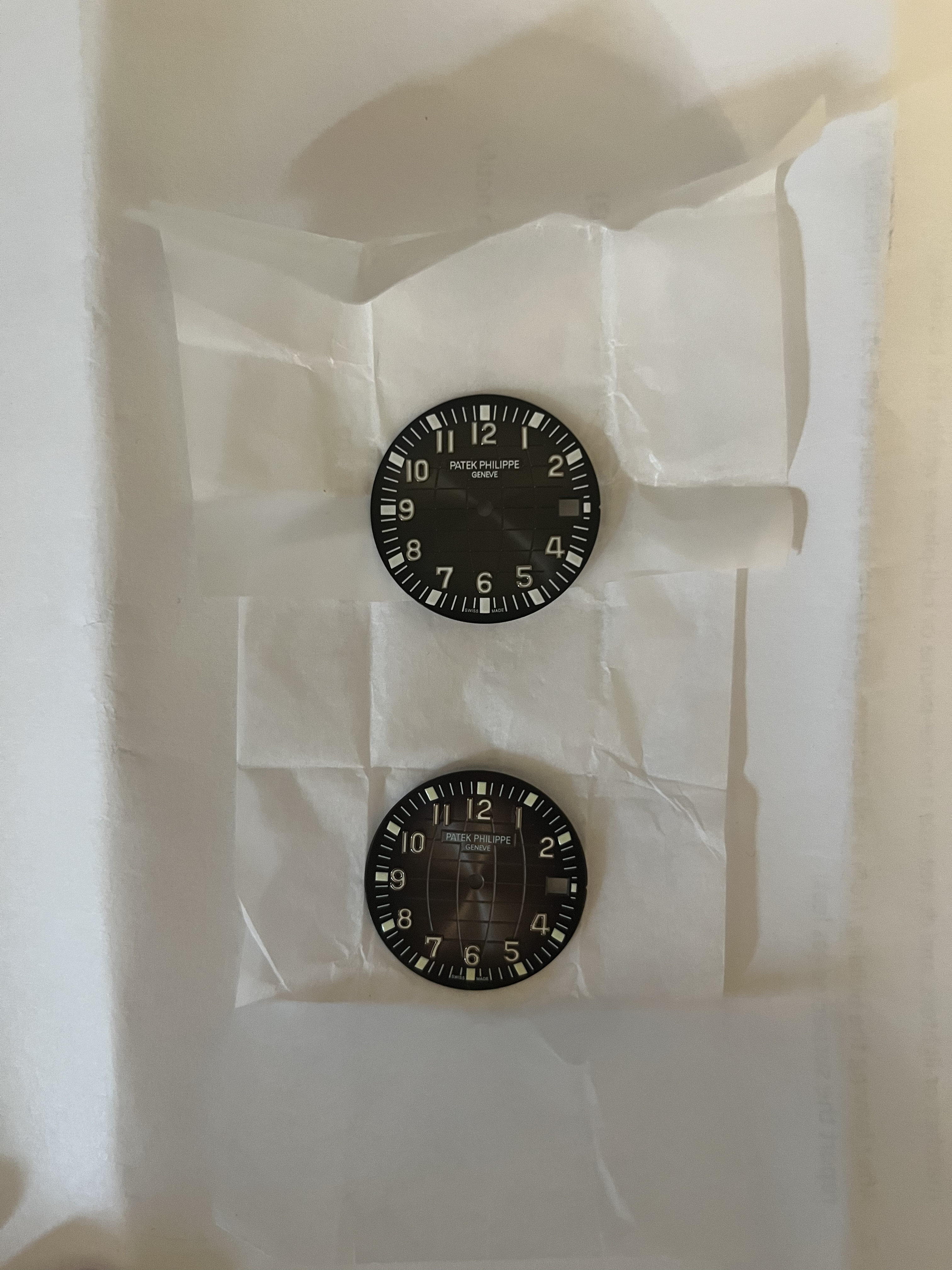
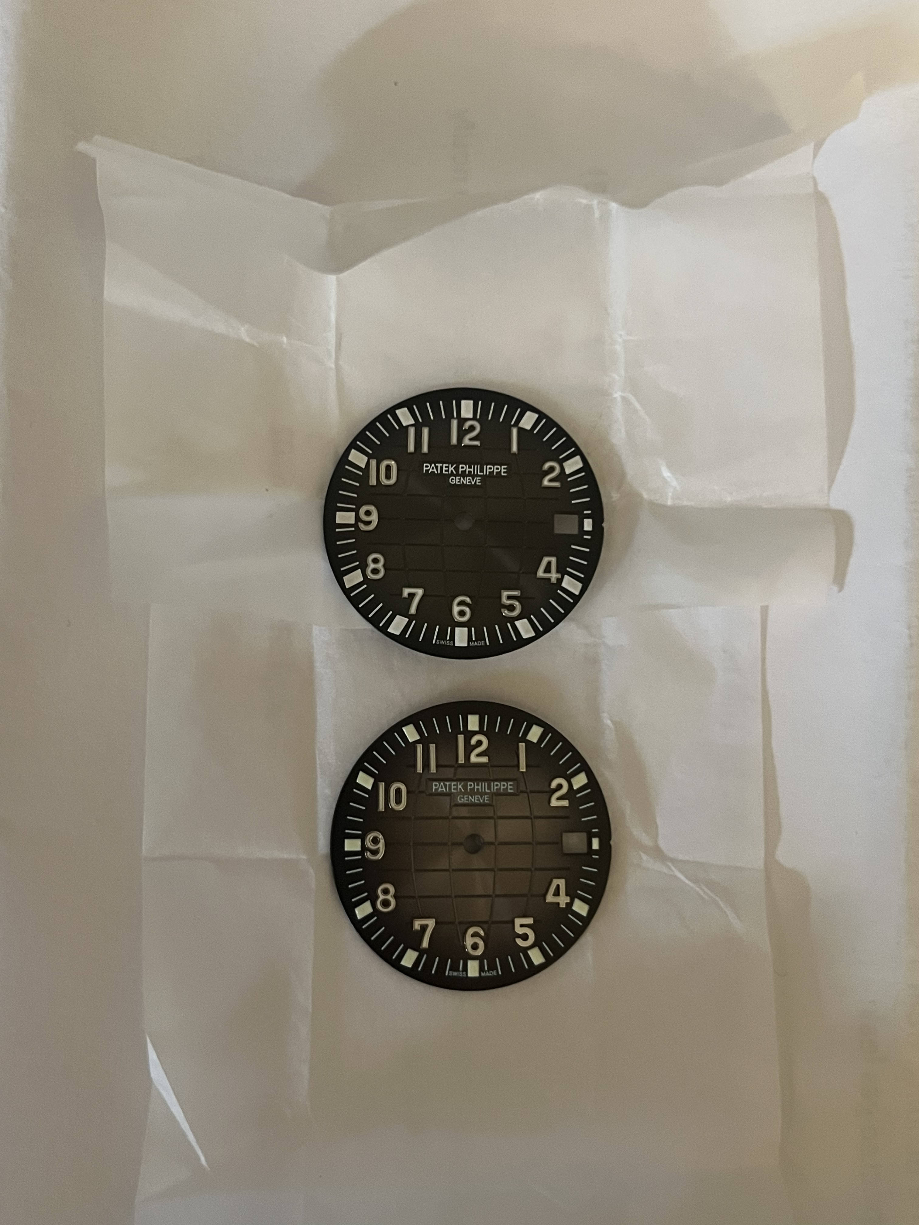
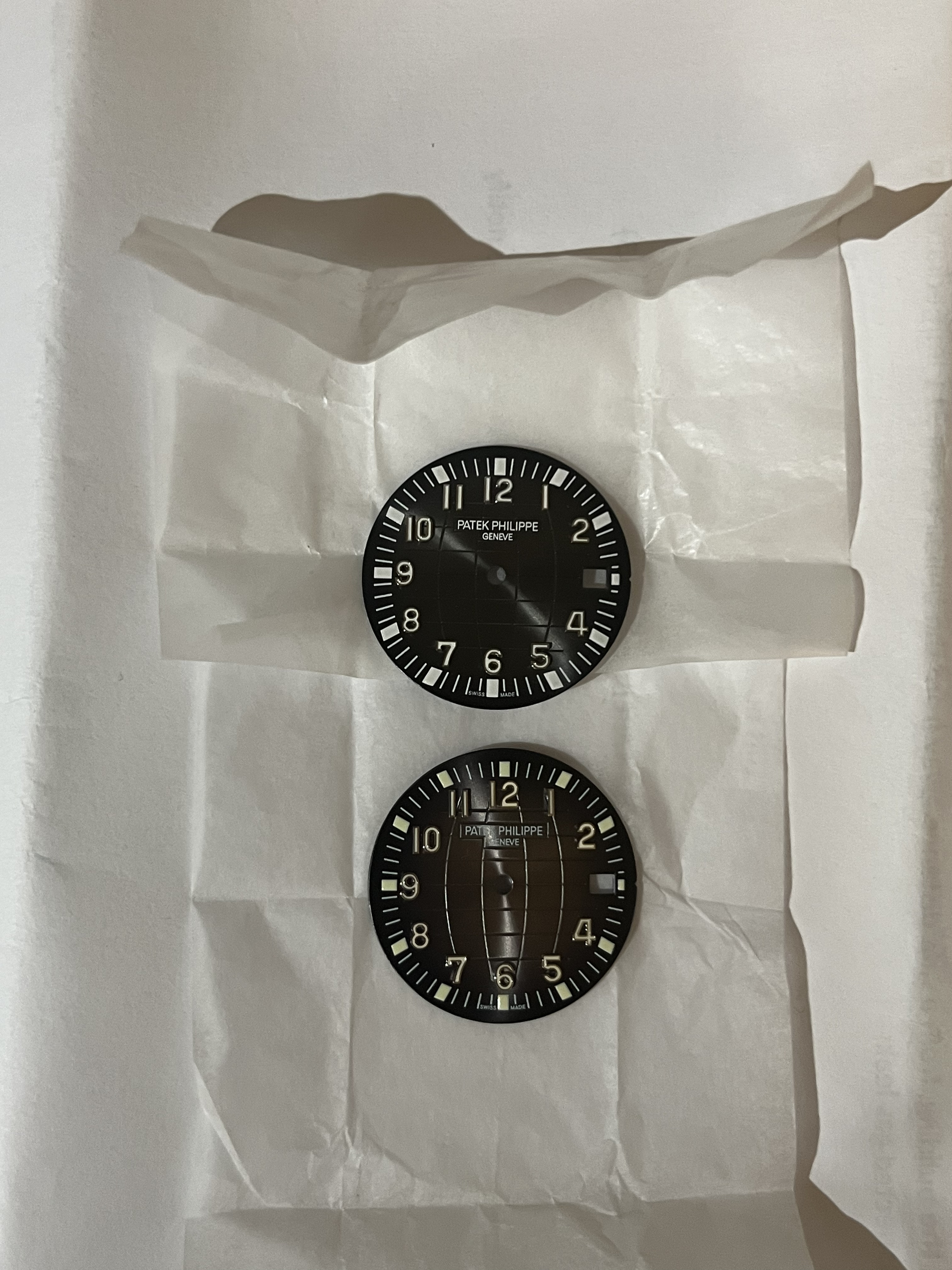
Think it's the angle, have both on order so will compare them and share hereThat 10 is horrible
-
Tired of adverts on RWI? - Subscribe by clicking HERE and PMing Trailboss for instructions and they will magically go away!
You are using an out of date browser. It may not display this or other websites correctly.
You should upgrade or use an alternative browser.
You should upgrade or use an alternative browser.
The Ultimate Aquanaut 5167A Dial Discussion
- Thread starter daytonadude
- Start date
- 11/7/16
- 2,440
- 2,398
- 113
There is no right answer. The 3KF overall is fine with a Buff date disc and is probably the most cost conscious. There are tradeoffs with each dial that makes this a no-win scenario in my book.
I've seen both Buff and SWF and they look great, but still not great once you see the lume hour indices.
I've seen both Buff and SWF and they look great, but still not great once you see the lume hour indices.
- 21/3/14
- 5,863
- 701
- 113
- 16/4/22
- 481
- 545
- 93
Just cuz i'm stupid - 3KF V2 is in the watch and the gen dial is in the case yea? Only thing that stands out to me other than slight differences in color is the PP logo - 3KF is always too high or too low.
I think other way around - Gen dial in the case (centered logo, less bright sunburst, nicely shaped markers)Just cuz i'm stupid - 3KF V2 is in the watch and the gen dial is in the case yea? Only thing that stands out to me other than slight differences in color is the PP logo - 3KF is always too high or too low.
Seb75
Getting To Know The Place
I think so, 3KF dial has way too much sunburst (same on their 5168G-001) and light color, whereas gen is deeper and very much matte. Nice !
Yes, gen dial in the caseJust cuz i'm stupid - 3KF V2 is in the watch and the gen dial is in the case yea? Only thing that stands out to me other than slight differences in color is the PP logo - 3KF is always too high or too low.
- 21/3/14
- 5,863
- 701
- 113
I think he/she meant the unmounted dial in the box instead of “case”. The gen one should be the one in the watch, right?Yes, gen dial in the case
Oops. Yes, gen dial is in the watch. Rep dial in plastic caseI think he/she meant the unmounted dial in the box instead of “case”. The gen one should be the one in the watch, right?
serumdiesel
Madman
- 17/3/21
- 670
- 547
- 93
Like night and day
Thought you were full of shit until I spent a good 2-3 mins studying the differences. Amazing how close they are at first glance, then how different after a bit of scrutiny.
- 21/3/14
- 5,863
- 701
- 113
Lol, I have the same watch, so I know what a gen dial looks likeThought you were full of shit until I spent a good 2-3 mins studying the differences. Amazing how close they are at first glance, then how different after a bit of scrutiny.
Last edited:
dashindark
Renowned Member
- 20/4/17
- 883
- 380
- 63
could you enlighten me on what to look at? I often have difficulties in finding differences…Thought you were full of shit until I spent a good 2-3 mins studying the differences. Amazing how close they are at first glance, then how different after a bit of scrutiny.
dashindark
Renowned Member
- 20/4/17
- 883
- 380
- 63
Never mind. I thought this thread was about buff/so. I have no problem seeing the differences between gen and 3k stock dials. If someone can point out the differences between buff/sw and gen, I would really appreciate it.
I am waiting on both sw and buff dials and will post the difference hereNever mind. I thought this thread was about buff/so. I have no problem seeing the differences between gen and 3k stock dials. If someone can point out the differences between buff/sw and gen, I would really appreciate it.
The moment you've all been waiting for...
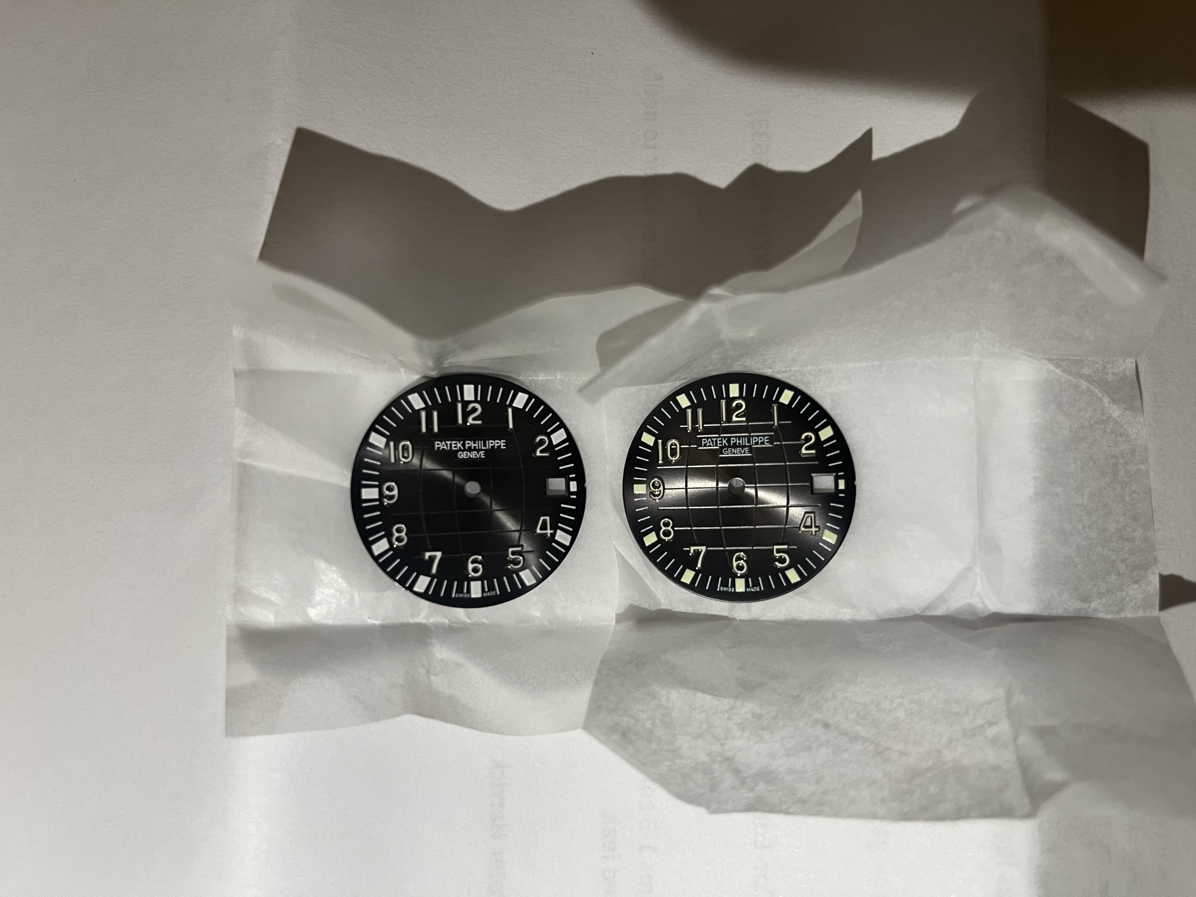
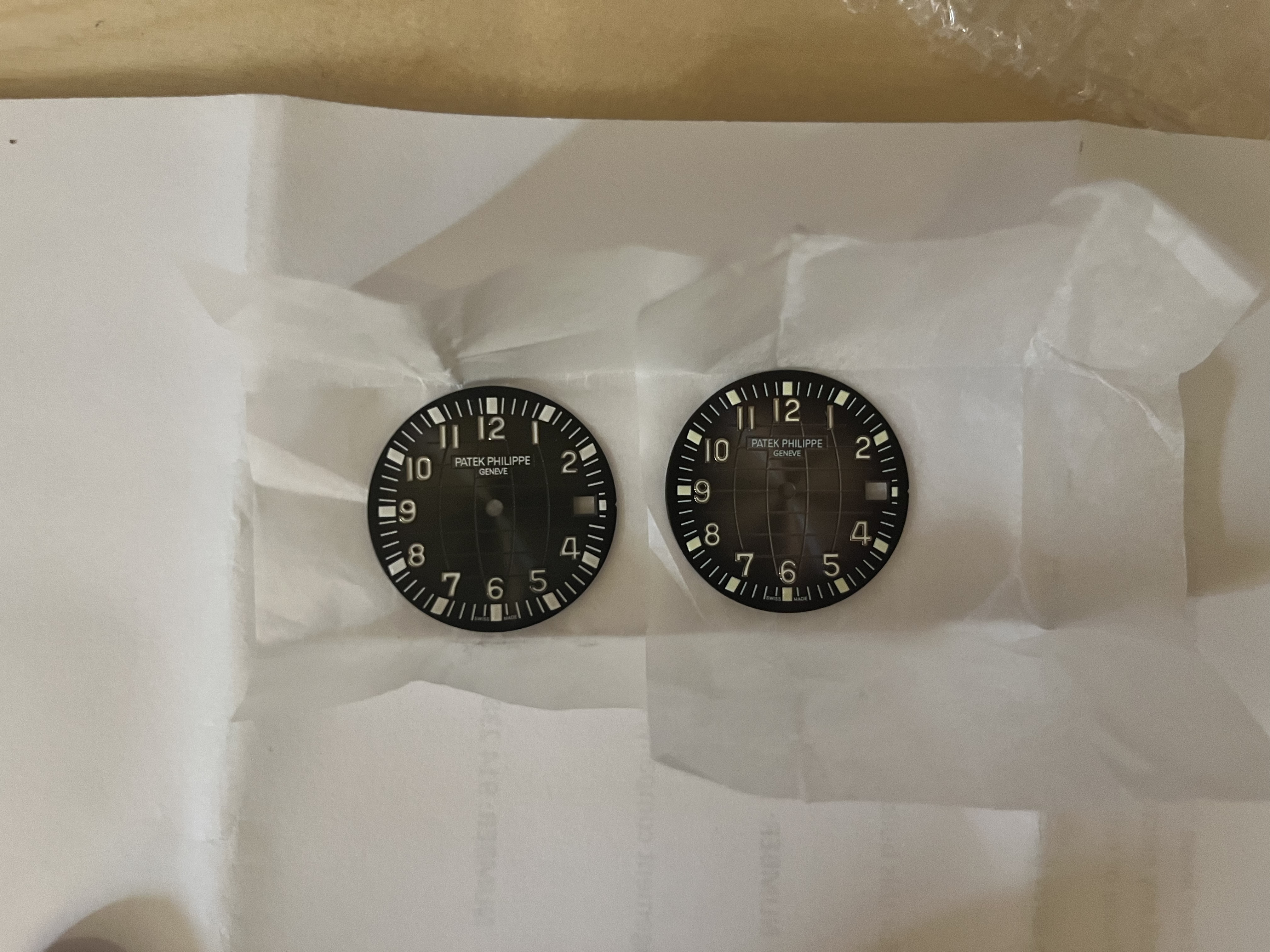
I've received both dials and, like many things on this forum and in agreement with @majwilliams0308, it all comes down to personal preference.
The sunburst on the Buff dial is gorgeous, and from users who have installed it and posted photos, it looks great in the watch. The lume ends up looking like an iteration of the Aquanaut from a decade ago (which matches the clasp provided on both the 3KF and ZF watches). I prefer the "Patek Phillipe Geneve" writing on this one for sure. The markers on the numbers have a tendency to change depending on the angle you're looking at them, which I really like.
The SW dial is more muted but still has sunburst. The number markers are comparable on both and I personally couldn't tell the difference between sticker and non-sticker lume. The numbers and markers are more white, and therefore more like current iterations of the Aquanaut.
I'm not sure which I'll end up installing. They both look great and are so close to gen. I'm done zooming in aggressively onto small issues in photos, none of them are noticeable and no one is going to be looking that closely!
Pictures in next post.
Last edited:
serumdiesel
Madman
- 17/3/21
- 670
- 547
- 93
dashindark
Renowned Member
- 20/4/17
- 883
- 380
- 63
Thanks a lot for your great input! Both dials are great.The moment you've all been waiting for...
I've received both dials and, like many things on this forum and in agreement with @majwilliams0308, it all comes down to personal preference.
The sunburst on the Buff dial is gorgeous, and from users who have installed it and posted photos, it looks great in the watch. The lume ends up looking like an iteration of the Aquanaut from a decade ago (which matches the clasp provided on both the 3KF and ZF watches). I prefer the "Patek Phillipe Geneve" writing on this one for sure. The markers on the numbers have a tendency to change depending on the angle you're looking at them, which I really like.
The SW dial is more muted but still has sunburst. The number markers are comparable on both and I personally couldn't tell the difference between sticker and non-sticker lume. The numbers and markers are more white, and therefore more like current iterations of the Aquanaut.
I'm not sure which I'll end up installing. They both look great and are so close to gen. I'm done zooming in aggressively onto small issues in photos, none of them are noticeable and no one is going to be looking that closely!
Pictures in next post.
BTW I don't quite understand the "stickers on lume" thing on SW dials. Can anyone clarify this?

