Some comments about issues found on this replica
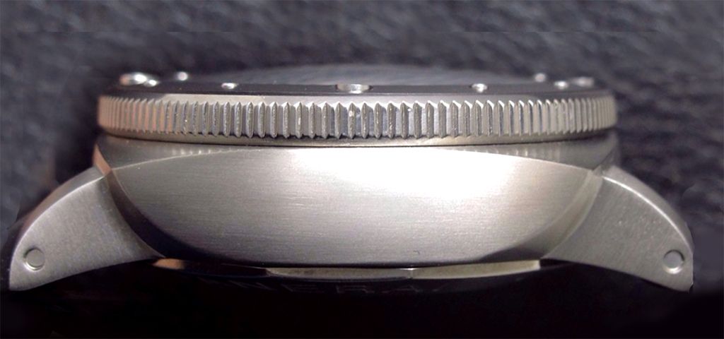
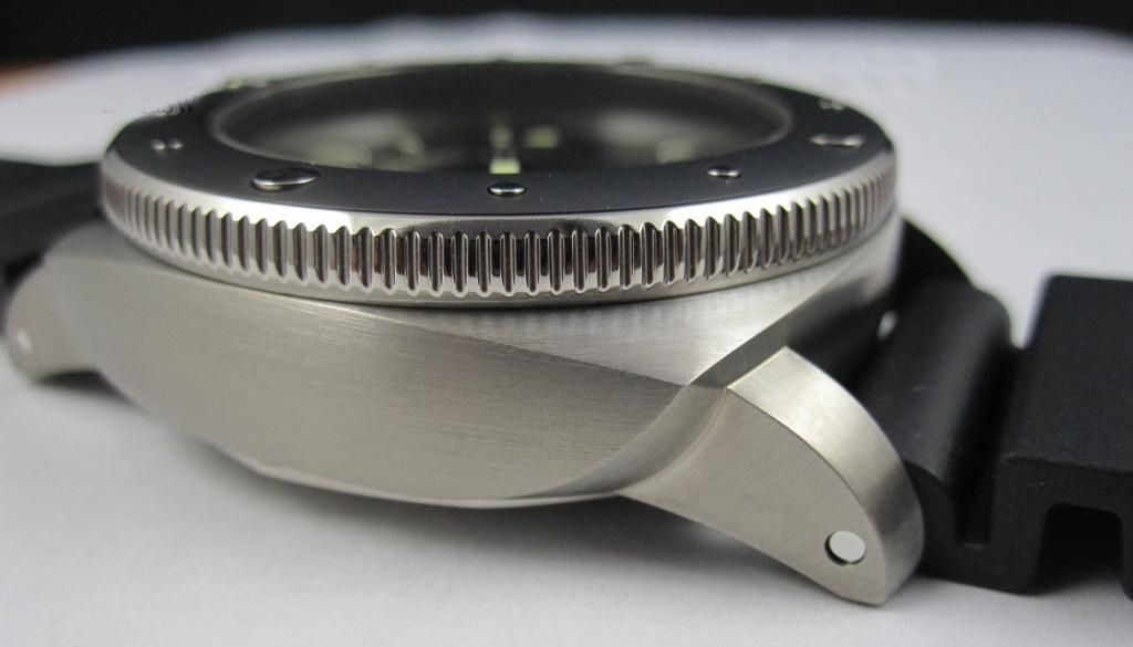
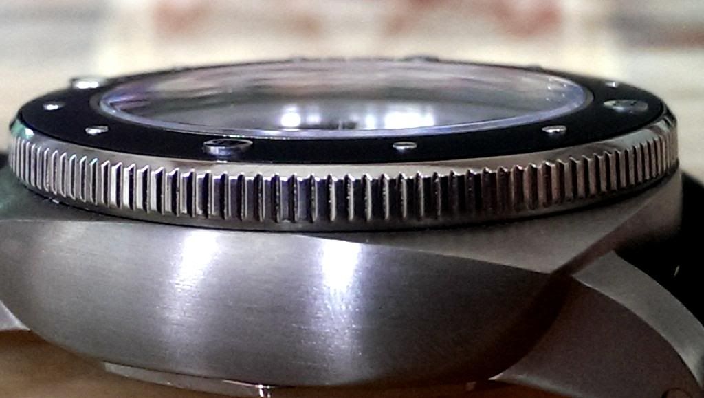
-Bab finish of the polished edge of the bezel. We can justify, due to the price of the replica, a worse finish in cushion shape lugs and case, but the polished of the bezel edge is an easy matter to be got in a rep.
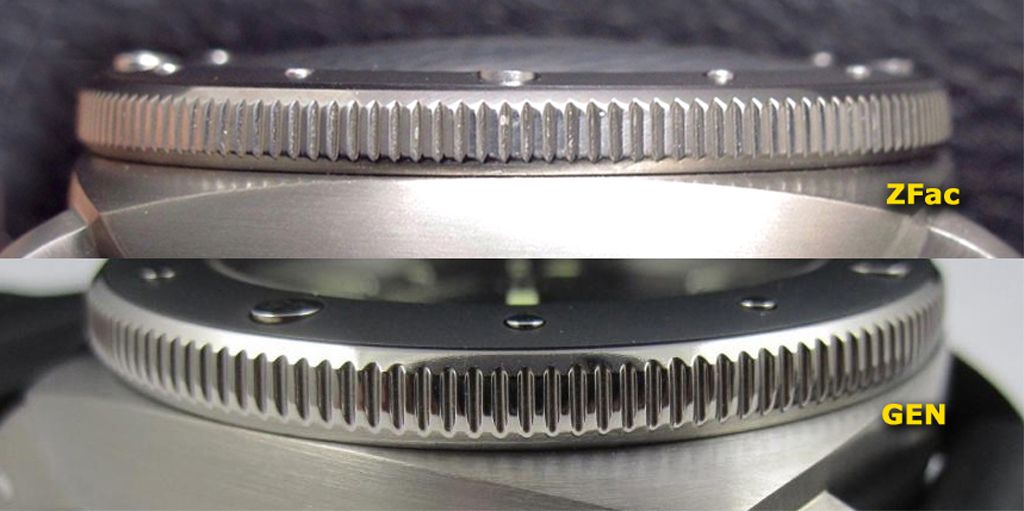
See comparison pics:
ZFac REPLICA
GEN PAM 389
-"Amagnetic" fonts are a bit wrong, mainly "a" and "g" and this "g" is a bit vertically misaligned
- Big markers on subdial are clearly bolder in rep
- Date Wheel fonts are Bolder too
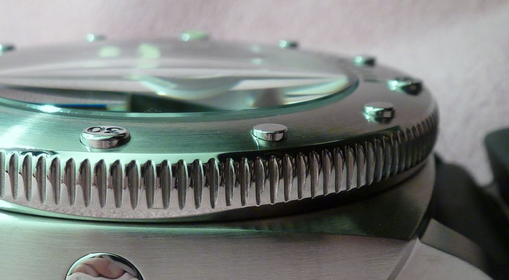
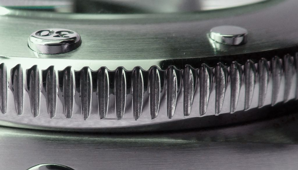
- "30" on bezel has "3" wrong (in this sample at least)
- REG. fonts are slightly wrong
- Inner angle in CG hollow seems a bit smaller like other similar replicas
- Markers on bezel from 12 to 3 seem shallow and with clear worse finish
I would like to see better pics and with a carefully cleaned rep watch to see the real quality of the ceramic bezel (no very nice in these QC pics)
And below some interesting comments of flaws found by
PeteM and posted in RG
http://www.repgeek.com/showthread.php?t=212402&p=2353511&viewfull=1#post-2353511
“
For me what caught my eye apart from the subdial Which I accept based on that pic I was wrong about... but it is definitely deeper on the gen.. and likely the concentrics are much less defined or shallower..
Was the knurling on the bezel interms of shape and finish plus and this could be just because of the pics or the finish is the way the ceramic insert meets the edge of the bezel there seems to be too much distance... but this could be just because of the knurling being different..
Then the tip of the CG especially on the inside is not as rounded as the gen and the same with the CG body where it meets the case... it appears as if there has been to much removed to give it that angle..the gens have this but the polishing of it gives it the appearance that more is missing than there actually is... also the CG seems slightly bigger on the rep as the REG of the REGTM seems to sit further away from the end of the CG but seems to be right in its distance from the arc of the CG..
The LSML is slightly higher above the six baton marker on the gen the bottom of LSML seems to sit slightly under the baton marker
The bezel markers appear sharper than the gen which seem more rounded however that could be just the fitting of the bezel or even the qc pics (which are limited) The gen has a rounded edge which makes the numbers appear closer to the edge wheras the numbers on the rep seem further from the edges because they are sharper and the numbers for example the 5 in 45...on the gen the rounded part looks like an open circle whereas the rep appears more like a squeezed U
The knurling on the crown is sharper on the rep and probably not as well finished
Again as mentioned the font is slightly off and thickness is lacking as in most reps
Then the rep pearl in some it looks good in others it seems to be lacking that acrylic glaze that you see over the lume in gen pearls just like the 187 reps etc do...some may recall the great Rolex pearl debate on say the DSSDs ... the gen has the lume sitting inside the polished surround with an acrlic glazed over so head on it looks full but when seen from sides or at angles the lume looks set inside the surround... I hope that makes sense..â€
Thats my take on the rep head on and I am sure other guys will have their own take on it...for me most of those details are minor (although a few can be easily modded) and on the wrist I reckon this is a great rep OTB"