Here it is fellas
http://www.trustywatchguy.com/index.php?main_page=product_info&cPath=35_66&products_id=6428
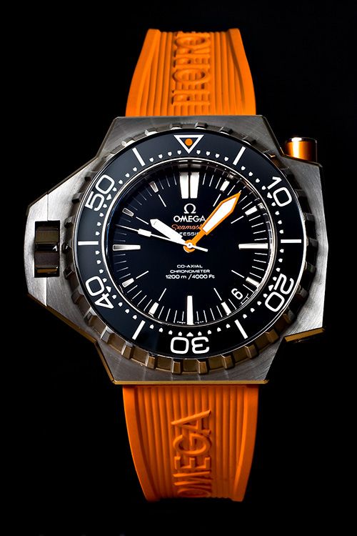
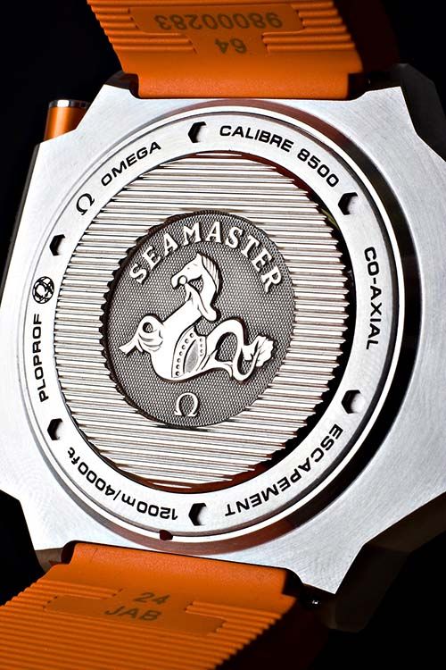
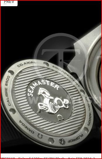
First two things I notice are the logo and the bezel font. The logo is AGAIN wrong like in the UPO having the little legs and the bezel font seems a bit thinner compared to the gen. That's all I can see for now but didn't really look into it. Other please share your thoughts and any noticed flaws

http://www.trustywatchguy.com/index.php?main_page=product_info&cPath=35_66&products_id=6428
First two things I notice are the logo and the bezel font. The logo is AGAIN wrong like in the UPO having the little legs and the bezel font seems a bit thinner compared to the gen. That's all I can see for now but didn't really look into it. Other please share your thoughts and any noticed flaws