- 12/3/18
- 35,716
- 71,474
- 113
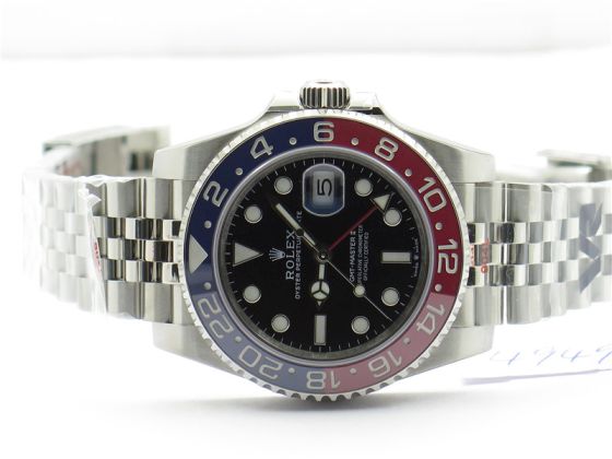
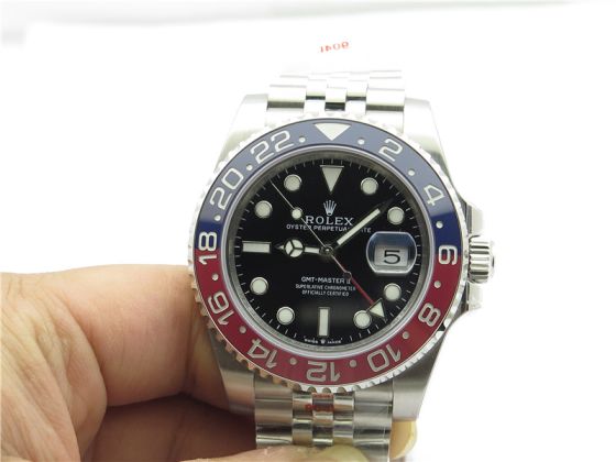
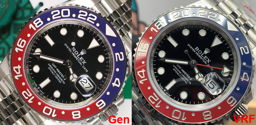
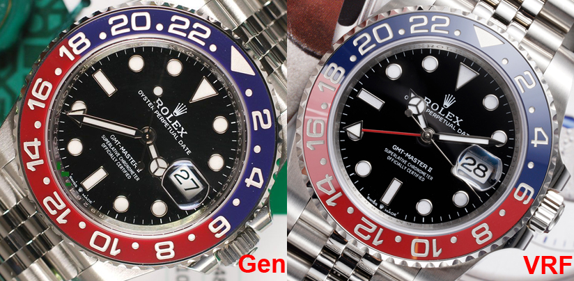
GMF Pepsi does not have the same font or spacing issues as the GMF Batman insert. It's not a bad insert. But neither is the VRF, I was just pointing out the similarity in construction which leads to the visible joint lines. The VRF is OK but we really aren't there yet. Maybe ARF or CF will be better.
GMF - note that some slight variances of marker fill color are not discernible to the eye IRL. This is an example where the appearance in a pic is less appealing than the real thing. This happens when a paint mod is done. I would rather it be this way than the other way around.

GMF - note that some slight variances of marker fill color are not discernible to the eye IRL. This is an example where the appearance in a pic is less appealing than the real thing. This happens when a paint mod is done. I would rather it be this way than the other way around.

Last edited:


