-
Tired of adverts on RWI? - Subscribe by clicking HERE and PMing Trailboss for instructions and they will magically go away!
You are using an out of date browser. It may not display this or other websites correctly.
You should upgrade or use an alternative browser.
You should upgrade or use an alternative browser.
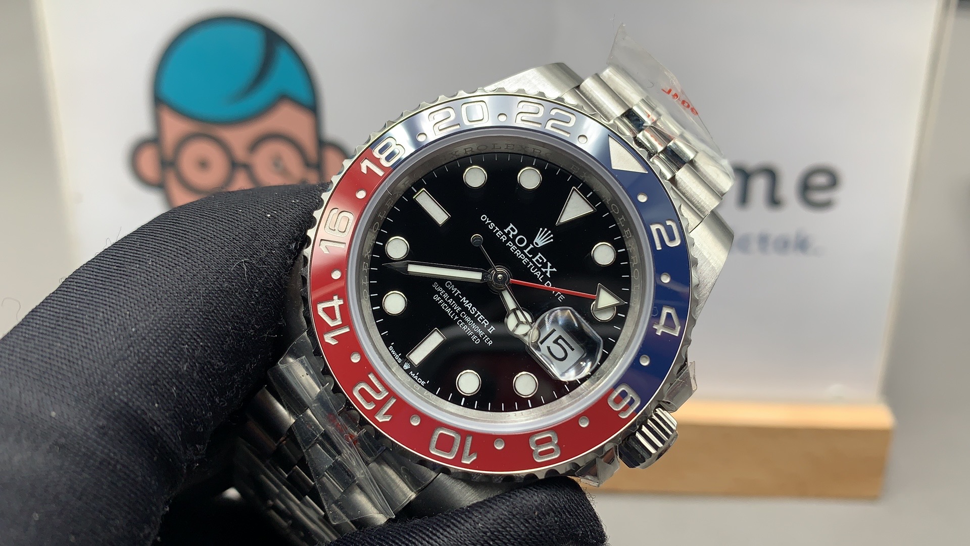
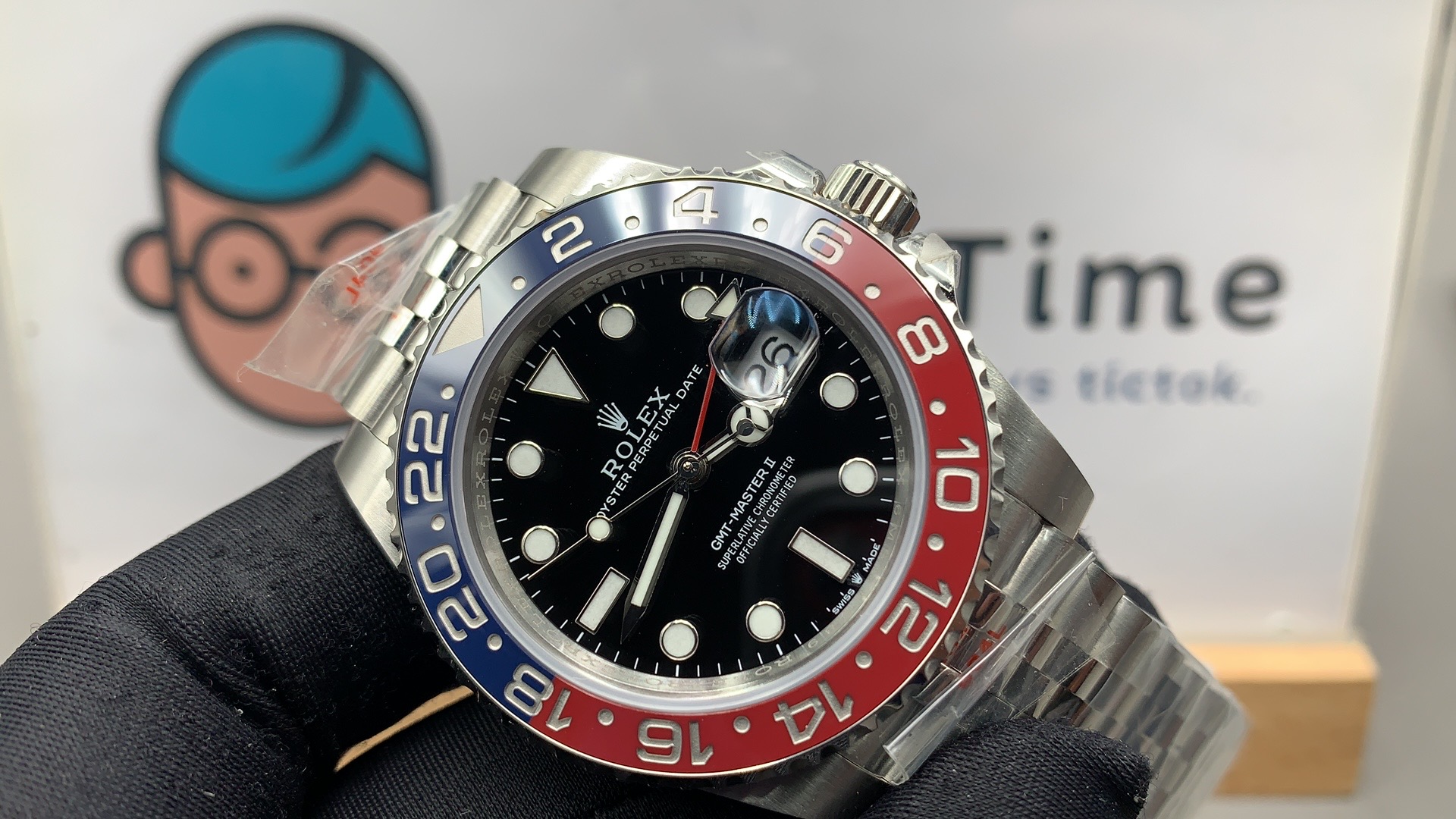
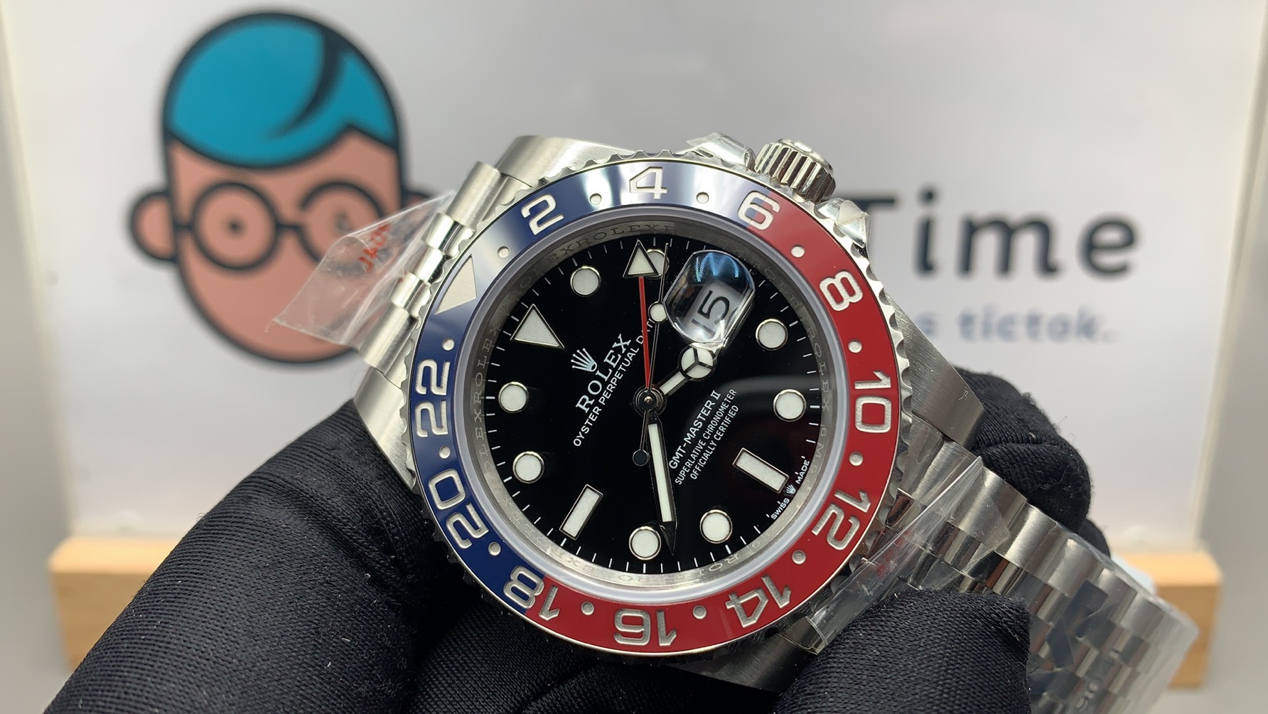
New VRF Pepsi GMT Max
- Thread starter rockdaytona
- Start date
Yes looking good, thought so too. My buyer’s remorse is getting better although not totally convinced yet about cyclops
Yes looking good, thought so too. My buyer’s remorse is getting better although not totally convinced yet about cyclops
Just buy a gen crystal. Can’t use that stock xtal
Tobel
Respected Member
- 6/7/17
- 5,456
- 3,673
- 113
Colors look great
I have to admit that I didn't like any QC pics as the colours didn't look good but on this video it does look quite good. looking forward to seeing real life pics!
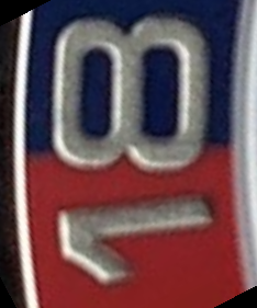
I can't see the big problem on 6 and 18. It is orrible for me!
Yes,for me too.
mari115
Respected Member
The cyclops issue the bad distortion at the slightest angle off from a dead center view. It doesn't take great expense to achieve a distortion free cyclops. A Clark's crystal with AR cyclops is $34. You can't make one of those display distortion no matter what angle you view it from. Almost $500 (with shipping and fees) for a rep and you get this flaw, seriously?
You are 100% right, there is no justification for it.
Well said.
It's crazy how if I say the same random people start saying that i'm obsessed by it lmao.
Keep on the great work brother, let's win this war ahahahah
mari115
Respected Member
Damn, this month is really dragging on long. Oh wait, it's only the 38th, haha.
ahahaha exactly
- 14/3/18
- 2,023
- 1,112
- 113
Fervid
I'm Pretty Popular
Colors look amazing in that lighting wow. Transition is a bit more off compared to most we've seen but the rest of the watch looks great
Last edited:
Tobel
Respected Member
- 6/7/17
- 5,456
- 3,673
- 113
Feel like I should RL, transition lines seem more off than other QCs?
I can't be sure but my feeling is that the transition line is more or less the same on every watch, but the angle at which the pic is taken as well as the light may hide it in some cases. Here with strong light coming from the top, it's the worst setup
Fervid
I'm Pretty Popular
mari115
Respected Member
ARF managed to hide the speedbump almost completely in their batman, there is NO excuse for the other factories now, they better start doing it right
Feel like I should RL, transition lines seem more off than other QCs?

I would RL because it seems there is a small but noticeable ding in the bezel between the 1 and 8 of the 18. Not a big deal at all, but new should be new... and who knows if the impact that left it did anything problematic to the movement.
- 12/3/18
- 34,663
- 66,755
- 113
Feel like I should RL, transition lines seem more off than other QCs?

I wouldn't RL for just that. It's very close and much better too low than too high.
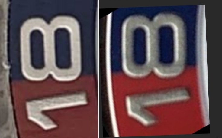
Almost all Noobs are visibly too high and after wearing it a while its something I don't even think about anymore. The insert colors are a much bigger tell at a much greater distance so you can't get one near a gen anyway. You have to decide what you'll be happy with but that sample looks good enough to me.

Last edited:
- 12/3/18
- 34,663
- 66,755
- 113
I would RL because it seems there is a small but noticeable ding in the bezel between the 1 and 8 of the 18. Not a big deal at all, but new should be new... and who knows if the impact that left it did anything problematic to the movement.
I'm sure that's just some lint bro but it wouldn't hurt to ask for it to be brushed away.
- 25/3/17
- 4,309
- 3,802
- 113
- 12/3/18
- 34,663
- 66,755
- 113
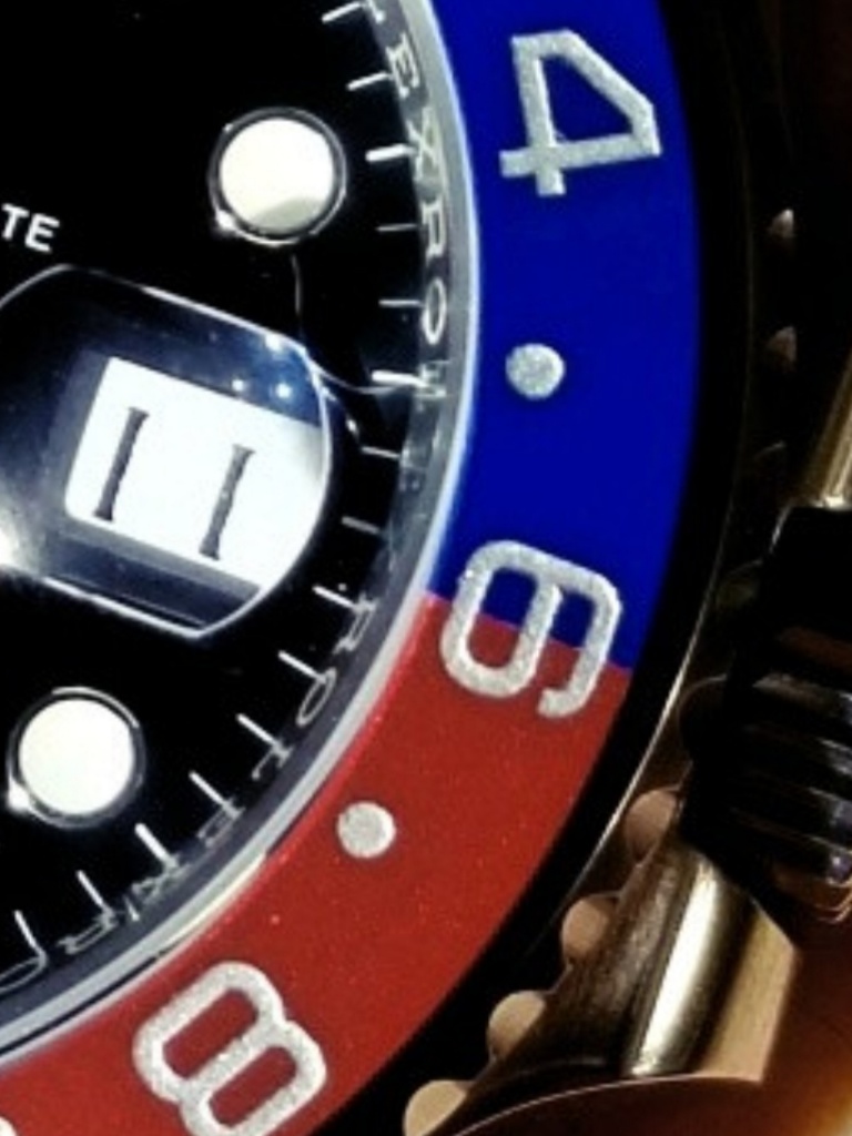
This is orrible for me!!!
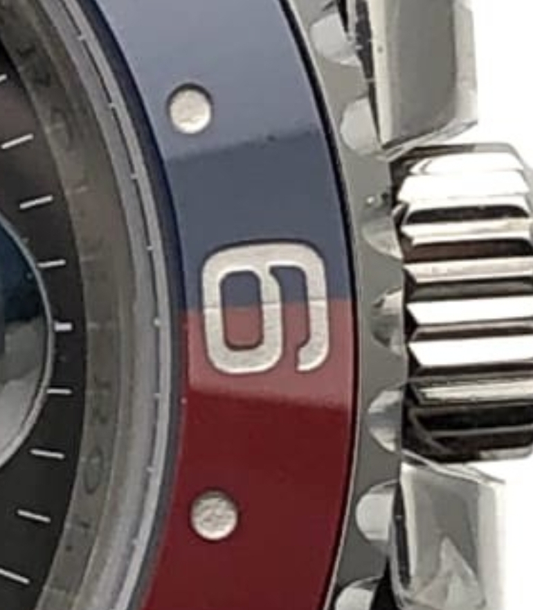
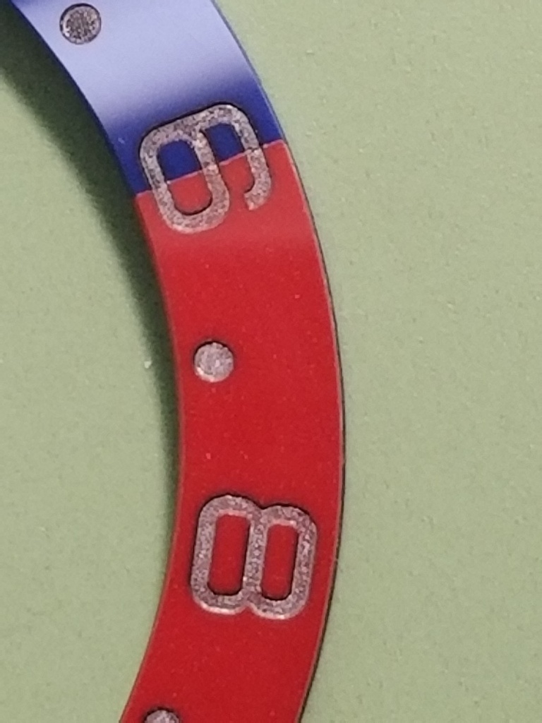
Agree bro but that's a batch issue, accept it or pick another watch. That's why I said it looks a lot like the GMF insert. At least there's not a white glue line!
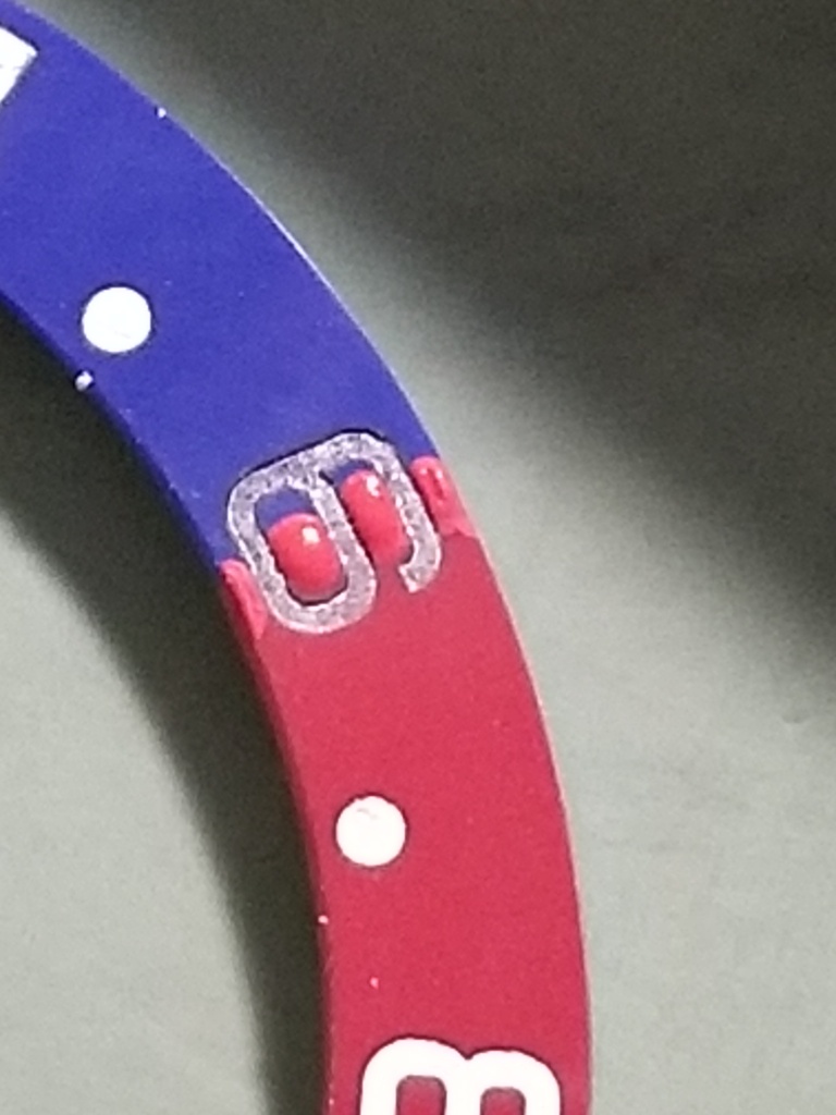
With some careful painting that can be improved a lot.
Last edited:
Fervid
I'm Pretty Popular
GMF font and spacing is still horrible imo. This insert is so much better and under certain lighting I think it will be the best for photos

