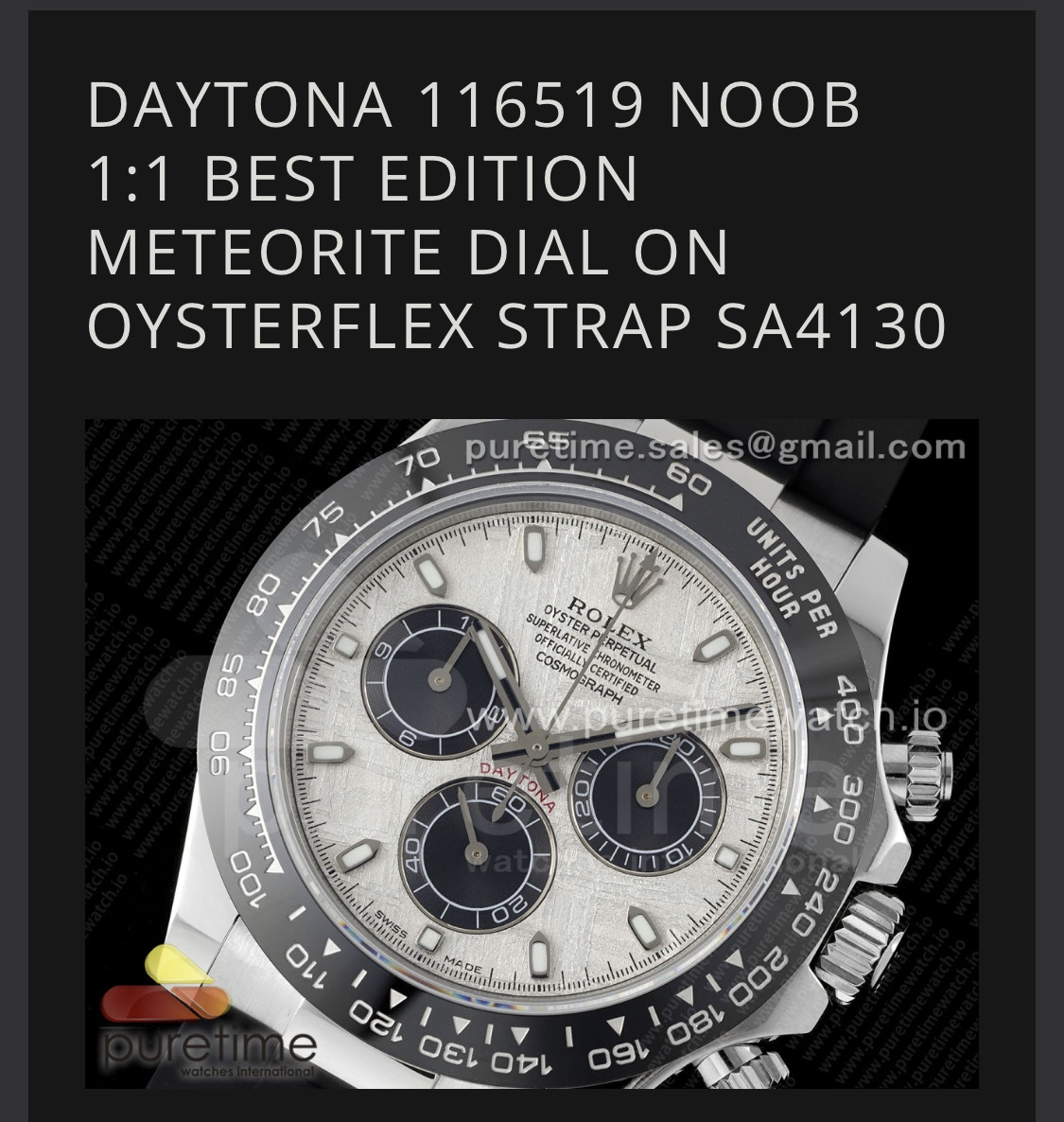
I wondering that same question. Why Noob over QF? New Noob that is lol@raremedium - 2nd attempt at QC with the NOOB meteorite from Puretime? Looks good.
What made you choose NOOB over QF?
-
Tired of adverts on RWI? - Subscribe by clicking HERE and PMing Trailboss for instructions and they will magically go away!
You are using an out of date browser. It may not display this or other websites correctly.
You should upgrade or use an alternative browser.
You should upgrade or use an alternative browser.
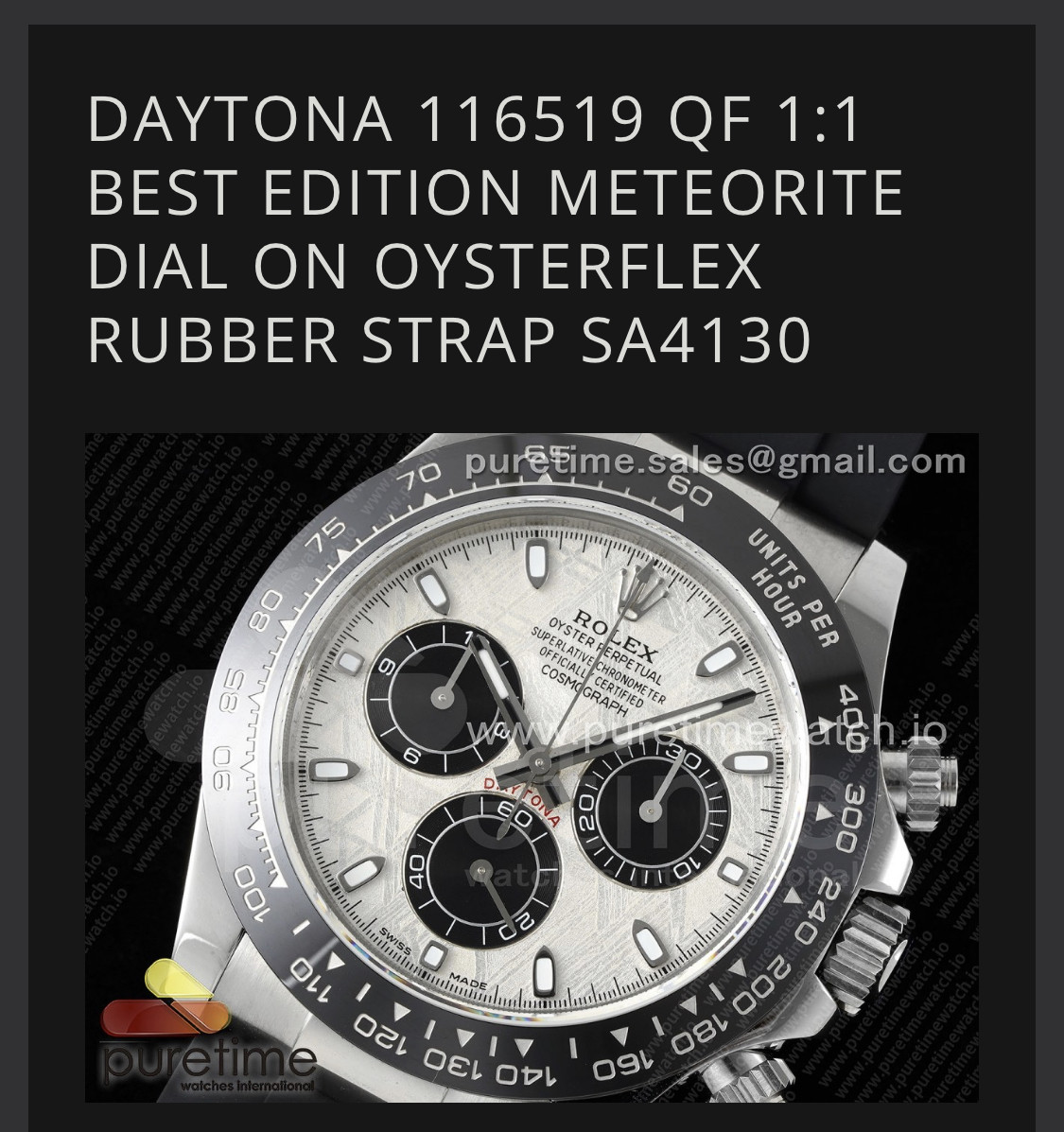
New QF 116519LN (real?) meteorite dial Daytona
- Thread starter dogwood
- Start date

Agreed. The question is: is the serif on the R on the bezel a problem for you or not.@raremedium - 2nd attempt at QC with the NOOB meteorite from Puretime? Looks good.
What made you choose NOOB over QF?
mmaggi
Renowned Member
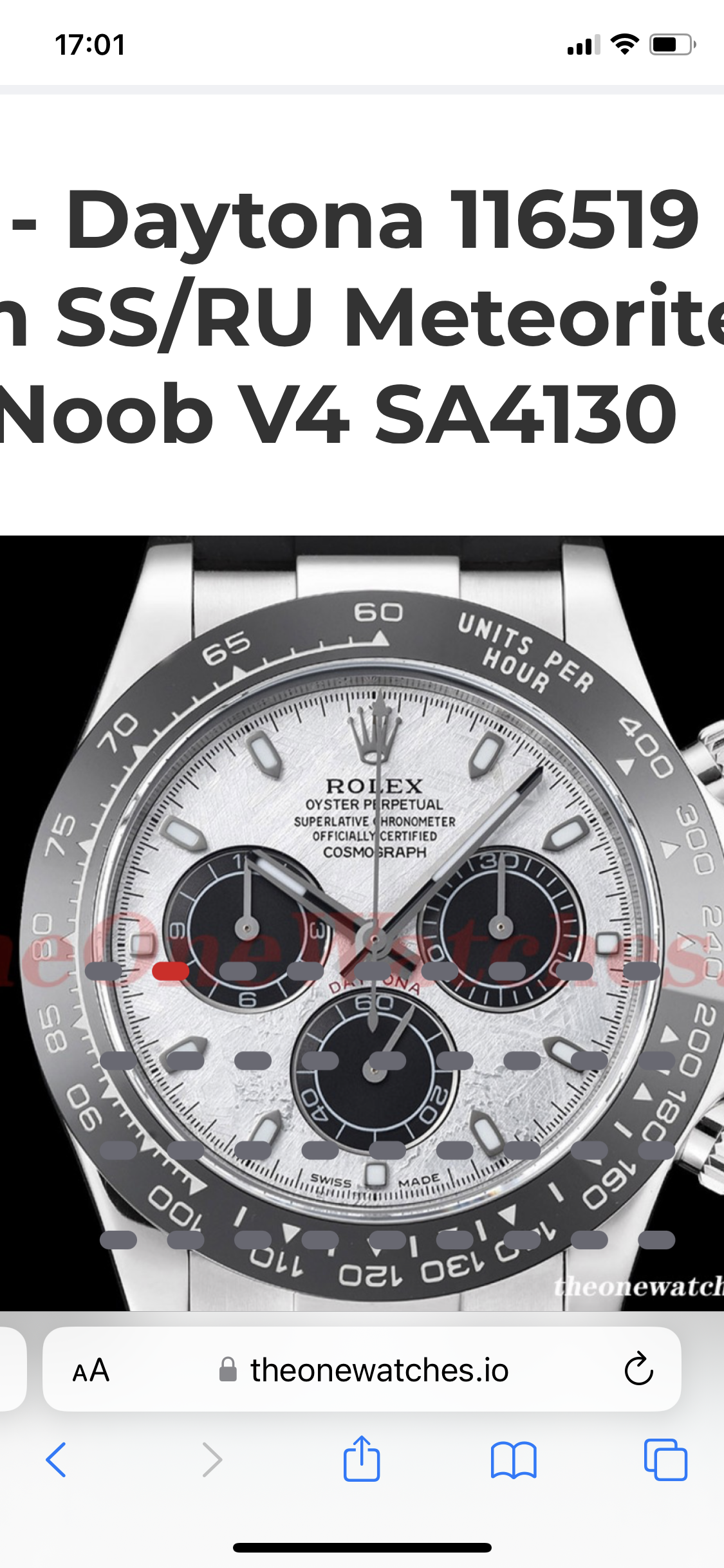
@dogwood - So now you have me thinking: Is there a problem with the serif font with the letter 'R' on the QF bezel? I'm looking at both bezels on Puretime (QF) and TheOneWatches (NOOB) and I can't see any difference between the 2. The QF bezel fonts appear ever so slightly bolder if anything.
What do you think?
What do you think?
Looking at them now… it looks like none of them have the little tail on the bottom of the R on the bezel.@dogwood - So now you have me thinking: Is there a problem with the serif font with the letter 'R' on the QF bezel? I'm looking at both bezels on Puretime (QF) and TheOneWatches (NOOB) and I can't see any difference between the 2. The QF bezel fonts appear ever so slightly bolder if anything.
What do you think?
mmaggi
Renowned Member
The bezels look very similar on both QF & NOOB. I wonder if the factories source from the same bezel maker.
Very likely the same source for both bezels.The bezels look very similar on both QF & NOOB. I wonder if the factories source from the same bezel maker.
raremedium
Known Member
- 6/3/15
- 165
- 86
- 28
mmaggi
Renowned Member
mmaggi
Renowned Member
raremedium
Known Member
- 6/3/15
- 165
- 86
- 28
raremedium
Known Member
- 6/3/15
- 165
- 86
- 28
mmaggi
Renowned Member
I've been analyzing the crap out of meteorite dial pictures and let me say that the NOOB meteorite dial is arguably every bit as good as QF, Buff & AMF. If you zoom in on the hour markers, to my eye NOOB matches GEN best. Of course on the wrist no one can tell the difference.
I would add (to a lesser degree) the bezel doesn't appear to be any different than QF and on the wrist I couldn't see anything noticeably different than any other ceramic Daytona (at least to my eyes). Zooming in is a different story.
With all this, I've concluded that there really is no bad decision, no bad meteorite Daytona. Buy what you like and wear it with pride and confidence.
mmaggi
Renowned Member
One thing I realized is that these "meteorite" dials are very inconsistent. I would imagine you have to be very patient and very picky about QC. Hopefully the TD/seller understands that there are alot of variables.
raremedium
Known Member
- 6/3/15
- 165
- 86
- 28
mmaggi
Renowned Member
I didn't see anything wrong with the 1st one. What specifically didn't you like about the bezel?The QCs of both Noob watches were pretty nice!
raremedium
Known Member
- 6/3/15
- 165
- 86
- 28
mmaggi
Renowned Member
mmaggi
Renowned Member
I looked at it again. Yes. It's not just the Units Per Hour print. The entire print of the bezel was off. Looks crooked in many spots.