-
Tired of adverts on RWI? - Subscribe by clicking HERE and PMing Trailboss for instructions and they will magically go away!
You are using an out of date browser. It may not display this or other websites correctly.
You should upgrade or use an alternative browser.
You should upgrade or use an alternative browser.
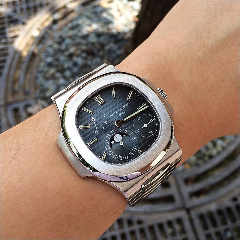
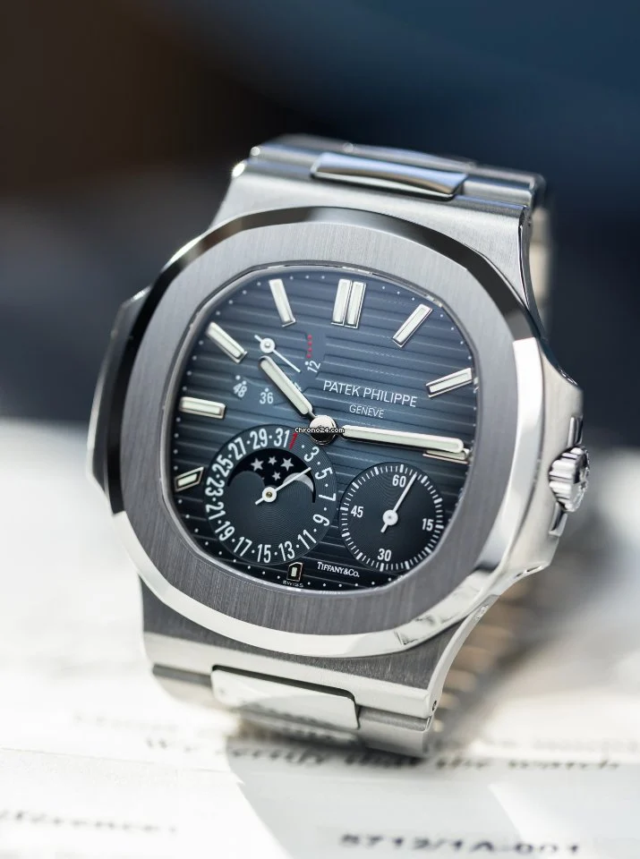
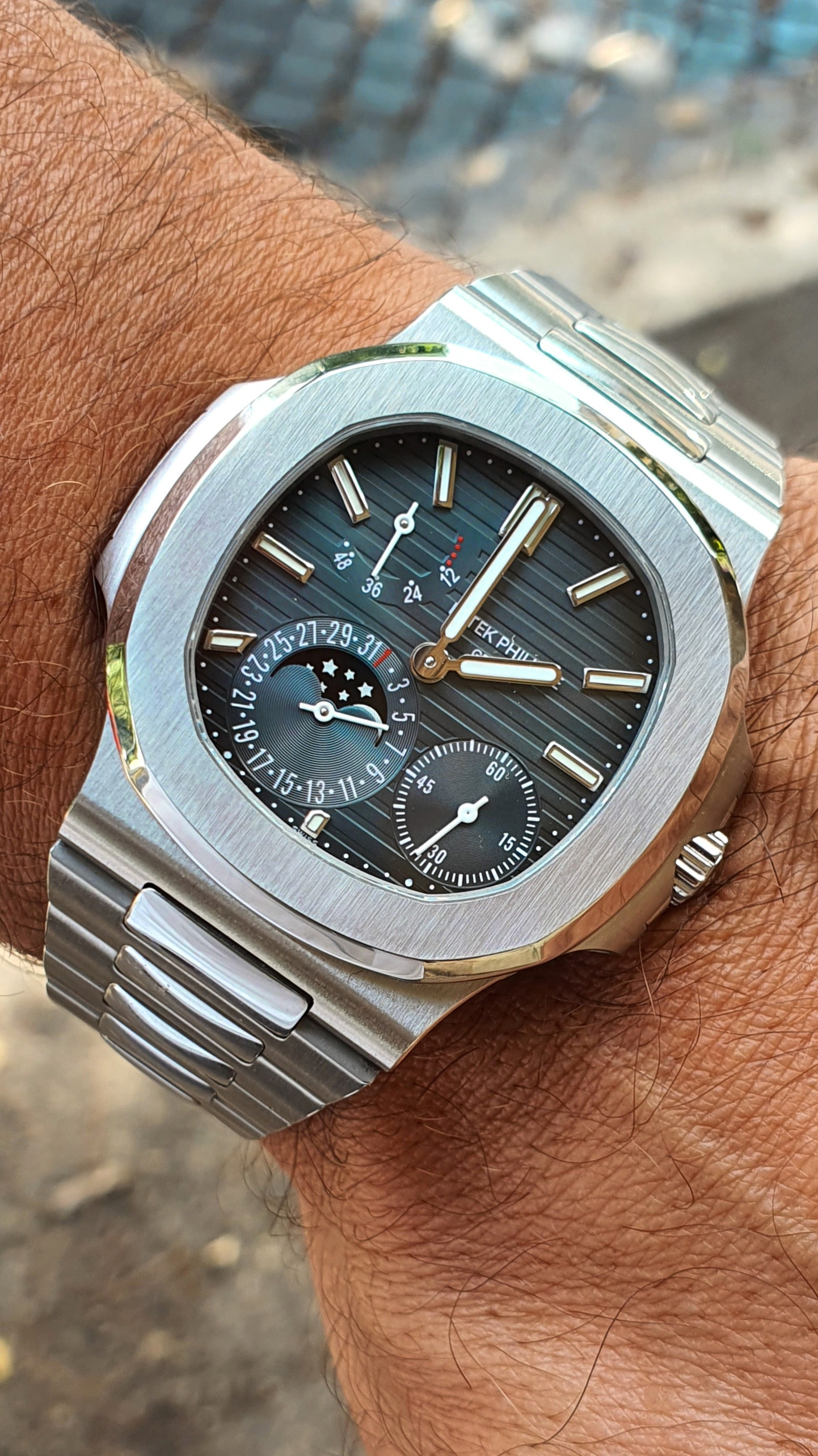
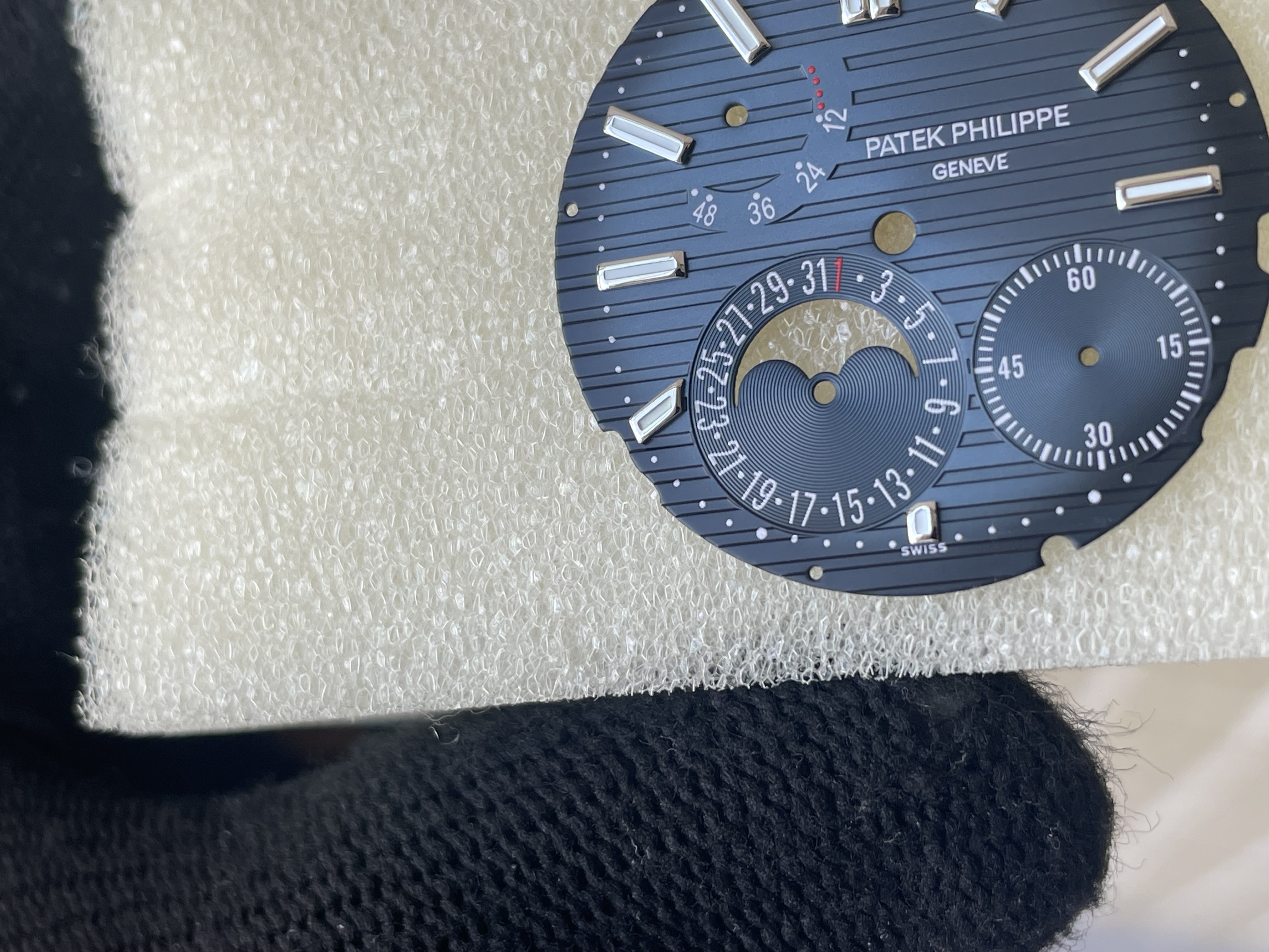
New PPF 5712 with PP240 Super Clone.....
- Thread starter dharma
- Start date
- 25/3/17
- 4,319
- 3,822
- 113
Slim font it's so close to mine
do you mean that the font of the numbers is too fat or the space between the 2 and the 5 at 25 has too much space ?It is a very nice color, but i cant unsee the date font
I know that there are dial with thick and thin fonts. Thats not the issue, the issue is the spacing between the numbers. Its most obvious on 2 5, but all the other numbers are wrong as well, even on the other seconds subdial
I know we are really nitpicking here, and some people don't care, they focus only on the color of the dial. I wish my OCD would allow that
The spacing and the font is wrongdo you mean that the font of the numbers is too fat or the space between the 2 and the 5 at 25 has too much space ?
I wouldn't worry too much about that, if you can live with the lumeplot at 6 having the wrong shape. (Top is supposed to be square, not at an angle
I think you should go gen dial then, I saw one in M2M a few weeks agoI wouldn't worry too much about that, if you can live with the lumeplot at 6 having the wrong shape. (Top is supposed to be square, not at an angle)
Here is a thin font gen vs the SW2, yes we are nitpicking, but that is kinda what we do here. Font is wrong, spacing is wrong, lumeplot at 6 is wrong, period.
will you see it on the wrist, no. Will anyone besides you give a shit, no So if you can live with it or not, it’s up to you
  I will wait for another option, or go gen. No point for me to spent a lot of money on a build, with flaws that would annoy me
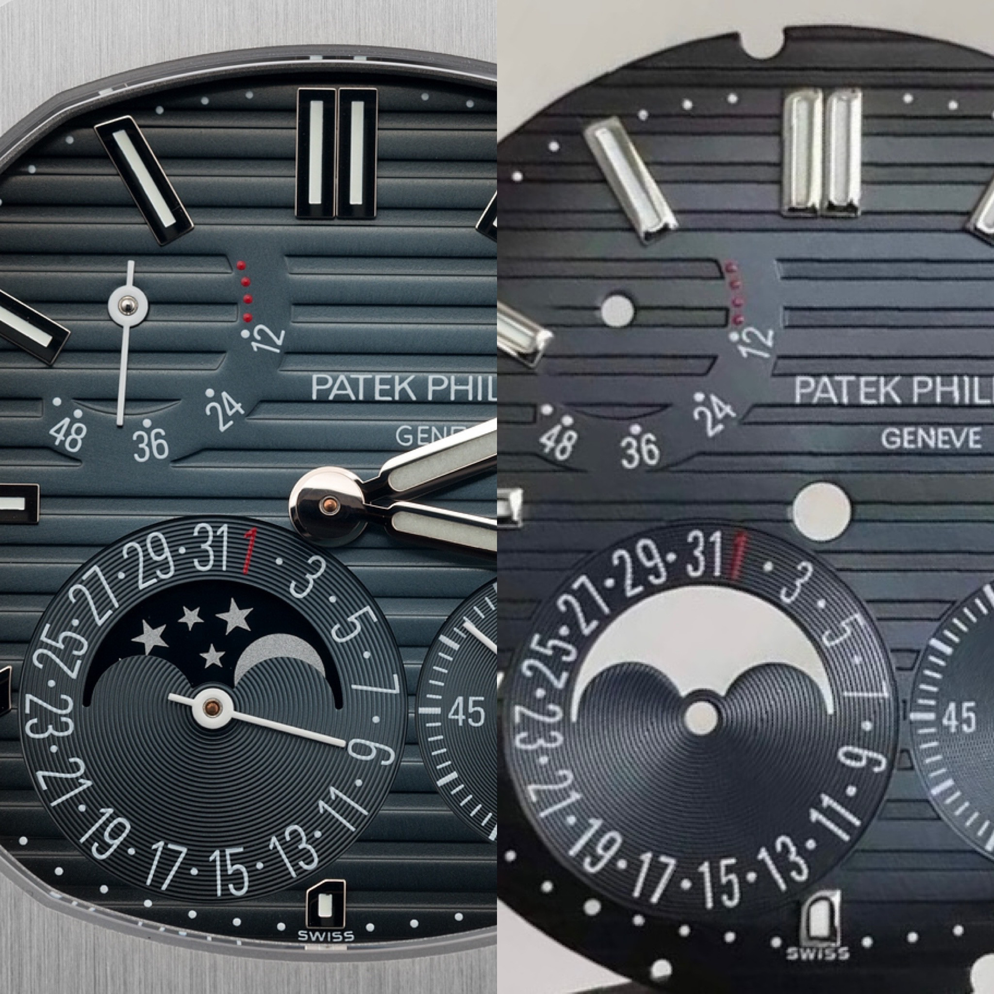
will you see it on the wrist, no. Will anyone besides you give a shit, no

He took it down no interest. There’s actually several on c24 atm and a couple more on ebay but pricing of a 5712 blue dial is honestly stupid. This is my favorite watch ever but there’s no reason for these dials to be worth more than a couple-few grand, not the current asking of 4-8k that’s insaneI think you should go gen dial then, I saw one in M2M a few weeks ago
Agreed - I’d do 1-2k for a gen, but at $7-10k I can live with hair wrong font thickness and the 6 marker. Having a few gen Patek’s, there’s a bit of variation already amongst themHe took it down no interest. There’s actually several on c24 atm and a couple more on ebay but pricing of a 5712 blue dial is honestly stupid. This is my favorite watch ever but there’s no reason for these dials to be worth more than a couple-few grand, not the current asking of 4-8k that’s insane
lol wat. if that's whats bothering u i think u should just go gen dialHere is a thin font gen vs the SW2, yes we are nitpicking, but that is kinda what we do here. Font is wrong, spacing is wrong, lumeplot at 6 is wrong, period.
will you see it on the wrist, no. Will anyone besides you give a shit, noSo if you can live with it or not, it’s up to you
I will wait for another option, or go gen. No point for me to spent a lot of money on a build, with flaws that would annoy me

- 25/3/17
- 4,319
- 3,822
- 113
but are the PPF indices better (especially at 6 o'clock) than the SW indices?Here is a thin font gen vs the SW2, yes we are nitpicking, but that is kinda what we do here. Font is wrong, spacing is wrong, lumeplot at 6 is wrong, period.
will you see it on the wrist, no. Will anyone besides you give a shit, noSo if you can live with it or not, it’s up to you
I will wait for another option, or go gen. No point for me to spent a lot of money on a build, with flaws that would annoy me

Some gen have curved indices like SW and others have straight edges like PPF. If you wanted to fix the 6 o clock marker issue, you could swap the indices. But still the date font issue would be present.but are the PPF indices better (especially at 6 o'clock) than the SW indices?
Why not just buy a v1 and take the dial out at this point? Were there significant flaws on it?

