-
Tired of adverts on RWI? - Subscribe by clicking HERE and PMing Trailboss for instructions and they will magically go away!
You are using an out of date browser. It may not display this or other websites correctly.
You should upgrade or use an alternative browser.
You should upgrade or use an alternative browser.
Clean 126500 Daytona review
- Thread starter m5smg2
- Start date
")
- 25/3/17
- 4,497
- 4,039
- 113
- 17/10/14
- 1,523
- 442
- 83
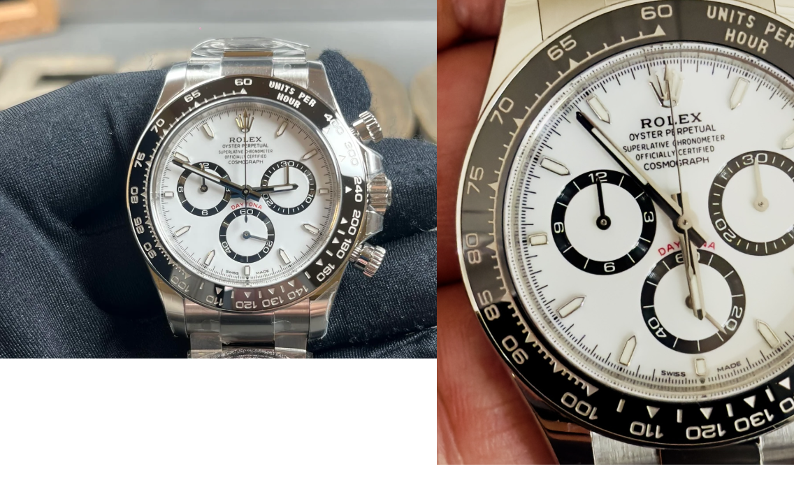
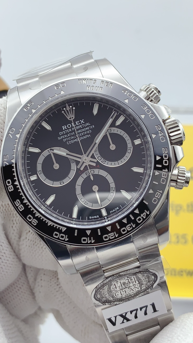
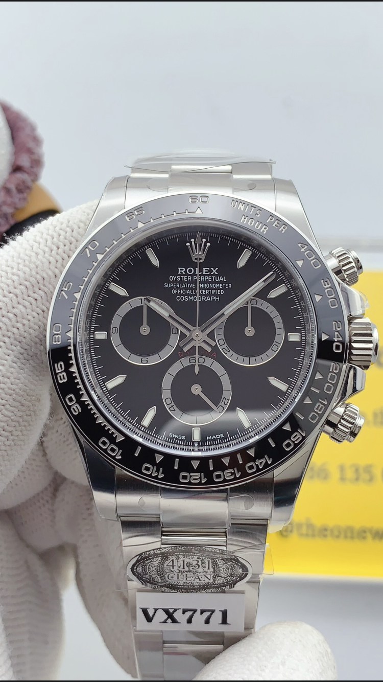
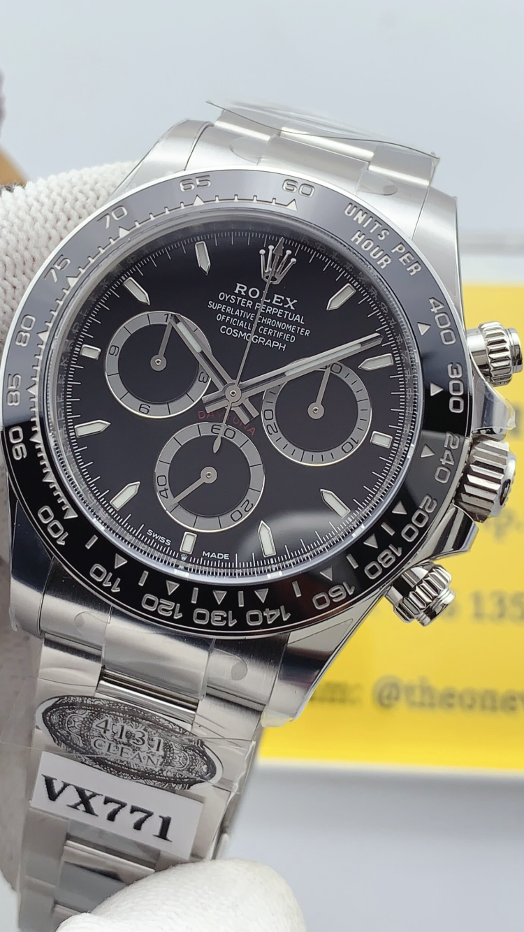
New Version of the Clean 126500 Panda.
Arrived last Friday. Maybe it helps? …
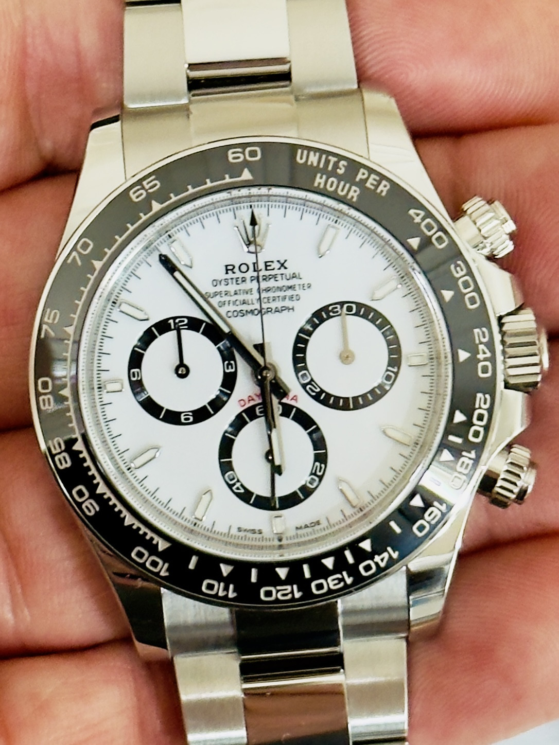
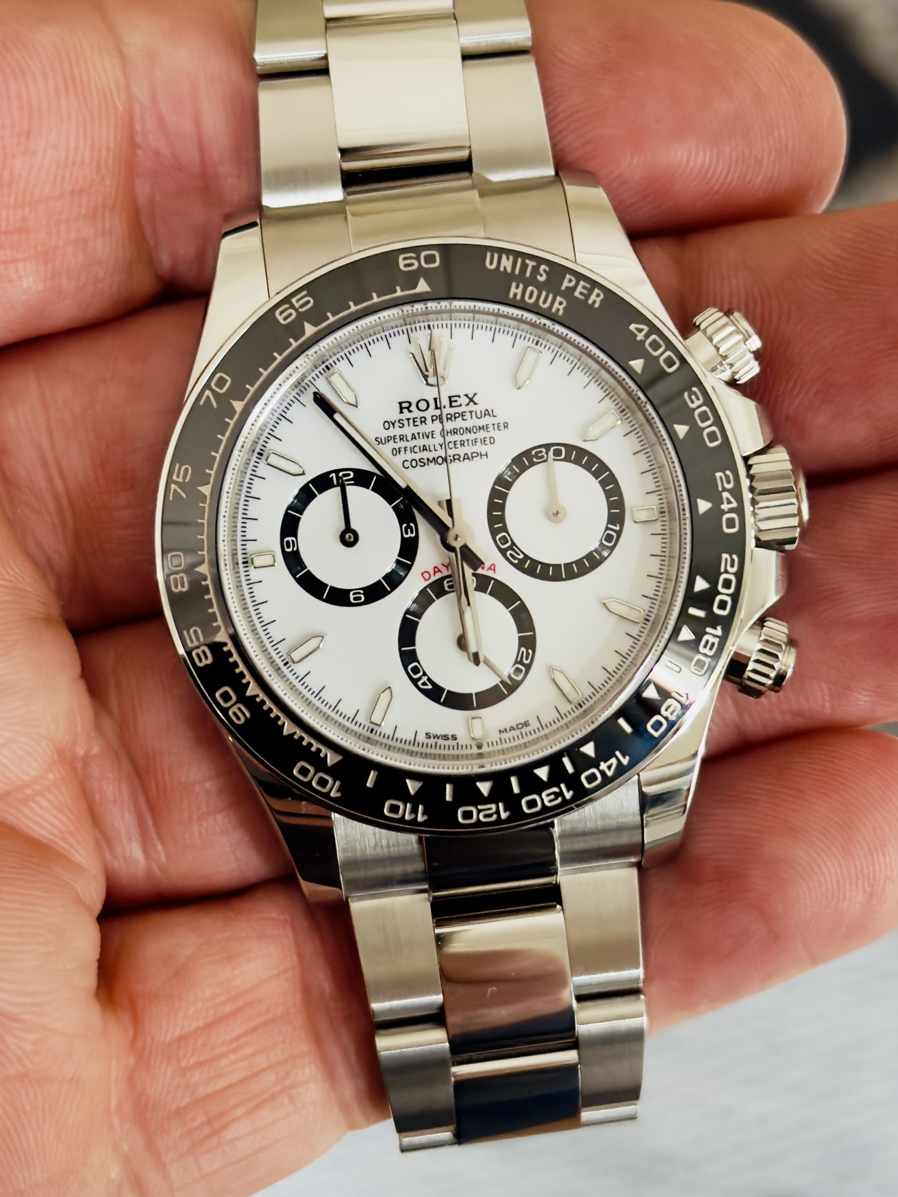
Arrived last Friday. Maybe it helps? …
In my opinion, the gap between the seconds chrono and the “DAYTONA” lettering is noticeably larger on the white dial version compared to the original. What do you think? I always look at this point letting me think the gap is too big!
Looks exactly the same to me. To be honest the main improvement that I think clean need to make on these is the bezel engravings. The bezel letters are slightly too close to the edge.
- 25/9/22
- 9,561
- 26,431
- 113
I'd rather they soften the tone of the white color than do a bezel change..... but white dials are hard to catch.Looks exactly the same to me. To be honest the main improvement that I think clean need to make on these is the bezel engravings. The bezel letters are slightly too close to the edge.