• Tired of adverts on RWI? - Subscribe by clicking HERE and PMing Trailboss for instructions and they will magically go away!

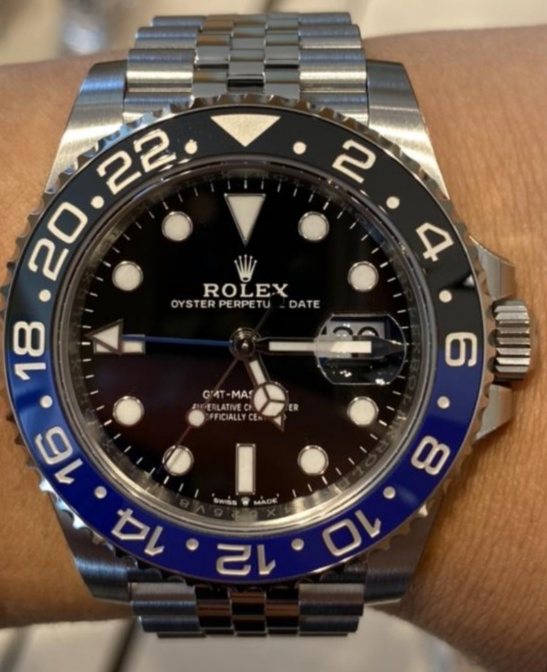
ARF Batman 3186 final sample

Clarkent

SuperfranKent®️
Banned
Certified
12/9/19
1,928
2,176
113
Smallville
between noob and gmf, noob is definitely a good compromise, as long as the sponge mod is made


Inviato dal mio iPhone utilizzando Tapatalk
 

KJ2020

Time Traveler
Supporter
12/3/18
35,350
69,651
113
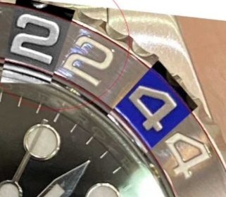
With respect to the different font thickness, any chance it's a perspective issue? That is, we we looking a little more straight on the bottom side of the watch that the top? Giving us a thinner appearance of the upper numbers due to their depth?
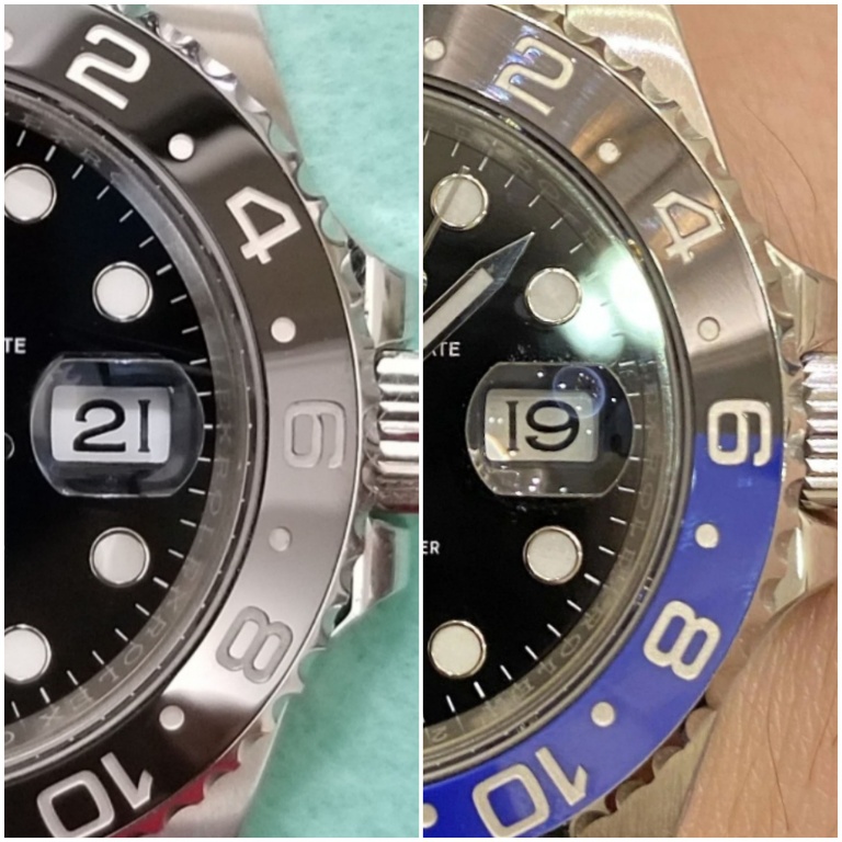
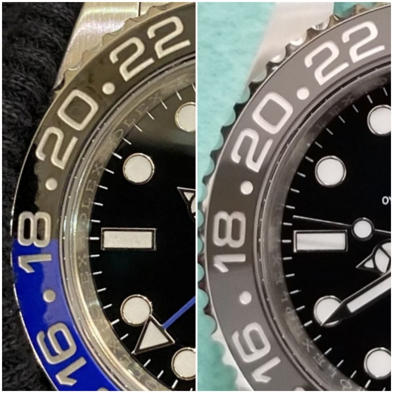
Some comparisons to ARF LN. The LN looks much more uniform throughout.

If a marker is less well lit, like the 6 and 8 in the LN pic below, it can appear slightly smaller as I mentioned previously. But the BLRO upper half is well lit so this size perspective anomaly would not occur.

ZAxG64.jpg


ZAxSvI.jpg
 
Last edited:

muiramas

Aristocrat
18/1/17
5,994
7,808
113
the printing of a font cannot be done half way and half way, we agree on this yes? it is an objective and not a subjective concept. in this case there can be two different types of reasons that can make the numerical font of the black part seem thinner: 1. the light + the inclination of the wrist create a shadow and make the numbers appear smaller. 2. the first paint made on the whole bezel is blue, the next one is black, consequently but black half moon has a double layer of paint (blue + black) that casts more shadow on the numbers and makes them look slimmer. that said, in my opinion the problem does not exist, the photos should be viewed in full light in order to see everything perfectly. congratulations to Puretime for the excellent work performed


Inviato dal mio iPhone utilizzando Tapatalk

KJ2020 is correct.

Its not as simple as saying a font is a font and there cannot be any difference (even if you omit the possibility of different weights - bold, medium etc...). Mechanical processes can make them bolder or thinner, and as this is almost certainly a 2 piece insert there are various manufacturing processes at play which can lead to a difference.

Even if it were a 1 piece insert, then there may also be reasons that the top numbers are different to the bottom - the way the artwork was generated for example. The Chinese are not known for their care or attention to the reproduction of Roman fonts - This is across across every discipline of manufacture.

There is no question that the numbers on the blue half of the insert are bolder. It's obvious. The question is how obvious is this in real life.


Untitled-1.jpg
 

KJ2020

Time Traveler
Supporter
12/3/18
35,350
69,651
113
Here's a 2019 gen with strong direct light on the 22. You can see it doesn't make the font look bigger, but just adds reflective highlights from the ceramic around the marker. All the markers are the same size.

ZL2VKi.jpg
 
  • Like
Reactions: leo6929 and saucin

Muskandar

Active Member
9/8/17
465
125
43
CONUS
With respect to the different font thickness, any chance it's a perspective issue? That is, we we looking a little more straight on the bottom side of the watch that the top? Giving us a thinner appearance of the upper numbers due to their depth?

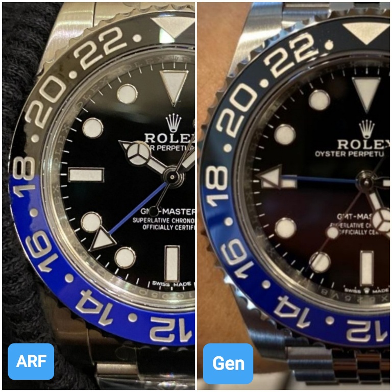
I agree with this possible conclusion.
I do agree that they look different sizes, but the actual cause of the appearance imo could be perspective.
I’m an X-ray technician, and while it might not seem that has anything to do with a picture of a watch. I work with taking pictures. The perspective... specifically the subjects angle... can cause that much of a difference in pictures.
However, it is still very possible that KJ is correct as well. I’m simply stating that perspective is just as likely the culprit as is different font size.

We will have to wait for more pictures, or a video.
 
  • Like
Reactions: MikeMeezy77

Muskandar

Active Member
9/8/17
465
125
43
CONUS

The argument about light affecting the appearance more specifically is related to the way light interacts with a black surface in comparison to the way light reacts with other colors. Black absorbs light photons, and reflects much less light than other colors. This can making objects surround by black appear smaller.

Again I think we need more pictures to make a definitive conclusion.
 
  • Like
Reactions: Johnny Depp

Mark1937

Respected Member
Certified
25/3/17
4,316
3,808
113
instead I say that the problem is the blue color. possible that they cannot reproduce it the same?
 

Fraflo87

I'm Pretty Popular
Certified
17/9/18
1,146
254
83
EU
How about this one?
In particular numbers 10 and 12.
5cba695b6bcaa48071b3b4c141da442e.jpg


Inviato dal mio SM-G950F utilizzando Tapatalk
 
  • Like
Reactions: Johnny Depp

KJ2020

Time Traveler
Supporter
12/3/18
35,350
69,651
113
ZLAe9Y.jpg


The argument about light affecting the appearance more specifically is related to the way light interacts with a black surface in comparison to the way light reacts with other colors. Black absorbs light photons, and reflects much less light than other colors. This can making objects surround by black appear smaller.

Again I think we need more pictures to make a definitive conclusion.

Here is the only other picture I need bro. I mean besides the one you quoted.

ZLW60o.jpg
 
Last edited:
  • Like
Reactions: Pietros and saucin

muiramas

Aristocrat
18/1/17
5,994
7,808
113
The argument about light affecting the appearance more specifically is related to the way light interacts with a black surface in comparison to the way light reacts with other colors. Black absorbs light photons, and reflects much less light than other colors. This can making objects surround by black appear smaller.

There is a kernel of truth in what you say, but its not completely applicable in this instance. Your example relates more to matt vs reflective and also the wavelength of reflected light rather than the absence of it.

If it were applicable here, we would be seeing an optical illusion on the gen - we don’t, regardless of perspective or angle.
 
Last edited:
  • Like
Reactions: Pietros and KJ2020

Muskandar

Active Member
9/8/17
465
125
43
CONUS
I have to agree that the comparison photo really does seem as KJ says.

I was just presenting another possible viewpoint.

I don’t know much about the process they go through when designing a rep. I would hope they would be able to catch such a drastic mistake before making a large amount of them. But as has been pointed out earlier with the CGs... I guess it happens frequently.


Sent from my iPhone using RWI
 
  • Like
Reactions: KJ2020