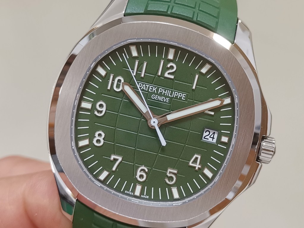
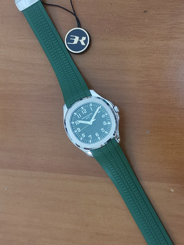
Dont you think the dial is a bit grainy? It seems a little too green as well. whereas gen seems whitewashed
either way, i dont mind just curious. The strap actually doenst seem THAT bad
Hard to tell with Patek dials. Lighting matters, and these photos may look kinda off, but it could be the function of the lighting since the lighting is on the warm side, but still of a slightly cooler colour temperature compared to the bottom most shots in the 5168G khaki page (the shots just above the "Other versions" tab). The top-most gen shots from Patek 5168G khaki page uses an extremely cool colour temperature so for all we know...this could be pretty close to what it would look like in that kind of lighting conditon. Using google images to extrapolate a bit more, there are some shots that show the khaki aquanaut irl looking more or less this colour in certain lighting conditions.
Do note that many of Patek's shots are composite shots...I'm no photographer, but afaik those shots are basically multiple shots in different lighting conditions to compensate for certain issues introduced by just your regular single shot photo...Probably touched up too. I mean...if Mcdonald's ad burgers get "make up" and are photoshopped...why not a luxury watch?
I would however withhold full judgment from mere photos. A lot influences how photos show up like the camera that took it...whatever automatic post-processing the phone or camera introduces, and how your screen interprets the colours captured by the camera. That puts most judgments based on photos relatively questionable at best.
I concur that the paint used on the rep aquanaut dial is not fine enough, and that the particles do not rest as cleanly as that of the gen. It probably has microbumps that end up making the dial look rough and less fine up close. The one shot in the photos far enough to assuage us that the dial is fine at regular distances is obscured by the reflections on the glass so it would be nice if we could get shots at regular wrist distance to evaluate whether the paint graininess is truly problematic enough to show up.
However, there is one flaw that bothers me that most people don't seem to notice or just don't bother to discuss (haven't logged in for awhile now). It's that the grooves of the Aquanaut dial are a bit too thin and shallow. Lacking the depth and overall effect of the gen aquanaut's lines. It's most noticeable when the lines intersect. I think that the gen aquanaut dials have a very fine fine bit of chamfering along the edges of those lines to give them this extra depth and a strange 3d effect compared to the 2d-ness of the 3kf aquanaut's lines. You'll notice it in Patek's close ups...just miniscule diagonal slants along the line edges that create an outsized 3d effect.
Normally, I would have better input to give by having a gen on hand, but I can only really extrapolate from my personal experience of owning the aquanaut's brother in gen, and my opinions should still be taken with a grain of salt because I've not really dealt with these kinds of matte dials from Patek for long enough to have a more informed opinion.


