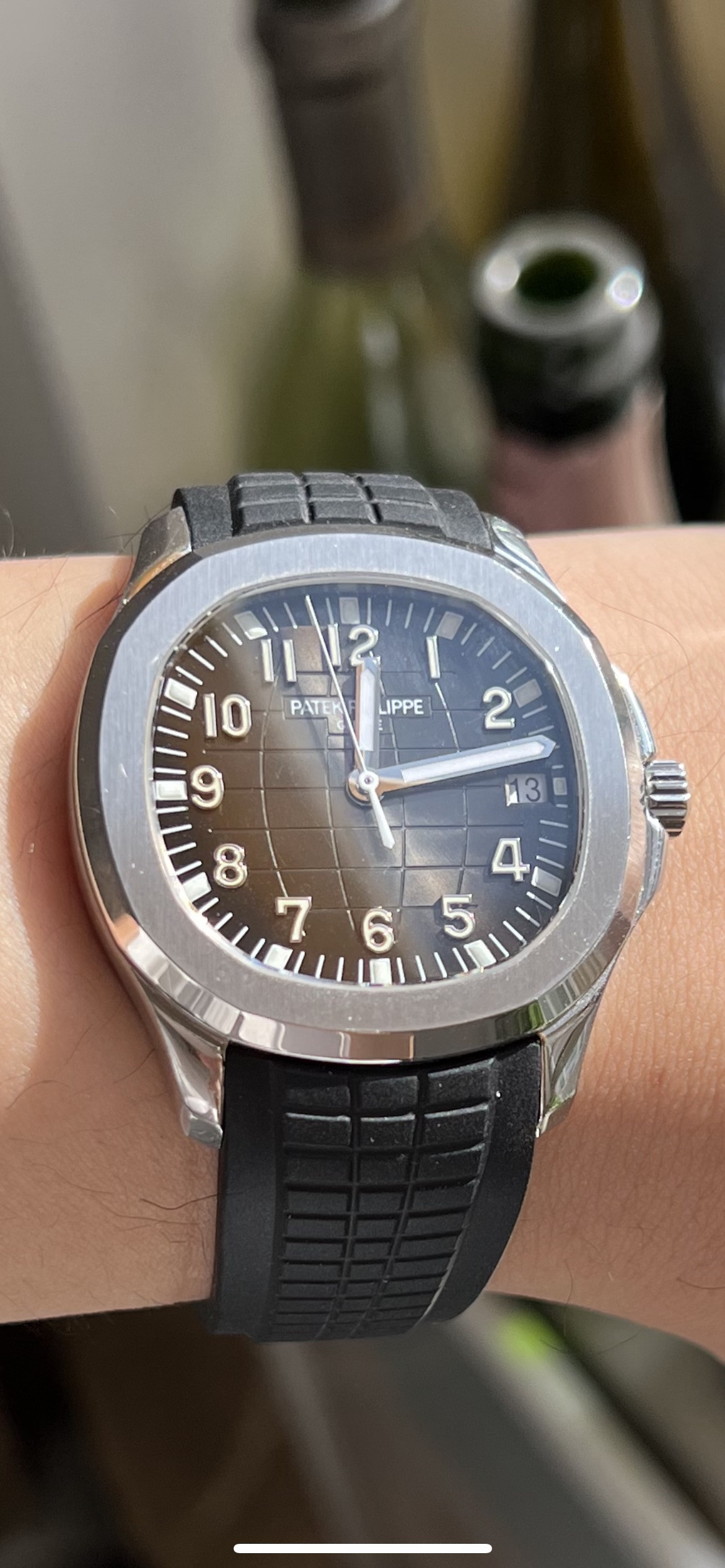
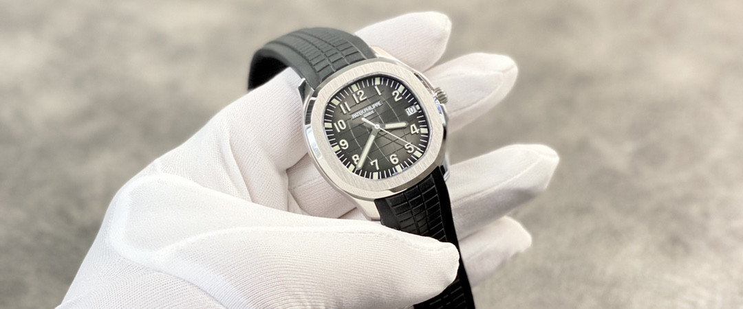
found some additional pics of the "new" dial. Hands/Indicies lume looks much more consistent color but PP logo isn't centered verically... sigh.
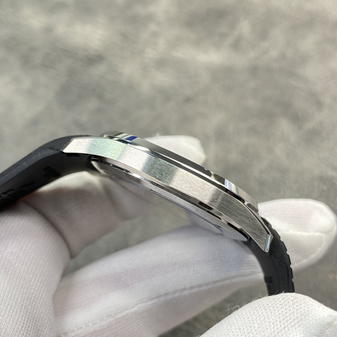
I don't know if anyone has noticed this, but on this updated 3KF the bezel looks much "flatter" than on the early versions. And compared to the first 3KF the vertical part of the bezel is thinner.
And when you look at it from the front, the bezel looks flatter:
I saw the gen a few days ago. And what i immediately noticed was the flatness of the bezel, it looks really thin and protrudes minimally above the case. I've owned the early 3KF, the bezel is thicker and it's a thing that's immediately noticeable if you've seen the gen.
This one looks much better imo. They also corrected the lume.


