• Tired of adverts on RWI? - Subscribe by clicking HERE and PMing Trailboss for instructions and they will magically go away!

New Sub up on Toros - Noob V2?

thisismynick

Active Member
27/12/10
416
1
18
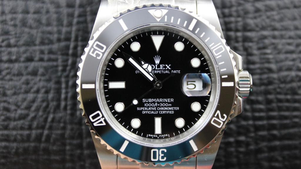
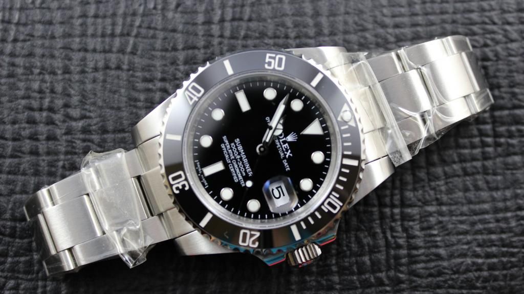
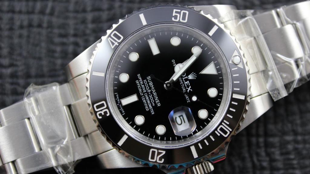
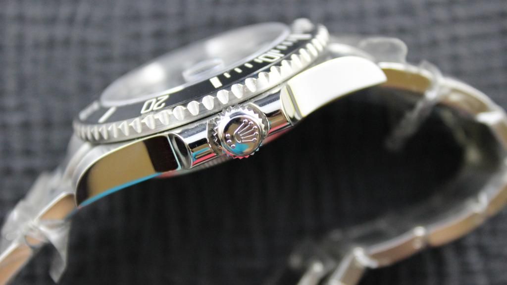
About the thickness of the font on the Bezel looking different on different pictures, - it's like this:
If you use a very large aperture (f/1.4), on say a 50mm lens, using a fullframe camera, you will only get the Dial in 100% focus. The Bezel will be a little out of focus, and therefor appear to have a fatter font. If you take the same picture using the same gear, but this time using a smaller aperture (f/11) you will get all of the watch in focus, and therefor the font will appear smaller.
It's very simple. ;)

Hmm...interesting. But would that also explain the differences in the larger gap @"5" and the larger black triangle @"4" (see above)?

And don't the bezels in the pics in this thread look pretty focused? :thinking:
 

T222

You're Saying I Can Sell?
23/12/11
94
0
0
Hey guys, so i got and accepted my QC photo's today.

I am extremely pleased with the watch and cannot wait to wear it.

Noob+Face+2.jpg


Noob+Face.jpg


Noob+Lume+2.jpg


I am so glad that my TD took his time in getting this, i'm extremely happy with it.

Sorry to say this, but to me it looks like a Noob V1. ?
I may be wrong, but the Hourhand looks a little fat, and the Lumen is the wrong color. (could be the whiteball.?)
But no matter what, the watch looks great!! :)
 

thisismynick

Active Member
27/12/10
416
1
18
Sorry to say this, but to me it looks like a Noob V1. ?
I may be wrong, but the Hourhand looks a little fat, and the Lumen is the wrong color. (could be the whiteball.?)
But no matter what, the watch looks great!! :)

Naw...it's a V2...look at the fat lugs and CG. Can't judge from the pearl and the hour hand due to the lume dsistorsion though. EDIT: Wrong, hour hand is the V2 with longer, smaller stick. V1 had a short stumb...

But the bezel insert font looks smaller than with what is supposed to be batch 2 V2, esp. 5 and 4 you can compare.
 

T222

You're Saying I Can Sell?
23/12/11
94
0
0
Hmm...interesting. But would that also explain the differences in the larger gap @"5" and the larger black triangle @"4" (see above)?

And don't the bezels in the pics in this thread look pretty focused? :thinking:

After looking a little more on the pictures, I think the hole "fatter font on Bezel" thing is sourced by the first pictures are overexposed, compared to the Lumen-picture. I you take a look at the rings around the Markers, they also look smaller on the overexposed pictures, and bigger on the Lumen-picture. If you overexpose a picture, the white will burn out, and smear the detail.
What do you say to this theory, my dear Dr. Watson? ;)
 

Dukes

Renowned Member
3/4/13
505
6
18
I guess my comment cames across much too critical, in any case more than it was intended. Sorry if that was felt in any way offensive.

I have ZERO photographic skills. So I wouldn't know if lighting can make such a difference in the apperance of font thickness etc.

Would be interesting if one of our resident photographer wizards could chime in and enlighten us, as to how the (at least to me) clearly visible difference in appearance ("5", "4", stick...) can come solely from the lighting / photographing technique etc.

Maybe it is just a fata morgana, this different font in batch 2. Maybe it's not. Surely I'd like to know... ,))

haha, no way offensive. Your point about the labeling of QC shots is very valid, as an error was made.

Anyway, i'm at the point where I don't much care, this watch looks great, and most of the members who have held this or a V1 or V2 batch 1 seem to agree that it's worth the extra money over a standard Noob or BP sub.

Might be interesting to see what BP come out with though, as they are sure to be developing their own premium rep.

When i receive the watch i'll take some lume shots.
 

thisismynick

Active Member
27/12/10
416
1
18
After looking a little more on the pictures, I think the hole "fatter font on Bezel" thing is sourced by the first pictures are overexposed, compared to the Lumen-picture. I you take a look at the rings around the Markers, they also look smaller on the overexposed pictures, and bigger on the Lumen-picture. If you overexpose a picture, the white will burn out, and smear the detail.
What do you say to this theory, my dear Dr. Watson? ;)

You're the photo pro, but I cannot see how that explains the "5" and "4" thing?

On the one hand, I'd like the new batch to be "better" in terms of insert font, for the benefit of all, and a possible personal buy later on of the LN.

On the other hand, if that is all just a fata morgana, at least my incoming batch 1 V2 Hulk is not rendered obsolete instantaneously... xD
 

teoulennon

Renowned Member
17/5/11
514
4
18
Seems like photography issues to me.
In the first pics (non lume) if you look at the "10" on the insert where the most light is hitting it it isn't as thick as the other numbers.
 

GrimReaper

Known Member
2/5/13
199
5
18
However if you look at the first lume photo it has the time and date set as per all my other QC pictures, so I am 100% sure it's of the same watch.
Look again, first two are 10:08, lume photo is 10:13.

EDIT:
Guess the lume photo was just taken 5 minutes later, date is the same.
 

GMTlover

Active Member
27/12/12
291
66
28
I thought the TD already confirmed that the lume pic
was from another watch?
 

GMTlover

Active Member
27/12/12
291
66
28
Ok, sorry well Sead told me that the new batch will come with improvements.
Don't know if they are already working with this "new" batch.
 

Mako88

You're Saying I Can Sell?
25/7/13
91
0
0
Ok, sorry well Sead told me that the new batch will come with improvements.
Don't know if they are already working with this "new" batch.

Exactly what he told me two weeks ago when I wanted to order the V2 then:

"Best to wait until second or third batch at least. Month or so."

DEFINITELY Good advice... ;)
 

wepiii

Active Member
18/12/12
459
0
0
I went to the AD at Lenox Mall in GA today. Took my watch off and put it in my pocket. Went in, told them up front that I really just wanted to look and didn't want to waste their time and they said that was fine. Looked at the Sub, and they insisted I try it on. I told them that I would love to, but I really couldn't afford the watch and didn't want to waste their time. They insisted anyway.

I ended up wearing it around the store for 10 or 15 minutes... I didn't have my watch out to compare it to, but now that I have done that, I could never ever imagine spending $8500 on that watch when I can get one as nice as the BP or V2 for such a small fraction... Even if I had the money. I was nervous going in that I wouldn't even want to wear my rep after seeing the gen in person. Definitely not the case. Comparing all our watches to their marketing pictures is unrealistic... Their watches don't compare to the marketing pictures. I'm ecstatic with my rep as is now. The gen even had a little blue to the AR.
 

Toycarsmy

Known Member
DO NOT TRADE WITH ME
4/4/13
170
0
0
What I can see,

V2 batch 1
- bad SEL
- thin insert font
- fatter dw font

V2 batch 2
- good SEL
- fat insert font
- thin dw font, left justified

Due to rushing production, maker will assemble based on what they have in stock?
 

PoptheC

Active Member
18/5/13
321
50
28
I got my Sub C QC picture today, I had accepted the watch. Isn't perfect but is okay for me.

As you can see the date wheels on new restock is lower and left justified, there are not the same when Noob 1st release v2. Pictures below.

2013-08-05225144.jpg


2013-08-05225227.jpg


2013-08-05225512.jpg


2013-08-05225557.jpg


2013-08-05225606.jpg


2013-08-05225704.jpg


2013-08-05225837.jpg


:img:


I hardly see any over exposure in these photos. I guess we are looking at "real" thicker bezel fonts here, not hallucination :cheers:
 

Capt. Obvious

Put Some Respect On My Name
5/5/13
4,136
2
0
Oh gosh, I can see this getting ugly.

"FS: Sub C, Noob V2 B2' swapped DWO with B1 and SEL with B3. Now looks same as B4..."


LOL
 

thisismynick

Active Member
27/12/10
416
1
18
Oh gosh, I can see this getting ugly.

"FS: Sub C, Noob V2 B2' swapped DWO with B1 and SEL with B3. Now looks same as B4..."


LOL

Word, bro.... And then they will feck something else up.... :-D

I guess if you get all recent and upcoming iterations/batch etc. U will probably be able to assemble a supersuper rep by making one out of five or so...

Pity, cause then one could've easier just buy a used gen. Keeps its value, looks most gen LOL.... But I guess I simply dont want to wear a couple grand on my wrist and I surely dont want to give thousands to R. for a simple steel tool watch without any complication worth mentioning...
 

theskull

Renowned Member
6/8/13
557
0
0
Hey i received QC pics yesterday, i accepted it, Angus told me that 's from the 2nd batch but i am not sure it is, could you tell me what you think..Thanks guys!

9455005477

9455005471