• Tired of adverts on RWI? - Subscribe by clicking HERE and PMing Trailboss for instructions and they will magically go away!

ZF Master Ultrathin Moon

VIV54

Renowned Member
13/12/17
688
393
63
https://puretime.io/master-ultra-th...n-white-dial-on-black-leather-strap-a925.html

finally puretime listed it:

My general impressions are that this is an improved version of the ZF. Subdial numbers font is improved. 3D effect moon improved. Better rose gold tone plating of the rotor.

The only tell I saw is the subial hand pinion which on the ZF was more rounded and gen like.

IMHO this qualifies as the best dress watch rep ever.:drinks_cheers:
 
  • Like
Reactions: XLR8R and csthe

XLR8R

Renowned Member
16/8/18
692
355
63
https://puretime.io/master-ultra-th...n-white-dial-on-black-leather-strap-a925.html

finally puretime listed it:

My general impressions are that this is an improved version of the ZF. Subdial numbers font is improved. 3D effect moon improved. Better rose gold tone plating of the rotor.

The only tell I saw is the subial hand pinion which on the ZF was more rounded and gen like.

IMHO this qualifies as the best dress watch rep ever.:drinks_cheers:
So ZFs subdial hand + GF Ultrathin Moon + Gen or Custom leather strap would be best combo?
 

csthe

I'm Pretty Popular
16/3/13
1,056
377
0
https://puretime.io/master-ultra-th...n-white-dial-on-black-leather-strap-a925.html

finally puretime listed it:

My general impressions are that this is an improved version of the ZF. Subdial numbers font is improved. 3D effect moon improved. Better rose gold tone plating of the rotor.

The only tell I saw is the subial hand pinion which on the ZF was more rounded and gen like.

IMHO this qualifies as the best dress watch rep ever.:drinks_cheers:

The major improvement is the moon, but i don't like the buttons...
 

Troklo

Active Member
Supporter
Certified
23/12/15
433
240
43
I was about to ask what was the verdict between the GF and the ZF version. Pesonally I like the GF more I think the moon looks much better
 
  • Like
Reactions: Mr.Paneristi

English Gent

Banned member, the goat does not approve
Banned
10/7/14
1,670
410
83
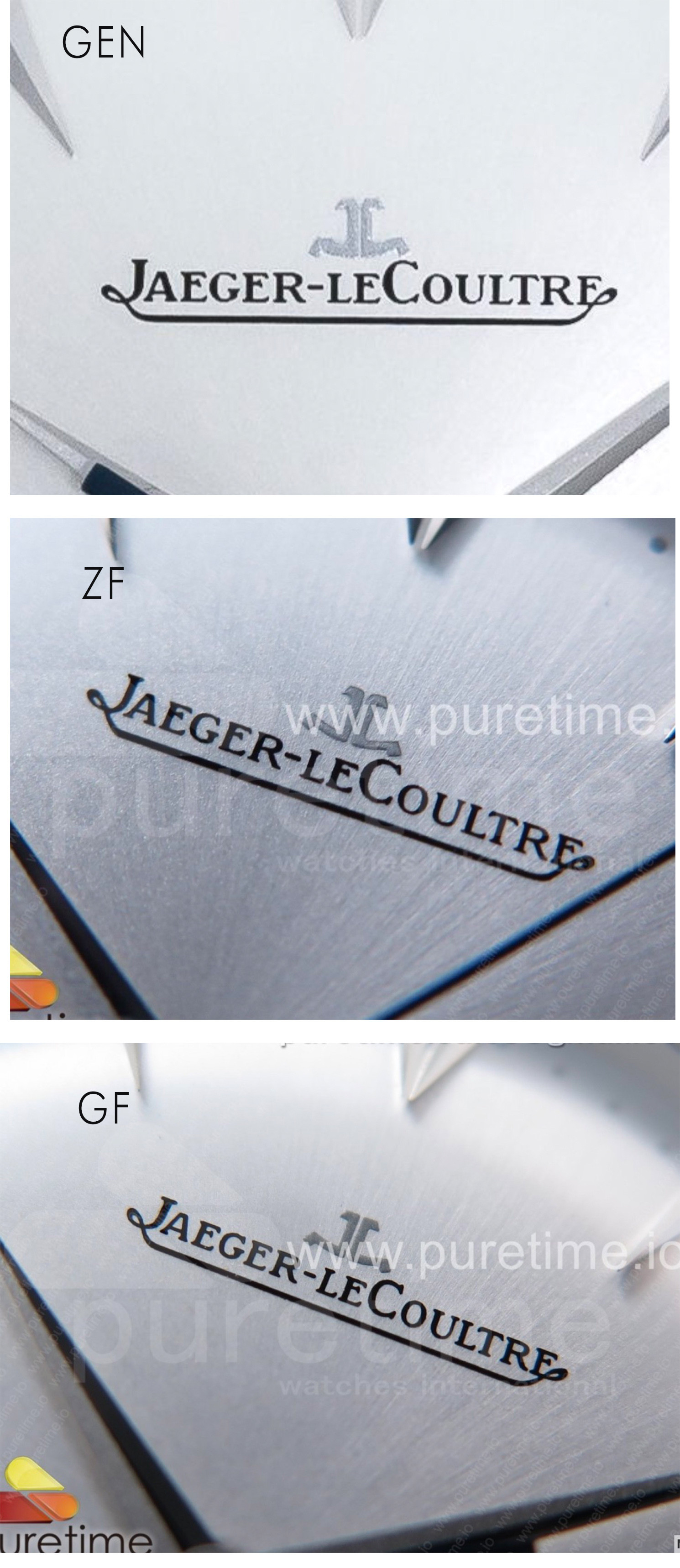
Logo is wrong, the C isnt as close to the silver JL, and R goes under the JL unlike gen

quick sample below,


English Gent

Banned member, the goat does not approve
Banned
10/7/14
1,670
410
83
the pics on trustytime dont have this logo problem, so not sure whats going on ​
 

VIV54

Renowned Member
13/12/17
688
393
63
Logo is wrong, the C isnt as close to the silver JL, and R goes under the JL unlike gen

quick sample below,

Mate the logo is 99% fine, I couldn't even notice those differences on macro pics if you wouldn't tell me. And to my eyes te R font is closer to GF than ZF. Remember thtn in real life those letters are so small that you can barely see them without using a loop or seeing the watch from really near.
 

English Gent

Banned member, the goat does not approve
Banned
10/7/14
1,670
410
83
Mate the logo is 99% fine, I couldn't even notice those differences on macro pics if you wouldn't tell me. And to my eyes te R font is closer to GF than ZF. Remember thtn in real life those letters are so small that you can barely see them without using a loop or seeing the watch from really near.

I agree, but if people are being picky about fonts on the moonphase, I thought I would bring it up, also as a profession typograher and brand designer, its something that once seen cant be unseen to me.. it is good few mm wrong. (I actually prefer the incorrect one, like logo not so close to the JL, but it isnt on brand!)
 
  • Like
Reactions: iceberg1459

VIV54

Renowned Member
13/12/17
688
393
63
I agree, but if people are being picky about fonts on the moonphase, I thought I would bring it up, also as a profession typograher and brand designer, its something that once seen cant be unseen to me.. it is good few mm wrong. (I actually prefer the incorrect one, like logo not so close to the JL, but it isnt on brand!)

yes mate but i still don't see your point.

Look:


One is from the video on puretime, the second is gen. I barely see any difference.
 

Troklo

Active Member
Supporter
Certified
23/12/15
433
240
43
There's barely any difference but it's there. I personally don't care but it's good he brought it up
 

English Gent

Banned member, the goat does not approve
Banned
10/7/14
1,670
410
83
yes mate but i still don't see your point.

Look:


One is from the video on puretime, the second is gen. I barely see any difference.

if you look at my 3 pics in thread, with one taken from Puretime, the logo is very different, maybe its a different watch, as pics on Trusty time dont have problem either.
 

Sharki06

Renowned Member
Certified
24/5/18
721
249
43
GF moon looks better, but for me the ZF moon is more GEN like !

The GEN seems didn't have these "3d" effect like the GF ....

For me ZF still the best
 

fabbe79

I'm Pretty Popular
18/10/15
1,170
173
63
Sorry for the repeated question but I tried to search this post and is quite huge to navigate. Can someone confirm how much time it takes the moonphase to change? Is it one month = 31 days or one moon month = 29 days 12 hours?
 

parkway

Do not accept unsolicited offers
7/1/19
4
2
0
Sorry for the repeated question but I tried to search this post and is quite huge to navigate. Can someone confirm how much time it takes the moonphase to change? Is it one month = 31 days or one moon month = 29 days 12 hours?

I just bought the ZF version, and to answer your question, I counted 59 clicks for the moon phase to turn a full revolution (1 revolution = 2 moon phases), so i think the moon phase is 29.5 days each, which seems correct.

It looks gorgeous btw, despite some flaws
MuMMSXr.jpg
VMIBE3.jpg
 
Last edited:
  • Like
Reactions: King Pound Cake

fabbe79

I'm Pretty Popular
18/10/15
1,170
173
63
Thank you! If the moonphase is correctly following moon periods then this is a must have!
 

Xabo

Known Member
27/3/19
122
53
0
Germany
Hey, guys,
I need your help with the QC with my ZF. Am I too picky or is the 6 and the 12 a bit off?
Further I find the spacing of the Font is also a bit off compared to the pictures at Intime. Maybe I'm a noob worrying too much and actually everything is good.

Many thanks for your help!


Xabo

Known Member
27/3/19
122
53
0
Germany
Ask for close-up pictures to your TD

Got them now, thank you.
I´m still not sure if the 12 and especially the 6 is off. I've seen now pictures from TD´s where the 6 points perfect on the point between the 15 and 17. And I've seen pictures where it is not on the symmetric like ok this QC pictures.

Should I reject? I would love to hear your opinion.


The 12 points not perfect between the JL and the spacing of the Font seems a bit off.


The 6 points not exactly on the point between the 15 and 17. Im not 100% sure if this is wanted. Here I need your help.

Thank you guys!
 

VIV54

Renowned Member
13/12/17
688
393
63
Got them now, thank you.
I´m still not sure if the 12 and especially the 6 is off. I've seen now pictures from TD´s where the 6 points perfect on the point between the 15 and 17. And I've seen pictures where it is not on the symmetric like ok this QC pictures.

Should I reject? I would love to hear your opinion.

The 12 points not perfect between the JL and the spacing of the Font seems a bit off.


The 6 points not exactly on the point between the 15 and 17. Im not 100% sure if this is wanted. Here I need your help.

Thank you guys!

it looks fine. accept it mate.
 

0004

Do not accept unsolicited offers
27/1/19
1
0
0
Are the movement are reliable ? The rotor are noisy ?
What is better option this one or the ZF Calatrava 5296 ? If you don’t wear the JLC every day , you don’t need a winder ?
Thank you


Отправлено с моего iPhone используя Tapatalk