-
Tired of adverts on RWI? - Subscribe by clicking HERE and PMing Trailboss for instructions and they will magically go away!
You are using an out of date browser. It may not display this or other websites correctly.
You should upgrade or use an alternative browser.
You should upgrade or use an alternative browser.
ZF AP 15500
- Thread starter kobe24
- Start date
Tigerdragon
Mythical Poster
- 19/10/13
- 7,292
- 1,687
- 113
Jurgenk
I'm Pretty Popular
- 28/5/07
- 1,092
- 935
- 113
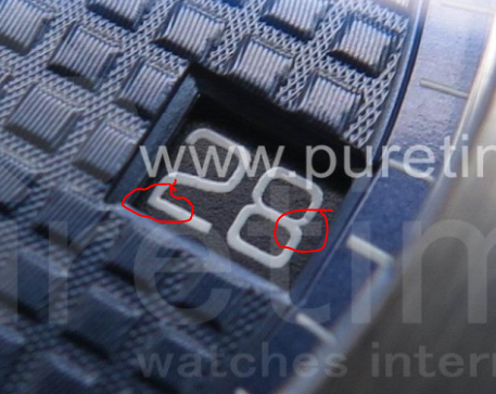
The datewheel font does not have the micro-gaps at the joints of the arms. The lower joint of the "2" in 28 should have the micro gap at a 45 degree angle and it's missing. The font they presented earlier looked 'good enough', and due to date wheel printers lacking that type of micro equipment, I bet ZF just wanted to release it for now. Look specifically at the 8 in "18" and the "2" in "12" to see


These are great observations.
I am partial to that font style which has been used for subdial numeral markings on some AP ROOs since at least the late G or H series.
It’s not obvious, but it is highly stylized and perhaps another example of evolution of the design language towards modernity while perhaps serving a small anti counterfeiting purpose.
The datewheel font does not have the micro-gaps at the joints of the arms. The lower joint of the "2" in 28 should have the micro gap at a 45 degree angle and it's missing. The font they presented earlier looked 'good enough', and due to date wheel printers lacking that type of micro equipment, I bet ZF just wanted to release it for now. Look specifically at the 8 in "18" and the "2" in "12" to see
]
Thank you kindly, this is very useful information for me, and helps me to appreciate the intricate details of the gen datewheel.
SHB
Mythical Poster
Puretime is still the prototpye dial, look at "Swiss Made" its still misses the texture like the prototype watch on page 1. Iam so sick of this prototype bullshit.
They did the same shit with the 15400 which has still the prototype dial on their page lol (look at swiss made its still the wrong dial).
SHB i think you did mentioned it right? With the 15400 dial and the flat swiss made.
Yes, from what i've heard from a contact and confirmed by Kobe24, there's two version of the dial, the actual and the flat swiss made that match an other series of 15400.
Been tried to order the flat version, zf said not ready yet, maybe after cny (contact words). This is for the 15400.
For the 15500 the story might be different, this might be just the prototype given to td's and final product might be differ.
Note: Not an expert at all with the 15500.
Tigerdragon
Mythical Poster
- 19/10/13
- 7,292
- 1,687
- 113
- 10/3/18
- 343
- 227
- 0
is the black dial available yet? recently bought a blue dial 15400, xf 15202, with the black dial 15400, i will have the holy trinity of AP
kobe24

Last edited:
- 10/3/18
- 343
- 227
- 0
I'll answer some of the questions regarding to the movement, ZF knew exactly the datewheel window is further to the right compared to the 15400 before they started the project, one of the solutions is to create a wider datewheel disk as well as a disk holder to reach to the further right. Since ZF wants to rush the product out before CNY, they couldn't bother to modify the balance wheel position to the correct 7-8 O'Clock position, basically just slap in some decoration plates is fine (it's a tell anyways if you see the movement)
jcguo0516
Active Member
- 4/12/18
- 448
- 289
- 63
is that it? damn if thats the black dial 15500, i will for sure getting one
- 19/7/16
- 607
- 949
- 0
- 19/7/16
- 607
- 949
- 0
- 10/3/18
- 343
- 227
- 0
my wrist shootIt's really good!! the black dial one!!
looks absolutely stunning on your wrist :blushing:
The Rod
I'm Pretty Popular
- 15/10/17
- 2,058
- 831
- 113
- 19/7/16
- 607
- 949
- 0
- 19/7/16
- 607
- 949
- 0
looks absolutely stunning on your wrist :blushing:
The screw is better, I think I will get one to wear during spring festival holiday
ScuderiaPT
Getting To Know The Place
my wrist shootIt's really good!! the black dial one!!
Wait that 15500 is the ZF? I thought that was gen because of how perfect the screws are lol.
- 24/10/17
- 3,548
- 5,837
- 113
my wrist shootIt's really good!! the black dial one!!
Oh my god, that looks stunning! Not a bad looking wrist either! Top share!

