-
Tired of adverts on RWI? - Subscribe by clicking HERE and PMing Trailboss for instructions and they will magically go away!
You are using an out of date browser. It may not display this or other websites correctly.
You should upgrade or use an alternative browser.
You should upgrade or use an alternative browser.
ZF AP 15500
- Thread starter kobe24
- Start date
- 23/8/19
- 657
- 261
- 63
SHB
Mythical Poster
Me too, lets see which dial colours are going to come out first!
Blue

ScuderiaPT
Getting To Know The Place
I was thinking 15400 zf in white but when I see this new model and pictures from Kobe24, i have change my mind.
Maybe this year will be AP 15400/15500 and 15202 incoming the collection ????
Maybe this year will be AP 15400/15500 and 15202 incoming the collection ????
Finally it is in puretime list
https://puretimewatch.io/royal-oak-...-blue-textured-dial-on-ss-bracelet-a4302.html
https://puretimewatch.io/royal-oak-...-blue-textured-dial-on-ss-bracelet-a4302.html
Finally it is in puretime list
https://puretimewatch.io/royal-oak-...-blue-textured-dial-on-ss-bracelet-a4302.html
Waiting for them to release other dial colours before jumping on one, to my untrained eye, it looks good!
Watcherswatch
Known Member
- 16/6/16
- 181
- 5
- 18
10.5 was not what I love but it seems like they didn't wanna play much with V1 and V2. For my untrained eye, looks great and movement deco seems also great Quick Dial Change would be the only thing I would probably want more from ZF
Quick Dial Change would be the only thing I would probably want more from ZF10.5 was not what I love but it seems like they didn't wanna play much with V1 and V2. For my untrained eye, looks great and movement deco seems also great
Movement decoration is completely different from gen. If you’re saying it looks good on its own I do agree. But the engraving, faux jewels, finish and of course layout of the movement are all completely off. Movement looks and declaration remain weak points of the royal oak reps if accuracy to gen is taken into serious account.
Dial wise, the tapisseries look wrong to me at first glance but I’ve not studied them to be fair. Datewheel font also doesn’t look right upon casual inspection. I may be wrong. The above two points are casual impressions vs in depth observations.
And what do the above translate to in real life? Probably a good looking watch on the wrist.
Sent from my iPhone using Tapatalk
SHB
Mythical Poster
Watcherswatch
Known Member
- 16/6/16
- 181
- 5
- 18
Movement decoration is completely different from gen. If you’re saying it looks good on its own I do agree. But the engraving, faux jewels, finish and of course layout of the movement are all completely off. Movement looks and declaration remain weak points of the royal oak reps if accuracy to gen is taken into serious account.
Dial wise, the tapisseries look wrong to me at first glance but I’ve not studied them to be fair. Datewheel font also doesn’t look right upon casual inspection. I may be wrong. The above two points are casual impressions vs in depth observations.
And what do the above translate to in real life? Probably a good looking watch on the wrist.
Sent from my iPhone using Tapatalk
I always enjoy how you close about all these comparisons! Especially with trained eyes like yours which can spot differences instantly. ‚Probably a good looking watch on the wrist‘ <— best quote since I joined rwi!
The Rod
I'm Pretty Popular
- 15/10/17
- 2,058
- 831
- 113
Movement decoration is completely different from gen. If you’re saying it looks good on its own I do agree. But the engraving, faux jewels, finish and of course layout of the movement are all completely off. Movement looks and declaration remain weak points of the royal oak reps if accuracy to gen is taken into serious account.
Dial wise, the tapisseries look wrong to me at first glance but I’ve not studied them to be fair. Datewheel font also doesn’t look right upon casual inspection. I may be wrong. The above two points are casual impressions vs in depth observations.
And what do the above translate to in real life? Probably a good looking watch on the wrist.
Sent from my iPhone using Tapatalk
It's very interesting how they still managed to use the Miyota regardless of the bigger size of the deco plate due to the bigger gen movement.
Also I think you are right in that they really didn't solve the problem with the date wheel printing. Maybe kobe24 can comment on this?
- 11/7/16
- 2,441
- 2,400
- 113
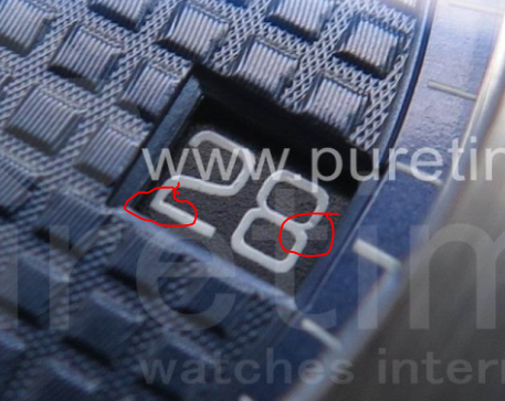
The datewheel font does not have the micro-gaps at the joints of the arms. The lower joint of the "2" in 28 should have the micro gap at a 45 degree angle and it's missing. The font they presented earlier looked 'good enough', and due to date wheel printers lacking that type of micro equipment, I bet ZF just wanted to release it for now. Look specifically at the 8 in "18" and the "2" in "12" to see

- 28/2/17
- 2,392
- 1,966
- 113
It would be interesting to know how visible this actually is to the naked eye. I mean don't get me wrong, zoomed in and blown up on a screen it’s obvious. But theres not even a cyclops on these, is a tiny little micro gap actually visible even with the watch close to your face, let alone at arms length when it definitely wouldn’t be
Phantomtech
I'm Pretty Popular
- 28/12/12
- 1,424
- 214
- 63
It would be interesting to know how visible this actually is to the naked eye. I mean don't get me wrong, zoomed in and blown up on a screen it’s obvious. But theres not even a cyclops on these, is a tiny little micro gap actually visible even with the watch close to your face, let alone at arms length when it definitely wouldn’t be
0% visibility to the naked eye even from a few inches away.
Tigerdragon
Mythical Poster
- 19/10/13
- 7,292
- 1,687
- 113
Puretime is still the prototpye dial, look at "Swiss Made" its still misses the texture like the prototype watch on page 1. Iam so sick of this prototype bullshit.
They did the same shit with the 15400 which has still the prototype dial on their page lol (look at swiss made its still the wrong dial).
SHB i think you did mentioned it right? With the 15400 dial and the flat swiss made.
They did the same shit with the 15400 which has still the prototype dial on their page lol (look at swiss made its still the wrong dial).
SHB i think you did mentioned it right? With the 15400 dial and the flat swiss made.
Last edited: