• Tired of adverts on RWI? - Subscribe by clicking HERE and PMing Trailboss for instructions and they will magically go away!

Tudor Pelagos KW/V6F V3 - Black

IceBear454

Known Member
14/5/17
102
0
0
The Gen has a silver topped center post. My V6F does not. Gen (on the left) does.

34978946563_6ec4c3a720_o.jpg


It seems that the V3 still hasn't fixed the sharp corners of the markers. Gen on the left.

37124048880_ee1075e023_o.jpg
 

negative

Known Member
DO NOT TRADE WITH ME
31/10/13
161
1
0
This is from Tudors instagarm page. Leftdrive pelagos got round corners. "Original" pelagos, sharp corners.
 

negative

Known Member
DO NOT TRADE WITH ME
31/10/13
161
1
0
After looking at MANY other photos I think Tudor got a very big variation on gen Pelagos, both markers, and font size and thickness. This is making me crazy :)
 

SubSquared

Active Member
Supporter
Certified
29/12/16
321
12
18
Never would have noticed the white dot without you saying it.
Is it really a dot or Tudor messing up?
Blue one looks different.
Its almost like a mistake in manufacturing process when cutting the second hand?
I prefer the no dot honestly
I don't think Tudor is as anal as Rolex

View attachment 81380 View attachment 81381
 

negative

Known Member
DO NOT TRADE WITH ME
31/10/13
161
1
0
Never would have noticed the white dot without you saying it.
Is it really a dot or Tudor messing up?
Blue one looks different.
Its almost like a mistake in manufacturing process when cutting the second hand?
I prefer the no dot honestly
I don't think Tudor is as anal as Rolex

View attachment 81380 View attachment 81381

If u look at tudors instagram or picutes of gens, some got the silver dot some dont. Same thing with font tickness. Blue dial and some black got really tiny font. Other is fat and bold. I think u right. Tudor is not as picky as Rolex.
 

SubSquared

Active Member
Supporter
Certified
29/12/16
321
12
18
If u look at tudors instagram or picutes of gens, some got the silver dot some dont. Same thing with font tickness. Blue dial and some black got really tiny font. Other is fat and bold. I think u right. Tudor is not as picky as Rolex.

Yeah lol and that is great for us over here :)
I mean some black bay's have crooked markers and what not...
I am going with this V6F version black one.
Lucy said they have an excellent QC in that factory and also a lot of members here said the same...
 

k4jun

Ω Section Moderator
Section Moderator
Certified
25/4/15
2,944
1,235
113
Thanks!
I am confused enough as it is :)
Very nice piece.

It's easy. There are only two makers.
One of the is called "ZF" and they do not use any other abbreviation.
Onother maker is "XF" aka "KW" or "V6F" ;)
 

IceBear454

Known Member
14/5/17
102
0
0
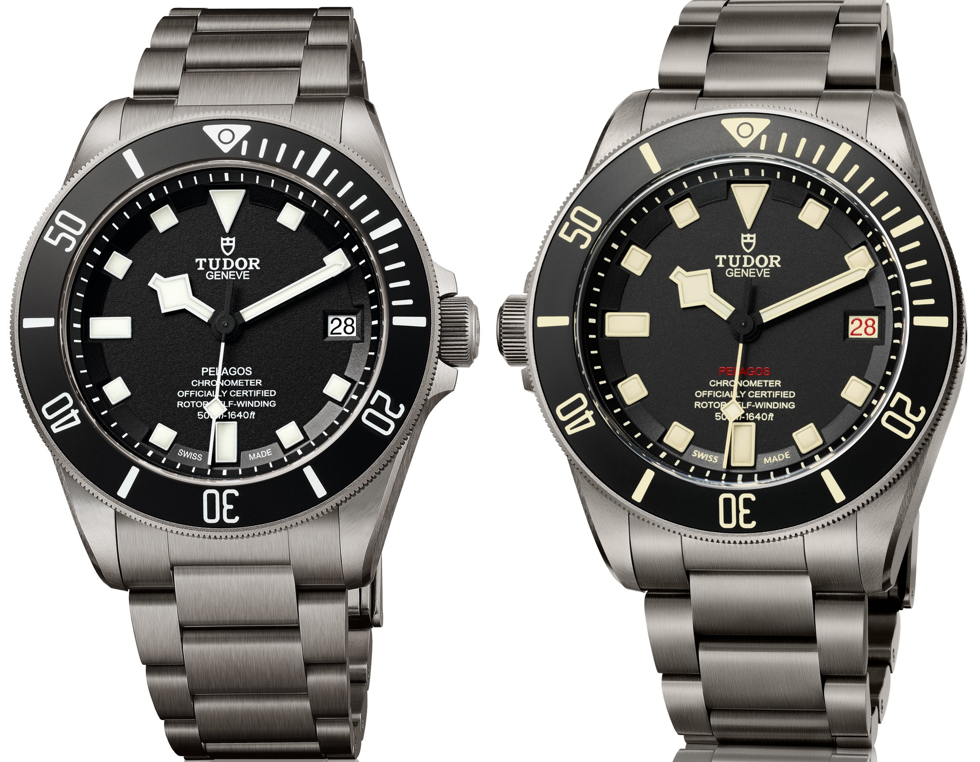
Here are some more photos to chew on.

LHD - top
Black - below
markers from the latest press resources on Tudor website. Two LHD, two Black, criss-crossed
My LHD Gen (left) - My V6F Rep (right)

37387019522_7f8e1b4451_o.jpg
 

negative

Known Member
DO NOT TRADE WITH ME
31/10/13
161
1
0
Here are some more photos to chew on.

LHD - top
Black - below
markers from the latest press resources on Tudor website. Two LHD, two Black, criss-crossed
My LHD Gen (left) - My V6F Rep (right)

37387019522_7f8e1b4451_o.jpg

I think u are right. But is this something you can see with your eyes or only when magnifying?

This photo is from 2015. Looks pretty sharp but with a little rounding.View attachment 81730
 

IceBear454

Known Member
14/5/17
102
0
0
I think u are right. But is this something you can see with your eyes or only when magnifying?

If you look for it, you have to really look to see it. But I think the effect of the difference is not so much in the detail, per se. Rather, it is in the overall sensation or impression. The creamy lume and indicators, bezel markings, the Red "Pelagos," and the different dial finish imparts an overall sense of "softness" and calm as compared to the high black/white contrast of the Black.

Tudor's press images, Black and LHD.

37161134660_6d033496fc_o.jpg
 

IceBear454

Known Member
14/5/17
102
0
0
See if you agree. The Rep with the sharp-cornered markers feels a little off. This is the exact model that I purchased at InTime.

37371400386_d1984bb0bc_o.jpg
 

robinstyler

Renowned Member
4/7/16
658
31
28
See if you agree. The Rep with the sharp-cornered markers feels a little off. This is the exact model that I purchased at InTime.

37371400386_d1984bb0bc_o.jpg

Great content from you. I definitely see your points. So lets hope the V3 fixes all of this. Even though its such a small detail it definately changes something about the watches aesthetics on the reps. Just doesn't seem so smooth anymore like the gen, but this is still nitpicking at a very high level.
 

SubSquared

Active Member
Supporter
Certified
29/12/16
321
12
18
Placed an order for the latest black V6F. Will share pics when I approve QC
 

IceBear454

Known Member
14/5/17
102
0
0
So lets hope the V3 fixes all of this. Even though its such a small detail it definately changes something about the watches aesthetics on the reps.

Yes, it does. And when you consider the heritage from which the Pelagos and Pelagos LHD descend, this degree of examination and satisfaction are easily justified. The "snowflake" hands and square markers go way back to the 1969 Oyster Prince Submariner ref 7016 and 1969 Prince Oysterdate Submariner ref 7021. The former with no date complication, the latter with date but a cyclops.

I truly enjoy my Pelagos LHD, both Gen and Rep. In my opinion, it is an icon among the diving, tool watch lineages. And, it's reasonably affordable. I love 'em! And this includes the rounded markers and blobby lume. It makes the watch feel more organic, alive and imperfect...like its wearer. :)
 

Awesomeo

Active Member
13/9/13
362
10
18
Agree with the differences between RHD and LHD.

The standard Pelagos is asceptic, clinical (and not in a bad way). IMO it’s one of the best tool watches there is. The LHD has a little more charm and personality.

Really interesting to see what a few changes do to the watch, both are excellent pieces.
 

IceBear454

Known Member
14/5/17
102
0
0
Here's a silly question...

Do you think making the LHD was as simple as flipping the case upside down and then rotating the movement? I mean aside from the purely cosmetic, stylistic changes. This came to mind as I was looking at the side-by-side of the Black and the LHD.
 

Awesomeo

Active Member
13/9/13
362
10
18
Here's a silly question...

Do you think making the LHD was as simple as flipping the case upside down and then rotating the movement? I mean aside from the purely cosmetic, stylistic changes. This came to mind as I was looking at the side-by-side of the Black and the LHD.

Not that simple though, date wheel, dial print, lume + markers are all different. Far less of a lazy job than the Black Bay Dark that was released at any rate.

Are the crown guards the same on the standard and LHD?
 

IceBear454

Known Member
14/5/17
102
0
0
I honestly cannot tell any difference. At least not from the press photos. I'm happy to post close up from a few standard angles if someone with the Black/Blue would do the same.

Alternatively, I might just stop in the AD the next time I'm at metro center and do a little quick comparo under the guise of shopping. Actually, that might not be so dishonest...the BB Bronze is really starting to catch my eye. But then again...I know the two-tone look is controversial but it really calls to me!

37430270341_60fc850681_o.jpg


PS. Let's hope a Pelagos GMT is coming in the future. I'd definitely go for that ahead of the Rolex GMT II Master. A titanium GMT with 70-hour reserve? Yes, please!

BTW, saw this concept posted on TRF. It's not mine and I don't know where it comes from...but imagine it in LHD dress...I certainly could. That deep-dish rehaut is tailor made for 24-hr markers, and that nice long GMT hand. Oh yeah.

36760388013_46f97c136a_o.jpg
 

Repworld

Mythical Poster
27/12/16
6,354
1,571
113
The Gen has a silver topped center post. My V6F does not. Gen (on the left) does.

34978946563_6ec4c3a720_o.jpg


It seems that the V3 still hasn't fixed the sharp corners of the markers. Gen on the left.

37124048880_ee1075e023_o.jpg

Very helpful thnx


Sent from my iPhone using Tapatalk