Like this:
It is perfect down to the pixel.
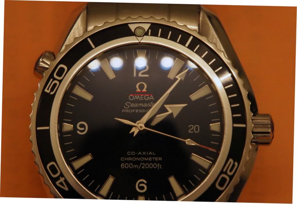
There is more black in the gap between the red line and the logo on the left side, because it's leaning slightly to the right. The line over the script is also cutting off more of the top of the 'G' than the 'O'. It's always better to use a higher res image when doing this sort of thing.
Really, just give me a break rather than now making me prove there is crookedness when it's not a big deal anyway. I don't want to argue pixels with someone.