• Tired of adverts on RWI? - Subscribe by clicking HERE and PMing Trailboss for instructions and they will magically go away!

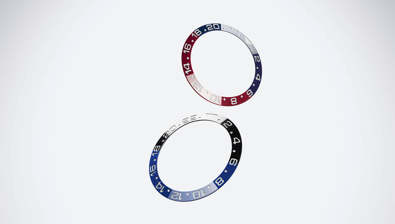
Pepsi bezel insert battle CF vs Xing_Patrick: A photo comparison

JustFou

Known Member
9/7/18
161
72
28
Hello RWI, as I promised in another thread I'll do a comparison on the current clean Pepsi bezel and the new Pepsi bezel made by a reddit user going by the name xing_patrick. First things first, you'll have to be lenient as English is not my first language and my writing skills are god-awful. I also have to start by mentioning I have no affiliations with this reddit user and this write-up is entirely my opinion. Also pictures can vary greatly between screens and the device used to take the photos. I used a Google Pixel 6a which tends to do some heavy post-processing (HDR) to get better contrast but ends up being less color accurate. This is the reason why this a comparison between CF (which I have in hand and compare in each picture) and the new insert and not with gen as I do NOT OWN a gen watch. However this is by part the best insert I've had my hands-on with and the one I personally like the best. I not plan on going and commenting each condition this is just to show the different colors in every lighting scenarios I could think of.

Let's get down to the pictures shall we?

Outside Sun


Outside no sun


Outside no sun (w/flash)


Inside (natural light)

Insert close-up (bezel fill)

Clean

Xing_Patrick

Inside (bathroom light)

Inside lighting (Lamp)

In the dark (taken with nightsight)

Canadian tire lighting

Inside apartment

General pictures (no particular lighting conditions)


One picture missing from this review is with a UV light. I did buy one and this insert is made out of one piece (meaning it gets entirely red under a UV light like the gen). However I could no get a good picture showing this phenomena on my phone ... Thanks for checking my post and hope you like it! Be sure to ask if you need more photos and be free to discuss which MK bezel you think it looks like and if you like the clean better!
 

RollyAP

Renowned Member
Patron
Certified
25/3/21
837
632
93
Thanks for the comparison! It definitely is a big leap from the CF bezel
 

diamonds

Renowned Member
Supporter
Certified
17/3/21
648
916
93
Excellent. The xing insert looks incredible.
 

Neon

Active Member
23/10/12
302
53
28
🇺🇸
I really appreciate the pics. Very tempting upgrade.

How hard is making the change?
 

butler182

Renowned Member
14/12/20
646
664
93
Wow...looks really good. And great pics in different light conditions too....thank you!!!
 

diamonds

Renowned Member
Supporter
Certified
17/3/21
648
916
93
[/url]


It may be the lighting or the angle, but in some of the photos, the Xing insert seems to be lacking a sufficient amount of clear coating. which makes the insert seem a bit dull and not as glossy as it should be.
 
  • Like
Reactions: Tijdwijzer

davidc

Getting To Know The Place
1/5/22
89
77
18
wow thanks for taking the time to share this. How hard was it to change out the insert?
 
  • Like
Reactions: Tijdwijzer

StreetFighter

Insert Coin
4/9/20
2,880
3,448
113
It's much better and a very good effort. I think it's a much better colour representation of the gen that I see through a digital camera and given there are gen 3 BLRO bezel variations and there will undoubtly be more as time goes by and you never see a gen BLRO in the wild I think it's the best BLRO bezel yet. I'm sure it will appear different again in hand before the camera software decides what it thinks it should look like.

He has solved one problem but there is another obvious flaw to fix, the transition line; on the gen the transition blends from one colour to the next, you cannot pinpoint the line because it fade over .5mm. The line on this new bezel insert is very obvious and similar to the 5 digit aluminum bezel in that regard.

The blend line of the 2 colours will be BLRO rep bezel achilles heel in my opinion.

Gen


Duckber

I'm Pretty Popular
16/8/19
1,585
868
113
It may be the lighting or the angle, but in some of the photos, the Xing insert seems to be lacking a sufficient amount of clear coating. which makes the insert seem a bit dull and not as glossy as it should be.

This is my thought as well when thinking of getting one. It is a step up from CF but still relatively flat and not as dynamic or as glossy as gen.
 

JustFou

Known Member
9/7/18
161
72
28
[/url]


It may be the lighting or the angle, but in some of the photos, the Xing insert seems to be lacking a sufficient amount of clear coating. which makes the insert seem a bit dull and not as glossy as it should be.
I'd say it's mostly lighting and angle as it can get quite glossy!
 

JustFou

Known Member
9/7/18
161
72
28
wow thanks for taking the time to share this. How hard was it to change out the insert?
Not really. Took me less than 5 minutes but you need the right tools. KJ has a great guide on bezel change!
 

JustFou

Known Member
9/7/18
161
72
28
It's much better and a very good effort. I think it's a much better colour representation of the gen that I see through a digital camera and given there are gen 3 BLRO bezel variations and there will undoubtly be more as time goes by and you never see a gen BLRO in the wild I think it's the best BLRO bezel yet. I'm sure it will appear different again in hand before the camera software decides what it thinks it should look like.

He has solved one problem but there is another obvious flaw to fix, the transition line; on the gen the transition blends from one colour to the next, you cannot pinpoint the line because it fade over .5mm. The line on this new bezel insert is very obvious and similar to the 5 digit aluminum bezel in that regard.

The blend line of the 2 colours will be BLRO rep bezel achilles heel in my opinion.

Gen


Gen looks amazing as always!
 

KJ2020

Time Traveler
Supporter
12/3/18
34,659
66,732
113
Just an FYI, there is no "clear coat" on Rolex ceramic inserts. The high gloss finish is achieved from polishing.


KJ2020

Time Traveler
Supporter
12/3/18
34,659
66,732
113
Hello RWI, as I promised in another thread I'll do a comparison on the current clean Pepsi bezel and the new Pepsi bezel made by a reddit user going by the name xing_patrick. First things first, you'll have to be lenient as English is not my first language and my writing skills are god-awful. I also have to start by mentioning I have no affiliations with this reddit user and this write-up is entirely my opinion. Also pictures can vary greatly between screens and the device used to take the photos. I used a Google Pixel 6a which tends to do some heavy post-processing (HDR) to get better contrast but ends up being less color accurate. This is the reason why this a comparison between CF (which I have in hand and compare in each picture) and the new insert and not with gen as I do NOT OWN a gen watch. However this is by part the best insert I've had my hands-on with and the one I personally like the best. I not plan on going and commenting each condition this is just to show the different colors in every lighting scenarios I could think of.

Let's get down to the pictures shall we?

Outside Sun


Outside no sun


Outside no sun (w/flash)


Inside (natural light)

Insert close-up (bezel fill)
Thorough compilation of pics bro, very nicely done! Looks like a worthwhile upgrade.
 

leo6929

I'm Pretty Popular
Supporter
Certified
2/5/16
1,713
1,141
113
Thanks for your effort mate, to me it looks waaaayyy better than my stock V2 CF... gotta get my hands on one of these :)
 

JustFou

Known Member
9/7/18
161
72
28
Just an FYI, there is no "clear coat" on Rolex ceramic inserts. The high gloss finish is achieved from polishing.


So it could be improved wtih some polishing ... interesting!
 
  • Like
Reactions: leo6929