- 18/1/11
- 19,846
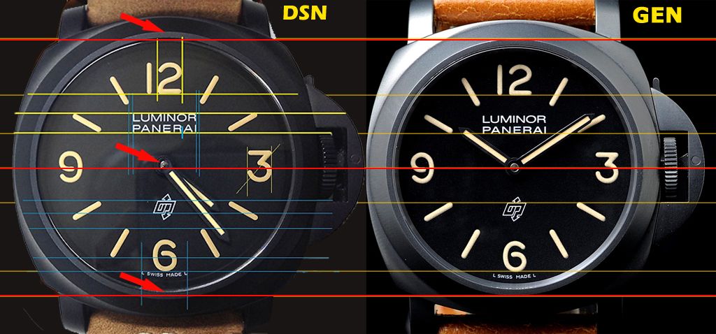
- 423
- 83
Sent")
Thanks Rwolf
Well received
I will make the study as soon as possible
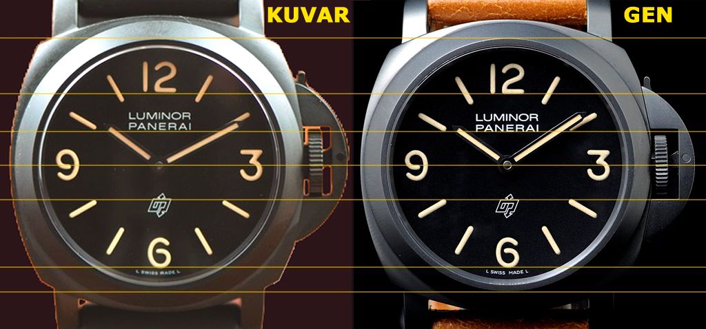
Kuvarsit dial seems really good indeed
ALE
Sent
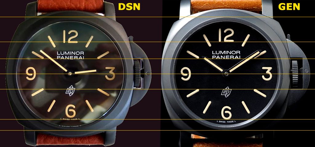
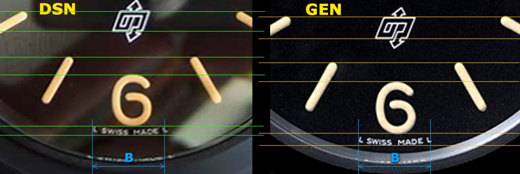
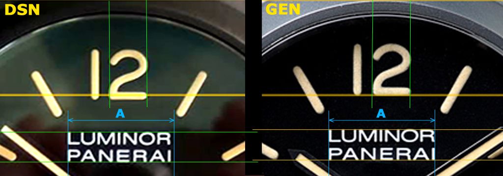
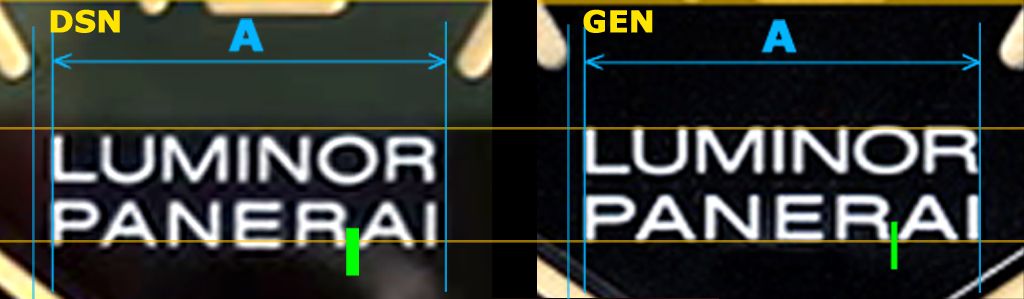
Kuvarsic V2 case color and dial seem to be very good. CG are nice also. Maybe this one is the best of them all?

In what way, how much smaller, is the K case?
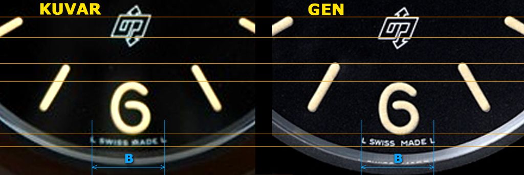
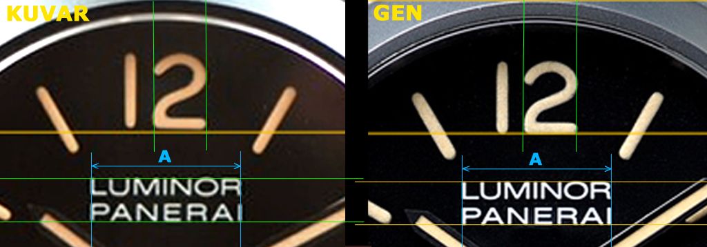
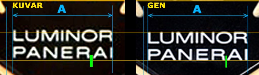
Concerning layout, dimensions and fonts the best dial by far
Really a little surprise for me. If the lume application and colour is good is a very good choice for a Super rep.
I will make the complete study as soon as possible.
Thanks Rwolf for the pics
ALE
:Yes, really impressive... dial and CG looks stunning.
PT sell the K version too.


If you want an accurate replica it would be better wait for new versions.
I will wait for Noob next version
ALE