- 18/1/11
- 19,846
- 423
- 83
The dials of PAM 360 – Comparison Gen / H maker V1/ H maker V1.2 / Noob / DSN / KUVARSIT
Following the introduction of PAM 360 replica from Noob factory, people started a discussion about the quality and accuracy of the good PAM 360 replicas in the market.
In this thread we will deal with the dial general dimensions, layout, Fonts and thickness of the markers and inscriptions in comparison to the gen PAM 360 dial.
Please don’t consider the colour of the lume or the DLC case of the pics because they are taken in different light conditions. The comparisons are just valid for fonts, positions, dimensions and alignments.
The most known replicas of this watch are:
-H maker V1
-H maker V1.2
-Noob factory (released in December 2012)
-DSN
-KUVARSIT
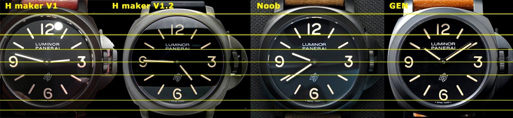
Unfortunately there are not Super replicas of this watch, mainly due to the inaccurate colour of the DLC case and some differences in dial features.
We will study in each version a comparison with the gen in several aspects:
- A general comparison
- The mainly wrong fonts: “2†and especially the “3â€
- Lower part of the dial: the LOGO, the “6†position, the L SWISS MADE L inscription.
- Upper part of the dial: “12†marker and the inscription LUMINOR PANERAI alignment
- The inscription LUMINOR PANERAI: Fonts, Size and the space R_AI
Important:
As above said: Please don’t consider the colour of the lume or the case DLC in the pics, because they are taken in many different light conditions. The comparisons are just valid for fonts, positions, dimensions and alignments.
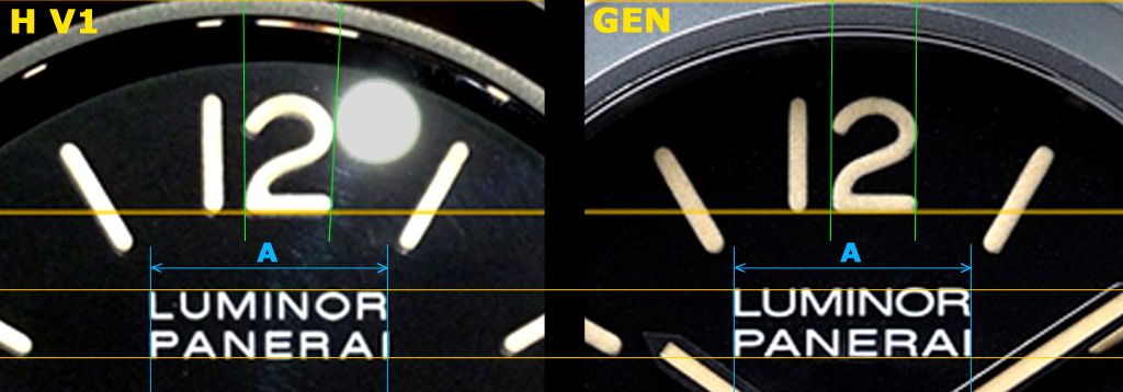
1- DIAL H maker V1 vs. GEN
People usually say, and it is a little legend, that this H maker V1 is the best dial of PAM 360. And indeed it is the best in some aspects but has some important flaws.
1.1- General comparison H maker V1 vs. GEN
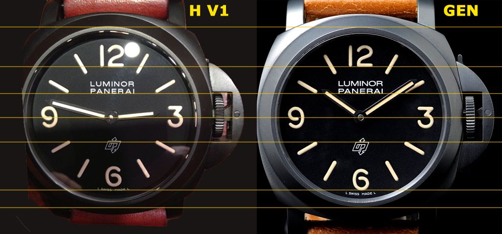
In above FIGURE you can see the direct comparison of H maker V1 and gen dial. The more noticeable flaws are: wrong “3â€, very wrong fonts in LUMINOR PANERAI and the “6†and L SWISS MADE L that are closer to the OP Logo.
This position of “6†marker and L SWISS MADE L inscription are bad in all studied reps. Maybe the pic angle makes some enhancement of the differences, but one thing is clear: “6†marker and L SWISS MADE L are much closer to the OP Logo in all studied replicas. See in the FIGURE of Section 1.3 the distances “Lg†and “L1†marked in yellow.
Lume thickness and application in H maker V1 dial look very good.
1.2- H maker V1 - Markers “2†& “3â€
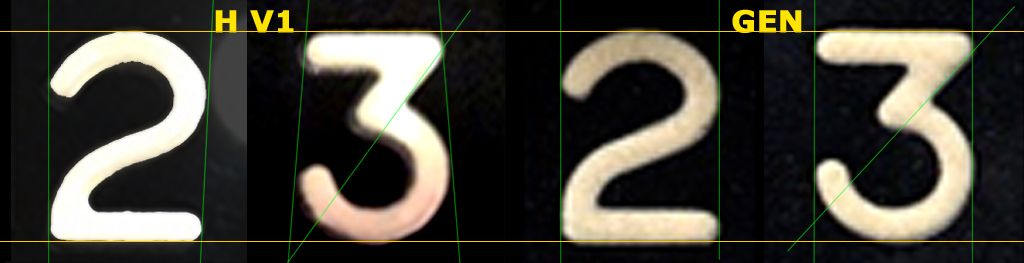
These are the main issues of this dial and unfortunately Noob has copied these flaws almost perfectly.
As you can see in above FIGURE the marker “2†is open at the top in the H maker V1, but is parallel in the Gen.
“3†marker is completely different having a really short upper bar and a different tilt angle in the middle bar. The V1 font is close at the top but in the gen is parallel.
In general the thickness of the fonts is accurate. Maybe the most accurate of all studied dials close to DSN and KUVARSIT.
This dial V1 has a lume application very similar to the gen.
Perhaps due to this accurate thickness and lume application this H maker V1 dial seems better than others.
Therefore we have a good font thickness and lume application with wrong font markers.
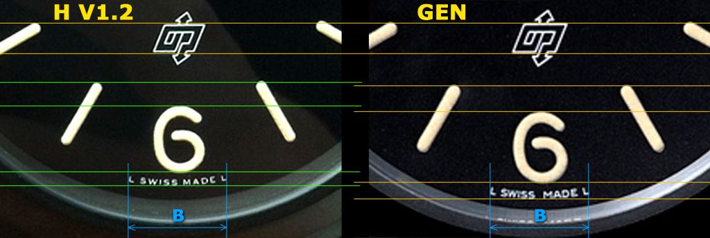
1.3- H maker V1 - Logo OP, “6†marker, L SWISS MADE L Inscription
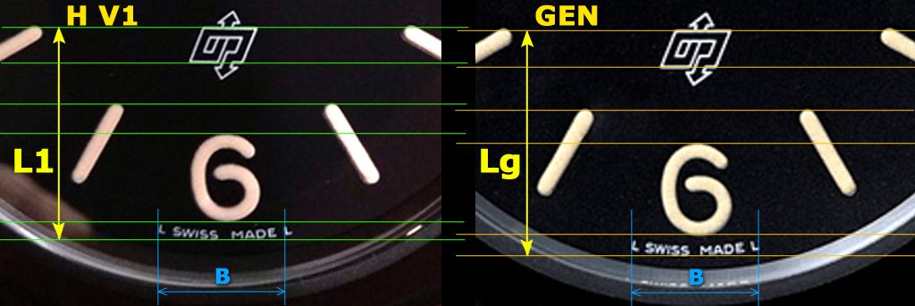
OP Logo and Sticks @8 & 4 are placed a bit high (no noticeable)
OP Logo shape is correct
Stick markers @5 & 7 placed a bit high
“6†marker is placed closer to OP Logo and font seems very correct
L SWISS MADE L inscription with quite accurate fonts but is placed closer to OP Logo and is longer than gen.
See in above FIGURE the distances “Lg†and “L1†marked in yellow.
1.4- H maker V1 - “12†marker LUMINOR PANERAI Inscription
“12†marker almost correct leaving aside the “2†open
Stick markers @2 & 10 well placed
LUMINOR PANERAI inscription (see below)
1.5- H maker V1 - LUMINOR PANERAI inscription
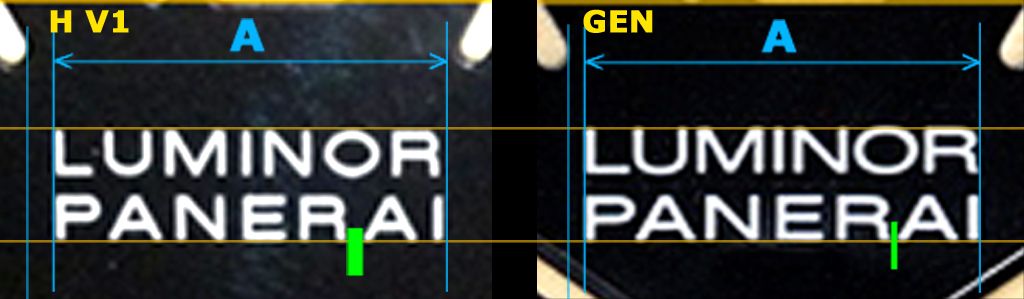
Fonts: Completely wrong. Awful “Uâ€, “Oâ€, “P†and mainly “R†narrower and completely off
Length: Correct, LUMINOR a little shorter due to narrow “Râ€
Position: Almost perfect
Distance R_AI: “R†is very narrow and therefore clearly bigger distance (the worse of five versions)
2- DIAL H maker V1.2 vs. GEN
Although many people said that the H maker V1 was a very good dial of PAM 360, really it had some important flaws which we have above studied. Surely due to these flaws H maker started a new version called H maker V1.2.
This version V1.2 was released with very accurate font shape in markers and inscriptions, and trying to resolve all V1 issues. But unfortunately this new version got other issues and the marker fonts were thinner than V1 and therefore than gen, because V1 was very accurate at this regard. Even the application of the lume was not as perfect as the V1. We will study below those issues
2.1- General comparison H maker V1.2 vs. GEN
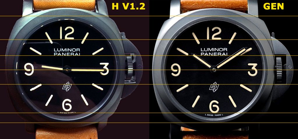
In above FIGURE you can see the direct comparison of V1 and gen dial. The more noticeable flaws are the thinner markers and the “6†and L SWISS MADE L that are closer to the OP Logo.
Lume application looks good, but not as good as H maker V1.
This H maker V1.2 dial really has fewer flaws than V1 and Noob. But unfortunately the thinner markers are a very noticeable flaw and people have rejected this dial from the beginning.
2.2- H maker V1.2 - Markers “2†& “3â€
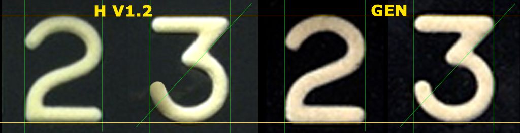
These are the main improvements of this H maker V1.2 dial and unfortunately Noob has not followed them.
As you can see in above FIGURE the markers “2†and “3†are almost the same as gen but thinner.
This dial has too a lume application similar to the gen but inferior to V1.
Surely due to this wrong thickness, people say that H maker V1 dial seems better that this one.
Therefore we have a good font shape accuracy and lume application with wrong thickness.
2.3- H maker V1.2 - Logo OP, “6†marker, L SWISS MADE L Inscription
OP Logo and Stick markers @8 & 4 are placed almost perfectly, like in the Noob and KUVARSIT version
OP Logo shape is correct
Sticks markers @5 & 7 placed a bit high
“6†marker is placed closer to OP Logo and fonts seem very correct
L SWISS MADE L inscription with quite accurate fonts (a bit shorter), as usually is placed closer to OP Logo, but it is the only having correct length.
2.4- H maker V1.2 - “12†marker LUMINOR PANERAI Inscription
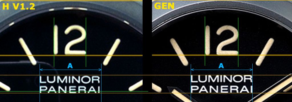
“12†marker almost perfect with a very correct “2â€
Stick markers @2 & 10 are placed a little higher and a bit over the PANERAI position.
LUMINOR PANERAI inscription (see below)
2.5- H maker V1.2 - LUMINOR PANERAI inscription
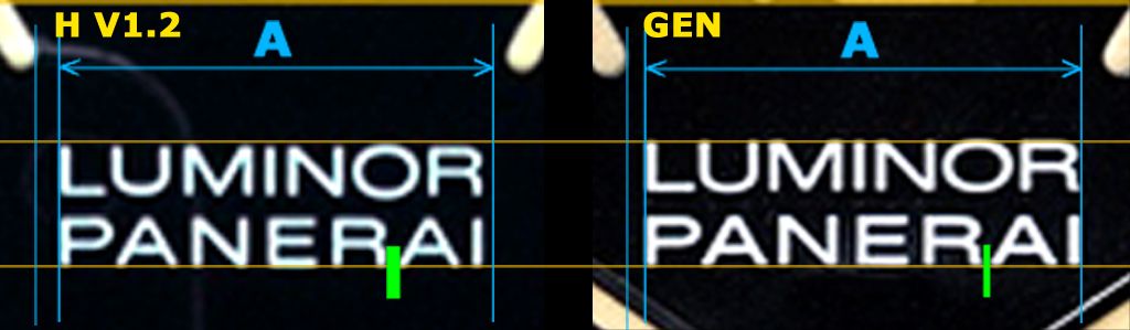
Fonts: Much more accurate than H maker V1. Only the “R†seems a little wrong. But the Noob and KUVARSIT fonts are better in general
Length: A little short
Position: Almost perfect. But the bad position (higher) of stick markers @2 & 10 makes the difference a bit noticeable
Distance R_AI: “R†is a little narrow and then this distance is a little big but better than in H maker V1 and worse than Noob and KUVARSIT.
3- DIAL Noob factory vs. GEN
The dial of the new PAM 360 from Noob is one of the more disappointing releases in replicas. Fans were waiting for a year the introduction of this replica but at this moment we have a Noob dial with a lot of inaccuracies and completely unacceptable, bearing in mind the current level of the PAM replicas.
I have thought a lot about this matter, trying to understand the flaws in Noob dial, and I have arrived at the conclusion that Noob has take a bad information from the market. Usually people say that H maker V1 dial is better, surely only because has a good appearance with a correct thickness of markers and lume application and people also say that H maker V1.2 dial is wrong only because it has thinner markers. But neither the H maker V1 dial nor the V1.2 are perfect as we have seen above.
Unfortunately Noob has not taken the appropriate decisions and has copied some pros of V1 and V1.2 but many cons too. Noob even has added some flaws by itself.
The result is a disappointing and unacceptable new PAM 360 dial.
Below we will analyze the features of this Noob dial.
3.1- General comparison Noob factory vs. GEN
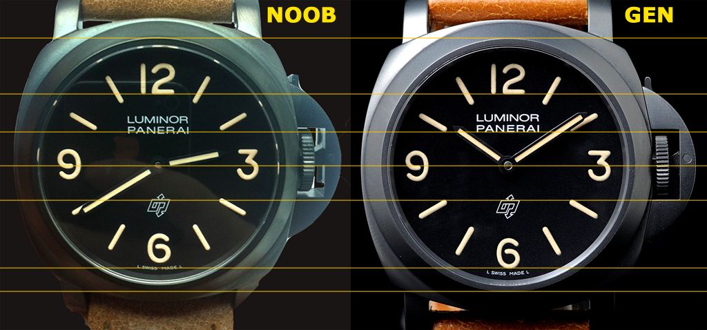
In above FIGURE you can see the direct comparison of Noob and gen dial. The more noticeable flaws are: wrong “3â€, the misalignment between the markers @ 2 & 10 and the PANERAI inscription and the “6†and L SWISS MADE L that are closer to OP Logo.
Lume thickness (a bit thicker) and application look very good.
3.2- Noob factory - Markers “2†& “3â€
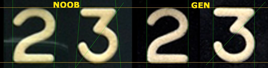
These were the main issues of H maker V1 dial and unfortunately Noob has copied these flaws almost perfectly.
As you can see in above FIGURE the marker “2†is open at the top in the Noob like the H maker V1, but is parallel in the Gen.
“3†marker is completely different having a really short upper bar and a different tilt angle in the middle bar like in H maker V1 dial. The Noob font is close at the top but in the Gen is parallel.
In general the thickness of the fonts is accurate. Maybe a little thicker.
This dial has too a lume application very similar to the gen but maybe inferior to the H maker V1.
This accurate thickness and lume application of Noob dial are the more important pros of this dial.
Like in H maker V1 dial we have a good font thickness and lume application with wrong font markers.
3.3- Noob factory - Logo OP, “6†marker, L SWISS MADE L Inscription
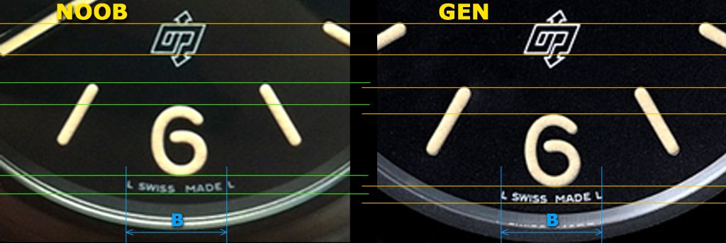
OP Logo and Sticks @8 & 4 are placed almost perfectly
OP Logo shape is correct
Sticks markers @5 & 7 placed a bit high
“6†marker is placed closer to OP Logo and fonts seem very correct
L SWISS MADE L inscription with quite accurate fonts, but is placed closer to OP Logo and is longer than gen, like in H maker V1.
3.4- Noob factory - “12†marker LUMINOR PANERAI Inscription
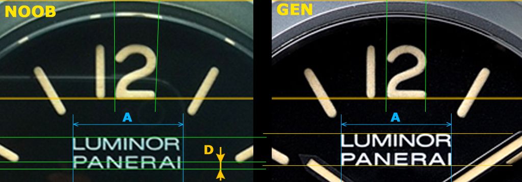
“12†marker almost correct leaving aside the “2†open
Stick markers @2 & 10 are placed a little high (like in V1.2). But, besides, LUMINOR PANERAI inscription is place a little low.
Due to both flaws above mentioned together there is a noticeable distance D (orange marked) between the alignment of stick markers @2 & 10 and the base of PANERAI inscription.
This is a noticeable flaw that you can easily see in this new Noob dial
3.5- Noob factory - LUMINOR PANERAI inscription
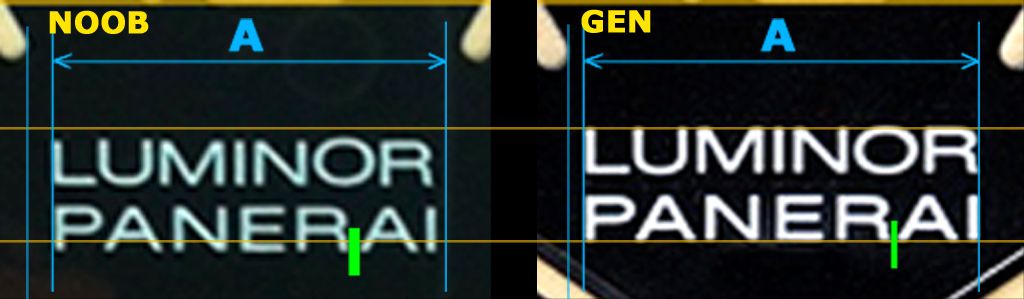
Fonts: Much more accurate than H maker V1, and better than V1.2. The most accurate fonts of five dials
Length: A little short
Position: A little low. But the bad position (higher) of stick markers @2 & 10 makes a difference very noticeable. See D distance (orange marked) in the FIGURE of previous Section.
Distance R_AI: This distance is a bit bigger but better than in H maker V1 and V1.2. Similar to KUVARSIT.
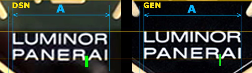
4- DIAL DSN (Davidsen) vs. GEN
DSN dial was a good dial at past, now since there are no perfect dials of this watch it keep a little of its old prestige. The wrong OP Logo and wrong fonts In LUMINOR PANERAI are unacceptable flaws in a modern PAM replica. But it is interesting to remark that with a correct logo this dial would be more acceptable (less noticeable flaws) IMO than V1, V1.2 and Noob
4.1- General comparison DSN vs. GEN
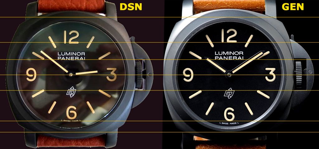
In above FIGURE you can see the direct comparison of DSN and gen dial. The more noticeable flaws are: very wrong OP Logo and placed high, wrong fonts in LUMINOR PANERAI, “6†and L SWISS MADE L that are closer to the OP Logo, L SWISS MADE L is closer to “6†marker.
Lume thickness and application in DSN dial look very good.
4.2- DSN - Markers “2†& “3â€
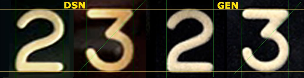
As you can see in above FIGURE the markers “2†and “3†are almost the same as gen. There is just a difference in the middle bar of “3†marker because it is thinner in the rep
This dial has too a lume application similar to the gen.
Therefore we have a good font shape accuracy and lume application.
4.3- DSN - Logo OP, “6†marker, L SWISS MADE L Inscription
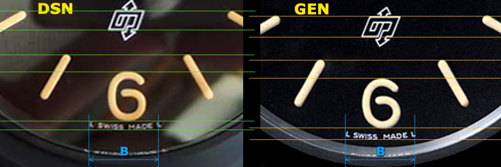
OP Logo and Sticks @8 & 4 are placed high (almost no noticeable) but they are aligned like gen-
OP Logo shape is completely wrong. See the inner part of “P†and “O†they are longer and narrower. This is for me the main flaw of this dial.
Stick markers @5 & 7 placed high
“6†marker is placed closer to OP Logo and font seems correct
L SWISS MADE L inscription with quite accurate fonts but longer. It is placed much closer to “6†marker(noticeable) and closer to OP Logo and is longer than gen.
4.4- DSN - “12†marker LUMINOR PANERAI Inscription
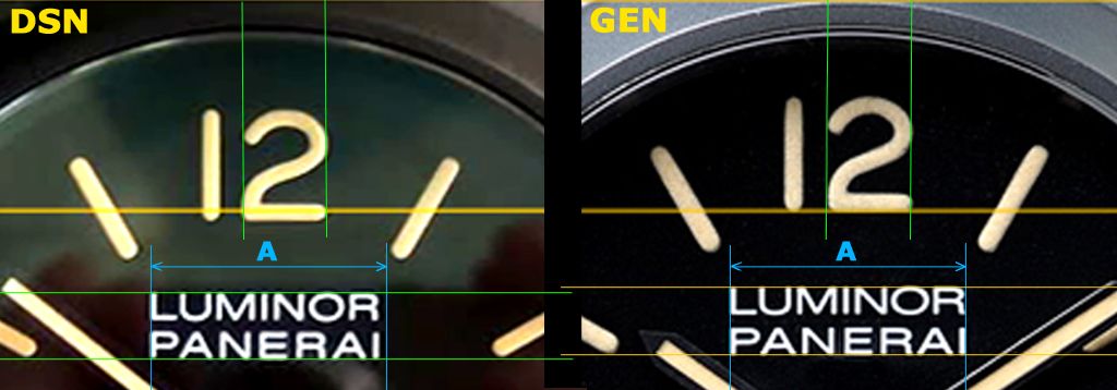
“12†marker almost perfect but placed a little low
Stick markers @2 & 10 well placed
LUMINOR PANERAI inscription (see below)
4.5- DSN - LUMINOR PANERAI inscription
Fonts: Wrong â€Uâ€, “Oâ€, “P†and mainly “R†narrower and completely off
Length: Shorter due to narrow “R†and smaller fonts
Position: A little low and misaligned with stick markers @ 2 & 10
Distance R_AI: “R†is very narrow and therefore clearly bigger distance.
5- DIAL KUVARSIT V2 vs. GEN
This KUVARSIT dial is the great surprise of this study. I know that some PCTeam members like Klockis and Rwolf have always well informed about this replica but I didin’t think that its dial was so good.
At this moment the dimensions and fonts of this dial are almost perfect. If we had a good case with a correct DLC colour we could build a Super replica of this watch.
5.1- General comparison KUVARSIT vs. GEN
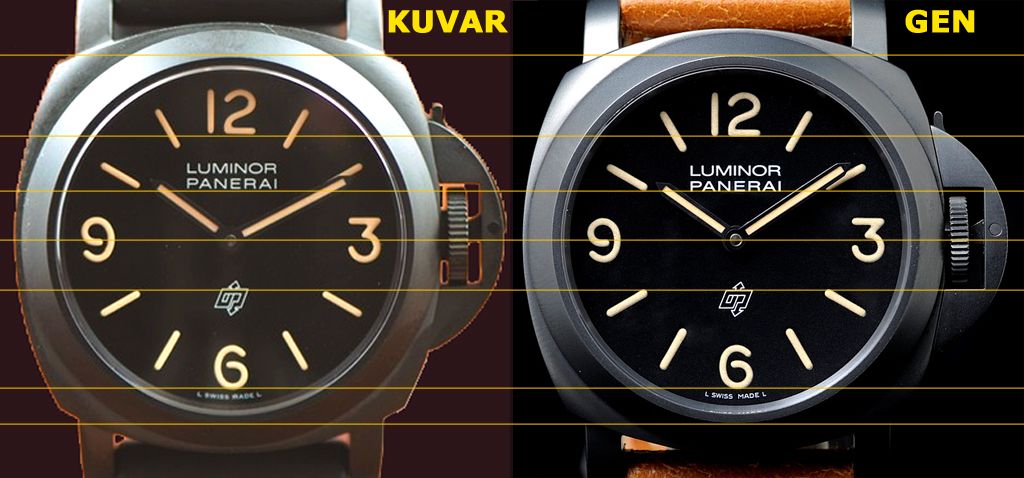
In above FIGURE you can see the direct comparison of KUVARSIT and gen dial. It really has no noticeable flaws.
This position of “6†marker and L SWISS MADE L inscription are good opposite to others studied reps.
Lume thickness and application in KUVARSIT dial look very good.
This is the better of fivestudied dials by far
5.2- KUVARSIT - Markers “2†& “3â€
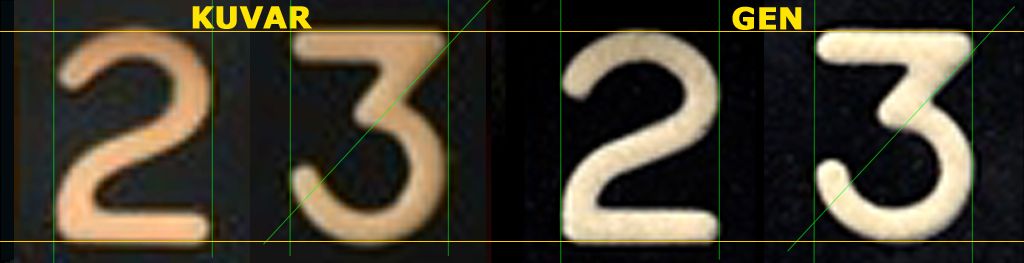
As you can see in above FIGURE the markers “2†and “3†are almost the same as gen.
This dial has too a lume application very similar to the gen.
Therefore we have a good font shape accuracy, lume application and thickness.
5.3- KUVARSIT - Logo OP, “6†marker, L SWISS MADE L Inscription
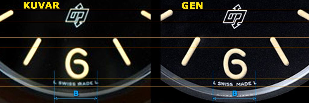
OP Logo and Sticks @8 & 4 are well placed and aligned.
OP Logo shape is correct
Stick markers @5 & 7 well placed
“6†marker is well placed and font seems very correct
L SWISS MADE L inscription with quite accurate fonts, well placed but is a bit (no noticeable) longer than gen.
5.4- KUVARSIT - “12†marker LUMINOR PANERAI Inscription
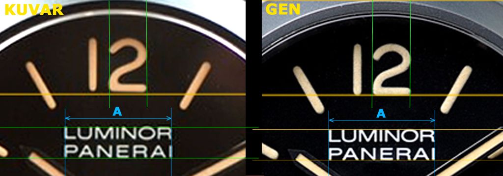
“12†marker almost perfect with a very correct “2â€. It is placed a bit high (no noticeable)
Stick markers @2 & 10 are placed a little higher and a bit over the PANERAI position (no noticeable).
LUMINOR PANERAI inscription (see below)
5.5- KUVARSIT - LUMINOR PANERAI inscription
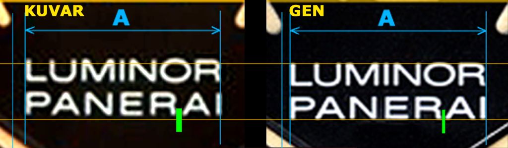
Fonts: They are very accurate. Only the “R†seems a little wrong. Very similar to the Noob but with worse “Râ€.
Length: Perfect
Position: It is a little high but has a good alignment with stick markers @2 & 10, which makes the higher position no noticeable.
Distance R_AI: “R†is a little narrow and then this distance is a little big but better than in H maker V1 and very similar to Noob dial.
CONCLUSIONS
Really it is a little surpirse to realize that with the KUVARSIT we have a correct rep dial of PAM 360, and we will have to wait for new releases if we want to get another corect dial for this watch
If we had a correct case with accurate DLC colour we could build a Super replica of this watch using this KUVARSIT dial.
Therefore, if I would have to buy one I would have a doubt between:
-The H maker V1.2: it has the more complete dial after the KUVARSIT and the DLC case colour seems lighter but closer to the gen (although Noob case shape and CG are better).
-The KUVARSIT with almost perfect dial but inaccurate case colour and maybe worse shape.
Just a personal taste matter.
Perhaps a good current solution would be the H maker case with a KUVARSIT dial. But i don't know if that is possible. Maybe Klockis or Rwolf can inform us about this possibility.
ALE
Following the introduction of PAM 360 replica from Noob factory, people started a discussion about the quality and accuracy of the good PAM 360 replicas in the market.
In this thread we will deal with the dial general dimensions, layout, Fonts and thickness of the markers and inscriptions in comparison to the gen PAM 360 dial.
Please don’t consider the colour of the lume or the DLC case of the pics because they are taken in different light conditions. The comparisons are just valid for fonts, positions, dimensions and alignments.
The most known replicas of this watch are:
-H maker V1
-H maker V1.2
-Noob factory (released in December 2012)
-DSN
-KUVARSIT
Unfortunately there are not Super replicas of this watch, mainly due to the inaccurate colour of the DLC case and some differences in dial features.
We will study in each version a comparison with the gen in several aspects:
- A general comparison
- The mainly wrong fonts: “2†and especially the “3â€
- Lower part of the dial: the LOGO, the “6†position, the L SWISS MADE L inscription.
- Upper part of the dial: “12†marker and the inscription LUMINOR PANERAI alignment
- The inscription LUMINOR PANERAI: Fonts, Size and the space R_AI
Important:
As above said: Please don’t consider the colour of the lume or the case DLC in the pics, because they are taken in many different light conditions. The comparisons are just valid for fonts, positions, dimensions and alignments.
1- DIAL H maker V1 vs. GEN
People usually say, and it is a little legend, that this H maker V1 is the best dial of PAM 360. And indeed it is the best in some aspects but has some important flaws.
1.1- General comparison H maker V1 vs. GEN
In above FIGURE you can see the direct comparison of H maker V1 and gen dial. The more noticeable flaws are: wrong “3â€, very wrong fonts in LUMINOR PANERAI and the “6†and L SWISS MADE L that are closer to the OP Logo.
This position of “6†marker and L SWISS MADE L inscription are bad in all studied reps. Maybe the pic angle makes some enhancement of the differences, but one thing is clear: “6†marker and L SWISS MADE L are much closer to the OP Logo in all studied replicas. See in the FIGURE of Section 1.3 the distances “Lg†and “L1†marked in yellow.
Lume thickness and application in H maker V1 dial look very good.
1.2- H maker V1 - Markers “2†& “3â€
These are the main issues of this dial and unfortunately Noob has copied these flaws almost perfectly.
As you can see in above FIGURE the marker “2†is open at the top in the H maker V1, but is parallel in the Gen.
“3†marker is completely different having a really short upper bar and a different tilt angle in the middle bar. The V1 font is close at the top but in the gen is parallel.
In general the thickness of the fonts is accurate. Maybe the most accurate of all studied dials close to DSN and KUVARSIT.
This dial V1 has a lume application very similar to the gen.
Perhaps due to this accurate thickness and lume application this H maker V1 dial seems better than others.
Therefore we have a good font thickness and lume application with wrong font markers.
1.3- H maker V1 - Logo OP, “6†marker, L SWISS MADE L Inscription
OP Logo and Sticks @8 & 4 are placed a bit high (no noticeable)
OP Logo shape is correct
Stick markers @5 & 7 placed a bit high
“6†marker is placed closer to OP Logo and font seems very correct
L SWISS MADE L inscription with quite accurate fonts but is placed closer to OP Logo and is longer than gen.
See in above FIGURE the distances “Lg†and “L1†marked in yellow.
1.4- H maker V1 - “12†marker LUMINOR PANERAI Inscription
“12†marker almost correct leaving aside the “2†open
Stick markers @2 & 10 well placed
LUMINOR PANERAI inscription (see below)
1.5- H maker V1 - LUMINOR PANERAI inscription
Fonts: Completely wrong. Awful “Uâ€, “Oâ€, “P†and mainly “R†narrower and completely off
Length: Correct, LUMINOR a little shorter due to narrow “Râ€
Position: Almost perfect
Distance R_AI: “R†is very narrow and therefore clearly bigger distance (the worse of five versions)
2- DIAL H maker V1.2 vs. GEN
Although many people said that the H maker V1 was a very good dial of PAM 360, really it had some important flaws which we have above studied. Surely due to these flaws H maker started a new version called H maker V1.2.
This version V1.2 was released with very accurate font shape in markers and inscriptions, and trying to resolve all V1 issues. But unfortunately this new version got other issues and the marker fonts were thinner than V1 and therefore than gen, because V1 was very accurate at this regard. Even the application of the lume was not as perfect as the V1. We will study below those issues
2.1- General comparison H maker V1.2 vs. GEN
In above FIGURE you can see the direct comparison of V1 and gen dial. The more noticeable flaws are the thinner markers and the “6†and L SWISS MADE L that are closer to the OP Logo.
Lume application looks good, but not as good as H maker V1.
This H maker V1.2 dial really has fewer flaws than V1 and Noob. But unfortunately the thinner markers are a very noticeable flaw and people have rejected this dial from the beginning.
2.2- H maker V1.2 - Markers “2†& “3â€
These are the main improvements of this H maker V1.2 dial and unfortunately Noob has not followed them.
As you can see in above FIGURE the markers “2†and “3†are almost the same as gen but thinner.
This dial has too a lume application similar to the gen but inferior to V1.
Surely due to this wrong thickness, people say that H maker V1 dial seems better that this one.
Therefore we have a good font shape accuracy and lume application with wrong thickness.
2.3- H maker V1.2 - Logo OP, “6†marker, L SWISS MADE L Inscription
OP Logo and Stick markers @8 & 4 are placed almost perfectly, like in the Noob and KUVARSIT version
OP Logo shape is correct
Sticks markers @5 & 7 placed a bit high
“6†marker is placed closer to OP Logo and fonts seem very correct
L SWISS MADE L inscription with quite accurate fonts (a bit shorter), as usually is placed closer to OP Logo, but it is the only having correct length.
2.4- H maker V1.2 - “12†marker LUMINOR PANERAI Inscription
“12†marker almost perfect with a very correct “2â€
Stick markers @2 & 10 are placed a little higher and a bit over the PANERAI position.
LUMINOR PANERAI inscription (see below)
2.5- H maker V1.2 - LUMINOR PANERAI inscription
Fonts: Much more accurate than H maker V1. Only the “R†seems a little wrong. But the Noob and KUVARSIT fonts are better in general
Length: A little short
Position: Almost perfect. But the bad position (higher) of stick markers @2 & 10 makes the difference a bit noticeable
Distance R_AI: “R†is a little narrow and then this distance is a little big but better than in H maker V1 and worse than Noob and KUVARSIT.
3- DIAL Noob factory vs. GEN
The dial of the new PAM 360 from Noob is one of the more disappointing releases in replicas. Fans were waiting for a year the introduction of this replica but at this moment we have a Noob dial with a lot of inaccuracies and completely unacceptable, bearing in mind the current level of the PAM replicas.
I have thought a lot about this matter, trying to understand the flaws in Noob dial, and I have arrived at the conclusion that Noob has take a bad information from the market. Usually people say that H maker V1 dial is better, surely only because has a good appearance with a correct thickness of markers and lume application and people also say that H maker V1.2 dial is wrong only because it has thinner markers. But neither the H maker V1 dial nor the V1.2 are perfect as we have seen above.
Unfortunately Noob has not taken the appropriate decisions and has copied some pros of V1 and V1.2 but many cons too. Noob even has added some flaws by itself.
The result is a disappointing and unacceptable new PAM 360 dial.
Below we will analyze the features of this Noob dial.
3.1- General comparison Noob factory vs. GEN
In above FIGURE you can see the direct comparison of Noob and gen dial. The more noticeable flaws are: wrong “3â€, the misalignment between the markers @ 2 & 10 and the PANERAI inscription and the “6†and L SWISS MADE L that are closer to OP Logo.
Lume thickness (a bit thicker) and application look very good.
3.2- Noob factory - Markers “2†& “3â€
These were the main issues of H maker V1 dial and unfortunately Noob has copied these flaws almost perfectly.
As you can see in above FIGURE the marker “2†is open at the top in the Noob like the H maker V1, but is parallel in the Gen.
“3†marker is completely different having a really short upper bar and a different tilt angle in the middle bar like in H maker V1 dial. The Noob font is close at the top but in the Gen is parallel.
In general the thickness of the fonts is accurate. Maybe a little thicker.
This dial has too a lume application very similar to the gen but maybe inferior to the H maker V1.
This accurate thickness and lume application of Noob dial are the more important pros of this dial.
Like in H maker V1 dial we have a good font thickness and lume application with wrong font markers.
3.3- Noob factory - Logo OP, “6†marker, L SWISS MADE L Inscription
OP Logo and Sticks @8 & 4 are placed almost perfectly
OP Logo shape is correct
Sticks markers @5 & 7 placed a bit high
“6†marker is placed closer to OP Logo and fonts seem very correct
L SWISS MADE L inscription with quite accurate fonts, but is placed closer to OP Logo and is longer than gen, like in H maker V1.
3.4- Noob factory - “12†marker LUMINOR PANERAI Inscription
“12†marker almost correct leaving aside the “2†open
Stick markers @2 & 10 are placed a little high (like in V1.2). But, besides, LUMINOR PANERAI inscription is place a little low.
Due to both flaws above mentioned together there is a noticeable distance D (orange marked) between the alignment of stick markers @2 & 10 and the base of PANERAI inscription.
This is a noticeable flaw that you can easily see in this new Noob dial
3.5- Noob factory - LUMINOR PANERAI inscription
Fonts: Much more accurate than H maker V1, and better than V1.2. The most accurate fonts of five dials
Length: A little short
Position: A little low. But the bad position (higher) of stick markers @2 & 10 makes a difference very noticeable. See D distance (orange marked) in the FIGURE of previous Section.
Distance R_AI: This distance is a bit bigger but better than in H maker V1 and V1.2. Similar to KUVARSIT.
4- DIAL DSN (Davidsen) vs. GEN
DSN dial was a good dial at past, now since there are no perfect dials of this watch it keep a little of its old prestige. The wrong OP Logo and wrong fonts In LUMINOR PANERAI are unacceptable flaws in a modern PAM replica. But it is interesting to remark that with a correct logo this dial would be more acceptable (less noticeable flaws) IMO than V1, V1.2 and Noob
4.1- General comparison DSN vs. GEN
In above FIGURE you can see the direct comparison of DSN and gen dial. The more noticeable flaws are: very wrong OP Logo and placed high, wrong fonts in LUMINOR PANERAI, “6†and L SWISS MADE L that are closer to the OP Logo, L SWISS MADE L is closer to “6†marker.
Lume thickness and application in DSN dial look very good.
4.2- DSN - Markers “2†& “3â€
As you can see in above FIGURE the markers “2†and “3†are almost the same as gen. There is just a difference in the middle bar of “3†marker because it is thinner in the rep
This dial has too a lume application similar to the gen.
Therefore we have a good font shape accuracy and lume application.
4.3- DSN - Logo OP, “6†marker, L SWISS MADE L Inscription
OP Logo and Sticks @8 & 4 are placed high (almost no noticeable) but they are aligned like gen-
OP Logo shape is completely wrong. See the inner part of “P†and “O†they are longer and narrower. This is for me the main flaw of this dial.
Stick markers @5 & 7 placed high
“6†marker is placed closer to OP Logo and font seems correct
L SWISS MADE L inscription with quite accurate fonts but longer. It is placed much closer to “6†marker(noticeable) and closer to OP Logo and is longer than gen.
4.4- DSN - “12†marker LUMINOR PANERAI Inscription
“12†marker almost perfect but placed a little low
Stick markers @2 & 10 well placed
LUMINOR PANERAI inscription (see below)
4.5- DSN - LUMINOR PANERAI inscription
Fonts: Wrong â€Uâ€, “Oâ€, “P†and mainly “R†narrower and completely off
Length: Shorter due to narrow “R†and smaller fonts
Position: A little low and misaligned with stick markers @ 2 & 10
Distance R_AI: “R†is very narrow and therefore clearly bigger distance.
5- DIAL KUVARSIT V2 vs. GEN
This KUVARSIT dial is the great surprise of this study. I know that some PCTeam members like Klockis and Rwolf have always well informed about this replica but I didin’t think that its dial was so good.
At this moment the dimensions and fonts of this dial are almost perfect. If we had a good case with a correct DLC colour we could build a Super replica of this watch.
5.1- General comparison KUVARSIT vs. GEN
In above FIGURE you can see the direct comparison of KUVARSIT and gen dial. It really has no noticeable flaws.
This position of “6†marker and L SWISS MADE L inscription are good opposite to others studied reps.
Lume thickness and application in KUVARSIT dial look very good.
This is the better of fivestudied dials by far
5.2- KUVARSIT - Markers “2†& “3â€
As you can see in above FIGURE the markers “2†and “3†are almost the same as gen.
This dial has too a lume application very similar to the gen.
Therefore we have a good font shape accuracy, lume application and thickness.
5.3- KUVARSIT - Logo OP, “6†marker, L SWISS MADE L Inscription
OP Logo and Sticks @8 & 4 are well placed and aligned.
OP Logo shape is correct
Stick markers @5 & 7 well placed
“6†marker is well placed and font seems very correct
L SWISS MADE L inscription with quite accurate fonts, well placed but is a bit (no noticeable) longer than gen.
5.4- KUVARSIT - “12†marker LUMINOR PANERAI Inscription
“12†marker almost perfect with a very correct “2â€. It is placed a bit high (no noticeable)
Stick markers @2 & 10 are placed a little higher and a bit over the PANERAI position (no noticeable).
LUMINOR PANERAI inscription (see below)
5.5- KUVARSIT - LUMINOR PANERAI inscription
Fonts: They are very accurate. Only the “R†seems a little wrong. Very similar to the Noob but with worse “Râ€.
Length: Perfect
Position: It is a little high but has a good alignment with stick markers @2 & 10, which makes the higher position no noticeable.
Distance R_AI: “R†is a little narrow and then this distance is a little big but better than in H maker V1 and very similar to Noob dial.
CONCLUSIONS
Really it is a little surpirse to realize that with the KUVARSIT we have a correct rep dial of PAM 360, and we will have to wait for new releases if we want to get another corect dial for this watch
If we had a correct case with accurate DLC colour we could build a Super replica of this watch using this KUVARSIT dial.
Therefore, if I would have to buy one I would have a doubt between:
-The H maker V1.2: it has the more complete dial after the KUVARSIT and the DLC case colour seems lighter but closer to the gen (although Noob case shape and CG are better).
-The KUVARSIT with almost perfect dial but inaccurate case colour and maybe worse shape.
Just a personal taste matter.
Perhaps a good current solution would be the H maker case with a KUVARSIT dial. But i don't know if that is possible. Maybe Klockis or Rwolf can inform us about this possibility.
ALE
")


