-
Tired of adverts on RWI? - Subscribe by clicking HERE and PMing Trailboss for instructions and they will magically go away!
You are using an out of date browser. It may not display this or other websites correctly.
You should upgrade or use an alternative browser.
You should upgrade or use an alternative browser.
PAM911 [HWF]
- Thread starter KOT1917
- Start date
Hazing
And So It Begins... Again
- 9/5/19
- 5,188
- 4,474
- 113
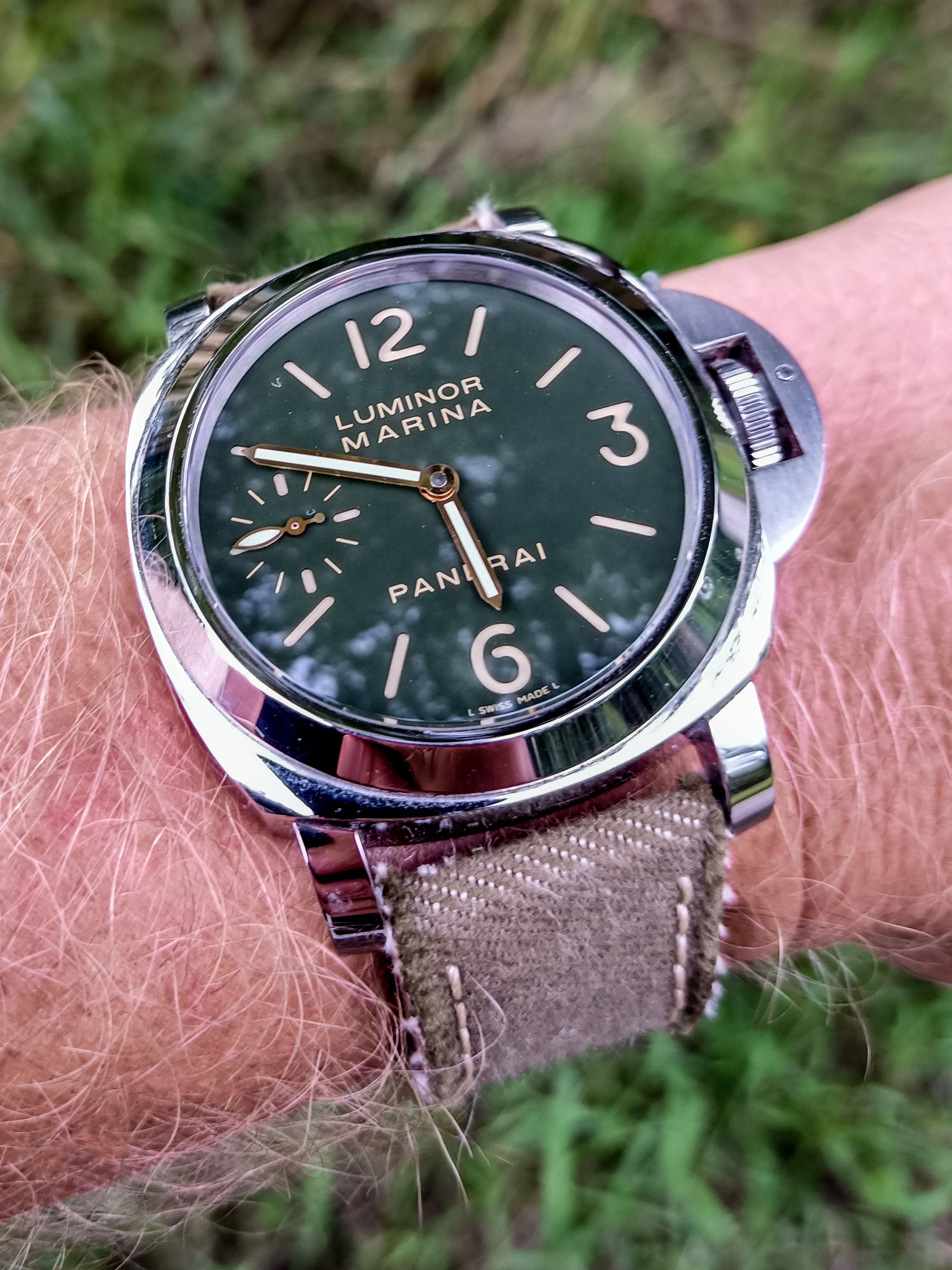
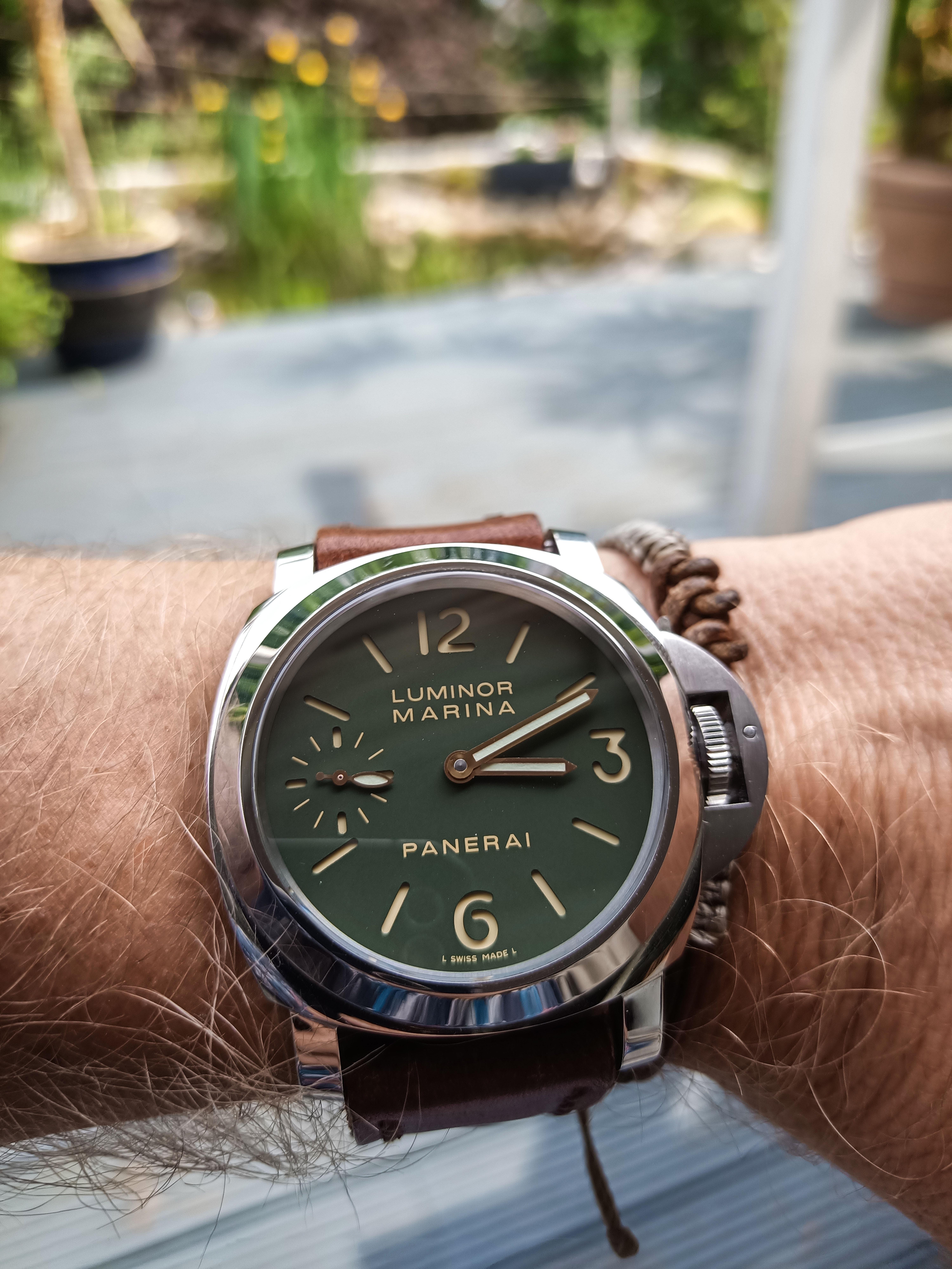
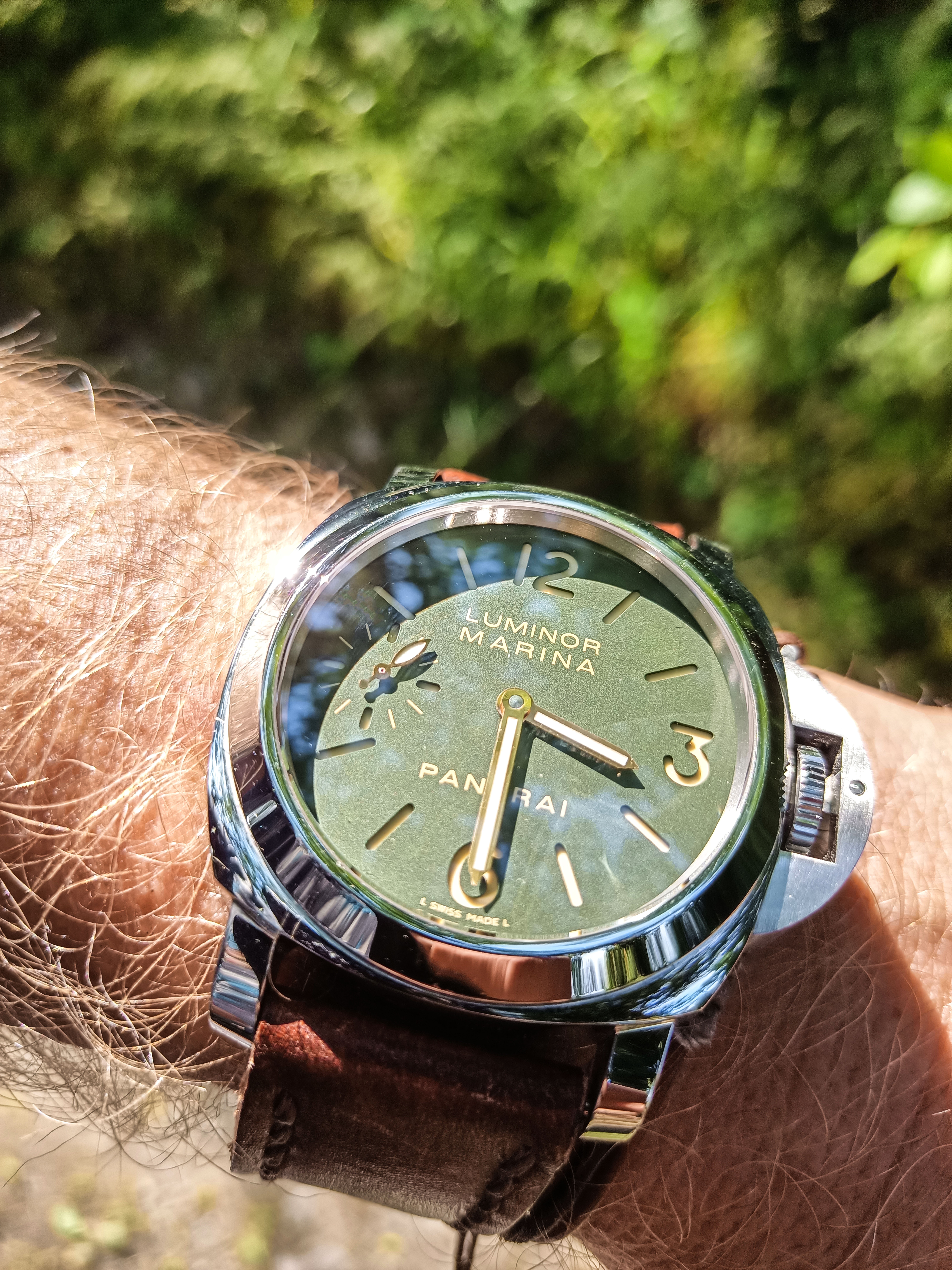
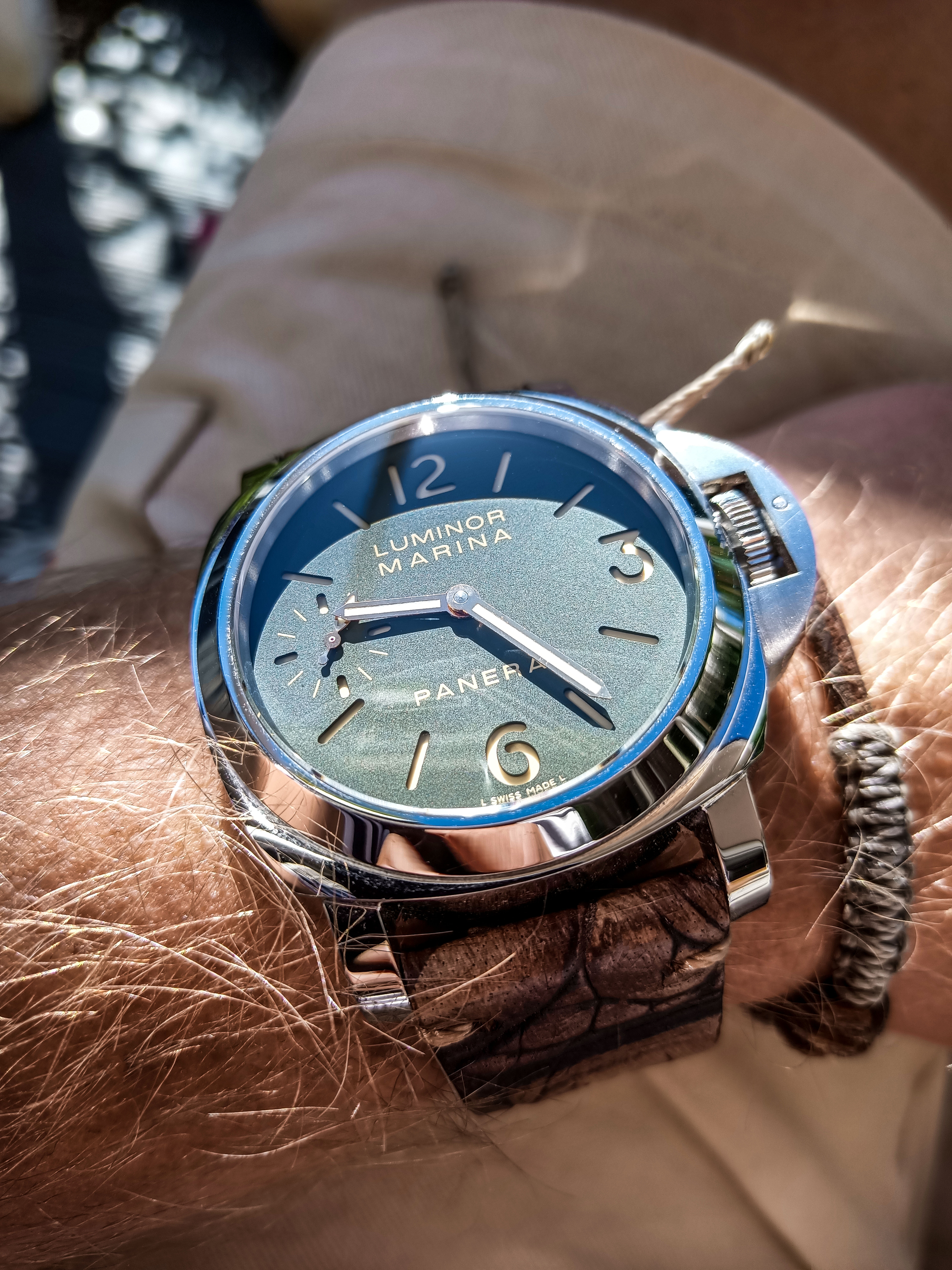
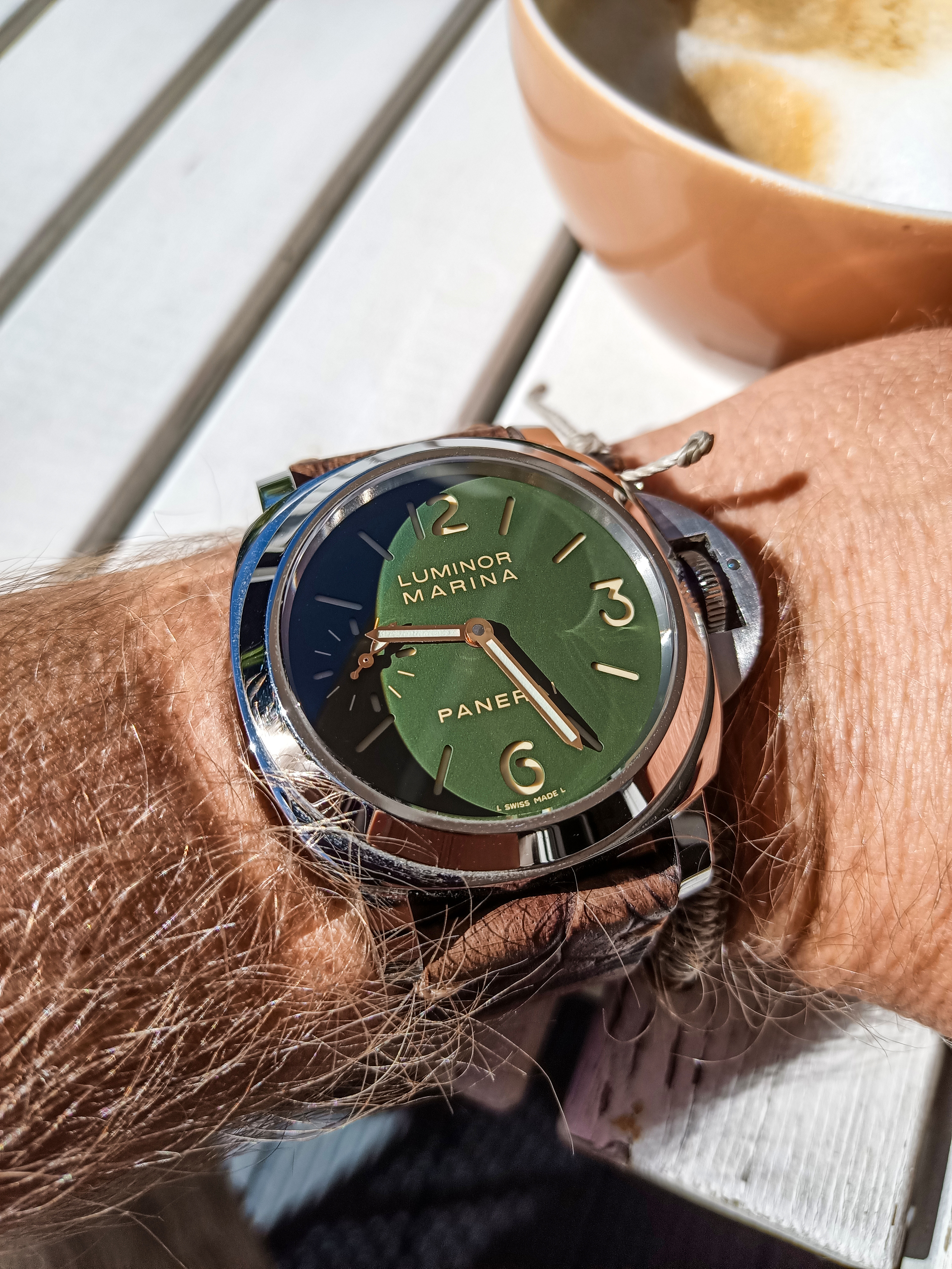
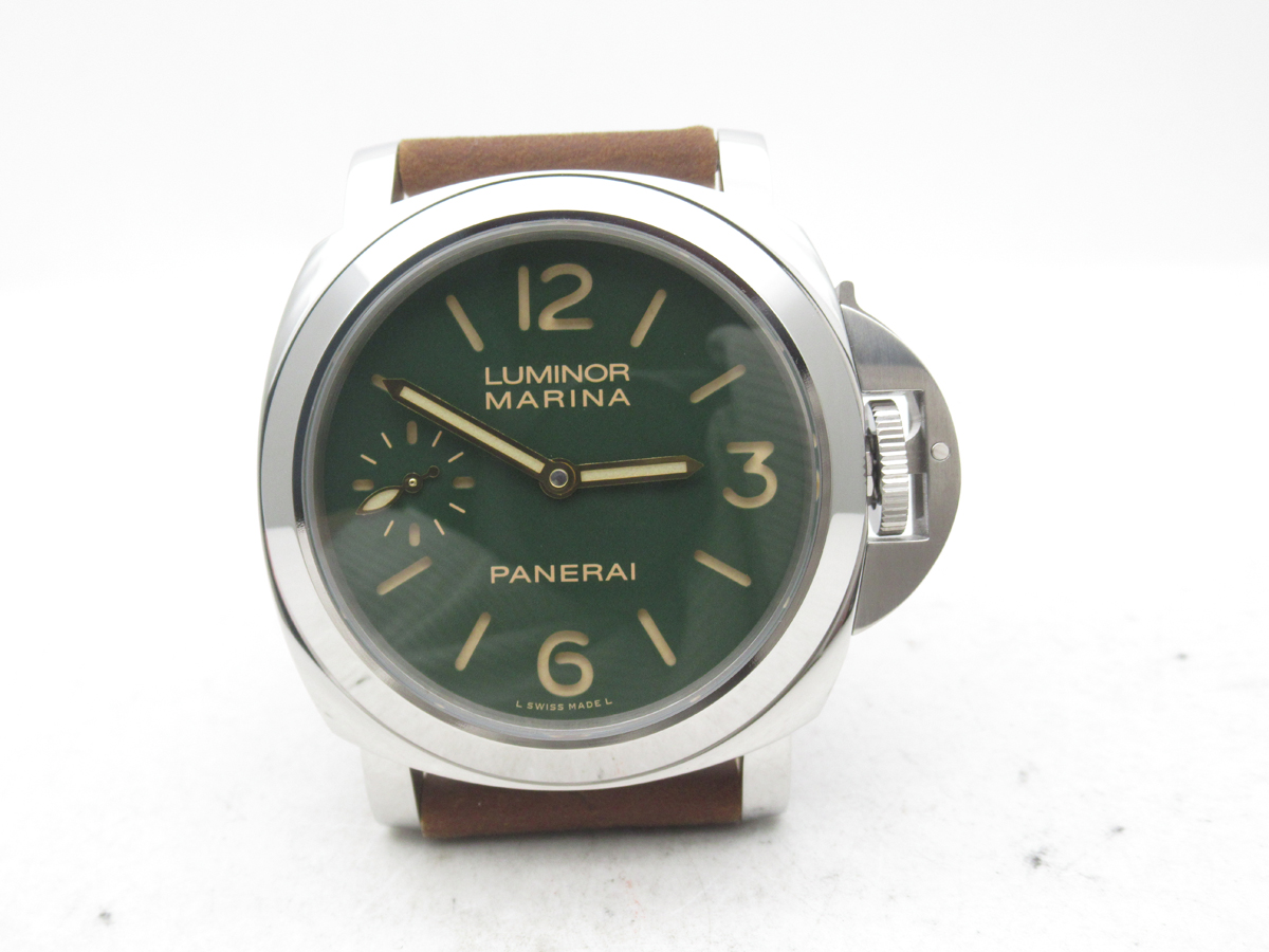
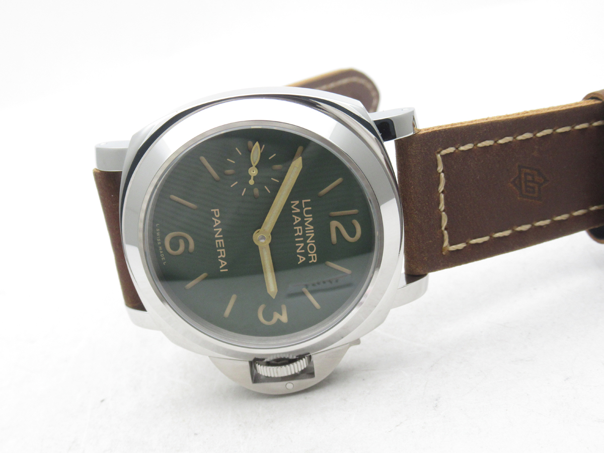
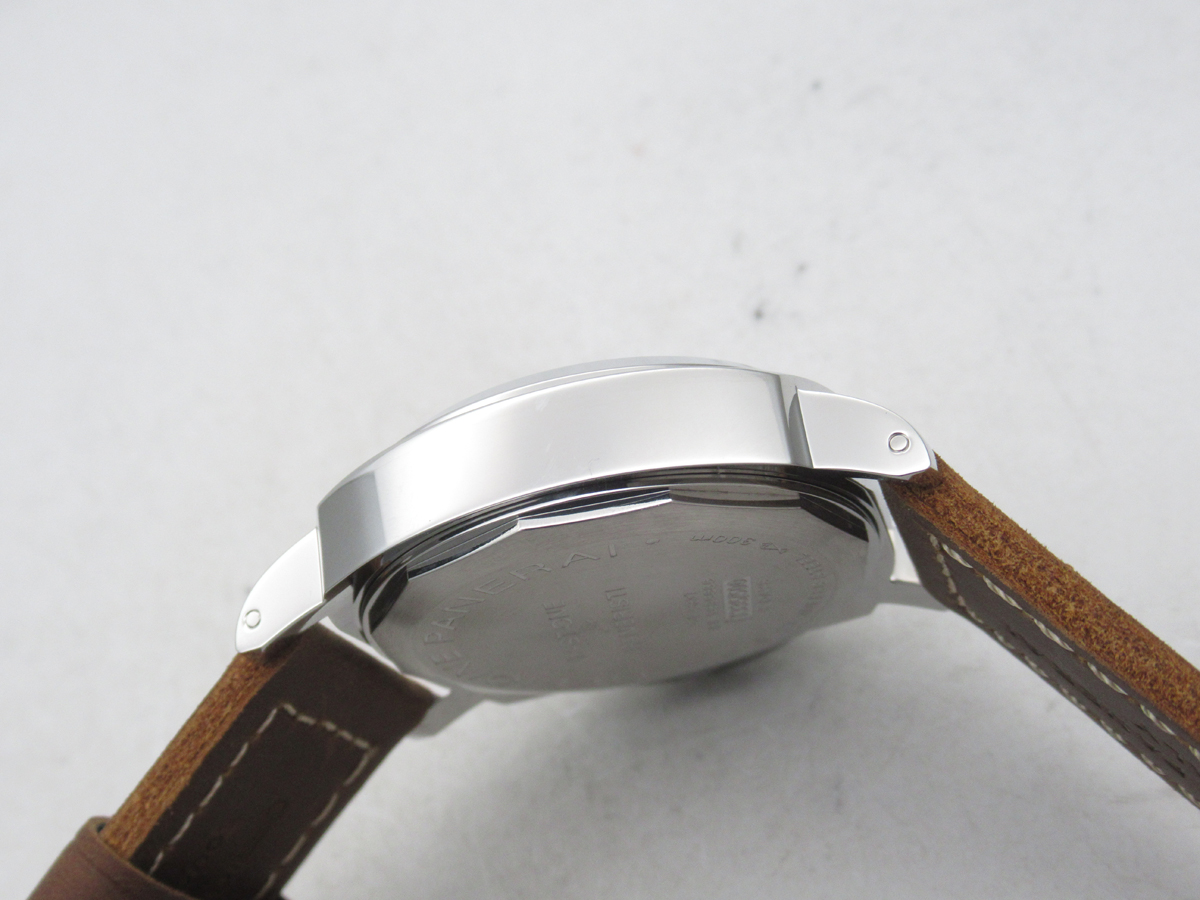
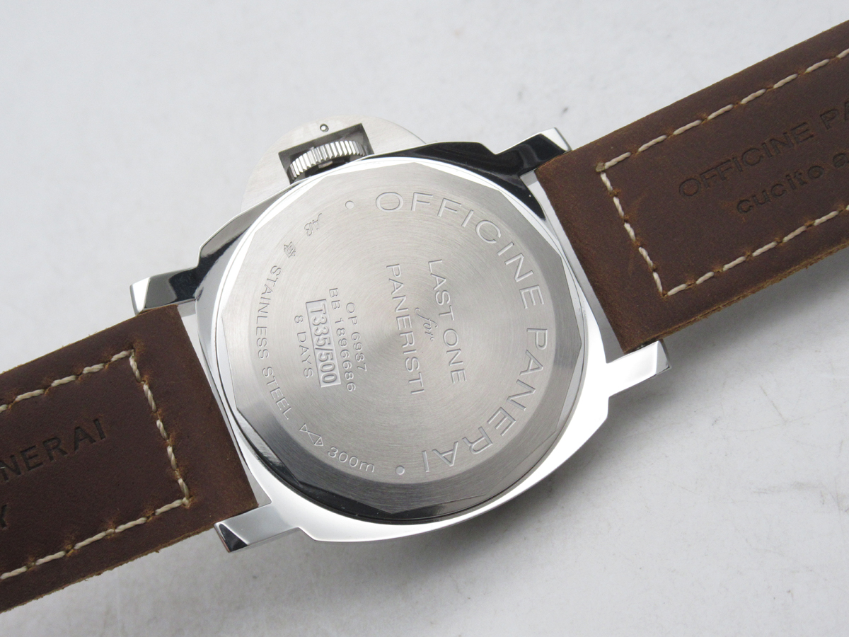
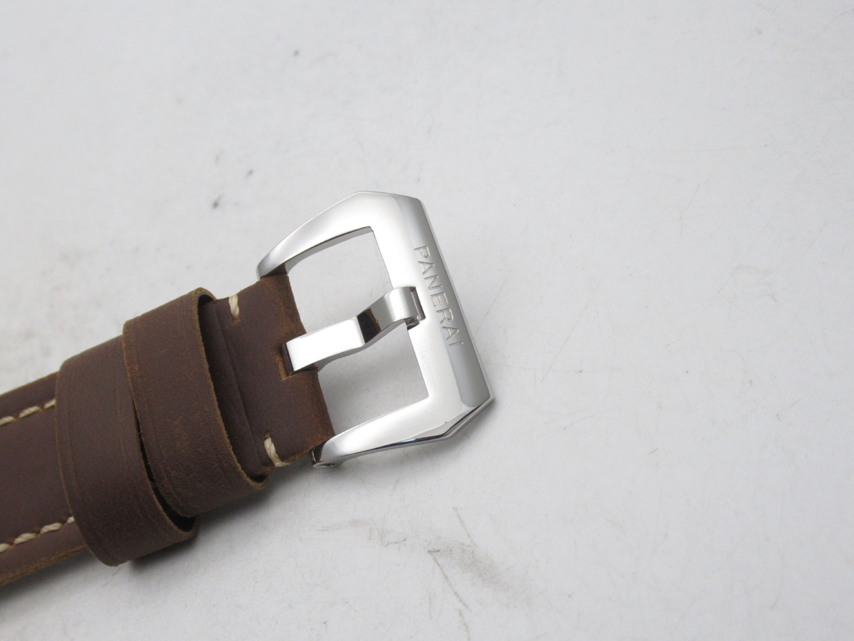
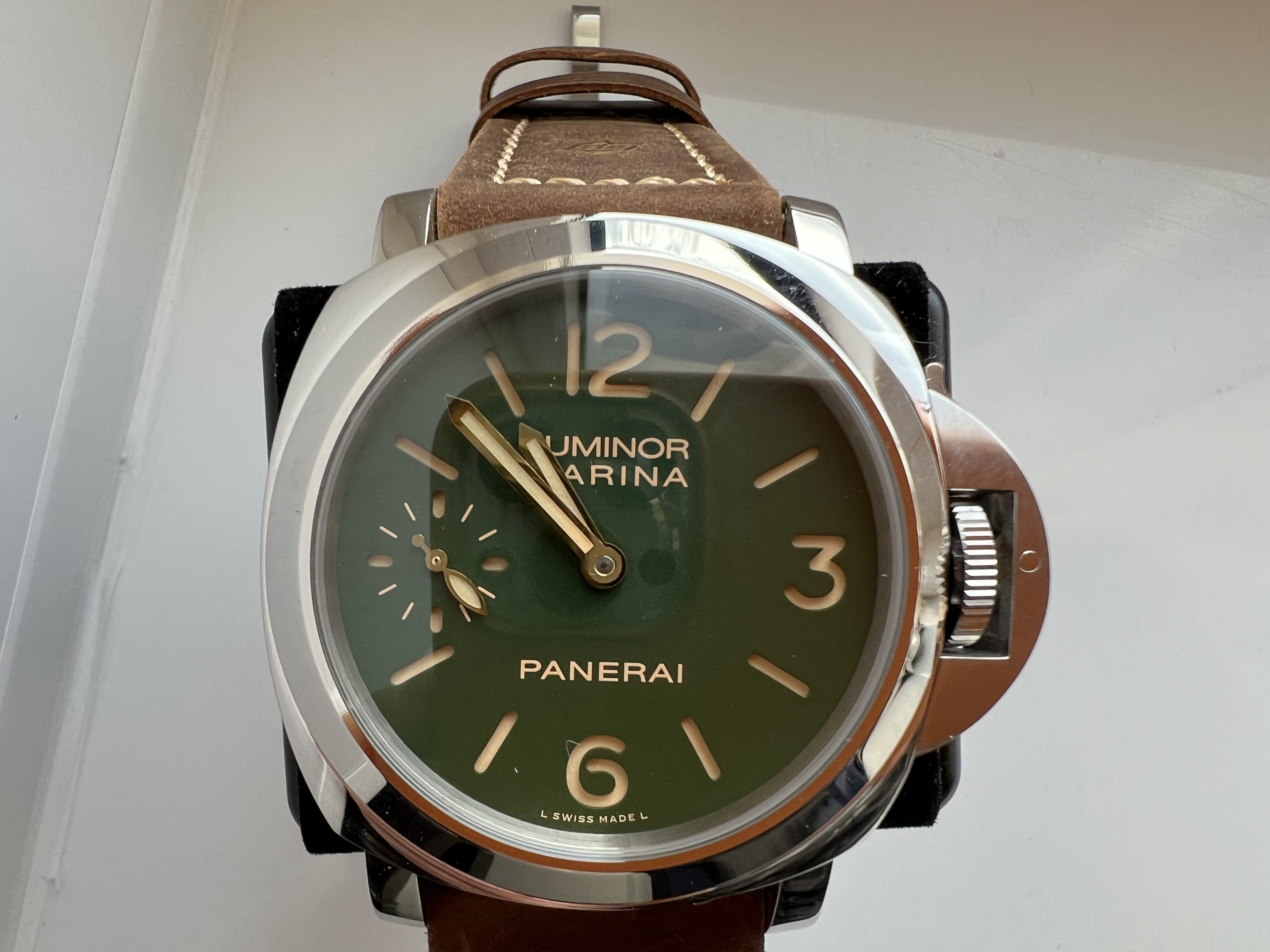
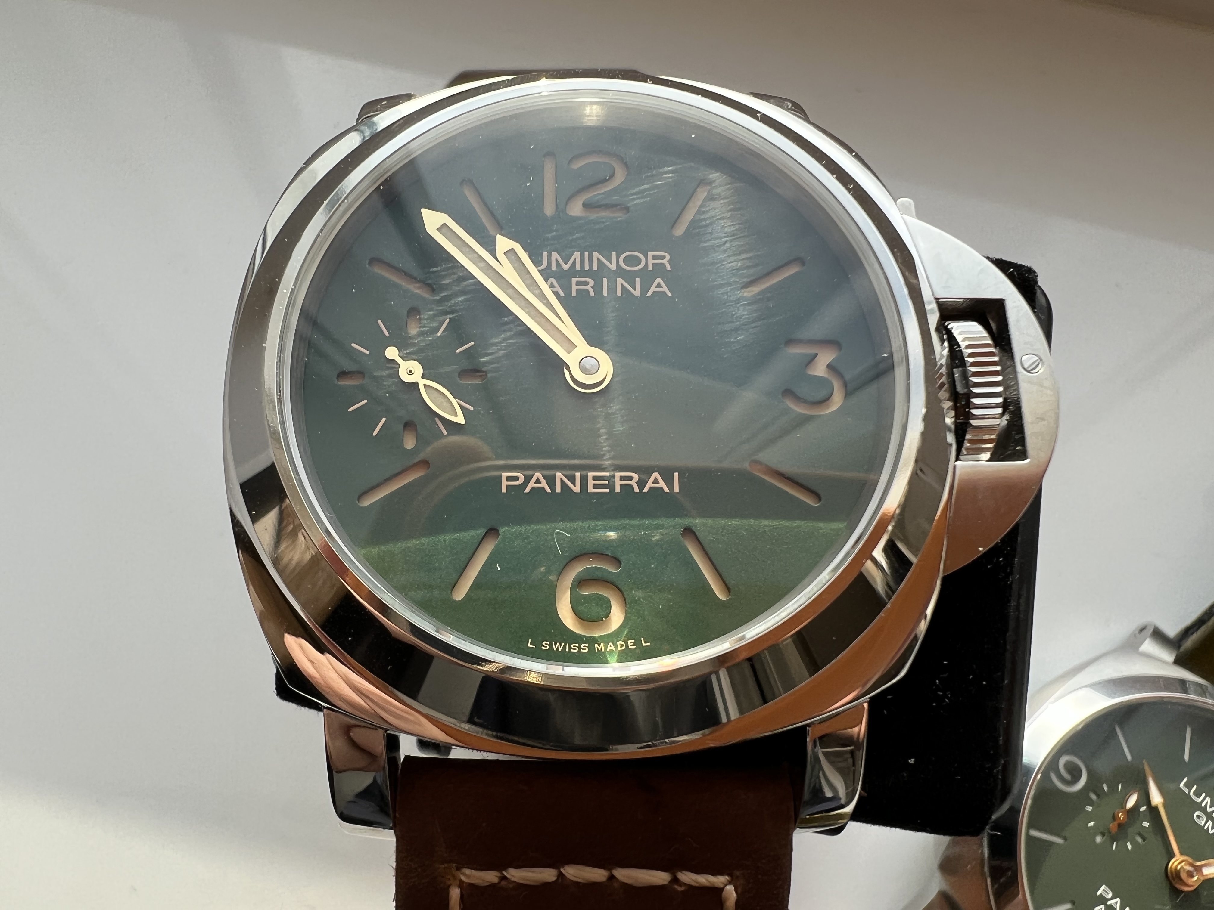
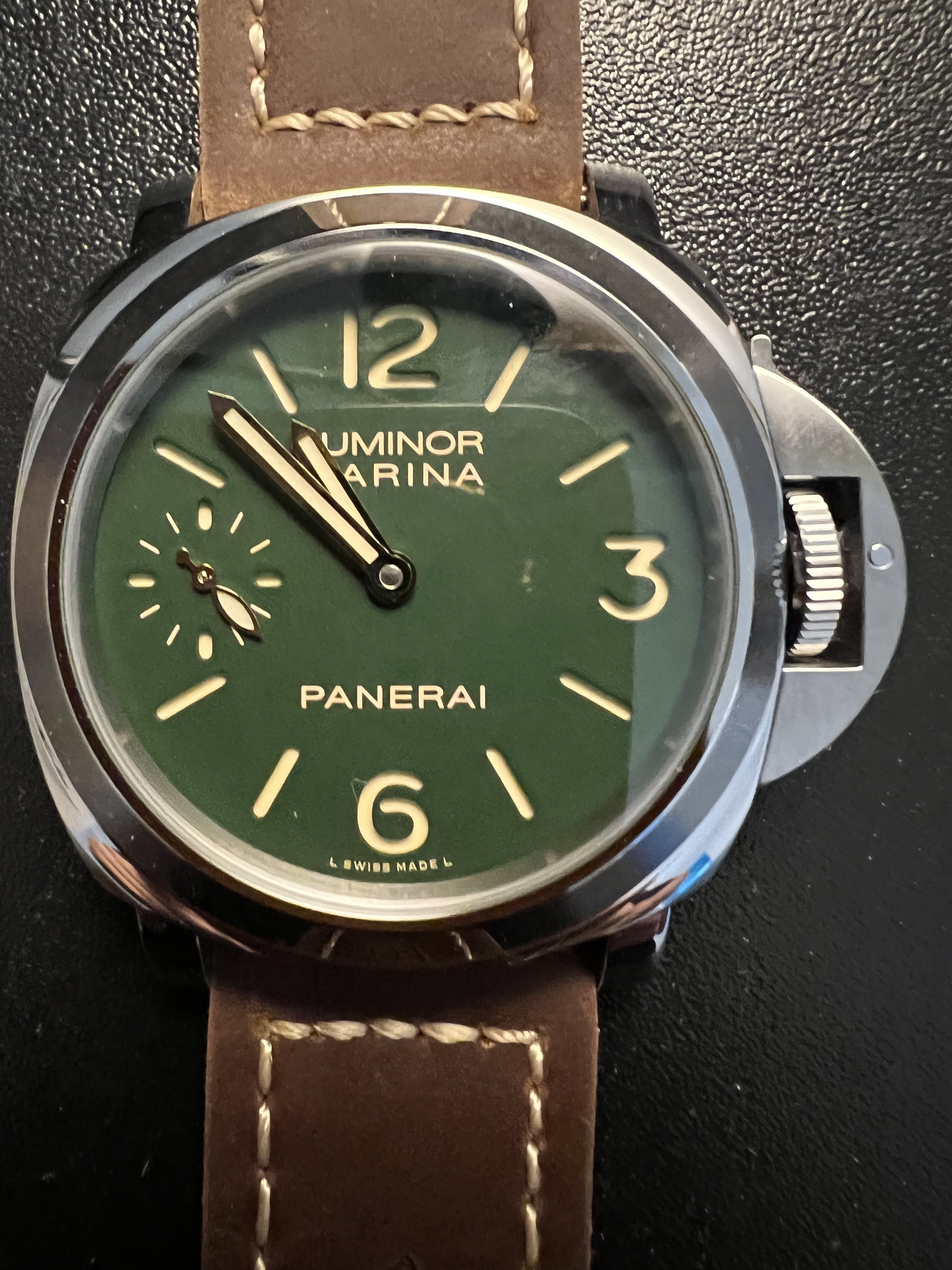
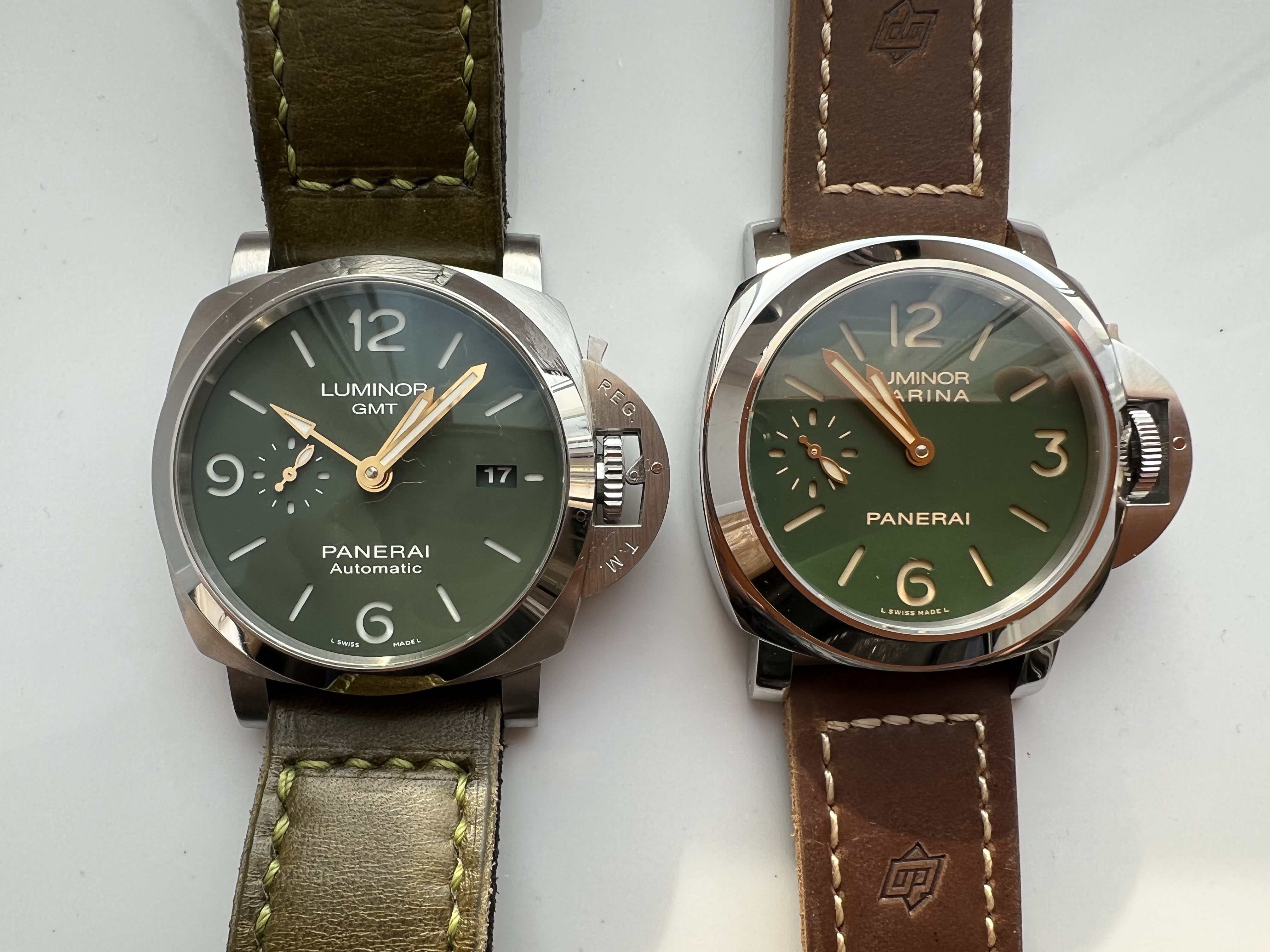
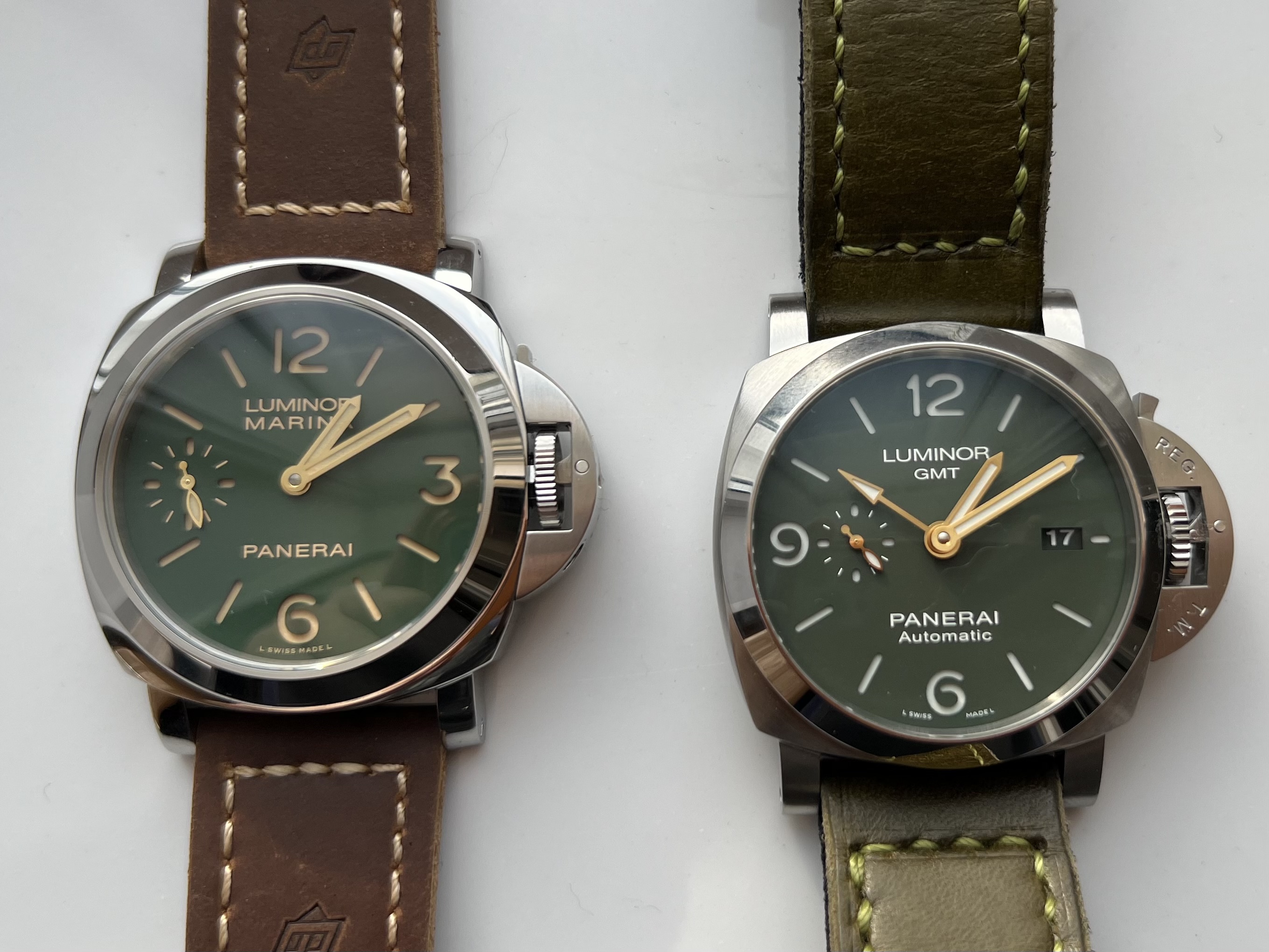
This isn’t terrible. In fact, I’m liking the looks of this. The dial does look green but it could photo differently than it looks in real life. The bezel silhouette looks off. But it’s not terrible.
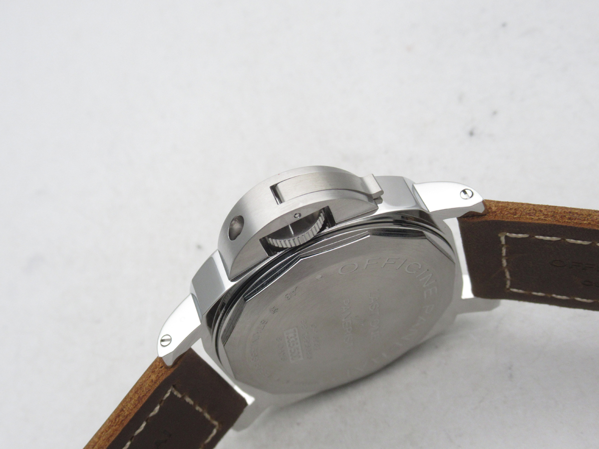
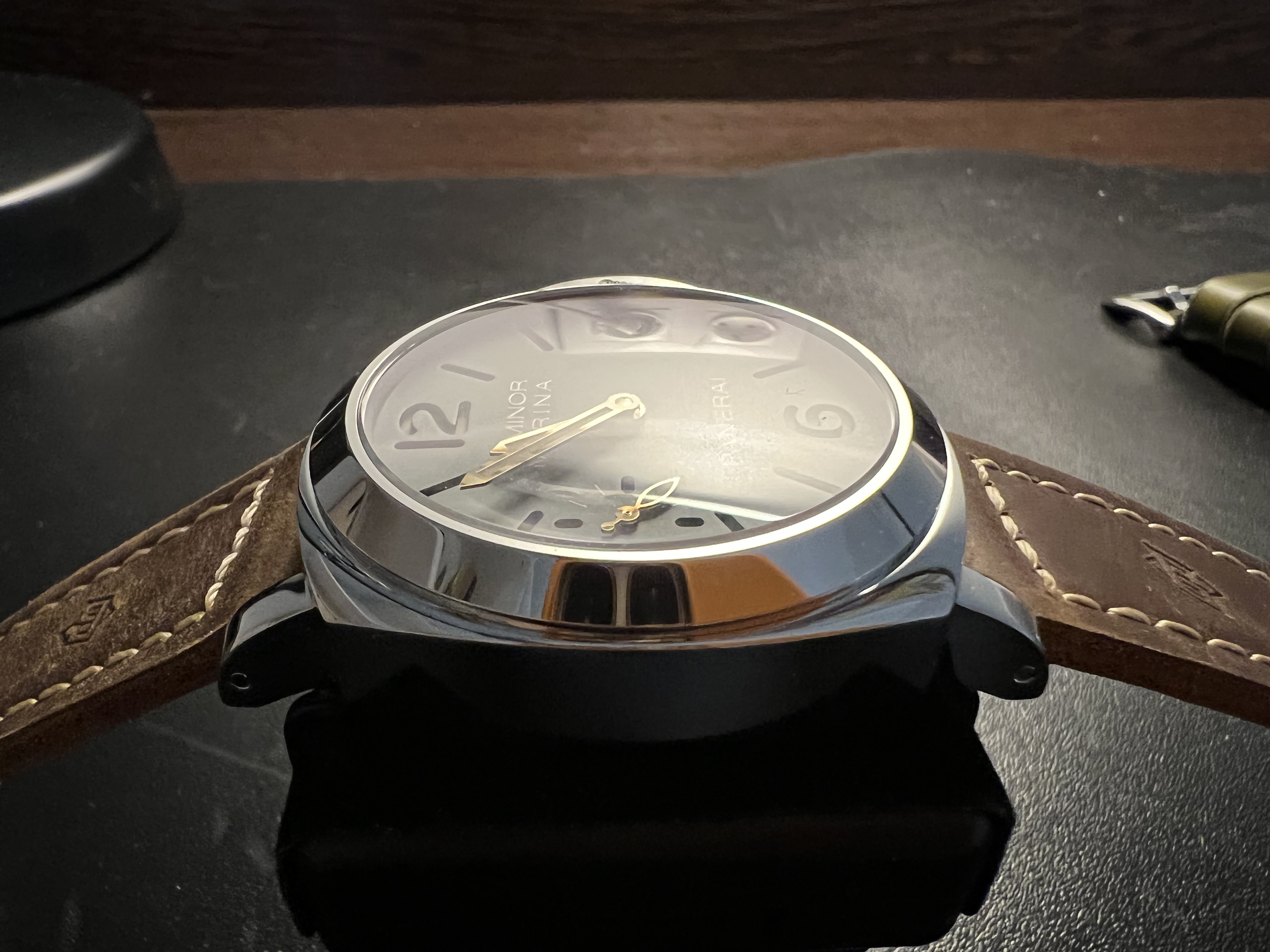
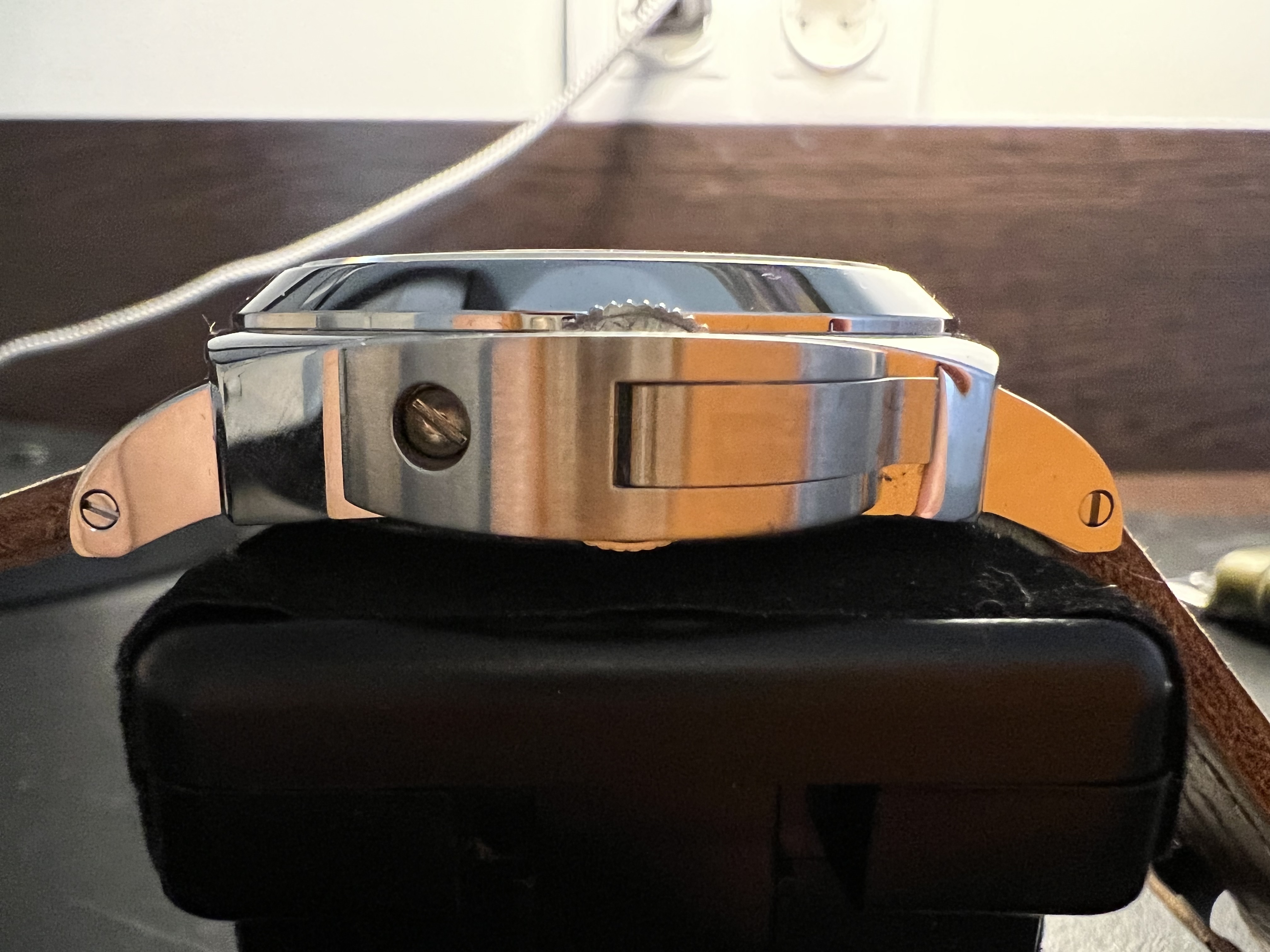
From watching the video, I have not yet been able to see the video on the CG lever (you cannot see its pin from the end, but when you open it, you can see it if there is one), and I am not very pleased with the AR blue tint at certain angles (apparently, as on all HWF crystals), which obviously should not be in GEN. In general, a crystal for 8 days should also not have a fish-eye effect, so it's far from ideal here, but even so ...
If I see useful photos somewhere, I will definitely share them.
If I see useful photos somewhere, I will definitely share them.
- 27/5/13
- 1,227
- 818
- 113
Let me know when you are fed up with her JayBee0815
Sent from my SM-G998B using Tapatalk
Begemotovn
Do not accept unsolicited offers
- 30/3/21
- 12
- 12
- 3
Hi, guys! Found a short video regarding pam 911: https://vtrtimewatch.io/pam-911-ss-hwf-11-best-edition-on-brown-leather-strap-a6497.html
Unfortunately, all the flaws mentioned above by mr. Kot seem to be present: bold fonts, lever roller absence, slightly different dial color etc. Even so, have ordered watch from Trustytime Andrew and waiting for qc pics - half a loaf is better than no bread
Unfortunately, all the flaws mentioned above by mr. Kot seem to be present: bold fonts, lever roller absence, slightly different dial color etc. Even so, have ordered watch from Trustytime Andrew and waiting for qc pics - half a loaf is better than no bread
papabear244
Renowned Member
- 17/11/20
- 527
- 157
- 43
Leave it to HWF to buck it up big time, same with the 779. But between the two i would pick the 779, this is just too green.
Sent from my iPhone using Tapatalk
Sent from my iPhone using Tapatalk
Hi, guys! Found a short video regarding pam 911: https://vtrtimewatch.io/pam-911-ss-hwf-11-best-edition-on-brown-leather-strap-a6497.html
Unfortunately, all the flaws mentioned above by mr. Kot seem to be present: bold fonts, lever roller absence, slightly different dial color etc. Even so, have ordered watch from Trustytime Andrew and waiting for qc pics - half a loaf is better than no bread
Post qc pics after you approved them. In my opinion. only concern is dial color. I could live with slightly thicker numeral or absence of lever roller.
papabear244
Renowned Member
- 17/11/20
- 527
- 157
- 43
A fine gentleman in Reddit posted some pics of his HWF 911. Since it’s Reddit, it’s pretty much public domain.
https://www.reddit.com/r/RepTime/co...urce=share&utm_medium=ios_app&utm_name=iossmf
I wonder if by applying a matte coat I can make the dial appear darker, but that would affect the finish and the lettering too.
Sent from my iPhone using Tapatalk
https://www.reddit.com/r/RepTime/co...urce=share&utm_medium=ios_app&utm_name=iossmf
I wonder if by applying a matte coat I can make the dial appear darker, but that would affect the finish and the lettering too.
Sent from my iPhone using Tapatalk
Thanks for sharing.
I think you can try everything, but it will not give the desired result.
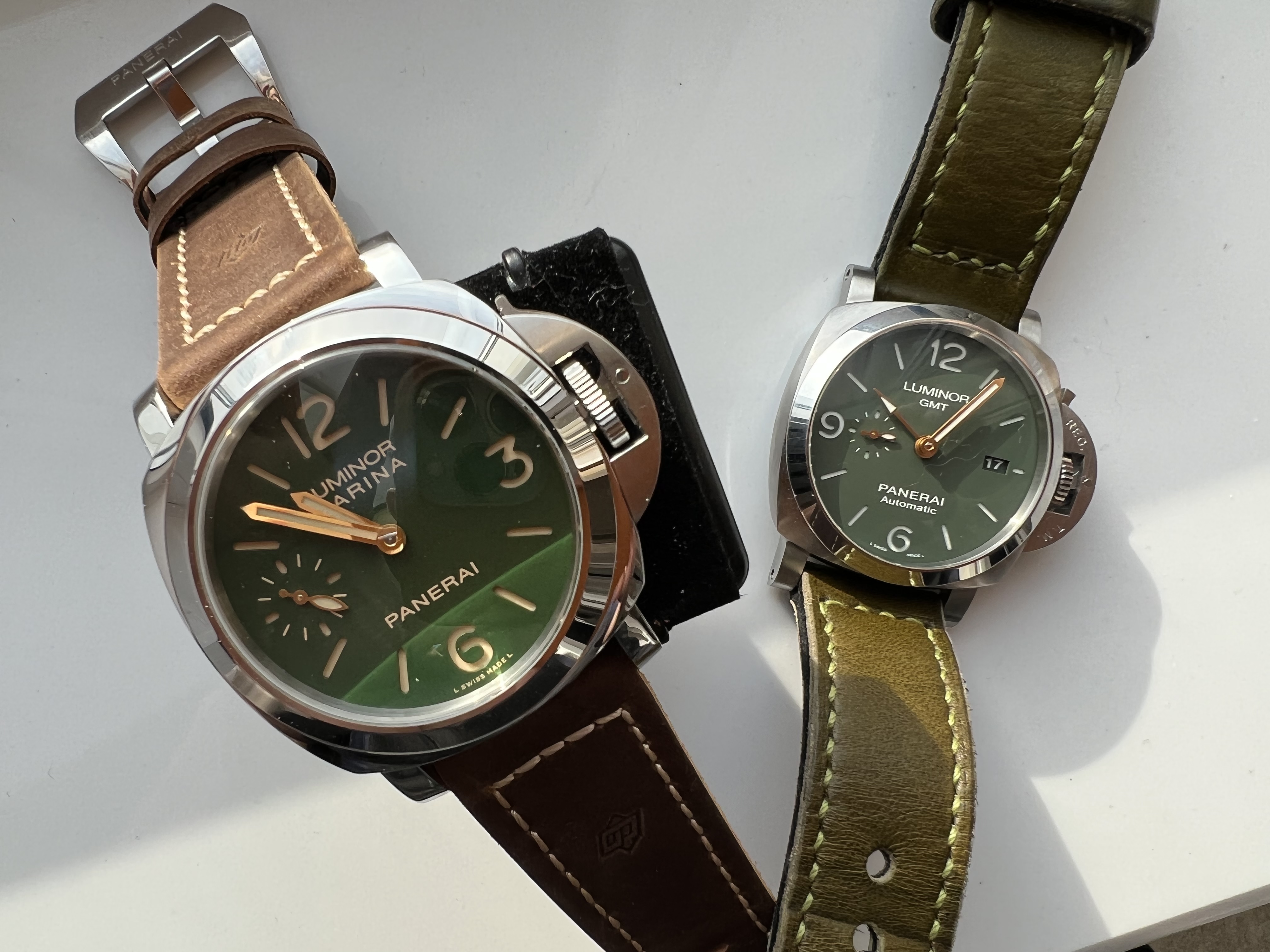
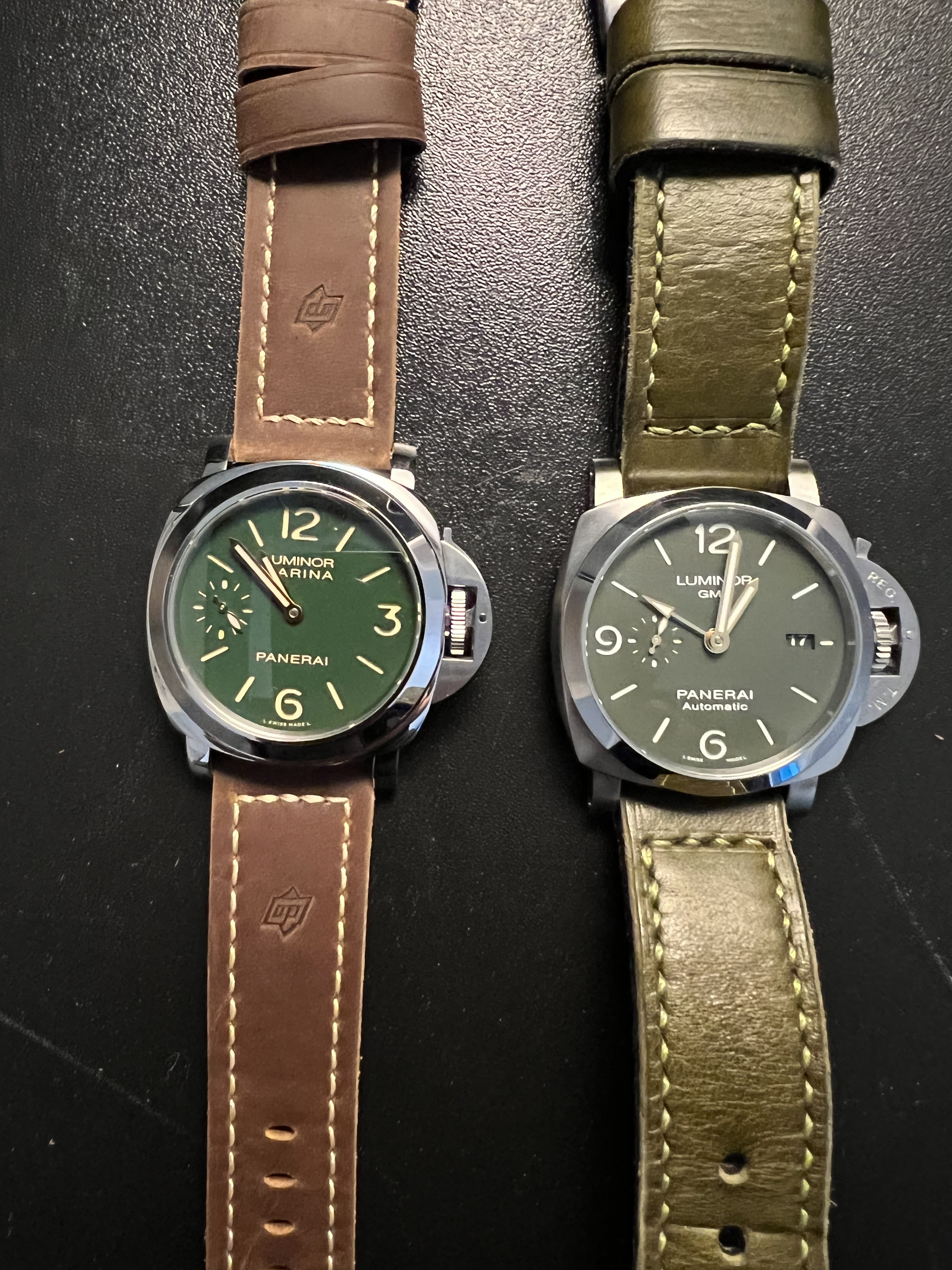
The dial should be not just darker, but richer in this color. I'm not a colorist and I don't make watches myself, but I'm pretty sure that at an amateur level, you can change something, but not make it closer to gen.
However, I understand what is being said, and the color HF will look cheaper than GEN, but I also found NOOB perfect in this.
It would be extremely interesting if someone showed NOOB and HWF in the one shot, with the same lighting side by side. Better yet, in different light conditions.
papabear244
Renowned Member
- 17/11/20
- 527
- 157
- 43
You’re right KOT, I was just thinking it wasn’t too bad after all. If I’m able to take that green just one notch down, that would be good for me. But then again, why bother. I’m sure someone will release a better version in the future. Or not.
Sent from my iPhone using Tapatalk
Sent from my iPhone using Tapatalk
Begemotovn
Do not accept unsolicited offers
- 30/3/21
- 12
- 12
- 3
Just made an order through Trusty. Will upload qc and photos when it arrives.
papabear244
Renowned Member
- 17/11/20
- 527
- 157
- 43
Just made an order through Trusty. Will upload qc and photos when it arrives.
How did it go?
Sent from my iPhone using Tapatalk
How did it go?
Sent from my iPhone using Tapatalk
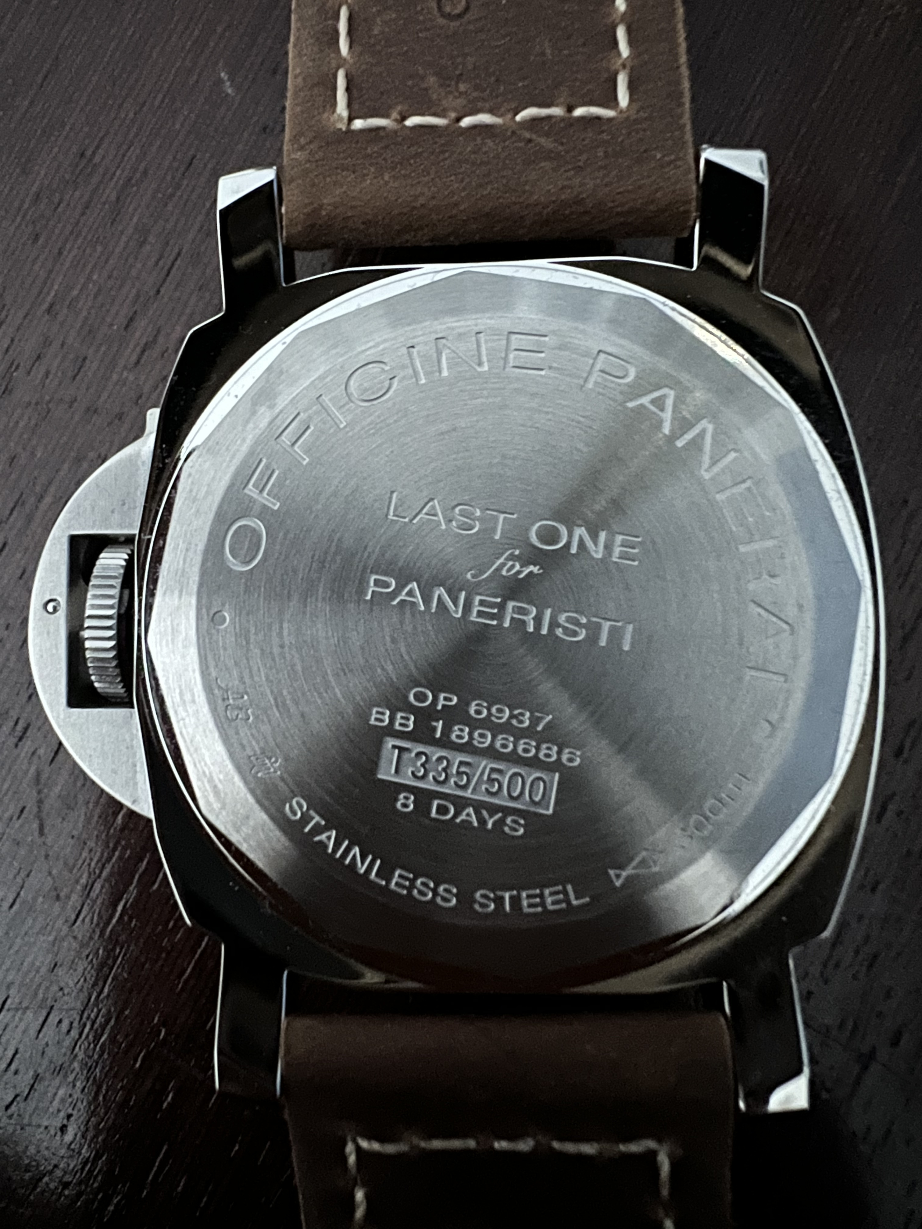
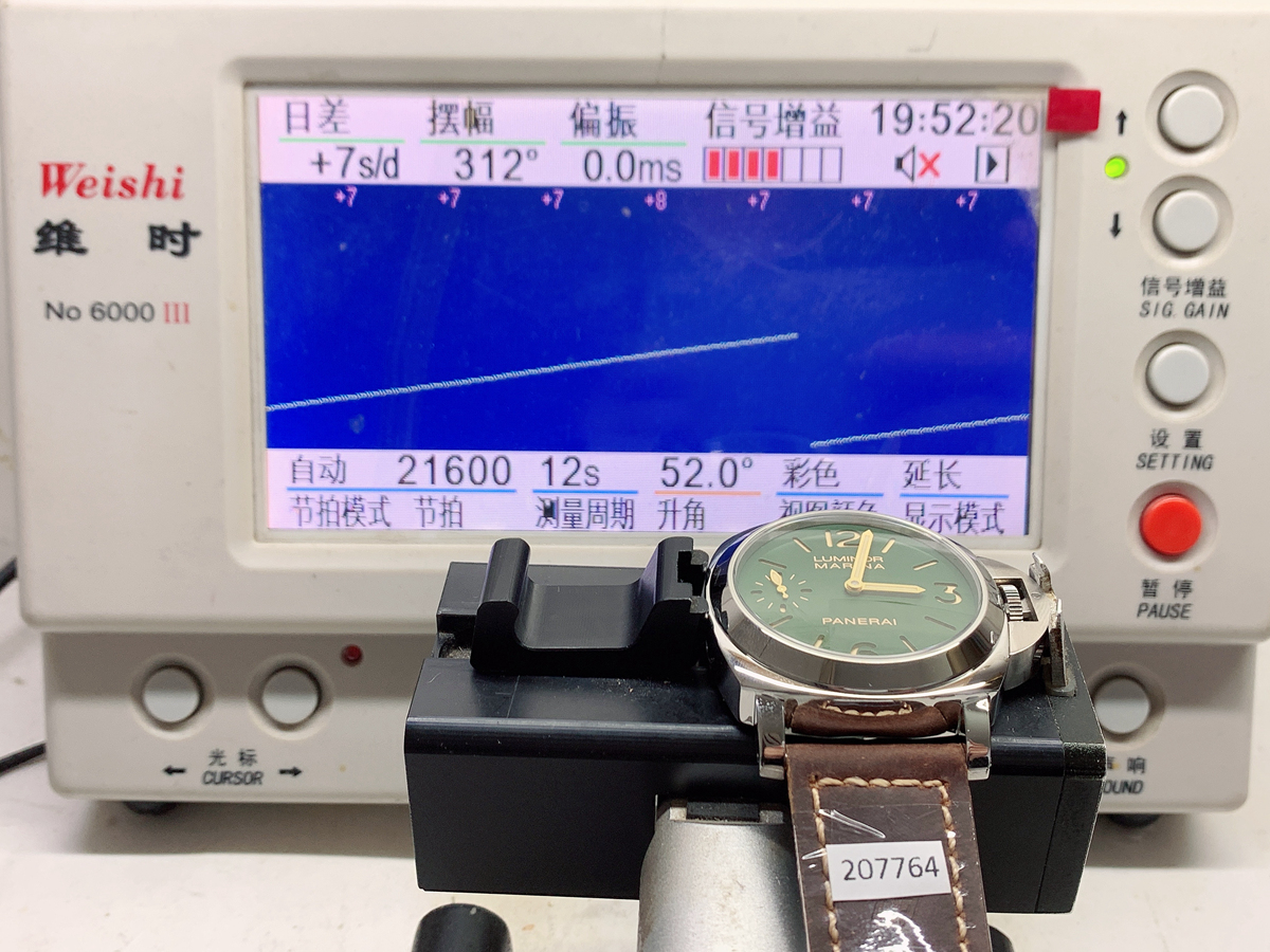
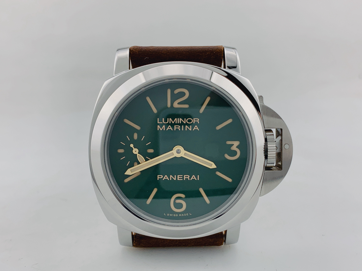
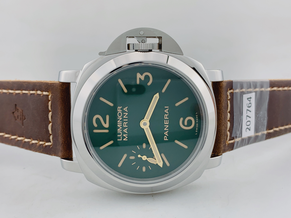
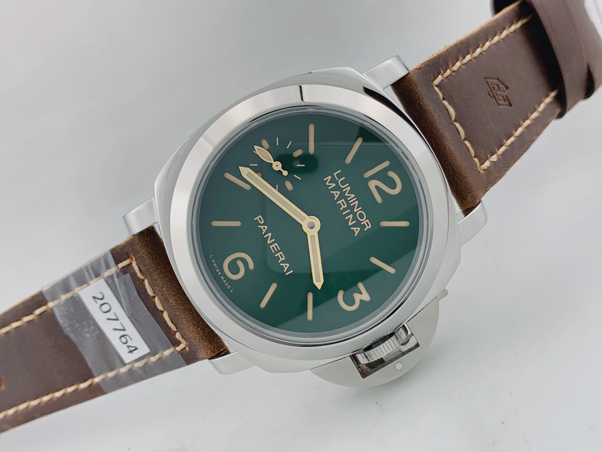
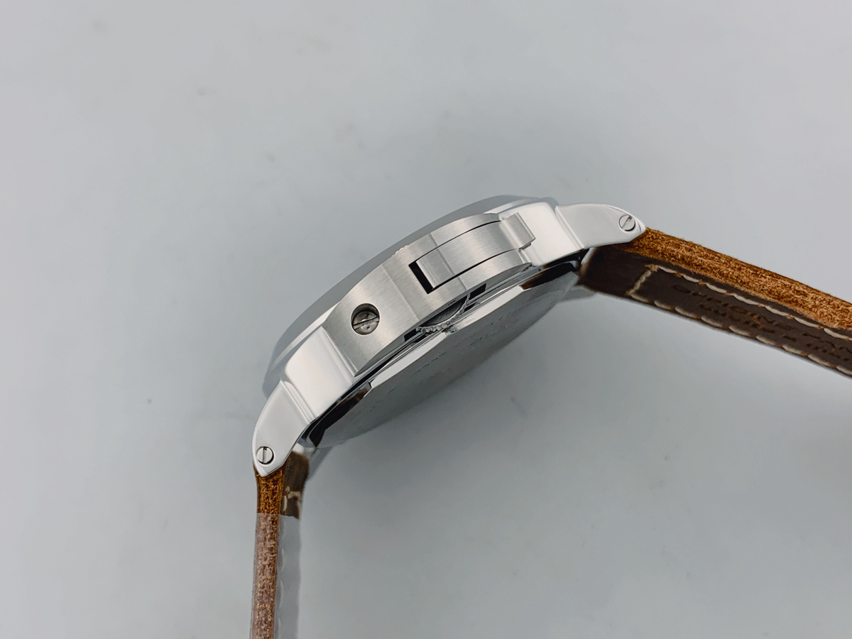
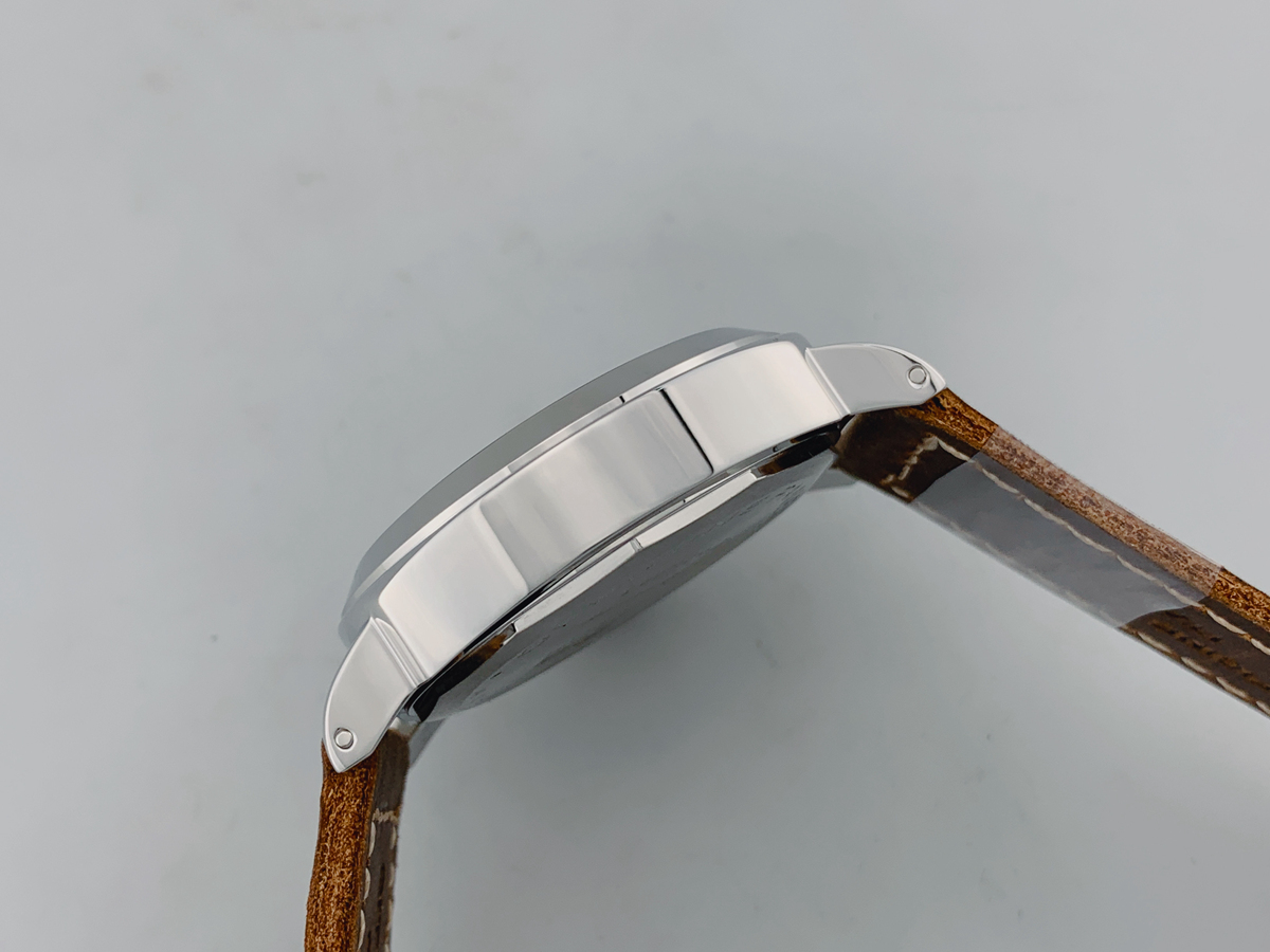
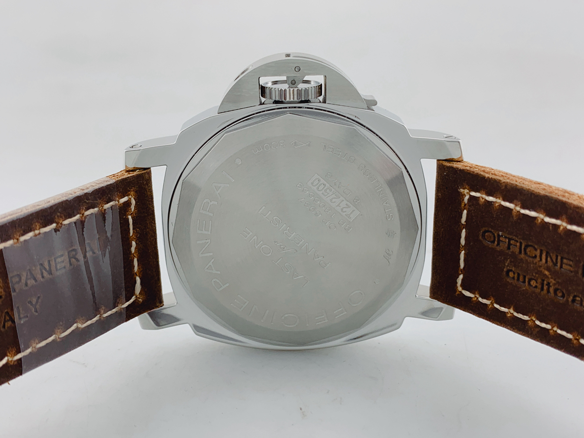
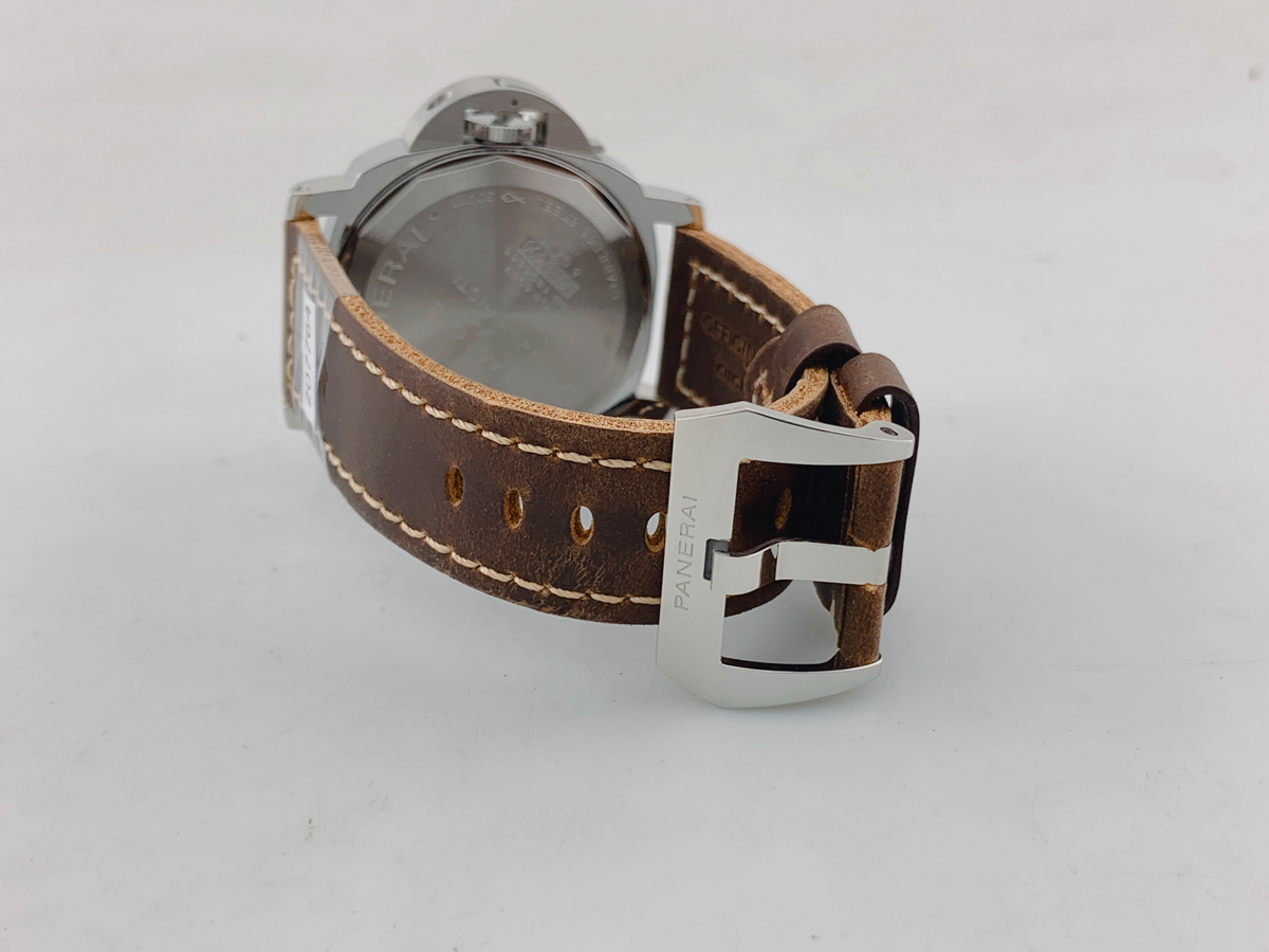
I got my QC from Andrew a few hours ago. It looks a bit foresty but I think thats the lighting.
Begemotovn
Do not accept unsolicited offers
- 30/3/21
- 12
- 12
- 3
Begemotovn
Do not accept unsolicited offers
- 30/3/21
- 12
- 12
- 3


