-
Tired of adverts on RWI? - Subscribe by clicking HERE and PMing Trailboss for instructions and they will magically go away!
You are using an out of date browser. It may not display this or other websites correctly.
You should upgrade or use an alternative browser.
You should upgrade or use an alternative browser.
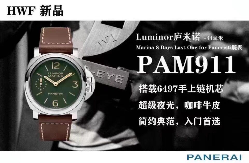
PAM911 [HWF]
- Thread starter KOT1917
- Start date
It's nice to see new Pam reps coming out these days.
Curious to see what HWF will do with that 911.
Envoyé de mon SM-G991B en utilisant Tapatalk
Curious to see what HWF will do with that 911.
Envoyé de mon SM-G991B en utilisant Tapatalk
At least the dial numerals look right, that would be enough for me to push the button, I can always transfer to a better case
Judging by their examples of other releases, this is more of a render. I have no doubt that the final model will look different. In any case, the example of 1084 shows this clearly. I hope the dealers' photos will dispel doubts.
With new photos, it becomes clearer:
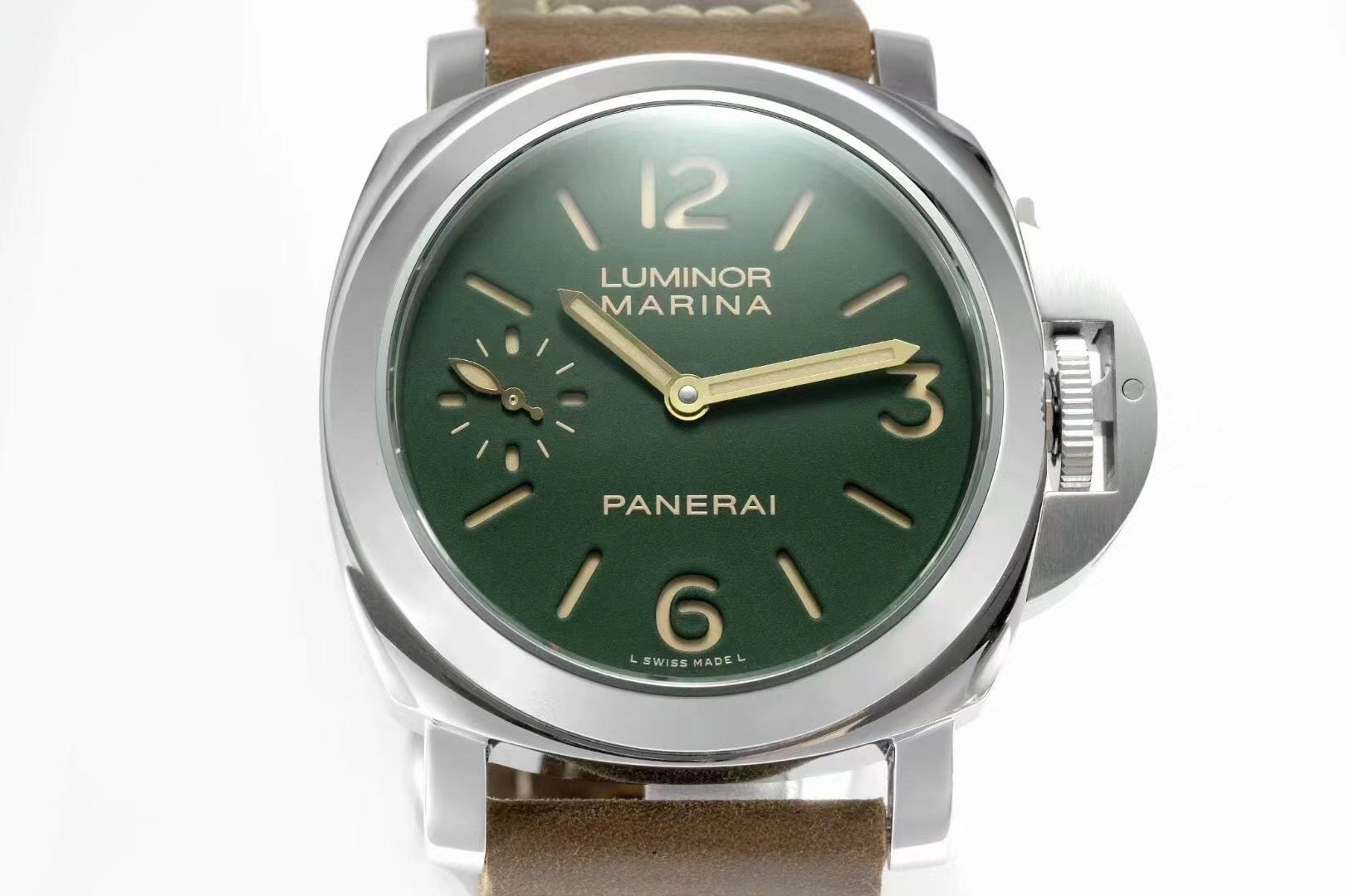
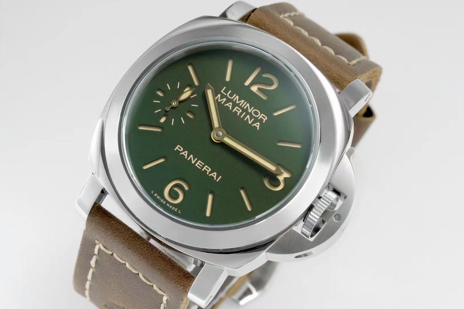
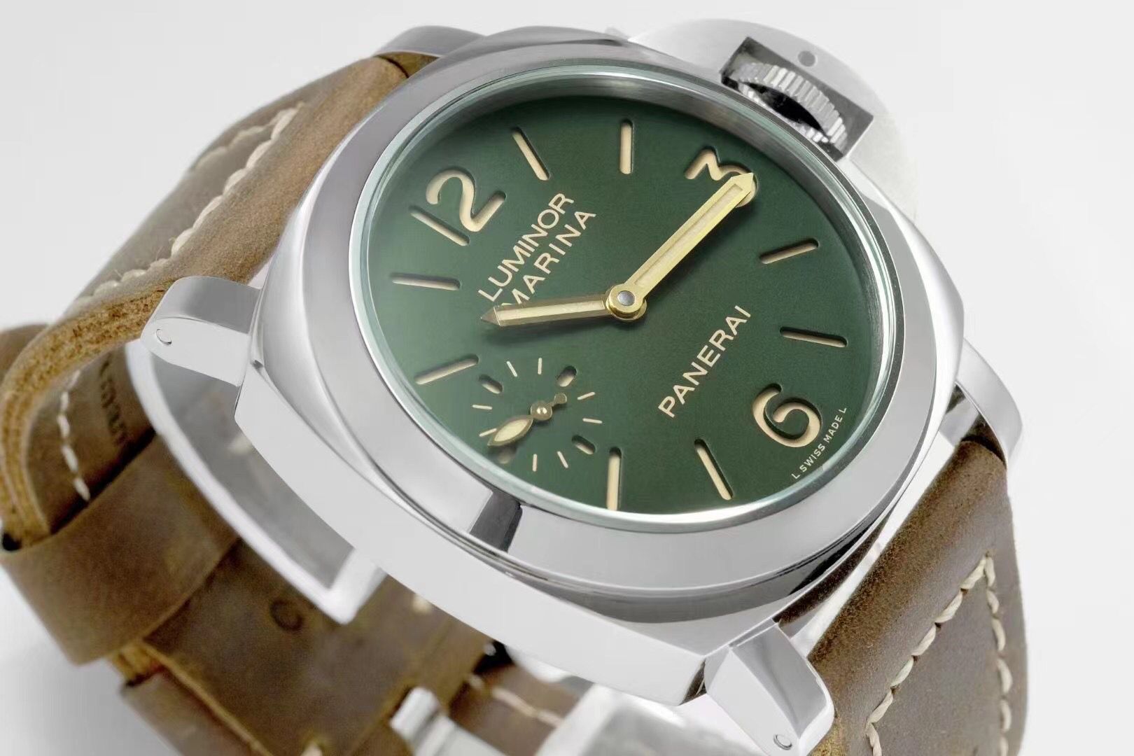
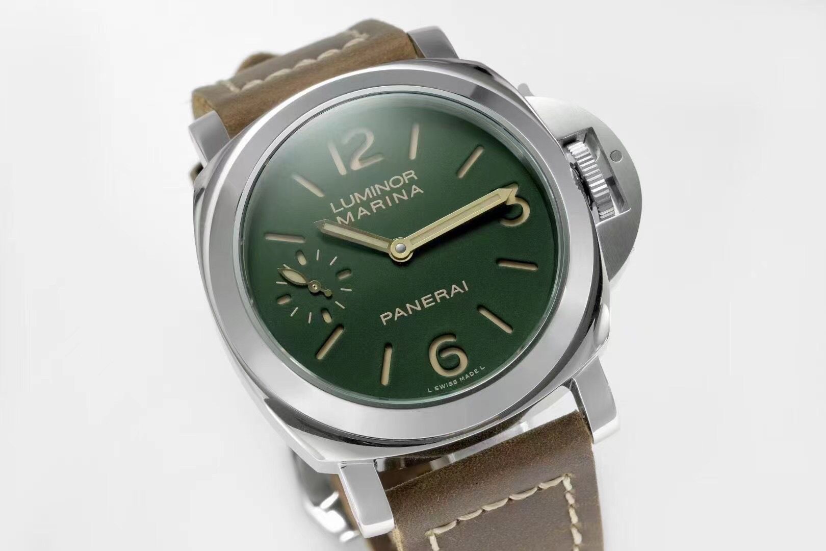
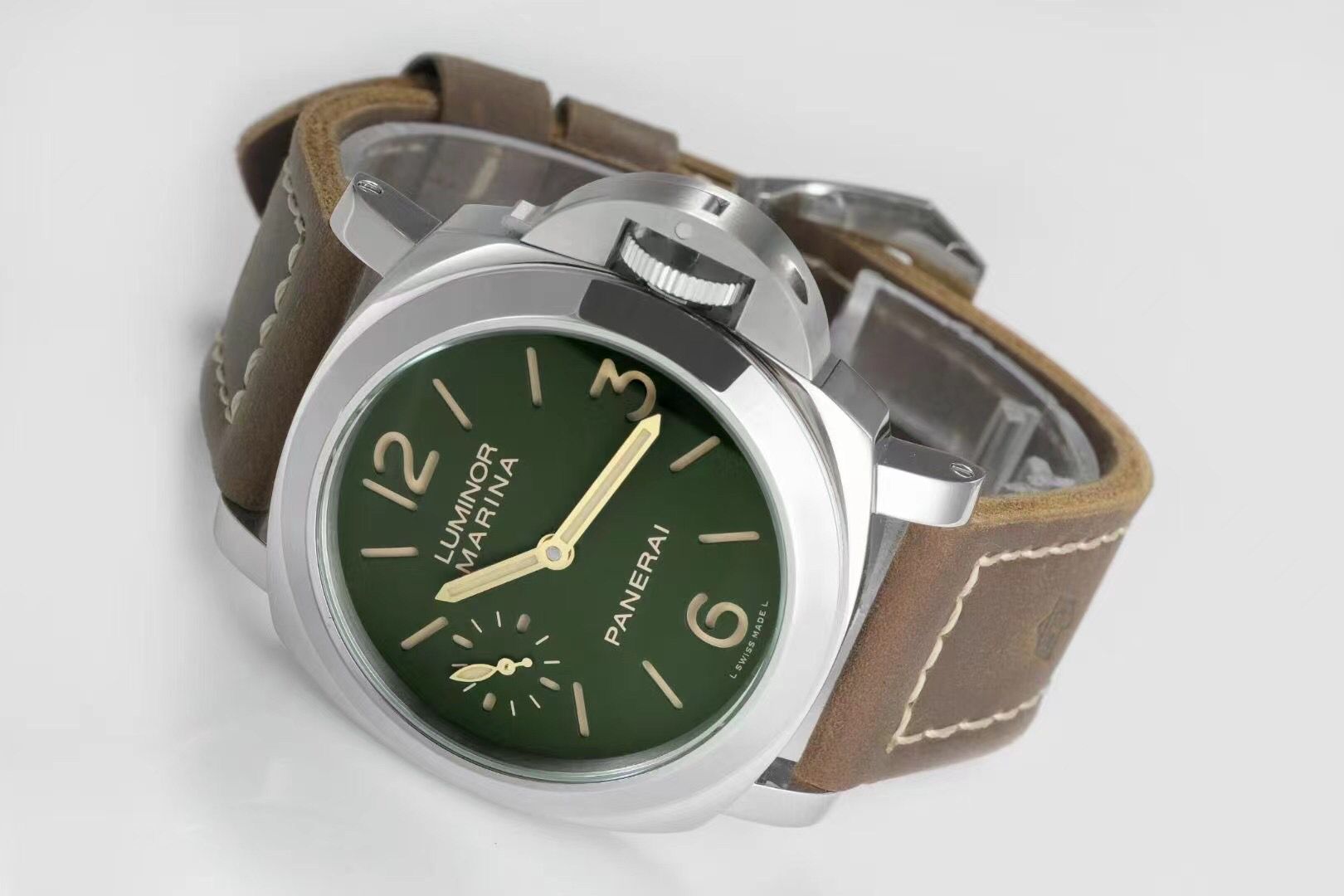
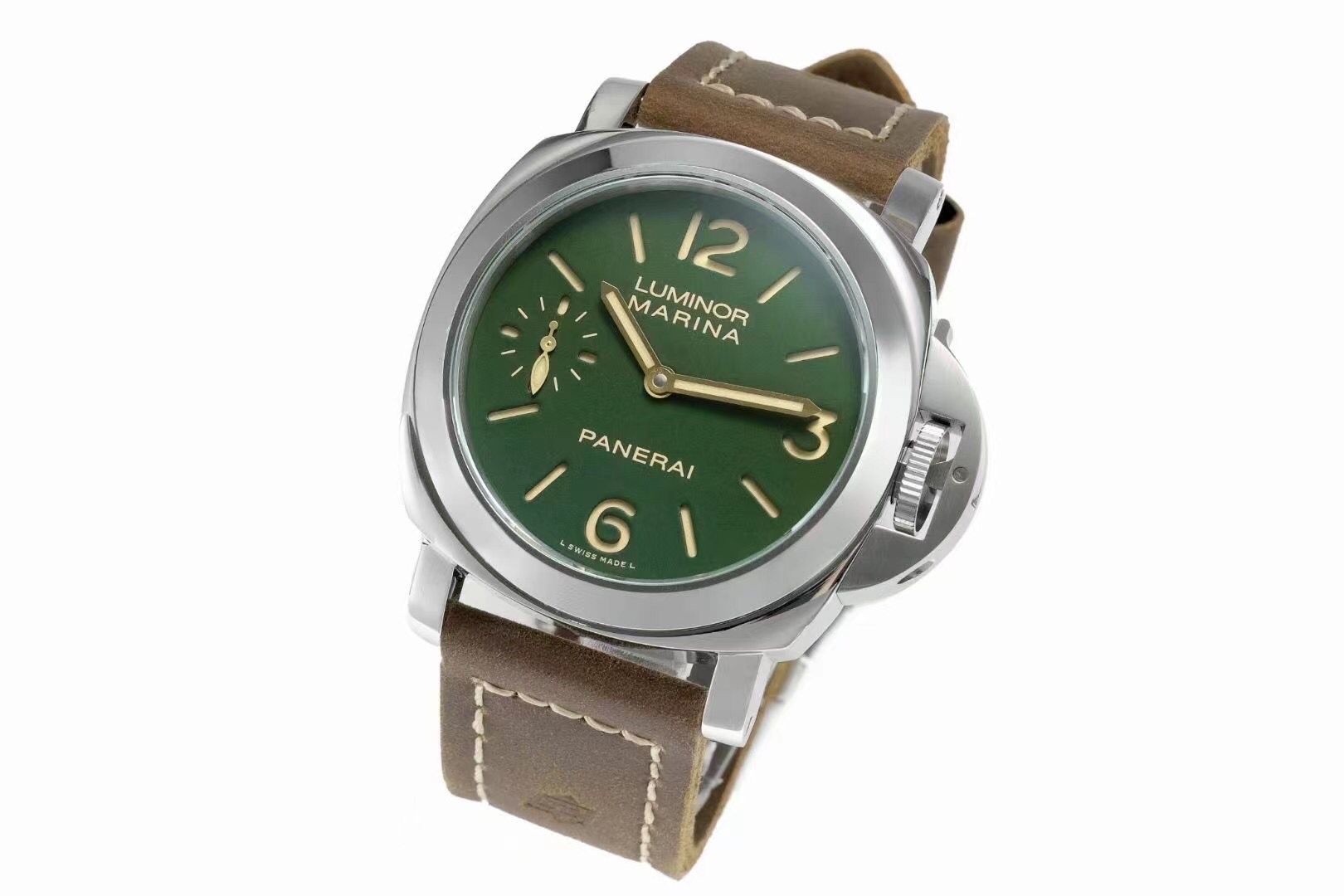
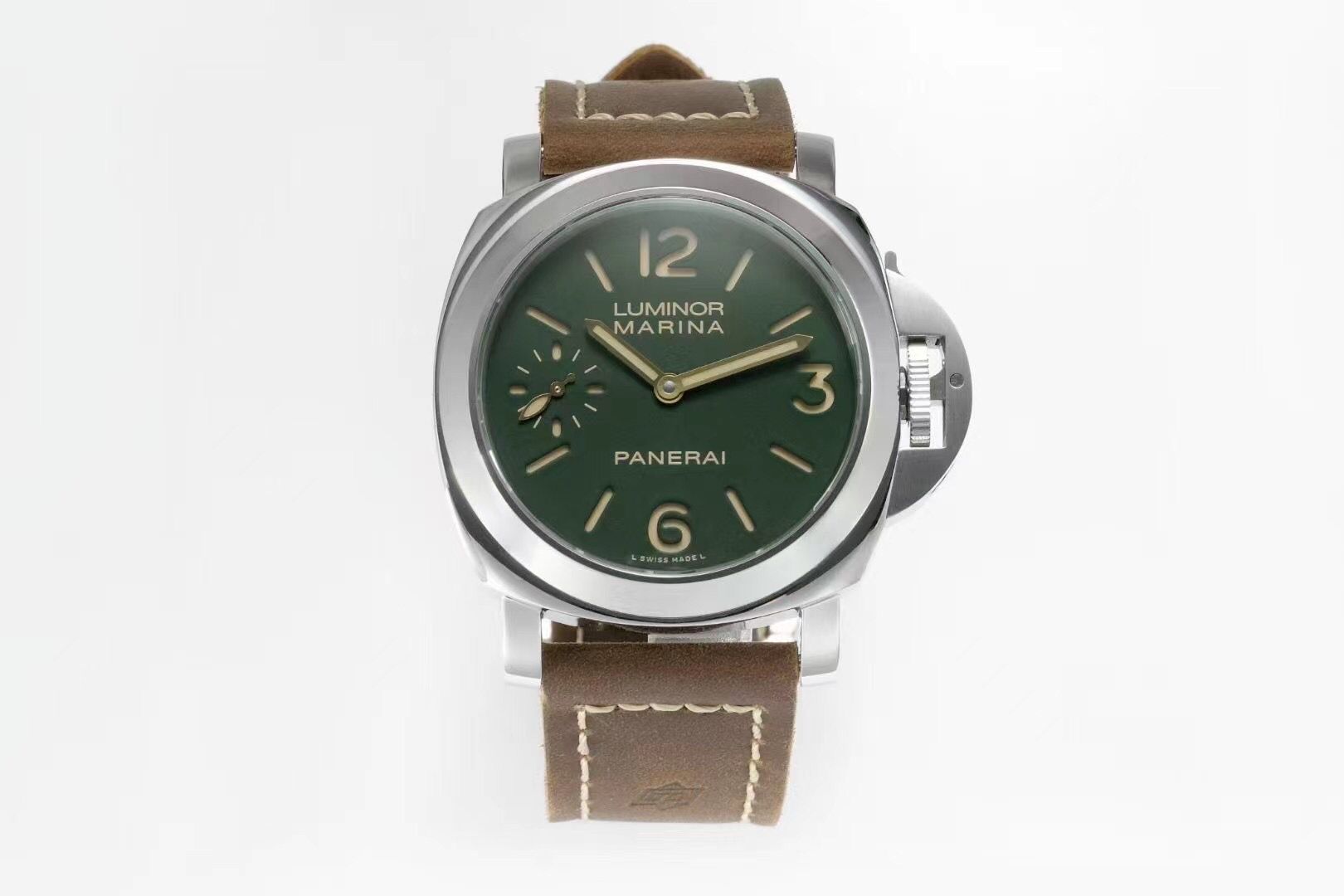
- Dial fonts, hands, sandwich stencil are correct (In outline)
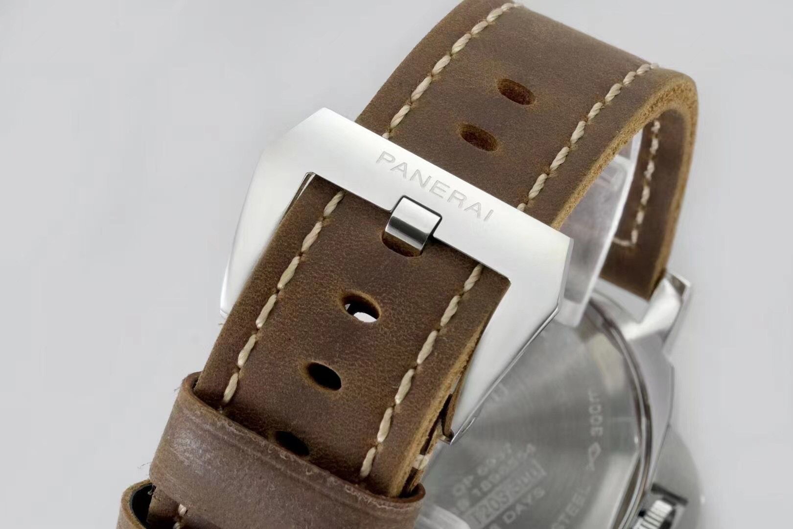
- Of the questions - I have not seen a single photo where it would be obvious that there is a roller on the tip of the CG lever. (I hope someone sees it better than me or adds a photo)
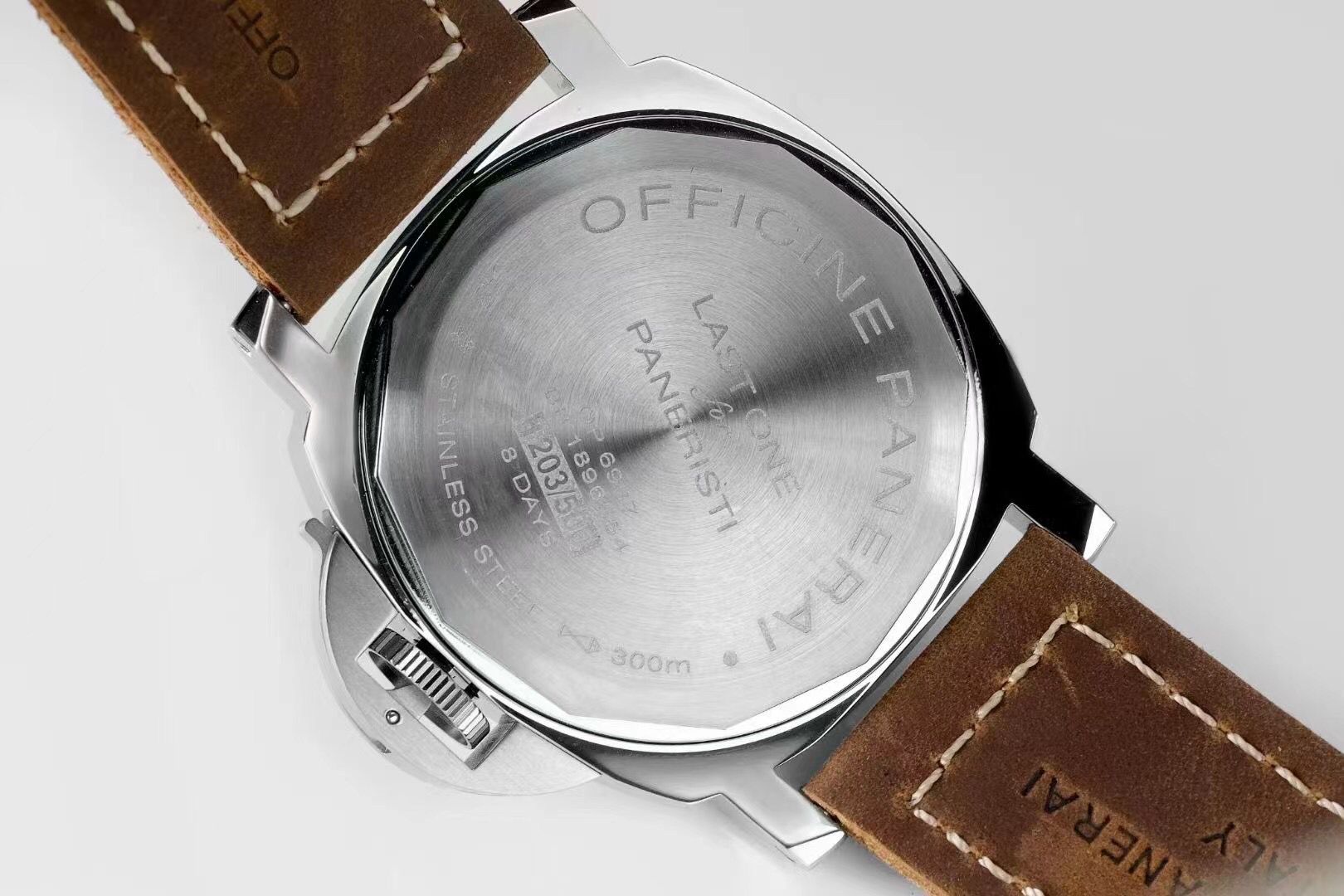
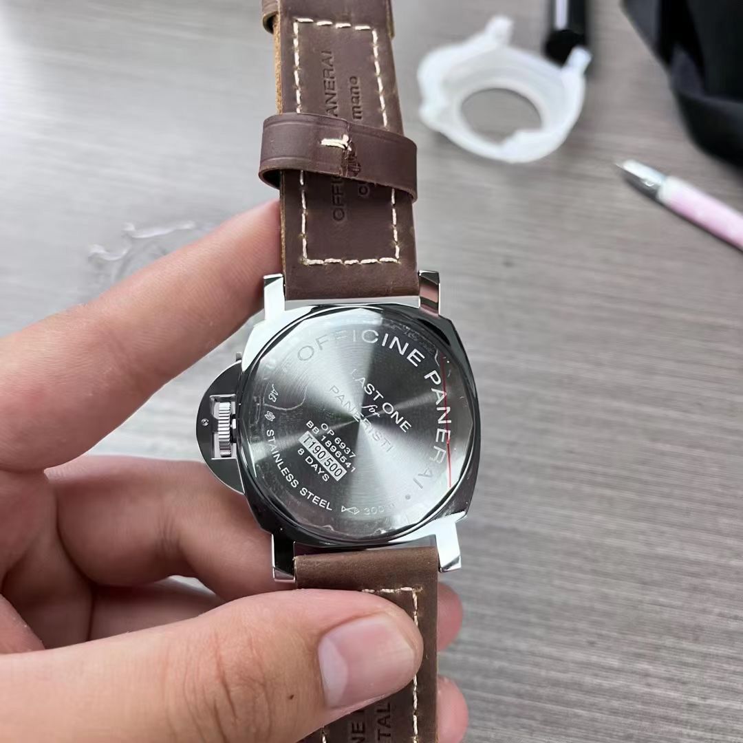
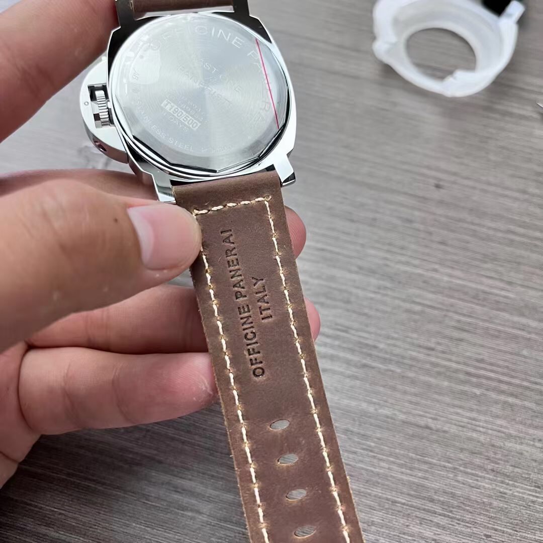
- The quality of the caseback engravings is not yet clear (the depth is not enough, and the light is not very good, but some elements are not visible, for example, Bonatti's initials)
- The color of the dials and fonts is something that we can fully appreciate only on live photos, I hope the green is deep enough, and the beige has this golden effect.
As a result, even at first glance, it is better than a noob, at least in those elements that are important to me, but some points require clarification: for something you need more photos, for something good QC photos, but for the last points - live photos, in different lighting, but in general - I see this as an extremely interesting release.
TD is coming soon, I think. Usually, the products of this factory first appear at TrustyTime, and you should follow the updates on their website, or newsletters if you are subscribed.
I am a little worried , therefore, I'm not sure how much it is correct to compare one set of photos, without confirming their reality, but with approximately gen and noob:
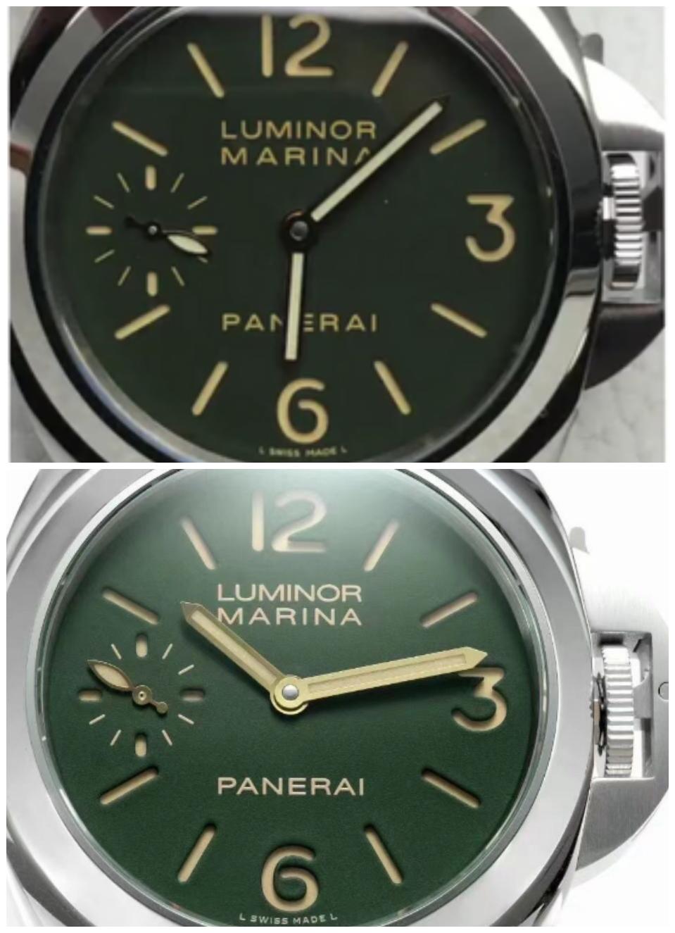
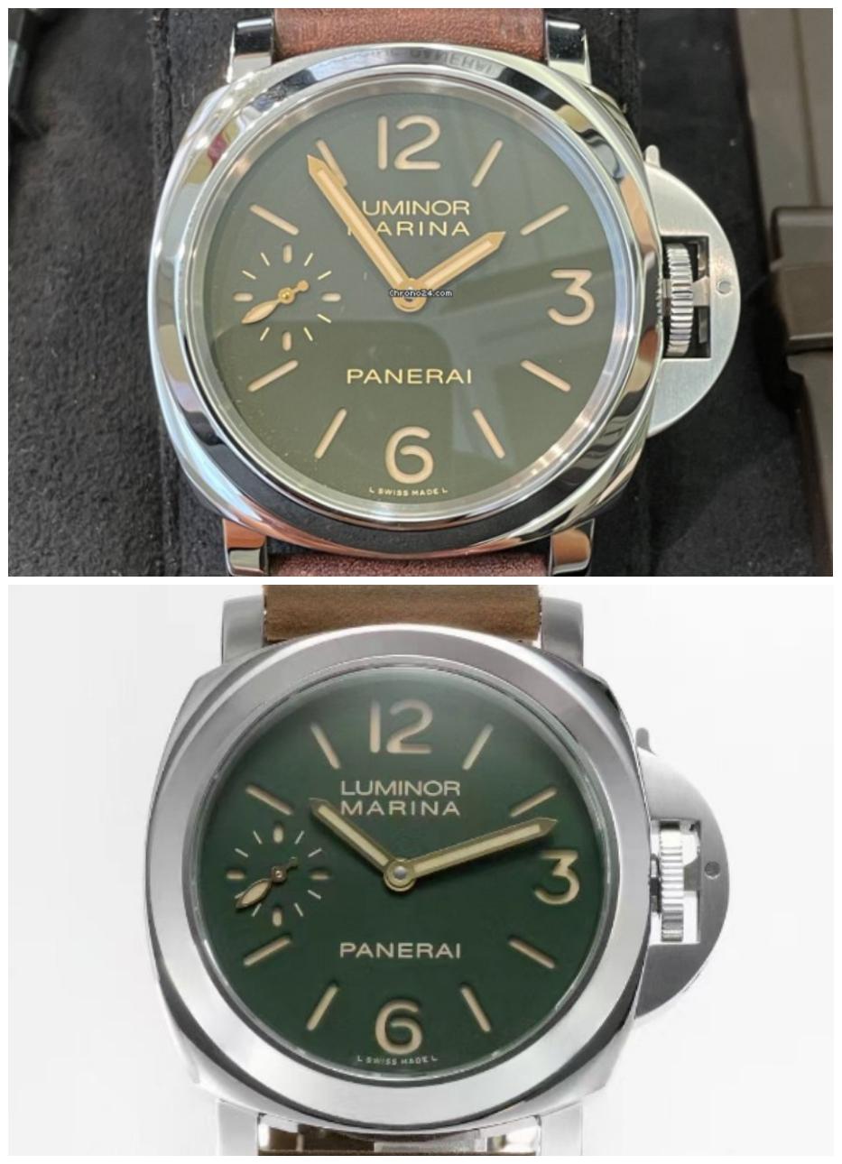
As you can see, the shape of the numbers, hands and dial fonts are chosen correctly (the question is how much exactly, but this is later)
I will also immediately leave a link to the thread of discussion of the PAM911 noob release, for everyone who wants to refresh this in memory:
https://forum.replica-watch.info/forum/panerai/9056333-new-pam-00911-by-noob-coming-soon
papabear244
Renowned Member
- 17/11/20
- 527
- 157
- 43
I hope it’s just my eyes but the color of markers in the small seconds and the “L Swiss made L” look whiter In the HWF whereas gen has them with the same color as the fonts?
Sent from my iPhone using Tapatalk
Sent from my iPhone using Tapatalk
Last edited:
Repworld
Mythical Poster
- 27/12/16
- 6,385
- 1,595
- 113
https://trustytime.io/index.php?main_page=product_info&cPath=37_49&products_id=23843
Sent from my iPhone using Tapatalk
Sent from my iPhone using Tapatalk
https://trustytime.io/index.php?main_page=product_info&cPath=37_49&products_id=23843
Sent from my iPhone using Tapatalk
Caseback looks dreadful
Repworld
Mythical Poster
- 27/12/16
- 6,385
- 1,595
- 113
Caseback looks dreadful
We need side by side with genuine, but yes it’s not gen replication.
Sent from my iPhone using Tapatalk
We need side by side with genuine, but yes it’s not gen replication.
Sent from my iPhone using Tapatalk
For starters there is no signature and the engraving is really bad laser finish
I think I remember that the Noob version was very good, waiting for comments from the owners about this HWF model
Caseback indeed, Noob dial was way off with wrong numbers and that awful spacing in the PANER AI. Here we have the opposite. Top dial but dreadful caseback
Sent from my iPhone using Tapatalk
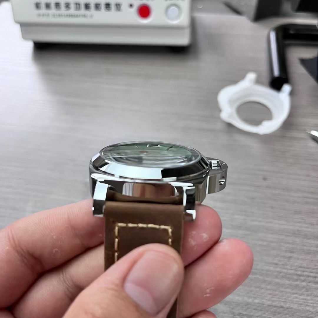
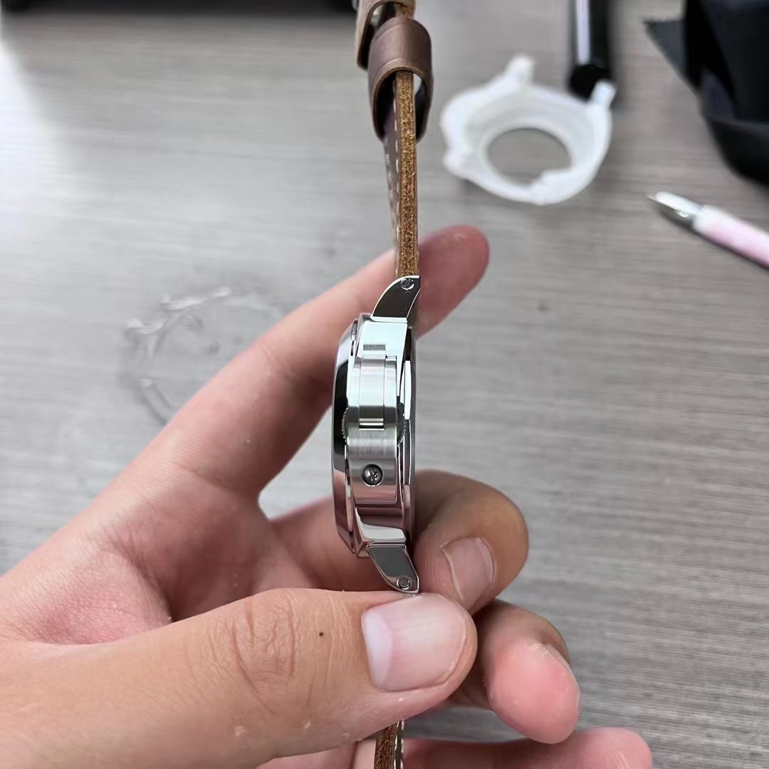
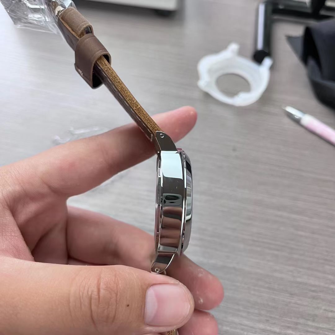
I believe that the case for the P.5000 in thickness and proportions awaited some shortcomings. I guess this is their case, which they use for all 6497 models.
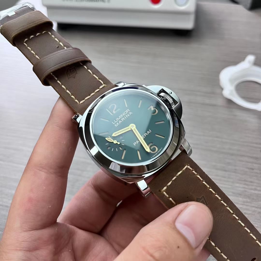
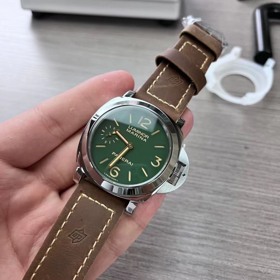
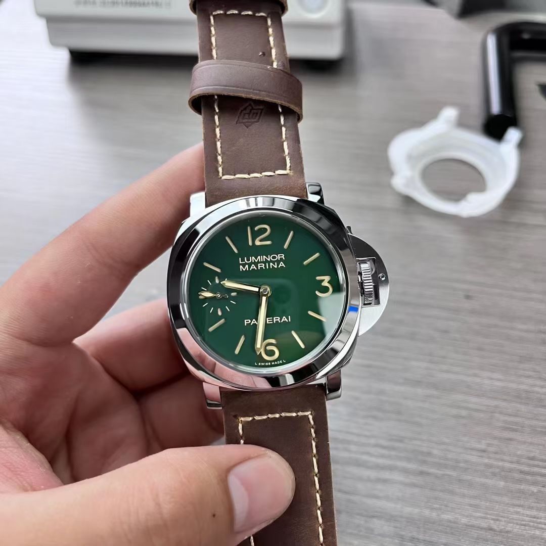
The numbers and labels seem a bit bold so far, and the green color is really brighter than I would have expected, but it is still a step forward in relation to the noob or n / n versions with a transparent caseback.
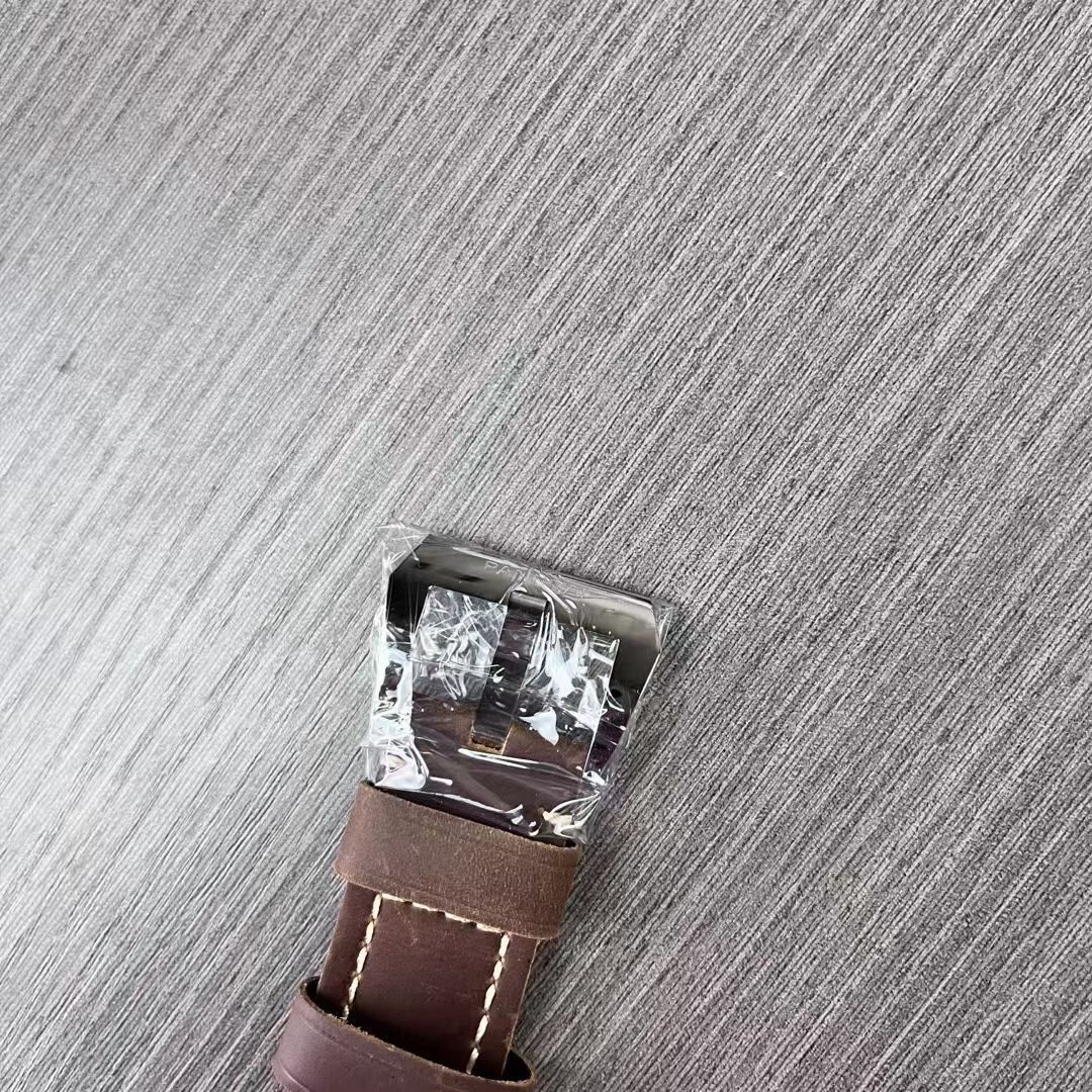
Here are some more photos: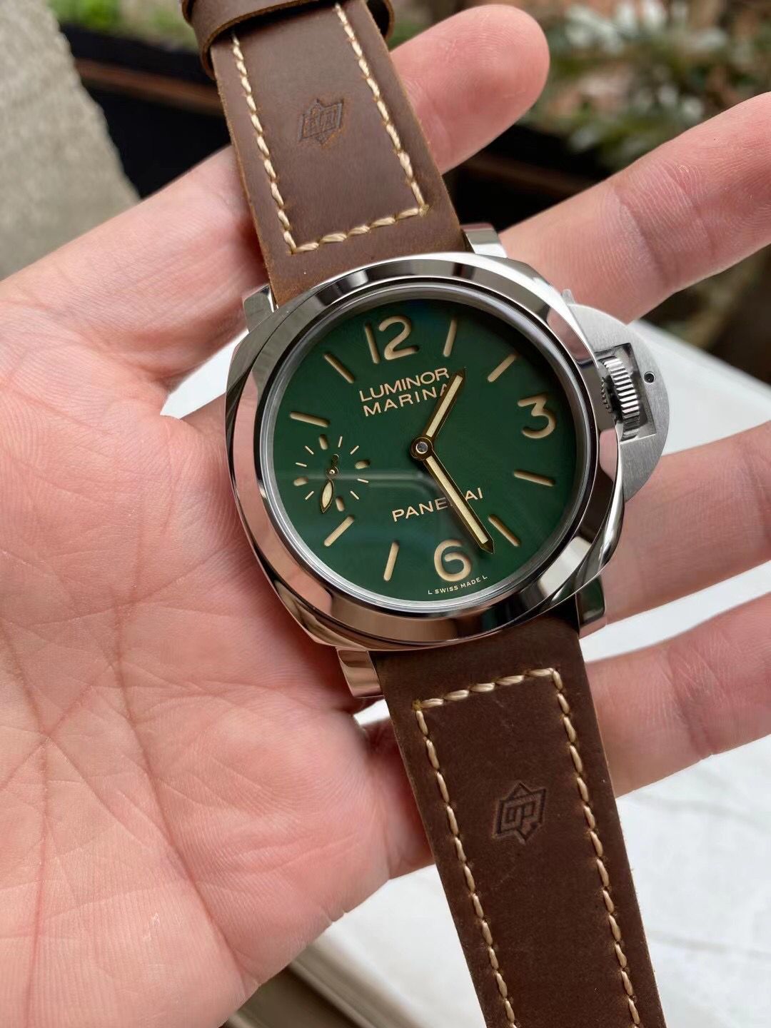
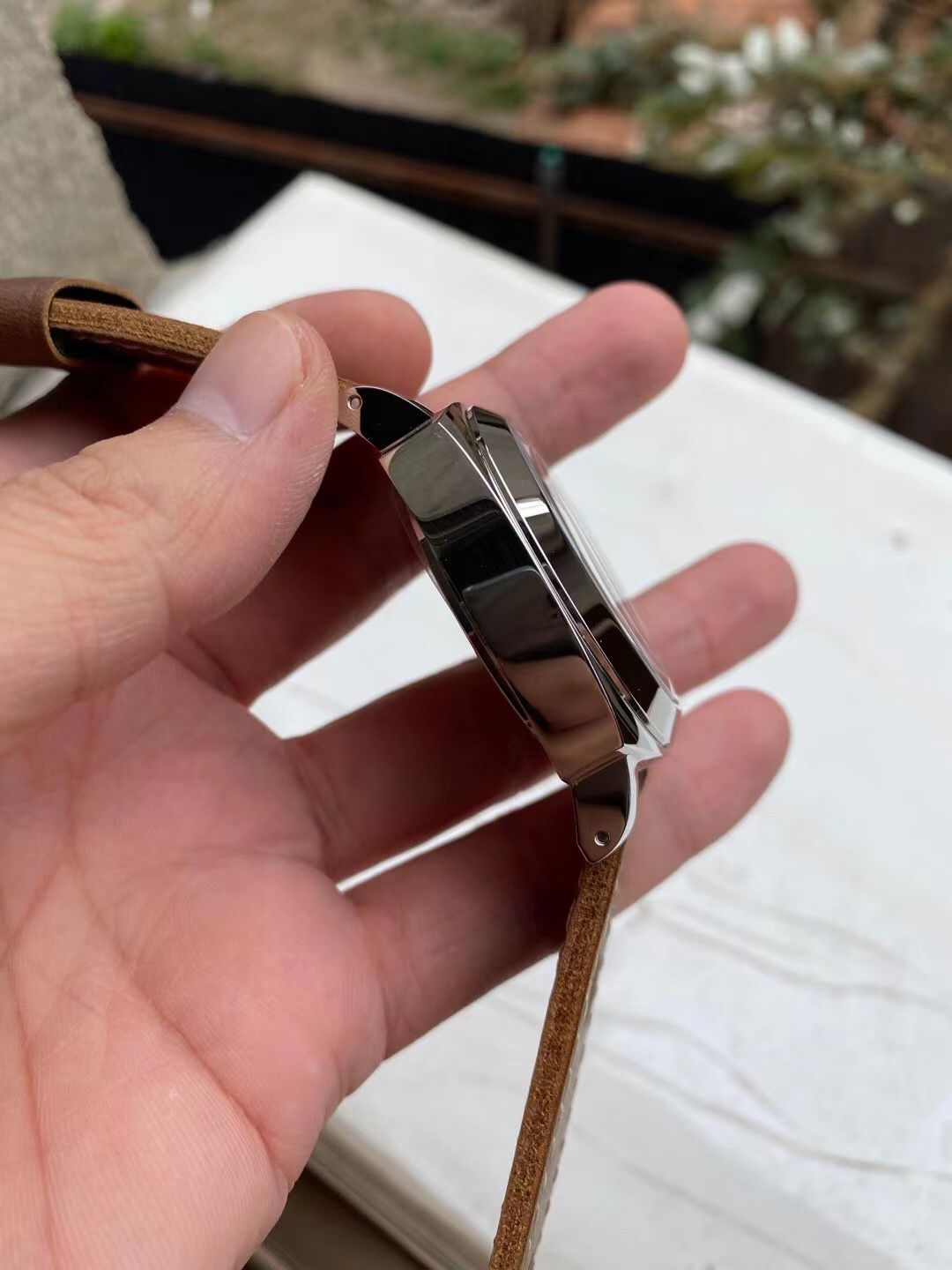
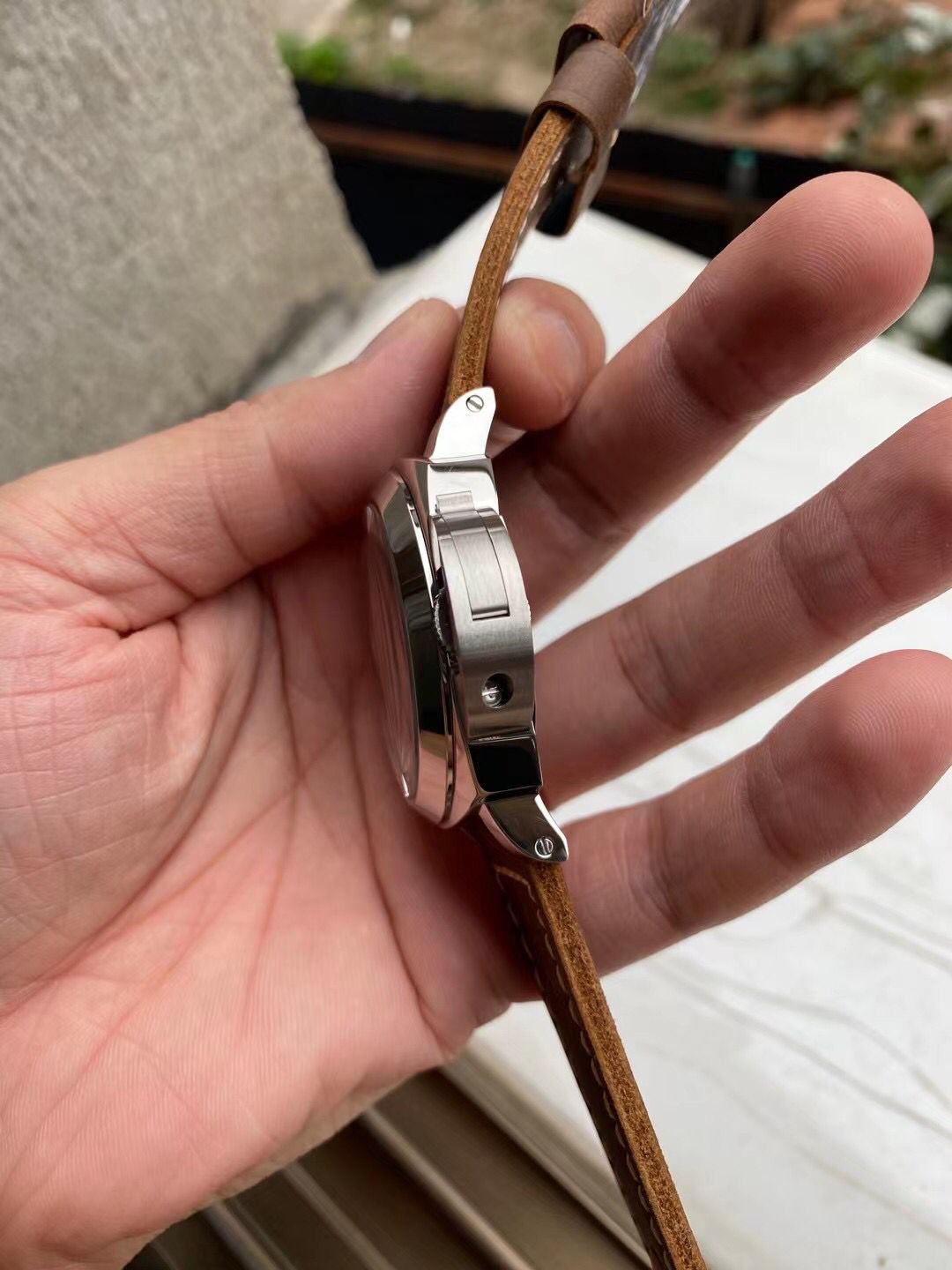
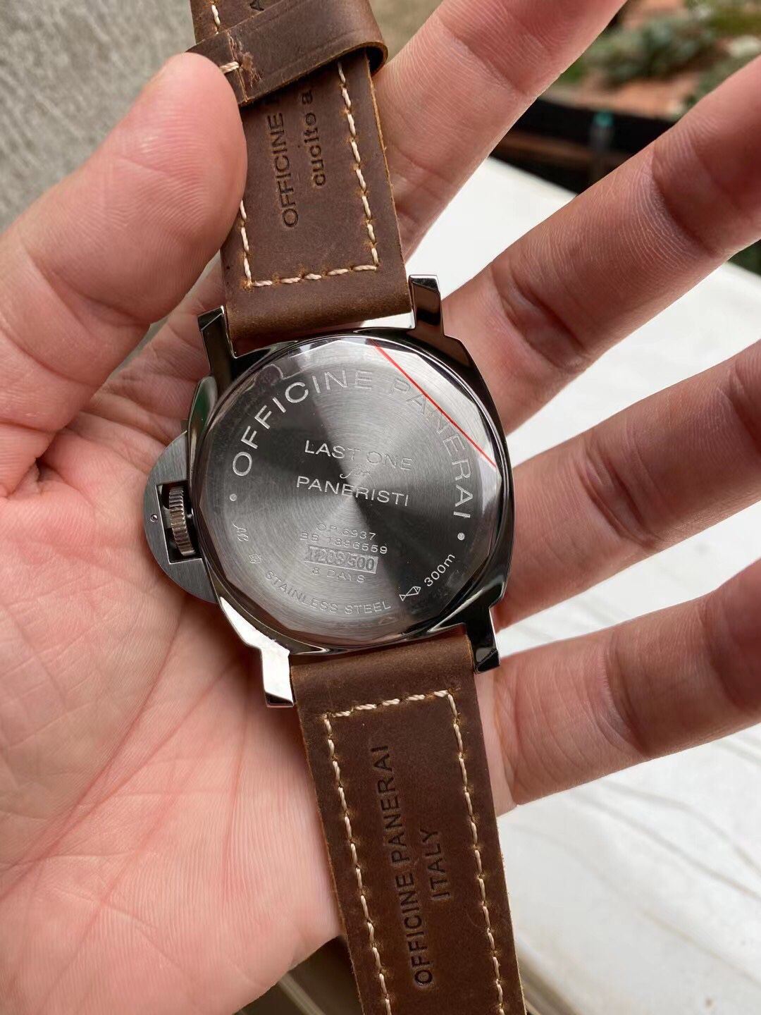
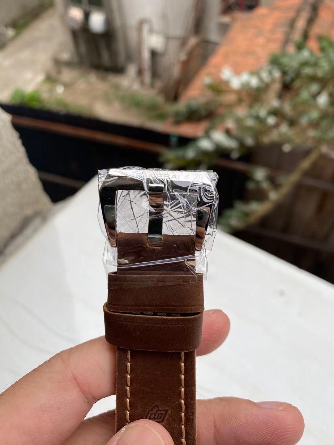
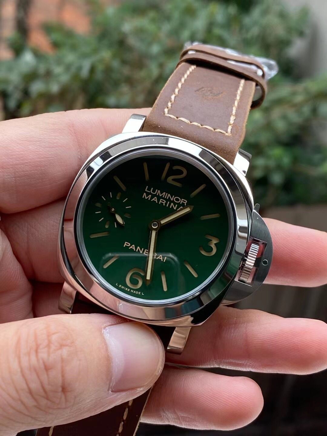
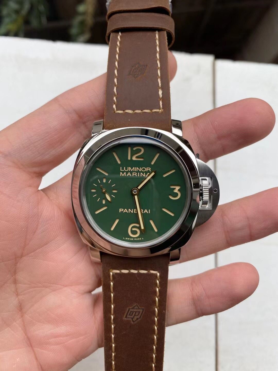
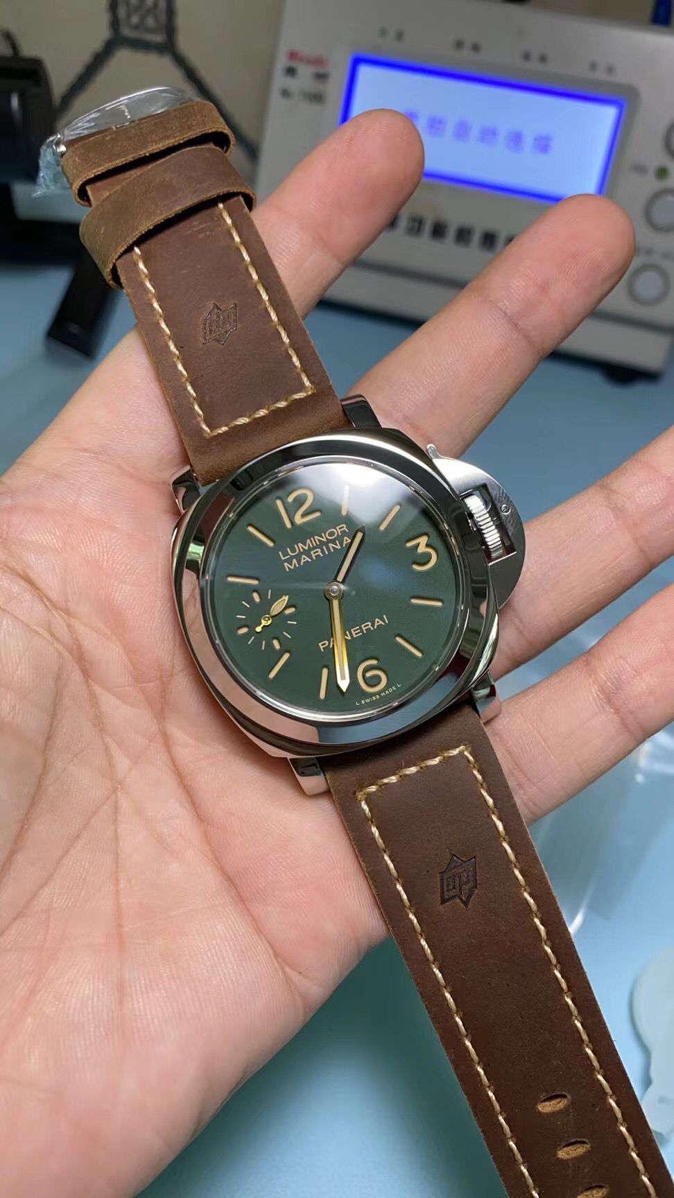
I note that the engravings, although weak, are all present, here it is seen better.
The numbers and labels seem a bit bold so far, and the green color is really brighter than I would have expected, but it is still a step forward in relation to the noob or n / n versions with a transparent caseback.
Here are some more photos:


I note that the engravings, although weak, are all present, here it is seen better.


Here is more pic sob a nature light.
Hands color looks much better than N.

