-
Tired of adverts on RWI? - Subscribe by clicking HERE and PMing Trailboss for instructions and they will magically go away!
You are using an out of date browser. It may not display this or other websites correctly.
You should upgrade or use an alternative browser.
You should upgrade or use an alternative browser.
PAM 1226 - TTF
- Thread starter jonnybaws
- Start date
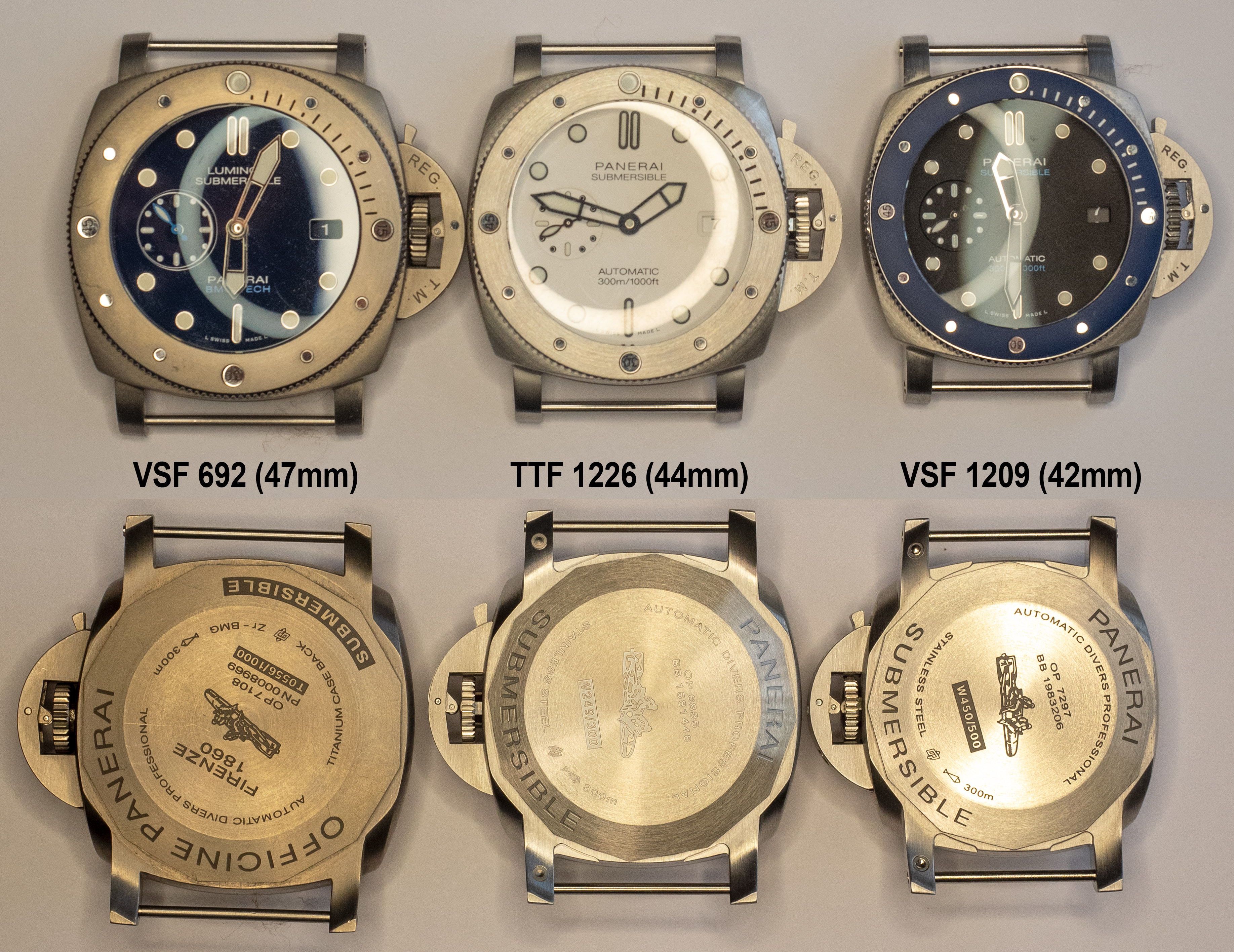
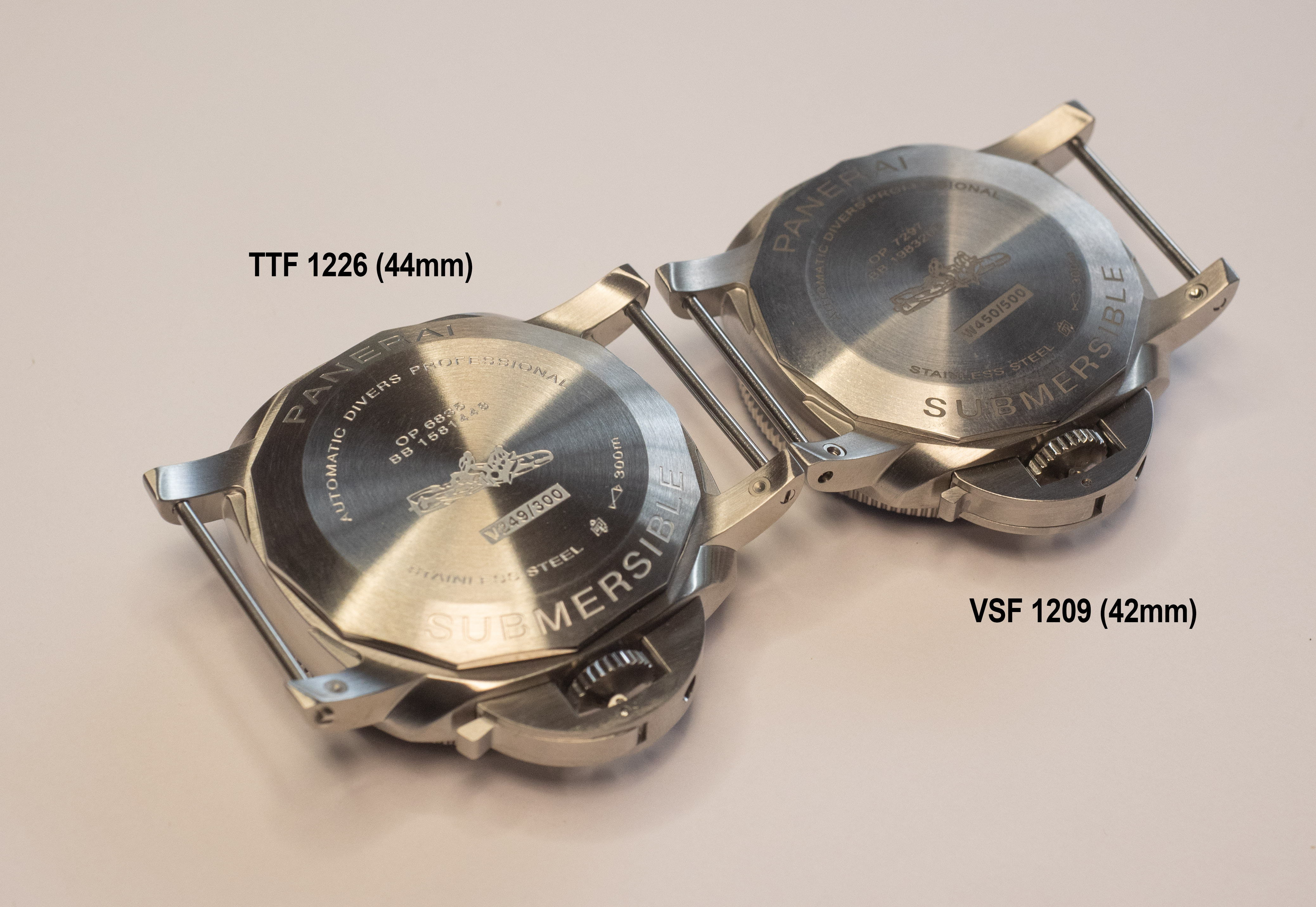
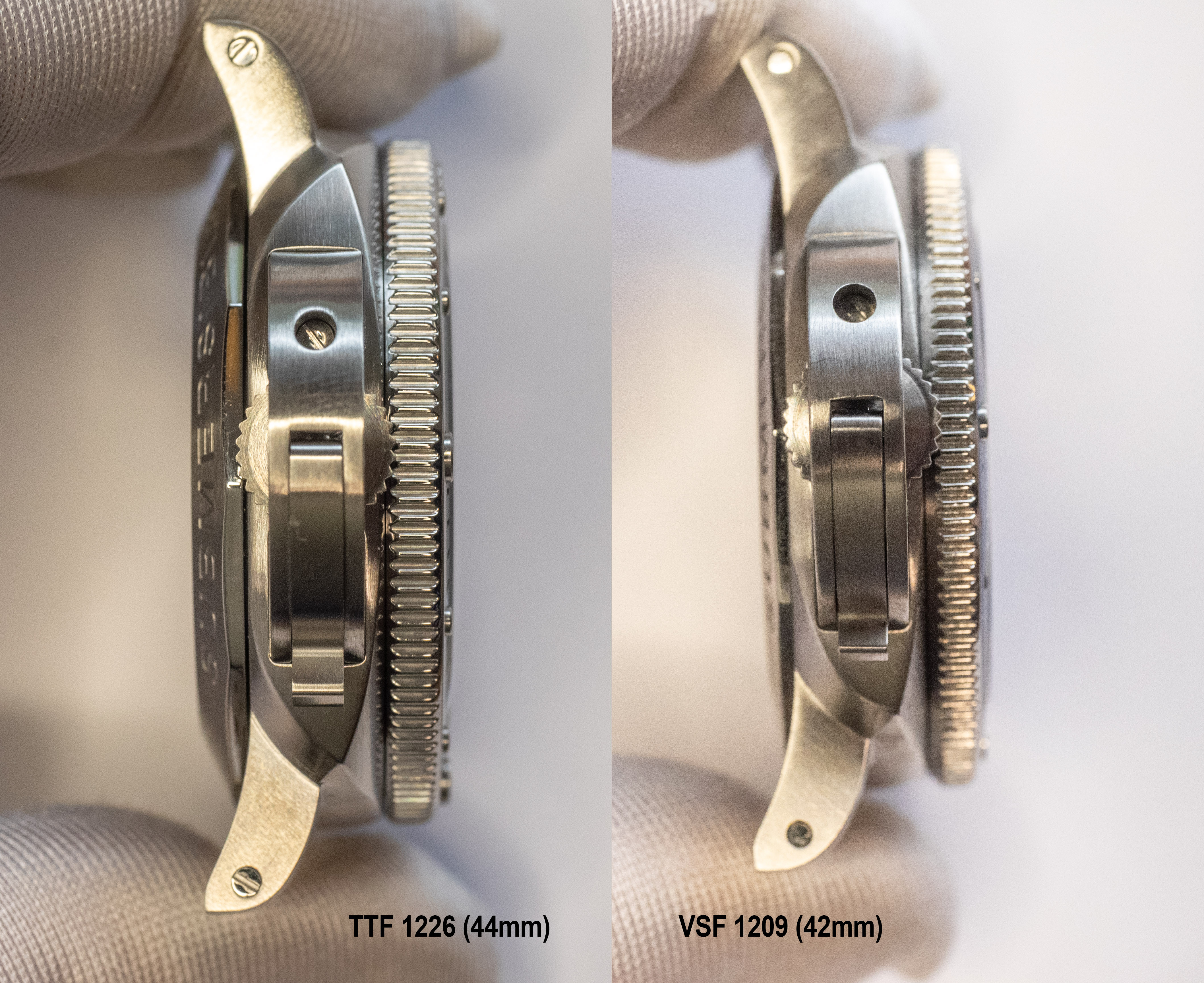
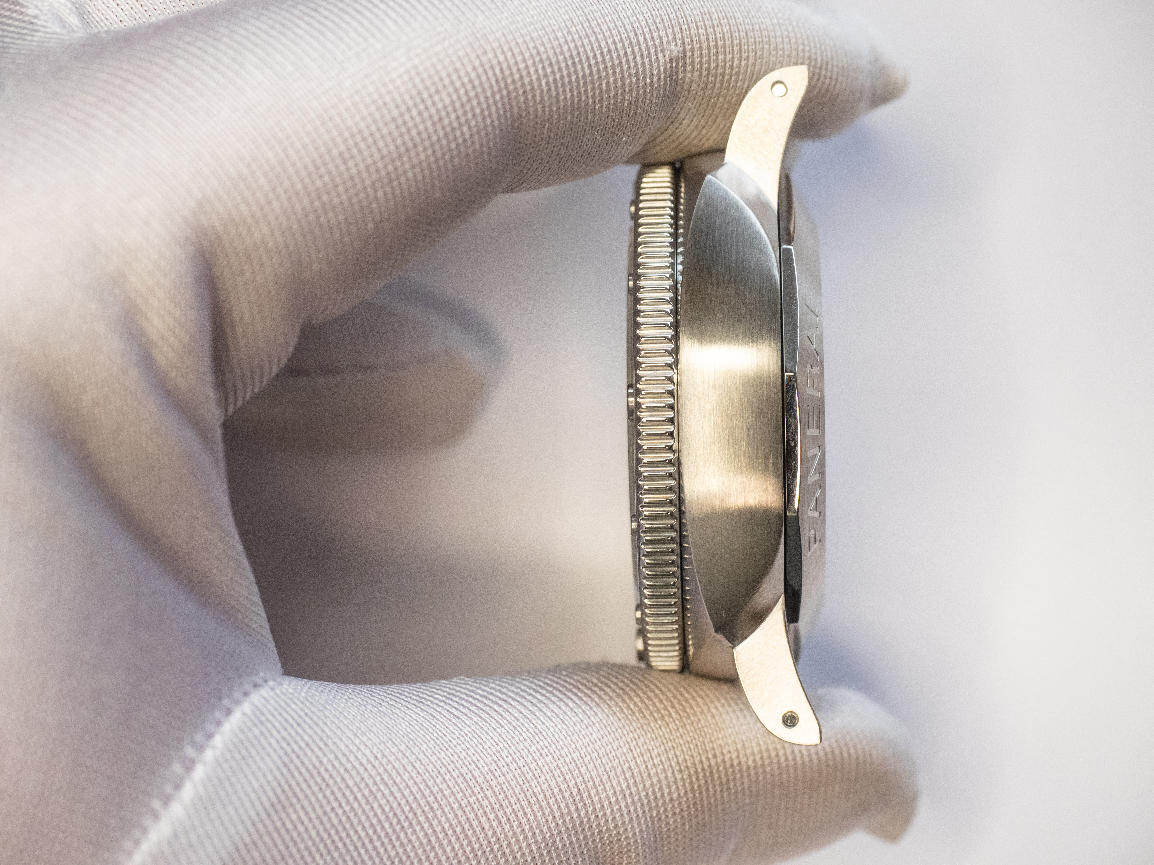
What I was able to quickly find now to visualize:
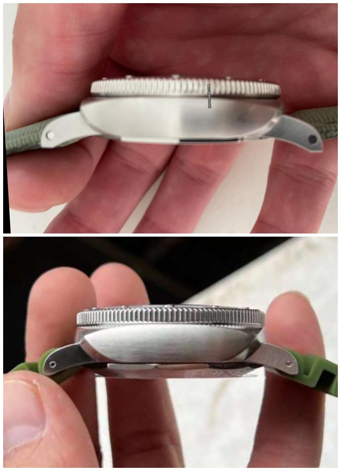
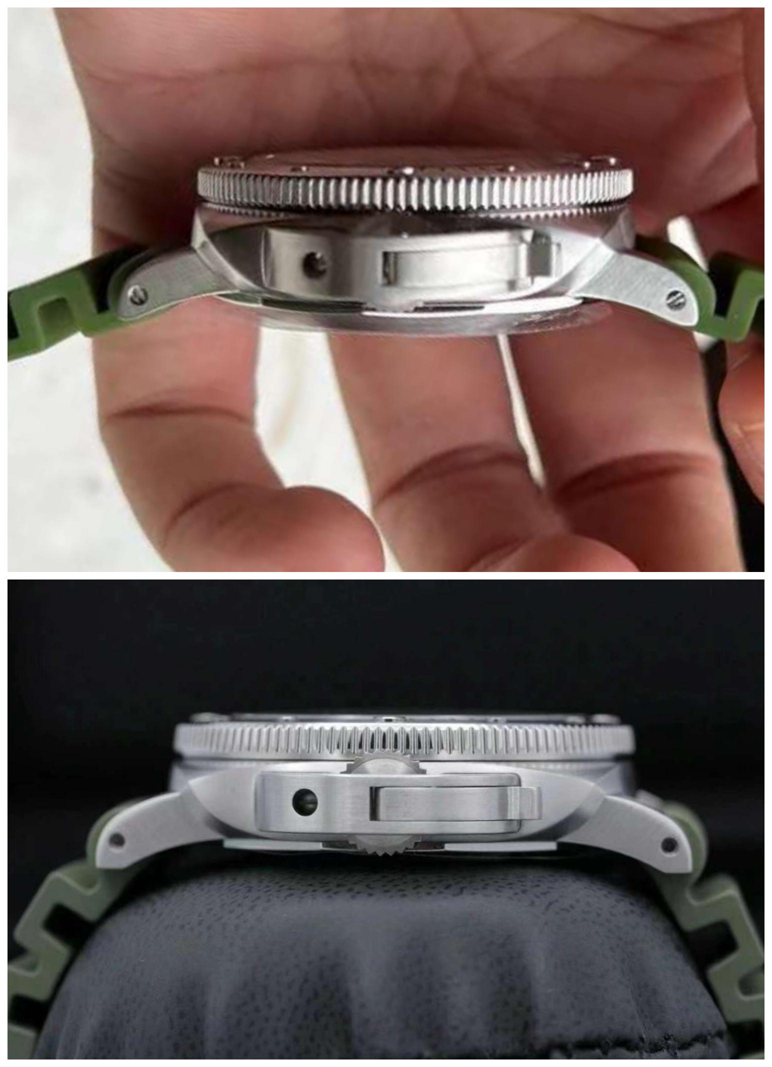
As you can see, there is a difference in the thickness of the midcase, but as I believe, most of it went to the caseback, despite the fact that the bezel is approximately the same height.


As you can see, there is a difference in the thickness of the midcase, but as I believe, most of it went to the caseback, despite the fact that the bezel is approximately the same height.
Profile is ugly at best… midcase shape seems incorrect, dial print is too thin, same for the datewheel print. Good first attempt but thickness/profile is a killer as it take away the elegance of this model (for me)
I guess the whole geometry of the case is a bit incorrect, like any other TTF (both the midcase and the bezel from the profile). I would like to see another butt between the protrusions, but in general, as I imagine, there are also problems there, although, perhaps, not as pronounced as in 42mm VSF.
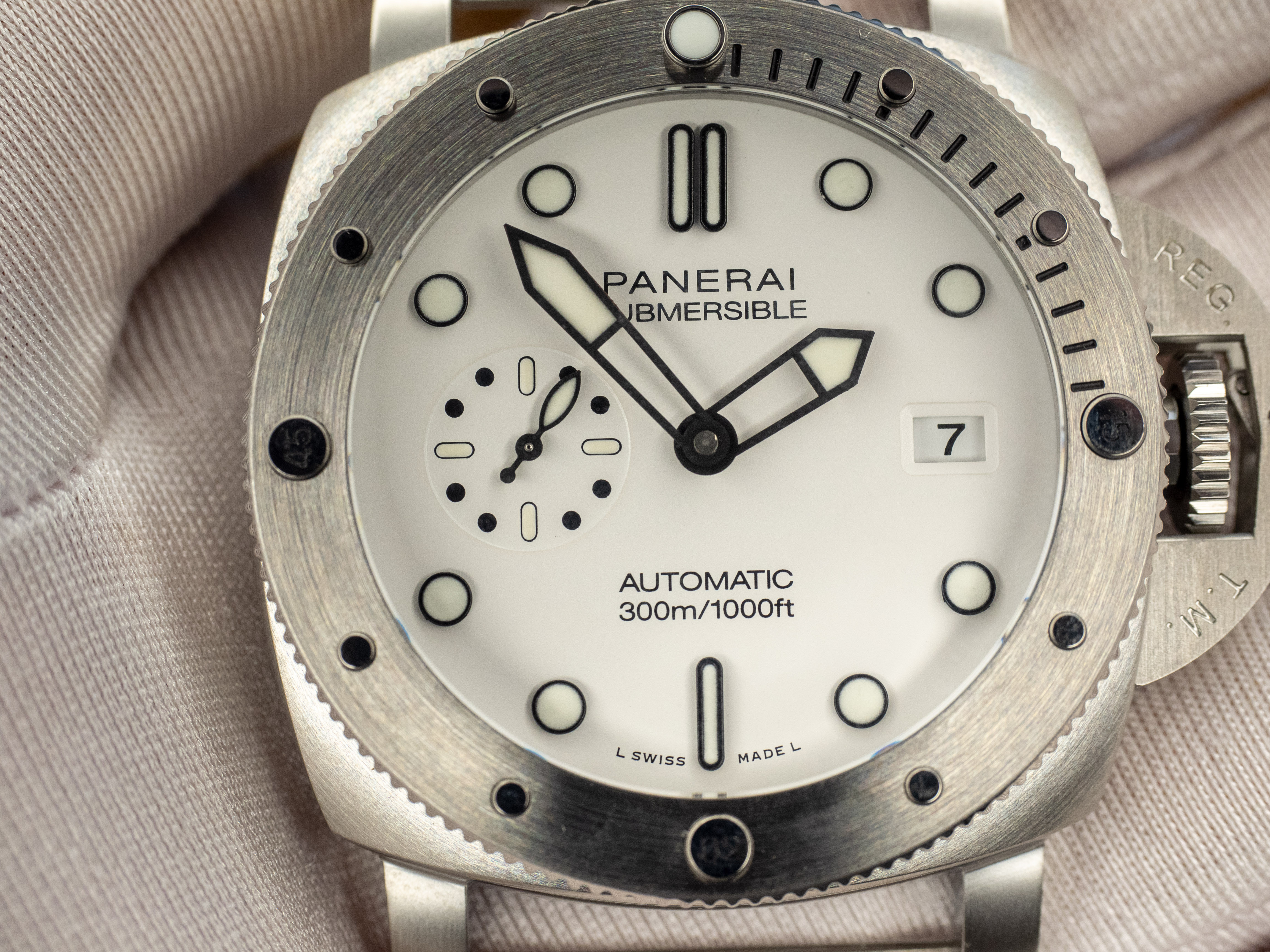
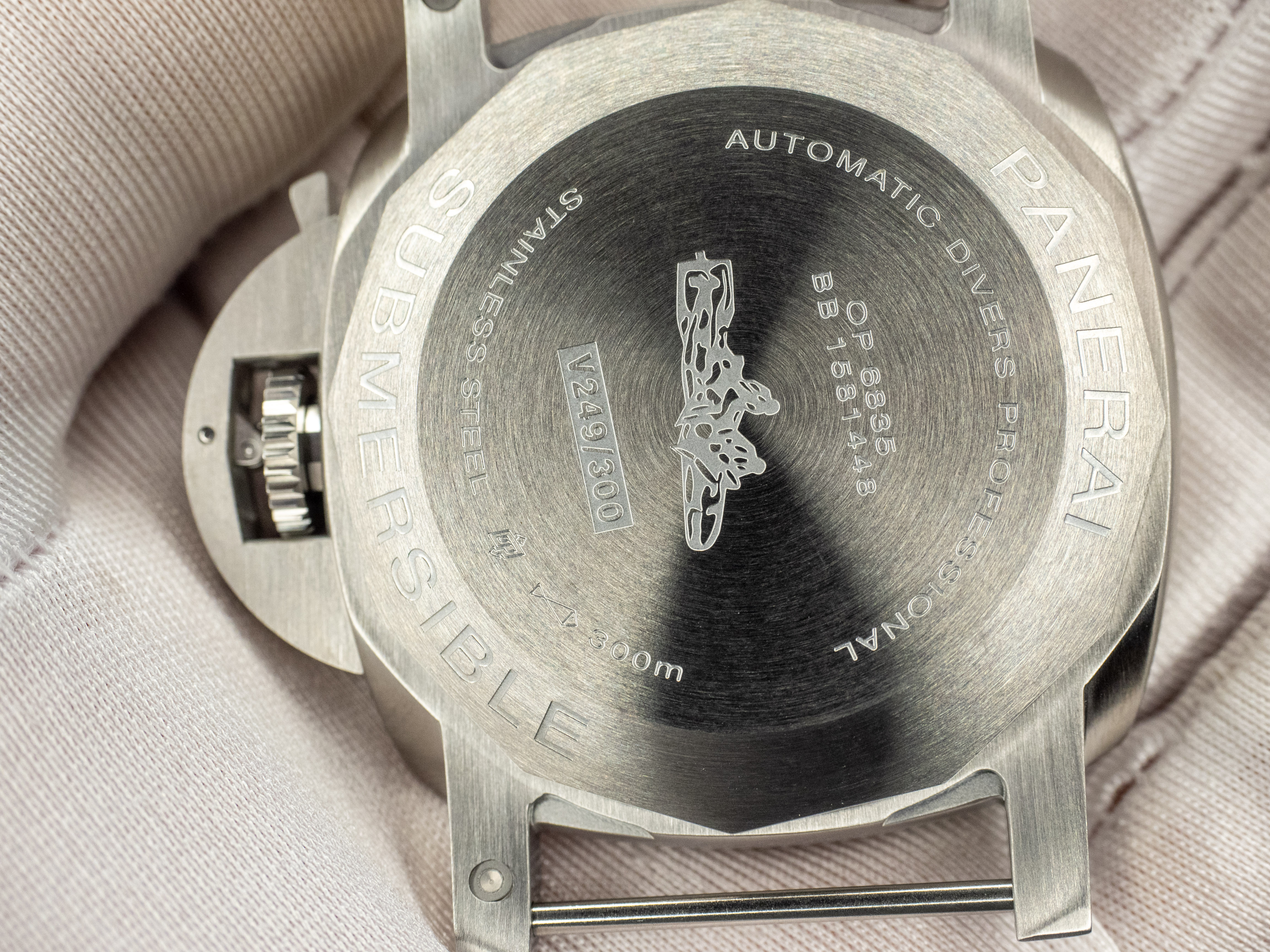
The fact that the fonts are thinner, and the frames of the labels are thicker - I think it is worth accepting or refuting if there is more than one set of photos, because often the white balance can distort. Although, most likely it is. In addition, I would like to add that the shape of the hands is not quite correct, the caseback is engraved completely wrong, the recess around the DW looks harsh, and it is very interesting to compare the shade and texture of the lume.
There are questions about the shape of the numbers on the bezel marks and how they are rounded.
The miracle did not happen, but it fits into the overall production of TTF, and in general, they did more and better than they often do.
Yes, the geometry seem to be a key problem of this model. Engravings and Fonts can be corrected in further versions, but the case shape is a serious thing. But that´s imo not surprising. The Gen has a P.900 movement with 5,9mm thickness, the A7750 is 7,9mm thick. So they have to make some compromises. I just hope that the "bump" on the back of the case on the arm doesn't look so dramatic.I guess the whole geometry of the case is a bit incorrect, like any other TTF (both the midcase and the bezel from the profile). I would like to see another butt between the protrusions, but in general, as I imagine, there are also problems there, although, perhaps, not as pronounced as in 42mm VSF.
Not a bad first effort given the known limitations of TTF... Hopefully SBF with a clone movement and thinner case is on the cards.
As i said in another thread:
Panerai Reps will be low quality unless the p900 is repped. The P9000 was the driving force behind a long list of NWBIG or nearly NWBIG reps: 47mm subs and 44mm Luminors.
Considering the big difference in sizes: P900 beeing smaller in diameter and especially thickness - there will be no decent reps, untill the p900 is cloned.
Here are my QC-Vids ...
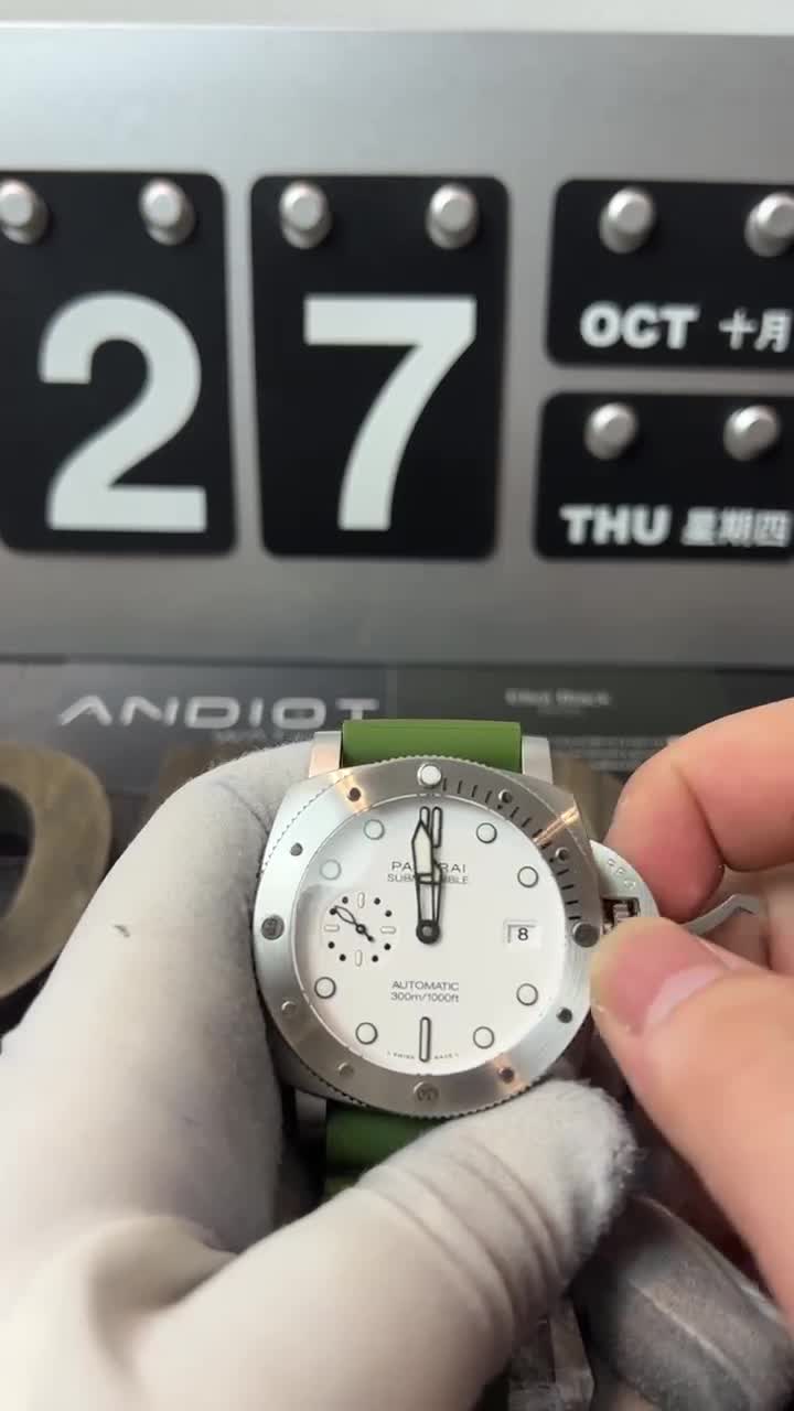
 streamable.com
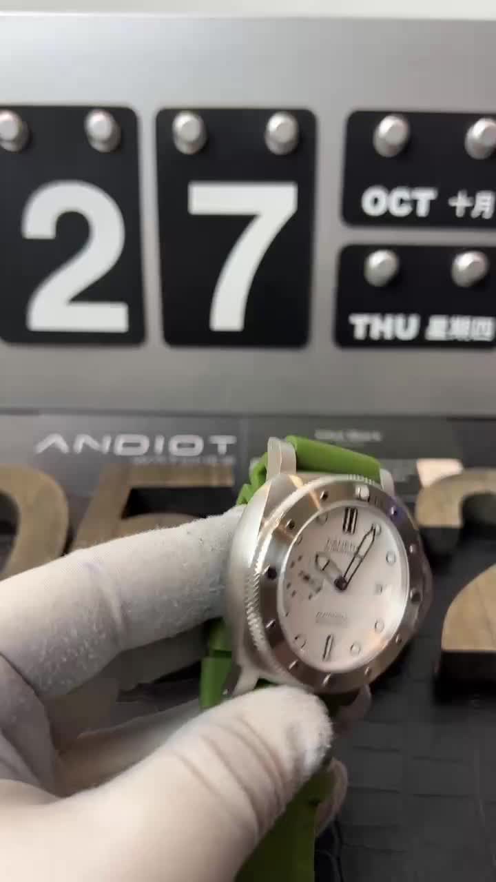
 streamable.com

WhatsApp Video 2022-10-28 at 11.02.55
Watch "WhatsApp Video 2022-10-28 at 11.02.55" on Streamable.

WhatsApp Video 2022-10-28 at 11.02.51
Watch "WhatsApp Video 2022-10-28 at 11.02.51" on Streamable.
- 18/1/11
- 19,846
- 424
- 83
- 16/5/19
- 581
- 399
- 63
About thickness…
Yesterday had the opportunity to try a 2068 in boutique and it is and feels really slim,(also too much little in my opinion for a Pam but that’s metter of taste probably).
An incredibly thing was the misalignment of the bezel! Something like a cheap rep! Also a little of back play…incredible!
The watch doesn’t feel cheap at all obviously but what a miss that bezel for a 10k watch!
It´s somewhere between China and Germany. Should arrive next week ;-)
The eagle has landed ;-)
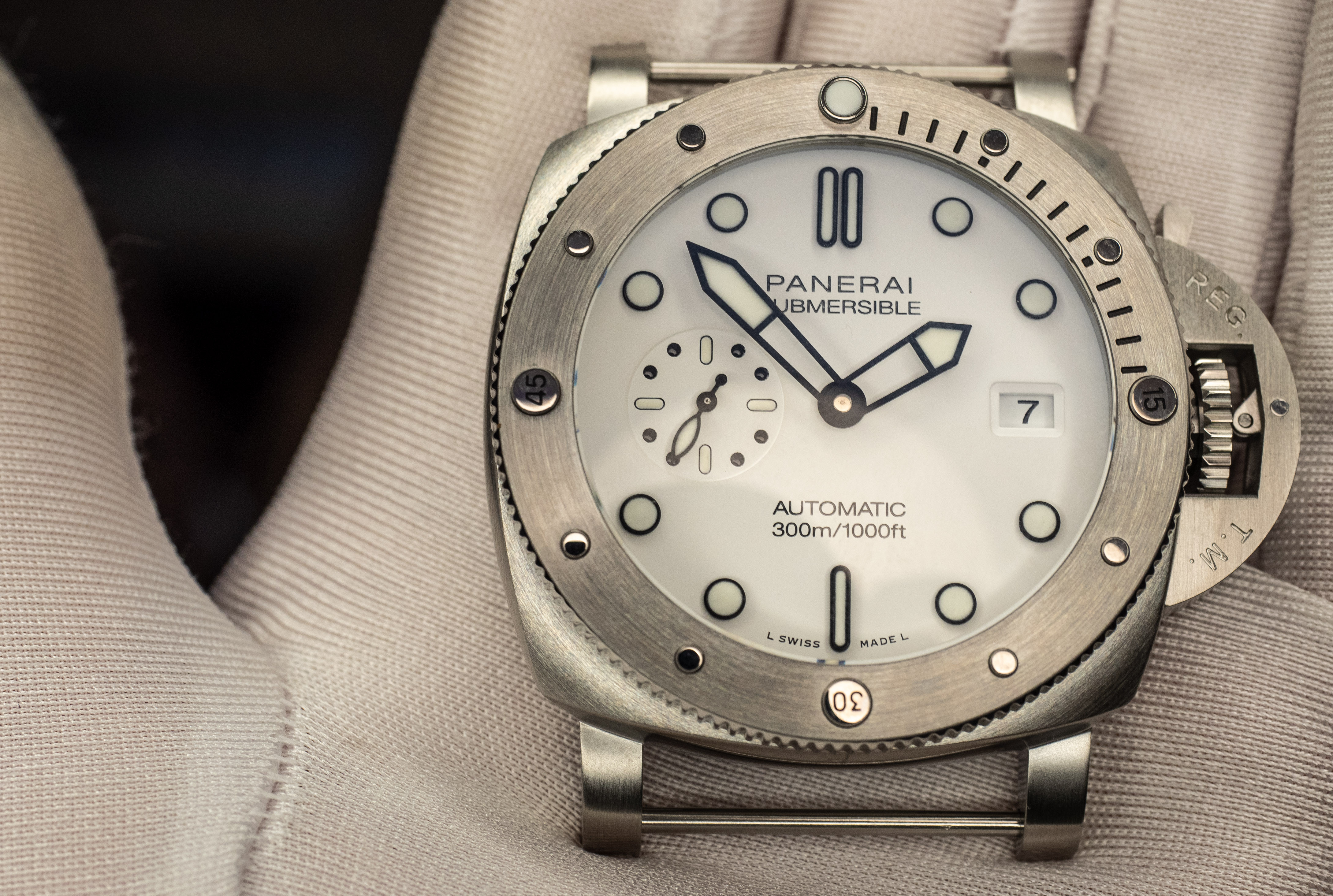
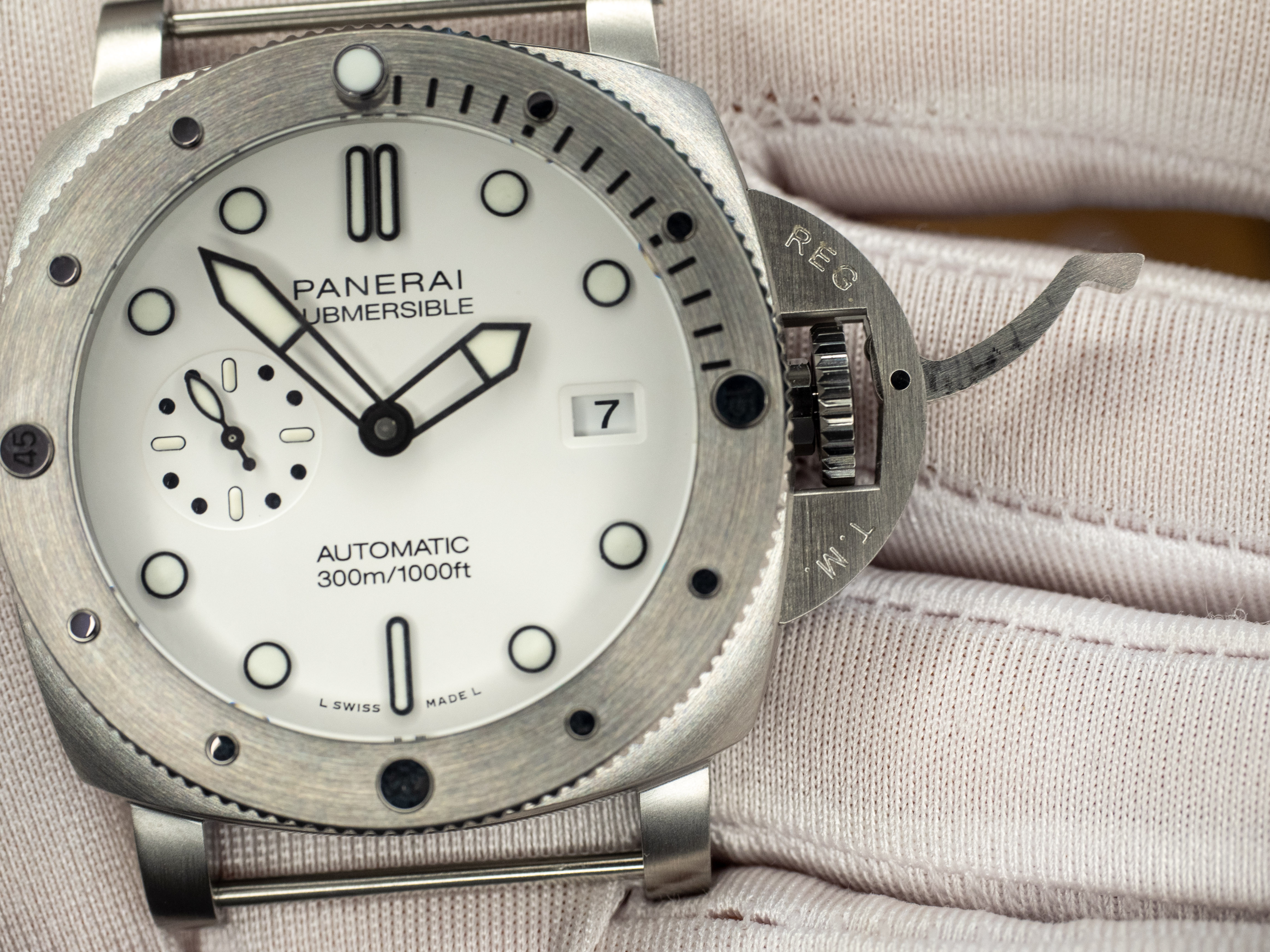
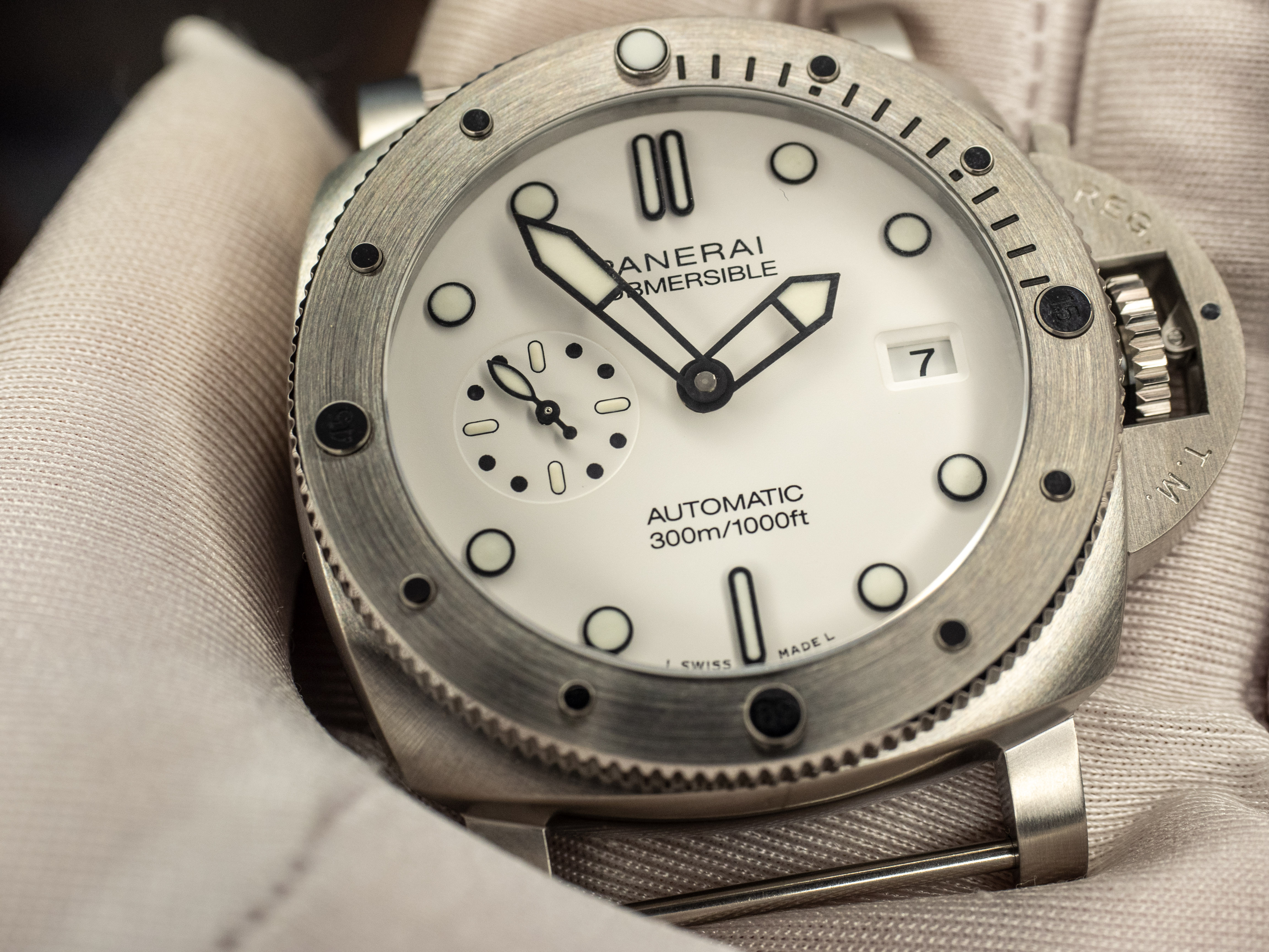
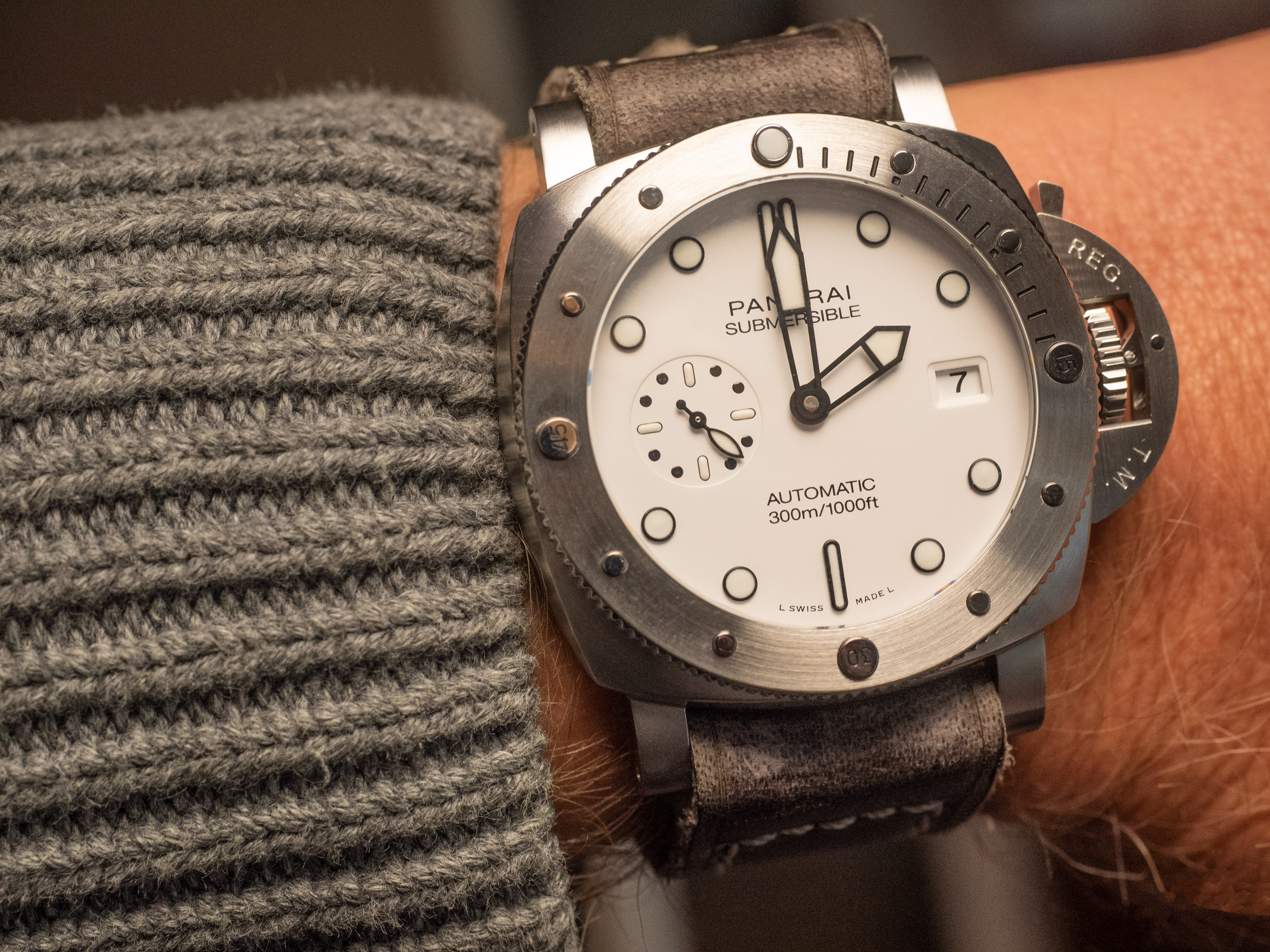
First impressions ...
Pro:
- The bezel play is good and precise (since this is the first model from TTF with a bezel, this is a surprise) though a little too loud
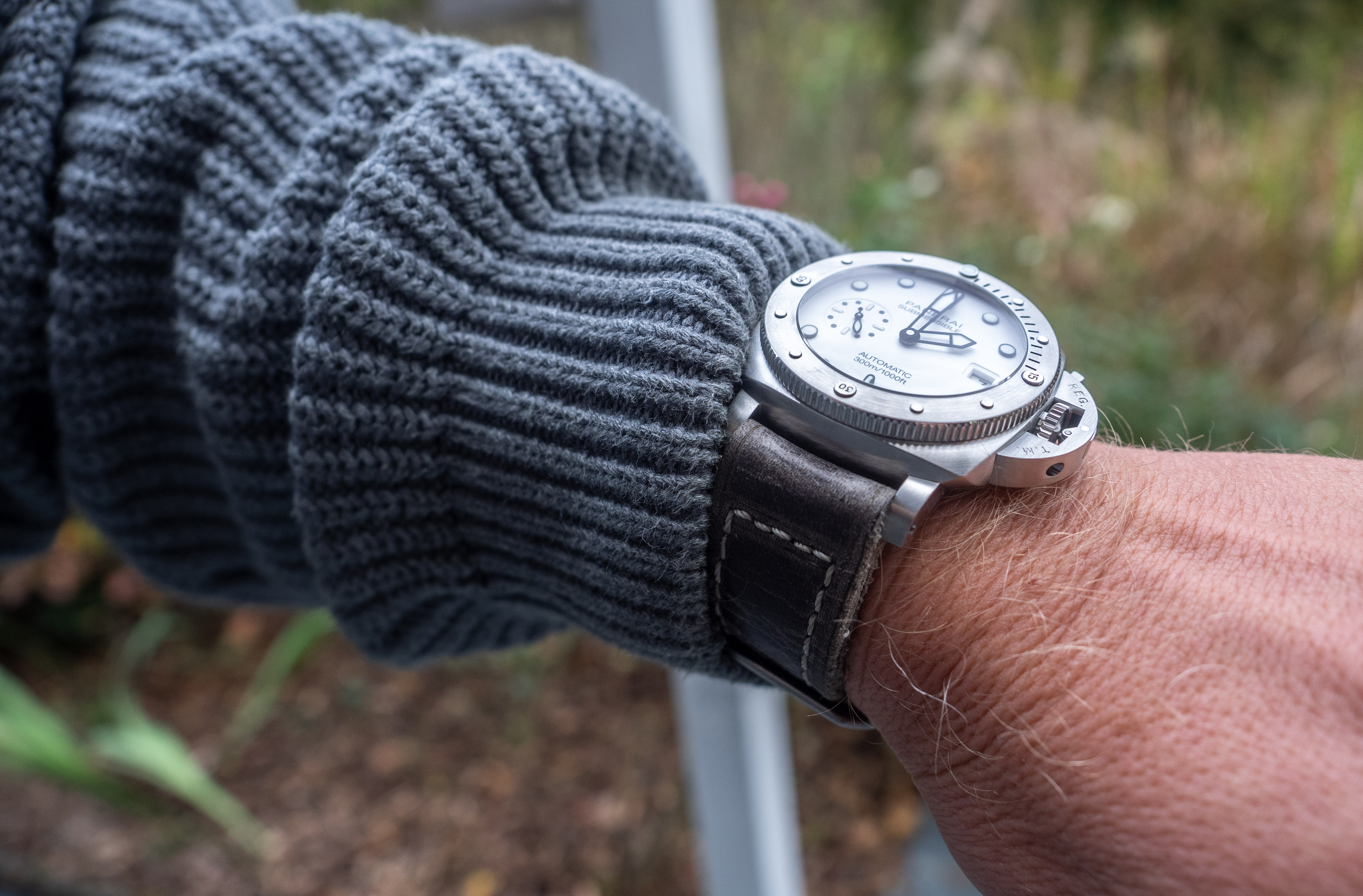
- Beside the obvious flaws, it´s a very nice watch with my "sweet spot" 44mm diameter
Con:
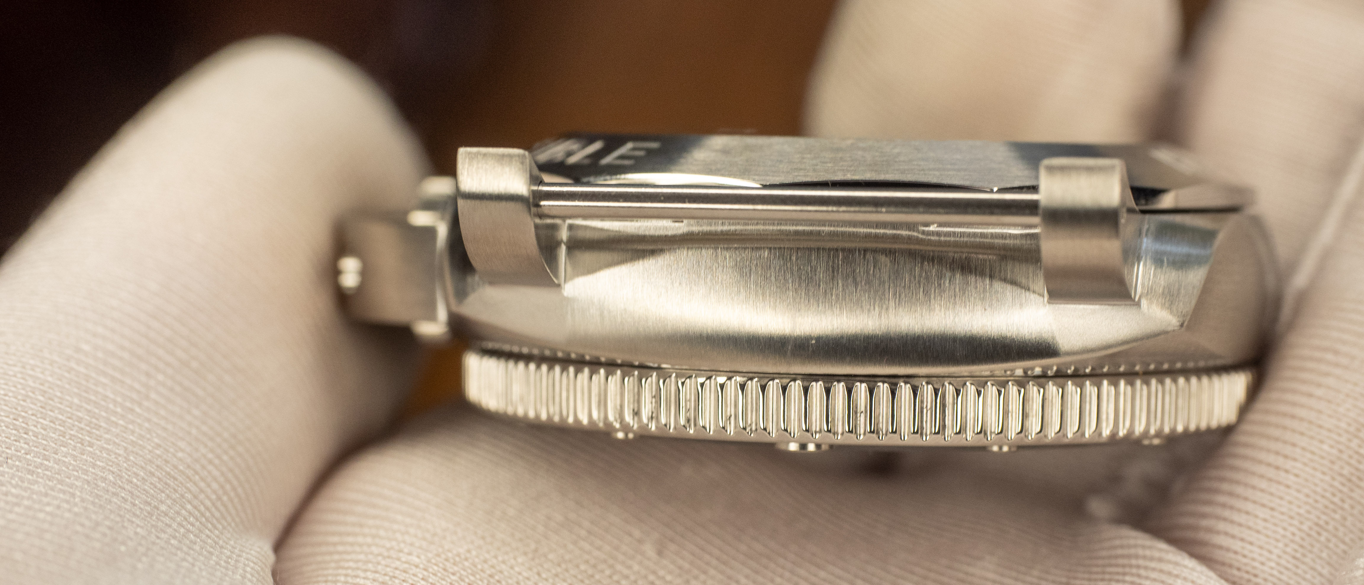
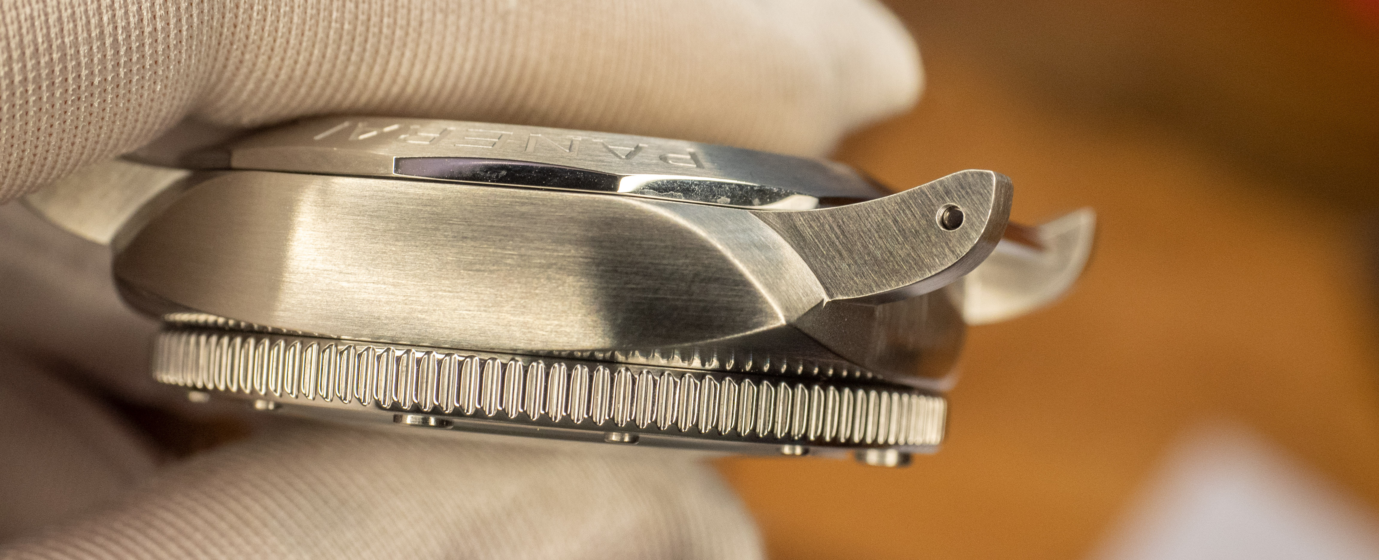
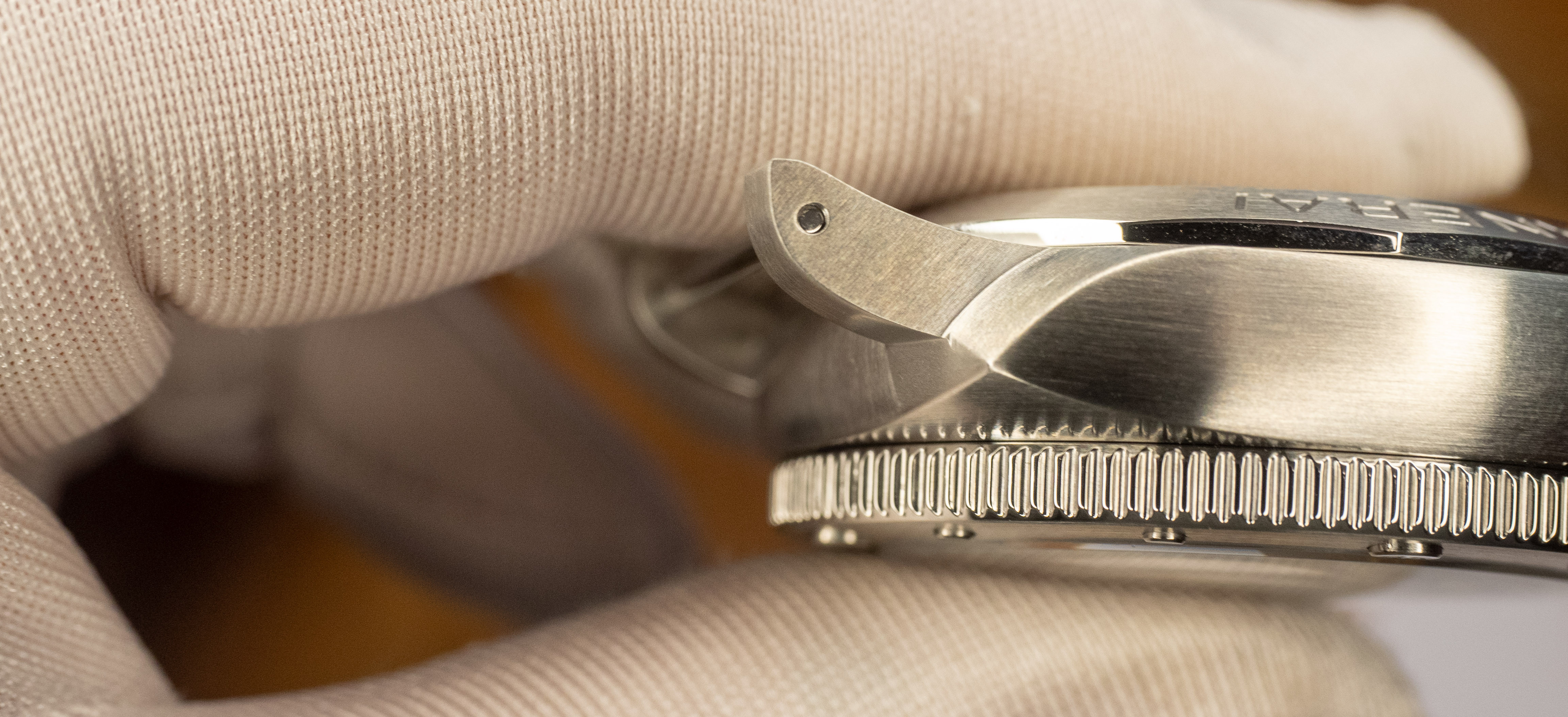
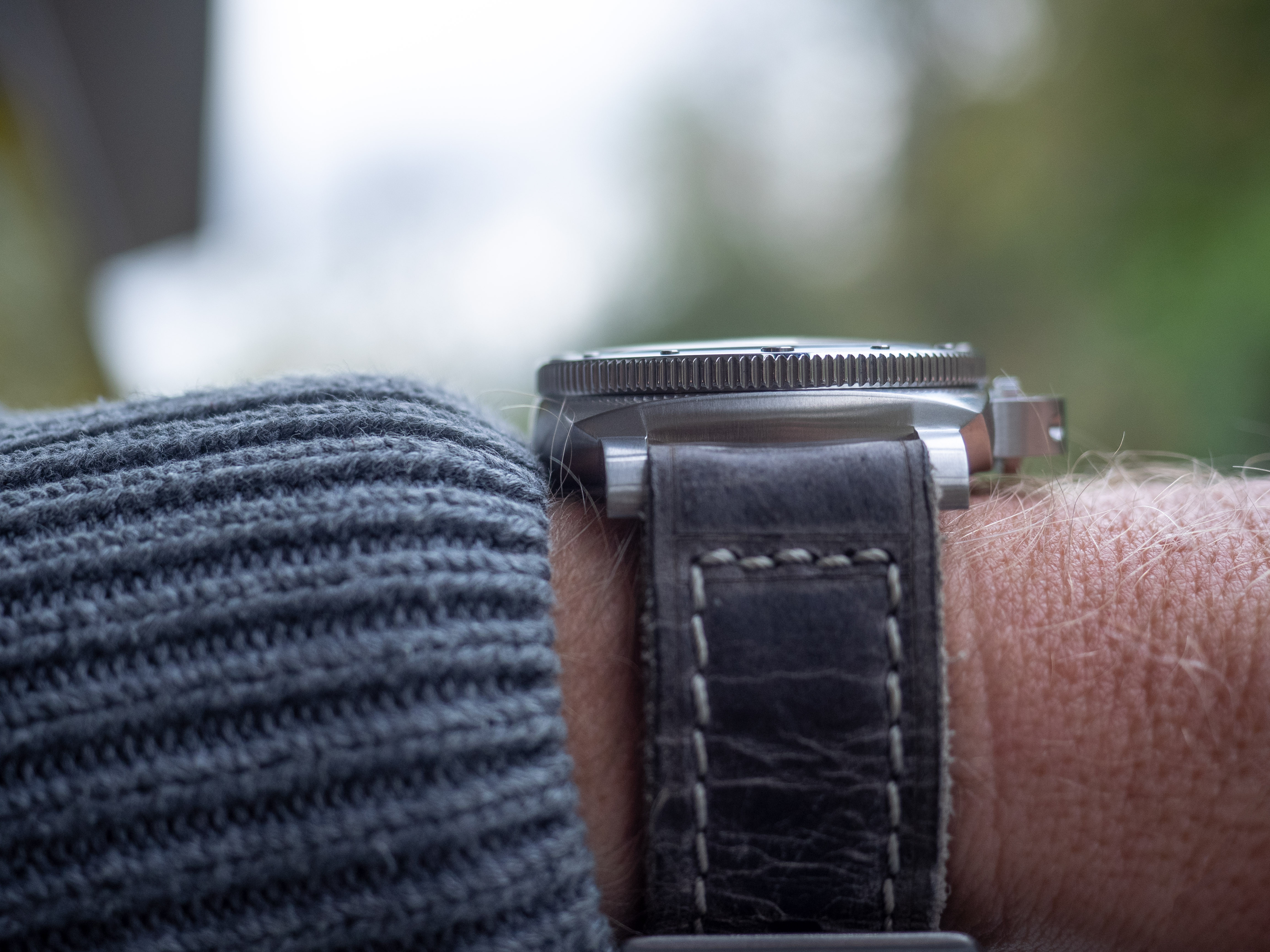
- The watch is way too thick. Unfortunately my new caliper has still not arrived, I can´t give you a number. My educated guess is 17,5mm. "Fortunately" the thickness is mostly a product of the fat backside and on the arm it´s no too obvious, that the watch is too thick. It wears at least much much thinner than the 243.
- The caseback engravement is simply rubbish ;-)
- TTF again uses a fake quick change. In fact it´s a normal lug screw.
So this is again a medium rep from TTF. Not too bad, but far far away from the Rep-Quality former factories.


- 9/12/18
- 2,545
- 10,650
- 113
Great review and pictures J! Regardless of the flaws, it's a very nice looking rep.
Excellent strap choice also.
Excellent strap choice also.
