• Tired of adverts on RWI? - Subscribe by clicking HERE and PMing Trailboss for instructions and they will magically go away!

Noob V4 Daytona's

mcchicken

Known Member
22/5/20
130
39
0
Does anyone know any modders in the US or Canada that would be able to shave an ARF V2 dial to fit a Noob case?
 

materialysis

Do not accept unsolicited offers
16/10/20
3
0
0
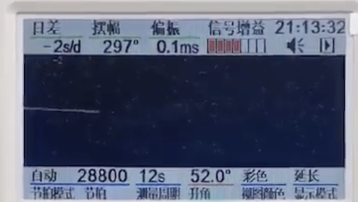
Just got QC Pics for my v4 Panda. Looks alright to me, centered bezel and SEL don't seem to have huge gaps to me.

Timer below:
Z23nFD.png


unknown.png


Is this acceptable? I don't mind the thickness of the text flaws too much, really, as this is my first rep watch and I will probably be telling others so anyway.

Any feedback would be awesome, if this is in the wrong place, please tell me. I made my forum account like 15 minutes ago but thought I'd post here as well.

Thanks all.
 
Last edited:

Therion666

Respected Member
Supporter
Certified
26/12/13
4,613
3,075
113
It's against the rules to ask general questions about your QC pics, but yours are kinda specific, so it's fine. I'd take it, it looks great. I'm no fan of those red lines, because they can be very misleading, if the watch is tilted in the photo ( which it mostly is, even if just a bit). Even the paragraph is not so bad on yours. Well done, you're a lucky guy!
 

stevier88

Renowned Member
Supporter
Certified
16/12/19
535
404
63
U.K
Just got QC Pics for my v4 Panda. Looks alright to me, centered bezel and SEL don't seem to have huge gaps to me.

Timer below:
Z23nFD.png


unknown.png


Is this acceptable? I don't mind the thickness of the text flaws too much, really, as this is my first rep watch and I will probably be telling others so anyway.

Any feedback would be awesome, if this is in the wrong place, please tell me. I made my forum account like 15 minutes ago but thought I'd post here as well.

Thanks all.

Draw some more lines please so we can tell.
 
  • Like
Reactions: popi2020

ettorefranco

Active Member
23/4/20
307
187
43
caput mundi
Given that it is not my intention to go against the tide and that I really like the Arf dial, but looking at the pic posted by saucin, a JTime QC and the pic of a gen found on the web, it seems to me that the V4 is more similar to the gen that not Arf. It is not so?
 

ettorefranco

Active Member
23/4/20
307
187
43
caput mundi
With this dimension of the pics, may be is not clear, but gen 5 lines dial writing seems to me more bold than Arf
 
Last edited:

M Scott

Renowned Member
22/9/18
857
1,163
93
I'm no fan of those red lines, because they can be very misleading, if the watch is tilted in the photo ( which it mostly is, even if just a bit).

Almost all of the watches are tilted in photos to some degree. That's why the first step in Photoshop is to properly level them. You can pick two points on the Dial, like the center of the tick marks at 9 and 3, and the leveling tool will do its job very well.

I like to use red lines to illustrate the differences in comparisons, or show how to spot alignment problems, but I never tell anyone to accept or reject a watch. I think that they should make that decision on their own.
 
  • Like
Reactions: Therion666

M Scott

Renowned Member
22/9/18
857
1,163
93
Given that it is not my intention to go against the tide and that I really like the Arf dial, but looking at the pic posted by saucin, a JTime QC and the pic of a gen found on the web, it seems to me that the V4 is more similar to the gen that not Arf. It is not so?

You decide...
.
 

n1co59000

Active Member
MULTI ACCOUNT
6/5/19
200
46
28
received my v4 c is impressive, the bracelet I do not know what the GEN is worth but I find it not crazy. if not, I love it, I saw the difference at 240

​​​​​​​
 

popi2020

Banned member, the goat does not approve
Banned
12/10/20
415
78
0
I wanted to know: in addition to dial and bezel, how does the speaker (shape, buttons, sel) change anything from V3 ^?
 

popi2020

Banned member, the goat does not approve
Banned
12/10/20
415
78
0
received my v4 c is impressive, the bracelet I do not know what the GEN is worth but I find it not crazy. if not, I love it, I saw the difference at 240


Red "daytona" is too dark in my opinion?!