-
Tired of adverts on RWI? - Subscribe by clicking HERE and PMing Trailboss for instructions and they will magically go away!
You are using an out of date browser. It may not display this or other websites correctly.
You should upgrade or use an alternative browser.
You should upgrade or use an alternative browser.
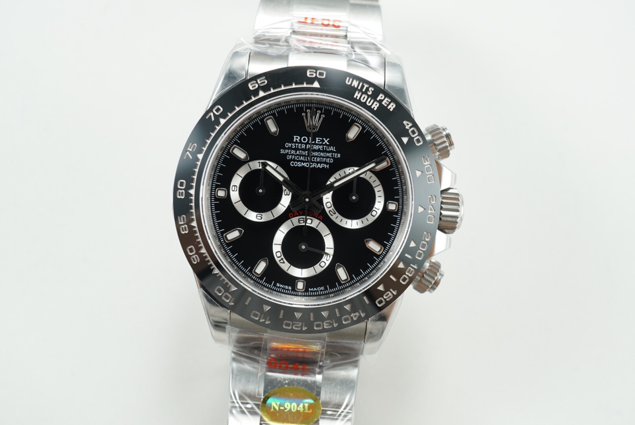
Noob V4 Daytona's
- Thread starter Fervid
- Start date
Zenth
Known Member
- 12/9/20
- 121
- 44
- 0
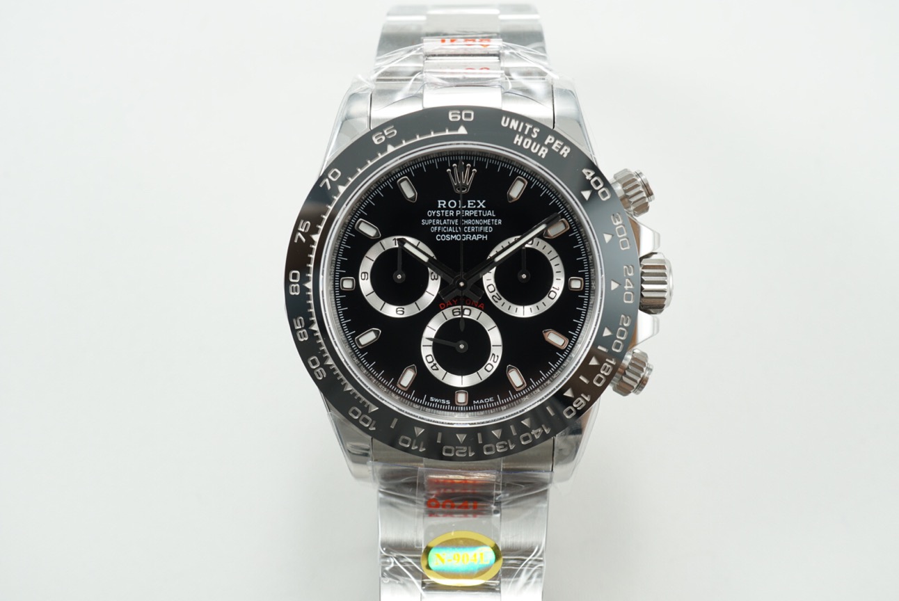
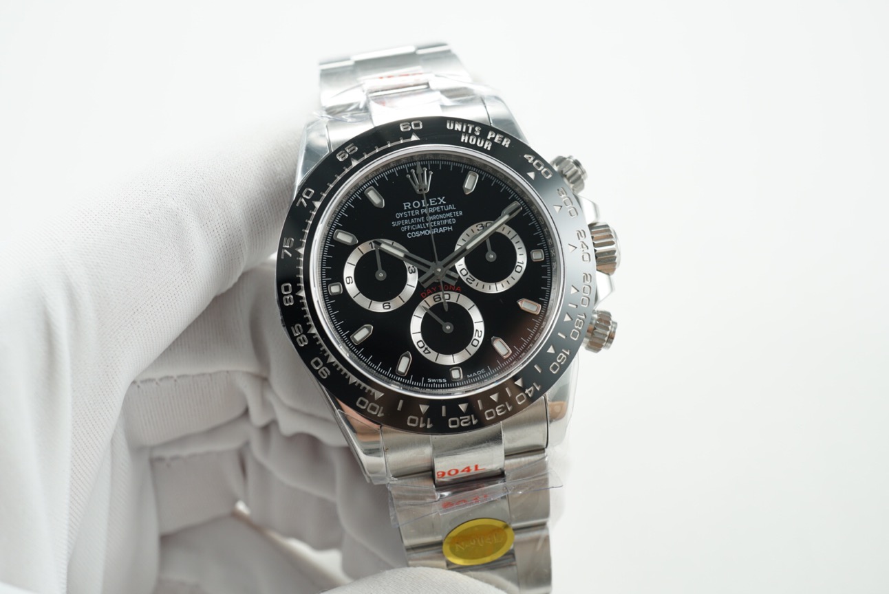
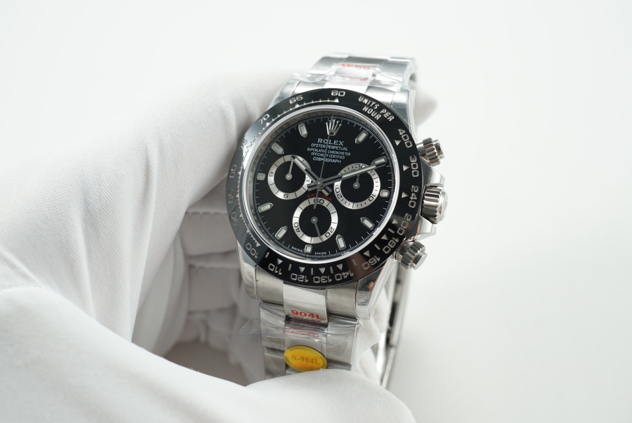
It looks good and not shining at all (by my naked eye lol)
Sent from my iPhone using Tapatalk
ettorefranco
Active Member
It looks good and not shining at all (by my naked eye lol)
In fact, that's what the TD told me: "sub dial circles are better in v4"
Bobi01
Respected Member
- 2/2/19
- 3,926
- 3,477
- 113
They improved bezel for sure,numbers are tad whiter than v3 i think and more crisp but also they ruined SELs..gaps are visible on every single qc we saw so far
- 13/2/18
- 529
- 454
- 63
Anyone have further insight as to the font print difference on the white dial? I’ve yet to see the black dial v4 have what appears to be too thick of font as some white dials have shown. I asked my TD and showed them this photo but they simply replied with “it’s the same”. Clearly does not look the same, yet both do seem like V4’s by the thicker sub dials.


ettorefranco
Active Member
They improved bezel for sure,numbers are tad whiter than v3 i think and more crisp but also they ruined SELs..gaps are visible on every single qc we saw so far
Sorry, but I can't see the SEL problem (I'm not very experienced). Can you explain better? Thanks
ettorefranco
Active Member
Anyone have further insight as to the font print difference on the white dial? I’ve yet to see the black dial v4 have what appears to be too thick of font as some white dials have shown. I asked my TD and showed them this photo but they simply replied with “it’s the same”. Clearly does not look the same, yet both do seem like V4’s by the thicker sub dials.

Same for me, for this reason I'm going for the black dial which looks much better to me
It looks good and not shining at all (by my naked eye lol)
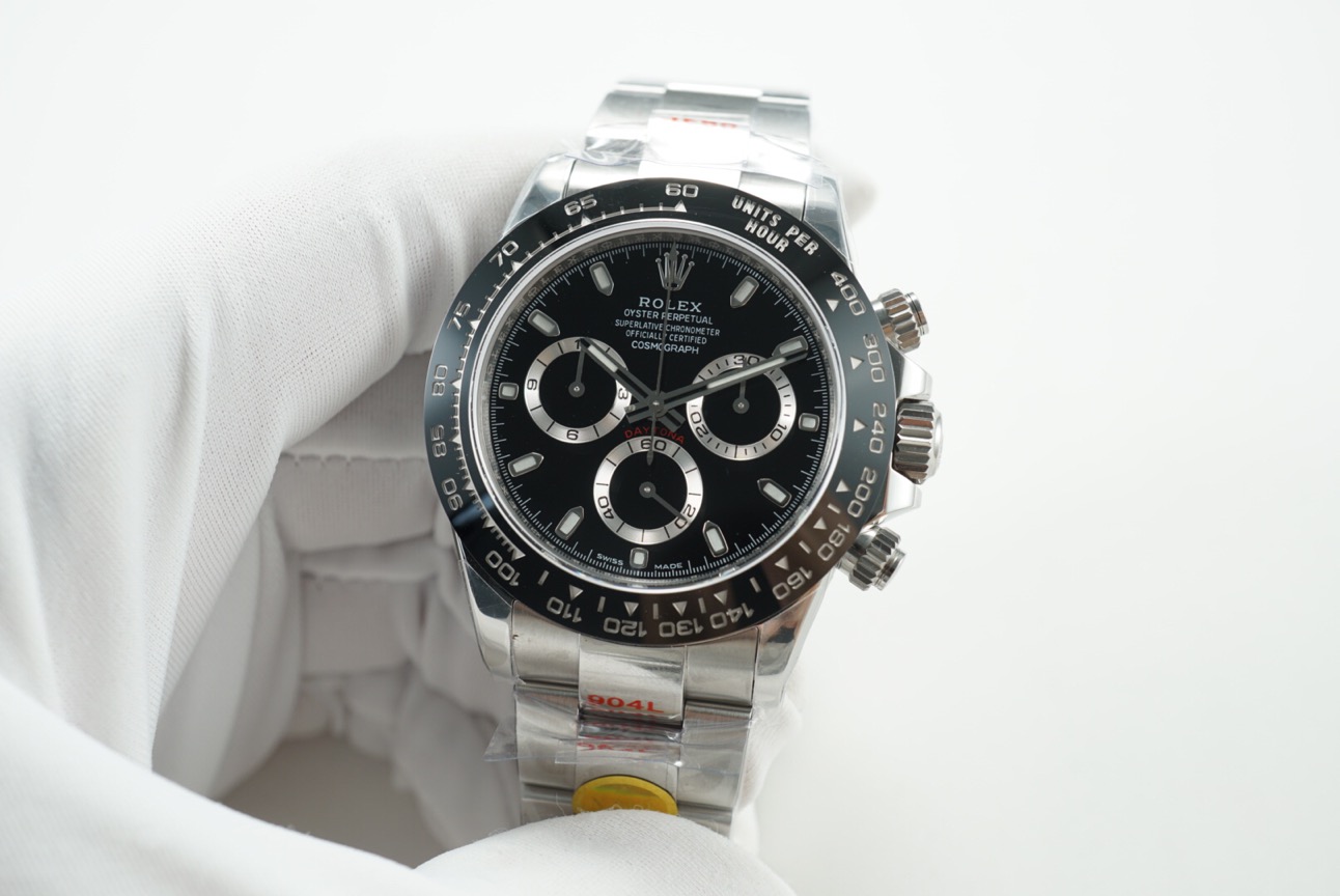
The Hands should be shinning more than the Sub-dials, which should be Matte Silver to be close to Gen.
In these all these pictures, the Sub-dials are shinning much more than the Hands and the same or more than the Case and Bracelet, which is not correct.
.
Zenth
Known Member
- 12/9/20
- 121
- 44
- 0
The Hands should be shinning more than the Sub-dials, which should be Matte Silver to be close to Gen.
In these all these pictures, the Sub-dials are shinning much more than the Hands and the same or more than the Case and Bracelet, which is not correct.
.

Maybe I’m inexperience in Black dial yet
Could you explain more details that you just mentioned? (I quite to not understand what you said)
Sent from my iPhone using Tapatalk
- 13/2/18
- 529
- 454
- 63
Same for me, for this reason I'm going for the black dial which looks much better to me
Not a bad decision. For me, I have too many black dials already and I’m looking to let go of my ARF Daytona white dial for the noob. Fix a few problems, create another >> the story with this hobby.
- 26/12/13
- 4,774
- 3,408
- 113
Maybe I’m inexperience in Black dial yet
Could you explain more details that you just mentioned? (I quite to not understand what you said)
Sent from my iPhone using Tapatalk
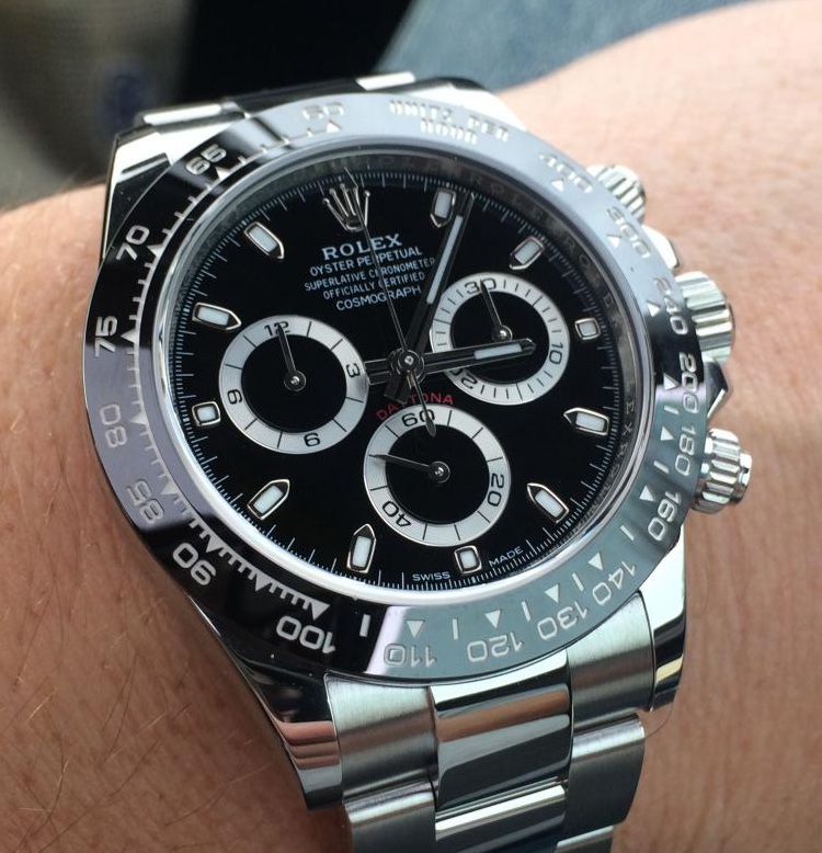
The silver circles of the subdials are too reflective,almost like there's sunburst effect. They're completely matt on gen and not reflective at all. Gray more than silver. Find some gen pics online and see for yourself. But you do have to see it in the metal to understand.
Gen for reference:

Last edited:
- 26/12/13
- 4,774
- 3,408
- 113
- 26/12/13
- 4,774
- 3,408
- 113
srhoque
Respected Member
- 28/11/18
- 3,259
- 2,467
- 113
The Hands should be shinning more than the Sub-dials, which should be Matte Silver to be close to Gen.
In these all these pictures, the Sub-dials are shinning much more than the Hands and the same or more than the Case and Bracelet, which is not correct.
.

Factories will never get that completely right given WG shines a bit more with direct sun. Even the markers should shine more. Frankly, I don't see any material difference for the Black dial between v3 and v4. I will still go with Noob base, ARF dial, CF bezel and gen hands
Maybe I’m inexperience in Black dial yet
Could you explain more details that you just mentioned? (I quite to not understand what you said)
The Gen 116520 Black Dials had Sub-dials that were almost as shinny as the Case and the Hands. This lack of contrast between the Hands and Sub-dials made the watch more difficult to read at a glance. So when the Black Dial 116500 was designed, Rolex made the Sub-dials thinner and gave them more of a matte silver finish as pictured here.

Bobi01
Respected Member
- 2/2/19
- 3,926
- 3,477
- 113
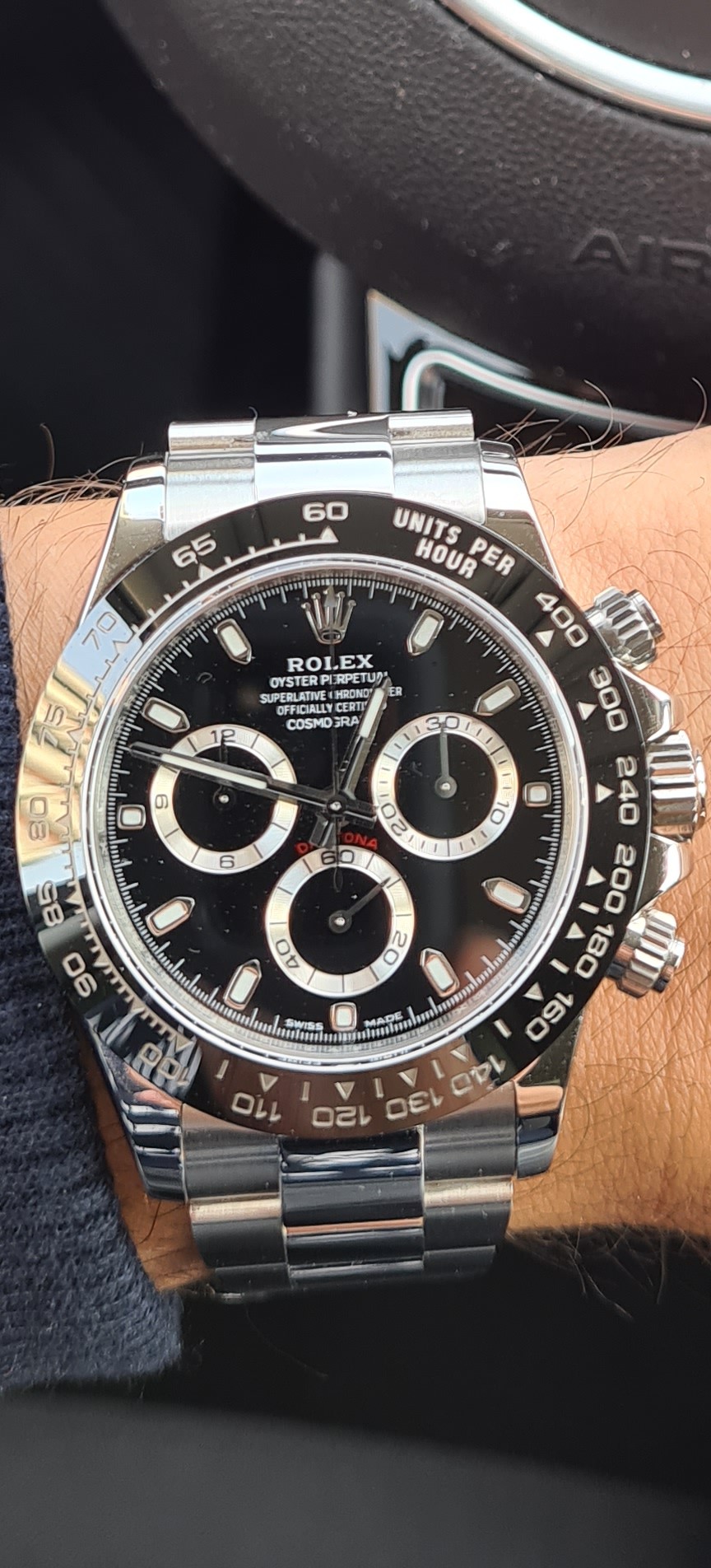
Maybe it is not matte like gen but it is close IMO
in next few days maybe i will compare mine v3 with gen 116500 black dial and i will do few shots side by side
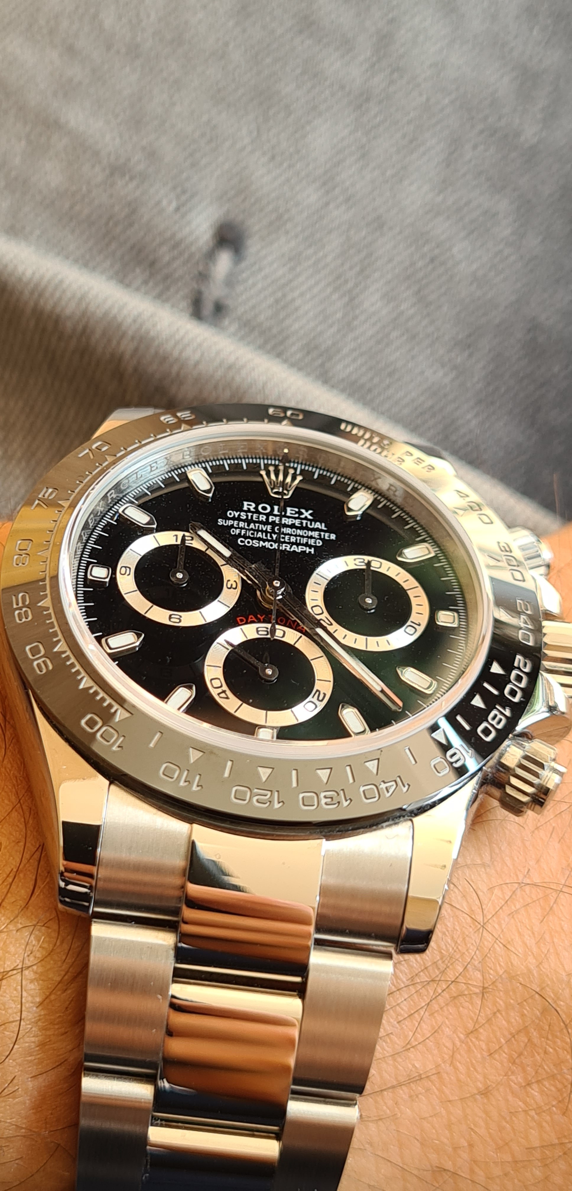
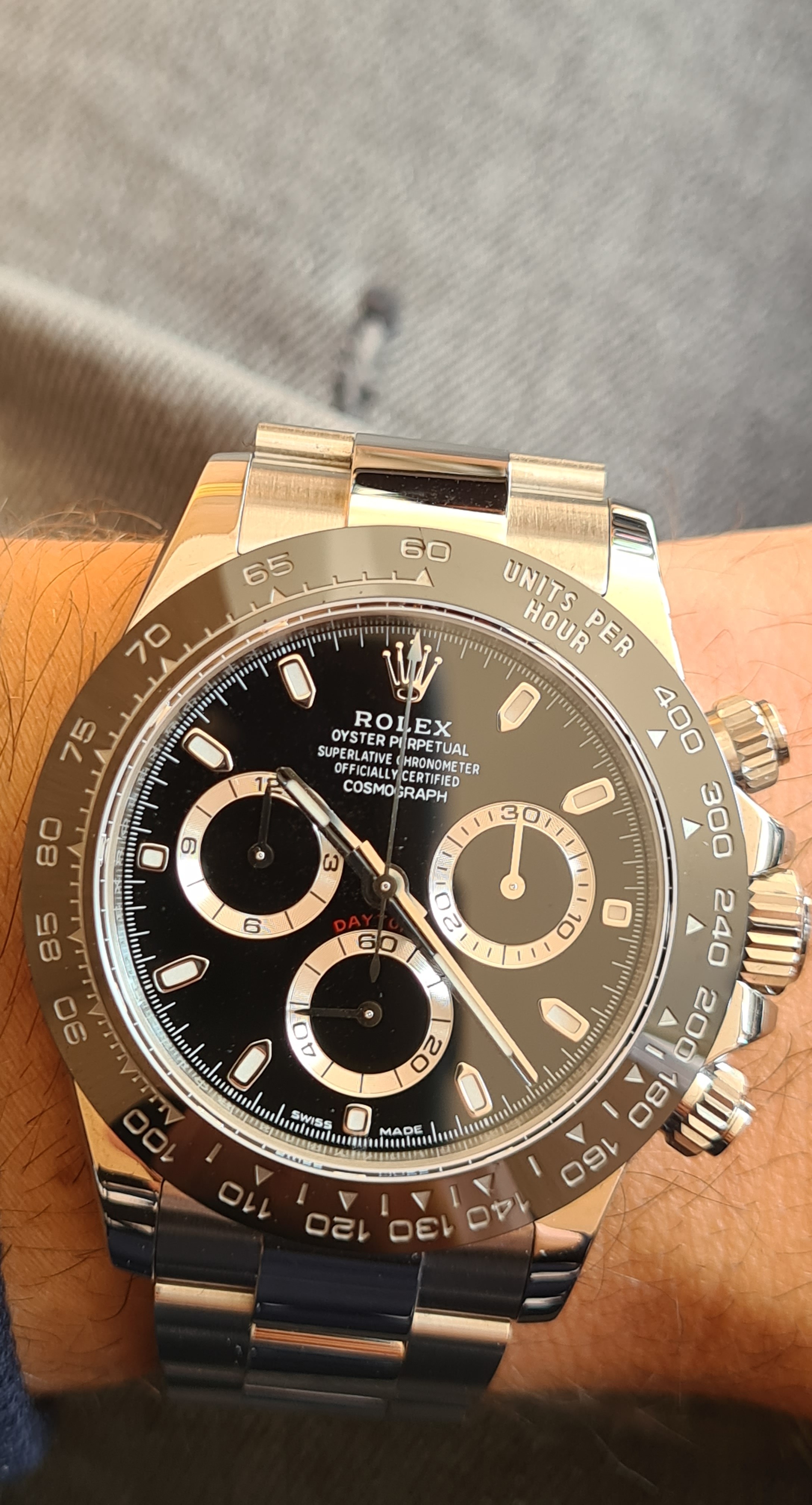
in next few days maybe i will compare mine v3 with gen 116500 black dial and i will do few shots side by side


Last edited:
Zenth
Known Member
- 12/9/20
- 121
- 44
- 0
Which TD ??? It looks very good..
- 26/12/13
- 4,774
- 3,408
- 113
So the hands should be brighter than the subdials. Not just a matter of the rep subdials being too bright, but the rep hands being too dull as well?

