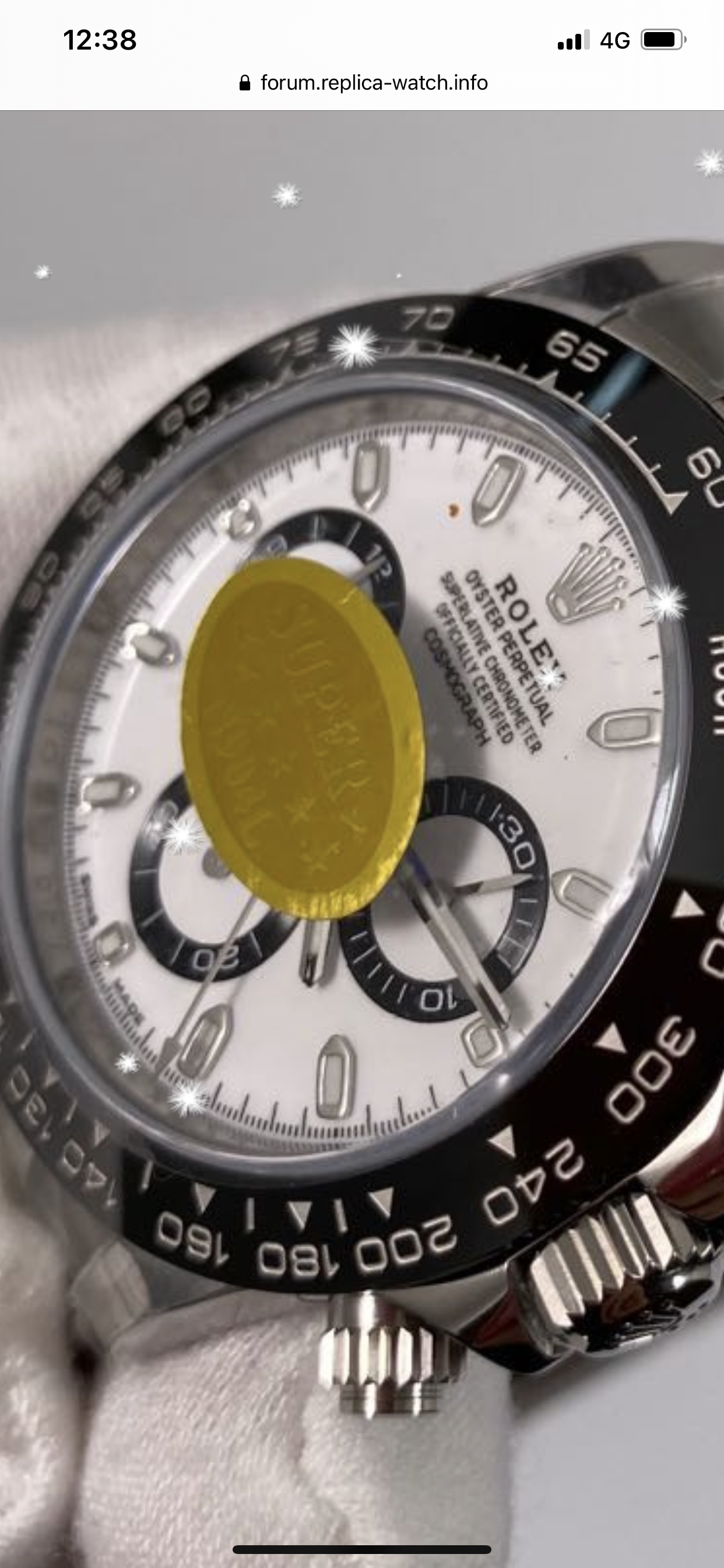
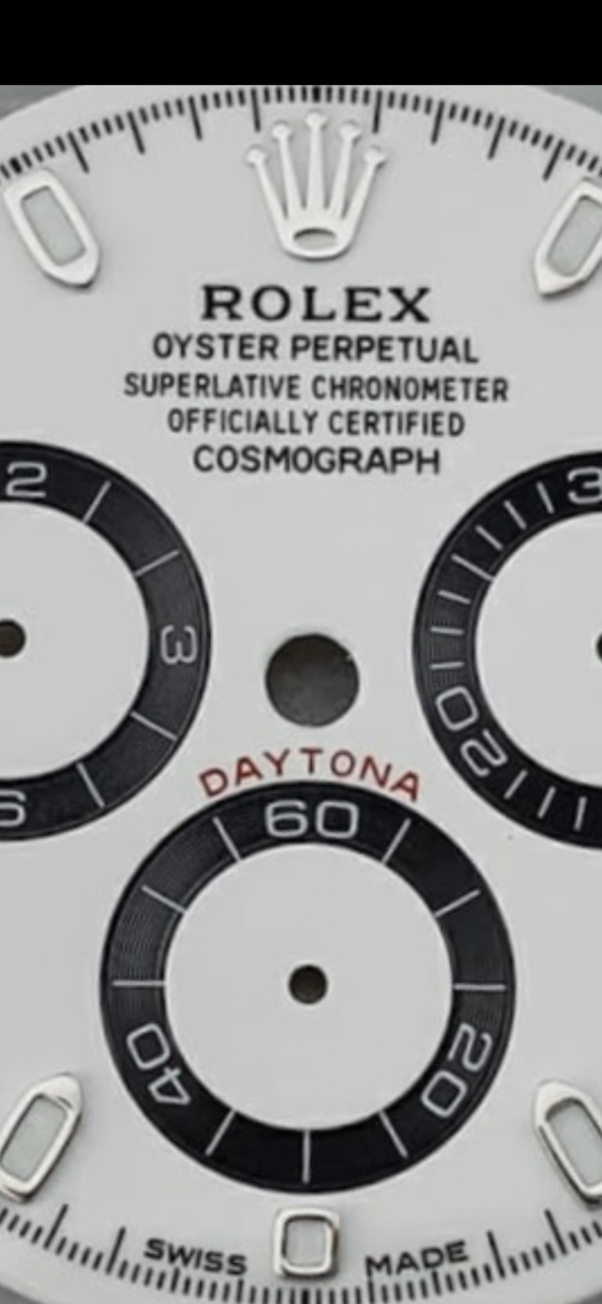
I saw a QC of latest batch, it seems that the bold text has been corrected, it looks really good!
It is not problem the bold text on noob,you have many examples of gen with even bolder text.. problem and flaw on noob text is letter O shape but i reasearch a lot,arf still have much better and crisp text,ROLEX on arf is better than gen at the moment lol but few things made me choose v4 over arf,both have flaws and still we dont have “almost perfect” daytona 116500 dial,what have made me choose v4 is that at the moment arf have little thinner subdials than gen and noob,also v4 improoved their markers as you can see and the shape and lume shape and size is same like gen,arf is also well made but have bigger markers and lume is bigger than gen,color of the lume on arf is too white and color of the dial is better on noob imo... so ARF better text on whole dial,noob correct thickness subdials and better markers size and shape
noob very nice and genlike shape and lume markers

ARF perfect text


