• Tired of adverts on RWI? - Subscribe by clicking HERE and PMing Trailboss for instructions and they will magically go away!

New VRF Pepsi GMT Max

jcguo0516

Active Member
4/12/18
448
289
63
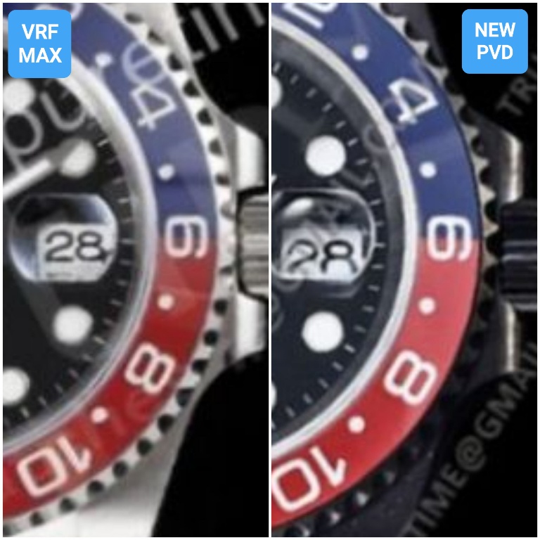
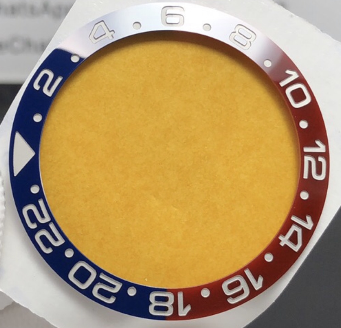
take a closer look at the number mark "18" you will see a line on the left side of the number "8" because the insert is combine by two piece which created this un-even surface


Hi, what exactely speed bumps means?


Inviato dal mio SM-N770F utilizzando Tapatalk
 
  • Like
Reactions: vcappp

harmeetjollyy

Active Member
7/8/16
209
8
18
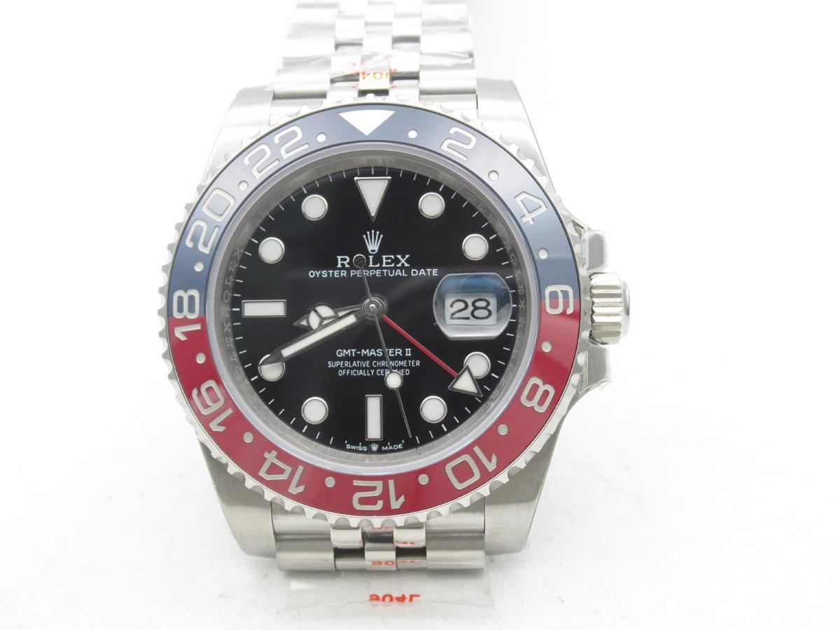
The red looks even lighter than the VRF MAX in TD pics, which is pretty bright red as we've seen. Plus the 1 serifs are wrong. Don't see any speed bumps and the transition points are good. Cyclops distortion is there at only a slight angle off, too bad.

ZmSzfR.jpg
I think noob is better

Sent from my SM-A705FN using Tapatalk
 

rockdaytona

Respected Member
Supporter
Certified
17/12/19
3,625
3,159
113
Parts Unknown
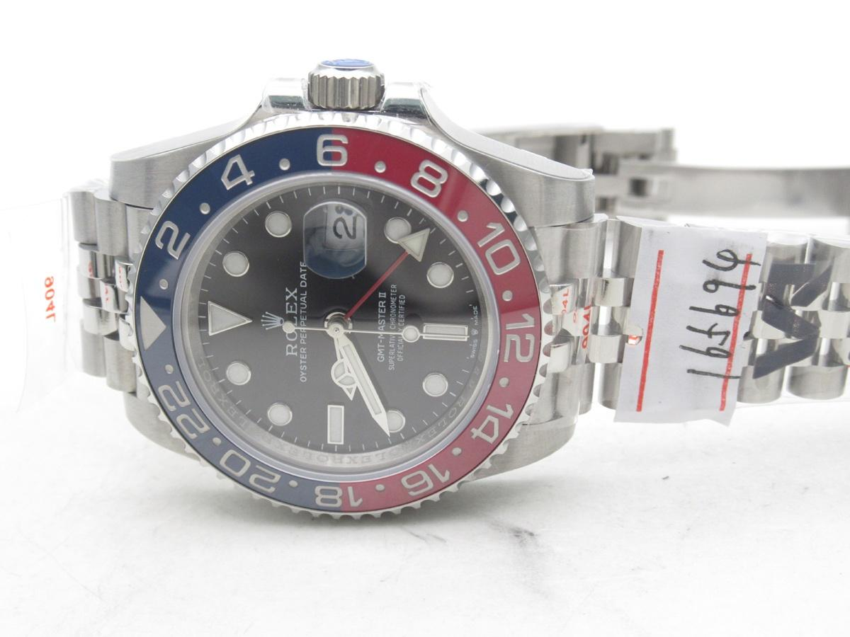
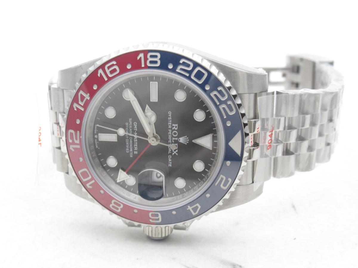
Come on mate you can do a bit better than that surely.. Look at the stickers in the second photo for me

Hmmmm. Not sure if the speed bump line defect outweighs the superior colors relative to the Noob... what say thee experts?
 

Fervid

I'm Pretty Popular
5/5/19
1,522
3,311
113
Down under
Hmmmm. Not sure if the speed bump line defect outweighs the superior colors relative to the Noob... what say thee experts?

I think it comes down to preference, for example I like the colors, transition and font of the noob insert, however the point of transition needs some work, although it's not really noticeable at all by eye.

I'd argue the point of transition on this new VRF insert is better albeit not as smooth with the speedbumps, colors aren't the best but definitely acceptable too.
 
Last edited:

Substar

Active Member
16/9/20
302
343
0
That’s 20 secs of my life I’ll never get back!;-)


Sent from my iPad using Tapatalk
 

srhoque

Respected Member
28/11/18
3,259
2,466
113
While the VRF Pepsi colors are debatable (in some pics they looks great with cranberry red while in others they are off), the VRF watch overall has some issues that I can’t ignore - Date font is bad, Rehaut printing is terrible, the bezel is totally wrong (Teeth are more protruding and bezel well is shallower). However on the positive it has the VR movement inside.

Other than the 18 transition, Noob has got many things right. The red could be more cranberry like though. I also hope they have improved the bezel fitment better in the recent WG models. For now, I prefer to use the Noob as the starting base.

For those that have ordered the VRF, post some real life pics.
 

Scottymagic

I'm Pretty Popular
Certified
14/3/18
2,023
1,112
113
Since when did the Noob Pepsi become so good? Stop being delusional lads. VRF colours are far better from what we’ve seen so far and as a watch it’s far more bang for your buck.

Noob on left, gen on right. Not my picture, I wouldn’t give Noob a cent of my cash for anything but a daytona these days.

V5WqpF.jpg
 

harmeetjollyy

Active Member
7/8/16
209
8
18
This is MK3 version. I have Noob Pepsi and red color is really wrong :-(
VR movement have good DW. Just put Noob ring bezel and good crystal in VRF pepsi...
But I dont think noob pepsi bezel is easily available

Sent from my SM-A705FN using Tapatalk